10,000 search results
(0.115 seconds)
- Lucida Schoolbook by Monotype,
$29.99Lucida is a family of fonts with one basic design, but offered in two variations. It has both serif and sans serif characters. Lucida is suitable for books/text, documentation/business reports, posters, advertisement, multimedia. - Butterfly MF by Masterfont,
$59.00 A practical font family with 3 weights for all your day by day design needs: headlines, web, signage etc. An extended sans serif typeface with rounded endings that provides unique softness appearance without losing legibility.
 - Lucida Casual by Monotype,
$29.99Lucida is a family of fonts with one basic design, but offered in two variations. It has both serif and sans serif characters. Lucida is suitable for books/text, documentation/business reports, posters, advertisement, multimedia. - Cline by Typomancer,
$20.00 Cline, a family of slab and sans typefaces that seamlessly harmonize with each other. All styles have the same width, so changing font weight will not affect your typesetting. Suitable for both text and headlines.
 - Lucida Blackletter by Monotype,
$40.99Lucida is a family of fonts with one basic design, but offered in two variations. It has both serif and sans serif characters. Lucida is suitable for books/text, documentation/business reports, posters, advertisement, multimedia. - Grambly by Hitype,
$15.00 Grambly is a bold sans serif and unique display typeface with a combination of elegant and bold style that will make it stand out. Suitable for logos, stickers, posters, packaging, branding, invitations, notes, print, etc.
 - Volianchy by MJType,
$25.00 Introducing Volianchy is a modern sans serif font designed for the discerning user in mind. This typeface draws inspiration from contemporary design trends, while retaining a timeless essence that ensures its relevance in any era.
 - Lucida Bright by Monotype,
$29.99Lucida is a family of fonts with one basic design, but offered in two variations. It has both serif and sans serif characters. Lucida is suitable for books/text, documentation/business reports, posters, advertisement, multimedia. - Text Book by ParaType,
$30.00 Designed at Polygraphmash in 1958 by Elena Tsaregorodtseva; Latin characters and italic were added in 1987 by Emma Zakharova. An early sans serif ('Grotesque'), it was developed for primers and the first level school textbooks.
 - Geometa Deco by Wiescher Design,
$39.50 Geometa Deco is based on Paul Renners Futura Classic. The design is timeless, but I always missed some decorative characters. So I sat down and did some. The type-designer for surprising solutions, Gert Wiescher
 - Folklore by Ahmad Jamaludin,
$15.00 Just in time for your Halloween projects hopefully :) Say hello to Folklore! A font that's all about spooky, ghoulish fun! With its charming all caps style and built-in speckly texture, Folklore brings a touch of whimsy to your creative projects. Plus, we've included an Outline version of the font as a little bonus. What's Included? Folklore Main File Regular and Outline version Instructions (Access special characters, even in Cricut Design) Unique Letterforms Works on PC & Mac Simple Installations Accessible in Adobe Illustrator, Adobe Photoshop, Microsoft Word even Canva! PUA Encoded Characters. Fully accessible without additional design software. Multilingual Supports: (Afrikaans, Albanian, Catalan, Croatian, Czech, Danish, Dutch, English, Estonian, Finnish, French, German, Hungarian, Icelandic, Italian, Lithuanian, Maltese, Norwegian, Polish, Portuguese, Slovenian, Spanish, Swedish, Turkish, Zulu) Thank you, Dharmas Studio
 - Campora by W Type Foundry,
$25.00 This year we attended the Bologna Children’s Book Fair in Italy. In our days off, we went to Piazza Maggiore to see what the city had to offer and luckily for us we saw an incredible store sign saying CAMPORA. We took some pictures of the typed font and later back in the studio we discovered that it was Dynamo. Immediately our minds were blown away by its beauty and thus we decided to design a new font inspired by its sharp and geometric design adding new weights and OpenType features. In the process we realized that both Dynamo and one of our favorite fonts Avant Garde, share a similar structure, so we made a type mashup between these beauties, including the sharpness of Dynamo and the revolutionary ligatures of Avant Garde.
 - Rethink by Viktor Nübel Type Design,
$35.00 The robust and contemporary sans-serif typeface Rethink, comes with strong characteristics. The typeface is made for work in text as well as in display. It features nine weights in two styles, including Small Caps, a set of contemporary OpenType functions, multiple figure sets and a rich language support. Rethinks main characteristics are the non-straight stroke endings and a slope that might come in an unexpected direction. It brings a bit of movement to the baseline and some attraction to the shapes in bigger sizes. These details are designed to ‘disappear’ in smaller sizes and to not disturb a reading process. Rethink was designed with the idea to help spreading bold ideas ond strong opinions, to support the work of activists in contemporary movements, to design statements with impact and meaningfulness.
 - Fuse by W Type Foundry,
$25.00 This font is inspired by two typographic styles, incorporating (both) geometry and humanism. It combines the rhythm of such typefaces as Meta Pro and The Sans, as well as terminations and structures from fonts like Din and Futura. This results in a font that plays with condensation and a parallel rhythm, simple and functional. Fuse is perfectly equipped with Opentype, it contains alternative glyphs, fractions, modern and old numbers, superscripts and subscripts, ligatures and Small Caps. We always kept the idea of having Fuse be humanistic, rational and universal, which makes it ideal for graphic design, printed publications, web design, motion graphics, interaction design and branding. Learn about upcoming releases, work in progress and get to know us better! On Instagram W Type Foundry On facebook W Type Foundry wtypefoundry.com
 - ITC Django by ITC,
$29.99Australian designer and art director Wayne Thompson has loved typography “ever since I received a battered second-hand Letraset catalog at the age of 10.” He based ITC Django on the handwriting of an acquaintance -- “a fellow I know who writes and illustrates children's books and is also a commercial artist” -- who called himself Django, after the jazz guitarist Django Reinhardt. “I felt that that name Django suited the funky, lively feel of the face,” says Thompson. But he adds, “Django has a split personality: it appears loose and easy at first, but after looking at it for some time I felt an edginess come through that was slightly psychotic.” The looseness of the lowercase contrasts with the spikiness of the capitals. The “edginess” is especially apparent in words in all caps. - Urban Starblues by Prioritype,
$21.00 Urban Starblues - Font Duo Strong paired fonts as the main design display. Yes, it is very good for design with graffiti theme. You can apply it to t-shirt designs, posters, covers, video thumbnails, merchandise and so on to make it look special. Features: Uppercase, Lowercase, (All Caps Sans) Numeral, Punctuation, Multilingual, Alternate (Graffiti) & PUA Encoded. Multilingual contained: Afrikaans, Albanian, Asu, Basque, Bemba, Bena, Breton, Catalan, Chiga, Cornish, Danish, Dutch, English, Estonian, Filipino, Finnish, French, Friulian, Galician, German, Gusii, Indonesian, Irish, Italian, Kabuverdianu, Kalenjin, Kinyarwanda, Luo, Luxembourgish, Luyia, Machame, Makhuwa-Meetto, Makonde, Malagasy, Manx, Morisyen, North Ndebele, Norwegian Bokmål, Norwegian Nynorsk, Nyankole, Oromo, Portuguese, Quechua, Romansh, Rombo, Rundi, Rwa, Samburu, Sango, Sangu, Scottish Gaelic, Sena, Shambala, Shona, Soga, Somali, Spanish, Swahili, Swedish, Swiss German, Taita, Teso, Uzbek (Latin), Volapük, Vunjo, Zulu. Thanks.
 - Galdien by Craft Supply Co,
$20.00 Introducing Galdien – Modern Sans Serif Font A Contemporary Typeface Galdien – Modern Sans Serif Font is, without a doubt, a testament to contemporary design simplicity and elegance. It seamlessly blends modernity with readability. Clean and Versatile Furthermore, Galdien’s clean lines and uncluttered appearance make it an extraordinarily versatile choice for a wide range of design applications. Its simplicity ensures it doesn’t overpower your message, making it a font suitable for various projects. Readability at its Core At its core, Galdien prioritizes readability. Each character is thoughtfully crafted to ensure clarity in both print and digital formats. This font’s legibility is especially essential for conveying your message effectively and effortlessly. Ideal for Modern Branding Additionally, Galdien is perfectly suited for modern branding initiatives. Its clean and sleek aesthetic aligns seamlessly with contemporary brand identities, offering a cohesive and professional look that resonates with today’s audience. In Conclusion Galdien – Modern Sans Serif Font is your unwavering companion for modern design endeavors. Its simplicity, versatility, and readability, combined with its adaptability to various media, make it an excellent choice for diverse projects. With Galdien, your message is not only communicated with clarity and style but also imbued with a contemporary touch that captivates your audience and leaves a lasting impression.
 - Rahere Slab by ULGA Type,
$18.98 Part of the extended Rahere typeface family, Rahere Slab is a humanist slab serif (or Egyptian) in six weights from light to extra bold with corresponding italics. Rahere Slab – like its sibling Rahere Sans – features subtle detailing, giving the typeface a distinctive, warm appearance without distracting the reader. Legible at large and small sizes, Rahere Slab is a versatile, workhorse typeface that is suitable for a wide range of applications such as information signage, packaging, annual reports, advertising, brochures, catalogues, screen text and visual identities. Slab serifs are ideal for projects that need to convey a sense of authority tempered with diplomacy or messages that just need some serious oomph – and Rahere is a great slab for the job. The italic lowercase is more cursive and expressive than the roman and when they’re used together it displays enough character to create emphasis without looking out of place while harmonising admirably. Set on its own (for example, pull-out quotes), the italic exudes a charm that draws attention to the text. The character set covers most European languages plus Vietnamese. Each weight contains lining & non-aligning numerals in both proportional & tabular spacing. The tabular numerals share the same width across all weights and styles (matching Rahere Sans too) – indispensable for financial tables in annual reports. If a companion sans serif is needed, Rahere Sans is the perfect partner. They are both part of the extended Rahere typeface family and have been designed to complement each other beautifully. The typeface is named after Rahere, a 12th-century Anglo-Norman priest, who founded the Priory of the Hospital of St Bartholomew, London in 1123. In 2007 I was successfully treated at Barts for relapsed testicular cancer so I’m indebted to all the doctors, nurses and support staff who work there. A special shout out to Orchid Cancer – a UK charity that helps men affected by cancer – who funded the research for my treatment.
 - Sweet Square by Sweet,
$39.00The Engraver’s Square Gothic—like its rounder cousin, the engraver’s sans serif, Sweet® Sans,has been one of the more widely used stationer’s lettering styles since about 1900. Its minimal forms, made without curves, were popularized long ago by bankers and others seeking a serious, established feel to their stationery. One might argue that the design is a possible precursor to Morris Fuller Benton’s Bank Gothic® typeface. Sweet® Square is based on antique engraver’s lettering templates called “masterplates.” Professional stationers use a pantograph to manually transfer letters from these masterplates to a piece of copper or steel that is then etched to serve as a plate or die. This demanding technique is rare today given that most engravers now use a photographic process to make plates, where just about any font will do. But the lettering styles engravers popularized during the first half of the twentieth century remain both familiar and appealing. Referencing various masterplates, Mark van Bronkhorst has drawn Sweet Square in nine weights. The sources offered just uppercase, small caps, and figures, yet similar, condensed examples had a lowercase, making it possible to interpret a full character set for Sweet Square. Italics were also added to give the family greater versatility. The fonts are available as basic, “Standard” character sets, and as “Pro” character sets offering special characters, a variety of typographic features, and full support for Western and Central European languages. Sweet Square gives new life to an uncommon class of typeface: an early twentieth-century commercial invention that brings a singular verve to modern design. Its unique style is as useful as it is novel. Bank Gothic is a registered trademark of Grosse Pointe Group LLC. - Sweet Square Pro by Sweet,
$59.00 The Engraver’s Square Gothic—like its rounder cousin, the engraver’s sans serif, Sweet® Sans,has been one of the more widely used stationer’s lettering styles since about 1900. Its minimal forms, made without curves, were popularized long ago by bankers and others seeking a serious, established feel to their stationery. One might argue that the design is a possible precursor to Morris Fuller Benton’s Bank Gothic® typeface. Sweet® Square is based on antique engraver’s lettering templates called “masterplates.” Professional stationers use a pantograph to manually transfer letters from these masterplates to a piece of copper or steel that is then etched to serve as a plate or die. This demanding technique is rare today given that most engravers now use a photographic process to make plates, where just about any font will do. But the lettering styles engravers popularized during the first half of the twentieth century remain both familiar and appealing. Referencing various masterplates, Mark van Bronkhorst has drawn Sweet Square in nine weights. The sources offered just uppercase, small caps, and figures, yet similar, condensed examples had a lowercase, making it possible to interpret a full character set for Sweet Square. Italics were also added to give the family greater versatility. The fonts are available as basic, “/fonts/sweet/square/” character sets, and as “Pro” character sets offering special characters, a variety of typographic features, and full support for Western and Central European languages. Sweet Square gives new life to an uncommon class of typeface: an early twentieth-century commercial invention that brings a singular verve to modern design. Its unique style is as useful as it is novel. Bank Gothic is a registered trademark of Grosse Pointe Group LLC.
 - Decorative Tuscanian by Intellecta Design,
$16.90a drop caps joining a barocque frame plus tuscanian caps - Victorian Fonts Collection by Burntilldead,
$14.00 Have you ever imagine to make layered Victorian logo as fast as you blink your eyes? or even make your document and website with victorian classical vibes? Abracadabra! Introducing you opentype font... King Edward and Queen Victoria fonts in one solid package. Very victorian, ornamental, decorative and classical. A solid combination that can bring your design, logo, document, website, etc. back to 1800 decade. Multilingual fonts-family and playful one with 200 alternate characters. Personal & commercial license is included! HOW TO GET ACCESS TO ALTERNATES? Make sure you run an APP or Software that allow you to access Glyph panel. All characters are available through Glyph panel, even more each of the alternate letter has it’s own unicode (PUA) so you can copy/paste from Apple Font Book or Windows Character Map. Total amount of glyphs 1814. OPENTYPE FEATURES - First lowercase (after a capital) and last letter swap automatically. You just need turn on Contextual Alternates. The Victorian graphic Dingbats collection joined together into standard font format (OTF and TTF). Easy to use and great for your decorative document, layout, sign, logo, etc.
 - Franzi by Wannatype,
$26.00 The new sans-serif Franzi typeface family – as neutral as can be, but at the same time individual and striking. Its unmistakable character lies in the detail, with no effect pushing itself to the fore. As a wide-running typeface with a relatively large x-height, the typeface family is perfectly suited to small text sizes but, with its elegant details, it leaves nothing to be desired in display applications either. Originally designed with constructed, often rectangular elements, Franzi has gradually been rounded during the development process and is now less hard in order to guarantee optimal legibility. A total of 20 well-developed fonts are available: 10 line thicknesses from hairline to black, each of which can be upright and italic. The italics are softly and elegantly drawn, while the upright characters appear much more severe. The design appeal reveals itself in the two-storey ‘a’ – a tribute to legibility in body copy; however, for those who prefer the geometric in applications, an alternative single-storey ‘a’ is also available. All styles have small caps, superscript and subscript lowercase letters, lining, non-lining and small caps figures, fractions as well as several ligatures, alternative fonts, symbols and arrows. The Latin uppercase letters are also available as discreet swash variants. In addition to the extended Latin alphabet, the typeface family also includes the complete Greek, Cyrillic and International Phonetic Alphabet IPA. Franzi was created as a further development of an order to produce a sign for a therapy practice in Vienna’s Franz-Hochedlinger-Gasse – hence the name, which is more common as an abbreviation for Franziska than as a diminutive for the male name Franz: Franzi is therefore a hybrid typeface name which has female tendencies.
 - Getaliss by Gatype,
$12.00 Getaliss is a casual script font suitable for a variety of projects, such as branding, invitations, merchandise, websites, advertisements, magazines and more. You'll get a full set of lowercase and uppercase letters, numbers and punctuation, multilingual symbols, ligatures, and extra strokes. Please message if you have any questions or concerns, and don't hesitate to say hello. Thank You!
 - Wafterby by Paramajan,
$8.00 Wafterby is a handsome sans serif typeface family. It comes in eight weights which have a minimal and clean feel. Its design is based on circle and line geometric shapes. It can be used as a cute minimal-style header display or as a stylish text for magazine, blog, corporate branding, packaging, wedding invitation project, etc.
 - Crumpled Parchment by Celebrity Fontz,
$19.99This original typeface appears to be lifted straight from an old crumpled piece of parchment or from a pirate map. An absolute must-have for Halloween, children's publications, pirate-themed texts, and any writing that needs to convey a haunting feel. These tattered letters conjure up spirits and spooks of buccaneers, swashbucklers, and conquistadores from centuries past. - Martian B by Deltatype,
$49.00 Martian B is a sans-serif based typeface, inspired from industrial signs with semi-modular structure, suitable for using in wide ranged. Available in nine weights from Thin to ExtraBlack. Use well with sign into small print or web which support many languages with extended latin glyphs with standard of Adobe Latin 4 and world ready supported.
 - Pillow Fight by PizzaDude.dk,
$17.00 A pillow fight is usually quite refreshing, no matter what age you have. And here is a font which has the exact same effect on your designs! The Pillow Fight font is multilingual, handmade and is a kind of fresh unicase with a brushy breeze! Go for sayings, short messages or catching headlines when using Pillow Fight!
 - Afternoon Tea by Rocket Type,
$19.95 Afternoon Tea is inspired by a lettering specimen featured in Letters and Lettering by Paul Carlyle and Guy Oring published in 1938. The striking features are the elegant balance between thick and thin strokes (demonstrating its obvious ink pen influence) while maintaining a sturdy presence which is ideal for titles and headings. Afternoon Tea is caps only.
 - Joking Lemon by Bogstav,
$17.00 Joking Lemon is a playful sans serif font, which does really well with catch words or headlines that needs a casual and fun look. Both ascenders and descenders are pretty long, giving the text a kind of stretched look - but still very legible! Use Joking Lemon for toys, recipes, packaging, candy, birthday cards ... actually anything, even cat food commercials!
 - Hai Brush by Sabrcreative,
$30.00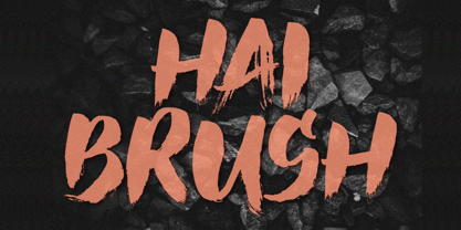 Unleash your creativity with the all-caps captivating Hai Brush Font. This unique typeface effortlessly combines the raw energy of hand brush strokes with a touch of elegance, making it an exceptional choice for a variety of design endeavors. Whether you're crafting logos, posters, or branding materials, Hai Brush Font adds an authentic, artistic flair to your projects.
 - Klubovka by artsterdam,
$15.00 Klubovka is a modern typeface with a vintage style. The font is made in a combined style, so you can't call it a serif or sans-serif typeface. Latin and cyrillic alphabets are available with a modern letter design, as well as support for other languages. The font looks good in both headings and body copy.
 - Soapy Feelings by PizzaDude.dk,
$18.00 Soapy Feelings is my slightly rough-edged handmade fantasy (or perhaps even fairytale) font. I've added several swashes, which can be used for both starting and endings of words. I've also added 4 slightly different versions of each letter (and they automatically cycle as you type!) and lastly, of course Soapy Feelings has multilingual support! Caps Only Fonts
 - P22 Coda by IHOF,
$39.95 Coda Pro is a simple but decorative and controlled sans serif design. Coda literally means ‘tail’ (Italian, from latin cauda) and refers to the way the letters h, m and n stretch below the writing line towards the end of a sentence or before a final stop. Coda Pro is an elegant and contemporary font suited for display purposes.
 - Snowbay by Sibelumpagi,
$16.00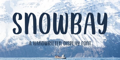 Snowbay is a playful handwritten typeface with a rough and natural style of the brush lettering. It comes with the all-caps glyph and multilingual support. Snowbay is perfect for many different projects such as logos & branding, invitation, stationery, wedding designs, social media posts, advertisements, product packaging, product designs, label, photography, watermark, special events or anything.
 - Modulus by Andrew Footit,
$30.00 Modulus is a clean, minimal, modern sans typeface. It looks smooth in any layout with its sleek rounded lines, use it for your magazines, brochures and editorial layouts. Modulus makes awesome headings, it looks great on its own or with imagery, body copy looks neat and tidy. Modulus is one to add to your font collection.
 - Ranger by Letterena Studios,
$10.00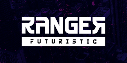 Ranger is a modern and classy sans-serif font with a futuristic style and fancy look. This typeface is perfect for an elegant & luxury logo, book or movie title design, fashion brand, magazine, clothes, lettering, quotes, and so much more. This font is PUA encoded, which means you can access all of the glyphs and swashes with ease! **Uppercase
 - Doorkick by Bogstav,
$16.00 Doorkick is my grungy handmade font with rough lines and a squarish look. Each letter has 5 different versions, which automatically cycles as you type - leaving your text with a super lively and natural/organic look. I'd say that Doorkick is best for short words or shoutouts, but try it out it massive text too! I dare you! :)
 - Mon de Tresor by Reyrey Blue Std,
$14.00 Mon De Tresor is an elegant and thin lettered sans serif font. Perfect for editorial projects, Logo design, Clothing Branding, product packaging, magazine headers, or simply as a stylish text overlay to any background image. It will add a luxury spark to any design project that you wish to create! Includes: Uppercase and Lowercase Ligatures Stylistic Alternate
 - Afternoon Tea by Open Window,
$19.95 Afternoon Tea is inspired by a lettering specimen featured in Letters and Lettering by Paul Carlyle and Guy Oring published in 1938. The striking features are the elegant balance between thick and thin strokes (demonstrating its obvious ink pen influence) while maintaining a sturdy presence which is ideal for titles and headings. Afternoon Tea is caps only.