10,000 search results
(0.046 seconds)
- Redfighter by Ditatype,
$29.00 Redfighter is an attention-grabbing display font with a games theme, featuring large letters and a rectangular shape with sharp corners. This font shows large letters that demand attention and make a statement. The generous size of each character ensures maximum visibility and impactful design elements. This design choice allows this font to stand out and grab the viewer's attention with its imposing presence. The rectangular shape with sharp corners in Redfighter adds a sense of structure and strength to the font. The clean lines and defined angles create a visually bold and striking appearance. This unique feature evokes a sense of power and precision, reflecting the intensity and competitiveness found in the gaming world. For the best legibility you can use it in the bigger text. Enjoy the available features here. Features: Stylistic Sets Multilingual Supports PUA Encoded Numerals and Punctuations Redfighter fits in headlines, logos, posters, titles, branding materials, print media, editorial layouts, website headers, and any other projects that aim to create a strong visual impact. Find out more ways to use this font by taking a look at the font preview. Thanks for purchasing our fonts. Hopefully, you have a great time using our font. Feel free to contact us anytime for further information or when you have trouble with the font. Thanks a lot and happy designing.
 - Strike Swiss - Unknown license

- Fluid by Cubo Fonts,
$20.00 Fluid is an elegant decorative typeface, a contemporary approach of Chinese calligraphy. As if a robot was holding a brush, practicing its digital "Qi".
 - Copacabana by Alan Meeks,
$45.00 Copacabana is heavily based on one of my favourite typefaces Goudy Old Style Italic. It is sharper and more clearly defined than Goudy yet still retains it old style characteristics. The face is slightly angled so is basically upright whilst still retaining Italic characteristics.
 - MedicineShelf by Ingrimayne Type,
$7.95 MedicineShelf has old-fashioned looking letters on old-fashioned looking bottles. The letters are taken from the typeface NeuAltisch . The MedicineShelf-Blank and MedicineShelf-Outline styles can be used in layers with the base MedicineShelf font to increase the coloring possible with this typeface.
 - Schwarzkopf by IHOF,
$24.95 SchwarzKopf is an 18th Century European "Schwabacher" blackletter which features a distressed edge for creating authentic "antique" documents. Old features the long "s" and other archaic forms. Both Old and New variations feature many additional ligatures such as tz, sch, ss, ff and ck.
 - High Noon by FontMesa,
$25.00Introducing High Noon; this very old font originally known as Antique Tuscan dates back into the 1800s and was available only as an uppercase font. Now with the addition of a new never-before-seen lowercase you'll find new uses for this old classic. - Wellmere Sans by Greater Albion Typefounders,
$16.00 Wellmere Sans is humanist a ‘sans serif’ typeface combining distinctive character with easy legibility. The emphasis here is on elegant simplicity and clarity. No alternate forms, no ligatures, just good simple design and elegance giving clarity and ease of communication. Ideal for timeless presentation of information, signs, posters, computer displays and so forth.
 - Flimsy by Bogstav,
$17.00 Flimsy is 100% handmade, but digitally remastered. I removed some blobs here and there, but kept enough of the original handmade line in order to make the Flimsy stand out as an organic and powerful ALL CAPS font! I've also added 5 slightly different versions of each letter, along with multilingual support!
 - Morning by Monotype,
$15.99 Morning’s spirited, bouncy cursive letterforms feel like a painter’s signature; it’s a familiar style but with something of a twinkle in its eye. The style of Morning looks to imitate wet brush and ink lettering, and dances between seriousness and play. You’ll find a mix of letter connections here, and some ligatures, too.
 - Jilkyway by PizzaDude.dk,
$20.00Jilkyway is a truly weird font. Here and there you might spot some sanity in the weird font curves. But as you type, your text becomes more and more weird! The font is also suitable for text written in ALL CAPS! You will need to use OpenType supporting applications to use the autoligatures. - Eeeek Images by Atlantic Fonts,
$59.00 Brew up some sweet Halloween fun with Eeeek Images, a Halloween picture font featuring 60 Amy Dietrich illustrations. From curious crows to cascading candy, Dracula to darling bats - Eeeek Images is MONSTEROUSLY fun... DARE NOT pass it up! Posters feature various fonts by Atlantic Fonts including Rowboat, Mountain Goat, Farmstand, Trailmap, and Judlebug.
 - Alt Fat by ALT,
$- Do you like fat fonts? Well here is a free one from me. Regular & Italic both free. Fat is a caps only font. Because of that if you type something with caps on, as you can see is typing in Greek I decide to make it like this since there no lowercase letters.
 - Bilground by Prioritype,
$17.00 Introducing Bilground - Handwritten Fonts Beautiful handwritten fonts with strong characters are now here to accompany your design projects. You can apply it to wedding designs, logos, quotes, social media posts, video content display etc. See some of the previews above for reference. Features: • Uppercase • Lowercase • Numeral • Punctuation • Multilingual • PUA Encoded • Opentype Features Thanks.
 - Winttra Wonsy by HandletterYean,
$10.00 Winter is coming and Winttra Wonsy is here to celebrate it. Winttra Wonsy is a perfect addition to make your holiday and winter more exciting. Feel free to use it for any craft work, book cover, name card, poster, logo, magazine, cover, banner, t-shirt, or even artwork in a large scale.
 - Soulgate by Bluestype Studio,
$16.00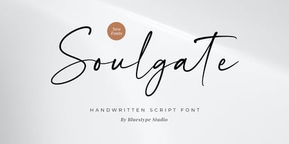 Hello ! This is our newest product font called Soulgate. Soulgate is a handwritten font that is naturally created and looks charming. The font you need is here for your design! This font is suitable for use on branding, social media, business cards, weddings, t-shirt designs, logotype, magazines, quotes, fashion, watermarks, invitations, signatures.
 - Bodoni Classic Swirls by Wiescher Design,
$39.50 Bodoni Classic Swirls breaks all the rules. The idea of Bodoni typefaces is no embellishments and here I go again and do another decorated set of Bodonis. But I find this is another very nice and useful typeface for all kinds of cards and certificates. Enjoy! Yours, again breaking the rules, Gert Wiescher
 - Creepy Crawly by Comicraft,
$19.00There are worms in the earth, hairy bugs under the bed and strange bloodshot eyeballs peering at you from out of the closet. Lilou's Creepy Crawly font is perfect for scaring away Trick-or-Treaters, just install our font and print out your signs with the legend: WE EAT LITTLE CHILDREN HERE! - Gelsson by madeDeduk,
$16.00 Really excited to introduce Gelsson is a realistic brush script! Gelsson will be perfect for all your designs project. Included: Uppercase Lowercase Number & Symbol International Glyphs Ligature If you need anything else just shoot me on email at: dedukvic@gmail.com find more previews on my website here : https://typeclassheroes.com/ Hope you enjoy it.
 - Marion by Typodermic,
$11.95 Step back in time with Marion, the transitional serif typeface that exudes a nineteenth-century flair. With its classic structure reminiscent of Century Roman, Marion stands out with a stroke treatment that’s closer to the timeless elegance of Baskerville. The inspiration for Marion comes from a diverse array of old metal typefaces, resulting in a design that’s uniquely historic and fascinating. One of the most distinctive features of Marion is the hammer claw shape of the serifs, adding a touch of industrial charm and a smokestack vibe. The font is available in Regular, Italic, Bold, and Bold Italic, allowing for a range of possibilities when it comes to design. With old-style numerals and standard f-ligatures, Marion offers the perfect balance between historical design and modern-day functionality. Additionally, it includes some eccentric discretionary ligatures and chirpy swash letters, adding a whimsical touch to your graphic design projects. Take your design to the next level with Marion. Its historically inspired design and unique features are sure to add a touch of elegance and sophistication to any project, making it the perfect choice for designers looking to create something truly remarkable. Most Latin-based European, Vietnamese, Greek, and most Cyrillic-based writing systems are supported, including the following languages. Afaan Oromo, Afar, Afrikaans, Albanian, Alsatian, Aromanian, Aymara, Azerbaijani, Bashkir, Bashkir (Latin), Basque, Belarusian, Belarusian (Latin), Bemba, Bikol, Bosnian, Breton, Bulgarian, Buryat, Cape Verdean, Creole, Catalan, Cebuano, Chamorro, Chavacano, Chichewa, Crimean Tatar (Latin), Croatian, Czech, Danish, Dawan, Dholuo, Dungan, Dutch, English, Estonian, Faroese, Fijian, Filipino, Finnish, French, Frisian, Friulian, Gagauz (Latin), Galician, Ganda, Genoese, German, Gikuyu, Greenlandic, Guadeloupean Creole, Haitian Creole, Hawaiian, Hiligaynon, Hungarian, Icelandic, Igbo, Ilocano, Indonesian, Irish, Italian, Jamaican, Kaingang, Khalkha, Kalmyk, Kanuri, Kaqchikel, Karakalpak (Latin), Kashubian, Kazakh, Kikongo, Kinyarwanda, Kirundi, Komi-Permyak, Kurdish, Kurdish (Latin), Kyrgyz, Latvian, Lithuanian, Lombard, Low Saxon, Luxembourgish, Maasai, Macedonian, Makhuwa, Malay, Maltese, Māori, Moldovan, Montenegrin, Nahuatl, Ndebele, Neapolitan, Norwegian, Novial, Occitan, Ossetian, Ossetian (Latin), Papiamento, Piedmontese, Polish, Portuguese, Quechua, Rarotongan, Romanian, Romansh, Russian, Rusyn, Sami, Sango, Saramaccan, Sardinian, Scottish Gaelic, Serbian, Serbian (Latin), Shona, Sicilian, Silesian, Slovak, Slovenian, Somali, Sorbian, Sotho, Spanish, Swahili, Swazi, Swedish, Tagalog, Tahitian, Tajik, Tatar, Tetum, Tongan, Tshiluba, Tsonga, Tswana, Tumbuka, Turkish, Turkmen (Latin), Tuvaluan, Ukrainian, Uzbek, Uzbek (Latin), Venda, Venetian, Vepsian, Vietnamese, Võro, Walloon, Waray-Waray, Wayuu, Welsh, Wolof, Xavante, Xhosa, Yapese, Zapotec, Zarma, Zazaki, Zulu and Zuni.
 - Sacnoth by Intellecta Design,
$23.90 Sacnoth is a font inspired in the old knots celtic visual.
 - LHF Grants Antique by Letterhead Fonts,
$33.00 Nice for an authentic old fashioned flavor without being over-bearing.
 - Speedball Metropolitan Caps by Intellecta Design,
$6.00 a decorative caps font based in designs of old Speedball booklets
 - Arcadia by Kraken,
$15.00A typeface inspired by the old computer games of the 1980s. - American Advertise 013 by Intellecta Design,
$9.00inspired in classic wood type heritage fonts from old America's foundryes - MARIAMNE by Type Innovations,
$39.00 MARIAMNE is an original design by Alex Kaczun. It is an elegant, modern and traditional interpretation based on and modeled after his successful "Contax Pro" and "New Age Gothic" typeface series. As such, it has generous proportions with clean, crisp lines—ideally suited for easy reading and long lines of copy. Alex felt that the skeleton for "Contax" was perfectly suited to transform the design into a modern version of 'old-style', somewhat reminiscent of German Black Letter. Numerous modifications where made to the body proportions, stems and shapes. True 'old-style' serifs and unusual 'cross-strokes' where added for a touch of distinction. The 'cross-strokes' where added at exactly visual mid-point on the overall heights. This gives the typeface a romantic, female-like quality to the overall design. Strong, yet delicate. Visually stimulating in appearance and function. The result is a truly unique transitional and modern design. Unlike other typefaces, MARIAMNE incorporates uniform stems throughout the capitals, lower case and figures. This gives the design a uniform appearance in overall color and strength. There is a perfect visual balance between inter-letter spacing, stem weights and proportions. The accents are equally large, bold and command attention. This font includes a large 'Pro' character set, which supports most Central European and many Eastern European languages. As a result, the design is ideally suited for display copy as well as text composition. In the near future, Alex plans to expand the typeface series to include a light and heavy weight, along with true italics.
 - Really No 2 W2G by Linotype,
$124.99Really No. 2 is a redesign and update of Linotype Really, a typeface that Gary Munch first designed in 1999. The new Really No. 2 offers seven weights (Light to Extra Bold), each with an Italic companion. Additionally, Really No. 2 offers significantly expanded language support possibilities. Customers may choose the Really No. 2 W1G fonts, which support a character set that will cover Greek and Cyrillic in addition to virtually all European languages. These are true pan-European fonts, capable of setting texts that will travel between Ireland and Russia, and from Norway to Turkey. Customers who do not require this level of language support may choose from the Really No. 2 Pro fonts (just the Latin script), the Really No. 2 Greek Pro fonts (which include both Latin and Greek), or the Really No. 2 Cyrillic Pro fonts (Latin and Cyrillic). Each weight in the Really No. 2 family includes small capitals and optional oldstyle figures, as well as several other OpenType features. Really No. 2's vertical measurements are slightly different than the old Linotype Really's; customers should not mix fonts from the two families together. As to the design of Really No. 2's letters, like Linotype Really, the characters' moderate-to-strong contrast of its strokes recalls the Transitional and Modern styles of Baskerville and Bodoni. A subtly oblique axis recalls the old-style faces of Caslon. Finally, sturdy serifs complete the typeface's realist sensibility: a clear, readable, no-nonsense text face, whose clean details offer the designer a high-impact selection. - C-Nation by URW Type Foundry,
$39.99 Marit Otto about C-Nation: The building typeface. Although the 70ties were very liberating and progressive, still girls played mainly with dolls and sweet things and boys with all kinds of challenging stuff. They did all sorts of basic scientific experiments in mini labs and of course built cool things with Meccano building sets. As a girl I was perfectly happy with the toys I had access to. But at the same time I was very curious about all the adventure toys and discoveries my brother did. It also made me wonder why the grown up people thought that our world could be separated so easily by separating our toys in pink and blue sections. At this day of age Meccano is probably hopelessly old fashioned and far to manual. Children of today are fed by fast images and cool animations on screen, they learn, play, communicate and relax in the same space, the digital space. The special feature of Meccano was that even though it was very basic there was the promise you could create anything. It might even contribute to a logical mind. The typeface I designed refers to the Meccano feel. It is a creative typeface. A bit masculine and bold looking perhaps but after the first impression a subtle and refined female touch is revealed. It has links to architecture and associations with metal constructions like ‘The Eiffel Tower’ and (old railway) bridges. I am convinced that we all think of that as very charming man-made objects.
 - Really No 2 Paneuropean by Linotype,
$103.99Really No. 2 is a redesign and update of Linotype Really, a typeface that Gary Munch first designed in 1999. The new Really No. 2 offers seven weights (Light to Extra Bold), each with an Italic companion. Additionally, Really No. 2 offers significantly expanded language support possibilities. Customers may choose the Really No. 2 W1G fonts, which support a character set that will cover Greek and Cyrillic in addition to virtually all European languages. These are true pan-European fonts, capable of setting texts that will travel between Ireland and Russia, and from Norway to Turkey. Customers who do not require this level of language support may choose from the Really No. 2 Pro fonts (just the Latin script), the Really No. 2 Greek Pro fonts (which include both Latin and Greek), or the Really No. 2 Cyrillic Pro fonts (Latin and Cyrillic). Each weight in the Really No. 2 family includes small capitals and optional oldstyle figures, as well as several other OpenType features. Really No. 2's vertical measurements are slightly different than the old Linotype Really's; customers should not mix fonts from the two families together. As to the design of Really No. 2's letters, like Linotype Really, the characters' moderate-to-strong contrast of its strokes recalls the Transitional and Modern styles of Baskerville and Bodoni. A subtly oblique axis recalls the old-style faces of Caslon. Finally, sturdy serifs complete the typeface's realist sensibility: a clear, readable, no-nonsense text face, whose clean details offer the designer a high-impact selection. - Really No 2 by Linotype,
$29.99 Really No. 2 is a redesign and update of Linotype Really, a typeface that Gary Munch first designed in 1999. The new Really No. 2 offers seven weights (Light to Extra Bold), each with an Italic companion. Additionally, Really No. 2 offers significantly expanded language support possibilities. Customers may choose the Really No. 2 W1G fonts, which support a character set that will cover Greek and Cyrillic in addition to virtually all European languages. These are true pan-European fonts, capable of setting texts that will travel between Ireland and Russia, and from Norway to Turkey. Customers who do not require this level of language support may choose from the Really No. 2 Pro fonts (just the Latin script), the Really No. 2 Greek Pro fonts (which include both Latin and Greek), or the Really No. 2 Cyrillic Pro fonts (Latin and Cyrillic). Each weight in the Really No. 2 family includes small capitals and optional oldstyle figures, as well as several other OpenType features. Really No. 2's vertical measurements are slightly different than the old Linotype Really's; customers should not mix fonts from the two families together. As to the design of Really No. 2's letters, like Linotype Really, the characters' moderate-to-strong contrast of its strokes recalls the Transitional and Modern styles of Baskerville and Bodoni. A subtly oblique axis recalls the old-style faces of Caslon. Finally, sturdy serifs complete the typeface's realist sensibility: a clear, readable, no-nonsense text face, whose clean details offer the designer a high-impact selection.
 - Vera Humana 95 - Unknown license

- Slamming - Unknown license

- Nuclear Standard by Zang-O-Fonts,
$25.00Strong, hard lines inspired the name of this font, based on the "nuclear standard" set by the U.S. and the Soviets during the cold war. - Cartoonist JNL by Jeff Levine,
$29.00 Cartoonist JNL was modeled from a casual brush lettering style found in a catalog of lettering templates sold by the Wright-Regan Instrument Company (Wrico).
 - Broughton by Ardian Nuvianto,
$18.00 Hello there Here is my new font Broughton. Broughton is consisting of a fashionable handbrush-style script make looks elegant, classy and touch of luxury and stylish. This font was created to look as close to a natural handwritten script as possible by including 9 ligatures. Broughton is perfect for brand design, barbershop logo, branding projects, logo, wedding designs, social media posts, advertisements, product packaging, product designs, label, photography, watermark, invitation, stationery and anything that you want. Here is that you get: Broughton font file More than 230 of glyphs 9 Standard Ligatures Works on PC & Mac Simple installations Supports multilinguage Accessible in the Adobe Illustrator, Adobe Photoshop, Adobe InDesign, even work on Microsoft Word. PUA Encoded Characters – Fully accessible without additional design software. Drop me message if you have any questions. Happy Creating Thanks
 - Fastenating JNL by Jeff Levine,
$29.00 Since the 1800s, many patents were issued for methods to hold papers together. The two most popular and enduring tools still in use today are the stapler and the paper clip. In recent times a number of clips in novelty shapes have been available in just about every size, shape and color imaginable. Back in the beginning there were many variations as well, but the purpose of these design variants was to try and command the majority of sales in the fledgling market of bent wire clips by offering a unique and hopefully better product. Fastenating JNL contains twenty-five images based on those early clip designs as well as one classic paper fastener (on the Z and z keys). The standard gem clip has been the most enduring design and is well over one hundred years old.
 - HGB Info OSF by HGB fonts,
$20.00 It's nice when a font provides old style figures, small caps and alternate letters. But what to do if my typesetting program doesn't support Open Type features? The solution may be old-fashioned, but it's effective: the variants are placed in separate font families: Standard, Old Style Figures (OSF), and Small Caps (SC). Any word processor can handle it. As a special feature, my OSF fonts also contain alternative letters such as a looped g or descenders in the italic f.
 - Spanish Main by FontMesa,
$19.95 Spanish Main is a revival of an old MacKeller Smiths & Jordan font named Sloping Black. Like most foundries MacKeller Smiths & Jordan doesn't display all the letters of the fonts in their specimen books so it took a little more time to find the complete character set for this old beautiful classic font. New in this version is the addition of a Greek character set which is experimental as you normally don't see Old English style fonts include a Greek alphabet.
 - Digital Sans Now by Elsner+Flake,
$59.00 Digital Sans Now combines and completes the many diverse requests and requirements by users of the past years. By now, 36 versions for over 70 Latin and Cyrillic languages have become available, including Small Caps. Digital Sans Now is also available as a webfont and reflects, with its simplified and geometric construction and its consciously maintained poster-like forms as well as with its ornamental character, the spirit of the decorative serif-less headline typefaces of the 1970s. The basic severity of other grotesque typefaces is here repressed by means of targeted rounds. Exactly these formal breaks allow the impression that it could be used in a variety of visual applications. Short texts, headlines and logos of all descriptions are its domain. It is because of this versatility that the typeface has become a desirable stylistic element, especially in such design provinces as technology, games and sports, and that, for many years now, it appears to be timeless. Additional weights designed on the basis of the original, from Thin to Ultra, the Italics, Small Caps and alternative characters allow for differentiated “looks and feels”, and, with deliberate usage, give the “Digital Sans Now” expanded possibilities for expression. The basis for the design of Digital Sans Now is a headline typeface created in 1973 by Marty Goldstein and the Digital Sans family which has been available from Elsner+Flake since the mid-1990s under a license agreement. The four weights designed by Marty Goldstein, Thin, Plain, Heavy and Fat, were originally sold by the American company Visual Graphics Corporation (VGC) under the name of “Sol”. Similarly, the company Fotostar International offered film fonts for 2” phototypesetting machines, these however under the name “Sun”. The first digital adaptation had already been ordered in the mid 1970s in Germany by Walter Brendel for the phototypesetting system Unitype used by the TypeShop Group, in three widths and under the name “Digital Part of the Serial Collection.” Based on the versions by VGC, Thin, Plain, Heavy and Fat, new versions were then created with appropriate stroke and width adaptations for data sets for the fonts Light, Medium and Bold as well as for the corresponding italics
 - Rangarang by Si47ash Fonts,
$24.00 "At last, something beautiful you can truly own!" This is the first Persian Arabic & Latin COLOR font ever designed! Chromatic or Color fonts are fairly new. And Persian Arabic color fonts are extremely rare. Here, you get a font that supports both Arabic and Latin! Rangarang [means colorful] font comes in with a wonderful color set and variety in forms. Every single glyph has a unique palette of colors. If you look closely at the glyphs, you'll see complex paths and connections in every single one of them. Each glyph could be seen as a typographic artwork! Rangarang font is great for entertainment design, posters, business cards, website titles, magazine illustrations, logotypes, book covers, banners, billboards,... There are countless options! Notes: - SVG fonts contain vector letters with gradients and transparency. - These fonts will show up in apps that are compatible with color fonts, like Adobe Photoshop CC 2017.0.1 and above, Illustrator CC 2018. Learn more about color fonts and their support in third-party apps on: www.colorfonts.wtf - Don't worry about what you see here in the preview section in your browser. You may see the glyphs in black here, but this font is working EXACTLY how you can see it in the font pictures I put here. So if you use it in apps that support colored fonts, you can be sure that after installing the font on the system you will be able to use it like every other font. Shahab Siavash, the designer has done more than 30 fonts and got featured on Behance, Microsoft, McGill University research website, Hackernoon, Fontself, FontsInUse,... Astaneh and Hezareh text and headline fonts, Yaddasht and Yadgar handwriting fonts,... already got professional typographers, lay-out and book designers' attention as well as some of the most recognizable publications in Persian Arabic communities.


