10,000 search results
(0.026 seconds)
- Diamond Braille by Echopraxium,
$5.00 Here is a "Decorative Braille font". The initial design was indeed drawn on a K.I.S.S digital sketchpad, the Windows default drawing tool (Microsoft Paint, classic version). A. Glyph Concept The Braille 2x3 dot matrix is weaved around a diamond-shape. a.1. Each "dot" is represented by a "right-angle isocel triangle". a.2. Braille dots in Diamond Braille a.2.I. "Dots" are outside the diamond for first Braille row (Braille dots 1, 4) and third Braille row (Braille dots 3, 6). a.2.II. "Dots" are inside the diamond for second Braillle row (Braille dots 2, 5). a.3. Diamond lattice Glyphs are connected horizontally (to/bottom diamond's corners) and vertically (left/right corners) to each other (see poster 5). a.4. Special Glyphs - Space: its is either empty ("Empty cell") or a "non Braille shape" { _, ° } depending on your display needs (as explained in b.3.II) - 6 dots: { £, =, û } - 6 empty dots: { ç, ¥ } B. Font user guide b.1. Lowercase glyphs { A..Z } In these glyphs the "dots" are represented as a white right-angle isocel triangle filled with a smaller black triangle. b.2. Uppercase glyphs { a..z } In these glyphs, the "dots" are represented as an empty triangle (this is an "empty dot"). b.3. 'Space' vs 'Empty Cell' b.3.I. 'Space' - 'Space' glyph is an empty shape - '¶' glyph (at the end of each line in Microsoft Word) is also an empty shape b.3.II. 'Empty cell' glyphs: _ (underscore), ° (degree). In these glyphs there are 2 "empty dots" at top and bottom corners of the diamond, which differentiates them from regular Braille glyphs (which dont have a "dot in the middle"). b.4. Diamond Lattice To display text as a 'diamond lattice', replace each 'Space' by an 'Empty cell' (as explained in b.3.II, see poster 5) b.5. Connectors The connector glyphs allow the creation of "circuit like" designs (see poster 1). Here are the connector glyphs: { µ, à, â, ä, ã, è, é, ê, ë, î, ï } b.6. Domino feature Some Glyphs represent numbers 1..6 in a way which is similar than on dominos (see poster 6) C. Posters Poster 1: the "Font Logo", it displays "Diamond Braille" text together with the Connectors feature. Poster 2: a pangram which is published on pangra.me ( "Adept quick jog over frozen blue whisky mix" ). Poster 3: an illustration of the Domino feature. Poster 4: a DiamondBraille version of the Periodic table. Poster 5: illustration of the Diamond lattice using only 6 dots ( û ) and 6 empty dots ( ç ) glyphs.
 - OricNeo by The Northern Block,
$12.80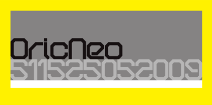 A computerized typeface inspired by the Matrix trilogy.
 - Annexxus by Kustomtype,
$25.00 Kustomtype's 'Annexxus' font is a serrif font family with a regular & oblique version. It contains all upper & lower cases. The 'Annexxus' family is coordinated into letterforms, metrics, and weights to work better together. Why still looking for old school types for your posters, text, design, artwork, headtext, editoral design, magazines, etc.? Dress up your graphic work with 'Annexxus! A good font does not have to be perfect to be wonderful!
 - Katherine by ParaType,
$30.00Script font developed for ParaType in 2007 by Gennady Fridman based on informal handwriting. The handwriting belongs to a woman of middle class that have found her place in the life and does not pretend to get more. It produces a feeling of reliability and promptness. The font can be used for advertising of house goods and in other printed materials where it's important to show informality and personal attitude. - Carlino by Pío Pío,
$17.00 Carlino is named after the cutest dog on earth. Why? Because it’s the cutest font ever made. Especially intended for stationery use, it’s loaded with lots of alternates and ligatures, not only in the lowercase but in the uppercase. All of them are Open-Type programmed, so the possibilities of having something unique are endless. Following nowadays trend, Carlino is a multi-layered font: shades, holes and dots were made to work alone or all together with fantastic results! The way it works is so easy that It’s impossible not to enjoy it: Just type a word; then the same one set in another style and voilà! The font has also a lot of sweet ornaments to embellish your projects. Find inside: hearts, fleurons, party icons, flags, and the funniest animals. To accompany Carlino, there’s nothing better than Carlino Capitals. Its cute flavor makes everything more lovely. Have fun with Carlino and oh! don't forget to feed this little pug or it will bark all day long! Special thanks to Maximiliano Sproviero, whose advice helped me make this dream come true.
 - Like Butterflies by Bogstav,
$10.00 Now here's a font that is named Like Butterflies, but has got nothing to do with butterflies! What? Why? Well, I recently heard the song "Even flow" by Pearl Jam and took a trip down memory lane - back to my early twenties. I remember how the lyrics affected me, and had an impact on how my life changed the years to follow. Maybe the style of the font does not reflect the inner meaning of the song, but it does reflect a look back in time for me - and the change that took place. Nevertheless, I hope you enjoy the somewhat simple, handmade style of Like Butterflies and the 4 versions that works very well together! Please notice that each letter has got 5 slightly different versions to choose from!
 - Sintesi Sans by FSdesign-Salmina,
$39.00 Sintesi Sans. Sans meets serif. Are you looking for a robust, contemporary but nonetheless an elegant font? Sintesi Sans might be exactly what you are looking for. Sintesi Sans builds together with Sintesi (SemiSerif) and Sintesi Semi an extended family. However each of the three member of the Sintesi-family accomplish the «synthesis» between Sans and Serif on its own way. Sintesi Sans scores because of its readability, robustness and contemporary style. It is a true Sans Serif and therefore really flexible, universally applicable especially as a body text font and in a broad number of other applications. Worth mentioning is the particularly slim «Extrathin» style, which elegance is not to be outbalanced. Thanks to the good readability and the wide set of styles and glyphs, Sintesi Sans suits to a wide spectrum of applications. Download a free trial package of the extended family with a reduced character set – check it out! Download a free trial version of Sintesi Sans with a reduced character set. Check it out!
 - Captain Kidd Demo - Unknown license

- Paz by Sudtipos,
$29.00 Paz, a squarish 4-weight industrial family, ranging from extreme hairline to black. It is ideal for editorial headlines where type plays a major role in the overall design. The fonts were designed by Ariel Di Lisio and digitized by Alejandro Paul.
 - Hors by Dima Pole,
$21.00 Hors is name of Arian God, also it is an ancient name of Mercury. Hors is display font font family with 6 styles, including filled, outline, shadowed and others. Hors is a handmade type. Here are more than 500 glyphs and opentype features.
 - Golden Dust by Gleb Guralnyk,
$12.00 Introducing a "Golden dust" font. Fully handcrafted with vintage points effect. Hundreds of dots brings a lot of fun :) I hope you'll enjoy it!
 - Architype Ingenieur by The Foundry,
$50.00 Architype Ingenieur was inspired by Wim Crouwel’s late 1950s exhibition catalogues and posters, for which he had created a few geometrically constructed, simplified letterforms. In the 1960 Venice Biennale Dutch entry poster, he drew grid-based letters with 45-degree angles for ‘olanda’, the style influenced by his boyhood fascination with naval lettering. A subtle variation appeared in the Stedelijk Museum catalogue for painter Jean Brusselmans. Several dot matrix versions followed. The themes and systems in these early letterforms are encapsulated in this new four weight family Architype Ingenieur.
 - Truesdell by Monotype,
$29.99 Frederic Goudy drew Truesdell in 1930 and first used it for an article in a quarterly journal for book collectors. Since it was a small family and not promoted, Goudy received few orders for fonts. The original drawings and matrices for the face were lost in the fire that destroyed Goudy's studio in 1939.The only known examples of Truesdell fonts reside in the extensive collection of typographic material at the Rochester Institute of Technology School of Printing. It was proofs from these fonts that served as the basis for Monotype's digital revival of the family. Monotype Truesdell was released in March of 1994, just slightly over fifty-five years after fire destroyed Goudy's original work. Truesdell font field guide including best practices, font pairings and alternatives.
 - Teksi by AdultHumanMale,
$10.00 Teksi Teksi I saw you everywhere, I just had to have you. Teksi is a marker felt style font, I’ve seen various hand drawn styles of this typeface or something similar on taxis and vans all over the island of Penang.This hand drawn style is slowly being replaced with boring Arials and other Serif printed fonts, so I wanted to capture the charm of the original. A heavily weighted font which could work for comic styles and headlines. I hope you like it.
 - Zega Text by Isaco Type,
$24.00 Zega Text is a top-heavy sans family, inspired in the imprecisions of letterpress printing. Zega has 14 versions that give to your text (printed or on screen) a delicious sense of old printing. Give an exclusive touch to your text with normal versions, without losing reading clarity. Try the heavier versions and add a nice impact to your titles! The family consists of 14 styles, 7 weights plus their respective italic versions. The fonts are available in OpenType PS and have extended character set to support CE, Baltic, Turkish as well as Western European languages. You can test Zega Text downloading the free trial font in Semibold version (TT only). This trial file supports only Western languages.
 - Tushy Perfume by Forberas Club,
$16.00 It's Tushy not stussy, even it's Pretty but ain't lazy. yoo what's up, this font is dedicated for you to be your crafting material. Super ready for any craft project as branding image, any tags, card maker, invitation card, greeting card, wedding decoration for your farmhouse wedding or rustic look, or decorative material.
 - Architype Fodor by The Foundry,
$99.00 Architype Crouwel is a collection of typefaces created in collaboration with Wim Crouwel, following his agreement with The Foundry, to recreate his experimental alphabets as digital fonts. Crouwel's most recognized work was for the Van Abbe and Stedelijk museums (1954 –72) where he established his reputation for radical, grid-based design. The Fodor letterforms were created for the magazine published by Museum Fodor, Amsterdam. To save cost it was designed to be ‘typeset’ on their own electric typewriter. The resulting monospaced effect was combined with a background of orange overlaid with pink dots that provided a page grid to align the text to. The title set on the dot matrix formed the 'system' for construction of the ‘digital effect’ letterforms. Now Architype Fodor recreates these letterforms as a truly digital font.
 - Quick Rest by wearecolt,
$19.00 Quickrest is a tall & quirky type with slight irregularities, Quickrest does not do conformity - each character is entirely individual. A fun looking family with its heart set in the handmade / crafty scene. The Quickrest family features five weights and slanted versions.
 - Puntino by Fontador,
$18.99 A dotted script typeface Puntino is (maybe the first) dotted script typeface and not made up of grid-based dots. They are optical corrected and there is always the same distance between the dots, with the aim to create more harmonic letterforms. The dots also vary gradually in size to reflect the thickening and thinning of strokes, giving the letterforms a sophisticated overall look. Puntino comes up with 4 styles and is perfectly suited for logos, brands, congratulation cards … The language support includes Western, Central and Eastern European character sets, as well as Baltic and Turkish languages. OPEN TYPE FEATURES: Standard ligatures and contextual alternates should be activated.
 - P22 Avocet by IHOF,
$29.95 A light chancery script font influenced by both the hand-held pen and the typefounder’s machinery. The curves are reminiscent of the beak of the avocet, a wading bird. This font was originally engraved in metal and copper matrices made for casting into hot metal type for letterpress printing.
 - Roadster Script by Fontop,
$9.00 Welcome my new vintage style ROADSTER font family. With so many extras the font gives additional opportunities for logo creation, branding designs, blogs. Also looks cool when used in headers in signs, layouts, ad materials. OpenType features include swashes and dividers. To use swashes and dividers you need to press dot (.) followed by a number from 1-9 range.
 - Matita Written by Trine Rask,
$12.00 Matita Written is the first release from a larger type family developed from 2005 through 2019 with handwriting in mind. It is a solid sans serif in two weights and dotted instructional versions, with alternative glyphs based on different writing habits. For teaching, teaching material or just typography. An unchildish handwritten type family for many purposes.
 - Marujo by PintassilgoPrints,
$15.00 Marujo is a highly decorative typeface inspired by painted pieces of Arthur Bispo do Rosário, a striking Brazilian artist who lived for 50 years in a psychiatric institution. Besides its spirited Regular and Light cuts, Marujo family brings nifty eye-catching variations adorned with dots and stripes. It also brings complementary fonts to spice things up even more: there are 2 shadow options and yet a picture font packed with doodles, mostly on nautical subjects (which are strongly present on Bispo do Rosário, a former seaman apprentice.) Bispo do Rosário's works employs a multitude of materials and are often very intricate. Words are everywhere, painted or embroidered at most. He produced a vast amount of works, and is now - posthumously - widely recognized in Brazilian art scene. The psychiatric institution in which he lived is now a museum dedicated exclusively to his work. Marujo draws inspiration not only from Bispo's works, but also from this man's potency, a persistent man who produced amazing art locked in such a tough environment for a life-long. Marujo fonts are positively adventurous and will safely navigate through a sea of feelings, reaching free spirits everywhere. To navigate is precise...
 - Bookish by Hackberry Font Foundry,
$24.95 This all started with a love for Jenson. I know there're hundreds of variations on that theme. But, that is where I began, several years ago. How far it came, as usual as I wandered through the vagaries of font design, is not unusual. If you've read any of my font design books, you know my design processes are quite loose and spontaneous. I wanted the general feel of a favorite old font, but softer, easier, and more comfortable. I built these on the same vertical metrics as my Librum Publishing Group. However, this family is not part of that group. I used the metrics because that shows my current taste in fonts. This family does work with the Librum group—but to be honest, I haven't experimented enough to come up with a good companion. I suspect I'll need to make another companion family. I may need make a non-modulated bold version also. But, that remains to be seen. I'm pleased with this.
 - Z3non by SB type,
$35.00 A bold retro-future font ~ cosmic, weighty & groovy. Each letterform began with a rounded edge box as the base and ovals as a way to create negative space. In instances where the oval was not enough, a series of simple additional arced or straight cuts were made. What resulted is a unique and original font with a lot of personality. Stylistically, the font has a space-age vibe while possessing sleek, futuristic characteristics that ultimately make it feel fresh. It is not meant to be a go-to font for articles with a lot of text, but meant to expand ones library and in the right moment it will bring a lot of energy and major impact. Please note that this family has a limited character set and does not contain €, $, ¢, £, ¥ and other punctuation marks. Please check the glyphs tab to ensure this font will work for you!
 - NorB Pen by NorFonts,
$28.00 NorB Pen was inspired from Arial Round font, I use this font for my jazz lead-sheets. It's a handwritten text font emulating a round marker permanent pen. You can use this font with any word processing program for text and display use, print and web projects, apps and ePub, comic books, graphic identities, branding, editorial, advertising, scrapbooking, cards and invitations and any casual lettering purpose… or even just for fun! NorB Pen comes with 8 weights, each with their matching italics and in a Light, Normal, Bold and Heavy version.
 - Pinel Pro by URW Type Foundry,
$39.99 The characteristic ‘French face’ was originally made in 1899 under the supervision of Joseph Pinel. Thus, what was originally French 10 pt. Nº 2, got its present name. The Frenchman Joseph Pinel called himself a "typographical engineer", but was at the time employed as a type draughtsman at the Linotype Works in Altrincham. It appears that this and some other faces that he supervised, were, except for use on the Linotype, also meant for manufacturing matrices for the Dyotype. This composing machine was an invention of Pinel. The Dyotype was a rather complicated machine and consisted, like the Monotype, of two separate contraptions, a keyboard which produced a perforated paper ribbon and a casting machine which produced justified lines of movable type. Unlike the Monotype which has a square matrix carrier, the Dyotype had the matrices on a drum (in fact two drums, hence the name of the machine). A Pinel Diotype company was founded in Paris and a machine was built with the help of the printing press manufacturer Jules Derriey. As is often the case, a lack of sufficient capital prevented the commercializing of this ingenious composing machine. Coen Hofmann digitized the font from a batch of very incomplete, damaged and musty drawings, which he dug up in Altrincham. He redrew all characters, bringing up the hairstrokes somewhat in the process. The result is a roman and italic, while the roman font also includes Small Caps
 - Klaklak by Fontroll,
$20.00 Oh no, not another typewriter font! But Klaklak is different. Not only has Klaklak four weights from worn out ink (light) to typing twice (bold), an Italic (which is Regular with authentic underlines as there is no Italic on typewriters) and an x-through font called Klaxxx (no need to erase your typos – just x them out (just kidding 😊)). It also does a lot to avoid repeating letterforms by first replacing about 320 common letter combinations by ligatures and then mixing them up with 4 style sets which results in about 1300 ligatures and more than 2600 glyphs in total per font. The result is a very realistic appearance of a mechanical typewriter. All you have to do is turn on Ligatures and Contextual Alternates in your favourite layout app. Of course Klaklak is multilingual, supports a lot of Latin based languages and has all glyphs for even demanding layout tasks. Enjoy!
 - DIRT2 DEATH - Personal use only

- Vekta Neo by Positype,
$22.00 The Vekta Type System is part of a larger, interconnected grouping of 3 families: Neo, Sans and Serif. The goal was to develop a family designed along a common skeleton and matrix that would allow for interchangeable usage along a cohesive visual system. It's About The Personality. Interchange type families to be as expressive as you want to be. Let the piece you are designing constrain your usage and not the typeface.
 - Vekta Serif by Positype,
$22.00 The Vekta Type System is part of a larger, interconnected grouping of 3 families: Neo, Sans and Serif. The goal was to develop a family designed along a common skeleton and matrix that would allow for interchangeable usage along a cohesive visual system. It's About The Personality. Interchange type families to be as expressive as you want to be. Let the piece you are designing constrain your usage and not the typeface.
 - Vekta Sans by Positype,
$22.00 The Vekta Type System is part of a larger, interconnected grouping of 3 families: Neo, Sans and Serif. The goal was to develop a family designed along a common skeleton and matrix that would allow for interchangeable usage along a cohesive visual system. It's About The Personality. Interchange type families to be as expressive as you want to be. Let the piece you are designing constrain your usage and not the typeface.
 - Mahendra by BBA Key,
$12.00 Mahendra Script is a new fresh and modern font in handmade calligraphy, with decorative characters and dancing lineage! So wonderful on invitations, greeting cards, branding material, business cards, quotes, posters, and more. If you do not have programs that support OpenType features like Adobe Illustrator and CorelDraw X Versions, you can access all alternates using Font Book (Mac) or Character Map (Windows). If you have any questions, please feel free to contact me via email.
 - Beanstalker by Hanoded,
$15.00 I’m not particularly fond of beans. I do eat them, but they’re not my idea of a delicacy… But this font has ‘fairy tale’ feeling to it, and I liked the name Beanstalker. Beanstalker is a hand made font (I used a fineliner to draw the glyphs). It is quite neat and organized, but does come with some rough edges and a bit of texture.
 - War by Suomi,
$19.00 The matrix screen types from the movie War Games stuck in my mind, so I decided to make few versions.
 - saxMono - Unknown license

- Organic Weekend by Bogstav,
$14.00 It is monospaced and organic. Two words that often not goes hand in hand, but in this case it does. You have 6 different versions of each letter to choose from, or just let the Contextual Alternates do the job by automatically cycles as you type.
 - Sharik Sans by Dada Studio,
$29.00 Sharik Sans (named after the brave and smart dog-hero from my favorite TV series) has a warm and gentle personality. It does not shout; it does not stand out. Sharik serves his master in everyday work. Although it is a sans serif, you can feel a calligrapher’s touch in its subtle details and endings. They shine out, especially at display sizes. The family consists of nine weights plus matching italics. It meets most of the needs designers deal with on a daily basis, including web usage. It is stuffed up with various OpenType features such as small capitals, a wide set of numerals, fractions, ordinals, alternates, and, of course, ligatures. And it perfectly harmonises with my other serif-like typeface family Clavo. NB: This font is NOT style linked by weight!
 - Brutal Fashion by Bogstav,
$18.00 There are a lot of things to say about fashion. I never really cared about what people meant was fashion, at any time of my life...well, not counting my teenage years!!! I was a teenager in the 1980ies and I was really into what was hot or not...but when I look at photos of myself from that time, I always wonder what kind of fashion trends I was following! :) Brutal Fashion is really not brutal in any way, but more attractive, nice, charming, handsome, delicate and graceful - with a stunning amount of handmade roughness!
 - More Blocks by Beware of the moose,
$9.99 It is not really a font, the are more icons. Based on a grid op seven squares al 127 possibilities – filled and unfilled. Use it decorative or just for fun. There is also a dotted version.


