10,000 search results
(0.036 seconds)
- Blubber by Jesse Tilley,
$18.64 This strange mysterious "blubber" is told to hold the secrets of the universe, many legends and myths have been told about its strange and amazing powers. Great fortunes await to those who can harness its power. NOT TO BE USED FOR EVIL. Get it before it gets you...
 - Breaking Monday by Letteralle,
$18.00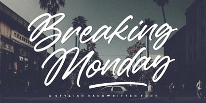 Introducing Breaking Monday Font! Breaking Monday is a stunning signature script font. Breaking Monday is suitable for handwriting logos, T-shirts, merchandise, quotes, social media posts, advertising, and a lot more! Breaking Monday comes with an accent language. To access swashes just type _1, _2, etc. Thank You!
 - Dusky Slab by Gleb Guralnyk,
$13.00 Hello, introducing a vintage style all caps typeface "Dusky Slab". It's a seventies style font with bold serifs and reverse contrast inspired by western hippie culture. Dusky Slab supports a lot of languages, including west european and cyrillic characters (check out all available symbols on the last screenshot).
 - Galexica Mono by Ingrimayne Type,
$6.00 GalexicaMono is an attempt to create a futuristic typewriter font, which may be an oxymoron. Unlike most typewriter fonts, it is sans-serif. The family has two weights, plain and bold, each with an oblique style. For a variant of the design that is not monospaced, see Galexica.
 - Keshia by Putracetol,
$14.00 Introducing Keshia, a fun and fancy script font with a lot of alternates character. The flourish touch is unique, its help you to make wonderful lettering. Keshia is perfect for logotype creation, lettering compositions, wedding invitations, fashion projects, book cover design, magazines, cards, packagings, posters, branding and more.
 - Sticky Rush by Bogstav,
$16.00 This is my and it's handmade super legible sans font. Very suitable for anything that needs a clearly handmade look, but not overdoing it. I've added several different versions, and they all fit on top of each other - or you can use them just fine as individual fonts.
 - Semarang Kolonial by Hanoded,
$15.00 Semarang Kolonial is a stylish, all caps Art Deco font. It is not a recreation of a particular typeface; merely my salute to a bygone era and to the birthplace of my father in law, who recently passed away. Semarang Kolonial goes well with the original Semarang font.
 - Honnitta by Letterara,
$12.00 Honnitta is a handwritten signature script with a modern look. It has a good readability and contains lots of glyph’s which give you the chance to give your designs a different look, each time you use Honnitta. Because of its diversity, Honnitta can be used for almost every design.
 - Display Prominent by Gerald Gallo,
$20.00 Display Prominent is a display font not intended for text use. It was designed specifically for display, headline, logotype, branding, and similar applications. In place of a lowercase there are short caps that are centered horizontally on the tall caps. There are also short numbers, punctuation, and miscellaneous characters.
 - Gibralt by NamelaType,
$19.00 Designed with high contrast. The stems are not completely straight, slightly narrow in the middle, combining rounded and right angle at the terminals and serif ends. Gibralt consists of 8 styles from Extra light to Black, each matching with italics version. Suitable for Headlines, paragraph, text, printing and more.
 - St Mika by Stereotypes,
$25.90 St Mika is big, black and beautiful. A little bit clumsy, Mika has his very own style of serifs and letterforms, making him very unique. If you want to yell or scream at someone, Mika is not your partner. This typeface is more about harmony and big letters.
 - Phaistos Disk Glyphs by Deniart Systems,
$25.00 The Phaistos series contains 47 unique characters based on the cryptichieroglyphic symbols depicted on the infamous Phaistos Disk. Measuring approximately 16cm in diameter, the Phaistos Disk was excavated in 1908 at the Minoan palace at Hagia Triada in Crete. The glyphs have not been conclusively deciphered to this day.
 - Type Wronger JNL by Jeff Levine,
$29.00 A typewriter gives you clean, crisp text from its keys, but Type Wronger JNL does anything but this. A distressed typewriter font, this font emits a rough, crude imprint as if the original had been photocopied, copied from that copy and re-copied until the original message had degenerated.
 - Slim Kim by Wiescher Design,
$39.50 Slim Kim is the sister font of Julienne. It mixes perfectly with Julienn. So whenever you need an especially slim serif font this is it! Slim Kim has very spiky serifs, so I did not want to make an extra-slim version. Enjoy this spiky font, your Gert Wiescher.
 - Cross Stitch Gothic by Gerald Gallo,
$20.00 Cross Stitch Gothic is not intended for text use. It was designed for use as fancy monograms or initials. Cross Stitch Gothic is based on upper case characters 28 stitches tall and contains the characters A-Z. Most characters extend above the capital line or below the base line.
 - Conqueror Text by Letterhead Studio-YG,
$45.00 Conqueror Text consists of 12 faces and is a part of a super family Conqueror. It is intended for big text blocks. Someone considers that the Conqueror Text — not so text font, because it too bright and unusual. But others, more courageous, use ConText and are quite happy.
 - Seaglass by Atlantic Fonts,
$26.00 Seaglass is decorative, feminine, and strong. Its whimsical curls and handmade form make a crafty statement in all-caps, and its expressive lower case invites in young and old alike - not unlike the gems found on secluded beaches. Let Seaglass transform your next packaging, poster, or book project.
 - Alfreda by Monotype,
$30.00 Alfreda grotesque is not just another grotesque typeface. Its morphology mixes modulated and unmodulated strokes, and natural and reverse contrast. All that with a humanistic touch and subtle ink traps. Weird. Alfreda comes in 6 weights, it has open type features, more than 400 glyphs and 18 stylistic sets.
 - Spiced Cheese by PizzaDude.dk,
$20.00 Just like spiced cheese, this font has got a taste that makes the heavens sing! Even though the font is grafitti and comic inspired, the letters suits mostly everything with it's rugged and unpredictable look. Comes with multilingual support along with 5 contextual alternates that cycles AS you type!
 - Sofia Pro Variable by Mostardesign,
$249.00 For those who wish to use the Sofia Pro font family in a variable version, this family comes in 2 files with 2 axes of variation (weight and italic). This version gives you a lot of freedom in the creation for your next project with a multitude of possibilities.
 - Saw Mill Stencil JNL by Jeff Levine,
$29.00 A vintage metal stencil from a saw mill with the term "reusable skid" was the model for Saw Mill Stencil JNL. Although the original was what would be termed a semi-stencil (some letters did not have 'breaks' in them), the font was designed with a more traditional look.
 - Friendlist by Lunas Type,
$19.00 Friendlist is a casual modern handwritten font. Friendlist comes with a lot of ligatures and ending swash that make your text is more charming and more expression. Friendlist brings natural element to your design, it's perfect for wedding, stationery, logos, social media quotes, branding identity, and many more.
 - Kegger by Chank,
$59.00Show you school spirit with this sporty, collegiate font. These big chunky serifs let the world know you speak with authority, and they'll read your message clear as a bell. It's like a traditional college font, but it's got a chanky flair. Good for hockey jerseys and house parties. - Theatrical Stencil JNL by Jeff Levine,
$29.00 A vintage hand-punched brass stencil for the Pasadena Playhouse spotted online was the basis for Theatrical Stencil JNL. Slight variations in the letter forms from other similar designs might not quickly be noticed, but there is always a charm in the hand-made look of any stenciled lettering.
 - Oh Livey by Angele Kamp,
$28.00 Oh Livey is a casual brush script that has a fun, modern vibe. Put it on everything from quotes and websites, and use the extra clipart to make designing so much easier and fun. Oh Livey contains lots of ligatures which will give it that authentic handwritten feel.
 - Old Dreadful No. 7 by Bitstream,
$29.99Old Dreadful No. 7 is truly a unique typeface design. Bitstream’s designers and other employees all contributed individual letterforms to the character set. This typeface is definitely not recommended for long blocks of texts! David Robbins expanded his contribution of the capital I into a complete typeface, Eyeballs. - Misyela by Stripes Studio,
$20.00 Introducing Misyela, made with modern handwriting! You can use it for your work because there are a lot of features in it to contain a complete set of letters lower and uppercase letters, assorted punctuation, numbers, and multilingual support. This font also contains several ligatures and alternate characters.
 - Canterbury Sans by Red Rooster Collection,
$45.00 Based on the Morris F. Benton for ATF in 1920, it was not completed for production until 1926. The serif version we released a few years ago was so popular, that we decided to design a complementary sans serif version in three weights, along with three corresponding Swash fonts.
 - Abdominal Krunch by PizzaDude.dk,
$20.00Abdominal Krunch is a wacky handwriting font. But that's not all; if you write in ALL CAPS a totally new font appears! Write in lowercase and you get the wacky/chunky handwriting letters - or choose to write in CAPS and you get a more bold, steady comic-like font! - Sherley by Putracetol,
$12.00 Introducing Sherley, a new elegant script font, lovely and sweet. Sherley is perfect for styling logos, stationery, wedding event, invitation, quote, social media, websites and so much more! Sherley comes with Opentype feature and a lot of alternates to help you make great lettering. Also supports multi language.
 - Kryptic LP by LetterPerfect,
$39.00 Kryptic is based on a design for computer optical character recognition (OCR) from the 1960s developed by Epps & Evans at the National Physical Laboratory. Its pure geometric and elemental shapes create graphic patterns and visual puzzles that only secondarily communicate meaning. Not recommended for extended text, unless intentionally encrypting!
 - Irish Penny by K-Type,
$20.00 Irish Penny is based on the lettering from Percy Metcalfe's beautiful and influential pre-decimal coinage of Ireland, the Barnyard Collection. The font is more monoline than is conventional for Irish insular styles, almost giving the feel of a modern soft sans, and perfect for small and large scale display purposes. Irish Penny contains a full complement of Latin Extended-A accented characters, Irish lenited consonants with the dot accent, and the tironian et which is commonly used in Ireland instead of an ampersand. Lowercase characters are provided small caps style, slightly reduced in size and subtly thickened in weight. The licensed font comes with a faux italic, and although obliques are not common among insular typefaces, Irish Penny Italic is a useful smart and sporty extra. Although the insular G/g is usually understood, Irish Penny also includes a more latinised option as an alternate G/g. The supplemental 'Irish Penny Alternate G' font places the latinised G and g characters at the normal G/g keystrokes, and makes the original insular glyphs the alternates. An alternate E/e with an angled crossbar is also included. The font contains a selection of discretionary ligatures, these include the ligatures that were used for pre-decimal coins: AC/ac, AE/ae, AL/al, AO/ao, AU/au, AT/at (halfpenny, half crown), AX/ax, AY/ay CA/ca, CC/cc, CE/ce, CO/co (half crown), CU/cu, CY/cy EA/ea (halfpenny, half crown), EC/ec, EE/ee, ET/et, EU/eu (sixpence), EY/ey FE/fe (farthing), FF/ff, FL/fl (florin) GI/gi (penny), GU/gu KA/ka, KE/ke, KI/ki, KO/ko, KT/kt, KU/ku LA/la, LE/le (halfpenny, half crown), LL/ll (shilling), LO/lo, LT/lt, LU/lu, LY/ly RA/ra, RC/rc, RE/re (three/sixpence), RH/rh, RI/ri (florin), RK/rk, RN/rn, RM/rm, RO/ro (half crown), RR/rr, RT/rt, RU/ru, RY/ry TA/ta, TE/te, TO/to, TU/tu NOTE - Irish Penny contains some characters that are not accessible directly from your keyboard, but which may be copied from a font viewer such as Character Map, Font Book or FontExplorer, and pasted into documents. They can also be accessed from the Glyphs browsers within OpenType-aware applications like Adobe InDesign and Illustrator, and Affinity Photo and Publisher.
 - Auchentaller by HiH,
$12.00 Auchentaller was inspired by a travel poster by Josef Maria Auchentaller in 1906. To our knowledge, it was never cast in type. Grado lies on the northern Adriatic, between Venice and Trieste. At one time the port for the important Roman town of Aquileia. With the decline of the Roman Empire, the upper Adriatic region came under the rule of the Visigoths, the Ostrogoths, the Byzantines, the Lombards, the Franks, the Germans, the Venetians and finally, in 1796, the Austrian Hapsburgs. So it remained until the dissolution of the Austro-Hungarian Monarchy in 1919, following World War I, when the seaport of Trieste was awarded to Italy. With Trieste came Montefalcone, Aquileia and Grado. The area was marked by years of political tension between Italy and Yugoslavia, exemplified by the d'Annunzio expedition to capture Fiume (Rijeka) in September, 1919. Some basic discussion of the period from 1919 to 1939 may be found in Seton-Watson’s Eastern Europe Between The Wars (Cambridge 1945) and Rothschild’s East Central Europe Between The Two World Wars (Seattle 1974). In 1965 I was traveling by train from Venice to Vienna. Crossing the Alps, the train stopped for customs inspection at the rural Italian-Austrian border, just above Slovenia. We were warned not to get off the train because there were still shooting skirmishes in the area. Through all this, Grado remained literally an island of tranquility, connected to the mainland by a only causeway and lines on a map. Auchentaller not only painted the beach scene at Grado, he moved there, living out the rest of his life in this comfortable little island town. His travel illustration contains the text from which the design of our font Auchentaller is drawn. The text translates: "Seaside resort : Grado / Austrian coastal land". Please see our gallery images to see a map locating Grado, as well as Auchentaller’s painting of the resort. Auchentaller is a monoline all-cap font, light and open in design , with a lot of typically art nouveau letter forms. Included in our font are a number of ligatures. As is frequently seen in designs by German speakers, the umlaut is embedded in the O & U below the tops of the letters. This approach led to two whimsies: a happy umlauted O and a sad umlauted U. This font has a clean, crisp look that is very appealing and very distinctive. Auchentaller ML represents a major extension of the original release, with the following changes: 1. Added glyphs for the 1250 Central Europe, the 1252 Turkish and the 1257 Baltic Code Pages. Add glyphs to complete standard 1252 Western Europe Code Page. Special glyphs relocated and assigned Unicode codepoints, some in Private Use area. Total of 336 glyphs. 2. Added OpenType GSUB layout features: pnum, liga, salt & ornm. 3. Added 116 kerning pairs. 4. Revised vertical metrics for improved cross-platform line spacing. 5. Revised ‘J’. 6. Minor refinements to various glyph outlines. 7. Inclusion of both tabular & proportional numbers. 8. Inclusion of both standard acute and Polish kreska with choice of alternate accented glyphs for c,n,r,s & z. Please note that some older applications may only be able to access the Western Europe character set (approximately 221 glyphs). The zip package includes two versions of the font at no extra charge. There is an OTF version which is in Open PS (Post Script Type 1) format and a TTF version which is in Open TT (True Type)format. Use whichever works best for your applications.
 - FS Brabo Paneuropean by Fontsmith,
$90.00Worldly Even though it’s a new arrival, FS Brabo has seen the world. Designed by a Brazilian working in London and studying in Belgium under a Dutchman, it’s certainly well-travelled. And it was inspired by the extraordinary archive of early book typefaces at the world-renowned Plantin-Moretus Museum in Antwerp, while Fernando Mello was attending Frank Blokland’s Expert class Type Design course at the Plantin Institute of Typography. It was there that Fernando became engrossed in the collection of early metal type, matrices, punches and type samples by figures such as Garamond and Granjon. So much so that he took on the mighty task of developing ‘a beautiful, functional, serifed text font’ of his own. Heroic FS Brabo’s journey from sketch to font family took an epic three years, starting in Antwerp, continuing at Fontsmith in London, and reaching its conclusion back in Fernando’s home city of São Paulo. No wonder Fernando was reminded of another titanic face-off: that of Antwerp’s Roman hero of legend, Silvius Brabo, and the evil ogre, Antigoon. Brabo came to the town’s rescue after the tyrannical giant had been charging ships’ captains extortionate taxes and chopping off the hands of those who refused to pay up. Having finally downed Antigoon after a long and terrible duel, Brabo cut off the giant’s own hand and threw it into the river Scheldt, unwittingly giving the town its name: the Dutch for ‘hand-throw’ is hand werpen. What better way for Fernando to name his literary typeface than after the hero of Antwerp’s oldest tale? The garalde factor FS Brabo is not a revival, but a very much a contemporary, personal interpretation of a garalde – a class of typeface originating in the 16th century that includes Bembo, Garamond and Plantin, with characteristically rounded serifs and moderate contrast between strokes. Brabo’s ‘ct’ and ‘st’ ligatures, upper-case italic swashes and contextual ending ligatures – ‘as’, ‘is’, ‘us’ – all preserve the beauty and character of traditional typefaces, but its serifs are chunkier than a garalde. Their sharp cuts and squared edges give them a crispness at text sizes, helping to bring a beautifully bookish personality to hardworking modern applications. A workhorse with pedigree It may give the appearance of a simple, four-weight typeface, but FS Brabo has hidden depths beneath its simplicity and beauty. OpenType features such as cap italic swashes, contextual ending swashes – programmed only to appear at the end of words – and stylistic alternatives make this a complete and well-equipped typeface. Comprehensive testing was carried out at text and display sizes, too, to prevent counters from filling in. All of which makes FS Brabo a very modern take on a traditional workhorse serif typeface: colourful and versatile enough to adorn not just editorial projects but also signage, advertising and logotypes. - FS Brabo by Fontsmith,
$80.00 Worldly Even though it’s a new arrival, FS Brabo has seen the world. Designed by a Brazilian working in London and studying in Belgium under a Dutchman, it’s certainly well-travelled. And it was inspired by the extraordinary archive of early book typefaces at the world-renowned Plantin-Moretus Museum in Antwerp, while Fernando Mello was attending Frank Blokland’s Expert class Type Design course at the Plantin Institute of Typography. It was there that Fernando became engrossed in the collection of early metal type, matrices, punches and type samples by figures such as Garamond and Granjon. So much so that he took on the mighty task of developing ‘a beautiful, functional, serifed text font’ of his own. Heroic FS Brabo’s journey from sketch to font family took an epic three years, starting in Antwerp, continuing at Fontsmith in London, and reaching its conclusion back in Fernando’s home city of São Paulo. No wonder Fernando was reminded of another titanic face-off: that of Antwerp’s Roman hero of legend, Silvius Brabo, and the evil ogre, Antigoon. Brabo came to the town’s rescue after the tyrannical giant had been charging ships’ captains extortionate taxes and chopping off the hands of those who refused to pay up. Having finally downed Antigoon after a long and terrible duel, Brabo cut off the giant’s own hand and threw it into the river Scheldt, unwittingly giving the town its name: the Dutch for ‘hand-throw’ is hand werpen. What better way for Fernando to name his literary typeface than after the hero of Antwerp’s oldest tale? The garalde factor FS Brabo is not a revival, but a very much a contemporary, personal interpretation of a garalde – a class of typeface originating in the 16th century that includes Bembo, Garamond and Plantin, with characteristically rounded serifs and moderate contrast between strokes. Brabo’s ‘ct’ and ‘st’ ligatures, upper-case italic swashes and contextual ending ligatures – ‘as’, ‘is’, ‘us’ – all preserve the beauty and character of traditional typefaces, but its serifs are chunkier than a garalde. Their sharp cuts and squared edges give them a crispness at text sizes, helping to bring a beautifully bookish personality to hardworking modern applications. A workhorse with pedigree It may give the appearance of a simple, four-weight typeface, but FS Brabo has hidden depths beneath its simplicity and beauty. OpenType features such as cap italic swashes, contextual ending swashes – programmed only to appear at the end of words – and stylistic alternatives make this a complete and well-equipped typeface. Comprehensive testing was carried out at text and display sizes, too, to prevent counters from filling in. All of which makes FS Brabo a very modern take on a traditional workhorse serif typeface: colourful and versatile enough to adorn not just editorial projects but also signage, advertising and logotypes.
 - Sketchbook - Unknown license

- Tip Me Cheapy - Unknown license

- You Suckin' Thief - Unknown license

- Euroika Kamp by Ingrimayne Type,
$6.00 Font editors allow one to blend fonts, that is, to take two different fonts and create a new one by averaging the two source fonts. This feature is responsible for the many different weights that come with some modern typefaces. It can also be used to blend completely different fonts, though these blends will require a lot of cleaning and correcting to make them useable. EuroikaKamp began as a blend of two vastly different faces: Euroika, a face with a lot of contrast, straight lines, and smooth curves, and KampFriendship, a hand drawn serif that is almost mono linear. The result is an odd, quirky face that may be useful when one wants a very readable font without the precision and formality of a standard text font.
 - Billy Sham by Putracetol,
$15.00 Introducing a new retro font called “Billy Sham“. Inspired from retro typography and lettering in the 70’s and 80’s combine with bold typography style. With a total of 534 glyphs with 359 alternate, you can make letter combinations for lettering with a lot of options. Come with open type feature ( a lot of alternates and end swash), its help you to make great lettering. Billy Sham best uses for Logotype, heading,cover, poster, logos, quotes, product packaging, header, merchandise, social media & greeting cards and many more. This font is also support multi language. To access the alternate glyphs, you need a program that supports OpenType features such as Adobe Illustrator CS, Adobe Photoshop CC, Adobe Indesign and Corel Draw.


