10,000 search results
(0.036 seconds)
- VLNL Dream Meal by VetteLetters,
$6.00 Nowadays, everything is ‘In The Cloud’. So why not put information in clouds directly? Here it is: a happy dreamy cloudy font. It’s called Dream Meal. Don’t read, just dream away; about nice food and typographic sensations. You can set whole texts 'in the cloud'. Every character makes up a part of a cloud. The clouds can float to the left or to the right. It’s an Open Type font. Actually: This font is a dream!
 - Overbeat by PizzaDude.dk,
$20.00 Grunge is not dead! Neither is punk! The proof is the Overbeat font! It has got both grunge and punk in the one and same. The letters are grungy, and punked up with a sort of halftone slime effect. It's hard, it's tough and perhaps even scary! Play around with the font and you'll quickly notice the variety of the font. Each lowercase letter has 4 different versions and there is ligature substitution for most common uppercase double letters!
 - Whatchamacallit by Comicraft,
$19.00 We popped the Doohickey into the Framistat and out popped this Whatchamacallit! Is it fat? is it thin? Is it tall? Is it short? Is it light? Is it heavy? Is it condensed?! is it expanded?! Yes, yes, yes and yes -- It’s all of the above and more! Our resident mad scientist John “Mr. Fontastic” Roshell has developed a single contraption that can handle any design emergency, from crimelords to supervillain team-ups to alien invasions. Whatchamacallit is a friendly and readable sans-serif, inspired by some of our all-time favorites -- Gill Sans, Futura, Venus and Antique Olive. But, like its machinery-contraption namesakes Doohickey and Framistat, Whatchamacallit has a lively personality -- the strokes are a little wavy, the ends a bit bulbous, and the circles are like little loaves of bread, rising in the Whatchamacallit's oven... delicious!
 - Burnaby Stencil by Typodermic,
$11.95 Listen up! Got a font that’s gonna give your text that raw, tough edge you’re lookin’ for. Burnaby Stencil, baby. This typeface is all about the spray-painted stencil vibe, with bold headlines that’ll grab attention like a bear trap. But don’t think it’s all bark and no bite. Burnaby Stencil packs a punch with a gritty tone that’ll make your message feel like it’s coming straight from the streets. And if you’re worried about it looking too cookie-cutter, no need to fret. This font switches up custom letter pairs in OpenType savvy apps, giving your text a natural, hand-painted feel. So if you’re ready to unleash the rugged, urban vibes in your designs, Burnaby Stencil is your new best friend. Let your words speak loud and proud with this font that’ll make ’em stand up and take notice. Most Latin-based European writing systems are supported, including the following languages. Afaan Oromo, Afar, Afrikaans, Albanian, Alsatian, Aromanian, Aymara, Bashkir (Latin), Basque, Belarusian (Latin), Bemba, Bikol, Bosnian, Breton, Cape Verdean, Creole, Catalan, Cebuano, Chamorro, Chavacano, Chichewa, Crimean Tatar (Latin), Croatian, Czech, Danish, Dawan, Dholuo, Dutch, English, Estonian, Faroese, Fijian, Filipino, Finnish, French, Frisian, Friulian, Gagauz (Latin), Galician, Ganda, Genoese, German, Greenlandic, Guadeloupean Creole, Haitian Creole, Hawaiian, Hiligaynon, Hungarian, Icelandic, Ilocano, Indonesian, Irish, Italian, Jamaican, Kaqchikel, Karakalpak (Latin), Kashubian, Kikongo, Kinyarwanda, Kirundi, Kurdish (Latin), Latvian, Lithuanian, Lombard, Low Saxon, Luxembourgish, Maasai, Makhuwa, Malay, Maltese, Māori, Moldovan, Montenegrin, Ndebele, Neapolitan, Norwegian, Novial, Occitan, Ossetian (Latin), Papiamento, Piedmontese, Polish, Portuguese, Quechua, Rarotongan, Romanian, Romansh, Sami, Sango, Saramaccan, Sardinian, Scottish Gaelic, Serbian (Latin), Shona, Sicilian, Silesian, Slovak, Slovenian, Somali, Sorbian, Sotho, Spanish, Swahili, Swazi, Swedish, Tagalog, Tahitian, Tetum, Tongan, Tshiluba, Tsonga, Tswana, Tumbuka, Turkish, Turkmen (Latin), Tuvaluan, Uzbek (Latin), Venetian, Vepsian, Võro, Walloon, Waray-Waray, Wayuu, Welsh, Wolof, Xhosa, Yapese, Zapotec Zulu and Zuni.
 - Thrusters by Typodermic,
$11.95 Welcome to the world of Thrusters—the angular, twin-line display typeface inspired by the timeless classic, Space Duel. Thrusters is the perfect way to bring the retro, arcade vibes to your designs! This bold and futuristic typeface is the ultimate tribute to the iconic arcade legacy, and it’s available in four different forms that can be used as layers to create stunning multicolor effects. Whether you’re creating a high-energy video game title screen, a promotional poster for a local arcade, or even a custom t-shirt design, Thrusters has got you covered. With its sharp angles and sleek curves, Thrusters is sure to turn heads and capture attention. It’s the perfect way to add some excitement and nostalgia to any design project. So what are you waiting for? Blast off into the world of retro gaming with Thrusters today! Most Latin-based European writing systems are supported, including the following languages. Afaan Oromo, Afar, Afrikaans, Albanian, Alsatian, Aromanian, Aymara, Bashkir (Latin), Basque, Belarusian (Latin), Bemba, Bikol, Bosnian, Breton, Cape Verdean, Creole, Catalan, Cebuano, Chamorro, Chavacano, Chichewa, Crimean Tatar (Latin), Croatian, Czech, Danish, Dawan, Dholuo, Dutch, English, Estonian, Faroese, Fijian, Filipino, Finnish, French, Frisian, Friulian, Gagauz (Latin), Galician, Ganda, Genoese, German, Greenlandic, Guadeloupean Creole, Haitian Creole, Hawaiian, Hiligaynon, Hungarian, Icelandic, Ilocano, Indonesian, Irish, Italian, Jamaican, Kaqchikel, Karakalpak (Latin), Kashubian, Kikongo, Kinyarwanda, Kirundi, Kurdish (Latin), Latvian, Lithuanian, Lombard, Low Saxon, Luxembourgish, Maasai, Makhuwa, Malay, Maltese, Māori, Moldovan, Montenegrin, Ndebele, Neapolitan, Norwegian, Novial, Occitan, Ossetian (Latin), Papiamento, Piedmontese, Polish, Portuguese, Quechua, Rarotongan, Romanian, Romansh, Sami, Sango, Saramaccan, Sardinian, Scottish Gaelic, Serbian (Latin), Shona, Sicilian, Silesian, Slovak, Slovenian, Somali, Sorbian, Sotho, Spanish, Swahili, Swazi, Swedish, Tagalog, Tahitian, Tetum, Tongan, Tshiluba, Tsonga, Tswana, Tumbuka, Turkish, Turkmen (Latin), Tuvaluan, Uzbek (Latin), Venetian, Vepsian, Võro, Walloon, Waray-Waray, Wayuu, Welsh, Wolof, Xhosa, Yapese, Zapotec Zulu and Zuni.
 - Revla Slab by Eclectotype,
$40.00 The Revla family just keeps expanding! This is Revla Slab. It has the same exuberant charm as its siblings ( Revla Sans and Revla Serif ) with a touch more chunk. OpenType contextual alternates make for text that is lively and bouncy, without the monotony of obviously repeating letterforms. It’s shamelessly fun, but pretty serious at the same time. The range of weights can be used to maintain an even colour across different sizes - use lighter weights for bigger sizes and vice versa. OpenType features include automatic fractions, ordinals, contextual alternates (which along with the pseudo-randomness, help maintain a nice tight fit with minimal glyph collisions), standard and discretionary ligatures (OK, only one discretionary ligature, but it’s a belter!), and case-sensitve forms. Obviously, in sharing a common skeleton, it will work well with other members of the Revla Superfamily, particularly Revla Sans.
 - Quinella by Eclectotype,
$40.00 Plumper than a misguided Z-lister's dodgy lip job, this is Quinella, named after the cheffy scoops of ice cream and the like, quinelles. It's a cute, fat script with a seventies vibe but a personality all of its own. It's non-connecting in the usual sense, but the letters overlap to make the white space as tiny as possible. Ligatures (standard and discretionary) make smoother solutions for quite a few pairs and trios, and every upper case letter has a more exuberant swash alternate. The contextual alternates feature substitutes in an alternate t for a better fit with certain letters. Fonts don't come much more voluptuous than this. The full-fat, creamy appearance makes it perfect for food packaging, but don't let it end there; it'll make memorable logos, unmissable headlines, and posters with more punch.
 - The Sunmora by Ardyanatypes,
$15.00 THE SUNMORA DECORATIVE SERIF Classic Decorative Serif Font from the eighties to present. It’s an elaborate curve and unique tail shape with a special 12 weight, thin to black. Make you freely set any design for headings, logos, fashion, website, floral, tagging, magazine cover, posters, and many more Completely bloom with the compatibility in multi-language, make it easy to use for any country. Come up with an alternative to bloom up your design and discretionary ligature to use it as decorative font THE SUNMORA has bloomed and it’s all class so if you want a stylish font that is guaranteed to draw the eye, then this is it! A guide to accessing all alternatives can be read at: http://adobe.ly/1m1fn4Y Features: A-Z Character Set a-z Characters set Numerals & Punctuations (OpenType Standard) Multilingual Thank you and have a nice day
 - Paradise Lost by Hanoded,
$15.00 Paradise Lost is a 1667 poem by John Milton which mostly concerns the Biblical story of the Fall of Man, Eve's temptation by the devil and the expulsion of Adam and Eve from Eden. It's quite a hefty read, as the poem consists of ten books with over 10.000 lines of verse. Needless to say, I didn't read it all. But, it did give me inspiration for a font, which I called Paradise Lost. It's a good name, even though there is nothing Biblical about this font. Paradise Lost was created (pun intended) using a broken bamboo satay skewer and Chinese ink. It is all caps, but upper and lower case differ and like to mingle. I also included several ligatures for double lower case letters (aa, ee, jj, kk, etc.). Paradise Lost comes with an eternity of diacritics.
 - Times New Roman PS Cyrillic by Monotype,
$67.99In 1931, The Times of London commissioned a new text type design from Stanley Morison and the Monotype Corporation, after Morison had written an article criticizing The Times for being badly printed and typographically behind the times. The new design was supervised by Stanley Morison and drawn by Victor Lardent, an artist from the advertising department of The Times. Morison used an older typeface, Plantin, as the basis for his design, but made revisions for legibility and economy of space (always important concerns for newspapers). As the old type used by the newspaper had been called Times Old Roman," Morison's revision became "Times New Roman." The Times of London debuted the new typeface in October 1932, and after one year the design was released for commercial sale. The Linotype version, called simply "Times," was optimized for line-casting technology, though the differences in the basic design are subtle. The typeface was very successful for the Times of London, which used a higher grade of newsprint than most newspapers. The better, whiter paper enhanced the new typeface's high degree of contrast and sharp serifs, and created a sparkling, modern look. In 1972, Walter Tracy designed Times Europa for The Times of London. This was a sturdier version, and it was needed to hold up to the newest demands of newspaper printing: faster presses and cheaper paper. In the United States, the Times font family has enjoyed popularity as a magazine and book type since the 1940s. Times continues to be very popular around the world because of its versatility and readability. And because it is a standard font on most computers and digital printers, it has become universally familiar as the office workhorse. Times?, Times? Europa, and Times New Roman? are sure bets for proposals, annual reports, office correspondence, magazines, and newspapers. Linotype offers many versions of this font: Times? is the universal version of Times, used formerly as the matrices for the Linotype hot metal line-casting machines. The basic four weights of roman, italic, bold and bold italic are standard fonts on most printers. There are also small caps, Old style Figures, phonetic characters, and Central European characters. Times? Ten is the version specially designed for smaller text (12 point and below); its characters are wider and the hairlines are a little stronger. Times Ten has many weights for Latin typography, as well as several weights for Central European, Cyrillic, and Greek typesetting. Times? Eighteen is the headline version, ideal for point sizes of 18 and larger. The characters are subtly condensed and the hairlines are finer." - Times New Roman Seven by Monotype,
$67.99In 1931, The Times of London commissioned a new text type design from Stanley Morison and the Monotype Corporation, after Morison had written an article criticizing The Times for being badly printed and typographically behind the times. The new design was supervised by Stanley Morison and drawn by Victor Lardent, an artist from the advertising department of The Times. Morison used an older typeface, Plantin, as the basis for his design, but made revisions for legibility and economy of space (always important concerns for newspapers). As the old type used by the newspaper had been called Times Old Roman," Morison's revision became "Times New Roman." The Times of London debuted the new typeface in October 1932, and after one year the design was released for commercial sale. The Linotype version, called simply "Times," was optimized for line-casting technology, though the differences in the basic design are subtle. The typeface was very successful for the Times of London, which used a higher grade of newsprint than most newspapers. The better, whiter paper enhanced the new typeface's high degree of contrast and sharp serifs, and created a sparkling, modern look. In 1972, Walter Tracy designed Times Europa for The Times of London. This was a sturdier version, and it was needed to hold up to the newest demands of newspaper printing: faster presses and cheaper paper. In the United States, the Times font family has enjoyed popularity as a magazine and book type since the 1940s. Times continues to be very popular around the world because of its versatility and readability. And because it is a standard font on most computers and digital printers, it has become universally familiar as the office workhorse. Times?, Times? Europa, and Times New Roman? are sure bets for proposals, annual reports, office correspondence, magazines, and newspapers. Linotype offers many versions of this font: Times? is the universal version of Times, used formerly as the matrices for the Linotype hot metal line-casting machines. The basic four weights of roman, italic, bold and bold italic are standard fonts on most printers. There are also small caps, Old style Figures, phonetic characters, and Central European characters. Times? Ten is the version specially designed for smaller text (12 point and below); its characters are wider and the hairlines are a little stronger. Times Ten has many weights for Latin typography, as well as several weights for Central European, Cyrillic, and Greek typesetting. Times? Eighteen is the headline version, ideal for point sizes of 18 and larger. The characters are subtly condensed and the hairlines are finer." - Times New Roman WGL by Monotype,
$67.99 In 1931, The Times of London commissioned a new text type design from Stanley Morison and the Monotype Corporation, after Morison had written an article criticizing The Times for being badly printed and typographically behind the times. The new design was supervised by Stanley Morison and drawn by Victor Lardent, an artist from the advertising department of The Times. Morison used an older typeface, Plantin, as the basis for his design, but made revisions for legibility and economy of space (always important concerns for newspapers). As the old type used by the newspaper had been called Times Old Roman," Morison's revision became "Times New Roman." The Times of London debuted the new typeface in October 1932, and after one year the design was released for commercial sale. The Linotype version, called simply "Times," was optimized for line-casting technology, though the differences in the basic design are subtle. The typeface was very successful for the Times of London, which used a higher grade of newsprint than most newspapers. The better, whiter paper enhanced the new typeface's high degree of contrast and sharp serifs, and created a sparkling, modern look. In 1972, Walter Tracy designed Times Europa for The Times of London. This was a sturdier version, and it was needed to hold up to the newest demands of newspaper printing: faster presses and cheaper paper. In the United States, the Times font family has enjoyed popularity as a magazine and book type since the 1940s. Times continues to be very popular around the world because of its versatility and readability. And because it is a standard font on most computers and digital printers, it has become universally familiar as the office workhorse. Times?, Times? Europa, and Times New Roman? are sure bets for proposals, annual reports, office correspondence, magazines, and newspapers. Linotype offers many versions of this font: Times? is the universal version of Times, used formerly as the matrices for the Linotype hot metal line-casting machines. The basic four weights of roman, italic, bold and bold italic are standard fonts on most printers. There are also small caps, Old style Figures, phonetic characters, and Central European characters. Times? Ten is the version specially designed for smaller text (12 point and below); its characters are wider and the hairlines are a little stronger. Times Ten has many weights for Latin typography, as well as several weights for Central European, Cyrillic, and Greek typesetting. Times? Eighteen is the headline version, ideal for point sizes of 18 and larger. The characters are subtly condensed and the hairlines are finer."
 - Times New Roman by Monotype,
$67.99 In 1931, The Times of London commissioned a new text type design from Stanley Morison and the Monotype Corporation, after Morison had written an article criticizing The Times for being badly printed and typographically behind the times. The new design was supervised by Stanley Morison and drawn by Victor Lardent, an artist from the advertising department of The Times. Morison used an older typeface, Plantin, as the basis for his design, but made revisions for legibility and economy of space (always important concerns for newspapers). As the old type used by the newspaper had been called Times Old Roman," Morison's revision became "Times New Roman." The Times of London debuted the new typeface in October 1932, and after one year the design was released for commercial sale. The Linotype version, called simply "Times," was optimized for line-casting technology, though the differences in the basic design are subtle. The typeface was very successful for the Times of London, which used a higher grade of newsprint than most newspapers. The better, whiter paper enhanced the new typeface's high degree of contrast and sharp serifs, and created a sparkling, modern look. In 1972, Walter Tracy designed Times Europa for The Times of London. This was a sturdier version, and it was needed to hold up to the newest demands of newspaper printing: faster presses and cheaper paper. In the United States, the Times font family has enjoyed popularity as a magazine and book type since the 1940s. Times continues to be very popular around the world because of its versatility and readability. And because it is a standard font on most computers and digital printers, it has become universally familiar as the office workhorse. Times?, Times? Europa, and Times New Roman? are sure bets for proposals, annual reports, office correspondence, magazines, and newspapers. Linotype offers many versions of this font: Times? is the universal version of Times, used formerly as the matrices for the Linotype hot metal line-casting machines. The basic four weights of roman, italic, bold and bold italic are standard fonts on most printers. There are also small caps, Old style Figures, phonetic characters, and Central European characters. Times? Ten is the version specially designed for smaller text (12 point and below); its characters are wider and the hairlines are a little stronger. Times Ten has many weights for Latin typography, as well as several weights for Central European, Cyrillic, and Greek typesetting. Times? Eighteen is the headline version, ideal for point sizes of 18 and larger. The characters are subtly condensed and the hairlines are finer."
 - Times New Roman Small Text by Monotype,
$67.99In 1931, The Times of London commissioned a new text type design from Stanley Morison and the Monotype Corporation, after Morison had written an article criticizing The Times for being badly printed and typographically behind the times. The new design was supervised by Stanley Morison and drawn by Victor Lardent, an artist from the advertising department of The Times. Morison used an older typeface, Plantin, as the basis for his design, but made revisions for legibility and economy of space (always important concerns for newspapers). As the old type used by the newspaper had been called Times Old Roman," Morison's revision became "Times New Roman." The Times of London debuted the new typeface in October 1932, and after one year the design was released for commercial sale. The Linotype version, called simply "Times," was optimized for line-casting technology, though the differences in the basic design are subtle. The typeface was very successful for the Times of London, which used a higher grade of newsprint than most newspapers. The better, whiter paper enhanced the new typeface's high degree of contrast and sharp serifs, and created a sparkling, modern look. In 1972, Walter Tracy designed Times Europa for The Times of London. This was a sturdier version, and it was needed to hold up to the newest demands of newspaper printing: faster presses and cheaper paper. In the United States, the Times font family has enjoyed popularity as a magazine and book type since the 1940s. Times continues to be very popular around the world because of its versatility and readability. And because it is a standard font on most computers and digital printers, it has become universally familiar as the office workhorse. Times?, Times? Europa, and Times New Roman? are sure bets for proposals, annual reports, office correspondence, magazines, and newspapers. Linotype offers many versions of this font: Times? is the universal version of Times, used formerly as the matrices for the Linotype hot metal line-casting machines. The basic four weights of roman, italic, bold and bold italic are standard fonts on most printers. There are also small caps, Old style Figures, phonetic characters, and Central European characters. Times? Ten is the version specially designed for smaller text (12 point and below); its characters are wider and the hairlines are a little stronger. Times Ten has many weights for Latin typography, as well as several weights for Central European, Cyrillic, and Greek typesetting. Times? Eighteen is the headline version, ideal for point sizes of 18 and larger. The characters are subtly condensed and the hairlines are finer." - Times New Roman PS Greek by Monotype,
$67.99In 1931, The Times of London commissioned a new text type design from Stanley Morison and the Monotype Corporation, after Morison had written an article criticizing The Times for being badly printed and typographically behind the times. The new design was supervised by Stanley Morison and drawn by Victor Lardent, an artist from the advertising department of The Times. Morison used an older typeface, Plantin, as the basis for his design, but made revisions for legibility and economy of space (always important concerns for newspapers). As the old type used by the newspaper had been called Times Old Roman," Morison's revision became "Times New Roman." The Times of London debuted the new typeface in October 1932, and after one year the design was released for commercial sale. The Linotype version, called simply "Times," was optimized for line-casting technology, though the differences in the basic design are subtle. The typeface was very successful for the Times of London, which used a higher grade of newsprint than most newspapers. The better, whiter paper enhanced the new typeface's high degree of contrast and sharp serifs, and created a sparkling, modern look. In 1972, Walter Tracy designed Times Europa for The Times of London. This was a sturdier version, and it was needed to hold up to the newest demands of newspaper printing: faster presses and cheaper paper. In the United States, the Times font family has enjoyed popularity as a magazine and book type since the 1940s. Times continues to be very popular around the world because of its versatility and readability. And because it is a standard font on most computers and digital printers, it has become universally familiar as the office workhorse. Times?, Times? Europa, and Times New Roman? are sure bets for proposals, annual reports, office correspondence, magazines, and newspapers. Linotype offers many versions of this font: Times? is the universal version of Times, used formerly as the matrices for the Linotype hot metal line-casting machines. The basic four weights of roman, italic, bold and bold italic are standard fonts on most printers. There are also small caps, Old style Figures, phonetic characters, and Central European characters. Times? Ten is the version specially designed for smaller text (12 point and below); its characters are wider and the hairlines are a little stronger. Times Ten has many weights for Latin typography, as well as several weights for Central European, Cyrillic, and Greek typesetting. Times? Eighteen is the headline version, ideal for point sizes of 18 and larger. The characters are subtly condensed and the hairlines are finer." - Times New Roman PS by Monotype,
$67.99In 1931, The Times of London commissioned a new text type design from Stanley Morison and the Monotype Corporation, after Morison had written an article criticizing The Times for being badly printed and typographically behind the times. The new design was supervised by Stanley Morison and drawn by Victor Lardent, an artist from the advertising department of The Times. Morison used an older typeface, Plantin, as the basis for his design, but made revisions for legibility and economy of space (always important concerns for newspapers). As the old type used by the newspaper had been called Times Old Roman," Morison's revision became "Times New Roman." The Times of London debuted the new typeface in October 1932, and after one year the design was released for commercial sale. The Linotype version, called simply "Times," was optimized for line-casting technology, though the differences in the basic design are subtle. The typeface was very successful for the Times of London, which used a higher grade of newsprint than most newspapers. The better, whiter paper enhanced the new typeface's high degree of contrast and sharp serifs, and created a sparkling, modern look. In 1972, Walter Tracy designed Times Europa for The Times of London. This was a sturdier version, and it was needed to hold up to the newest demands of newspaper printing: faster presses and cheaper paper. In the United States, the Times font family has enjoyed popularity as a magazine and book type since the 1940s. Times continues to be very popular around the world because of its versatility and readability. And because it is a standard font on most computers and digital printers, it has become universally familiar as the office workhorse. Times?, Times? Europa, and Times New Roman? are sure bets for proposals, annual reports, office correspondence, magazines, and newspapers. Linotype offers many versions of this font: Times? is the universal version of Times, used formerly as the matrices for the Linotype hot metal line-casting machines. The basic four weights of roman, italic, bold and bold italic are standard fonts on most printers. There are also small caps, Old style Figures, phonetic characters, and Central European characters. Times? Ten is the version specially designed for smaller text (12 point and below); its characters are wider and the hairlines are a little stronger. Times Ten has many weights for Latin typography, as well as several weights for Central European, Cyrillic, and Greek typesetting. Times? Eighteen is the headline version, ideal for point sizes of 18 and larger. The characters are subtly condensed and the hairlines are finer." - Aerle by Hackberry Font Foundry,
$24.95 My first font for 2009 was Aerle. It is a new dark sans serif font in my continuing objective of designing book fonts that I can really use. It made a little ripple in the industry, but more than that I found that I loved it with Aramus and Artimas — my latest book font family with the same proportions. In many ways, Aerle is a very different direction for me built on what I have learned on Aramus and other recent developments in my style. The concept came to me while using Bitstream's Mister Earl on a site online—though there is no direct reference. I wanted a more playful heavy sans with a much smaller x-height than I have been using lately, plus taller ascenders. As I was using Aerle, I constantly needed a light and bold version. The new direction I am taking is a result of a decision that my fonts, though I loved the character shapes, produced an even type color that is too dark or a little dense. Aerle was an attempt to get away from that look even though the letterspacing is quite tight. For Aerle Thin I pushed a little further in that direction and increased the letterspacing. The hand-drawn shapes vary a lot, many pushing the boundaries of the normal character. This gives a little looseness and helps the lightness in feel I am looking for. It will be interesting to see where this all goes. Most new type around the world is far too perfect for my taste. While the shapes are exquisite, the feel is not human but digital mechanical. I find myself wanting to draw fonts that feel human — as if a person crafted them. In most ways this is a normal font for me in that it has caps, lowercase, small caps with the appropriate figures for each case. These small caps were very small (x-height as is proper). So Aerle's small caps are a little oversize because they plugged up too bad at x-height size. The bold is halfway between. These size variations seem important and work well in the text. This font has all the OpenType features in the set for 2009. There are several ligatures for your fun and enjoyment: bb gg sh sp st ch ck ff fi fl ffi ffl ffy fj ft tt ty Wh Th and more. Like all of my fonts, there are: caps, lowercase, & small caps; proportional lining figures, proportional oldstyle figures, & small cap figures; plus numerators, denominators, superiors, inferiors, and a complete set of ordinals 1st through infinity. Enjoy!
 - Lugano by Greater Albion Typefounders,
$14.00 Lugano has it’s inspiration in 1920s advertising material and is ideal for lively banner lettering, posters and cover design. Four typefaces are offered - Lugano comes in regular, alternate, striped and alternate striped forms. Try it out and inject a little fun into your work today!
 - Amanet by Tour De Force,
$25.00 Amanet is original old fashion typeface that comes as Regular weight followed with stylistic compatibile Borders. It's pretty readable in small sizes which recommends it for use on packages, labels or specific corporate identities. "Amanet" is an archaic Serbian word for English word "legacy".
 - Fussion by Variatype,
$12.00 Fussion is inspired by modern technology, it's really suited to your branding project or logotype and more commercial project. With more ligatures to make it flexible to any brand name. FONT FEATURES Additional Accents 66 Languages Kerning Alternates Ligatures SOFTWARE RECOMMENDATION Adobe Photoshop Adobe Illustrator
 - Maebashi by CBRTEXT Studio,
$20.00 Maebashi is a display font in Japanese style. This font comes with a Japanese feel and you can feel it every time you use this font. It's the perfect font for multipurpose projects like logos, branding, posters, headlines, and more (especially for Asian-themed projects).
 - Cowboy Stories by Open Window,
$19.95 Cowboy Stories celebrates a landmark innovation for dingbat fonts. It's a 2 color layered-dingbat. Its complementing character set provides just the right amount of Spaghetti Western charm. Need assistance spinning a memorable fireside yarn? Grab your trusty spittoon and a copy of Cowboy Stories.
 - Befano by Balevgraph Studio,
$10.00 BEFANO is a simple and modern sans serif font. It’s playfulness make it great for creative projects. Excellent for headlines, caption, brand logo, t-shirt, school & university, and more. What's Included? Uppercase & Lowercase Numbers & Punctuation Ligature & Stylistic Alternate Multilingual Support PUA Encoded Regular & Italic
 - Linex Sweet by Monotype,
$29.99Linex Sweet was designed by Albert Boton in the late 1990s. It's a smallish family of three weights; the middle weight has an italic companion face. With its soft corners and slightly quirky head-serifs, Linex Sweet is a friendly design that sees much use. - Emilyne by Sibelumpagi,
$14.00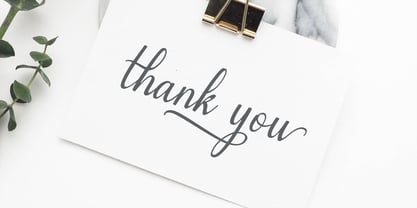 Emilyne is a sweet hand-lettered calligraphy font. It includes swashes and alternates which can be used to give your design looks beautiful and elegant. It’s perfect for logos, product packaging, wedding invitations, branding, headlines, signage, labels, signature, book covers, posters, quotes and many more.
 - Psychoscout by Absoluut Designers,
$30.00 Psychoscout is an initial cap font, originally developed for the Psychoscout record by Flat Earth Society (2006). In 2011 the font was updated for commercial use. It's highly recommended for headlines or posters. It can also be used as a stencil for decorating walls etc.
 - Nyack Monoline JNL by Jeff Levine,
$29.00 Nyack Monoline JNL is the drawn-from-scratch alphabet by Jeff Levine that served as the basis for Nyack Inline JNL and Nyack Solid JNL. Its delicate, thin lines were too good to leave unreleased, and it's a perfect companion to the other versions.
 - FF Kaytek Slab by FontFont,
$50.99 Kaytek™ Slab is a fresh take on the correspondence typefaces of the 90s - which were originally designed for the demands of office environments. Just like its predecessors, this text typeface is robust and hard-working - meaning it works well in challenging design or printing environments - but it’s not without personality. Look closer at the lowercase g and a, especially in the italic, and you can see some unexpected elements of subversiveness within the design. This blend of sturdiness and quirkiness means it’s just as relevant for information-heavy projects, such as annual reports, as it is in more expressive environments. Although first and foremost designed for text, Kaytek Slab’s details shine through in its heavier weights and larger sizes, meaning it also has display potential. Every style of the typeface takes up exactly the same amount of space, thanks to the way Radek Łukasiewicz created the design. He based the entire typeface on a single, master set of proportions. This means designers can switch between styles without the text being reflowed, making it particularly useful in magazines, where space might be limited, and also on the internet, where hover links appear in a different style. As well as its roots in the office, Kaytek Slab draws on a little bit more 90s nostalgia. It’s named for the first and only Polish walkman, and embodies the same solid, no-nonsense shapes that made the analogue technology of the era so charming. Kaytek Slab is robust and solid. Kaytek Slab comes in 12 weights, from Thin to Black Italic, and offers multi-language support. Kaytek Sans, Kaytek Headline and Kaytek Rounded, are also available.
 - FF Kaytek Sans by FontFont,
$50.99 Kaytek™ Sans is a fresh take on the correspondence typefaces of the 90s - which were originally designed for the demands of office environments. Just like its predecessors, this text typeface is robust and hard-working - meaning it works well in challenging design or printing environments - but it’s not without personality. Look closer at the lowercase g and a, especially in the italic, and you can see some unexpected elements of subversiveness within the design. This blend of sturdiness and quirkiness means it’s just as relevant for information-heavy projects, such as annual reports, as it is in more expressive environments. Although first and foremost designed for text, Kaytek Sans’ details shine through in its heavier weights and larger sizes, meaning it also has display potential. Every style of the typeface takes up exactly the same amount of space, thanks to the way Radek Łukasiewicz created the design. He based the entire typeface on a single, master set of proportions. This means designers can switch between styles without the text being reflowed, making it particularly useful in magazines, where space might be limited, and also on the internet, where hover links appear in a different style. As well as its roots in the office, Kaytek Sans draws on a little bit more 90s nostalgia. It’s named for the first and only Polish walkman, and embodies the same solid, no-nonsense shapes that made the analogue technology of the era so charming. Just like these early personal music devices, Kaytek Sans is practical, but not clinical, able to work hard while still exuding warmth and personality. It pairs effortlessly with Kaytek Slab, which is a sturdier and more expressive take on the design. Kaytek Sans comes in 12 weights, from Thin to Black Italic, and offers multi-language support. Kaytek Slab, Kaytek Headline and Kaytek Rounded are also available.
 - Nesting by Twinletter,
$12.00 Introducing “Nesting” – sanserif / display font with a new look, which is stylish and flexible. Its bold, solid, clear, and strong characteristics make this font look beautiful with the right portions in your various design projects This font is made with passionate pleasure and passionate passion applied to this font design, so this font is suitable for offline or online games, PC or smartphone games, adventure posters, children’s movie titles, food titles and logos, magazines, youtube covers, youtube cover images, social media page covers, banner headlines, children’s book titles, film titles, and more. What’s Included : Standard glyphs Ligature Works on PC & Mac Simple installations Accessible in Adobe Illustrator, Adobe Photoshop, Adobe InDesign, even work on Microsoft Word. PUA Encoded Characters – Fully accessible without additional design software. Fonts include multilingual support for; Afrikaans, Albanian, Croatian, Czech, Danish, Dutch, English, Estonian, Finnish, French, German, Hungarian, Italian, Norwegian, Polish, Portuguese, Slovak, Slovenian, Spanish, Swedish
 - Sutray by Alit Design,
$12.00 Introducing Sutray Typeface Sutray Typeface has a script style with a retro theme that is unique and cool. This font when used for making poster designs, logotypes, text headers and magazine covers is very attractive because of its uniqueness. Sutray Typeface also have 7 families from Thin to Bold. So designers or non-designers if using the Sutray Typeface can be very easy to use and choose a family that is suitable for the design to be made. Apart from that this font is very easy to use in both design and non-design programs because all alternates and glyphs are supported by Unicode (PUA). In order to use the beautiful swashes, you need a program that supports OpenType features such as Adobe Illustrator CS, Adobe Photoshop CC, Adobe Indesign and Corel Draw. but if your software doesn't have Glyphs panel, you can install additional swashes font files.
 - Feisty by Fauzistudio,
$20.00 Feisty (2020) is a straight script bold using magic OpenType automatically at mimic real hand lettering. Use it for magazine, fashion, invitations, greeting cards, bussines card, logo, t-shirt, web banner, book cover, campaign and watermark photography. Feature Presents an advanced OpenType to automatically choose the appropriate letter shape as you type based on whether the letter appears at the beginning, middle or end of a word. The width of the bar in the lowercase "t" can be changed as desired. Has two different styles of caps: Normal caps, which are the same style as the lowercase; and a type of Comic font, plain caps for setting acronyms, roman numerals or any other case that calls for all caps. With extended language support for most Latin-based Western and Central European languages. Automatic all fractions. *Requires an application with support for OpenType advanced typography, such as Adobe Creative Suite and QuarkXPress.
 - Zapfino Extra by Linotype,
$103.99 Today's digital font technology has allowed renowned font designer and calligrapher Hermann Zapf to realize a dream he first had more than fifty years ago: to create a typeface that would come very close to the freedom and liveliness of beautiful handwriting. The basic Zapfino font family, released in 1998, consists of four alphabets with many additional stylistic alternates that can be freely mixed together to emulate the variations in handwritten text. In 2003, Zapf completed Zapfino Extra, a large expansion of the Zapfino family. Designed in collaboration with Akira Kobayashi, Zapfino Extra has a cornucopia of new characters. It includes exuberant hyper-flourishes, elegant small caps, dozens of ornaments, more alternates and ligatures, index characters, and a very useful "forte" (bold) version. Use Zapfino to produce unusual and graceful advertisements, packaging, and invitations. Featured in: Best Fonts for Logos, Best Fonts for Tattoos
 - Hero Sandwich Ingredients by Comicraft,
$19.00 As comic book readers know all too well, team ups are every super hero’s bread and butter... when the brave and the bold are in a pickle, and super villains are running onion rings around them, here’s how they roll: They Meat! They Team-Up with your taste buds! They Fight Hunger! Yes, some hero combos may get along better than others, but they are always more powerful together. So take a footlong bite out of crime, and make the subways safe again with our mouthwatering HERO SANDWICH! Prepared with plastic gloves on by those awfully nice chaps at the Comicraft deli. Anyway you slice it, these five Ingredients can be layered to generate a Hero Sandwich with the carbs and protein you need to deliver a knuckle sandwich to the bulking agents of your deadliest foes! See these families related to Hero Sandwich Ingredients: Hero Sandwich Combos Hero Sandwich Pro
 - Capo by Alias,
$60.00 The intention with Capo was to make a typeface with a pinched, angled connection between curves and verticals. We have explored this incised, cut motif previously on typefaces, most notably Noah, Sabre and Harbour. These have focussed more specifically on stone-cut forms. For Capo we wanted to mix the expressive quality of its ‘pinch’ idea with an overall aesthetic that could be applied to text rather than headline. So Capo has something of the function and warm, organic quality of Grotesque style typefaces. In Capo’s Bold and Black weights the sharpness of the letter shapes is more dramatic and emphasised, making for great effect for large-sized text. Why Capo? A capo is a device used on the neck of a stringed (typically fretted) instrument to shorten the playable length of the strings by pinching or clamping them in place, hence raising the pitch.
 - Degdegan by Haksen,
$18.00 Degdegan is a futuristic classic bold script style with unique alternates feel nice balanced. Provide many variant ligatures style make the design letter looks incredible. Honestly it works perfectly for headlines, logos, posters, packaging, T-shirts and much more. Recommended to use in Adobe Illustrator or Adobe Photoshop with opentype feature. Ligatures feature is default setting in Adobe Illustrator or Adobe Photoshop in Uppercase character. So when you want not to use the ligatures. Open glyphs panel : In Adobe Photoshop choose tool Window Character and then please klick fi symbol In Adobe Illustrator choose tool Window Type Open Type and then please klick fi symbol How to access Alternates Character? Open glyphs panel : In Adobe Photoshop choose tool Window glyphs In Adobe Illustrator choose tool Type glyphs If you have questions, just send me a message and I’m glad to help. Have a great day, Haksen
 - Margit Variable by Schriftlabor,
$324.00 Margit Variable is the single font file of the type family Margit. Containing two-axis, one for setting the weight and another for the italic, this convenient single font file allows you to explore and mix endless typesetting combinations. You can now precisely choose a unique combination using the two-axis sliders, fitting your exact needs. The complete family is included in Margit Variable, containing all the characters and features in Margit, including Latin and Cyrillic scripts, supporting over 200 languages. Margit's letterforms have a contemporary style with pointy edges and friendly curves inspired by old wood-type specimens. Its bold and unapologetic design will be great to use in poster design, giving the content a stronger voice. This font family can bring a unique look to your packaging projects and modern branding solutions. Explore the extensive range of styles and weights that make this typeface ultra-versatile.
 - Khimany by Twinletter,
$17.00 Welcoming you to the dynamic and distinctive world of typography! A genuinely distinctive serif display typeface is Khimany. Khimany is the ideal option if you're seeking a bold and distinctive look for your numerous visual design tasks. What sets Khimany apart from other people? has incredible characteristics. Khimany provides you with the versatility to create distinctive and varied letter designs by making ligatures and alternates readily available. This is your chance to give each of your projects a unique touch. Khimany offers various languages since we realize how crucial it is to communicate with a worldwide audience. Your message will reach a global audience in a powerful and clear way with Khimany. So, are you prepared to differentiate your designs? Khimany is prepared to support your success. Get this font right away and see how Khimany can turn any of your projects into unforgettable works of visual art.
 - Teny by Twinletter,
$12.00 Introducing “Teny” – sanserif / display font with a new look, which is stylish and flexible. Its bold, solid, clear, and strong characteristics make this font look beautiful with the right portions in your various design projects This font is made with passionate pleasure and passionate passion applied to this font design, so this font is suitable for offline or online games, PC or smartphone games, adventure posters, children’s movie titles, food titles and logos, magazines, youtube covers, youtube cover images, social media page covers, banner headlines, children’s book titles, film titles, and more. What’s Included : Standard glyphs Ligature Works on PC & Mac Simple installations Accessible in Adobe Illustrator, Adobe Photoshop, Adobe InDesign, even work on Microsoft Word. PUA Encoded Characters – Fully accessible without additional design software. Fonts include multilingual support for; Afrikaans, Albanian, Croatian, Czech, Danish, Dutch, English, Estonian, Finnish, French, German, Hungarian, Italian, Norwegian, Polish, Portuguese, Slovak, Slovenian, Spanish, Swedish
 - HWT Artz by Hamilton Wood Type Collection,
$24.95 HWT Artz is the newest wood type to be cut at Hamilton Wood Type and Printing Museum. It was designed by venerable type designer Erik Spiekermann exclusively for his own print studio (P98a in Berlin), specifically to be cut into large size wood type. The digital version is being offered to the general public with proceeds of sales to benefit the museum's ongoing operations. HWT Artz evokes bold early 20th century European poster lettering. The design itself is intended to minimize hand-finishing and thus production time with rounded corners rather than sharp interior corners that would normally have to be hand-finished. In keeping with the tradition of naming new Hamilton designs after key figures from the living history of Hamilton (and following Spiekermann's tradition of four letter font names), Artz is named after Dave Artz- Hamilton Manufacturing retiree and master type trimmer.