10,000 search results
(0.038 seconds)
- Alquitran Family by RodrigoTypo,
$40.00 This is an extension of Alquitran, but now converted into a family from the Thin to the Black Line, it contains dingbat, inspired by the Pichação!
 - Bessington by wearecolt,
$16.00 Bessington is a quirky rough uppercase display font, each character hand drawn using rich black ink on a soft paper giving it a beautifully ragged look.
 - Lyra by Canada Type,
$39.95 Lyra is an Italian Renaissance script that might have developed if metal type had not broken the evolution of broad pen calligraphy. It lies in the area between the humanist bookhand and the chancery cursive, combining the fullness and articulation of the Roman letters with a moderate italic slant and condensation. A steep pen-angle allows use of a broader pen relative to the x-height, giving the letters more contrast with light verticals and heavy curves. Lyra embodies the Renaissance spirit of refining technical advances of the late middle ages with reintroduction of ancient classical principles. Based on the moving penstroke with constantly changing pen-angle, it brings the vitality of handwriting to the ordered legibility of type. Lyra is a formal italic, too slow for copying books. By eliminating the element of speed, digital technology opens up a new level of calligraphy, bringing it into the sphere of typography as would naturally have happened if metalworkers had not controlled the process. If classical Western traditions are respected, digital calligraphy has the potential to recapture the work of the past and restart its stalled evolution. There is of course no substitute for the charm of actual writing, with each letter made for its space; but the tradeoff is for the formal harmony of classical calligraphy as every curve resonates in tune with every other. This three-weight font family marks Philip Bouwsma's much-requested return from a three year hiatus. It also reminds us of his solid vision in regards to how calligraphy, typography and technology can interact to produce digital beauty and vesatility. Each of the three Lyra fonts contains almost three character sets in a single file. Aside from the usual wealth of alternates normally built into Bouwsma's work, Lyra offers two unique features for the user who appreciates the availability of handy solutions to subtle design space issues: At least three (and as many as six) length variations on ascending and descending forms, and 65 snap-on swashes which can be attached to either end of the majuscules or minuscules. The series also offers 24 dividers and ornaments built into each weight, and a stand-alone font containing 90 stars/snowflakes/flowers, symmetric contstructs for building frames or separators, masking, watermarking, or just good old psychedelia.
 - Announcement Board JNL by Jeff Levine,
$29.00 Many decades back, churches, schools and other buildings with a need to display an outdoor message often chose a sign making system utilizing characters silk screened onto metal pieces in a block chamfer style. Each piece had a crimp in the top of the metal which formed a hook to fit over the existing rails of a message panel. This allowed for a finished sign to be displayed within minutes, and a quick change of information was not very time-consuming. A popular version of these signs provided white letters and numbers on black backgrounds. This was the model for Announcement Board JNL, which is available in both regular and oblique versions. There are two different width blank panels on the broken and solid bars for those who wish to kern the letters tight to form a ribbon, however they were designed to have slight spacing in order to emulate the hand assembly of those vintage sign panels.
 - Mimeograph Template JNL by Jeff Levine,
$29.00 Before ink jet and laser printers; before copy machines, the main way to make multiples of anything not provided by printing press was by a mimeograph machine or spirit duplicator. The mimeograph utilized a porous drum which inked the backside of a waxed stencil sheet. Unlike traditional stencils which have cut out areas that are directly inked or painted, a mimeo stencil has the area to be printed scratched away by removing the wax coating with a stylus. The resulting image allows the ink from the drum to seep through the sheet and transfer to the blank paper. Based on a plastic lettering guide once manufactured by the A.B. Dick Company of Chicago, Mimeograph Template JNL is available in regular and oblique versions. Albert Blake Dick, the company’s founder, coined the term ‘mimeography’. The font’s character shapes follow the routed letters of the template, complete with rounded terminals. An earlier font release [designed with flat terminals and some alternate characters] is available as Interoffice Memo JNL.
 - Green Grove by True Story Letterworks,
$12.00 Green Grove is a display typeface with low contrast and compressed proportions. It works good in headlines for posters, key visuals, corporate identity and package design.
 - Cad by NicolassFonts,
$- CAD is brilliantly suited for graphic design and display use and perfect for logotypes, t-shirts, packaging, brand identity, books, magazines, newspapers, posters, billboards, and advertising.
 - Kenzomaru by Almarkha Type,
$29.00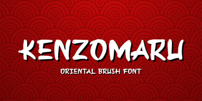 Kenzomaru is a Oriental Brush font that will make your designs look modern, unique and fun. It’s perfect for labels, quotes, posters, DIY projects, branding, packaging, greeting cards, websites, photos, photography overlays, signs, window art, scrapbooking, tags and so much more!
 - French Typewriter by Typorium,
$15.00 French Typewriter is a slab serif typeface created in 2019 by Jean-Renaud Cuaz. It takes roots in the typewriting font styles with a French flair. In the history of this font style, early typewriters were initially thought to be replacements for printing and so featured proportional fonts, before being replaced by monospaced typefaces. French Typewriter was created with proportional design, departing from the constraint of identical width and space. Designed for vintage and modern use with a script influenced italic, French Typewriter provides a large range of weights from Extra Light to Black with matching italics offering a large palette of styles for both vintage and modern design. A series of swash capitales has been created for all 6 italic weights along with ligatures and alternative a, g, y signs to provide opportunities for attractive text design. Fine tuned kerning has been implemented to make this slab serif font family greatly legible in small size. Condensed styles will be available in 2019.
 - VTF Justina by Variable Type Foundry,
$22.99 VTF Justina is a different typeface with a sans serif style that is inspired by geometric typographies to seek functionality and simple quality in any type of project. This very personal character of its forms together with the variety of eighteen weights with their respective italics (Thin, Extra Light, Ultra Light, Light, Regular, Semi Bold, Bold, Ultra Bold, and Black) it has makes it perfect to combine with the VTF Rozanova in digital projects (for example, web or applications) or printed (for example, corporate identity or packaging). Becoming a very interesting option for both large and small bodies without losing legibility in any weight. Justina has Opentype functions (Case sensitive forms, ordinals, scientific inferiors, denominators, superscripts, subscripts, numerators, fractions) designed exclusively for its design. Supports the following languages: Afrikaans, Albanian, Catalan, Croatian, Czech, Danish, Dutch, English, Estonian, Finnish, French, German, Hungarian, Icelandic, Italian, Latvian, Lithuanian, Maltese, Norwegian, Polish, Portuguese, Romanian, Slovak, Slovenian, Spanish, Swedish, Turkish and Zulu.
 - Alfons by Fenotype,
$35.00 Alfons is a handy collection of 38 display fonts with a pack of Ornaments and Extras on top of that. Alfons is great for any kind of display use from online to packaging to posters or identities. Alfons is divided into eight subfamilies that play great together. Alfons’ core family is a monoline script that has eight weights from extra thin to black and on top of that two printed versions that have softer, a bit blurred features. Alfons Script is equipped with Standard Ligatures which makes the flow more natural. For more swirling swashes and bouncy flow try Swash, Stylistic or Titling Alternates in any OpenType savvy program or manually select from even more alternate characters from Glyph Palette. Alfons Display, Sans, Condensed, Serif and Slab are equipped with Swash alternates and Alfons Tiki has interlocking ligatures feature that you can access from Discretionary Ligatures. Alfons Extras is a pack of pictograms and icons and some catchwords. Alfons Ornaments is designed to work with Script.
 - VAG Rounded by Linotype,
$34.99 Originally commissioned in 1979 as a new corporate typeface for Volkswagen AG, the VAG Rounded™ family’s geometric sans letterforms feature distinct rounded terminals, imparting the design with a friendly, approachable demeanor. With its design led by Gerry Barney, the VAG Rounded family remained in use for Volkswagen AG’s unified, worldwide automobile marketing for over a decade. The design was released for public use in 1989, and was bundled with many desktop publishing software titles available at the time. This opened the door for millions of computer users to work with the VAG Rounded type family. Available in four weights—from thin to black the VAG Rounded family is an apt choice for logo design, identity systems, or any application where a typographic warmth is desired. For contrast in voice, consider pairing the design with a more reserved serif typeface, or a sans serif with narrow styles, such as those found in the Alternate Gothic, Trade Gothic, or FF DIN type families.
 - Taro by Dharma Type,
$19.99 Taro Why do designers make more and more geometric fonts? There are already many geometric sans in the world. Because It is a natural flow of design. It is true that we like geometric type instinctively. Taro was designed to archive a good balance between the following three things geometrically. 1. To be Natural, Flowing, Organic. 2. To be Neutral, Unbiased, Universal. 3. To be legible, distinguishable, readable. Consists of eight weights and their matching italics. Supporting almost all latin languages. All-caps text for one line or a few is as wonderful as normal mixed-case typesetting.
 - 1786 GLC Fournier by GLC,
$38.00This family was inspired by numerous documents and books printed in Paris during the end of the 1700s. Mainly, documents printed by P.G. Simon & N.H. Nyon, “Printers of the parliament” were used for the Normal and italic styles and “Caps”. “Titling” characters were coming from a collection of hymns printed by Nicolas Chapart. In France these Fournier characters, as Baskerville in Great Britain, were the most often in use in the late 1700s, just before the Didot designs. This font supports strong enlargements, specially the capitals of “Caps” file and “Titling”, remaining very smart, elegant and fine. - Corbert Condensed by The Northern Block,
$- A condensed sans serif designed as an additional companion to the Corbert font family. Incorporating the key characteristics from the original family with influences drawn strongly from the Bauhaus and modernist era. This condensed version is 15% closer than the normal family improving economy of space across design layouts. Used in conjunction with the regular widths Corbert becomes a functional and versatile font system ideally suited for large complex design projects. Details include 9 weights with italics, 540 characters with alternative lowercase a, e and g, 5 variations of numerals, manually edited kerning and Opentype features.
 - 1920 My Toy Print by GLC,
$38.00 This family was inspired by a small French "toy print" box, with rubber stamp characters, from the 1920s. The set contained only capital letters, no accented letters and limited punctuation. We have reconstituted a complete modern standard set. The doubling of each usual character in each style (A-Z/a-z and numerals) gives a rich and variously uneven appearance, looking like the results of the real use of those old rubber stamps. The bold style may be used as a reinforcement, mixed with Normal style without disadvantage, allowing four choices for each usual letter... The original size is 6mm (about 17 pts).
 - Alpha One by Wiescher Design,
$18.00 »AlphaOne« is my newest addition to the experimental Alpha-font-collection. I just had to do this one! It is based on Paul Renners fonts, but has got nothing to do with them, I just took the widths and some basic forms. No – or hardly no – optical corrections were made to the glyphs. I wanted the pure geometric forms to come to life. This was a lot of fun to design, I especially like the »Q« with the negative tail. I did make four weights, but nothing is normal with this font, so weight doesn’t really mean anything. Have fun!
 - Marconi by Linotype,
$29.99 Marconi was created by Hermann Zapf in 1973. According to Gerard Unger, it was the world's first digital typeface. Zapf’s design was developed as a text face for books and magazines. The round forms of the Marconi follow the principle of the superellipse. The lowercase letters are enlarged as the result of reading tests, while the capital letters are slightly reduced. The 8-point size — normally used for newspapers — looks more like 9 1/2 points. Marconi is a legible typeface with its large and open lowercase letters. It is ideal for long text blocks in newspaper, book, and magazine production.
 - Halau Spooky by Vintage Voyage Design Supply,
$12.00 Introducing you a cartoon font family straight for your Halloween or other horror events. A wide range of variations completely satisfy the most sophisticated font gourmet. From Thin to Bold horror sans styles and a fancy horror script. Also, 62 Halloween graphic elements come as a Graphic Style! Each font has Normal and Roughen Styles. All sans serif's come as filled, inlined and inline separately. 33 typefaces total. • Halau Script has two uppercase letters sets and a lot of alternates included swashes. Halau Sans also has few alternate symbols and pair of ligatures (fj, fi). Trick or treat, folks. Enjoy!
 - 1479 Caxton by GLC,
$38.00 This family was inspired by the two fonts used by the famous William Caxton in Westminster (UK) in the late 1400s. There is only one (Normal) style. We have added the accented characters and others not in use in the early time of printing, but the ligatures and the few abbreviations for the Old English language and Latin were present in the original fonts. The original cap height is about five to seven millimeters. Decorated letters like 1495 Lombardes, 1512 Initials, 1550 Arabesques, 1565 Venetian, and 1584 Rinceau can be used in complement with this font without anachronism.
 - Sommerwerk Ink by Sommerwerk,
$29.00 This font is inspired by typography found on old German shop windows. It is a script font, but instead of imitating human handwriting and the gestures connected to it, the goal was to come up with a new writing flow and stroke order. As opposed to handwriting Latin script letters, which normally means drawing each character and then connecting it to the next one, the strokes of this font run across multiple glyphs. Intentionally, the design aims to achieve a flowing transition between each glyph without making use of contextual alternates, taking the limitations of classic machine lettering as a challenge.
 - Mohr by Latinotype,
$29.00 Mohr is a neutral, versatile and contemporary font based on some characteristics found in geometric sans-serif typefaces. Mohr’s features, together with its design characteristics, make it suitable for a wide range of applications, from display use to small text. The Mohr family comes in three versions: normal, alt and italic, each with 9 font weights, from Thin to Heavy, resulting in a total of 27 fonts. Mohr also includes initial and terminal swashes in most of the uppercase and lowercase characters. This gives the font a unique personality and provides a greater range of uses such as branding and packaging.
 - Martinez by Arterfak Project,
$11.00 Greetings. Introducing our new font, "Martinez". Made with vintage references like a cowboy, lumberjack, wooden and handcraft. A modern slab serif that you can apply for your headline, sub headline even your body text. There is a Normal and a Shadow style that gives you lots of possibilities. "Martinez" is a western font with a lot of features inside. Make your own combination with ligatures, alternates and swashes. Recommended for any style, especially vintage, retro, minimalism and contemporary design. This font is made with simple shapes that you can apply too in your print works like t-shirt, embroidery, posters and craft.
 - Boldies by Illushvara,
$14.00 Boldies is a serif font, mixed the modern with the classic concept line serif. The Alternate shape will make your design look like Modern. But don't worry if you need the Design like Classic and Bold Serif, you just put the normal Uppercase and Lowercase. With many ligatures will make your design projects stand out! Add this font to your most creative ideas for Application, Art Gallery Poster or postcard, Architectural Logo Project, Classic Magazine, Product Skincare or Logotype you want to used! Support the Multilingual Language! If you have any question, don’t hesitate to contact me. Happy Designing !!! Thank You, Illushvara Design
 - Fou Pro by URW Type Foundry,
$49.99 The Fou typeface family was designed as an alternative to Trade Gothic condensed bold. During the design process of a normally wide font variant a system developed that responds to white space and changing proportions. Thus, round transitions become rectangular and vice versa, space is made and space is taken away. This system and the associated changes are continued on a model with semi-serifs. Fou can also be used as an alternative to Din or the wider Q-Type, but in comparison offers more room for emphasis with its italics, expert sets and numerous special characters.
 - MVB Gryphius by MVB,
$39.00MVB Gryphius is a digitization of uncommon type from an era normally associated with the work of Nicolas Jenson. Produced by Otto Trace, the fonts come from types used by Sebastian Gryphius in Lyon in the early 16th century. The italic appears in a book from 1524 and the roman and small caps appear with the same italic in another book printed by Gryphius in 1541. Retaining the rough contours and uneven texture of its source, MVB Gryphius is best used at text sizes from 12- to 15-point, but its old world character can work in display settings too. - Triplepass by Shapovalov Fonts,
$10.00 Triplepass is a narrow grotesque with 3 styles: normal, with cut corners and a stencil shape. The font has a retro character, contains both humanistic rounded designs and modern smooth alternatives. The font is suitable for logos, large headlines, posters, signs, prints, font compositions, as well as for sports-related layouts where clear numbers and space savings are needed. Triplepass contains extended Latin, Cyrillic, fractions, ligatures and two icons of a basketball. It contains OpenType features: liga, numr, dnom, calt, ss01, ss02. The font is also case sensitive, has fractions, currency signs including the rouble sign.
 - Luka by Nantia.co,
$12.00 LÜKA HandWritten Multilingual Font, is an elegant display font. Needless to say that the font supports a full set of Greek characters, Cyrillics, and an extended Latin character set with diacritics. In fact, it’s a unique font that has a great variety of applications with multilingual support. A thin, elegant yet crafty looking typeface. Of course, the wide range of language support of the font makes it ideal for international food packaging. In addition, you can use it on organic packaging design, for crafts and wedding invitations and social media content. Also, the font has four weights: thin, normal, bold and heavy.
 - Daphne by Ahmet Altun,
$20.00 In the beginning, this font had been designed for an affiche work as wood pattern which includes one font and medium weight. The stylish design of this font had been inclined us to create more weights and more styles. Daphne Font Family comes in three weights; normal and italic. Plus two additional styles which are wood pattern and shadow. You can get great wood pattern results with Daphne Font Family; also with colored shadows, you can get gorgeous results in poster works and t-shirt prints. Even in very small type sizes, it can be legible.
 - GreenCherry by Vishwakarma Studio,
$10.00 GreenCherry typeface is for regular texts. I have designed every glyph with kept perfection in mind. I also retained symmetry throughout all glyphs. They look very premium when placed together. The typeface has 3 fonts - Thin, Normal & Bold. Every font has 210 glyphs and supports Western European languages. It has essential OpenType features like Kerning and Hinting. Hence you can use it wherever you want. It works very well with print media and web media as well. This typeface is suitable for Websites, Apps, Blogs, Book Publication, Stationery, Signage, and other Printing media. I am sure you will enjoy this typeface.
 - Comma Base by Martin Majoor,
$- Comma Base is a sans typeface for it has no serifs. No wait, it is a typical serif typeface because it has a high contrast. Strictly speaking, Comma Base is a missing link between serif and sans, offering the best of both worlds. Comma Base supports several OpenType features for advanced typographic control. It consists of 16 styles, 8 weights from Hairline to Ultra, in both roman and italic. Comma Base is a uniwidth font. This means changing a text from normal to bold doesn’t effect the set width, a professional feature that is highly appreciated by graphic designers.
 - Magical Brush by Hanoded,
$15.00 Personally I think a brush font should have the word ‘Brush’ in its name. It’s not that easy finding a name - you need some magic to come up with a good one! Magical Brush is a completely handmade font. I used a small brush (a number 3 to be precise) and Chinese Ink. I wanted just a little ‘erosion’, so I used copier paper rather than my expensive French water color paper (which is quite rough). Magical Brush comes in the normal variant and a chickenpox one. Use it for your posters, your book covers and your Christmas invitations!
 - Joaquin by Mozatype,
$11.00 JOAQUIN is a vintage font family. This font's retro look and style is inspired from many vintage packaging and from typographic cover lettering. It is perfect for vintage logo design, labels, posters, signage, t-shirt, storefront, headlines, or packaging design. greeting cards and logotype. JOAQUIN includes 4 different styles; Normal, Regular, Inline, and Shadow. So you can combine them with each other and get fancy headlines. What’s Included : - Works on PC & Mac - Easy to use ( Installations ) - Compatibility Windows, Apple, Linux, Cricut, Silhouette, and Other cutting machines Thank you for purchasing this font. Please appreciate, if you like this. ENJOY it :)
 - Exec by Wiescher Design,
$35.00 I created my new »EXEC« sans font during the years 2018 to mid 2020. The Normal »EXEC«-family has 7 weights, ranging from Thin to Bold (plus 7 italics). This elegant Sans is suited for editorial, book text, advertising and packaging, logo, branding, small text as well as web and screen design. »EXEC« has advanced typographical support including ligatures, small caps, alternate characters, case-sensitive forms, fractions, super- and subscript characters. »EXEC« comes with a range of figures—oldstyle and lining figures, each in tabular and proportional widths. »EXEC« supports Basic-, Western-, and Central-European Latin-based languages.
 - Fou Serif CN by URW Type Foundry,
$49.99 The "Fou" typeface family was designed as an alternative to "Trade Gothic condensed bold". During the design process of a normally wide font variant a system developed that responds to white space and changing proportions. Thus, round transitions become rectangular and vice versa, space is made and space is taken away. This system and the associated changes are continued on a model with semi-serifs. "Fou" can also be used as an alternative to Din or the wider Q-Type, but in comparison offers more room for emphasis with its italics and condensed styles, expert sets and numerous special characters.
 - Hekaz by Twinletter,
$15.00 Hekaz is a graffiti font with powerful, unconventional shapes that is nevertheless pleasing to the eye. This font is the solution if you need an abstract, distinctive, and different from the normal font for remarkable design demands. Use it immediately to make your project elegant and bombastic. This graffiti font is great for product logos, poster titles, headlines, packaging, film titles, logotypes, gorgeous writing, and trendy graffiti designs, among other things. Of course, if you utilize this font in your numerous creative projects, they will be perfect and outstanding. Use this typeface right away for your one-of-a-kind and remarkable projects.
 - Tattooflash Fingers by Otto Maurer,
$15.00 Tattooflash Fingers is a special Font for Finger-Tattooing. The Glyphs come in 3 Sizes for short fingers, normal fingers and long fingers. The Font is made for the little Space on a Human Finger. You can make your own Tattooflash! To Color your Tattooflash take the PART version!. After Install the Fonts you can use the part-version in Photoshop or better in Affinity Photo or Affinity Designer to color your Flash. Use the Swashes to make your tattoo flash better, make your own TattooDesign! You are a Tattooartist? This Fonts are made for YOU!
 - Arbour Soft by TypeUnion,
$35.00 Arbour Soft is the cheeky version of it's big brother, Arbour. The soft version creates a smooth finish that flows perfectly across screens and print. Arbour Soft comes in 7 weights, from a delicate extra-light to a soft, strong black, with matching soft italics for each upright. The soft black weights are perfect for your new brand or article headlines, and the light weights are great for calling out text. The mid weights are perfect for longer texts.
 - ITC Woodland by ITC,
$29.99ITC Woodland is the work of Japanese designer Akira Kobayashi. It is based on Kobayashi's hand lettering with a flat brush or square-edged pen. I wanted to design each weight to act its own part," says the designer. "The light version tends to look almost fading in small sizes, but the heavy weight is as black as Cooper Black." The cheerful ITC Woodland is ideal for graphics, greeting cards, correspondence, and other applications requiring a light touch. - Knip by Hanoded,
$15.00 Knip, in Dutch, means ‘cut’. You can tell by the glyphs that I made this font by cutting out the shapes from black paper, gluing it onto white paper and photographing the result so I could digitalise it! I don’t make too many cut out fonts, as it is a lot of work and it often leads to nothing. Besides that, I depend on the paper supply from my kids and they happened to have black paper this time!