10,000 search results
(0.053 seconds)
- Geometris Round by NicolassFonts,
$25.00 Geometris Round Semi-Condensed is a modern versatile sans-serif typeface. What differentiates Geometris Round Semi-Condensed from the other fonts is an exceptionally distinctive design. It is brilliantly suited for graphic design and display use and perfect for logotypes, t-shirts, packaging, brand identity, books, magazines, newspapers, posters, billboards, and advertising.
 - Blooming Heart by Lunas Type,
$19.00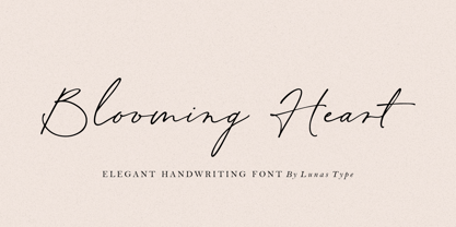 Introducing, Blooming Heart! Blooming Heart has a natural expression, with a charming and elegant impression. A modern and luxurious handwritten font comes with handwritten swashes and ligatures. Blooming Heart brings a charm feeling, clean style and timeless to your design such as wedding, stationery, logos, social media quotes, branding identity, and many more.
 - Bustellina by Krafted,
$10.00 Seeking to redefine your brand's image or add an extra essence to your projects? We've got you covered. Introducing Bustellina - An Elegant Sans Serif Font. Whether it's logos, digital assets, or print media, Bustellina leaves an enduring impression. Amplify your brand's visual identity with the captivating allure of this font. Have fun!
 - Ephemera Nickson by Ephemera Fonts,
$15.00 The Nickson pro 1 invokes the spirit of the cigar labels & circus poster from the early 1900's. A typeface designed for headlines, posters, advertising and corporate identity. There are Alternate character of uppercase. Check the alternate keys file for more info or if you're using the OT version simply select Stylistic Set.
 - Labyrinthus Rounded by Cerri Antonio,
$30.00 Labyrinthus Rounded is a multiline decorative font that works very well for identity logos, posters and 3D-works. It continues the tradition of the precedent Labyrinthus but with a softer rounded impact. It's interesting to note that with it it's possible to play with the multiline concept to create endless overlapping geometric creations.
 - Glamost by Bale Type,
$15.00 Glamost is a minimalist and elegant serif with many ligatures that will make your project more stand out. You can use this font for any purpose, such as branding identity, logo, magazine, quotes, etc. With simple steps, you can get an aesthetic touch in your design. This font also support multi language.
 - Thurbrooke by Greater Albion Typefounders,
$18.50 Thurbrooke is an early 20th century inspired display family, offering two sizes of Roman capitals. Five typefaces are offered in the Thurbrooke family. The Regular face is shaded in horizontally engraved lines and suggests something of vintage advertising captions. A reversed 'Reverso' face, transposing black and white space is offered, as is a 'Black' face with solid letterforms. The remaining two faces are a bit more specialised. Thurbrooke 'Banner' is the latest in our popular line of masthead or cartouche faces-very impressive for banner headings. Thurbrooke Initials is a set of initial capitals, which blend in perfectly with Thurbrooke Reverso, or which also make splendid drop capitals. Why not explore some (or all) of the elements of the Thurbrooke family today, and introduce some early 20th century inspired colour to your work?
 - 1512 Initials by GLC,
$20.00 This set of initial decorated letters is an entirely original creation, drawn inspired by Italian renaissance patterns. It contains two roman alphabets : one drawn in white on black background and the other in black on white. We have included a few fleurons and decorative elements. It can be used as variously as web-site titles, posters and flyers design, publishing texts looking like ancient ones, or greeting cards, all various sorts of presentations, as a very decorative, elegant and luxurious additional font... This font supports strong enlargements remaining very smart and fine. It's prefered height is about one inch equivalent to about four lines of characters. This font may be used with all blackletter fonts, but works especially well with 1543 Humane Jenson, 1557 Italique and 1742 Civilite, without any anachronism.
 - Godan by Afkari Studio,
$10.00 Godan Modern Slab Serif Font Family Godan is A modern Slab Serif font family with minimal, modern,and futuristic style. This font works perfect for you who needs a typeface for headline, logotype, apparel, branding, packaging, advertising, branding, packaging, advertising etc. This typeface is comes in uppercase, lowercase, punctuation, symbols, numerals, alternates, and support multilingual. Features; - 10 styles; Godan Thin, Godan Thin Italic, Godan Light, Godan Light Italic, Godan Regular, Godan Italic, Godan Bold, Godan Bold Italic, Godan Black, Godan Black Italic - Works on PC & Mac - Simple installations - Accessible in the Adobe Illustrator, Adobe Photoshop, Adobe InDesign, even work on Microsoft Word - Fully accessible without additional design software. - Mültîlíñgúãl Sùppört for; ä ö ü Ä Ö Ü ß ¿ ¡ Hope you enjoy with our font and this font usefull font your projets!
 - Murality by Mans Greback,
$49.00 Murality is a cartoon graffiti typeface. The letters are fun and friendly, with a happy personality and optimistic quirkiness. A street sans-serif style, Murality is drawn and created by Mans Greback, and is the perfect combination of cool and childish typography. This hip-hop styled comic typeface family consists of six styles: Regular, Thin, Black, Black Thin, Outline, Shadow The font is built with advanced OpenType functionality and has a guaranteed top-notch quality, containing stylistic and contextual alternates, ligatures and more features; all to give you full control and customizability. It has extensive lingual support, covering all Latin-based languages, from North Europe to South Africa, from America to South-East Asia. It contains all characters and symbols you'll ever need, including all punctuation and numbers.
 - Yink by Eclectotype,
$40.00 Yink takes big, bulbous, ball terminals up a notch, by repeating the shapes not only in the black but in the white space too. This interplay between black and white shapes is reminiscent of the yinyang symbol in places, which is where the name Yink originates. It's a shamelessly over-the-top font, and should be set large. There's a handful of OpenType features, including ligatures and alternates: Ligatures for ff, fft, ft, tt, gj Alternates are grouped into stylistic sets: 1. An alternate u, possibly more legible, but definitely not as much fun! 2. Again, a more boring version of m, just in case the default is ambiguous. 3. A more exuberant L 4. A blackletter informed T 5. Alternate P and R 6. An alternate 1 (one)
 - Gulitov by ParaType,
$25.00 Original type work designed in unconventional technique by type and graphic designer Yuri Gulitov. The shapes of signs were built up in a very specific routine. At the first stage signs were drawn on the black sheets of paper by the PVA adhesive, then a white sheets was placed above, and finally after some time the white sheets were torn off. The scraps of white paper presented the signs. Inverse style shows hypothetic result of tearing off the black sheets. The style together or separately can be used in display and advertizing works for demonstration of fight between the forces of good and evil or vice versa. Analog version of the font was awarded by diploma on Third International Biennale of Graphic Design “Golden Bee”. Digital version was released by ParaType in 2008.
 - Stack Braille by Echopraxium,
$5.00 This is a monospace font for the Braille alphabet. The idea came while exploring new ways to display the regular braille glyph ( 3 rows of 2 dots ). The glyph design is inspired by "stackable multiple board" games like the famous Vulcan chess (from Star Trek series) and the Qubic (3D tic-tac-toe). The stack is made from 3 levels, each level is a 3x3 grid with 2 "playable" cells (South-West and North-East). Each cell can be either empty, filled by a white square token or a black square token. The 3D effect is obtained by means of the classic isometric perspective. Lowercase letters use black tokens, while uppercase letters use white tokens. Most special characters (e.g. digits, *$#@, []{}() etc.. ) are also provided for special usages like program source code (see poster 5).
 - The font named GoodPeace by Dirt2 can be characterized as embodying a unique blend of artistic flair and a message of harmony. It is a testament to the power of type design in conveying more than jus...
- Ma Braille by Echopraxium,
$5.00 The "Ma" in "Ma Braille" is used as a minimalist way to say "Negative Space". "Ma" in japanese arts is an "esthetical usage of emptiness". Thus this font explicits the negative space around visible braille dots in each glyph. A. Font user guide a.1. Lowercase glyphs { A..Z } In these glyphs, dots are represented as "black squares" while the negative space is displayed as 1 or 2 white filled polygons. a.2. Uppercase glyphs { a..z } In these glyphs, dots are represented as "white squares" while the negative space is displayed as 1 or 2 black filled polygons. a.3. Digits: they are just the same than a..j, but the "North US version" is also provided in ascii codes 0xE0..0xE4 (1..5) and 0xE7..0xEB (6..0). a.5. "Dashed Border": a.5.1. "Black dashed" border glyphs; { £, ¥, µ, Â, Ä, Ê, Ë, Î, Ï, Ô } a.5.2. "White dashed" border glyphs; { Ö, Õ, °, ô, ö, î, ï, û, u, õ } B. Posters Poster 1: "Font Logo" version 1, it displays "Ma Braille" text surrounded by the "black dashed border" glyphs. Poster 2: "Font Logo" version 2, it displays "MA" glyphs in big size and smaller "Braille" glyphs within "M" and within "A" as well. Poster 3: the classical pangram to test a font "The Quick Brown Fox jumps over the Lazy dog". Poster 4: Article 1 of the Human Rights: All human beings are born free and equal in dignity and rights. They are endowed with reason and conscience and should act towards one another in a spirit of brotherhood. Poster 5: the "Glyph set" (Border glyphs not included) with A..Z, a..z, digits and special characters.
 - Olymp80 by Konst.ru,
$10.00 Dedicated to the XXII summer Olympic Games. I was inspired by the icons of these games when creating font Olymp80. This is an excerpt from the official report of the Moscow Olympics: "Sports pictographs, as we know, are pictographic drawings symbolising sports. They serve as points of reference and help overcome language barrier. Over the past few years, they have been integrated into the decoration of Olympic cities, and have been depicted in Olympic posters, commemorative medals, postage stamps, tickets, souvenirs, etc. On the OCOG-80’s request, graduates from several art colleges took up the design of the pictographs of the insignia as the theme of their dissertations. With the help of the research institute of industrial aesthetics, the Organising Committee chose the work submitted by Nikolai Belkov, Mukhina Art School graduate from Leningrad. The State Committee for Inventions and Discoveries under the USSR Council of Ministers recognised the new design as a production pattern. Though highly stylised, the new signs are easily comprehensible. They are smoother in outline because they are constructed at an angle of 30-60 (previously the angle was 45-90). Another merit of the new system is that the designs can be adapted for use in four representations: direct (solid, black against a white background), reverse (solid, white against a black background), contour (black contour against a white background), and reverse-contour (white contour against a black background), and permit several colour and shade and size variations." All text and pictures you may see on 1980 Moscow, Volume 2, Part 2, Page 420. Monospaced font for names, logotypes, titles, headers, topics etc. Font includes only uppercase letters with two alternative designs for each letter.
 - Japanese Brush - Unknown license

- Tatline by Groteskly Yours,
$15.00 Tatline was intended to be a fun side project that developed into something cool and rather unprecedented. It's bold, it's chunky —and it just looks good whether it's a mock movie poster or a key element in a brand identity for a business. With serifs thicker than stems, it looks more down to earth, solid, reliable and firm. And yet there's an almost imperceptible playfulness in the way it looks and behaved on the screen and paper. Tatline would look great on posters and flyers. We've tried creating a coffee brand identity with it —and surprise, looks great again. Maybe it's magic, but we like to think it's just a result of tough work put into creation of Tatline. Try it yourself and let us know what you think!
 - Logika Nova by Designova,
$35.00 Logika Nova is a simple, clean typeface with a modern design and remarkable appearance. This is a perfect choice for creating logotypes, branding, headlines, corporate identities, and marketing materials for web, digital & print alike. The typeface will be a great option for branding, logo/logotype design projects, marketing graphics, banners, posters, signage, corporate identities, and editorial design. Adding extra letter spacing will make this font the perfect choice for minimal headlines and logotypes, as shown in the promo designs attached. Handcrafted and designed with powerful OpenType features in mind, each weight includes extended language support with Western European, Central European, and South Eastern European sets. A total of 280 glyphs are available. Logika Nova typeface includes 12 fonts, with six upright weights (Thin / Light / Book / Regular / Bold / Heavy) and Italic equivalents of all six weights.
 - Doodly by Luxfont,
$8.00 Introducing a funny, playful doodle font with soft sloppy glyphs. Easily turning text into handwritten. Font family is cool for complementing a design with a doodle or sketch illustration, the font does not have complex spelling of letters, therefore it is suitable for a children's audience and will complement a children's book, as well as fit into any design with a playful holiday theme, and much more. Family has 2 font styles with different interchangeable letters (different only uppercase and lowercase, other glyphs are identical) - can be used as alternate's. Family of 6 fonts is divided into 3 types: regular/basic, italic and outline. Features: 6 fonts 2 styles (Regular, Medium) with different interchangeable letters (different only uppercase and lowercase, other glyphs are identical) 3 types: Basic, Italic, Outline Kerning ld.luxfont@gmail.com
 - Hispania Script by HiH,
$10.00 Hispania Script is a distinctive and distinctly nineteenth century script. It was released by Schelter & Giesecke of Leipzig, Germany around 1890. Particularly noteworthy are the sharply-pointed legs of the upper case ‘K’ & ‘R’ that seem to be characteristic of the period. Similar strokes, often with a slight curve, may be seen in typefaces like Alt-Romanish and Tinteretto by Schelter & Giesecke, Artistic and Lateinsch by Bauer and Berthold and the poster lettering of Edward Penfield. The angle of this script (approximately 24 degrees) and the sharp delicate points must have made the manufacture of this face in metal type a challenge. The resulting type was probably quite fragile and subject to accidental damage. Additionally, the sharp points would be subject to wear. With digital type, these concerns are eliminated. As far as I know, no one has ever dropped a digital letter on the floor. Nonetheless, creating a digital outline for a typeface like Hispania Script, with many crossing strokes, can be quite time-consuming. Even with an accurate scan of a good quality original, it is usually necessary to construct each crossing stroke separately and then remove the overlap in order to obtain a sharp and convincing intersection. Steep internal angles are often defined with two points, rather than one, to minimize ink or toner fill that can muddy the rendering in smaller sizes. Like all formal scripts, Hispania Script is always useful for announcements and invitations. However, the distinctiveness of of this design strongly suggests that there are other applications that may benefit from its use. Step outside the box and try it in some unexpected places. It is the unexpected that often draws a person’s eye.
 - Tazugane Gothic by Monotype,
$187.99 The Tazugane Gothic typeface family is the first original Japanese typeface created by Monotype. Designed by Akira Kobayashi, Kazuhiro Yamada and Ryota Doi of the Monotype Studio, the Tazugane Gothic typeface offers ten weights and was developed to complement the classic Latin typeface, Neue Frutiger. The design of the Tazugane Gothic typeface balances an original, humanistic style with elements of traditional Japanese handwriting. The two typefaces work together in a natural, seamless and adaptable manner so that Japanese and Latin texts can be used side-by-side for a wide range of applications, including in magazines, books and other print media; on digital devices; in branding and corporate identity systems; and in signage for buildings, highways and mass transit. Tazugane Gothic was updated to support the “Reiwa” new era symbol. Reiwa can be written as two kanji: 令和. This update to Tazugane Gothic includes Reiwa designed as a single ligature and is encoded as U+32FF. The inspiration for the Tazugane Gothic typeface is as elegant as its design. Since antiquity, cranes have been regarded in East Asia as auspicious birds for their noble appearance and elegance in flight. The typeface is named Tazugane Gothic in honor of the longevity of the crane, with the goal that it will be used for many years to come. The combination of the Tazugane Gothic typefaces’ traditional and humanistic elements, along with its intended ability to complement popular Latin typefaces, makes it one of the most uniquely flexible designs for applications where Japanese and Latin texts can be used together. The typeface family was created to have wide appeal, with a pleasing and consistent experience for readers, for use on screen, in print, in signage, packaging and advertising. Tazugane Gothic has 10 weights. The Light, Book, Regular, Medium and Bold weights are considered best for text sizes. The Ultra Light, Thin, Heavy, Black and Extra Black weights are recommended for headline sizes.
 - MB NEGATIVESPACE by Ben Burford Fonts,
$25.00 MB NEGATIVESPACE was inspired on a trip to Birmingham with my wife, seeing a billboard with the main text and parts of it missing. The idea is to use it sparingly; use a good amount of tracking to fill in the blanks and it works even better. Great for headlines, displays logotypes and short texts.
 - Madani by NamelaType,
$49.00 Madani is a geometric sans serif consisting of 9 weights ranging from Thin to Black and matching Oblique. With a touch of character choice, adding tails to some glyphs on the stylistic set 1 and pointing joined at some of the tapered characters in the stylistic set 2, suitable for display and body text font.
 - Iamblock by wearecolt,
$- Free Font Iamblock is a super heavy display font that makes a statement. In the family, you get a monospace and a naturally spaced version of Iamblock. Iamblock was developed with the rave and party scene in mind, with lots of bright, bold colors mixed with blacks and whites... it's about the heavy contrast.
 - French Stencil Moderne JNL by Jeff Levine,
$29.00 French Stencil Moderne JNL is modeled from an alphabet found in the 1930s publication "100 Alphabets Publicitaires" by M. Moullet, and is available in both regular and oblique versions. Strongly resembling the stencil motif of Futura Black, this French stencil alphabet has enough variations to give it a unique design flavor all its own.
 - Franklin Gothic Pro by Red Rooster Collection,
$60.00 The original Franklin Gothic was designed in 1903 by Morris Fuller Benton. Franklin Gothic is named after Benjamin Franklin, America’s greatest printer. Our Franklin Gothic Black Condensed is unique because it is designed to set properly in all display applications. It contains all the high-end features expected in a quality OpenType Pro font.
 - Genius by Artegra,
$19.00 Genius is a clean, geometric typeface with great legibility and modern look, which makes it a perfect typeface for any kind of use. It's especially suitable for branding, advertising, magazines, web design and so on. Created by Ceyhun Birinci, the Genius family consists of 9 weights from thin to black along with their italics.
 - Avenir Arabic by Linotype,
$149.00 This Arabic extension to Adrian Frutiger’s Avenir typeface family was created by Nadine Chahine for Monotype. Avenir Arabic proudly incorporates a timeless geometric style with humanistic nuances that made Avenir so famous. Featuring six weights from Light to Black, Avenir Arabic supports OpenType features for Arabic, and includes Windows codepage 1256 Arabic character set support.
 - Typo Upright by Bitstream,
$29.99A faithful reproduction of the common French Ronde of the nineteenth century; the design originates at the Inland Typefoundry in St. Louis as French Script and was revised by Morris Fuller Benton in 1905 and made popular by ATF under the name Typo Upright. Stephenson Blake also had a version available as Parisian Ronde. - Balcon by Tour De Force,
$25.00 Balcon is condensed sans family designed to be your first web font choice. Contains 5 weights: Light, Regular, Bold, ExtraBold and Black, it fits perfect into any project, from editorial editions to packages, labels, posters. If you're looking for a bit decorative version of this family, feel free to check Balcon Round sans family.
 - SG Gluper by Studio Gulden,
$25.00 SG Gluper - inspired by the OG Cooper Black typeface that is intended for display use. This retro serif font combination can handle many typographic uses but is best suited for headlines, branding, and logos. It has a multilingual feature that supports more than 200 languages. Gluper also has an alternate version including swashes and ligatures.
 - Signate Grotesk by Sign Studio,
$18.00 Signate Grotesk comes in 9 weights. The dimensions are synchronous from Thin to Black and are also equipped with an Italic style of 12 degrees. Equipped with Cyrillic characters will provide good language support. Can stand alone or as a support for other typography. Very versatile for writing official documents, logotypes, product branding, website design.
 - Neue Konstrukteur Round by HouseOfBurvo,
$15.00 Neue Konstrukteur Round is an engineered, mechanical typewriter font with a hint of heritage blackletter. Inspired by a trip to Germany this font has five weights from Thin to Black with accompanying italics. That makes 10 font files in total, enough for the most demanding projects. Also check out its sister font Neue Konstrukteur Square.
 - Regarn by Craft Supply Co,
$15.00 Regarn Font Family is a sans serif font with 9 weight options to choose from thin to black, Regarn is versatile enough for any type of project. Whether you’re a designer looking for a new font to add to your collection, or just need some basic text fonts on hand, Regarn has you covered.
 - Neue Konstrukteur Square by HouseOfBurvo,
$15.00 Neue Konstrukteur Square is an engineered, mechanical typewriter font with a hint of heritage blackletter. Inspired by a trip to Germany this font has five weights from Thin to Black with accompanying italics. That makes 10 font files in total, enough for the most demanding projects. Also check out its sister font Neue Konstrukteur Round.
 - Encorpada Pro by dooType,
$40.00After the successful release of Encorpada Black, now it’s time of Encorpada Pro type system. Now with seven weights and a lot of curves. Freely inspired by the didones shapes, Encorpada Pro now have a extended character set with more than 40 languages supported, Opentype Features and Amazing Swashes in Italic Version. Enjoy It. - Rephran by Mirror Types,
$20.00 Rephran is a font completely designed by hand, with brush and black indian ink,all the lines were softly made by hand. Every letter is like a piece of art, including the numbers and signs. Check the PDF in the gallery section to see the details. It includes Capitals, lower case letters, Signs and Numbers.
 - Brinnan by Typogama,
$19.00 Brinnan is a wide, contemporary sans serif typeface that was conceived as a branding and editorial solution. With it’s ten weights, ranging from an elegant Thin weight to a solid and dense Black weight, this family was designed as a versatile and flexible that can be used on a range of projects and mediums.
 - VAG Rounded Next Variable by Monotype,
$172.99VAG Rounded Next Variable Regular is a single font file that features one axis: Weight. For your convenience, the Weight axis has preset instances from Light to Extra Black. This Roman (upright) font is provided as an option to customers who do not need Italics, and want to keep file sizes to a minimum.
