10,000 search results
(0.078 seconds)
- Starblock by Letterhend,
$10.00 Introducing, Starblock is playful display. This font perfectly made to be applied especially in logo, and the other various formal forms such as invitations, labels, logos, magazines, books, greeting / wedding cards, packaging, fashion, make up, stationery, novels, labels or any type of advertising purpose. Features : uppercase & lowercase numbers and punctuation multilingual alternates PUA encoded We highly recommend using a program that supports OpenType features and Glyphs panels like many of Adobe apps and Corel Draw, so you can see and access all Glyph variations.
 - The Donald NF by Nick's Fonts,
$10.00Something about the swoopy loops in the uppercase characters of this typeface, originally called "Ronde", reminds one of the signature 'do of a certain real-estate-mogul-turned-TV-celebrity, and so this font was named. Delightfully different, this face can be playful or formal, as suits the the occasion. To complete its nineteenth-century creds, the font includes classic bishops fingers at the ASCII tilde and ASCII circumflex positions. Both versions of the font include 1252 Latin, 1250 CE (with localization for Romanian and Moldovan). - Brigstone by Tony Type Studio,
$13.00 Brigston Calligraphy is a calligraphic font with a modern style and an elegant touch, inspired by Italian women's handwriting and ancient manuscripts. Carefully designed to work together in harmony making it perfect for wedding favors, book covers, greeting cards, logos, branding, business cards and certificates, even for any design work that requires modern, formal or extravagant. Try Calligraphy Desired, enjoy the wealth of OpenType features and let its elegant fun and excitement make you happy and boost your creativity! You can use this font very easily.
 - Youbee by Ingrimayne Type,
$9.95 Youbee is a casual serifed font that is highly legible. It has a bit of contrast, but not much. It could be used as book text, but is better suited for less formal uses such as newsletters and pamphlets. Youbee gets its name from it origin, the Ultimate Blend (UB) of four very different typefaces: Euroika, Ingriana, BetterTypeRight, and KampFriendship. The earliest members of the family were constructed in 1996, with a shadow version added in 2011, extra weights in 1999, and two different widths in 2022.
 - Channe by BaronWNM,
$16.00 Channe is a display serif font. a blend of straight and curved shapes that look contrasting and elegant. Channe has a unique shape on the capital letters "A, B, F, H, P, Q, and several other letters. It also has several ligatures with a unique blend. Channe font is very suitable for use on labels of cosmetics, fashion, jewelry products, and several other products. Also suitable for posters, magazine covers, book covers, business cards, invitations, and several other things that demand a formal and elegant impression.
 - Boggle Royale by Abbasy Studio,
$15.00 Introducing Boggle Royale, is layered display typeface. It was inspired by the vintage design on the circus and festival signage. Boggle Royale also comes with 3 font, Regular, Shadow, and Hatch. it will make a perfect combination for you to create more detailed designs. Boggle Royale is perfectly suitable for made to be applied especially in logo, and the other various formal forms such as invitations, labels, logos, magazines, books, greeting / wedding cards, packaging, fashion, make up, stationery, novels, labels or any type of advertising purpose.
 - Camie by Letterhend,
$17.00 Introducing, Camie - A Modern Serif Font. This font perfectly made to be applied especially in logo, and the other various formal forms such as invitations, labels, logos, magazines, books, greeting / wedding cards, packaging, fashion, make up, stationery, novels, labels or any type of advertising purpose. Features : uppercase & lowercase numbers and punctuation multilingual alternates PUA encoded We highly recommend using a program that supports OpenType features and Glyphs panels like many of Adobe apps and Corel Draw, so you can see and access all Glyph variations.
 - Beadly by ahweproject,
$9.00 Beadly. A retro bold script that will bring you back to the 70s feel. This typeface has the extrude version so you can create your retro effect font with ease. This font is perfectly made to be applied especially in logos, and other various formal forms such as invitations, labels, logos, magazines, books, greeting/wedding cards, packaging, fashion, make-up, stationery, novels, labels, or any type of advertising purpose. Beadly is PUA encoded which means you can access all glyphs and swashes with ease!
 - Sofia City by Evolutionfonts,
$- Sofia City is a decorative hand-drawn family that can be used on both formal and informal occasions. It has a dual personality: One time it looks like unfinished contours of a sans serif, and the other - like a very thin serif. The family is named after the city of Sofia - the capital of Bulgaria, and my hometown. Sofia City comes in two versions - "Pencil" and "Ink" each with full character set and true italics. Also there is a free demo version (capital letters only).
 - Bountyman by Letterhend,
$14.00 Bountyman is a slab serif typeface with slant version. Perfectly to be applied to the other various formal forms such as invitations, labels, logos, magazines, books, greeting / wedding cards, packaging, fashion, make up, stationery, novels, labels or any type of advertising purpose. Features : Regular & Slant version Uppercase & lowercase Numbers and punctuation Multilingual PUA encoded We highly recommend using a program that supports OpenType features and Glyphs panels like many of Adobe apps and Corel Draw, so you can see and access all Glyph variations.
 - RMU Manolo by RMU,
$35.00 Manolo was a Ludwig & Mayer in-house design from the beginning of the 20th century. Though more formal than many others, the design keeps its Art Nouveau air. This beautiful font was completely redrawn and redesigned with giving the numerals more style. Two stippled border elements were added which you can reach by typing [alt] + P and [alt] + p. Like most fonts of this era, RMU Manolo comes with a long s too. RMU Manolo encompasses most European languages, Central and West, plus Turkish.
 - Karmila Script by Alcode,
$18.00 Karmila Script is a decorative signature font, where you can achieve the feeling of handwritten letters. So that this font is perfect for your modern graphic design needs, such as social media content, wedding invitations, book covers, greeting cards, logos, branding, business cards and certificates, actually for any design work that requires a formal or luxurious impression. Try Karmila Script, enjoy the richness of OpenType features and let her fun and elegant excitement make you happy and enhance your creativity! You can use this font very easily.
 - Linotype Spitz by Linotype,
$29.00The Chrysler Building's decorative motif acted as the formal language that inspired the Linotype Spitz typeface. Linotype Spitz is a combination of pointed and semicircular elements that develop their own aesthetic value in their interplay. Neither the Chrysler Building nor the Linotype Spitz is designed on the basis of geometric rules; they both take account of optical phenomena in their design. Linotype Spitz is characterized by its elegant appearance, due to its exceptionally fine and pointed design. The font is ideal for posters and advertising. - Merryas Signature by Letterhend,
$17.00 Merryas Signature is a beautiful signature script based on manual hand writing. The stylistic alternate, ligatures and the tick and thin stroke make this font looks a real hand writing instead of typing a font. This type of font perfectly made to be applied especially in logo, and the other various formal forms such as invitations, labels, logos, magazines, books, greeting / wedding cards, packaging, fashion, make up, stationery, novels, labels or any type of advertising purpose. Features : Uppercase & lowercase Numbers and punctuation Alternates & Ligatures Multilingual PUA encoded
 - Asteria Royalty by Letterhend,
$19.00 Introducing, Asteria Royalty - A font made by natural handwriting. Perfectly to be applied to the other various formal forms such as invitations, labels, logos, magazines, books, greeting / wedding cards, packaging, fashion, make up, stationery, novels, labels or any type of advertising purpose. Features : uppercase & lowercase numbers and punctuation multilingual alternates, swash & ligatures PUA encoded We highly recommend using a program that supports OpenType features and Glyphs panels like many of Adobe apps and Corel Draw, so you can see and access all Glyph variations.
 - Dehors by Letterhend,
$19.00 Dehors is a western display typeface. It is suitable for design needs with a touch of classic western, especially in logo, and the other various formal forms such as invitations, labels, logos, magazines, books, greeting / wedding cards, packaging, fashion, make up, stationery, novels, labels or any type of advertising purpose. Features : numbers and punctuation multilingual PUA encoded We highly recommend using a program that supports OpenType features and Glyphs panels like many of Adobe apps and Corel Draw, so you can see and access all Glyph variations.
 - MVB Chanson d'Amour by MVB,
$39.00An old book found at a Paris bouquiniste contained samples of the typeface “Caractère de finance,” a bâtarde design by 18th century typefounder Pierre Simon Fournier. Rather than revive the type, Kanna Aoki decided to reinvent it, using a felt pen to achieve a rustic, handwritten quality, departing from the 18th century model as she saw fit. MVB Chanson d'Amour conveys a soulful elegance that stops short of the ostentatious, overwrought found in many formal scripts. It is lovely and sweet, but never saccharine. - Modern Royale by Bluestype Studio,
$15.00 Modern Royale is a chic and quirky lettered serif font. Trendy and stylish, this font will elevate each of your creations. Modern Royale is PUA encoded which means you can access all of the glyphs and swashes with ease! Very suitable for logo, headline, tittle, and the other various formal forms such as invitations, labels, logos, magazines, books, greeting / wedding cards, packaging, fashion, make up, stationery, novels, labels or any type of advertising purpose. Features : - Stylistic Alternates & Ligature - Number & Punctuation - Support Multilingual Languange Thank You.
 - Tuxedo Stencil JNL by Jeff Levine,
$29.00 The sheet music for the 1934 tune "Two in A Dream" had the title hand lettered in a bold type style that utilized some stencil and some solid lettering. Following through on the stencil portion of the design, Tuxedo Stencil JNL was created in both regular and oblique versions. The 1930s were the era of elegant supper clubs and night spots, and it was not unusual to find gentlemen all decked out in formal wear for an evening on the town, hence the font's name.
 - Romantic Soulmate by Letterhend,
$17.00 Romantic Soulmate is a sophisticated condensed serif typeface. Perfectly to be applied to the other various formal forms such as invitations, labels, logos, magazines, books, greeting / wedding cards, packaging, fashion, make up, stationery, novels, labels or any type of advertising purpose. Features : Regular & Italic style lowercase uppercase numbers and punctuation multilingual alternates PUA encoded We highly recommend using a program that supports OpenType features and Glyphs panels like many of Adobe apps and Corel Draw, so you can see and access all Glyph variations.
 - Silent Dreams by RagamKata,
$14.00 Present to you for New Modern Unique Serif, Silent Dreams! Silent Dreams is a sophisticated ligature serif from us. This typeface has been made carefully to make sure its premium quality and luxury feel. The ligatures makes this typeface unique and stands out rather than the regular serif font. This font is very suitable for logo, headline, tittle, and the other various formal forms such as invitations, labels, logos, magazines, books, greeting / wedding cards, packaging, fashion, make up, stationery, novels, labels or any type of advertising purpose.
 - Dosky by takoliko,
$10.00 Dosky is a groovy, retro, bubble font. It have a big and bubbly anatomy. Inspired by 70s vibe and culture. The font is perfect to create a project that have a retro feeling but have a little bit modern and modest on it. Dosky support multilingual language also came with 6 font style : Reguler, Condensed, Expanded and Oblique styles. Dosky can be used as a fun or a formal kind of project. It can easily be matched to your projects, and good for communicating your brands.
 - Vintage Waves by Raditya Type,
$16.00 Introducing Vintage Waves. A retro bold serif which will bring you back to 60s feel. This font perfectly made to be applied especially in logo, and the other various formal forms such as invitations, labels, logos, magazines, books, greeting / wedding cards, packaging, fashion, make up, stationery, novels, labels or any type of advertising purpose. We highly recommend using a program that supports OpenType features and Glyphs panels like many of Adobe apps and Corel Draw, so you can see and access all Glyph variations.
 - Yapari by Power Type,
$15.00 YAPARI is a font inspired by a street typography located in a Makassar city 2005, this writing is poured into a font and then made several variations of width which are Wide, Extended, and Expanded kind of stretched font then have thickness ranging from Thin, Extra Light, Light, Regular, Medium, Semi Bold, Bold, Extra Bold, Ultra. This font is suitable for use for design projects that have a bold impression and can also be used for all lines of media as well as formal and informal
 - Kaliurang Signature by Letterafandi Studio,
$10.00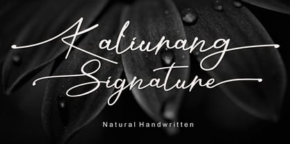 Kaliurang Signature is a modern handwritten font by Letterafa Studio. It has flowing letters that will give your designs a unique and sweet look. Kaliurang Signature is perfect for logos, greeting cards, package design, brand identity, craft design and any DIY project.
 - Kole P Rounded by NicolassFonts,
$25.00 Kole P Rounded is based on the Kole font family. The complete family contains 18 weights. Kole P Rounded family is ideally suited for signage, packaging, brand identity, software, editorial design, as well as web and screen design. Perfectly for headlines and logotypes.
 - Pale by Hiekka Graphics,
$29.00 Pale is an experimental geometric monoline sans font. Pale will look great in the headings and will be a functional addition to the design work. Pale is a bold choice for logo designs, posters, identity and packaging, headlines, editorial design and album covers.
 - Matrice by Studio Sun,
$20.00 Matrice is a sans serif (Semi Extended) display font family in 8 weights plus matching natural italics. support 75+ Languanges (Latin Based) influenced by the grotesk typefaces developed in the early 20th century, perfect for branding (Identity), logotype, headline text, and caption.
 - Sato by Pedroglifos,
$10.00 Sato is a playful sans type designed to be legible without sacrificing authenticity. The subtle ink traps is a nice touch on display sizes, and the balance between curve and edgy terminals make it a great option for identity design and signage.
 - Eqoos by Iwm Design,
$10.00 Eqoos font captivates with its distinctive stripe style, exuding a modern and professional vibe. Perfect for logos, brand identities, and promotional materials, this font seamlessly combines robust typography with trendy elegance, infusing a unique and captivating visual appeal into your graphic designs.
 - Carot Sans by Storm Type Foundry,
$39.00 Carot Sans is designed on the basis of three elements - square, circle and triangle. Simple and fresh typeface for visual identities, book covers, magazines and advertisement. The whole Carot system of 64 members offers a modern alternative for all types of design work.
 - Petala Pro by Typefolio,
$39.00 Pétala Pro took its first steps almost ten years ago. Since then, the quest for perfection has forced several interruptions. It was necessary recalculate the route, tread other ways, discover new maps, and make easy curves. In the end, a new milestone on typeface design was reached. Pétala Pro combines readability with a gentle but strong personality. The smooth and balanced forms shares space with expressive ink traps. The 18 styles of the family – from Thin to Black – allow the flexibility needed to complex design briefs. When designing the different weights, rather than automated solutions, subtle adjustments were made to value the optical qualities of each style. Such care makes all the difference under extreme conditions. The wide variety of alternates makes Pétala Pro even more versatile. All the styles come with a lot of advanced OpenType features such as stylistics sets, localized forms, contextual alternates, ligatures, small caps, numbers, fractions and more. Pétala Pro brings your message with efficiency and personality for a multi-language environment and in any medium or support, such as video, mobile and computers screens. Pétala Pro is the ideal choice for editorial, advertising, branding and corporate identity.
 - PF Bague Slab Pro by Parachute,
$79.00 PF Bague Slab Pro draws its inspiration from early 20th century slabs and was designed as a companion to Bague Sans, a versatile monoline typeface with a distinct and eye-catching personality. Following its predecessor’s design guidelines, it overcomes the monotonous and mechanical rigidity of early geometrics by introducing subtle variations in stroke width and semi-wedge serifs rather than square slabs. These striking serifs, along with a mixture of attractive letterforms, exude a strong, modern and energetic personality at display sizes. On the other hand, at small sizes these distinct characteristics become subtle and the simplistic geometric personality of the typeface comes in place to offer a highly readable text. Bague Slab Pro is a very clean and legible typeface with a warm and well-balanced texture which is ideal for editorial design, branding and corporate identity. This superfamily includes 18 weights from Hairline to Ultra Black with a consistent and well-refined structure. The italics are slightly narrower than the romans with cursive characteristics. Each style consists of 718 glyphs with 13 opentype features and an extended set of characters which supports simultaneously Latin, Cyrillic and Greek. PDF Specimen Bague Slab Pro on Behance
 - Ravensara Sans by NaumType,
$19.00 Ravensara Sans — fashionable, high-contrast humanist sans. Ravensara family was born from the idea of taking the concept of Didone to weight extremes. Ravensara Sans is available in 7 weights, including Thin, Light, Regular, Medium, SemiBold, Bold and Black. Depending on weight, Ravensara Sans, like the other members of this font family, show quite different behavior. Heavy weights function above all as display fonts and work particularly great in all-caps. Medium weights of Ravensara Sans represent humanist grotesque, descended from the pages of fashion magazines. Thin weight perfectly complements the others if you need an especially wide choice of weights. Also, all the weights work great in all-caps. Ravensara Sans is a part of the Ravensara superfamily, united by the same anatomy, which currently also includes Ravensara Serif and Ravensara Stencil. If you need to achieve classic Haute Couture look — Ravensara Sans is a great choice. It’s a perfect choice for fashion logos, headlines, short texts, magazines, due to its simplicity looks great in oversize typography, branding, identity, website design, album art, covers, posters, advertising, etc. Ravensara Sans extends multilingual support to Basic Latin, Western European, Euro, Catalan, Baltic, Turkish, Central European, Pan African Latin and Afrikaans.
 - Kate Slab by Monday Type,
$15.00 Kate Slab Pro is a sophisticated and robust modern Slab Serif Typeface that works in a variety of design scenarios. It is designed to work in big attention grabbing headlines as well as in smaller text and even body text. The recognition value of Kate Slab Pro is its biggest asset in world of uniformity. Ranging from "100 Thin" all the way to "900 Black" makes Kate Slab Pro such an amazing and versatile font family that stands out. Kate Slab Pro doesn’t only work great in lifestyle and fashion related contexts but will also look amazing for restaurants, coffee shops or and other use cases that ask for character and identity. To fill all the gaps of a designer's needs, Kate Slab Pro comes with an italic style with every weight. Those italics are equipped with unique and real italic characters and will make you love it. Being a Slab Serif Kate Slab Pro manages to remind you of a classic Font Family with a modern and timeless approach that will make you happy for decades. Monday Type can’t wait to see the beautiful designs you are going to create with our Kate Slab Pro.
 - Diamant Handwriting by 38-lineart,
$14.00 Diamant Handwriting is an upright handwritten font, which looks like a thick pen stroke. Form orientation is generally flowing horizontally, this is a reflection of composure in writing, we set the rhythm of each glyph so that the combination of high and low letters is very soft, try it, whatever you type with this font looks very calm. Activate the OpenType feature, because this font is equipped with ligatures (liga), Stylistic(salt), Contextual(calt) and initial alternates. We present all of this so that your writing is automatically setup, we also provide access to all alternates (aalt) features, this allows you to choose the glyph you like manually. We designed this font only for brand identity. Your brand will look different from other brands. You can also use it for short slogans to further amaze views and attract more customers to see you closer. 'Diamant' is another word of diamond that is often used in Europe, we give this name as a representation of the whole font as a symbol of luxury, brilliance and stability and comfort. We do not extend the theory and philosophy of this font, you better try it yourself, and you will be amazed. thank you
 - Miedinger by Canada Type,
$24.95 Helvetica’s 50-year anniversary celebrations in 2007 were overwhelming and contagious. We saw the movie. Twice. We bought the shirts and the buttons. We dug out the homage books and re-read the hate articles. We mourned the fading non-color of an old black shirt proudly exclaiming that “HELVETICA IS NOT AN ADOBE FONT”. We took part in long conversations discussing the merits of the Swiss classic, that most sacred of typographic dreamboats, outlasting its builder and tenants to go on alone and saturate the world with the fundamental truth of its perfect logarithm. We swooned again over its subtleties (“Ah, that mermaid of an R!”). We rehashed decades-old debates about “Hakzidenz,” “improvement in mind” and “less is more.” We dutifully cursed every single one of Helvetica’s knockoffs. We breathed deeply and closed our eyes on perfect Shakti Gawain-style visualizations of David Carson hack'n'slashing Arial — using a Swiss Army knife, no less — with all the infernal post-brutality of his creative disturbance and disturbed creativity. We then sailed without hesitation into the absurdities of analyzing Helvetica’s role in globalization and upcoming world blandness (China beware! Helvetica will invade you as silently and transparently as a sheet of rice paper!). And at the end of a perfect celebratory day, we positively affirmed à la Shakti, and solemnly whispered the energy of our affirmation unto the universal mind: “We appreciate Helvetica for getting us this far. We are now ready for release and await the arrival of the next head snatcher.” The great hype of Swisspalooza '07 prompted a look at Max Miedinger, the designer of Neue Haas Grotesk (later renamed to Helvetica). Surprisingly, what little biographical information available about Miedinger indicates that he was a typography consultant and type sales rep for the Haas foundry until 1956, after which time he was a freelance graphic designer — rather than the full-time type designer most Helvetica enthusiasts presume him to have been. It was under that freelance capacity that he was commissioned to design the regular and bold weights of Neue Haas Grotesk typeface. His role in designing Helvetica was never really trumpeted until long after the typeface attained global popularity. And, again surprisingly, Miedinger designed two more typefaces that seem to have been lost to the dust of film type history. One is called Pro Arte (1954), a very condensed Playbill-like slab serif that is similar to many of its genre. The other, made in 1964, is much more interesting. Its original name was Horizontal. Here it is, lest it becomes a Haas-been, presented to you in digital form by Canada Type under the name of its original designer, Miedinger, the Helvetica King. The original film face was a simple set of bold, panoramically wide caps and figures that give off a first impression of being an ultra wide Gothic incarnation of Microgramma. Upon a second look, they are clearly more than that. This face is a quirky, very non-Akzidental take on the vernacular, mostly an exercise in geometric modularity, but also includes some unconventional solutions to typical problems (like thinning the midline strokes across the board to minimize clogging in three-storey forms). This digital version introduces four new weights, ranging from Thin to Medium, alongside the bold original. The Miedinger package comes in all popular font formats, and supports Western, Central and Eastern European languages, as well as Esperanto, Maltese, Turkish and Celtic/Welsh. A few counter-less alternates are included in the fonts.
 - Camy by Scholtz Fonts,
$9.50 I wanted to create a "handwriting" font which could be used professionally. I have often needed such a font with a variety of weights and styles for a particular project and have had to resort to mixing fonts, creating a rather messy, amateur job. Camy is named for a little village in South West France where I did much of the initial work on this font. Camy is ideal for contemporary display work, comes in ten styles, and has a contemporary appeal with its casual, easy to read letters. Camy was designed as a total professional package for designers looking for a handwritten font suitable for all kinds of contemporary display work: the idea being that once you have the Camy Professional Pack you don't have to waste time searching for other handwritten fonts. The Family: LIGHT -- NARROW - light weight, condensed width, delicate line -- MEDIUM - light weight, delicate line -- WIDE - light weight, expanded width, delicate line NORMAL WEIGHT -- NARROW - of medium weight and condensed width - perfect for limited space -- MEDIUM - of medium weight -- WIDE - of medium weight and expanded width BLACK - for best readability -- NARROW - condensed width for bolder statements in small areas without losing legibility -- MEDIUM - for bolder statements -- WIDE - expanded width for bolder statements FAT -- WIDE - for maximum impact Use a combination of styles for product branding, book covers, invitations, greeting cards. The Camy combination works well for both headings and body text. Camy contains over 250 characters - (upper and lower case characters, punctuation, numerals, symbols and accented characters are present). It has all the accented characters used in the major European languages.
 - Yorkten by insigne,
$- Clean and welcoming, the distinct look of Yorkten is remarkably satisfying to the eye. Straight to the point, Yorkton features a fashionable, geometric composition with angled main stems. There are no fewer than fifty-four fonts in the family, all of which are characterized by one of three widths – extended, normal or condensed. Each individual subfamily is equipped with eight weights from Thin to Black with respective Italics, giving Yorkten a breathtaking range of fonts to boast. The greater value for you, though, is its members’ ability to work well together. With a deep toolbox of weights and widths to choose from, this family provides you with significant value and a broad number of design solutions, making sure you have the tools you need for each challenge. So where should you use the font? Jeremy Dooley designed Yorkten’s underpinning structure to be compact. Combined with its superior features and terrific legibility, this versatile font can be used effectively for many jobs, whether in print or on screen. Use it freely for e-books and apps. Yorkten is particularly great for headlines, banners, posters, and websites. As with all insigne fonts, fonts that are well received by the market are expanded into future variants such as rounded or slab serif types. Yorkten’s later expansions will increase the versatility and functionality of the family. There’s no need to wait for these future releases, though. This new face already complements a number of other insigne faces, such as Grayfel, Look, or the Cabrito Superfamily. So what are you waiting for? Get Yorkten today and bask in the rich potential it offers! Get Yorkten and luxuriate in its straightforward multifunctionality!
 - Motorway by K-Type,
$20.00 MOTORWAY is the companion typeface to TRANSPORT, the British road sign lettering. The Motorway alphabet was created for the route numbers on motorway signage, and is taller and narrower than the accompanying place names and distances which are printed in Transport. However, for Motorway Jock Kinneir and Margaret Calvert created only the numbers 0 to 9, the capitals A, B, E, M, N, S and W, ampersand, slash, parentheses and a comma. So, although the lettering made its first appearance on the Preston bypass in 1958, K-Type Motorway is the first complete typeface and contains all upper and lower case letters, plus a full complement of punctuation, symbols and Latin Extended-A accented characters. As with the Transport alphabet the starting point was Akzidenz Grotesk, Motorway taking inspiration from condensed versions. Changes were mainly driven by a quest for legibility, resulting in some reduced contrast between horizontal and vertical strokes, and Gill-esque straight diagonal limbs on the 6 and 9, and high vertex for the M. Kinneir and Calvert designed the limited range of characters in two weights; a SemiBold 'Permanent' weight for use as white letters on blue motorway signs, and a Bold 'Temporary' weight for heavier black letters on yellow non-permanent signage. In addition to creating full fonts in both original weights, the K-Type family adds a new Regular weight, plus a set of italics, completing a highly usable condensed typeface which, while rooted in history, is fully functional for both print and web usage. The K-Type fonts are spaced and kerned normally, simply increase the tracking to recapture the generous spacing of motorway signage.