10,000 search results
(0.044 seconds)
- Plastic Toys by Trim Studio,
$12.00 Plastic Toys is a basic display font for mom and kids crafter. It created to complete the normal type of font but need a playful and plasticy feel that crafter always needed. because of it feels, you can mix and match this style with various handbrush and normal strong font to get the feel of what your design needed Its perfectly suited for crafter and graphic artist to complete their design such as invitation, advertisement, poster, logo, birthday, product sign, and many more! Plastic Toys Font also Lightweight, even so contains All Standard glyphs and punctuations
 - Centrale Sans Condensed by Typedepot,
$29.00 Centrale Sans Condensed is not just a "squished" version of our Centrale Sans family, it's designed as a stand alone typeface with the family characteristics in mind. It bears all the qualities of the normal width being even friendlier because of the closer relation it has with the humanist model. The condensed width is with 15% narrower than its normal sibling, which makes it precious space-saving tool. Centrale Sans Condensed also have 9 weights from Hairline to Extra Bold plus their matching italics. It includes Some OpenType features like discretional ligatures, tabular figures and stylistic alternatives.
 - Supra Mezzo by Wiescher Design,
$29.00 »Supra Mezzo« – designed by Gert Wiescher in 2012/13 – is an unusual addition to the Supra family, a weight in between the normal and the condensed width. This cut comes in very handy if you need to put lots of text into a relatively small space without loosing readability. The compactness with great legibility makes Supra Mezzo absolutely unique. The light and normal weights and the dominant x-height with its high ascenders make for easy reading of long copy. The heavy and x-light weights are great for elegant headlines. Supra is an OpenType family.
 - Urfa Rounded by Ahmet Altun,
$19.00 Urfa Rounded Font family is the rounded version of Urfa Typeface. The Urfa Rounded font family comes in nine weights of Normal and Italic. In addition, all weights contain small caps in both italic and normal. With the Urfa Rounded font family, you can create beautiful works for the web, including logos, banners, body copy, and presentations. Urfa Rounded typeface also works nicely in print formats such as posters, T-shirts, magazines, and affiches. Because of its eye-pleasing style, this font is both effective and versatile. It supports a wide range of languages, including Extended Latin and Cyrillic.
 - Chimphand by One Fonty Day,
$6.00 Chimphand is an organic, natural and contemporary handwritten typeface with their tall x-height. Weights of light, regular and bold for both normal width and condensed allow you to play with the typeface more. In addition, you will have an access to their style sets ( Gap ) to add stencil-ish character to every weights. This gap style is much more subtle than normal stencils, but unique and nicely fit to the typeface. Gaps are more visible on larger fonts and bolder weights. Chimphand is good for any purpose, but works more on shorter text. Thanks and enjoy!
 - Apron by Hurufatfont,
$29.00 The genesis of Apron font type family is inspired by soft-vertical structure of airplane window. On the other hand Apron is making a reference to technological design mentality of early 2000's. In short texts it has stable view and also humanist effect. Very suitable for mobile apps, web designs, sportive & technological product packs and ads designs. Especially Narrow Bold and Condensed Bold Italic weights have fluid and strong expression for striking headlines. User friendly Apron serves rich opentype properties; small capitals, alternative letters (a, c, e, g, k, l, q, s, y, A, C, G, K, M, N, R, S, 3, 6, 9), stylistic sets, standart and optional ligatures, oldstyle figures, tabular linings, arrows, bullets and wide money currencies, fractions and math symbols. Now please fasten your seat belts and enjoy it.
 - Rock Painting by Morganismi,
$9.00 Rock Painting is based on ancient Northern rock paintings and I edited the glyphs to resemble latin letters, runelike. So it's quite writable and the characters can also be used separately in bigger shape. Some of the glyphs are idols of old Finnish gods and spirits: A - Ahti, god of (usually) water element or a spirit that lives in a pond, a lake or a river etc. I - Ilmarinen, god of the air K - Kaleva, ancient giant blacksmith, the great ancestor of Finns L - Luonnotar, the spirit of all nature, gives birth to creatures T - Tapio, god of the forest or the forest itself N - Nyyrikki/Nyrki, son of Tapio, a great hunter and so on. The font also includes glyphs resembling animals and things like moose, beaver, swan, fish, sickle, boat and more.
 - Yotta by Wilton Foundry,
$19.00 Yotta was created for situations where a thin sans with a little extra style is required in branding, advertising promotional projects — it is especially suited for the FASHION retail industry. The extended stroke feature (in u/c B,DP,R and l/c a,b,dg,h,m,npq,u,y) is discreetly applied so it does not dominate. I guess “quasi-serif” might be a way to describe Yotta. “Yotta Thin” and “Yotta Thin Italic” is a friendly Opentype and ready for you to unleash your creativity! btw. Yotta is big, very big: the name comes from YottaByte, as in Megabyte (one million bytes), Gigabyte (one billion (109)Terabyte (one million million (1012), Petabyte (a million gigabytes), Exabyte one quintillion (1018), Zettabyte one sextillion (1021), & Yottabyte (one septillion (1024)
 - Marathon by Linotype,
$29.99Marathon was originally designed by Rudolf Koch in 1931 for Schriftgiesserei Klingspor. It is a roman with short ascenders and descenders. The serifs are small, but longer at the ends of the arms of E, F and L, M is rather splayed and is without top serifs, like M in other typefeaces designed by Rudolf Koch. The lowercase g has no link and an open tail, again like the g in other Koch types. U has the lower-case design. In the W the middle strokes cross, the lower case w has no middle serif. The figures are short-ranging. Ute Harder from the Fachhochschule Hamburg had redesigned Marathon with the help and supervision of Professor Jovica Veljovic. She has added a book weight to offer more flexibility with this beautiful typeface. - Bommer Sans by dooType,
$30.00Bommer Sans is a warm and friendly type with a distinguishable look. It has been designed to add our twist to the flavour of English humanistic sans serif typefaces. Bommer Sans works like a charm for editorial, headlining, exhibition, signage and wayfinding projects. The big x-height and ascenders close to cap height favor tighter interlinear spacing. The ‘Q’ tail, resting on the baseline, is an invitation to play vertical, stacking lines of caps. Curved strokes on the ‘i’, ‘k’, ‘l’, ‘K’ and ‘R’ bring a friendly touch without compromising the sturdy structure, a marked characteristic of the design of the figure set. With seven weights in the upright and its matching italics, Bommer Sans has 14 styles and is part of the Bommer family. Check Bommer Slab for a great companion! - Lovely Scream Queens by Youngtype,
$15.00 Lovely Scream Queens is a hand brush font made with brushes and ink. This typeface is ideal for use in thick watercolor designs or in those needing a hand writing touch such as blog titles, posters, comic books, t-shirts, clothing, book covers, business cards, greeting cards, branding, merchandising and more. Lovely Scream Queens contains a full set of: Uppercase Lowercase alternative n, b, i, w, l, e Punctuation numbers multi-lingual support Lovely Scream Queens Italic works in harmony with Lovely Scream Queens Regular to create exceptional typographic creations. Get inspiration from the preview above. How to access all alternative characters, using Windows Character Map with Photoshop: https://www.youtube.com/watch?v=Go9vacoYmBw How to access all alternative characters using Adobe Illustrator: https://www.youtube.com/watch?v=XzwjMkbB-wQ Thank you!
 - Preface by Shinntype,
$39.00 Preface vs. Helvetica/Futura/Gill: a different strategy of text color. Whereas the established classes of sans serif typeface achieve a dynamic balance between stroke and space by combining a diversity of letterform with an evenness of fit, Preface switches the emphasis, driving out diagonals to create a dominant harmony of curves and perpendiculars, matched with a greater variety of inter-character space shapes—the result of extra width introduced in the “f” and “t”, and by the openness that accompanies the wide tails of the “ a” and “l”, the long ear of the “r”, and the serif of the “i”. En masse, and in keeping with the present trend in typography, Preface exhibits a coarser texture than the traditional sans serif faces, but one that is nonetheless even and precise. With tabular, oldstyle figures.
 - ApronSoft by Hurufatfont,
$19.00 The genesis of ApronSoft font type family is inspired by soft-vertical structure of airplane window. On the other hand ApronSoft is making a reference to technological design mentality of early 2000's. In short texts it has stable view and also humanist effect. Very suitable for mobile apps, web designs, sportive & technological product packs and ads designs. Especially Narrow Bold and Condensed Bold Italic weights have fluid and strong expression for striking headlines. User friendly ApronSoft serves rich opentype properties; small capitals, alternative letters (a, c, e, g, k, l, q, s, y, A, C, G, K, M, N, R, S), stylistic sets, standart and optional ligatures, oldstyle figures, tabular linings, arrows, bullets and wide money currencies, fractions and math symbols. With reduced file size, it’s softer now!
 - Inkarus by Scratch Design,
$10.00 Introducing Inkarus a playful font with a bold and all uppercase characters style. This font is perfect for posters designs, packaging, logotype, title, label, print ads, gift card, magazine title, movie title, sign, and the beautiful and curvy shape will give your designs that alternative look to your creative work looks innovative. Amazing curvy was hand-drawn and make the outlines look irregular and beautiful. This font has a lot of hand-lettered looks and the characters give a retro or urban feel. Inkarus has a serif style but can collaborate with sans-serif style together because the modern bold sans serif typeface has been the alternatives and ligatures of this font. Combine that bold shapes together will make your work a more unique, retro attitude. Ligatures Inkarus has 32 ligatures that you can turn on via the glyphs panel in Adobe applications. The ligatures make a innovative difference in the look of this font. It switches out between serif and sans serif styles that make your designs look still unity. Opentype The Alternatives and Ligatures use OpenType features. First, you will need a design app to access these options an application such as Adobe Photoshop, Illustrator, or InDesign. Alternatives All lowercase a,d,e,h, I, j,k,l,m,n, p,r, t, r you can switch out letters for other and makes your design look more like hand-lettering and innovative although you using in a repetitive way. Inkarus font includes; All uppercase characters 32 ligatures option Support for multi-languages characters Punctuation, Symbols, and Numbers Alternative lowercase characters ( a,d,e,h, I, j,k,l,m,n, p,r, t, r ) The font format is OTF So what you are waiting for? Grab it fast this font and make your innovative design. If you have any questions drop me a message.
 - Athletic Dept by Hustle Supply Co,
$15.00 Athletic Dept This typeface is a hand drawn, vintage inspired athletic display font. This typeface was drawn on grid paper, scanned and vectorized in illustrator. The roughness and imperfections vary slight for each letter, giving your project an authentically handcrafted look. This typeface comes with Western European Characters as well as some special Characters. It also includes OTF, TTF & Web Font Files.
 - Maxwell Sans by Kimmy Design,
$12.00 Maxwell is a clean condensed san serif typeface inspired by similar retro fonts from the 1950's. It comes in regular and small caps versions, includes stylistic alternatives and via the glyph panel you can access scientific inferiors, fractions, oldstyle numerals, Cyrillic, Greek, Latin and other Western and Central European languages. It can be used as a headline font or paragraph text.
 - Shibe by Linecreative,
$16.00 Shibe - Bold italic font, has a strong, sharp character, and is combined with the font graffiti styles, To make a beautiful combination, simply mix upper and lower case and mix with alternative glyphs Shibe offers you: Shibe- A clean Bold italic font including Upper & Lowercase characters(ALL CAPS), Stylistic alternates Character (2 Character) Supports Multi linguage (Latin Western Europe), Numbers and Punctuation
 - Oriole Bird by Tanincreate,
$17.00 Oriole Bird is a modern calligraphy script to bring an elegance to your designs - branding projects, social media, wedding invitation, greeting cards, packaging, logo design, news, titling, headlines, posters, signboards and more. It features multi language support (for most of Western Europe), contains glyphs with some OpenType features - standard ligatures, alternates for uppercase (beginning swashes) and lowercase letters (beginning and ending swashes).
 - Flap Jacks NF by Nick's Fonts,
$10.00Head 'em up and roll 'em out! Western styling with a wagonful of whimsy combine in this little beauty, based on a typeface named Blackjack, designed by Vincent Pacella for Photolettering in the 1970s. The PC Postscript, Truetype and Opentype versions contain the complete Latin language character set (Unicode 1252) plus support for Central European (Unicode 1250) languages as well - Quartz Grotesque by Hustle Supply Co,
$18.00 Quartz was originally published on the shop Font Forestry, but they are planning on closing - So now Quartz will live on Hustle Supply Co. Quartz is a minimalist All-Caps Sans Serif typeface that comes in 7 different weights. It's perfect for projects looking for that minimalist / clean aesthetic. Quartz includes regular, oblique, thin, bold & outlined versions. Western European Characters are included. Thanks!
 - Pluton by Proportional Lime,
$6.99 Pluton, a mono-spaced font, is designed to be versatile and easy on the eyes, with over 1400 defined glyphs. It has wide coverage comprising several different alphabets (Western European, Cyrillic, Hebrew, Runic, Ogham), mathematical, and physical symbols. Pluton Regular has been upgraded to contain over 2600 glyphs. A pluton is a igneous mass of rock formed at considerable depth.
 - Pocket Px by Letradora,
$18.00 Inspired by illustration lettering, Pocket has a contemporary, quirky feel. Its combination of narrow and round forms give it a humorous feel.It has support for most western and central European languages, and has alternates for most letterforms, allowing for variations that make it look authentically hand-drawn. Check out other fonts in the Pocket family: Pocket Serif and Pocket Swash
 - Old Chisholm JNL by Jeff Levine,
$29.00 An old brass stencil of the word 'large' was spotted for sale in an online auction. What set it apart from many other vintage stencil items was the beautiful, hand-punched Western letters with a diamond-shape center. Those five letters served as the basis for Old Chisholm JNL, which retains the look and hand-made charm of the original metal stencil.
 - Mexon by Linecreative,
$14.00 Mexon font is a sans-serif typeface with minimal, modern,and futuristic style. This typeface is available in all caps only with stylistic alternates feature plus supports multilingual languages. This font is appropriate for your branding, logo design, shirts, etc. Mexon offers you: Mexon- A clean San serif font including Upper & Lowercase characters(ALL CAPS) Numbers and Punctuation Multilingual Support (Latin Western Europe)
 - GaoYah Display by Stones Design Lab,
$20.00 GaoYah Display Thin is a type in very thin line, GaoYah means Elegance in Mandarin, some characters build in unique shapes can make a good memory. This font is suitable for huge titles display, in which way the line and detail shows elegance. It will make good performance in dark background as well. Including Basic English and Western Europe languages.
 - Garked by Linecreative,
$16.00 Garked is a font typeface inspired by ancient nordic runes, you want to customize a logo, brand or other design with ethnic or tribal style, this font is perfect for your choice. What you get, you will get: 1. Garked – Clean San serif font including Uppercase & Lowercase (ALL CAPS) characters, 2. Numbers and Punctuation 3. Support Multi language (Western Europe Latin)
 - The Roseberry by me55enjah,
$8.00 Introducing The Roseberry, a classic handmade serif. The Roseberry is a handmade serif display typeface, inspired by classic western poster. Imperfect lines and edges lead us to a classic look. In 3 different kind of style, The Roseberry can simply give a vintage vibe on your design. Features: * 3 different style: Roseberry Solid, Outline & Codet. * All caps, numbers and punctuation.
 - Samuel by Gian Studio,
$12.00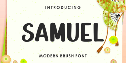 INTRODUCING Samuel is modern brush font, stylish and organic. can be used for stationery, fashion, logo, merchandise, books, clothing, magazines, cover artwork etc. Syaquita includes several ligatures, alternates and international support for most western languages. Thanks so much for looking, I really hope you enjoy it and please don't hesitate to drop me a message if you have any issues or queries :)
 - Boottering by HafisHidayat,
$15.00 Boottering is a modern handmade script, organic, energetic and dynamic, can be used for various purposes. such as the title, correspondence, wedding invitations, letterheads, signage, labels, signature newsletters, logos, posters, badges, etc. Boottering features 222 Glyphs, 40 alternate all lowercase characters, including ligatures, International support for most Western Languages is included, And for Boottering Sans do not have International Language support.
 - Les Folies JNL by Jeff Levine,
$29.00An early 20th-Century French lettering book displayed at an online image sharing site stood out with a hand-lettered version of a classic Victorian font. The lettering - a spur serif top and a split serif (or "Western-style") bottom is the basis for Jeff Levine's Les Folies JNL. All of the nuances and idiosyncracies of hand-lettering are left intact. - Leisoll Reef by Tanincreate,
$16.00 Leisoll Reef is an elegant modern calligraphy script created mostly for feminine designs - branding projects, social media, wedding invitation, labels, greeting cards, packaging, logo design, news, titling, headlines, posters, signboards and more. It features multi language support (for most of Western Europe), contains 256 glyphs with some Open Type features - standard ligatures, alternates for low case letters (beginning and ending swashes).
 - Telecomm NF by Nick's Fonts,
$10.00 This font is actually two different fonts. The uppercase mimics the typeface used once upon a time in Teletypes, and the lowercase is patterned after the face used during the first half of the twentieth century by Western Union for their telegrams. Both flavors of this font feature the 1252 Latin, 1250 Central European, 1254 Turkish and 1257 Baltic character sets.
 - London Court by Greater Albion Typefounders,
$16.50 London Court is a family of three 'Tudor Revival' display faces, inspired by an inscription seen underneath a clock in a splendid Tudor revival arcade in Perth, Western Australia. The resulting typeface designs are similarly 'Tudor Revival' or if you prefer 'Tudorbethan'- Roman with Blackletter details. Ideal for creating headings and posters which have an 'Olde-Worlde' feel with modern legibility.
 - Howdy by Ben Buysse,
$45.00 Howdy is a modern French Clarendon revival typeface inspired by late 19th-century woodblock type and sign painting. Its ties to the American West evoke a distinctive western and retro flair. It was designed with flexibility in mind. Intended for use as a display type, its reverse contrast forms make an impact from tall or wide headlines and anything in between.
 - Etrusco Now by Italiantype,
$39.00 Etrusco Now is the revival of a lead typeface originally cast in lead by Italian foundry Nebiolo in the early 1920s. Heavily inspired by the design of the Medium weight of Schelter & Giesecke's Grotesk, Etrusco was, like Cairoli, an early precursor of the modernist grotesque superfamilies: a solid, multi-purpose "work-horse" typeface family that could solve a wide range of design problems with its range of widths and weights. When designing the new incarnation of Nebiolo's Etrusco, the Italiantype team directed by Cosimo Lorenzo Pancini and Mario de Libero decided to extend the original weight and width range to keep this "superfamily" approach. Etrusco Now has twenty-one styles widths in three widths of seven weights each, with matching italics; the original weights for the typeface have been collected in the Etrusco Classic subfamily. Etrusco Now new widths allowed the team to include in the design many nods and homages to other vintage classics of Nebiolo. The lighter weights of the normal width have been heavily influenced by the modernist look of Recta, while the heavy condensed and compressed widths refer to the black vertical texture of Aldo Novarese's Metropol. This infuses the typeface with a slightly vintage mood, making Etrusco at the same time warmly familiar and unexpected to eyes accustomed to the formal and cold look of late modernist grotesques like Helvetica. Contemporary but rich in slight historical quirks, Etrusco Now is perfect for any editorial and branding project that aims to be different in a subtle way. Etrusco Now's deviations from the norm are small enough to give it personality without affecting readability, while its wide range of open type features (alternates, stylistic sets, positional numbers) and language coverage make it a problem solver for any situation. Like its cousin Cairoli, Etrusco is born out of love for lost letterforms and stands like its lead ancestor from a century ago, at the crossroads between artsy craftsmanship and industrial needs.
 - Alaturka by Bülent Yüksel,
$19.00 ABOUT FAMILY: What makes "Alaturka" elegant, friendly and contemporary is its very rounded curves with very open terminals. "Alaturka" has been designed with a higher "x-height" than other fonts in its class to make tiny readability more obvious in any use situation. It will be ideal for use in small sizes such as business cards or mobile applications. This typeface is also equipped with powerful OpenType features to satisfy the most demanding professionals. It has solid features like case sensitivity, small, true capitals, full ligatures, tabular figures for tables, old-style figures to elegantly insert numbers into your sentences, and more alternative characters to give personality to your projects. FEATURE SUMMARY: - 2 style: 1From 1923 To 2023 - 8 weights: Thin, Extra Light, Light, Regular, Medium, Bold, Extra Bold, and Black. - 3widths: Normal, Narrow, and Condensed. - Matching italics (12º) for all weights and widths. - Matching small caps for all weights and widths. - Lining and old-style figures (proportional and tabular). - Some alternate characters - Unlimited fractions. - Automatic ordinals (1st, 2nd, 3rd, etc.). - Extended language support: Most Latin-based scripts - Extended currency support. You can enjoy using it.
 - Invisible by Ronny Studio,
$19.00 Invisible is a geometric sans serif font family. Contains 9 weights with Regular and Family Look from Thin to Black and matching Slanted style. Invisible Normal character shapes have optimized proportions and improved balance perfect for use for text and heavyweights have strong characters have a unique style with smooth shapes to work with any look. Invisible fonts can be enhanced and used for any display medium to support your visual designs. Please contact us if you have any questions. Enjoy Crafting and thanks for supporting us! :) Thank you ____________________________________________________________________________________ Language Support : Afrikaans, Albanian, Asu, Basque, Bemba, Bena, Breton, Catalan, Chiga, Colognian, Cornish, Croatian, Czech, Danish, Dutch, Embu, English, Esperanto, Estonian, Faroese, Filipino, Finnish, French, Friulian, Galician, German, Gusii, Hungarian, Indonesian, Irish, Italian, Kabuverdianu, Kalaallisut, Kalenjin, Kamba, Kikuyu, Kinyarwanda, Latvian, Lithuanian, Lower Sorbian, Luo, Luxembourgish, Luyia, Machame, Makhuwa-Meetto, Makonde, Malagasy, Maltese, ManxMeru, Morisyen, North Ndebele, Norwegian Bokmål, Norwegian Nynorsk, Nyankole, OromoPolish, Portuguese, Quechua, Romanian, Romansh, Rombo, Rundi, Rwa, Samburu, Sango, Sangu, Scottish Gaelic, Sena, Serbian, Shambala, Shona, Slovak, Soga, Somali, Spanish, Swahili, Swedish, Swiss-German, Taita, Teso, Turkish, Upper Sorbian, Uzbek (Latin), Volapük, Vunjo, Walser, Zulu.
 - Tokoloshe by Scholtz Fonts,
$17.95Tokoloshe is a name in African mythology for a mischievous leprechaun-like figure that loves practical jokes and tricking people. There are many books of such African stories, for example Tales of the Tokoloshe by Pieter Scholtz. The letter shapes that I used in the Tokoloshe font have inspiration from two sources: -- the spiky character of the font was derived from the wonderfully imaginative, wooden carvings of the Makonde people of beings called "shetani". The word "tokoloshe" is used by other tribes, but from his behaviour, he is certainly a type of shetani. -- some of the letter shapes were informed by Art Deco styles of fonts, for example: Kunjani, Black Tie SF, Selznick Normal, Zaire SF, Binner Gothic and ITC Anna. But the Tokoloshe font, like its namesake, is much more freespirited. Use this font whenever you want to suggest the rich artistic, cultural and spiritual heritage of Africa. The font is fully professional in terms of its character set. It contains over 235 characters - (upper and lower case characters, punctuation, numerals, symbols and accented characters are present). In fact, it has all the accented characters used in the major European languages. - PT Sans Pro by ParaType,
$50.00PT Sans Pro is a comprehensive type family intended for a wide range of applications. It consists of 32 styles: 6 weights (from light to black) with corresponding italics of normal proportions; 6 narrow styles; 6 condensed styles; 6 extra condensed styles and 2 caption styles (regular and bold). The design combines traditional conservative appearance with modern trends of humanistic sans serif and possess enhanced legibility especially in caption styles. These features, besides conventional use in business applications and printed materials, make the fonts usable for direction and guide signs, schemes, screens of information kiosks, and other objects of urban visual communications. The fonts have extended Latin and Cyrillic character sets serving alphabets of all title languages of the national republics of Russian Federation and supporting the most of the languages of neighboring countries. Each font contains about 1400 characters including small caps for all alphabetic characters, 4 sets of figures with lining and old style variations, stressed Cyrillic vowels, indices, fractions and so on. Design -- Alexandra Korolkova with assistance of Olga Umpeleva and supervision of Vladimir Yefimov. The fonts released by ParaType in 2010. - Movida by ROHH,
$39.00 Movida™ is a 101-font mega family - modern, spurless, with geometric flat-sided nature. Its versatile character and huge choice of styles let it serve as a charismatic display typeface as well as clean contemporary tool for setting paragraph text. Its dynamic personality fits perfectly to such industries as sports, gaming, technology, streetwear, automotive. Movida works great for logo design & branding, magazine editorial use, web design, user interfaces and mobile applications. Movida features a super-flexible 3-axis variable font allowing fluent adjustments to width, weight and italic angle. This single font contains all the styles and features of the whole mega family. Main features: 5 widths (Narrow, Condensed, Normal, Expanded, Wide) 10 weights for each width (from Hairline to Black) + 10 corresponding italic styles 1 variable font (3 axes: weight, width, italic angle) modern, slick & sharp spurless design large x-height improving legibility in small sizes flattened oval shapes, adding vertical rhythm and elegance to narrow styles extended latin language support OpenType features (case sensitive forms, standard and discretionary ligatures, stylistic sets, contextual alternates, lining, oldstyle and tabular figures, slashed zero, fractions, superscript and subscript, ordinals, currencies and symbols)