4,946 search results
(0.015 seconds)
- RAN by URW Type Foundry,
$35.99 RAN Reformed Typeface for Beginners by Georg Salden - a headstrong and courageous approach to an improved handling of handwriting. Diverse and sometimes irreconcilable theories exist about how beginners are supposed to learn writing and reading. This has led to fierce discussions among experts already. We don’t want to pour more oil on the fire, but hope to create a new awareness for this topic, which is important to everyone of us. For beginners the combination of single characters (sounds) to whole words is essential during the acquirement of reading and writing. In this process they develop the skill to recall entire terms from memory. Therefore, after current practice, every word shall be written in a single stroke without lifting the pen in between. Georg Salden contradicts this postulate and warns, that coercively holding the pen down within a word can easily lead to exaggerated loop formations and a general meandering of the written text. The intellectual process in connecting single sounds to words while writing would happen anyway and the prohibition to lift the pen would often lead to tensions. To still support the necessary connections in general and to simplify the connecting, he teaches to write all round letters like a, e, g, o with inclusion of the connecting stroke, so that the spacing and combining with the next character arise by themselves. By settling the stroke at certain points and with a clear and logical writing method, a conscious and careful contact with the various strokes arises. All this automatically leads, together with a certain deceleration, to an increase of beauty and readability in the handwriting. The repeatedly discussed topic »connected or unconnected« appears to be solved in the most comfortable way as, depending on the particular character combination, both solutions are possible.
 - Leroy by Andinistas,
$39.95 Leroy is a font family of 5 members designed from geometrizing Roman and Gothic skeletons. Its purpose is to provide optimal reading of titles and paragraphs with strong mechanical flavor. Because of this, its variables are designed to sort information in media such as labels, signs and industrial atmosphere packaging related with the Soviet Union’s fonts in 1920. This idea matured white horizontal lines superimposed on alphabets drawn with an ancient architectural team known as “Leroy K & E Controlled Lettering System”. Then that evolved into a family concept unifying its proportion to the same X height for its members, resulting in a versatile type system. Therefore, Regular and Bold variables have low contrast between thick and thin strokes. Its upstream and downstream are extremely short, generating a suitable interline that clogs the vertical area. Its overall width equal to its X height, supports its tight spacing that compacts the horizontal area. Therefore, the variant with black caliber has plenty of contrast between thick and thin strokes. The light variable has a “blind” effect radiating light halos, ideal to propose hierarchies and combinations with orthogonal projection. In that sense, Leroy’s modular character reminds constructivist ideology merged with typographical variants suitable for graphic design with geometric look. To achieve this, I studied the softening of forms and counter blocks into a typographical system specially designed for composing useful information to attract attention. In that sense, the dingbats were obtained through a careful process of research and testings done with drawings that provided full and empty visual strategies that with the passage of time helped to forge the major decisions of a metamorphosis from industrial tools, birds and humans from pictogram mixing various genres.
 - Journal Sans New by ParaType,
$40.00 The Journal Sans typeface was developed in the Type Design Department of SPA of Printing Machinery in Moscow in 1940–1956 by the group of designers under Anatoly Schukin. It was based on Erbar Grotesk by Jacob Erbar and Metro Sans by William A. Dwiggins, the geometric sans-serifs of the 1920s with the pronounced industrial spirit. Journal Sans, Rublenaya (Sans-Serif), and Textbook typefaces were the main Soviet sans-serifs. So no wonder that it was digitized quite early, in the first half of 1990s. Until recently, Journal Sans consisted of three faces and retained all the problems of early digitization, such as inaccurate curves or side-bearings copied straight from metal-type version. The years of 2013 and 2014 made «irregular» geometric sans-serifs trendy, and that fact affected Journal Sans. In the old version curves were corrected and the character set was expanded by Olexa Volochay. In the new release, besides minor improvements, a substantial work has been carried out to make the old typeface work better in digital typography and contemporary design practice. Maria Selezeneva significantly worked over the design of some glyphs, expanded the character set, added some alternatives, completely changed the side-bearings and kerning. Also, the Journal Sans New has several new faces, such as true italic (the older font had slanted version for the italic), an Inline face based on the Bold, and the Display face with proportions close to the original Erbar Grotesk. The new version of Journal Sans, while keeping all peculiarities and the industrial spirit of 1920s-1950s, is indeed fully adapted to the modern digital reality. It can be useful either for bringing historical spirit into design or for modern and trendy typography, both in print and on screen. Designed by Maria Selezeneva with the participation of Alexandra Korolkova. Released by ParaType in 2014.
 - Magola by Andinistas,
$39.95 Magola is a creamy flavor font family whose purpose is to season with emotions the reading of words and phrases formed by puffy glyphs coated with a caramel of empty spaces external and internal. Independently or in groups, members of the family serve to decorate and organize packaging or advertising material in letters apparently crafted for food or entertainment contexts. Its starting point was to draw letters like a ballon fish evolved into a black version with empty areas and microscopic contrasted with colorful inflated and filled areas. Then the challenge was based on the sum transferred between full and empty into a lighter caliber. In that vein, its overall design adapted skeletons of italics and Roman calligraphy. Therefore, its regular, bold and black files have great height "x" with upwards and downwards extremely short and large internal counterblocks to facilitate reading. In this regard, to strengthen its objective and capture the reader's attention, its kind of contrast and simulated auctions flat tip brush strokes, and amount of contrast between thick and thin in the black version is slightly inverted. Its sizes, smooth strokes and irregular lines reinforce its traditional spirit, so it is favorable to shine the information on posters or large-format media. In short, its optical conformation based on a non-literal way, in metrics similar in all family members to be easily exchanged without changing the ìxî height. It is therefore a striking and versatile tool, that besides being useful in large sizes, can be used in small sizes as well. And more importantly, its general concept is more profitable when its members are mixed to nest headings, subheadings and short paragraphs, designed according to size, position, color and location in logos, covers, posters, ads and flyers.
 - Circe Rounded by ParaType,
$40.00 Circe Rounded is an extension for a popular Circe typeface, with rounded terminals. Bold and ExtraBold faces have two variants with different radius of the roundings. Circe Rounded is even more friendly than the original Circe. The typeface is designed by Alexandra Korolkova and Alexander Lubovenko and released by ParaType in 2015. It is known that the Circe typeface is distinguished by mild and humanist nature being formally a geometric sans-serif. However, as an experiment we decided to make it even softer: Circe now has a version with rounded terminals — Circe Rounded. Rounding is generally regarded as a mechanical operation, but in this case a lot of manual adjustment was needed because of the humanist nature and peculiarities of type design. Moreover, the two bold styles now have two options: a basic one is slightly rounded and an alternate one is fully rounded. In Circe Rounded we decided to dismiss characters with swashes that are rather inappropriate in such a rounded font, but the stylistic sets and alternate characters are remaining. Rounded terminals make an open and friendly typeface even more childish. For example, in quite large point sizes (because the x-height is still not big) it can be used as a body type in infant books. Circe Rounded, similar to Circe, has alternative forms of lowercase characters, which are called “infant” and are used in publications for children’s reading. However, a humanist basis is preserved alongside with its softness and it does not allow it to be as “plasticine” as many other rounded fonts. Two of the most obvious areas of possible application of Circe Rounded are everything for children and everything edible, especially all that is sweet and puff. However, we believe that there are other options.
 - Geometry Soft Pro by CheapProFonts,
$10.00 The Geometry Pro family has been designed to be the final word in purely geometric fonts, and this rounded “Soft” sub-family is the ultimate web 2.0 style font collection. Even though it is strictly geometric (as drawn with a compass and a ruler fixed to 90 and 45 degree angles) it is not slavishly modular: letters have differing widths, and the sidebearings, spacing and kerning has been finely adjusted to create smooth text. The Soft family contains three weights each with 6 variants: A is the basic form and the starting point B has more dynamic and modern shapes C has open and swirly shapes X is the serious text version Y has a very horizontal look Z is a collection of all the remaining more funky shapes Mix and match to your heart’s desire! Please enjoy the free “Bold N” version - this “notched” variant lets you test out the quality of the outlines and the language support. ALL fonts from CheapProFonts have very extensive language support: They contain some unusual diacritic letters (some of which are contained in the Latin Extended-B Unicode block) supporting: Cornish, Filipino (Tagalog), Guarani, Luxembourgian, Malagasy, Romanian, Ulithian and Welsh. They also contain all glyphs in the Latin Extended-A Unicode block (which among others cover the Central European and Baltic areas) supporting: Afrikaans, Belarusian (Lacinka), Bosnian, Catalan, Chichewa, Croatian, Czech, Dutch, Esperanto, Greenlandic, Hungarian, Kashubian, Kurdish (Kurmanji), Latvian, Lithuanian, Maltese, Maori, Polish, Saami (Inari), Saami (North), Serbian (latin), Slovak(ian), Slovene, Sorbian (Lower), Sorbian (Upper), Turkish and Turkmen. And they of course contain all the usual “western” glyphs supporting: Albanian, Basque, Breton, Chamorro, Danish, Estonian, Faroese, Finnish, French, Frisian, Galican, German, Icelandic, Indonesian, Irish (Gaelic), Italian, Northern Sotho, Norwegian, Occitan, Portuguese, Rhaeto-Romance, Sami (Lule), Sami (South), Scots (Gaelic), Spanish, Swedish, Tswana, Walloon and Yapese.
 - Cinque Donne by Debi Sementelli Type Foundry,
$44.99 Cinque Donne means “Five Women” in Italian. It was inspired by the five sisters in my family as well as a group of five high school friends I have known for 46 years, aka “The Club Girls”. The Pro version has 3370 glyphs with all the bells and whistles! Women are connectors, encouragers and supporters. Young, old, shy, extroverted, when you put us together, somehow we make a beautiful impact on each other’s lives. This is what Cinque Donne does in a visual way. Some letters are simple and prefer to sit quietly. Others are flourished and proud and like the limelight in the middle of a word. And then there are alternates that are flexible and work in any number of surprising places. Stylistic sets can add a vivacious feel while contextual alternates bring better understanding. Classic or contemporary, subdued or flamboyant, these letters represent the variety of women that make life interesting for us all. Within the varied glyphs, I hope you find characters that remind you of the special women in your life. Let Cinque Donne salute them on the page! The Cinque Donne Family includes: Cinque Donne, Cinque Donne Bold, Cinque Donne Swash and Cinque Donne Pro. Check out the Buying Choices tab to see special discounted combinations! Crafters: All of my fonts have been specially coded for PUA (Private Use Area) so you can access all of the swashes and alternates using Character Map (PC) or Character Viewer (Mac) or with any number of apps including PopChar. If you would like to purchase PopChar at a special discount email me and I will send you the link. Cinque Donne Pro and Cinque Donne Swash include Swash, Stylistic and Titling Alternates, Contextual Alternates, Standard and Discretionary Ligatures, Roman Numerals & Fractions.
 - Calagio by Eurotypo,
$38.00 Calagio is a casual and modern font, which can be categorized as expressive lettering style. This font contain 565 glyphs carefully designed, with OpenType features. A lot of alternative glyphs in upper and lower case letters, ligatures and ornaments, so you can combine and make your design more real at your convenience.
 - Rockmore by Almarkha Type,
$29.00 Rockmore is a bold script font with a clear style and dramatic movements. This font is great for logos, printed quotes, invitations, cards, product packaging, headers, Logotype, Letterhead, Poster, Apparel Design, and much more! Rockmore comes with uppercase, lowercase, numerals, accents (Multilingual characters), punctuations and a lot of gorgeous variations on each character!
 - Cherie Bomb by Great Scott,
$12.00 Cherie Bomb is a handmade brush font with a punk-rock feeling, but with personality and heart. It will allow you to create stunning hand-lettering quickly and easily. Cherie Bomb includes over 350 characters, uppercase and lowercase, basic punctuation, numerals and works great with a lot of international languages besides english.
 - Fleurons Three by Wiescher Design,
$39.50 Fleurons are embellishments and here is my third and so far nicest round. I found some old ones in London and made them more modern ones. These go very well with my scripts Nadine and Ellida and a lot of my other scripts!!! Yours once more in a beautiful mood, Gert Wiescher
 - Samary by Aisiv,
$9.00 The Samary typeface is the perfect font for a cute, lovely, and adorable design; it won't let you down! Perfect for gift cards, kids shirts, birthday cards, over cakes, game design, you name it! It contains Latin extended characters which are suitable for English, German, Spanish, Icelandic, Swedish, Finnish and even Norwegian.
 - Fictionalism by Haiku Monkey,
$10.00 Fictionalism is carefully handcrafted slab serif, slightly condensed to fit lots of beautiful text wherever you need. It's handwritten, but neat as a pin; it's tidy, but has a lively character that grabs attention in a friendly way. Use it for branding, posters, text, or a million and one other design applications.
 - Dominatrix BB by Blambot,
$20.00Dominatrix is a dirty little font who won't let up until you say the safe word. And I'm not telling you what the safe word is. This font comes with autoligatures so consecutive duplicate letters won't look identical. It also has more European characters than you can shake a leather whip at. - Ramadesh by Typotheticals,
$5.00Lightly playful, this font had a lot of influences in its design. I liked the look of this style in three fonts and decided to create my own version. This is it. Included is a version called Italic, but it is not a true Italic, just a variation in some lower case letters. - Roklin by Sign Studio,
$20.00 Roklin is an elegant serif family for use as both formal text and headers. Has quite a lot of character alternatives and also enhanced ligatures. It's perfect for casual typography as well as official documents, really. All characters are PUA Encoded, you can use this font easily in many common editor software easily.
 - Ferrocarbon by Megami Studios,
$7.50 For the angular, blocky look, the future is Ferrocarbon! Designed primarily as a title font, I created it way back in 2013 and promptly forgot about, so I'm releasing it to the world now. it's meant to be used for your tech and sci-fi uses, but don't let us stop you there!
 - Malkuns by Gartype Studio,
$15.00 Hello buddy ! This time we will introduce to you Malin Kundang ! Malin Kundang comes with a lot of Alternate to make your design more cool and of course come with Multilingual characters. This Font that are suitable for many of your needs such as book covers, titles, logos, letterheads, quotes, posters, etc
 - Argenta by Sudtipos,
$59.00 Argenta is handwritten and fresh. The casual spirit of this face is evident, but complemented by very specific typographic details. A playful script with an immensely useful array of alternate characters. Released in OpenType format to expand possibilities of use with lots of alternates when used with OpenType-aware applications such as AdobeCS.
 - Bellatrone by Sarid Ezra,
$15.00 Bellatrone - Modern Script is a script that contain lowercase, uppercase, symbol, and also support multi language. There's a lot ligatures in this font. Bellatrone Script is a font that you can use to make a logo for branding, beautiful fashion design, suitable for wedding invitation, or handwritten quote. Also already PUA Encoded.
 - Nugetto by ZetDesign,
$15.00 Nugetto is a font with a groovy theme. This font has bold, pointed, and circular strokes so it looks very bold but still has a lot of flexibility. This font is very suitable for non-formal writing such as party celebrations, Halloween, food, holidays, and is also suitable for writing on logos...
 - Atta Weird by Kaer,
$21.00 Hello! Do you need a weird font for your lettering, invitations, or banners? Please try it. There are a lot of ligatures and multilingual glyphs. What you will get: * Uppercase (lowercase glyphs are same) * Multilingual support * Numbers and symbols If you have any questions or issues, please contact me: kaer.pro@gmail.com Best, Roman.
 - Rambla by TipoType,
$31.90 Rambla is a humanist sans for medium-long texts. It’s slightly condensed, with a generous x-height and short ascender/descenders. Its proportions have as objective to gain space in height and width. It’s elegant at large sizes and legible at the same time, with a lot of rhythm in small sizes.
 - WIP Money Maker by WIP Fonts,
$49.00WIP Money Maker depicts the handwriting of man with verve, strength of purpose and resoluteness. The (lower case) characters are joined as it is usual in German speaking countries. Originally designed in 1995 the font has been extended by a lot of new characters such as accented characters, punctuation, symbols and currency symbols. - Emiken Display by Attract Studio,
$18.00 Emiken Display is a contemporary font with lots of psychedelic designs that comes with an emotional character that is bold to read. Emiken Display has three types of fonts, namely regular, slant and italic style. Emiken Display is very suitable when used for logo designs, badges, web layouts, headers, packaging and many others.
 - Dark Blow Swash by Gatype,
$10.00 Dark Blow Brush Font is a new font with textured stroke detail, also provided some ligatures and swashes extra. Perfect for projects posters, logos, product packaging, invitations, greeting cards, brands, news, blogs, everything including personal charm etc. Thanks so much for looking and please let me know if you have any questions.
 - Bold Groove by Wasabib Type Foundry,
$17.00 Is a typeface that carries powerfull message in a modern graphic style with ease. it uniquely combines simplicity and sophistication. BOLD GROOVE has everything you need to add creativity and personality to your design while being easy to read. Let Bold Groove impress your viewers and help deliver your message with strong impact.
 - SLICKY BOHEM by Jolicia Type,
$25.00 SLICKY BOHEM is a bold condensed typeface that is strong geometric. with a variety of discretionary ligatures to give you all you need for great typography. make your creative work stand out with lots of unique ligatures. highly recommended and those who are planning a poster design, logo, headline, t-shirt, etc.
 - Quindelia by OCSstudio,
$17.00 Quindelia is a beautiful font with lots of love and affection in it, unique ligatures, smooth and elegant strokes, containing six alternatives in it. Quindelia is perfect for weddings, events, invitations, cards, quotes, displays, logos, blog sliders, special addresses, stamps, packaging, greeting cards, romance, etc. ** Thank you for downloading, hopefully it’s useful **
 - Clarinta by Putracetol,
$19.00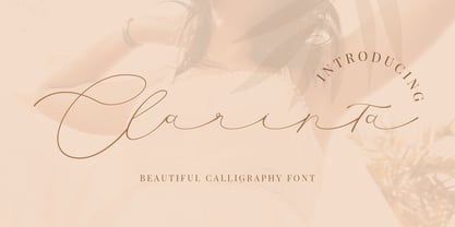 Clarinta, a beautiful script font. a lovely, elegant and sweet script font. Clarinta is perfect for styling logos, stationery, wedding event, invitation, quote, social media, websites and so much more! Come with Opentype feature with a lot of alternates, its help you to make great lettering.This font is also support multi language.
 - Brillscript by Brainware Graphic,
$12.00 Brillscript is a display script font. Comes with a lot of opentype features, Brillscript also supports multilingual covering Latin based language (Latin Extended-A) such as Bosnian, Catalan, Czech, Danish, German, English, Spanish, Estonian, Finnish, French, Irish, Croatian, Hungarian, Icelandic, Italian, Lithuanian, Latvian, Maltese, Dutch, Norwegian, Polish, Portuguese, Slovak, Slovenian, Albanian, Swedish, Turkish
 - Turista Flaca NF by Nick's Fonts,
$10.00This Art Deco-inspired face is based on the Baltimore Type Foundry’s Tourist Extra Condensed. Graceful and elegant, this typeface’s compact design also packs a lot of information into very little space. This font contains the complete Latin language character set (Unicode 1252) plus support for Central European (Unicode 1250) languages as well. - Peristiwa Script by Attract Studio,
$14.00 Peristiwa Script is an elegant, full featured vintage inspired calligraphic script font with lots of alternative characters and OpenType features. Perfectly handwritten touch with a heavy right angle is perfect for logos, wedding invitations, modern websites, greeting cards and more! Font Pairing : Bethany Elingston Including: Alternates & Ligatures OpenType support Multilingual PUA encoded.
 - Airways by Mans Greback,
$59.00 A typeface fast and light enough to fly! Airways is a vintage script font, with an airy yet confident style. It was carefully drawn by Måns Grebäck in 2016, and contains a lot of contextual alternates and ligatures. The font is useful in logotypes and advertising material that requires your customers' attention.
 - Xspace by Artyway,
$14.00 I'm thrilled to present you a new futuristic typeface. Smooth humanistic forms and elongated proportions, modern trends dictate a new fashion in type design. Perfect for science research posters, modern futuristic logos, automotive type design and more. Check how it works and let me know, I am always glad to hear your opinion.
 - Petit Four by Hanoded,
$15.00 A "Petit Four" is a small, bite-sized, French pastry. The font before you is a bite-sized Hanoded original. It is hand made, fun to use and comes with a lot of calories. Like its namesake, use Petit Four sparingly and it will be the cherry on top of your design.
 - Sabbatical by Fontforecast,
$17.00 Sabbatical is a no nonsense brush font family with lots of character. The family contains 3 hand-lettered fonts, Regular, Bold and Basic. This dry textured script font is inspired by travel journals written by adventurous souls, hence the name. The design is perfect for any type-based creations, quotes, invites, packaging, branding and much more! Sabbatical Basic has his own unique form which complements Sabbatical Regular and Bold. It consists of a fun caps font with an even more playful variation. All Sabbatical fonts have alternate glyphs that can either be accessed by the swashes feature, stylistic sets, or glyphs panel, depending on the application you are using. There are lots of discretionary ligatures that offer more variation. With over 880 glyphs the design options are unlimited.
 - South Central by Loshaj Foundry,
$9.00 "To us it ain't vandalism. It's just letting the people know: We grew up here. This is our neighborhood. And as they pass by they know where we're at." – Los Angeles gang member Graffiti is equivalent to local news, its intended purpose is to inform general populace where gang members are, where they operate, as far as territory lines, and which neighborhoods are at war. Gang Graffiti can be used for: – Marking territory with graffiti. – It's a form of gang advertisement. – Letting people know who's in the gang, living, dead, or in prison. – Which neighborhoods they are at war with. – Who are their allies. Graffiti has along history, specifically Los Angeles gang graffiti, which has has been around since the 1930s. South Central typeface includes uppercase letters, numbers, and select punctuation glyphs.
 - 1484 Bastarde Loudeac by GLC,
$38.00 Font designed after that used in Brehan-Loudeac (Britanny, France) by Robin Fouquet and Jean Crès in years 1480s to print a lot of texts and books. This font include “long s”, naturally, as typically medieval, and a few special characters and abreviations, also some variants, like for “d”, “r” or “v”. The small “y” is accented, just like in British alphabet of the time, though the texts were printed in French. Added, a lot of accented characters no longer existing on this time. A render sheet, in the font file, makes it more easy to identify on a keyboard. This font is used as variously as web-site titles, posters and flier designs, editing ancient texts... all you need. This font supports easily as large than small size, remaining readable, original and pretty.
 - Haggis by The Ampersand Forest,
$19.00 Meet Haggis! Inspired by the Insular Half-Uncial and Uncial typefaces that have long been associated with Scotland, Ireland, and their Celtic cousins, Haggis is an unusual creature. Unlike traditional Uncials, he's monoline, rounded, sausagey, and distinctly lighthearted! Use him for posters, signage (especially pub signs!), kids' stuff, and packaging — anyplace a little quasi-Celtic flavor is desired, but with a fun twist. Must we say it? He's a Funcial! Tongue-in-cheek though he may be, Haggis has some great features. He comes in Lean and Overstuffed forms, and has full true small caps, standard(ish) Roman alternates for the more out-there characters, lots of ampersand forms (including a true[ish] "Et" and a Tironian and), fun quasi-Celtic bullets, and lots of ligatures. Try him out today — with some tatties and neeps!