10,000 search results
(0.037 seconds)
- Popular Vote by Hanoded,
$10.00 I made this font during the rather hectic start of 2021. Popular Vote is an easygoing, laid-back kinda font. It fits just about anywhere, regardless of your political orientation, your sense of aesthetics or the job you will use it for. Popular Vote will feel at home on a box of crackers, on the cover of a book about keto diets, or on that T-shirt you have always wanted to design. Enjoy!
 - KonQa - Unknown license

- Stiletto - Unknown license

- Argentum - Unknown license

- Marconi by Linotype,
$29.99 Marconi was created by Hermann Zapf in 1973. According to Gerard Unger, it was the world's first digital typeface. Zapf’s design was developed as a text face for books and magazines. The round forms of the Marconi follow the principle of the superellipse. The lowercase letters are enlarged as the result of reading tests, while the capital letters are slightly reduced. The 8-point size — normally used for newspapers — looks more like 9 1/2 points. Marconi is a legible typeface with its large and open lowercase letters. It is ideal for long text blocks in newspaper, book, and magazine production.
 - FTY SKORZHEN by The Fontry,
$25.00 At one time very recently, serifs were lost to the design sinners of the world. Now see them found again. Unearthed and rediscovered. Retribution is not far off. We have been unchained from the belief that gothics have provided us no way back from a lack of variety and interest.
 - IngyArrows by Ingrimayne Type,
$10.00 IngyArrows is a set of three fonts with three sets of arrows, with one of them a blend of the other two, where normally there are standard numbers, letters, and punctuation marks. The revision of 2011 added many of the arrows that exist in several places in the unicode codings and that cannot be accessed by normal keystrokes.
 - LT Hakuna Matata by Latam Type Foundry,
$15.00 Introducing "LT Hakuna Matata" font collection, inspired by The Classic Movie Lion King. Styles: Normal, Outline, Shadow, Ink. Captures Timon and Pumbaa's essence. Normal exudes joy, Outline adds an artistic touch. Shadow creates depth, Ink offers handcrafted charm. Experience African savannah's energy in typography.- Where typography meets the magic of The Lion King. Enjoy! Thank's for Support!
 - Warrior by CastleType,
$59.00 Warrior is a chunky typeface design inspired by a Russian Egyptian-style block alphabet (original designer unknown). Now available in seven weights (Hairline, Extra Light, Light, Medium, Regular, Bold, Black) in addition to three decorative styles: Shaded (3-dimensional), Inline, and Open. With its blocky letters and stable slab serifs, Warrior will add a bold, masculine look to your design. All members of the Warrior family support most European languages including modern Greek, and, of course, languages that use the Cyrillic alphabet.
 - Oxford Press by Set Sail Studios,
$17.99 Recreate authentic letterpress typography with Oxford Press, a set of chunky uppercase Serif & Sans fonts designed using real vintage metal letterpress blocks sourced from old printing companies. The Serif & Sans fonts each have two variations, 'Clean' and 'Rough'—with the latter having real, highly detailed hand-made letterpress textures applied to each letter. Each letter of the 'Rough' fonts also has an alternate texture, which can be accessed simply by switching between upper and lowercase characters. The 'Rough' fonts can make a striking impact as bold header text for posters, adverts, prints and packaging, whereas the 'Clean' versions are more suited for smaller accompanying text, cleaner designs or for applying your own textures and styles. Language Support • English, French, Italian, Spanish, Portuguese, German, Swedish, Norwegian, Danish, Dutch, Finnish, Indonesian, Malay, Hungarian, Polish, Croatian, Turkish, Romanian, Czech, Latvian, Lithuanian, Slovak, Slovenian.
 - Mimeograph Lettering JNL by Jeff Levine,
$29.00 Mimeograph Lettering JNL is based on one of the numerous plastic lettering templates once manufactured by the A.B. Dick Company of Chicago and is available in both regular and oblique versions. The mimeograph utilized a porous drum which inked the backside of a waxed stencil sheet. Unlike traditional stencils which have cut out areas that are directly inked or painted, a mimeo stencil has the area to be printed scratched away by removing the wax coating with a stylus. The resulting image allows the ink from the drum to seep through the sheet and transfer to the blank paper. As with a companion font (Mimeograph Template JNL), the character shapes follow the routed letters of the template, complete with rounded terminals. A previous font release [designed with flat terminals and some alternate characters] is available as Interoffice Memo JNL.
 - Chow Fun - Unknown license

- Cell by Type Minds,
$7.50 Cell is a sturdy, geometric typeface with many potential applications. Though it is best suited to display sizes, its construction is simple enough for use in smaller settings. Its octagonal, almost mechanical design is softened by rounded corners. The face is characterized by a single thick stroke in each letter, lending it a unique appearance. It also features an oblique counterpart with several italic-style glyphs. Both members of the family also include small capitals mapped to the Private Use Area. Cell was designed to be at once simple and unique. Its grid-based structure is enhanced by slight adjustments for optical consistency. Glyphs which are normally round instead have 45-degree angles at the corners, sticking to the grid system without losing legibility.
 - Maketa - Personal use only

- Zinekiss by Pedro Teixeira,
$12.00 Zinekiss - for the love of black ink and zine culture. Zinekiss, is a font with a very natural/organic handrawn script of black ink
 - IMPuzzled by Ingrimayne Type,
$9.00 IMPuzzled uses the OpenType feature of Contextual Alternatives to alternate two sets of characters. The sets are on two puzzle pieces that tessellate, that is, fit together to fill the plane with no gaps or overlaps. Empty pieces are on the brace keys and can be used to fill spaces. The black or solid style is designed to be used in a layer under the regular style, though it can be used alone if adjacent pieces are given different colors. This unusual font has limited uses but may be appropriate when the topic is related to the broad areas of puzzles, puzzled, and fitting pieces together.
 - Slanted ITALIC Shift by TypoGraphicDesign,
$19.00 CONCEPT/CHARACTERISTICS The constructed, clear and modern character of the typeface based on the basic form of the triangle. The motto is geometrically and italic. APPLICATION AREA The modern, futuristic and constructed font „slanted ITALIC shift“ would look good at display size for poster, flyer, comics and graphic novel lettering and logos. Headlines in magazines or websites, packaging, music covers or webbanner etc. TECHNICAL SPECIFICATIONS Headline Font | Display Font | Geometric Font „slanted ITALIC shift“ OpenType Font with & 308 glyphs & 6 styles (thin, light, regular, medium, bold, black). Alternative letters, symbols and ligatures (with accents & €) FONT IN USE www.typographicdesign.de/font-in-use-slanted-italic-shift/
 - Lagu Sans by Alessio Laiso Type,
$20.00 Lagu Sans is a contemporary typeface that blends a geometric inspiration with a charming contrast between thick and thin strokes. Alessio Laiso has designed Lagu Sans in 18 styles: 9 weights ranging from Thin to Black, with matching, beautiful italics. The companion Lagu Serif makes the Lagu family a real workhorse for any use, including web, digital, print, branding and signage. Lagu Sans has a large x-height and open counterforms, making it easily readable. It comes with powerful OpenType features, including ligatures, alternative glyphs, small caps, fractions, tabular figures, old-style figures, and more. The Lagu family supports 219 languages, covering 100% of the Latin Plus character set.
 - LE Genoss by Attype Studio,
$18.00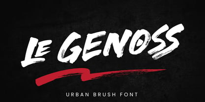 le Genoss is urban brush font inspired by real brush calligraphy with real texture. What's included: - le Genoss.otf - 10 Swashes - Ligatures - Multilingual Support --- Hope you enjoy with our font! Attype Studio
 - Layal by Arabetics,
$39.00 Layal is an Arabetic type design with a calligraphic flavor. It follows the guidelines of the Mutamathil Taqlidi type style with one glyph for every basic Arabic Unicode character or letter, as defined in Unicode Standards version 5.1, and one additional, final-position, glyph for each Arabic letter that is normally connected with other letters from both sides in traditional cursive Arabic strings. Layal employs variable x-height values. It includes all required Lam-Alif ligatures and uses ligature substitutions and selected marks positioning but it does not use any other glyph substitutions or forming. Text strings composed using types of this family are non-cursive with stand-alone isolated glyphs. Tatweel (or Kashida) glyph is a zero width space. Keying it before any glyph will display that glyph isolated form. Keying Tatweel before Alif Lam Lam Ha will display the Allah ligature. Layal family includes both Arabic and Arabic-Indic numerals; all required diacritic marks, Allah ligature, in addition to standard English keyboard punctuations and major currency symbols. Layal is available in normal, bold, black, light, and extra light, each both in regular and italic styles.
 - Rubbed - Unknown license

- Hand Boys by Jorsecreative,
$20.00 Hand Boys Is a typeface signature font that is inspired from Boys handwriting style. Suitable for making Greeting Cards, invites, quotes, book content, T-shirt, child magazine contents, short story, poster label etc.
 - Morris Roman Alternate - Personal use only

- Shannon by Monotype,
$29.99The Book of Kells is a handwritten Irish text which dates back to the 8th century. Kris Holmes and Janice Prescott digitalized some letters from this book and some from a Grotesk font in the style of Frutiger. A computer filled in the blanks and the designers then gave the font its finishing touches by hand. - Bologna by David Turner,
$35.00 Inspired by pointed pen calligraphy and modulated sans serif typefaces used for advertising in the 1920´s, Bologna is a high contrasted sans serif with a modern and fashionable look. Bologna comes in three weights: Regular, Bold and Black. The Regular and Bold weights are, despite of their high contrast, also build for body texts. Whereas Bologna Black, with a more expressive look and sharp angles, is specially designed for large and striking headlines, packaging or identities. Overview: 3 weights - Regular, Bold, Black Regular/Bold: 657 Glyphs Black: 871 Glyphs Lining, tabular and old style figures Ligatures: fl, fi, ff, ffi ffl, Unicase Letters: a, e, m, n, r Alternative Guillemets Case Sensitive Arrows Bologna Black: hairline accents and interpunctations Fractions Extended Language Support Stylistic Sets: ss01 = Alternative Guillemets / Alternative y ss02 = Unicase glyphs ss03 = Numerals in circle ss04 = Numerals in black circle ss05 = Hairline Accents and Interpunctations (Bologna Black)
 - Powder Script by Fenotype,
$35.00 Powder Script is a showy brush style script family of three weights -regular, bold and black plus matching Ornament and Pattern set. Powder Script is packed with almost 800 glyphs per weight and is full of features. To activate alternate characters click on Swash, Stylistic or Titling Alternates in any OpenType savvy program or manually select from even more characters from the Glyph Palette. Inside each weight is a set of block capitals that you can activate by turning on Small Caps. You can use Small Caps to create evenly lined text blocks to support your design. Engage Powder Ornaments and Powder Patterns to complete your designs while using Powder Script. For the best price purchase the complete Powder Script Family.
 - Familiar Pro by CheapProFonts,
$- This family was inspired by a Type Battle over at Typophile: How would you design a font metrically compatible with Helvetica, but better than Arial? Working with preset letter widths was an interesting constraint, both a relief and a limitation at the same time. I have done all the 4 basic weights, and the skewed obliques (done to a slightly less steep 10 degrees angle as opposed to the originals 12) has been optically adjusted. The letters have been designed quite close to the german/swiss grotesk tradition, but by using super-elliptical rounds, rounded dots and slightly curved outer diagonals the end result is a friendly looking font family that still looks... familiar. ALL fonts from CheapProFonts have very extensive language support: They contain some unusual diacritic letters (some of which are contained in the Latin Extended-B Unicode block) supporting: Cornish, Filipino (Tagalog), Guarani, Luxembourgian, Malagasy, Romanian, Ulithian and Welsh. They also contain all glyphs in the Latin Extended-A Unicode block (which among others cover the Central European and Baltic areas) supporting: Afrikaans, Belarusian (Lacinka), Bosnian, Catalan, Chichewa, Croatian, Czech, Dutch, Esperanto, Greenlandic, Hungarian, Kashubian, Kurdish (Kurmanji), Latvian, Lithuanian, Maltese, Maori, Polish, Saami (Inari), Saami (North), Serbian (latin), Slovak(ian), Slovene, Sorbian (Lower), Sorbian (Upper), Turkish and Turkmen. And they of course contain all the usual "western" glyphs supporting: Albanian, Basque, Breton, Chamorro, Danish, Estonian, Faroese, Finnish, French, Frisian, Galican, German, Icelandic, Indonesian, Irish (Gaelic), Italian, Northern Sotho, Norwegian, Occitan, Portuguese, Rhaeto-Romance, Sami (Lule), Sami (South), Scots (Gaelic), Spanish, Swedish, Tswana, Walloon and Yapese.
 - Throws by Tomatstudio,
$10.00 This is not an ordinary fonts, this is how the real throw up graffiti come into fontype! if you want real throw ups style graffiti fonts, this is the answer! because this is pure from my real graffiti eperiences around the streets. Kerning, spacing i adjust more tight, similar with the real throw up in the streets. The intersection between letter also you can erase it or leave it collide, depends of whats your styles, see our tutorial in the picture slides. I hope you guys like it, cheers!
 - EquipCondensed by Hoftype,
$49.00 EquipCondensed is the matching complement for Equip and EquipExtended . With its 16 fonts it extends the Equip family to 48 styles. It not only works superbly as a contrasting face for the ‘normal’ Equip but due to its moderate width, it also performs brilliantly as a space saving typeface. EquipCondensed is very well suited for ambitious typography. The EquipCondensed family comes in OpenType format with extended language support. All weights contain semi-ligatures (design optimized single characters), proportional lining figures, tabular lining figures, proportional old style figures, lining old style figures, matching currency symbols, fraction- and scientific numerals and arrows.
 - Roma Initial Caps JNL by Jeff Levine,
$29.00Roma Initial Caps JNL is a set of alphabet caps drawn from elegant lettering found in an old sign painter's manual. The upper case keys have the letters in white on black backgrounds, while the lower case has the letters in black on a white background with a black border. - Linotype Devanagari by Monotype,
$103.99 The new Linotype® Devanagari typeface is a traditional text face now available in five weights (from Light to Black) and suitable for a wide variety of print and digital uses. A compact design, Linotype Devanagari also provides economy of space where textual real estate is at a premium. In addition, its large character set enables the setting of Hindi, Marathi, Nepali and is suitable for Sanskrit passages. The design’s open counters ensure high levels of legibility at small sizes and at modest resolution. The history of Linotype Devanagari is quite extensive. Inspired by the late 19th and early 20th century Nirnaya Sagar designs, it was originally designed in 1977 by Mathew Carter for phototypesetting systems. It was then revised and expanded for digital typesetting by the Linotype letter-drawing studio headed by Georgie Surman under the art direction of Fiona Ross. This new, enhanced revival was designed by Lisa Timpi and Gunnar Vilhjálmsson with Fiona Ross as a consultant. This new Linotype Devanagari is part of a project to refresh the pivotal Linotype Bengali and Linotype Gujarati typefaces and make them available for the first time in the popular OpenType font format.
 - Bodoni Slapp - Unknown license

- fabianestem - Unknown license

- HOUSEPIPES - Unknown license

- Sensory Input - Unknown license

- Hulbert by Typotheticals,
$10.00A rough hand drawn playful serif that would be good at larger than normal text use, or headlines. - Rikon by JCFonts,
$30.00 Rikon is a modern Sans Serif Family designed by Joël Carrouché and available in six weights, from Thin to Black. With its simple yet original letter shapes, this family displays a strong personality and will really shine in branding or titling applications, while being legible enough to endure longer texts and smaller sizes. The fonts are available in OpenType format, and include diacritics for most European languages and a selection of OpenType features (two stylistic sets, case sensitive forms, tabular figures...).
 - Naston by Sopheynoft,
$49.00 Naston Regular is the font of choice for those who seek an elegant and versatile typeface. With its timeless design, Naston Regular adds sophistication to a wide array of applications, be it formal invitations, business presentations, or creative projects. Its meticulously crafted letterforms prioritize readability while maintaining a unique and distinctive style, leaving a lasting impression on your audience. This font's broad language support and impeccable craftsmanship ensure a seamless reading experience, making it an excellent choice for anyone who values professionalism and aesthetics in their design projects. Choose Naston Regular to elevate your content and effectively convey your message with clarity and elegance.
 - Milk and Balls by Alit Design,
$12.00 Introducing Milk and Balls Serif font family. This character that seems rigid and decisive is perfect for bold and formal design concepts. The unique shape of the letter makes the design made different from the others. Milk and Balls font is very suitable for header text, body text, and the contents of paragraphs because there are 11 family fonts from Thin to Heavy, in addition there is also an italic version. So Milk and Balls are very complete and suitable to be a collection of fonts that can be used at any time. Don't worry about Multilingual, because Milk and Ball’s are supported by multilingual.
 - Didonesque Script by Monotype,
$25.99 Didonesque Script has the flair of a script typeface, yet retains the rigid structure and incline of its cousins in the Didonesque family. This makes for an interesting approach – the flamboyancy of this script is restrained which resonates a distinctly reserved and formal tone. This typeface is perfect for formal occasions, with its main intent for use in short runs of text, headlines, branding and logo applications. Open Type features are utilized to good effect – positional forms, contextual alternates, ligatures, stylistic alternates, and old style figures all add value to Didonesque Script. There are four weights, from delicate to voluptuous (Regular, Medium, Bold, and Black), which are replicated in “Display” versions – these are designed for use at larger point sizes. Key features: • 4 weights in two styles – Regular and Display • Positional Forms (when activated) ensure the correct glyphs appear in context as you type • Full European character set (Latin only) • 550+ glyphs per font.


