9,840 search results
(0.036 seconds)
- Aloha Brush by Nirmana Visual,
$22.00 Aloha Brush This font is a supercharged, street-wise brush font bursting with energy. With extra feel as a real brush would! Letters are made with brushes on paper. Then scanned and carefully drawn into vector format. Thas 2 styles of regular and italic variations with a more natural look to your text. Aloha Brush is very suitable for use in various media such as; packaging, logos, labels, posters, shirt designs, bulletins, typography, and many other media.
 - SK Pupok by Shriftovik,
$32.00 SK Pupok is a soft decorative typeface with rounded shapes. Its friendly appearance is suitable for many design tasks. The typeface has two styles: regular and outline. This configuration allows you to experiment with typeface compositions and styles. The SK Pupok typeface is multilingual and supports many languages, including the basic and extended Latin, Cyrillic, and many others. It is great for creating any design works and will look great in poster design and even in web design.
 - Location JNL by Jeff Levine,
$29.00 The lettering style of Location JNL is based on sets of "vintage" metal house identification letters and numbers seen for sale online. As these sets are available from overseas sources, it's not clear whether those metal characters are cast from original vintage dies that have been used for years or just designed to look like a vintage style of lettering. Nonetheless, they make for a great digital interpretation and the design is available in both regular and oblique versions.
 - Sanchez Slab by Latinotype,
$- Sánchez, designed by Daniel Hernández, is a serif typeface belonging to the classification slab serif, or Egyptian, that bears a strong resemblance to the iconic Rockwell. Offering contrast and balance to the square structure, Sánchez Slab is a new version, more robust with straight edges, that give greater character and power. Sanchez Slab comprises 12 variants, ranging from extra light to black, each of the same x-height. Regular and Italic variants are available for free.
 - Stillmore by Jehoo Creative,
$18.00 Stillmore is inspired by a modern lifestyle that expresses character with ease. Then a font with two contrasting styles was created, Stillmore basic and cursive, symbolizing that each person has different character desires. Has 3 weights Regular, Bold, Black with unique details in each glyph that make them stand out. This font is perfect for making a stunning impact on designs of many contemporary types. Has more than 430 glyphs in individual styles. Supports many languages including cryllic.
 - MC Erlota by Maulana Creative,
$14.00 Erlota is a Quirky modern fun sans serif font. With regular consist stroke, fun character with a bit of ligatures and alternates. To give you an extra creative work. Erlota font support multilingual more than 100+ language. This font is good for logo design, Social media, Movie Titles, Books Titles, a short text even a long text letter and good for your secondary text font with script or serif. Make a stunning work with Erlota font. Cheers, Maulana Creative
 - Periodical JNL by Jeff Levine,
$29.00 Periodical JNL is based on one the many stylized titles from the cover of the 1920s Spanish magazine "Nuevo Mundo" (New World). Each cover displayed a beautiful piece of period artwork along with the magazine's name in different lettering styles of the time (Art Nouveau and early Art Deco). The original design features an "engraved" look and now has an oblique counterpart. Also available are solid versions (without the inside lines) in both regular and oblique styles.
 - Laftale by Midvel,
$12.00 Fresh script font, Laftale. Laftale help you to make brush font easily. Laftale is casual script typeface with clean characters. This font comes in three style, regular, Italic, and bold. This font is perfect to design especially poster, logo, apparel, book cover, greeting card, birthday card, quotes, advertising poster, and anymore. Explore Opentype features to get unique combination. Feature : · Uppercase · Lowercase · Number · Punctuation · Multilingual (Accented Letters) · Ligature · Swash · Contextual Alternate · Style set (01-03) · PUA Encoded Characters
 - Doubledecker by Hanoded,
$15.00 I love riding English double decker buses! I haven’t been on one lately, but for some reason I had an image of a red double decker bus in my head when I made this font. Doubledecker is a bold, cartoon-like, handmade font. It comes in regular and dots, plus a bonus doodle font called Doubledecker Stuff. Use it for any design that needs a tad of loud, a pinch of unusual and a wee bit of polka.
 - Malinsha by Arterfak Project,
$15.00 Introducing Malinsha, a vintage brush font created from manual hand-lettering. Inspired by retro signage and modern calligraphy, Malinsha has a bold letterform that perfect for displays. Available in Regular and Distressed that you can mix and match to be fit your theme. Malinsha equipped with hundreds of alternates characters that ease you to create an amazing typographic design! Malinsha is perfect for logo, logotype, apparel, merchandise, poster, website, label, signage & storefront, badge, packaging, greeting cards, and much more!
 - Smothy Bubble by HansCo,
$15.00 Smothy Bubble is a cute and fun display font with bubble style. You will get three types of fonts in this pack, Regular, Bubble and Shadow version. Use this display font to add that special bubble touch to any design idea you can think of! Very suitable for logotype, Stickers, Packaging design, Cricut Project, headlines, brand identity, t shirt or apparel industry, posters, magazines, books, YouTube, Instagram, websites, or any of your creative design projects. Enjoy!
 - Nishyad by Maulana Creative,
$14.00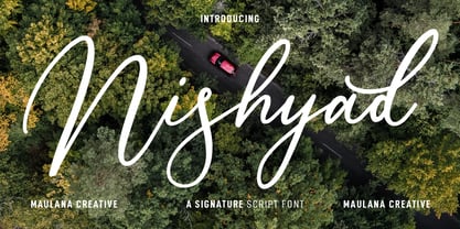 Nisyhad is an unique signature script font. With regular contrast stroke, fun character with a bit of ligatures and alternates. To give you an extra creative work. Nisyhad font support multilingual more than 100+ language. This font is good for logo design, Social media, Movie Titles, Books Titles, a short text even a long text letter and good for your secondary text font with sans or serif. Make a stunning work with Nisyhad font. Cheers, MaulanaCreative
 - Destinys by Maulana Creative,
$14.00 Destinys Script and Sans Font Duo is a modern script and display sans font. With regular marker stroke and bold sans stroke, fun character with some of ligatures. To give you an extra creative work. Destinys Script and Sans font support multilingual more than 100+ language. This font is good for logo design, Social media, Movie Titles, Books Titles, a short text even a long text. Make a stunning work with Destinys Script and Sans font. Cheers, MaulanaCreative
 - Crisp Cracks by Maulana Creative,
$11.00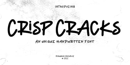 "Crisp Cracks" is a casual Handwritten font. With regular stroke, fun character with a bit of ligatures, lowercase alternates and swashes. To give you an extra creative work. "Crisp Cracks" font support multilingual more than 100+ language. This font is good for logo design, Social media, Movie Titles, Books Titles, a short text even a long text letter and good for your secondary text font with sans or serif. Make a stunning work with "Crisp Cracks" font. Cheers, MaulanaCreative
 - Oblonga by Eurotypo,
$28.00 Oblonga shows thin, elegant lines. The continuity of the trace is only suggested through the curves of the letters, a soft effect of bonding that maintains the identity of each character. Oblonga is an Art-Déco font proposed in a modern key, a revival performed without aggression. More than three hundred glyphs (regular and Italic) that ensure legibility in Central-European and Slavic languages, enriched by some appropriate discretionary ligatures that enhance the charme of a time gone away.
 - Oldion by Locomotype,
$19.00 Oldion is a captivating display font, draws inspiration from the boundless realms of science fiction and modern technology. With its distinctive and futuristic accents adorning each letter, Oldion breathes life and dynamism into your projects. Available in both regular and rounded styles, infuses a touch of innovation and intrigue into your designs. Oldion is your ideal choice for a wide range of creative applications, from commanding movie posters and attention-grabbing headlines to captivating packaging and distinctive logotypes.
 - Argot by K-Type,
$20.00 Argot is inspired by condensed grotesque letterforms and would be a monolinear sans except for an unorthodox disparity between inner and outer shapes. Elegantly curved outlines contrast starkly with austere rectangular counters, suggesting a no-frills functionality, 20th century modernism, or an unsettling discordance. The squared off inner spaces also add clarity and crispness. Argot is available in three widths — Wide, Normal and Narrow. Each width is supplied in three weights — Regular, Bold and Black — with corresponding italics (obliques).
 - Hitshot Signature by Maulana Creative,
$12.00 Hitshot is an expressive signature brush script font. With regular brush stroke, slanted and fun character with some of ligatures and lowercase alternates. To give you an extra creative work. Hitshot font support multilingual more than 100+ language. This font is good for logo design, Social media, Movie Titles, Books Titles, a short text even a long text letter and good for your secondary text font with sans or serif. Make a stunning work with Hitshot font. Cheers, MaulanaCreative
 - MC Rasteira by Maulana Creative,
$16.00 Rasteira is an elegant classical display serif font. Regular contrast stroke, fun character with a bit of ligatures and alternates. To give you an extra creative work. Rasteira font support multilingual more than 100+ language. This font is good for logo design, Social media, Movie Titles, Books Titles, a short text even a long text letter and good for your secondary text font with script or serif. Make a stunning work with Rasteira font. Cheers, Maulana Creative
 - Drawlers by Letterhend,
$14.00 Drawlers is a organic sans with stencil versionthat effortlessly infuses your designs with a touch casual and a dash of classic. Its unique type- maekt it perfect choice for any projects especially in logo, and the other various formal forms such as invitations, labels, logos, magazines, books, greeting / wedding cards, packaging, fashion, make up, stationery, novels, labels or any type of advertising purpose. Features : Regular & Stencil Version Uppercase & lowercase Numbers and punctuation Alternates & Ligatures Multilingual PUA encoded
 - Humanism by Prominent and Affluent,
$30.00 Inspired by the urban typography, which later led to a grotesque style. It can be used for bold editorial statements graphic heavy prints or just as a simple logo. This new type will definitely make your designs stand out and unique. Its robust, strong and contemporary form makes it perfect for any project that needs the extra strength. Humanism is available from A to Z in the regular and italic style, developed in an urban style.
 - Maryam by Outras Fontes,
$24.00 Maryam is an Outras Fontes type family designed by Ricardo Esteves Gomes. With moderate contrast, these fonts have elegant and very legible forms even in small x-height sizes. There are more then 70 ligatures in each font, providing a lot of letterform variations that make this type family looks like a real handwriting on a page. It is currently available in two versions (Regular and Alternate) that you can combine with each other as you wish.
 - Apothecary by Pixel Colours,
$26.00 Apothecary is a modern stylish font duo that includes a sweet flowing script font and a typewriter font made from an authentic typewriting. Combine both fonts to create beautiful logos and branding. Design professional apothecary and botanical labels and packaging or make elegant wedding invitations. Includes: Apothecary regular: a script flowy monoline font Apothecary typewriter: an antique typewriter font perfect for small texts, taglines or info Lowercase and uppercase characters Numerals, alternates and ligatures. Language support
 - Lalalo by Cuda Wianki,
$25.00 Lalalo is a casual, modern sans-serif font family based on hand-lettering. It's oval letter shapes provide soft and friendly appearance. Lalalo font is very legible with a warm touch perfectly suited for children books. Lalalo family consists of 6 weights ( Extra Light, Light, Regular, Semibold, Bold, ExtraBold). You can use it with normal fill or outlined. You can mix various colors and stroke widths to gain interesting results. There is also a set of nice frames available.
 - Greenhorn by Juraj Chrastina,
$29.00 Greenhorn is a hand-traced comic type for headlines. Funky, irregular and smiling. The first inspiration comes from the unique lettering of a classic czech cartoonist.
 - Agrafie by Linotype,
$29.99This typeface was developed by Roland John Goulsbra in 1995. Almost like the printing of a child, the irregular forms of Agrafie make a unique impression. - Roundel by K-Type,
$20.00 Roundel is a paradoxical, modern heraldic typeface. It is a display face of simple, angular and curved shapes, with each main glyph contained within a circle.
 - Cumbre by Antipixel,
$22.00 Cumbre is a slanted display type with unorthodox anatomy, a dynamic rhythmic structure, movement expression, and intense visual language. An eccentric rebel with ribbon-like moves, a balanced extrovert that makes meticulous use of ink traps. Both the name and design got inspiration from mountain peaks. "Cumbre" in Spanish means summit, and that's the motive for the spiked design and the angular serrated structure. Cumbre is built by balancing sharp angles and venturous curves. The stems are spiky, and they vary in width. Cumbre is slanted and unicase. It has condensed proportions, moderate weight contrast, spacious counters, pointy terminals, and square ink traps. Cumbre is meant for large display settings to make the most out of the precise outlines and the clean intersections. The font styles: 'Sharp' has straight paths and precise intersections. 'Round' has the same outlines but with round corners. 'Stamp' has irregular wavy contours and heavy swelling at intersections.
 - Foobar Pro - 100% free

- Turnkey by wearecolt,
$19.00 Turnkey is a modern grotesque typeface, it could be described as a neo-grotesque with hints of geometric shapes. A workhorse typeface designed to be versatile for both small and large sizes, ink traps have been used as a design feature above 26pt and a technical feature when printing small body text. The combination of 36 weights and styles allows you the freedom to create. Each weight includes extended support for over 90 languages (Including Cyrillic), fractions, tabular figures, arrows, ligatures, alternate glyphs, and more. Demo licenses are available from colttypeco.com In addition to a standard style set, the Turnkey family also has an italic set plus soft versions of both. Turnkey Soft is a slightly rounded version of the standard and italic, which looks more friendly, warm, and soft. It's corporate but with a personality. Current instances are: Turnkey Standard - Thin, Thin Italic, Extra Light, Extra Light Italic, Light, Light Italic, Regular, Regular Italic, Medium, Medium Italic, SemiBold, SemiBold Italic, Bold, Bold Italic, Extra Bold, Extra Bold Italic, Heavy, Heavy Italic. Turnkey Soft - Thin, Thin Italic, Extra Light, Extra Light Italic, Light, Light Italic, Regular, Regular Italic, Medium, Medium Italic, SemiBold, SemiBold Italic, Bold, Bold Italic, Extra Bold, Extra Bold Italic, Heavy, Heavy Italic When used as body type, Turnkey pairs well with: Take Note, Stroom and Markout. Turnkey is perfect for; headings, titles, body copy, logos, magazines, editorial design, corporate branding, brand identity, websites, blogs, apps, games, ebooks, publications, and signage. Turnkey can be found in the Typodarium 2024 OpenType features: Access All Alternates, Glyph Composition / Decomposition, Discretionary Ligatures, Denominators, Fractions, Kerning, Standard Ligatures, Localized Forms, Mark Positioning, Mark to Mark Positioning, Numerators, Proportional Figures, Scientific Inferiors, Stylistic Set 1, Stylistic Set 2, Stylistic Set 3, Subscript, Superscript, Tabular Figures. Support for 95 languages: Belarusian, Russian, Ukrainian, Afrikaans, Albanian, Asu, Basque, Bemba, Bena, Breton, Catalan, Chiga, Colognian, Cornish, Croatian, Czech, Danish, Dutch, Embu, English, Esperanto, Estonian, Faroese, Filipino, Finnish, French, Friulian, Galician, Ganda, German, Gusii, Hungarian, Inari Sami, Indonesian, Irish, Italian, Jola-Fonyi, Kabuverdianu, Kalenjin, Kamba, Kikuyu, Kinyarwanda, Latvian, Lithuanian, Lower Sorbian, Luo, Luxembourgish, Luyia, Machame, Makhuwa-Meetto, Makonde, Malagasy, Maltese, Manx, Meru, Morisyen, North Ndebele, Norwegian Bokmål, Norwegian Nynorsk, Nyankole, Oromo, Polish, Portuguese, Quechua, Romanian, Romansh, Rombo, Rundi, Rwa, Samburu, Sango, Sangu, Scottish Gaelic, Sena, Serbian, Shambala, Shona, Slovak, Soga, Somali, Spanish, Swahili, Swedish, Swiss German, Taita, Teso, Turkish, Upper Sorbian, Uzbek (Latin), Volapük, Vunjo, Walser, Welsh, Western Frisian, Zulu
 - BF Garant Pro by BrassFonts,
$39.99 BF Garant™ Pro elegantly balances geometric design with dynamic character! (This Pro-Edition is the fully packed upgrade of the well-known Hot New Fonts #1 BF Garant.) The strict architecture is combined with open counters, tapered spurs and diagonal cut ascenders and descenders that create an open, lively character without denying the straightness of geometry. 10 weights from Thin to Black and matching (oblique) Italics ensure versatile use of the type family. BF Garant Pro’s characters include the extended Latin Unicode range (incl. Vietnamese), Cyrillic and Greek. So it is very suitable for branding and packaging. “The last modern geometric typeface you really need!” The large x-height, dynamic details and some more conventional, humanist-inspired letter alternatives (a, g, k, u, y, G, Q - some of which are grouped together in the style set “Text”), make it not only a contemporary graphic element, but a highly legible timeless design tool, is not only ideal for logotypes or contemporary branding use, but also for modern editorial design. The 1,760 characters per font include ligatures, alternates, line figures and old style figures, small caps, numerals for small caps, fractions, symbols (incl. Peace sign), currencies, different arrows etc. In addition, 23 useful OpenType features make BF Garant™ Pro a workhorse for many typographic applications. With the 11 style sets, BF Garant™ can be fully adapted to the user’s requirements without losing its unique character. And for those who ever wanted to open a bar on Tatooine, BF Garant™ Pro also includes the currency sign of Galactic Credits! Feel the Font!
 - C-Nation by URW Type Foundry,
$39.99 Marit Otto about C-Nation: The building typeface. Although the 70ties were very liberating and progressive, still girls played mainly with dolls and sweet things and boys with all kinds of challenging stuff. They did all sorts of basic scientific experiments in mini labs and of course built cool things with Meccano building sets. As a girl I was perfectly happy with the toys I had access to. But at the same time I was very curious about all the adventure toys and discoveries my brother did. It also made me wonder why the grown up people thought that our world could be separated so easily by separating our toys in pink and blue sections. At this day of age Meccano is probably hopelessly old fashioned and far to manual. Children of today are fed by fast images and cool animations on screen, they learn, play, communicate and relax in the same space, the digital space. The special feature of Meccano was that even though it was very basic there was the promise you could create anything. It might even contribute to a logical mind. The typeface I designed refers to the Meccano feel. It is a creative typeface. A bit masculine and bold looking perhaps but after the first impression a subtle and refined female touch is revealed. It has links to architecture and associations with metal constructions like ‘The Eiffel Tower’ and (old railway) bridges. I am convinced that we all think of that as very charming man-made objects.
 - Zigfrida by Anderson Ruda,
$20.00 Zigfrida Typeface was born from a process of re-designing a logo where, through a grid created, I was developing all its main characters. As the project grew, it was noted that it was necessary not only to limit itself to the Latin alphabet, but also to develop Cyrillic characters. Its possibilities of use are endless, can be used in projects for your favorite sport, signs, posters, large formats, advertising projects, architectural, packaging, titles, among others. The result of all this was the development of a font that has up to 747 glyphs that can understand 100% of Latin languages and the vast majority of countries that use the Cyrillic alphabet. It has unique personality and characteristics that bring a differential to any project it is part of. ----- A Zigfrida Typeface nasceu a partir de um processo de re-design de um logotipo onde, através de um grid criado, fui desenvolvendo todos os seus principais caracteres. A medida que o projeto foi crescendo, observou-se que era preciso não apenas se limitar ao alfabeto latino, mas também desenvolver os caracteres cirílicos. Suas possibilidades de uso são infinitas, pode ser utilizada em projetos para seu esporte favorito, sinalizações, cartazes, grandes formatos, projetos publicitários, arquitetônicos, embalagens, títulos, entre outros. O resultado de tudo isso foi o desenvolvimento de uma fonte que possui até 747 glifos capaz de compreender 100% dos idiomas latinos e a grande maioria dos países que utilizam o alfabeto cirílico. Tem personalidade e característica únicas que trazem um diferencial para qualquer projeto que ela fizer parte.
 - Neuliner by CozyFonts,
$20.00 The Neuliner Family is sleek, condensed, extremely legible & flexible available in 7 styles. The inspiration stems from the classic, slender Art Deco era. Designed with a repeated vertical theme Neuliner is consistent from style to style with variations in weight and character. With over 350 glyphs and applying in over 80 languages with Numerals, Dingbats & Euro accents this family is complete. At the time of its first release Neuliner is available in Medium, Bold, Italic, Outline, Drop, Rough, & Rounded. Other styles are in the works. As displayed in the posters, Neuliner works well, in any style, for headlines, by-lines, logos, titles, posters, signage, billboards, ads, main & end titles, monograms, numbering systems, wedding invites and stationary, etc. The Bold style works congruously with the Outline & Drop styles, for either 'trapped' or 'offset' effects. This family also has its roots and influence in Mid Century influenced architecture and design yet lends its style to contemporary and modern design in the 2020s. The Drop & Rough versions are unique styles that render well in Adobe Illustrator & Adobe Photoshop for use in a myriad of colors and effects. The rough-edged style resembles a stitched and weathered effect, while the drop version plays prominently as headlines in either bright or muted color combinations. The versatile, ever-classic outline style gives any image or photographs an impression of elegance and transparency without sacrificing legibility. Neuliner Rounded embosses and engraves either blindly or foil added with a lasting impression. Neuliner Family from Cozyfonts Foundry.
 - Lexington by Canada Type,
$24.95A revival and major expansion of a 1926 Ludwig Wagner Schriftgiesserei typeface called Titanic, Lexington is the ultimate art deco expression of the high times of signage and theater during the first half of the twentieth century. Big feminine caps and cozy direct minuscules make for a unique combination rarely found in other deco faces. Topped off with the humorous and quite suave tall and pointy ascenders and descenders of the alternates, Lexington makes for a versatile and uniquely eye-catching display face beneficial to poster art, book covers, classy menus, product packaging and music paraphernalia. The original specimen Hans van Maanen worked from showed the majuscules, minuscules, figures, and 4 alternates of some ascending minuscules. This new digital version includes all of the above, plus many more additions: - Plenty more alternates, for some caps as well as for all the ascending and descending lowercase. - Three different size variations for the comma and the period. - Oldstyle figures. - A full complement of accented characters to support more Latin-based languages than ever, including Baltic, Celtic, Turkish, and Central/Eastern European languages. - A Handtooled style variation that covers both the main character set and the alternates. Lexington was named after Manhattan's Lexington Avenue, home of the some of the most famous and polished art deco architecture of the 1920s and 1930s. Lexington and Lexington Handtooled come in all popular font formats. The OpenType versions combine their respective alternates with the main character sets, for ease of use within OpenType-savvy applications. - FS Pele by Fontsmith,
$50.00 Iconic Conjuring memories of chunky typefaces from the late-60s and early-70s, and named after the world’s greatest footballer of that and probably any other era, FS Pele is one of a set of Fontsmith fonts designed specifically for headlines and other prominent applications. “We wanted to create fonts that could be integral to the design of posters, album covers and magazines,” says Jason Smith. Welcome to FS Pele, iconic, like its namesake (though, perhaps, a little less nimble). Big Pele, little Pele There was only one Pele. But there are two sizes of FS Pele. FS Pele One, with the finer counters and details, adds considerable weight and style at large sizes, especially in big block headlines on posters. FS Pele Two’s thicker “slots” make it a better choice for smaller-sized text. A load of blocks FS Pele began as an exercise by Phil Garnham in turning squares into legible letters, via the least means necessary. The idea extended his ideas about logo-making, and the search for a stamp-like brand mark that lends authority, stability and instant identification. “The thought that the type was a 2D/3D jigsaw of slotted, architectural pieces was almost an after-thought. I wanted to create a strong, stacking, block aesthetic for the most contemporary poster design. “At the time there were a lot of designers creating their own versions of the same thing but I wanted to take the blocker forms to the next step, and infer a more legible text without sacrificing the idea.”
 - Encercle Sans by Typodermic,
$11.95 With Encercle Sans, you can create circles and other shapes containing numbers up to 999999. Here's how it works: hold shift and type the number of digits, followed by a number. If you want the number 25, hold shift, type 2 followed by 25. If you want the number 250, hold shift, type 3 followed by 250. You can also type letters, periods, slashes, hyphens, question marks and exclamation points. Create an inverse white-on-black effect using your application's Bold feature. Easily change shapes by selecting a different font style from your application's font menu. Encercle Sans is available in the following shapes. Circle Square Box (wide rectangle) Box with rounded ends (tab) Diamond Circle inside a diamond Hexagon Hexagon rotated Octagon Triangle up Triangle down Triangle right Triangle left Quote bubble with left tail Quote bubble with right tail Quote bubble with no no tail Cloud (thought bubble) Encercle Sans uses OpenType technology. Most current graphic design applications support basic OpenType features but there are a few exceptions including AutoCAD, SketchUp, Solidworks and Canva. Encercle Sans will work in Affinity, Inkscape, GIMP, Adobe apps (not Photoshop Elements), Microsoft apps (not PowerPoint), Sibelius and more. Encercle Sans includes a PDF manual with examples. There's also an advanced feature which allows you to create solid-colored backgrounds. For a thinner, classic architecture/drafting style, check out Encercle Draft. For more complex layered effects with a different selection of typefaces and shapes, check out Numbers with Rings. Encercle PDF user manual.
 - Neuzeit Office by Linotype,
$50.99 The Neuzeit Office family is designed after the model of the original sans serif family Neuzeit S™ , which was produced by D. Stempel AG and the Linotype Design Studio in 1966. Neuzeit S itself was a redesign of D. Stempel AG’s DIN Neuzeit, created by Wilhelm Pischner between 1928 and 1939. Intended to represent its own time, DIN Neuzeit must have struck a harmonious chord. DIN Neuzeit is a constructed, geometric sans serif. It was born during the 1920s, a time of design experimentation and standardization, whose ethos has been made famous by the Bauhaus and De Stijl movements in art, architecture, and design. Upon its redesign as Neuzeit S in the 1960s, other developments in sans serif letter design were taken into account. Neuzeit S looks less geometric, and more gothic, or industrial. Separating it from typefaces like Futura, it has a double-storey a, instead of a less legible, single-storey variant. Unlike more popular grotesque sans serifs like Helvetica, Neuzeit S and especially the redesigned Neuzeit Office contain more open, legible letterforms. Neuzeit Office preserves the characteristic number forms that have been associated with its design for years. After four decades, Neuzeit has been retooled once again, and it is more a child of its age than ever before. Akira Kobayashi, Linotype’s Type Director, created the revised and updated Neuzeit Office in 2006. His greatest change was to retool the design to make its performance in text far more optimal. Additionally, he created companion oblique to help emphasize text.
 - FS Pele Variable by Fontsmith,
$199.99Iconic Conjuring memories of chunky typefaces from the late-60s and early-70s, and named after the world’s greatest footballer of that and probably any other era, FS Pele is one of a set of Fontsmith fonts designed specifically for headlines and other prominent applications. “We wanted to create fonts that could be integral to the design of posters, album covers and magazines,” says Jason Smith. Welcome to FS Pele, iconic, like its namesake (though, perhaps, a little less nimble). Big Pele, little Pele There was only one Pele. But there are two sizes of FS Pele. FS Pele One, with the finer counters and details, adds considerable weight and style at large sizes, especially in big block headlines on posters. FS Pele Two’s thicker “slots” make it a better choice for smaller-sized text. A load of blocks FS Pele began as an exercise by Phil Garnham in turning squares into legible letters, via the least means necessary. The idea extended his ideas about logo-making, and the search for a stamp-like brand mark that lends authority, stability and instant identification. “The thought that the type was a 2D/3D jigsaw of slotted, architectural pieces was almost an after-thought. I wanted to create a strong, stacking, block aesthetic for the most contemporary poster design. “At the time there were a lot of designers creating their own versions of the same thing but I wanted to take the blocker forms to the next step, and infer a more legible text without sacrificing the idea.” - Swarha by Gumpita Rahayu,
$18.00 Built in 1930 - 1935 by Dutch architect Wolff Schoemaker, the Swarha Islamic Building was originally used as a lodging for the honoured guest country and the journalists for Asia-Africa Conference in 1955. This building has an important role as one of Bandung historical art deco heritage, with the art deco typefaces styles on it's singage in this building, giving it a more classic west and east taste. Wolff Schoemaker was trying to combine the elements between eastern and western culture in design. One of his works was the Swarha Islamic Building in a circular design with rounded and high dynamic angle. Unfortunately the Swarha Islamic Building has been abandoned and and less attentioned by the local people itself to preserve this historic building. So I'm trying to raise the value of the historical heritage by creating this typefaces. This typefaces was inspired by the Swarha Building characteristic itself with its solid construction and dynamic, by adding classic taste on each characters. Available in two styles, Neue and Rounded represents the classic architectural Swarha Islamic Building styles with tropical Bandung Art Deco taste. This typeface is highly usable as a display type for your designs, and will fit with movie titles, magazines, your classic shops logo and signage designs, or you can use this typefaces as your web pages headlines. The characters of this typefaces are only in uppercase style, but it built with small caps on the lowercase featured, and additional Opentype Features were loaded, some stylistic alternates, accessible catchwords in the discretionary ligatures, and standard ligatures.
