8,789 search results
(0.033 seconds)
- Labtop - Unknown license

- Futurex - Unknown license

- Futurex Bugz - Unknown license

- Contra Sans by Wiescher Design,
$16.50 Contra Sans is the base of my Contra family of fonts. It has just sufficient contrast to make for easy reading and an interesting appearance.
 - Networkand Family by yasireknc,
$14.00 Description This is Networkand Family. World's best graffiti and non-graffiti marker-styled font ever. Networkand marker font family, carefully selected from hundreds of letters. Signature-styled Networkand Script perfectly fits next to the Networkand Font. Besides all this, the Networkand Swashes Font is designed to customize your designs to another level. You can read Medium article here. FEATURES: Original: Networkand Fonts and swashes created for your special designs. You can turn your dreams into reality and customize them. Unique Creation: An unprecedented experience a creation that no one has ever had before and will uncover your awareness. Create your Brand: Unlike a standard font to create a new brand concept. Be different. Be different in life. Your own. Create your own mark: That’s the most special part of this font. A brand new identity for your personal signatures.
 - SAV PT by Puckertype,
$29.00SAV Display PT is directly inspired from hand-painted commercial signage found around Savannah, Georgia. There is a strong tradition of hand-painted signs adorning small car wash stations, to beauty salons, to mechanics and restaurants. Currently a collection of about four to five painters account for the majority of the signs. This font was derived from 10 uppercase letters that seemed to represent the aesthetic thread found throughout the signs. There are no lowercase letters found in these signs, so the lowercase of the font had to be designed from scratch. I felt this added versatility to the font and its possibilities for usage. This font is strictly a display font. However, because of the apparent roots (intended or unintended) of the lettering to transitional/modern modulated fonts, it does read surprising well at smaller sizes. - ITC Batak by ITC,
$29.99In Northern Sumatra, the crystal clear waters of Lake Toba lap gently against the surrounding mountains. In the middle of the lake sits the island of Samosir, for centuries the secluded home of the Batak people. Visitors arrive by ferry into the tiny town of Tuk Tuk, escaping the heat and humidity of the Sumatran jungle. Throughout the village, restaurants and guest houses are adorned with hand-painted signs in bright colors. Perhaps due to Sumatra's long history of European colonization, the letterforms are reminiscent of those used for posters and handbills in America and Europe at the end of the 19th century, but with a distinctly Southeast Asian flavor. Charles Nix, intrigued by the combination of Victorian fancy and Batak arabesque, photographed, sketched and translated the letterforms into a design that is now ITC Batak. Named for the proud ancestors of Samosir's inhabitants, it is a bold condensed letter with hexagonal serifs - a sort of properly dressed grotesque. Batak is available in either Condensed or Condensed Bold. - Imagine stepping back in time to the bustling streets of a Renaissance-era German marketplace, where the air is filled with the sound of craftsmen at work and the aroma of fresh parchment and ink. Th...
- California Kingston by Crumphand,
$25.00 California Kingston display is a typography design product that is specifically created for use in the headlines, titles, or other prominent text elements of a design. This typeface is often characterized by its bold, attention-grabbing appearance and its ability to make text stand out on a page. The main goal of a California Kingston font display is to create an impact and draw the viewer's attention. This is typically achieved through the use of thicker and more pronounced strokes, unique shapes and design elements, and often, a more stylized appearance. California Kingston displays can be used in a variety of design projects, including posters, logos, packaging, advertisements, and more. They are often paired with complementary fonts to create a well-designed and cohesive visual identity. When choosing a California Kingston font display, it is important to consider the project's overall aesthetic and message, as well as the intended audience. It's also essential to ensure that the font is legible and easy to read, even at smaller sizes. Overall, a California Kingston font display is an excellent way to make a bold statement in a design and to capture the viewer's attention.
 - Wingman by Fontforecast,
$23.00 Wingman consists of nine fonts, that can work together in perfect harmony to create beautiful designs. Like a true wingman they reinforce each others potential and offer mutual support. Wingman Brush takes the lead and is, with its six styles, well equipped for many challenging typographic tasks. All Brush styles (except Brush Extra) have 815 glyphs and are packed with Open Type magic, e.g. contextual alternates, that automatically replace beginning and ending glyphs as you type. There are lots of swashes to choose from, organized in several stylistic sets. The bold and the regular styles have matching shadow versions. Brush Bold and Brush Silhouette fit together also. Nice logo-like effects can be achieved by layering these styles. On top of that Brush Vintage was added for a rustic feel. Brush Extra has 322 design elements in both smooth and vintage style. Wingman Serif was designed to use together with the brush styles. It comes in a solid and outline version. Both fonts can fly solo, but together with Wingman Brush they make a powerful formation. Wingman Family requires the use of an Open Type savvy application.
 - Senkron by Gurup Stüdyo,
$19.00 Senkron is composed of "normal" and a "blok" styles. Senkron ("normal") was designed as a pure and modern neo grotesk font. The anatomy of the letters are designed to achieve an equal text color. For this purpose, the legs of the letters “R” and "K" are designed with a vertical angle to prevent the white space that would occur in the middle of these letters. In the minuscule, the characteristic features of letters such as ‘a’, ‘l’, ‘t’ are concretized and legibility is supported in the text. Considerable attention has been paid to the harmony between the anatomical structures of the letters and the diacritical mark’s structure. Senkron Blok is arranged for situations which have diacritical marks overflow to leadings of the headline and headline typographical color is affected negatively from this situation. For this purpose, majuscule diacritical letters are resolved within the letter height. However, when this is done, new forms are obtained by integrated diacritical marks with letters instead of directly merging them. The idea behind this approach is to preserve the typographic value of diacritical marks and emphasize the semantic value of diacritical letters. 82 letters have been redesigned in this way.
 - Urbani by W Type Foundry,
$25.00 URBANI is the result of a mix between Neohumanist and Neogrotesque types. The subtle narrowness of its proportions makes it ideal for composing extensive blocks of text. The slightly superior height of its ascenders, the wider proportions of its counter-forms, the addition of ink traps at certain stroke intersections; every aspect of URBANI’s design was conceived with reading in mind. The Opentype tool Alternative Glyphs is especially important, since its use is fundamental in achieving a universal and geometrical visual language through the rationalization of the font family. URBANI is inspired upon the works of Adrian Frutiger and Paul Renner, a constant source of admiration and inspiration to W. This type family comes fully equipped with Opentype tools, a huge range of alternate glyphs, fractions, modern and old style numbers, superiors and inferiors, ligatures and smallcaps. Universality is a major goal when it comes to creating our fonts. URBANI is ideally suited for general graphic design, print and digital publications, motion graphics, web design, branding and interaction design. Learn about upcoming releases, work in progress and get to know us better! On Instagram W Foundry On facebook W Foundry wtypefoundry.com
 - Aldero by R9 Type+Design,
$48.00 Aldero™ strives to be as useful to any design environment as Alder trees are to the forest. Wildlife and insects feed on Alder leaves and seeds. The tree also provides shelter for animals in winter while its shades keep streams from getting too hot in summer. The trunks and branches are excellent habitats for lichens and mosses. The nitrogen-rich leaves help fertilize the soil where they landed. Alder’s utilitarian nature inspires us to create Aldero™, a handy, versatile, go-to type family for all professional designers. To achieve what we set out to do, we gave Aldero™ the two-in-one looks, doubled the sets of ligatures, and loaded it with plenty more of Opentype features. We put in long hours, months after months, until we are proud of the outcome. And we truly believe that you will enjoy working with this typeface as much as we do. With five weights, ten styles, and 1,100+ glyphs per style, this versatile typeface comes with virtually two looks. The standard glyph set is perfect for formal, corporate design, while the stylistic alternate set elicits a fun, friendly, and casual feel. You can use each style separately or mix and match them to achieve your design aesthetic. Thanks to these options, a wide range of design possibilities are at your fingertips. In addition to the two large sets of ligatures (for both the standard and the stylistic glyph sets), we also pack tons of Opentype features into Aldero™ to improve your user experience while working with this typeface. To activate the case-sensitive features, for example, highlight the phrase with the type tool, then hit the “All Caps” button; or select each mark, punctuations, or symbols with the type tool, then choose the case-sensitive option from the Opentype popup window. Hope you enjoy working with Aldero™ as much as we do! To find out more about Aldero™ Opentype features and type specimen, please visit https://r9typedesign.com/aldero-features
 - Joanna Sans Nova by Monotype,
$50.99 The Joanna® Sans Nova family is the only typeface in the Eric Gill Series that was not initially designed by Gill. Created by Monotype Studio designer Terrance Weinzierl over a three-year period with digital applications at the forefront of the design criteria, Joanna Sans Nova is a humanist sans serif based primarily on Gill’s original Joanna. The design comprises 16 fonts, from thin to black, each with a complementary italic. Joanna Sans Nova has a larger x-height to ensure high levels of legibility – even on small digital screens. Due to its inherent humanist proportions, Joanna Sans Nova is surprisingly comfortable for longer form reading. Its low contrast in character stroke weights also improves imaging in a variety of environments. In addition, the calligraphic and fluid details enable the roman and italic designs to shine in headlines and other display uses. Joanna Sans features a robust range of OpenType features for fine typography, including small caps, old style figures, proportional figures, ligatures, superscript and subscript figures and support for fractions. With over 1000 glyphs per font, Joanna Sans supports more than 50 languages – in Latin, Greek and Cyrillic scripts. “I've always been a fan of Gill’s work, explains Weinzierl, and found the simple, humanist qualities of Joanna really fitting for a sans serif design. I wanted to make something with Gill flavor, but with more harmony in the extreme weights than Gill Sans – and with my twist on it. I went through six or seven different italic designs before landing on the current direction.” “The original Joanna had a very distinct italic, Weinzierl continues. “It’s very condensed, and has a very shallow angle. I wanted to have an italic that stood out, but in a different way. I took a cursive direction for the italic details, which are wider and slanted more, both improving character legibility.” The Joanna Sans Nova typeface family is part of the new Eric Gill series, drawing on Monotype’s heritage to remaster and expand and revitalize Eric Gill’s body of work, with more weights, more characters and more languages to meet a wide range of design requirements. The series also brings to life new elements inspired by some of Gill’s unreleased work, discovered in Monotype’s archive of original typeface drawings and materials of the last century.
 - Aanaar by Letterjuice,
$66.00 This typeface comes from a self initiated project called Sápmi, which aims to contribute to keep a group of minority languages alive through solving issues in the education environment. This re-thought edition takes the name of Aanaar and joins our library with a bigger character set and two new weights which complete the typeface providing a big typographic palette as well as adding stylistic two-story a and g for more advanced readers as well as to enable the typeface to be used in other environments. The typeface was originally designed for children’s text books. Analysing kid’s typeface design, we identified some important problems and solved them within the boundaries we had. The main concern in a typeface which will be used by children is letter recognition, as they have not yet fully develop their reading skills. For example, letters like “a” and “g” share a very similar structure in this particular kind of typefaces, where the only distinctive part is the descender of the “g”. It is known that the lower part of the letter is the less important feature when reading, therefore we decided to make a clear distinction between them by having an “a” with a spur on the top right. This also helped distinguishing “a” and “o”. Children typefaces usually have one story “a”, making “a” usually too close to “o”. Additionally we moved the joint in “a” upwards and narrowed very slightly the “a” to make sure they cannot be mistaken. More generally, the x-height is fairly tall and the typeface has a bit of movement which give it a good rhythm helping moving along nicely when reading. Aanaar consists of 5 weights (Light, Regular, Medium, Bold and Black) plus two Italics (Light Italic and Italic).
 - Death World by Typefactory,
$14.00 Death World is a fancy display font. It embodies playfulness and authenticity and is the perfect choice for any children activity, fantasy, game font, party invitation, or school project. Add this fun display font to your designs and notice how it makes them come alive!
 - Athellia Script by Lindstrom Design,
$19.00 An upright condensed formal script. Athellia is right at home on packaging, labels, Menus, Headlines, invitations, and title design. NOTE: MyFonts does not display contextual alternates so many of the ‘o’ combinations do not display correctly here but do with open type alternates activated.
 - Norman Stencil by Resistenza,
$39.00 Norman Stencil, is a new Norman. An high contrast, serif and narrow font. 2 styles and 2 weights. Norman Stencil it works perfectly on big texts, logos, headline and others display purposes. Activate your opentype features and you will enjoy all the ligatures and alternates.
 - Digby by Atlantic Fonts,
$26.00 Digby is friendly, honest and active. Digby family includes twelve hand-drawn fonts. They work well together, in fact Digby Line Thin fits nicely over Digby Regular. All have a generous set of double letter ligatures and are designed to work great as all-caps.
 - Aylea by Lafitte 58,
$16.00 Aylea a modern and relaxed display font. It embodies playfulness and authenticity and is the perfect choice for any children activity, school project, Christmas, New Year, Birthday and many more. Add this playful font to your designs and notice how it makes them come alive!
 - Aniara by Gustav & Brun,
$18.00 Aniara is a playful, happy and intergalactic font. Arriving in three different weights, Light, Regular and Bold. + the antagonist; the dark version without the space/counter. Aniara comes with laser shrinked upper case letters. It attacks with a alternative upper and lower case glyph. PoFF!!
 - Airiest by Gassstype,
$23.00 Hello Everyone, introduce our new product Airiest It Is Simple Handwriting Font with a natural feel. This handmade font will make your design has a beautiful natural touch for each details. It is perfect for any design You can activate 11 Ligature glyphs OpenType panel.
 - Schreibweise by E-phemera,
$20.00Schreibweise is a pirate-flavored font inspired by a hand-lettered manuscript dating from 1492. The digital font features numerous traditional blackletter and discretionary ligatures and contextual alternates to help create the feel of genuine hand lettering, and features archaic glyphs including the long s and rotunda r for vintage typography. The font also includes a complete set of small caps. - Brown Pro by Shinntype,
$39.00 At text size, Brown is a classic grotesque, distinguished by its semi-condensed proportions—especially in the capitals, which harmonize well with the lining figures—and an exceptional clarity in certain high-resolution media, such as offset printing, achieved by micro-detailing. At display size, the detailing provides the otherwise austere forms of the neo-grotesque with a subtle wealth of visual interest.
 - Groovy Soumaya by Letterhanna Studio,
$19.00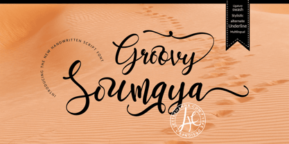 Groovy Soumaya Font is a beautiful and flowing handwritten font. Use it for wall displays, wedding invitations, social media post logos, advertisements, product packaging, product designs, labels, photography, watermarks, invitations, stationery, and any project that requires impressive typography. To achieve that authentic handwritten feel, Groovy Soumaya Font comes with a full set of lowercase alternates as well as 34 ligatures.
 - Bridgewater by GRIN3 (Nowak),
$19.00 Bridgewater is a hand-drawn, brush font with contextual alternates to help with flow and readability. Each letter and number has three variations. When the font is used in OpenType-savvy applications, the 3 variants of glyphs are automatically alternated to achieve a random-like effect. Language support includes Western, Central and Eastern European character sets, as well as Baltic and Turkish languages.
 - Aisle Seats JNL by Jeff Levine,
$29.00The Redikut Letter Company of Hawthorne, California specialized in die-cut cardboard display letters used by sign makers to achieve a three-dimensional effect on show card and display work. A set of these letters purchased by Jeff Levine brought back memories of classic movie houses with their fancy display and lobby cards, and thus was created "Aisle Seats JNL". - Spricker by Mans Greback,
$59.00 Spricker is where contemporary design meets typographical precision. With slab serifs anchoring its design, this typeface achieves a striking balance between robust weight and delicate hairline thin strokes. Every character is a study in contrast, yet the ensemble delivers undeniable legibility. Its unique letterforms bring a fresh flair to the classic structure, making Spricker a standout choice for modern designs.
 - Paquita Pro by Huy!Fonts,
$19.00Paquita was my first foray into the turbulent world of typography. Created in full in about three hours drawing directly into the program, technically speaking was a disaster. Once achieved the highest levels of misery I decided to get serious and after a lot of studies and tweaks, is now in its Pro version on sale in this prestigious store. - Chaos by Zenmurai,
$20.00 Chaos is a caps only modern sans with a geometric and futuristic style touch inspired by “Blade Runner” , “Cyberpunk 2077” , “Ghost In The Shell” and Futuristic UI & Transistor. The difficulty in make Chaos typeface is achieve balance between simplicity and complexity.This font is an exploration of Sci-Fi movies & Futuristic User Interface, using the visual language narratives to catalyze new styles and perception.
 - Artegra Soft by Artegra,
$29.00 Artegra Soft is the round cornered addition to the Artegra superfamily. It's based on the perfectionist geometric forms of Artegra Sans, all the glyphs are softened with round corners with manual corrections to the soft edges. The family has 54 fonts in condensed, normal and extended widths, 9 weights per width with matching true italics to achieve the upmost versatility.
 - Luscombe by Greater Albion Typefounders,
$9.50 Luscombe is a boisterous and lively display face, recalling the shaded and outlined faced much beloved of 1920s poster and advertising artists, while offering a regularity of outline that those faces often did not achieve. Itís ideal for poster and display work, or for signage with a subtle period feel. Mix the two faces to add emphasis where it's needed.
 - Baltasar by GRIN3 (Nowak),
$22.00 Baltasar is a handwritten, brush script with ligatures and contextual alternates to help with flow and readability. Every lowercase letter has three variations. When the font is used in OpenType-savvy applications, the 3 variants of glyphs are automatically alternated to achieve a random-like effect. Language support includes Western, Central and Eastern European character sets, as well as Baltic and Turkish languages.
 - Taurus by Fenotype,
$30.00 Save time and effort – choose your type wisely. Use Taurus and you’ll achieve impact without having to resort to cheap tricks. We have done the work for you: just type out words using Taurus and you’ll have a logo for a Wall Street law firm – or for that precious vintage Barolo. Refinement. Sophistication. Seriousness. Sex appeal. Taurus has it all.
 - Jeremy by GRIN3 (Nowak),
$22.00 Jeremy is a handwritten, brush script with ligatures and contextual alternates to help with flow and readability. Every lowercase letter has three variations. When the font is used in OpenType-savvy applications, the 3 variants of glyphs are automatically alternated to achieve a random-like effect. Language support includes Western, Central and Eastern European character sets, as well as Baltic and Turkish languages.
 - Bergell by ITC,
$29.00Inspired by the work of famed Swiss artist Alberto Giacometti, the German designer Thomas Finke created Bergell, a lively and natural script face. Bergell's calligraphic style is both dynamic and elegant, like the kind of special, festive handwriting many desire, but few ever manage to achieve. Why spend so much time at your drawing table when there are great fonts like this one? - Soft Block by fontgeneration,
$19.00 The letters possess some of the most characteristic features of this type of font, used for communication and advertising in various mechanized and motor sports, as well as in the gaming industry. The technological-engineering constructiveness is achieved through the strict geometry of the forms, and the sporty competitive look is stylistically expressed through the slopes and contrasts of the beams.
 - Moondog Fifteen - Unknown license

- Moondog Thirty - Unknown license

- Schneidler by Bitstream,
$29.99Working for Bauer in the thirties, F.H.E. Schneidler followed Weiss’ lead to provide an alternative. In 1956 he added the companion italic under the name Amalthea.


