9,571 search results
(0.026 seconds)
- Linotype Graphena by Linotype,
$29.99Linotype Graphena is part of the Take Type Library, selected from the contestants of Linotype’s International Digital Type Design Contests of 1994 and 1997. It is a handwriting font designed by the Italian artist Giancarlo Barison. Consciously irregular and erratic, the letters dance across a page, large and small, tilted and erect. Linotype Graphena could be described as angular, restless, even mischievous. It should be set in point sizes no smaller than 12 and is best used for headlines and displays. - Tequendama by JVB Fonts,
$30.00 A display fontface for titles inspired on Latin America, Ethnic, Native, Tribal, Mysthical, Handmade, Aboriginal, Pre-Hispanic, Pre-Columbian, Textured. By mid-1997 I was developed the early type edition was called «Muisca Sans» as my work for the degree in Graphic Design (Universidad Nacional de Colombia), based on the concept of pre-Columbian figures characteristics within some of the very few visual elements recovered from the Muisca culture, ancient pre-Columbian tribe disappeared before the arrival of the Spaniards in what is now central Colombia. In fact, the name of the capital Bogotá (the capital of Colombia) goes back to Bacatá as primary or village downtown of what was once the imperial capital of tribe Muisca. Although this unfinished early typographic project has not yet been published, Tequendama is the evolution of the first one. Tequendama reminds the myth of Muisca culture and religion of this tribe. The god Bochica, a wise old man with a white beard heard the cries of his tribe suffered against flooding of their land losing harvests before the divine punishment resulted by the offended god Chibchacun. However Bochica appeared wearing a white robe sitting on a huge rainbow and he broken the mountain towards the southwest wise old man with a golden staff broke the mountain to drain the flooded savanna. This emblematic and iconic place would later be called as «Salto de Tequendama». Tequendama name also been adopted to a nearby province to Bogotá.
 - PG Gothique Variable by Paulo Goode,
$300.00 IMPORTANT: This is the VARIABLE VERSION of PG Gothique This is my addition to a long line of traditional gothic typefaces. As you can probably tell, PG Gothique Variable is inspired by classics such as Trade Gothic, News Gothic, Franklin Gothic, Alternate Gothic, and Gothic Gothic. Well, maybe not the last one... But Paulo, we have all those already, why would we want to add PG Gothique Variable to our collection? This typeface has many subtle design nuances that differentiates itself from its historical influences. Also, this is possibly the most comprehensive Latin gothic font family released to date. It has 99 default styles that cover pretty much every width and weight you could ever need, while this variable version unlocks options to match your exact style preference – including the angle of italic. PG Gothique Variable is designed to handle a multitude of applications, from branding projects, to titles, body text, user interfaces, and film poster credits. This typeface has a style that will suit the purpose. There are 99 default instances in this family, ranging from Thin to Ultra weights across six widths in both roman and italic. Activate Stylistic Set 1 and you will get the alternate slab-serif-style capital “I” that offers improved legibility when placed adjacent to a lowercase “l”. PG Gothique Variable has an extensive character set that covers every Latin European language. See full details and hi-res examples at https://paulogoode.com/pg-gothique
 - Pauline Didone by insigne,
$22.00 An Art Deco, script inspired typeface for 'modern' times, Pauline Didone is a full type family with a unique and flavorful design. It has a sense of femininity and naïveté that comes from its predecessor, Pauline. It's a typeface useful for short bits of copy, logotypes and interesting titling. This typeface family of 10 different fonts includes 5 weights and their italics and a wide range of OpenType alternates. The original Pauline was inspired by and has a strong influence from retro scripts. The typeface is geometric, formed with deliberate contrasting brush strokes and a ostentatious flair. Pauline Didone's high contrast strokes give it a very interesting look that is up to date with latest design trends and very useful for today's design environment. Pauline Didone pairs nicely with the original sans-serif Pauline. The typeface family also includes a full array of alternate forms, including over 150 alternate characters. These alternates can be accessed by activating OpenType features and style sets. Note: In order to use these OpenType features, you will need a program with advanced typography capabilities such as the Adobe Suite or Quark. These alternates also include a group of ball terminals that can be accessed under the swash alternates. Pauline Didone is the latest in a trusted line of typefaces from insigne. Why settle for the ordinary when you can choose Pauline Didone to lend its unique look to your art work?
 - Bonkard by Twinletter,
$15.00 Bonkard is a font created with great care to meet all of your requirements. Your project will be more flawless if you use this font; everyone will think it’s attractive and charming. We completed this font with standard and thick-thin families, so you may use it for subtitles and text titles because we made it with ease and flexibility in mind for you to use in all types of special projects. Not only that, but the unique shape of each letter is something we pay close attention to so that your customers fall in love at first sight. This graffiti font is great for product logos, poster titles, headlines, packaging, film titles, logotypes, gorgeous writing, and trendy graffiti designs, among other things. Of course, if you utilize this font in your numerous creative projects, they will be perfect and outstanding. Use this typeface right away for your one-of-a-kind and remarkable projects.
 - Bum Steer JNL by Jeff Levine,
$29.00 In older American slang, a "bum steer" is a bad tip, some bad advice or being sent in the wrong direction (to name a few examples). Bum Steer JNL was modeled from some playful hand lettering found on a piece of early 20th Century sheet music entitled "When Uncle Joe Plays a Rag on His Old Banjo". It's very possible that "Hobo" (a popular type design of the time) was a strong influence on the sheet music's style of title lettering. It seems that songwriters in those bygone days were prone to cramming as many words from a line of their song into the title itself. Another such example of a wordy song title which coincidently is in keeping with the theme of a "bum steer" (pun intended) is a novelty number from 1915: "Cows May Come and Cows May Go but the Bull Goes on Forever" (words by Vincent Bryan, music by Harry Von Tilzer). [It's kind of self-descriptive, don't you think?]
 - Al Magensburg by Aluyeah Studio,
$99.00 Hallo alle! Magensburg is an ethnic arches inspired display font. This font was carefully crafted and inspired ethnic arches in the world. In general, it creates a luxurious and mysterious look in design. Coming to you with 160+ stunning alternate to create a perfectly mystical, beautiful, classy, elegant design. Use this font for your fashion brand, resort, cosmetics, invitations, wedding, branding, packaging, magazines, boutique, social media, restaurant, spa, greeting cards, headers, headline and many more. Features: OpenType support Multilingual support (15 languages) PUA Encoded Super Easy to Use alternates - It's OpenType support but you can easly call alternates character using special combination like A.2 R.4 h.8 etc so you dont need special software. To get results like the preview just type M.8ag.3en.3sb.6urg Thanks for checking out my font. I really hope you enjoy using it! If you have any questions I'd be more than happy to answer them, just send me a message!
 - Postea by TypeTogether,
$47.00 The Postea font family is Veronika Burian and José Scaglione’s take on German geometric typefaces, reshaped with the right attributes for setting paragraphs and headings, and perfect for branding and text use. Some typefaces are a rough tool, like a pumice rock: abrasive to the senses, unforgiving, and unhelpful for most reading situations. Postea is an obsidian: smooth and classy, with attractive nuances in any light. The classic curves and purposeful details keep its individuality intact while allowing it to fit an incredible range of geometric font needs. Because of these qualities, Postea makes normal reading in paragraphs a cinch and your branding memorable. Compared to midcentury attributes of restraint and a sparse appearance, Postea’s deliberate play between character widths injects life and distinctiveness into its personality. The default ‘t, f’ have lyrical doses akin to a robust evening drink and are rounded out with a serpentine ‘s’ and rotund ‘o, g, b’. Another nice surprise awaits: spacing for the Hairline weight is tighter for optimal use in large headings and titles, while the regular weights have the expected, slightly looser spacing for text. Setting the test word ‘bogarts’ brings all this together nicely, invoking a balance between a constructed and human feel while brushing away the dust from a century of derivatives. Postea is opinionated and its modern stylistic sets allow it to be accommodating with softer, specially-designed alternative characters. SS01 replaces ‘b, f, M, m, t’, while SS02 changes only the lowercase ‘a’ to the round style, and SS03 swaps out the angled ‘y’ for a straight version. The fourth and sixth stylistic sets are packed with wallpaper-worthy geometric patterns, ornaments, arrows, and symbols aplenty. Postea’s 14 styles (seven upright and italic) and two variable fonts are accompanied by an all-new family of icons in three weights, which we developed a new, easy way to activate. Simply bookend the desired icon name with colons (:arrowUp: :chargingStation: :aid: :firstAid:), making sure to capitalise each word after the first word, then highlight and activate SS05. Icons include wayfinding, social interface, sanitary precautions like face masks, thermometers, and hand washing, and much more. Postea is resilient in the number of ways the family can be used, and its recognisable characters make it a prime selection for branding, signage, corporate typefaces, and magazines. Beginning with midcentury virtues, Postea is the rational response for text — a lyrical take on geometric sans serifs.
 - Joane by W Type Foundry,
$25.00 Joane mixes the elegancy of French didones, calligraphic endings and glyphic serifs, thus its features convey a warm unique style. Moreover, its curves have been beautifully designed, and it also comes with both and engraved and deco versions, which add more versatility to the way it can be used. Joanes is perfectly suited for magazines, branding, advertising, labels, web and packaging. Joane is my first typeface to be published worldwide. To achieve this goal, I received essential help from W team and friends. I personally want to say thanks to Diego Aravena for the patience, good will and learning; for the friendship and support to Franco Jonas and Raúl Meza. Because of their help I could find the treasures at the end of the process. Ale Navarro
 - Bellfort Draw by GRIN3 (Nowak),
$19.00 Bellfort Draw family is a hand-drawn version of the Bellfort family. It features 5 different sub-families: Regular, Rough, Hollow, Dark, Script. Each of these sub-families contains up to three font weights. When the font is used in OpenType-savvy applications, the 3 variants of glyphs are automatically alternated to achieve a random-like effect. When not using the Contextual Alternates feature, you can still pick the alternates in the Glyphs palette or use the alternates available from the keyboard upper and lower case. Bellfort Draw Script is a handwritten, fully connected script with ligatures and contextual alternates to help with flow and readability. Language support includes Western, Central and Eastern European character sets, as well as Baltic and Turkish languages.
 - Letteria Pro by Latinotype,
$29.00 A triple threat, Letteria Pro is a typographic trio designed for branding and packaging. With the soul of a broad nib pen and the grace of a brush, it has five weights and a lot of style. In order to achieve a pragmatic contrast between a composition’s communication levels, we have created a mechanical typeface with only capital letters in sans and slab versions that elude to a De Stijl style. Ligatures and swashes provide a plethora of options, including Thin, Light, Regular, Bold and Black weights, while its companions offer a single weight. Together, this Latinotype original covers more than 200 languages within the Latin alphabet. Yet another powerful tool for your arsenal of fonts that command consumer attention.
 - Umbero by NaumType,
$25.00 Umbero is an experimental geometric blackletter. Umbero was inspired by modern street art (by artists like Pokras Lampas, RETNA, etc.), gothic script and constructivism. It has an ornate and twitchy structure: you can not find two similar letters. Capital letters have even more complex structure, then lowercase, to the extent that you can even use them as initial letters with a different, more calm font if you want to achieve a medieval stylization in a contemporary way. Get Umbero if you need something extra for your design. Or vice versa use it as a starting point of your work. It’s a perfect choice for the mystic or contemporary logos, headlines, oversize typography, branding, identity, website design, album art, covers, posters, advertising, etc.
 - P22 Nudgewink Pro by IHOF,
$39.95 P22 Nudgewink is a funky font family with humorous retro 1960s attitude and crazy bouncy baseline now in four weights (That is one louder!) Each character in the Pro fonts has four different variations accessible with any OpenType friendly application. The "P22 Randomizer" feature makes sure that variations of each letter keep the look of hand lettering with slight variations of up to four versions of the same letter appearing automatically. Along with stylistic alternates, Pro versions include automatic fractions, ligatures, superiors, inferiors, ordinals and a whole bunch of groovy graphic dingbats. With all these options at your disposal, dynamic handcrafted effects can be achieved with just a little bit of goofing around. So check it out, load it up and turn it on!
 - Aviano Sans Layers by insigne,
$19.00 With this charismatic new type system, the possibilities are as large as your vision behind them. Achieve the impact you're looking for by layering the different fonts and colorations for a custom, hand-drawn look that likes to be noticed. Play around with the potential. Create effects such as realistic 3D looks by adding centerlines, dotted centerlines, and shadow variations. Inspired by the affable look of vintage handmade signage, the Aviano Sans Layers spacing accommodates these shadows and other features well with its generous width and helps you hit your message home. Try mixing it with the other members of the Aviano Hyperfamily, too. There are lots of funky options for you to explore. See what you can create with Aviano Sans Layers!
 - Praktika by Fenotype,
$25.00 Praktika Modern grotesk super family Praktika is a multifunctional super family of 40 fonts. It consists of three distinct widths and weights from extra light to extra bold. Conceptually, it is a rendition of the familiar early 20th century European grotesque styles, used in road signage – reimagined to meet the needs of contemporary world. Its design language, however, has been kept decidedly rough and bulky, to achieve a unique-yet-familiar look and feel. Praktika comes with more than a few features, accessible in any open type savvy program. • Built-in small capitals • Both lining and old style numerals, in tabular or proportional form • Superscript and subscript numerals • Many alternate characters For the best experience, purchase the whole family which is available for a good bargain price.
 - Ciutadella Rounded by Emtype Foundry,
$69.00 Ciutadella Rounded is not only a font with soft corners, it has a real rounded terminal across all the weights. It was a challenge to achieve a rounded effect in close counters characters, especially in the heaviest weights where there is less space available to accommodate the round ending. Suitable to be used across a wide range of applications, from identity systems to publications. It is available in Open Type format and includes Alternate Characters (‘a’, ‘t’ and ‘&’), Ligatures, Tabular Figures, Fractions, Numerators, Denominators, Superiors and Inferiors. It supports Central and Eastern European languages. The type family consists of 10 styles, 5 weights (Light, Regular, Medium, SemiBold and Bold) plus italics. For more details see the PDF. See also Ciutadella and Ciutadella Slab.
 - Imperfection by LIGHTDESIGNS,
$9.00 IMPERFECTION Is a hand-written san-serif font inspired by human imperfections (mistakes). This is the first font created by LIGHTDESIGNS. It has no consistency in it's design which made the font looks like a lot of mistakes has been made. But this is done with purpose. With these characteristics, the font is given the name "IMPERFECTION', With surprising font and glyph designs, the intent of this font design is to pass a message that says, "SUCCESS IS NOT THE ACHIEVEMENT OF PERFECTION, BUT THE ACCOMMODATION OF IMPERFECTION™ This font design will be a fit in every design project it is utilised like logos, posters, flyers, magazine, card designs e.t.c. This font can be nicely pairs with script fonts & San serif font.
 - Moho Script by John Moore Type Foundry,
$24.95 Moho Script introduces a decorative modern geometric of Japanese, sometimes german flavor for an unconventional script. It breaks the mold of the usual fonts to create a new visual impact of absolute contemporaneity with a retro touch. Moho Script, as all typefaces of this extended family, comes in five weights and an inline style, and it's been provided with a complete set of glyphs for languages of the Eastern and Western Europe. With the OpenType feature Swash you can make words with letter "t" that overlap to achieve what no meet in others typefaces. Moho Script is a perfect font for headlines display, menus, deals, logos, labels, outdoor advertising and publishing design, great for architecture, fashion, music, aviation and social affairs.
 - Adelbrook by Vibrant Types,
$36.00 Adelbrook is a dynamic serif typeface that keeps calm. It enriches text with the archaic structure of humanist type, because its characters arrange in a harmonious rhythm with a dynamic stroke, asymmetric serifs and stems that lean in the direction of reading. These characters have gravity and are firmly on the baseline. The tapered stems define a heaviness that end in emphasized foot serifs. Actually all the details are heftier the lower they are. This is particularly evident in a subtle vertical hairline variation, light or unapplied head serifs, and clipped upper dots. The clearness of the semi-serif italics with a brushy nature integrates perfectly in a subtle way. All these details result in a sophisticated text typeface with a sharp contemporary design.
 - Parliament by Hoefler & Co.,
$49.99 The Parliament typeface was designed by Jonathan Hoefler beginning in 1995. A burlesque typeface in the Regency Blackletter style, Parliament was inspired by the ‘Four-line Pica Black No. 1’ typeface of William Caslon Jr (1821), whose enigmatic design for the letters E, G, I, N, V and Y hinted at a broader ambition to modernize the arcane shapes of the gothic alphabet’s capital letters. Parliament completes this project for the first time by including two sets of alphabets, one archaic and one modern, along with a third set of ‘small caps’ that restores to the blackletter the versatility of Roman type. Parliament was first used for the 1998 ATypI Conference in Lyon, and was published by Hoefler&Co in 2022.
 - Boboli by Stefano Tonti,
$35.00 The Boboli garden in Florence (16th century) is one of the first examples of Italian renaissance garden, where nature was shaped into geometric beauty; the Boboli font was designed in the same spirit, filtered by a Modernist view. It comes in two sets, Autumn/Winter and Spring/Summer: by mixing them you can compose the typographic season of your choice. From the geometric, minimal Fall/Winter set stem the leaves of the baroque-esque Spring/Summer set, with many stylistic alternatives that allow perfect matching. The two opposite styles merge perfectly, because the leaves are not mere decorations but organic part of the structure, achieved by sampling the curves of the basic glyphs. With Boboli design meets nature, Bauhaus goes greenhouse.
 - Elizabeth by ParaType,
$30.00 The hand composition typeface was developed at the Ossip Lehmann type foundry (St. Petersburg) in 1904-07 (after designs by Alexander Leo?). It was redeveloped at Polygraphmash in 1960s for slugcasting composition. Named after Russian Empress Elizabeth I (1709-61). Based on typefaces of George Revillon type foundry of 1840s, though some characters’ shapes were redrawn similar to Russian Academy of Sciences typefaces (mid-18th century). Sharp contrast, strong weight Modern Serif with archaic flavor. The typeface is useful in text and display composition, in fiction, historical, and art books, especially connected to the 18th or 19th centuries. It looks great in Russian classical literature such as Pushkin and Gogol works. The revised, improved and completed digital version was designed at ParaType in 2001 by Lyubov Kuznetsova.
 - Breakers by Kostic,
$40.00 Breakers is a sans serif originally conceived to be a display typeface. Works great in text also, but the diversity in weights is its strong point. It is easy to achieve that high contrast using thin against the ultra weight, but setting tall and lean capitals against the compact and heavy small caps can make really diverse compositions for all kinds of display design. With small caps included, and over 600 glyphs in each weight, it should prove itself useful in finding the right combination for any typographic setting. Breakers has a character set to support Western and Central European languages, and an extended set for monetary symbols. Each weight includes small caps, ligatures, proportional lining and oldstyle numbers, tabular figures, fractions and scientific superior/inferior figures.
 - Hookline by WAP Type,
$15.00 HOOKLINE Font will be perfect for a variety of projects such as logo & branding, headlines, invitations, posters, flyers, wedding designs, social media posts, advertisements, product packaging, product designs, labels, photography, watermarks, special events or poster titles.
 - Detective Case JNL by Jeff Levine,
$29.00 The cover title for “Private Detective” magazine (from October, 1942) was hand lettered in a stylized, extra bold Art Deco type design which is now available as Detective Case JNL in both regular and oblique versions.
 - Customs Agent JNL by Jeff Levine,
$29.00 The hand lettered, condensed stencil title on a movie poster for the 1950 film “Customs Agent” inspired both the digital typeface and the font’s name. Customs Agent JNL is available in both regular and oblique versions.
 - Wavy Lines by Patria Ari,
$15.00 Introducing Wavy Lines – wave line font in uppercase and lowercase. This font can use to support your project to make design more beautiful. Wavy Lines suitable for book cover, merchandise, poster, title, quotes, and many more!
 - Sangkala by RagamKata,
$14.00 Sangkala is A serif modern and classic typeface that has own unique style & modern look. This typeface is perfect for an elegant & luxury logo, book or movie title design, fashion brand, magazine, clothes, lettering and quotes.
 - Heywa by DawnCreative.Id,
$13.00 Heywa is a nature styled, handwritten font with a mixture of ornaments that adds classic and vintage styles to it. It is very well suited to be used for book titles, bands, movies, advertising, and more.
 - Journalier by Par Défaut,
$20.00 Journalier is display sans serif typeface Perfect for Title and Heading, compose more than 300 characters, multilingual and OpenType features (Numerator, Denominator, Fraction, Superscript, Subscript, OldStyle Figure, Tabular Figure with OldStyle + Currency, Ordinal Lowercase & Discretionary Ligature)
 - Buggy Ride by Jonahfonts,
$35.00 A biform type face, with open & closed rounded forms which give it a different appeal suitable for some interesting titling and short bits of copy. Try using it for small captions, greeting cards, logos and packaging.
 - Galaxia by Mevstory Studio,
$25.00 Galaxia created by Muhammad Afif Ersya is a futuristic modern font that features characters, multilingual, numbers & punctuation. It’s well suited for use in the tech & gaming space for logos, titles, packaging, web design, apps & much more.
 - Snack Shop JNL by Jeff Levine,
$29.00Snack Shop JNL draws its basic influence from the capital letters of Jeff Levine's Two Reeler JNL, but is a bolder, outline design - looking more like sign lettering than a title font from a silent movie. - Honey Spring by Selvia Design,
$14.00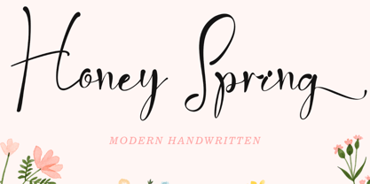 "Honey Spring" is a very natural and elegant handwritten modern font. This font is equipped with lowercase, uppercase, swashes, titling, numerals, punctuations, and multilingual support. Suitable for invitations, weddings, engagements, spring, valentines, and other special occasions.
 - Control spirit by Sulthan Studio,
$12.00 Introducing Control spirit - Bold typeface handwritten font It is suitable for all types of work that you do with various purposes such as logos, wedding invitations, titles, t-shirts, letterheads , signboards, labels, news, posters, badges, etc.
 - Unpretentious JNL by Jeff Levine,
$29.00 Simple, unassuming, yet fully functional in all sign, poster and headline applications is Unpretentious JNL and its oblique counterpart. Where plain, bold titling is necessary, this typeface will draw attention to the message with minimum effort.
 - Scurlock by Scriptorium,
$18.00Scurlock is an original Dave Nalle design. It is a rough-hewn, hand-drawn font with some interesting character. It's excellent for doing unique, eye-catching titles and has a bit of a wicked, fantastical look. - Local News JNL by Jeff Levine,
$29.00 The hand lettered title for the 1954 film “Power of the Press” was done in a condensed sans serif type style that is now available digitally in both regular and oblique versions as Local News JNL.
 - Nouveau Spur JNL by Jeff Levine,
$29.00 The condensed, spur serif hand lettering for the title on the 1906 sheet music cover of “Gee! But this is a Lonesome Town” inspired Nouveau Spur JNL; which is available in both regular and oblique versions.
 - Time Count JNL by Jeff Levine,
$29.00 On the 1966 movie poster for “Seconds”, Saul Bass designed a hand lettered title utilizing a ‘futuristic’ stencil style. This inspired the digital typeface Time Count JNL, which is available in both regular and oblique versions.