9,571 search results
(0.024 seconds)
- Meno Text by Lipton Letter Design,
$29.00 Richard Lipton designed Meno in 1994 as a modest yet elegant workhorse serif family in seven styles. In 2016, he expanded this spirited oldstyle into a 78–style superfamily. The romans gain their energy from French baroque forms cut late in the 16th century by Robert Granjon, the italics from Dirk Voskens’ work in 17th-century Amsterdam. Meno consists of three carefully drawn optical sizes—Text, Display, and Banner, with Condensed and Extra Condensed widths added to the latter two cuts. Steadfast in text settings, Meno is replete with alternate forms, swashes, and other enhancements that showcase Lipton’s masterful calligraphic hand. The series offers a complete solution for achieving high-end editorial typography.
 - Meno Display by Lipton Letter Design,
$29.00 Richard Lipton designed Meno in 1994 as a modest yet elegant workhorse serif family in seven styles. In 2016, he expanded this spirited oldstyle into a 78–style superfamily. The romans gain their energy from French baroque forms cut late in the 16th century by Robert Granjon, the italics from Dirk Voskens’ work in 17th-century Amsterdam. Meno consists of three carefully drawn optical sizes—Text, Display, and Banner, with Condensed and Extra Condensed widths added to the latter two cuts. Steadfast in text settings, Meno is replete with alternate forms, swashes, and other enhancements that showcase Lipton’s masterful calligraphic hand. The series offers a complete solution for achieving high-end editorial typography.
 - Al Harf Al Jadid by Linotype,
$187.99Al Harf Al Jadid is a traditional-style Arabic display typeface. Al Harf Al Jadid Two is an outline version of Al Harf Al Jadid One. Although their design is ultra bold, its forms remain a readable Naskh, in response to the needs of secular lettering for emphatic headlines and signs. Al Harf Al Jadid One and Two are characterized by a distinctive, strong baseline-stroke, reminiscent of a similar hand-rendered technique traditionally used in Arabic calligraphy to achieve a bold appearance. Initially developed as digital fonts by Linotype-Hell Ltd. in the mid-1980s, Al Harf Al Jadid One and Two have remained amongst the most popular heading faces used in Arabic magazine and newspaper publication. - BR Nebula by Brink,
$30.00 BR Nebula is a geometric sans serif that builds on the foundations of early geometric designs such as Paul Renner’s Futura, and later works such as Avant Guarde. BR Nebula takes inspiration from these early explorations in sans serif design and re-imagines them for the modern age. Distinctive geometric letterforms have been refined and simplified with opened terminals to achieve a clear, legible and modern aesthetic. BR Nebula is available in 20 contemporary styles, with weights ranging from Hairline to Super. The fonts also provide advanced typographic support with OpenType features such as case sensitive forms, stylistic alternates, slashed zeros and multiple figure sets. Also containing advanced language support as standard. For custom enquiries please contact: mail@brinktype.com
 - Yoko by Thinkdust,
$10.00 Yoko is a straightforward font with a straightforward message, and an interesting finish. Yoko wants you to enjoy life, live to your fullest and be happy. Yoko understands that it doesn’t look easy, but it can be, and you can achieve it. Straight lines and perfect corners make Yoko’s messages come across simply and openly. There’s no fancy flourishes in what you say with this font, just a goal and a solution. That’s not to say it’s dull though, because the textured finish gives Yoko a depth that carries its own form of weight. The solid impact of the shapes and the rough texture of the finish make Yoko’s message stand out, whatever you choose to say with it.
 - M Gentle PRC by Monotype HK,
$523.99 The design concept of M Gentle is inspired by the aesthetics of ribbon gymnastics and the tenderness of orchids. The beauty of the two are combined in one typeface. Keeping the characters in right proportion and standard structure, its horizontal and vertical strokes (橫、豎) are generally straight. The linkage among dots (點), downstrokes and the ticks (剔) to the right represent a sense of movement and fill the typeface with liveliness and humanity. While M Gentle Light shows purity and softness, Medium and Bold fonts have their own personalities. They are all legible and suitable for a wide range of purposes, make the family a popular choice in the advertising industry.
 - Dunhill Script by Lipton Letter Design,
$29.00 A bit of happenstance and accident are always full of possibility — Richard Lipton’s Dunhill Script is based on observations of the work of his left-handed calligraphy students and then from a small detail generated by his own freehand sketching. Like his other script typefaces, Dunhill was born from the desire to achieve a certain visual drama. Many details show the pen at work, like the terminal shapes and the caps and ascenders. Dunhill also has a range of alternate stylistic glyphs and contextual features that can transform it into a connected script. It’s a great choice for editorial display or advertising and branding settings on its own or paired with a Roman sans or serif.
 - Curwen Sans by K-Type,
$20.00 Curwen Sans is a monoline sans-serif dating from the early twentieth century. Though contemporary with Johnston’s Underground and Gill Sans, and emerging from the same artistic milieu, Curwen Sans was created solely for in-house use at the Curwen Press in London so never achieved a wide audience or recognition. The original face was cut only in a Medium weight, but the new digital family consists of four weights, each with an optically corrected Oblique, and all containing a full complement of Latin Extended-A characters. K-Type Curwen Sans comprises three packages: • Basic Family (Regular, Oblique, Bold, and Bold Oblique) • Light (Light and Light Oblique) • Medium (Medium and Medium Oblique)
 - Novecento Carved by Synthview,
$22.00 Novecento Carved is a layered font family. It is designed to be paired with the 2013 version of Novecento Sans , used as base layer. Each glyph of each style of Novecento Carved (around 18.000) was manually reviewed and adjusted to overcome the limitations of an automatic interpolation algorithm. The minimalism of its construction makes it super easy to achieve a bas-relief or engraving effect just switching luminosity values among the two layers (carved and sans). Novecento Carved was selected and displaying on Typodarium 2018, the 18th of June. Webfont usage: to make Novecento Sans and Carved to align properly, please apply these settings when generating your webfonts: Hinting = native; Line Height Adjustments = native.
 - Zeta by Roy Cole,
$34.00 Zeta was developed by Roy Cole, the British typographer and book designer. It is his second typeface family, completed in 2006, and comprises six fonts. As with his other typeface families - Lina, Colophon and Coleface - Zeta is a sans-serif typeface, particularly notable for its fluidity and strong legibility. Whilst the proportions of Zeta are derived from classical models, the letter forms themselves are totally modern in concept. For example, when used for blocks of text little line spacing is needed to achieve good readability. Zeta is conceived as an easy reading typeface presenting an up-to-date impression wherever it is utilized. Due to its origins it really comes into its own when used for book design.
 - M Gentle HK by Monotype HK,
$523.99 The design concept of M Gentle is inspired by the aesthetics of ribbon gymnastics and the tenderness of orchids. The beauty of the two are combined in one typeface. Keeping the characters in right proportion and standard structure, its horizontal and vertical strokes (橫、豎) are generally straight. The linkage among dots (點), downstrokes and the ticks (剔) to the right represent a sense of movement and fill the typeface with liveliness and humanity. While M Gentle Light shows purity and softness, Medium and Bold fonts have their own personalities. They are all legible and suitable for a wide range of purposes, make the family a popular choice in the advertising industry.
 - dT Jakob by dooType,
$30.00 dT Jakob started as a revival by Gustavo Soares for Paul van der Laan’s class at the Type and Media Masters, in The Hague, NL – back in 2007. There are quite a few excellent geometric sans typefaces available, but we did want to make our contribution and have a fine geometric face to offer. dT Jakob was born out of Erbar, by Jakob Erbar, one of the very first geometric sans, released in metal around 1926. Our goal was to make a versatile typeface, that handles display and text typography beautifully. To achieve that we designed a complete range of weights, matching italics and lots of OpenType Features. Hope you enjoy it :D
 - Bellfort by GRIN3 (Nowak),
$19.00 Bellfort family features 7 different sub-families: Regular, Rough, Press, Shadow, Press shadow, Shadow Only, Script. Each of these sub-families contains up to four font weights. When the font is used in OpenType-savvy applications, the 3 variants of glyphs are automatically alternated to achieve a random-like effect. When not using the Contextual Alternates feature, you can still pick the alternates in the Glyphs palette or use the alternates available from the keyboard upper and lower case. Bellfort Script is a handwritten, fully connected script with ligatures and contextual alternates to help with flow and readability. Language support includes Western, Central and Eastern European character sets, as well as Baltic and Turkish languages.
 - Meno Banner by Lipton Letter Design,
$29.00 Richard Lipton designed Meno in 1994 as a modest yet elegant workhorse serif family in seven styles. In 2016, he expanded this spirited oldstyle into a 78–style superfamily. The romans gain their energy from French baroque forms cut late in the 16th century by Robert Granjon, the italics from Dirk Voskens’ work in 17th-century Amsterdam. Meno consists of three carefully drawn optical sizes—Text, Display, and Banner, with Condensed and Extra Condensed widths added to the latter two cuts. Steadfast in text settings, Meno is replete with alternate forms, swashes, and other enhancements that showcase Lipton’s masterful calligraphic hand. The series offers a complete solution for achieving high-end editorial typography.
 - Fino by TypeTogether,
$35.00 Tall, stately, and refined, with a showy contrast between thick and thin, a certain kind of titling Didone has become synonymous with fashion. Ermin Međedović’s latest type system amplifies the most theatrical aspects of this genre while bringing an uncommon flexibility of style and variation to any type palette — particularly those required for editorial design. Fino is a Rational (or Modern) display serif with sharp details. Its fairly Title proportions produce a regular beat of bold stems at frequent intervals. One can add an unexpected twist to this plot line by introducing the alternate ‘C, D, G, O, and Q’ (found in the uppercase); these replace the standard, Title oval shapes with big, full, show-stopping round ones. Other alternate forms, along with a grand ensemble cast of ligatures, lets the director continually flip the script. This stage is set in three acts: Fino, Fino, and Fino Stencil. Each of these offer six weights and italics, and each actor is comfortable speaking any Latin-based language, from standard Hollywood English to the many accents of Eastern Europe. Finally, every style comes in two optical sizes, with Title having the finest hairlines for the biggest parts. This lets you put Fino to work in a variety of productions, from short texts (24pt–48pt settings) to epic titles. The complete Fino family, along with our entire catalogue, has been optimised for today’s varied screen uses. All these talents let Fino perform a range of roles far broader than your typical Bodoni or Didot.
 - Fino Sans by TypeTogether,
$35.00 Tall, stately, and refined, with a showy contrast between thick and thin, a certain kind of titling Didone has become synonymous with fashion. Ermin Međedović’s latest type system amplifies the most theatrical aspects of this genre while bringing an uncommon flexibility of style and variation to any type palette — particularly those required for editorial design. Fino Sans is a Rational (or Modern) display serif with sharp details. Its fairly Title proportions produce a regular beat of bold stems at frequent intervals. One can add an unexpected twist to this plot line by introducing the alternate ‘C, D, G, O, and Q’ (found in the uppercase); these replace the standard, Title oval shapes with big, full, show-stopping round ones. Other alternate forms, along with a grand ensemble cast of ligatures, lets the director continually flip the script. This stage is set in three acts: Fino Sans, Fino Sans, and Fino Sans Stencil. Each of these offer six weights and italics, and each actor is comfortable speaking any Latin-based language, from standard Hollywood English to the many accents of Eastern Europe. Finally, every style comes in two optical sizes, with Title having the finest hairlines for the biggest parts. This lets you put Fino Sans to work in a variety of productions, from short texts (24pt–48pt settings) to epic titles. The complete Fino Sans family, along with our entire catalogue, has been optimised for today’s varied screen uses. All these talents let Fino Sans perform a range of roles far broader than your typical Bodoni or Didot.
 - Fino Stencil by TypeTogether,
$35.00 Tall, stately, and refined, with a showy contrast between thick and thin, a certain kind of titling Didone has become synonymous with fashion. Ermin Međedović’s latest type system amplifies the most theatrical aspects of this genre while bringing an uncommon flexibility of style and variation to any type palette — particularly those required for editorial design. Fino Stencil is a Rational (or Modern) display serif with sharp details. Its fairly Title proportions produce a regular beat of bold stems at frequent intervals. One can add an unexpected twist to this plot line by introducing the alternate ‘C, D, G, O, and Q’ (found in the uppercase); these replace the standard, Title oval shapes with big, full, show-stopping round ones. Other alternate forms, along with a grand ensemble cast of ligatures, lets the director continually flip the script. This stage is set in three acts: Fino Stencil, Fino Stencil, and Fino Stencil Stencil. Each of these offer six weights and italics, and each actor is comfortable speaking any Latin-based language, from standard Hollywood English to the many accents of Eastern Europe. Finally, every style comes in two optical sizes, with Title having the finest hairlines for the biggest parts. This lets you put Fino Stencil to work in a variety of productions, from short texts (24pt–48pt settings) to epic titles. The complete Fino Stencil family, along with our entire catalogue, has been optimized for today’s varied screen uses. All these talents let Fino Stencil perform a range of roles far broader than your typical Bodoni or Didot.
 - Magnadens by JC Creation Design,
$10.00 Magnadens is a typography with thick, stylish lines that can be particularly suitable for headlines, posters and logos. The main peculiarity of this typography are the slightly arched stems on the edges, which gives it a solid base while maintaining a certain elegance. Some glyphs like the "h" and the alternative "n" or "m" bring a medieval connotation while remaining modern.
 - Feast by Great Lakes Lettering,
$40.00 Feast is a calligraphy style font designed by Alissa Mazzenga. Her hand-sculpted letterforms emanate a powerful, yet delicate presence. Their magic resides in the ethereal movement of fluid wisps of ink, forming soft arched lines and design that stands alone. This hand written style font is based on Alissa's signature calligraphy style and pairs beautifully with fonts like Frosted and Icing.
 - Arshinta by Nandatype Studio,
$13.00 Arshinta is a handwritten, contemporary script with an irregular baseline. It is suitable for use in titles, apparel, invitations, books, stationery design, quotes, branding, logos, t-shirt, packaging design, poster and more.
 - TE Modern by Tharwat Emara,
$7.00 Its one of the modern Arabic fonts, a spontaneous free line characterized by beauty and speed of reading. To be used in advertisements, writing titles, magazines, cartoons, films, serials, comics and plays.
 - Borough Hall JNL by Jeff Levine,
$29.00Picture yourself on a New York subway station platform with the location name set into the tiles on the wall. Borough Hall JNL evokes the feeling of urban industrialism at its best. - Cruise Director JNL by Jeff Levine,
$29.00 The hand-lettered title on the poster for the 1933 musical comedy film “Melody Cruise” was rendered in an Art Deco thick-and-thin style with ‘engraving lines’ placed within the letters.
 - MBF Canno by Moonbandit,
$12.00 A geometric modern with rounded corner sans serif font. This sleek and clean typeface is perfect for futuristic, scifi, technology theme projects. Use canno for poster, headlines, titling, logo and many more.
 - Whoosh JNL by Jeff Levine,
$29.00Whoosh JNL is a basic character set font with no foreign or extra characters. It simulates rapid movement and is perfect for displaying titles that convey rush hour, time constraints or speed. - Mono Flower by Letterafandi Studio,
$12.00 MONO FLOWER is a modern sans serif font. This font is perfect for logos, greeting cards, package design, brand identity, craft designs, any DIY projects, book titles, wedding invitations, packaging, and more.
 - Dioxide by Fype Co,
$16.00 Dioxide typeface classic taste including two styles regular and texture, its authentic and very interesting to make a memorable vintage logo, packaging, poster or title design with a serif and victorian style.
 - Robertina by Letterafandi Studio,
$14.00 Robertina is a Modern handwritten font. That font is perfect for ; logos, greeting cards, a package design, a brand identity, craft design, any DIY project, book title, wedding invitation, packaging and more.
 - Gillray Pro by RMU,
$40.00 Based upon H. Broedel's Hogarth Script, Gillray Pro, an RMU design, comes with two weights: Light and Medium. This formal script font is ideal for invitations, diplomas, certificates, book titles, ads etc.
 - Whitehall JNL by Jeff Levine,
$29.00Whitehall JNL is the serif counterpart to Jeff Levine's Wingate JNL - both are strongly influenced by the Art Deco stylings of such condensed typefaces as Huxley Vertical and other narrow titling fonts. - Lamoreli by AVP,
$19.00Lamoreli is a strong rounded face that provides high impact in a non-aggressive way. It is suitable for display, titling and headlines. It retains integrity even when considerably expanded or condensed. - Cherrine by Solidtype,
$14.00 Cherrine is a handcrafted font. decorative, fun and friendly. Can used for various purposes. such as the title, logo, quotes, invitations, signage, posters, etc. International support for most Western Languages is included.
 - Clarenwood JNL by Jeff Levine,
$29.00 Based on some examples of a Clarendon-inspired wood type design, Clarenwood JNL is a bold and effective titling font which harkens back to old times and advertising on a grander scale.
 - Goostine by Akifatype,
$16.00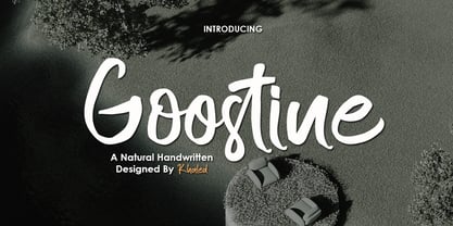 Goostine is a modern handwritten brush font, organic, dynamic and energetic sytle.Can used for various purposes. such as the title, signature, logo, correspondence, wedding invitations, letterhead, signage, labels, newsletters, posters, badges, etc.
 - Ridie by Dealita Studio,
$16.00 Ridie is an elegant display of modern serif with beautiful contrast. Specially designed for fashion-themed projects, perfectly suitable for creating elegant, chic, lifestyle designs such as logos, titles, magazines, and more.
 - Gibrella by Akifatype,
$14.00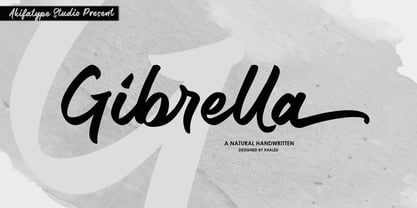 Gibrella is a modern smooth brush font, organic, dynamic and energetic sytle.Can used for various purposes. such as the title, signature, logo, correspondence, wedding invitations, letterhead, signage, labels, newsletters, posters, badges, etc.
 - Moonlit Night JNL by Jeff Levine,
$29.00 The simple, hand lettered sans serif title on the 1935 sheet music for "Campus Moon" was the design model for Moonlit Night JNL, which is available in both regular and oblique versions.
 - Movie Screen JNL by Jeff Levine,
$29.00 The hand lettered opening titles from the 1944 Laurel and Hardy comedy “The Big Noise” served as the inspiration for Movie Screen JNL, which is available in both regular and oblique versions.
 - Western Brushes by Soft Creative,
$14.00 Western Brushes is a modern, organic, dynamic, and energetic brush font. Can be used for various purposes. such as titles, signatures, logos, correspondence, wedding invitations, letterhead, signage, labels, bulletins, posters, badges, etc.
 - Best Spring by Selvia Design,
$15.00 "Best Spring" is a very beautiful and unique handwritten font. Decorated with cute heart balloon shapes on alternative letters. Equipped with uppercase, lowercase, uppercase alternates, swash, titling, numerals, punctuations, and multilingual support.