9,569 search results
(0.019 seconds)
- Archaz Negras by Mans Greback,
$59.00 Archaz Negras strikes a chord with its rough rock band logo aesthetic. Its symmetric and captivating character makes it a fit for movie posters, Halloween invites, or a heavy metal t-shirt that demands attention. Dark, daring, and undeniably striking, Archaz Negras channels the raw energy of death metal and an eerie aura of horror. Designed with precision by Mans Greback, this destroyed font resonates with the rebellious spirit of punk and its haunting allure of the unknown.
 - Orchid Key by Missy Meyer,
$12.00 I built the Orchid Key font family from the ground up with the idea that there would be several different styles; the Inline Spurs style was the first to be built, which let me then subtract the spurs, inline slices, or both to make the other styles. I've never made a font quite like this before, which shows in the time it took - it's been over 5 months since I started construction! Each style contains the same character set, with 700 total glyphs. Each has the usual basics: letters, numbers, and punctuation; plus over 300 extended Latin characters for language support, and almost 200 alternates for tons of variety! There's a swash alternate for every uppercase letter, at least 6 alternates for every single lowercase letter, and a set of 10 extra swashes and flourishes so you can customize! Whether you're looking for a western or country look, a retro look, or a modern hipster look for your project, check out Orchid Key!
 - Serene Orchid by Prestige Artsy Studio,
$19.99 Introducing Serene Orchid a revolutionary new sans serif font! This modern and evolutionary font combines sleek, minimalistic design with the latest technological advancements to create a font that is truly one-of-a-kind. Serene Orchid font offers a wide range of stylistic sets, giving designers and creatives ample options to choose from. From elegant to edgy styles, this font can be used to bring any project to life. The design of this font is inspired by the natural evolution of design and typography. It embraces the latest trends while staying true to the fundamental principles of typography, resulting in a font that is both timeless and contemporary. The unique spacing and letter formation of Serene Orchid font ensures perfect readability and legibility for any project, and its compatibility with all major design software ensures ease of use. Whether you are using this font for brand identity, packaging, editorial design or anything else, this modern and evolutionary sans serif font is sure to make your projects stand out. Try it out today and see the difference for yourself!
 - Purple Orchid by Gie Studio,
$10.00 Are you planning to do an amazing piece of work to make lots of people smile happily while taking your hat off every time? If so, this is the right time to give your work a little touch with a sincere and elegant writing. Introducing Purple Orchid - A Fresh Style Script Font Purple Orchid is a natural handwritten font with a modern signature style and elegant. This font is perfect for you to use for creating handwritten-style logos, wedding stationery, photographer watermarks logos, modern websites, fashion branding, name card, wedding invitation and all the identity of your business products. Purple Orchid includes Multilingual Options to make your branding globally acceptable 83 Languages. Features: Standard Ligatures Multilingual Support 83 Languages PUA Encoded Numerals and Punctuation Special baseline collection Thank you for your visit and downloading premium fonts from Gie Studio
 - Silver Archer by SilverStag,
$14.00 In a world of fleeting trends, Silver Archer stands as a testament to enduring elegance and timeless design. Inspired by the classic sans serif typefaces of the mid-20th century, Silver Archer exudes an air of sophistication and refinement, making it an ideal choice for a wide range of typographic applications. With its meticulously crafted proportions and harmonious stroke contrast, Silver Archer strikes a perfect balance between traditional aesthetics and contemporary sensibilities. Its open counters and generous x-height ensure exceptional legibility, both on screen and in print, while its nine weights, ranging from Thin to Black, with each weight complemented by its italic counterpart, provide ample flexibility to suit any design mood or hierarchy.
 - Archer Display by SilverStag,
$19.00 Introducing Archer Display – a serif font that bridges the realms of tradition and modernity with effortless finesse. This font carries the weight of a bygone era in its high-contrast design and substantial serifs, but it also boasts a captivating contemporary edge with select letters that have been thoughtfully reimagined for a touch of avant-garde charm.
 - Arctic Chunky by Fly Fonts,
$15.00Arctic Chunky is a fun font that is best used at display sizes. - The Archies Typeface by IKIIKOWRK,
$17.00 Proudly present The Archies Typeface, created by ikiiko. A summer mood typeface that has a vintage style & holiday vibes. This typeface is perfect for an holiday greeting, summer camp poster, vacation title, beach & tropical design, and so much more. What's Included? Uppercase & Lowercase Number & Punctuation Ligature Multilingual support Format File : TTF & OTF Works on PC & Mac Get also a good offer & FREEBIE at our site : www.ikiiko.com Enjoy our font and if you have any questions, you can contact us by email : ikiikowrk@gmail.com
 - Arch by Typomancer,
$20.00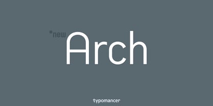
- Arbhie Script by Zane Studio,
$20.00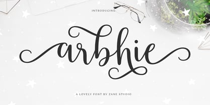 Arbhie Script is a beautiful, modern and new calligraphy font with many alternative styles, swashes make this font look natural, elegant and perfect for extraordinary projects. Arbhie Script is perfect for various projects such as invitations, product packaging, product design, labels, photography, watermarks, logos & branding or whatever. To use beautiful swash, you need a program that supports OpenType features such as Adobe Illustrator CS, Adobe Photoshop CC, Adobe Indesign and Corel Draw.
 - Ubuntu Titling Rg - 100% free

- SW Crawl Title - Unknown license

- P22 Monumental Titling by IHOF,
$24.95 Based on Transitional Roman forms, this tasteful and well crafted Humanist display face exudes an air of authority along with a subtle playfulness. Narrow proportions allow for space conservation. Alternate letterforms & ligatures give this caps-only font expanded possibilities for any given text setting.
 - Gothic Outline Title by URW Type Foundry,
$35.00
- Sacred Geo Tiling by John Moore Type Foundry,
$39.95 SacredGeo Tiling is a Dingbat font that contains a very varied pattern of classical geometry, to play with them and combining to create beautiful backgrounds, decorating pages, posters, covers, or creating lines, repeated or alternating sequences and very useful for creating frames. Due to the wide range of patterns of possible combinations is nearly infinite number of results, especially if you create different layers of colors or shades and blend them or breaking them to be colored in sections.
 - Wild Title Sans by Caron twice,
$39.00 Wild Title Sans is ideal for projects that are intended to be leisurely and relaxed. The font deliberately destroys the principles of restrained fonts, emphasizing unbridled individuality. The distinct notches in the font are enlarged ink traps, which are used for typesetting in small sizes and usually copy the structure of the character. In this case, the ink trap becomes part of the structure of the character, giving the font a strong and original feature. The weight of individual styles is also distinct: the emphasis on the vertical breaks with traditional approaches to posture. This font literally draws attention to itself. Individual styles are suited to a variety of uses, from small-point texts to bold, distinctive headings. Specimen: http://carontwice.com/files/specimen_Wild_Title_Sans.pdf
 - Dusk Till Dawn by Comicraft,
$19.00 The Vampires have risen from their graves! Innocent young virgins (also goats, sheep, sheep dogs, cows and other sundry farmyard animals) may not see out the night. DUSK TILL DAWN has been exhumed, lightly dusted in dry earth and exsanguinated for your convenience. Bury your tombstones in Gothic Chic with a font that may very well be worth dying for. We cannot guarantee you will come back to life however. We waited to unleash this font until the midnight hour, so grab your wooden stakes, silver bullets, crossbows, slingshots and any supernatural weaponry you may have at hand. Garlic capsules and Holy Bibles are also recommended!
 - Eckhardt Titling JNL by Jeff Levine,
$29.00Eckhardt Titling JNL is another treatment of a popular typeface that lends itself well to the hand-lettered sign and display work of days past. A clean sans serif with a slight touch of Art Deco, this font renders well from small point sizes to large posters. As with other fonts in this series, it is named in honor of Jeff Levine’s good friend Albert Eckhardt, Jr. who owned Allied Signs in Miami, Florida from 1959 until his passing. - Film Title JNL by Jeff Levine,
$29.00 A World War II training film had its opening title card “First Aid” hand lettered in a casual, Art Deco sans serif design. This is now available digitally as Film Title JNL, in both regular and oblique versions.
 - Floor Tiles JNL by Jeff Levine,
$29.00In the beginning of his typographic design work, Jeff Levine produced a large number of freeware dingbat fonts utilizing very rudimentary font creation software. Although popular in the world of home crafts, there were many issues inherent with those early font files. Jeff has chosen to clean up and update some of these fonts and make them commercially available. PLEASE NOTE: Refer to the license agreement regarding use of Jeff Levine's art-based fonts. Logos and derivative works made from these fonts are not allowed. - Titling Stencil JNL by Jeff Levine,
$29.00 Titling Stencil JNL is an extra bold stencil treatment of R. Hunter Middleton’s ‘Karnak’ (produced in 1936 for Ludlow) and is a companion font to both Bookkeeping JNL and Bookkeeper JNL (a lightweight version of the type design). Middleton based his ‘Karnak’ family of typefaces on the geometric slab-serif ‘Memphis’, which was designed in 1929 by Dr. Rudolf Wolf and released originally by the Stempel Type Foundry of Germany. According to Wikipedia, ‘Karnak’ was named after the Karnak Temple Complex in Egypt, in reference to the fact that early slab serifs were often called “Egyptians” as an exoticism by nineteenth-century type founders.” Titling Stencil JNL is available in both regular and oblique versions.
 - Quick Titling JNL by Jeff Levine,
$29.00 An ad spotted in a 1960 issue of Billboard magazine promoting a 45 rpm release by Randy Lee doing the old song "Did You Ever See A Dream Walking?" featured the song title in a casual, brush lettered style. While the ad made a perfect model for a digital font design, the record itself tanked. Quick Titling JNL is available in both regular and oblique versions.
 - Type Tiles JNL by Jeff Levine,
$29.00 Type Tiles JNL is based on a ‘completed’ version of ‘Alpha-Blox’ by American Type Founders, circa 1944. The capitals, lower case and numerals shown in the sample sheet put out by ATF depicted type made with five-high blocks comprised of modular units spaced two points apart. These units could be combined in varying ways to create custom type of varying heights and widths and was available for purchase in both linear (multi-line) and reverse (white on black) formats. Using the 'reverse' model shown on the sample sheet, all of the characters were re-created digitally, and missing punctuation, foreign characters and other glyphs found in a basic computer font were drawn and added. The 'J' and 'T' in the type sample had truncations, so a more complete character was created for each of those letters. For those wanting an unbroken string of words or blank end caps, there is a double column space on the vertical bar key. A single column space is located on the broken bar key for shorter end caps. Type Tiles JNL is available in both regular and oblique versions
 - Ingy Star Tilings by Ingrimayne Type,
$9.00 IngyStarTilings allows one to create a variety of patterns that have stars. Some of them are quite common and others less so. A sample file is available that shows possible patterns that can be constructed with this typeface, including some non-star repeating patterns. As the posters indicate, some of the patterns constructed with the regular version are intended to be multicolored.
 - Stylish Title JNL by Jeff Levine,
$29.00 The cover title for the July, 1935 issue of Harper’s Bazaar magazine was hand lettered in a condensed, squared slab serif design with a few stylized characters. This is now available as Stylish Title JNL, in both regular and oblique versions. For many years, each issue of the magazine had its title rendered in different type styles; offering many unique variations to coincide with that month’s cover art.
 - JAF Domus Titling by Just Another Foundry,
$42.00 JAF Domus Titling is a rounded typeface with classical Roman proportions. It is unique in that it was designed as an all-caps sans from the beginning. The fonts range from Extralight to Extrabold and include a large number of accented characters as well as small caps and alternates.
 - OL Subway Tiles by Dennis Ortiz-Lopez,
$30.00 - Title Gothic Light by BA Graphics,
$45.00A very thin light line gothic, great headline face. - Breve Sans Title by DSType,
$50.00 Breve was designed for use in editorial projects. Simple but with enough personality to stand by is own, in a quest for a more forceful and contemporary appearance. All the fonts in Breve superfamily, share the same exact structure, both in terms of anatomy and functionality. The Text versions provide a softer and warm feel to the typographic palette and is intended for use in much longer passages of text, while the Title versions are distinguished by non-descending letterforms, making the titles and headlines much more uniform and interesting. The News version is more classic, with ball terminals and classic proportions, while the Display is, somehow, the set of fonts we had to design: extra-black, ultra-contrasted, proud-display fonts.
 - FB Titling Gothic by Font Bureau,
$40.00Titling Gothic FB is an immense series of nearly fifty styles inspired by that century-old favorite ATF Railroad Gothic. Led by the Los Angeles Times and Gentleman’s Quarterly, U.S. publications are using David Berlow’s series to unify the structure of headlines from its wide spectrum of options. Titling Gothic FB started as a relative of Berlow’s Rhode family, but took its own direction; FB 2005 - Nouveau Titling JNL by Jeff Levine,
$29.00 Sheet music for 1907's "Just A Little Fond Affection" had the song title hand lettered in a simple sans serif design with influences from the then-current Art Nouveau movement. This is now available as Nouveau Titling JNL; available in both regular and oblique versions.
 - LTC Forum Title by Lanston Type Co.,
$24.95 Forum Title was originally designed by Frederic Goudy in 1911. It was intended to be the heading font used for a book set in Kennerley. Based on inscriptional Roman stone cut capitals, this face is true to the early Roman forms which did not have a lower case. Forum exemplifies the classic Roman letterform at its finest. If a lower case were desired, Forum Title can be paired with Goudy Oldstyle for a harmonious hybrid font.
 - LTC Record Title by Lanston Type Co.,
$24.95 Record Title was designed by Frederic Goudy in 1927 as a proprietary commission for the Architectural Record magazine. Based on classic Roman letter proportions, Goudy considered this one of his most successful commissions ever. It is an all caps titling face originally digitized by Jim Rimmer for Lanston in 2001. It was remastered in early 2007.
 - Le Havre Titling by insigne,
$24.00 Throughout time, history’s architects have incorporated some of the finest illustrations of type into their great works--cuneiform on Mesopotamian ziggurats; Greek etched into the temples of the gods; inscriptions marking the monuments of mighty Rome. From these Roman inscriptions specifically, we take our capital letters of today; and while we've lost the need for serifs over time, our current characters maintain the classical foundations, even after being distilled to their simplistic forms. Here’s where we have the basis for Le Havre Titling. This updated face is a carefully optimized version of Le Havre that uses purely capital lettering. Originally inspired by the golden period of the passenger ship and the French port that bid a rich bon voyage to so many famed, luxurious ocean liners of the Roaring Twenties and Thirties, the typeface includes an exciting array of ligatures that brings it into the present day and gives designers a tremendous amount of versatility in their work. With its seven weights, Titling looks equally at home on the side of a building as it does in a finely crafted invitation. With over five hundred glyphs, Le Havre Titling offers a multiplicity of options for your projects. Combine ligatures, play around with two sets of art deco forms, use original caps, and more; every one of these is obtainable with the OpenType functionality. The new design also shares five weights with the original Le Havre, allowing you to maximize your potential through its interchangeability. Titling’s Thin weights are delicate but not too fragile, and its geometric forms give each individual composition you create an exquisite and beautiful sense of emotion. Without a doubt, this fresh, fashionable take on the classical forms offers your reader refined, yet unanticipated approach as he or she travels through your text.
 - Sunrise Till Sunset by Comicraft,
$19.00 Between twilight and daybreak it is said that the dark side of the human psyche eclipses the sun that shines from the depths of our souls. Certainty turns to doubt, clarity becomes confusion, man turns into wolf, the dead wake, vampires seduce the young are restless and milk boils over on the stove. Those that seek only to bathe in the light of a romantic new moon often end their tragic lives soaked in nothing other than their own blood, and the milk spilt on the stovetop has no one left to cry over it. There are fifty shades of grey during those hours after sunset and I think just as many in my porridge this morning. Yes, okay, I admit it, I spoiled the milk! This porridge tastes like it was left in a graveyard overnight. Death warmed over. Gothic and lumpy. Just like the Buried weights of this font.
 - OL Forum Titling by Dennis Ortiz-Lopez,
$40.00 - Skaryna 2017 Title by Koval TF,
$9.98 Skaryna 2017 Title is a revival of the original typeface designed and cut by Francisk Skaryna in 1517–1519. Skaryna 2017 Title is designed to celebrate the 500th anniversary of the original work by Francisk Skaryna (lat. Franciscus Scorina de Poloczko) — scientist and educator from Polotsk (current Belarus). The original designs contain only Cyrillic characters. So Latin and additional characters were added to make the legacy of Francisk available for the World. The revival was designed to stay close to the original and remain a little bit inaccurate as early Renaissance printing technologies were. This project was sponsored by Anton Bryl.
 - Averes Title Roman by Reserves,
$49.00 Averes Title Roman is a high contrast sans titling typeface available in three weights. It features an array of stylistic discretionary ligatures with corresponding accented variants supporting numerous languages. Features include: Discretionary ligature feature Romanian s accent language feature Dutch IJ language feature Polish kreska language feature Slashed zero Ordinals feature Language: Afrikaans, Albanian, Asu, Basque, Bemba, Bena, Catalan, Chiga, Congo Swahili, Cornish, Danish, Embu, English, Esperanto, Faroese, Filipino, French, Galician, Ganda, German, Gusii, Hungarian, Icelandic, Indonesian, Irish, Italian, Jola-Fonyi, Kabuverdianu, Kalaallisut, Kalenjin, Kamba, Kikuyu, Kinyarwanda, Luo, Luyia, Machame, Makhuwa-Meetto, Makonde, Malagasy, Malay, Maltese, Manx, Meru, Morisyen, North Ndebele, Norwegian Bokmål, Norwegian Nynorsk, Nyankole, Oromo, Polish, Portuguese, Romanian, Romansh, Rombo, Rundi, Rwa, Samburu, Sango, Sangu, Sena, Shambala, Shona, Soga, Somali, Spanish, Swahili, Swedish, Swiss German, Taita, Teso, Turkmen, Vunjo, Welsh, Zulu *Requires an application with OpenType and/or Unicode support.
 - Decennie JY Titling by JY&A,
$39.00 - Crane Titling NF by Nick's Fonts,
$10.00This multipurpose display alphabet combines medieval-inspired uppercase letters drawn by famed book illustrator Walter Crane with charming, if somewhat quirky, lowercase letters by J. W. Weekes. The net effect is a typeface which can add style and warmth to any project. Both versions of this font include the complete Unicode 1252 Latin and Unicode 1250 Central European character sets.

