10,000 search results
(0.039 seconds)
- Magistone by Sronstudio,
$18.00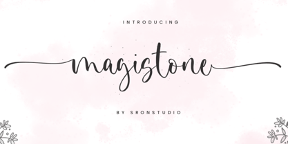 Magistone is a beautiful calligraphy font perfect for crafting, branding, invitation, stationery, wedding designs, social media posts, advertisements, product packaging, product designs, label, photography, watermark, special events or anything. Magistone comes with full set of uppercase and lowercase letters, swash alternates, ligatures,multilingual symbols, numerals and punctuation.
 - Vanilla Baked by Fikryal,
$15.00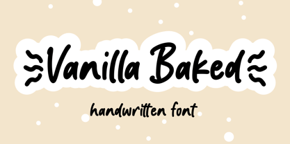 Vanilla Baked is a handwritten font perfect for crafting, branding, invitation, stationery, wedding designs, social media posts, advertisements, product packaging, product designs, label, photography, watermark, special events, or anything. Vanilla Baked comes with full set of uppercase and lowercase letters, ligatures, multilingual symbols, numerals and punctuation.
 - Christmas Dancing by Fikryal,
$15.00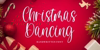 Christmas Dancing is a beautiful handwritten font perfect for crafting, branding, invitation, stationery, wedding designs, social media posts, advertisements, product packaging, product designs, label, photography, watermark, special events or anything. Christmas Dancing with full set of uppercase and lowercase letters, ligatures, multilingual symbols, numerals and punctuation.
 - Changer by Fikryal,
$18.00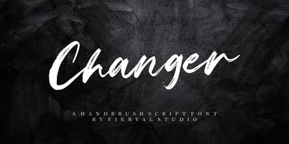 Changer is a hand brush font perfect for crafting, branding, invitation, stationery, wedding designs, social media posts, advertisements, product packaging, product designs, label, photography, watermark, special events, or anything. Changer comes with a full set of uppercase and lowercase letters, ligatures, multilingual symbols, numerals, and punctuation.
 - Skywalker by Dirtyline Studio,
$17.00 Skywalker is a hand brushed typeface, with authentic dry brush imperfections, and a very bouncy baseline It has a perfectly paired complimentary marker font , and a super handy set of bonus Swash. Ideal for logos, handwritten quotes, product packaging, header, poster, merchandise, social media & greeting cards.
 - King Marley by Arsa Visual,
$9.00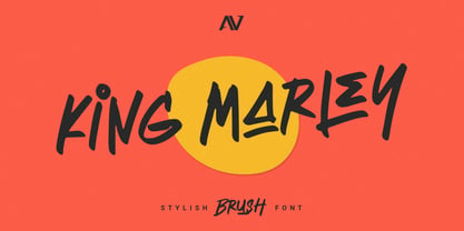 King Marley is a brush font that looks stylish and modern perfect for your modern project. King Marley It contains uppercase, lowercase, ligature and swash. Perfect for branding projects, logo, social media posts, advertisements, product packaging, product designs, label, photography and any projects that need handwriting taste.
 - British Times by Fikryal,
$18.00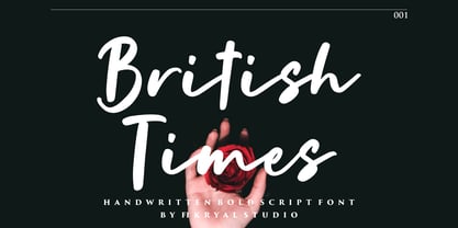 British Times is a handwritten font perfect for crafting, branding, invitation, stationery, wedding designs, social media posts, advertisements, product packaging, product designs, label, photography, watermark, special events, or anything. British Times comes with a full set of uppercase and lowercase letters, ligatures, multilingual symbols, numerals, and punctuation.
 - Margenta by Sronstudio,
$15.00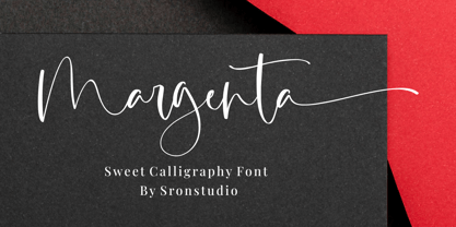 Margenta is a beautiful calligraphy font perfect for crafting, branding, invitation, stationery, wedding designs, social media posts, advertisements, product packaging, product designs, label, photography, watermark, special events or anything. Margenta comes with full set of uppercase and lowercase letters, swash alternates, ligatures,multilingual symbols, numerals and punctuation.
 - Walahard by JprintStudio,
$10.00 Introducing Walahard, Walahard is a sweet, soft handwritten font. Get inspired by its authentic feel and use it to create gorgeous wedding invitations, beautiful stationary art, eye-catching social media posts, and cute greeting cards. Ready to use for projects, texts, letters, or whatever you want!
 - Nestor Quirky Typeface by Hipfonts,
$18.00 Nestor is a retro inspired display typeface that's unique, lovable, and quirky. It's perfect for headlines, advertising, posters, branding, social media, quotes, prints, and much more. If you're in need of a typeface that has groovy curves with a bold personality, then Nestor is for you.
 - Orange Blossom by Fikryal,
$15.00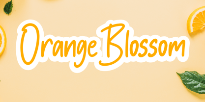 Orange Blossom is a beautiful display font perfect for crafting, branding, invitation, stationery, wedding designs, social media posts, advertisements, product packaging, product designs, label, photography, watermark, special events or anything. Orange Blossom comes with full set of uppercase and lowercase letters, ligatures,multilingual symbols, numerals and punctuation.
 - Kathaline by Fikryal,
$15.00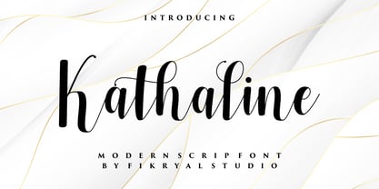 Kathaline is a natural script font perfect for crafting, branding, invitation, stationery, wedding designs, social media posts, advertisements, product packaging, product designs, label, photography, watermark, special events, or anything. Kathaline comes with full set of uppercase and lowercase letters, alternates, ligatures,multilingual symbols, numerals and punctuation.
 - Bastery by Multype Studio,
$13.00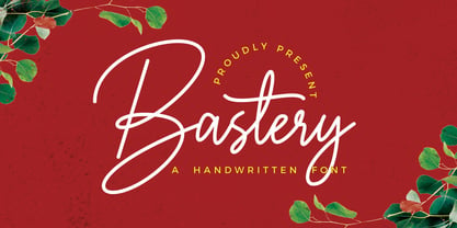 Bastery is a handwritten script font that contain uppercase, lowercase, symbol, number, ligature, and also support multi language. Bastery is perfect for photography, watermark, social media posts, advertisements, logos & branding, invitation, product designs, label, stationery, wedding designs, product packaging, special events or anything that need handwriting taste.
 - Halloween Day by Goodigital13,
$20.00 These font can be used in web design and apps as well as in booklet, posters, or any other printed matter. Halloween, is a display spooky feel font. It’s suitable for dark and Halloween theme. Such as a Poster, Logotype, Social Media Promotion, Merchandise or Crafter.
 - Dearlove by Fikryal,
$16.00 Dearlove is a beautiful calligraphy font perfect for crafting, branding, invitation, stationery, wedding designs, social media posts, advertisements, product packaging, product designs, label, photography, watermark, special events or anything. Dearlove comes with full set of uppercase and lowercase letters, swash alternates, ligatures,multilingual symbols, numerals and punctuation.
 - Calligramy by IbeyDesign,
$16.00 Calligramy Calligraphy Script Font is a unique stylish calligraphy font. It’s perfect for adding a personal charm to your photography, watermarks, social media posts, advertisements, logos & branding, invitations, product designs, labels, stationery, wedding designs, product packaging, special events, or anything that need calligraphy or handwriting taste.
 - Yellow Spring by Sakha Design,
$10.00 Yellow Spring is a fresh and vibrant handwritten font that radiates a cheerful and youthful energy. Its organic and imperfect shapes create a natural and authentic look, making it perfect for logos, social media graphics, and packaging designs that aim to convey a fun and friendly vibe.
 - Toykids by Sakha Design,
$10.00 Toykids is a playful and stylish font with a youthful spirit. Is suitable for both professional-looking projects such as branding designs, labels, websites, and business cards as well as casual designs like packaging, posters, flyers, quotes, social media posts, invitations, and special occasions cards, etc
 - Haunted Brick by LetterStock,
$20.00 Introducing “Haunted Brick” – The Spooky Halloween Decorative Font Dive into the eerie world of “Haunted Brick,” a spellbinding decorative Halloween font that will send shivers down your spine. Perfect for crafting captivating Halloween posters, invitations, and chilling social media posts, this font boasts a unique hand-drawn style adorned with intricate spider webs in every glyph. Key Features: Spine-Chilling Elegance: “Haunted Brick” strikes the perfect balance between elegance and the macabre, adding a spine-chilling touch to your Halloween designs. Creepy Creativity: Whether you’re conjuring up posters, eerie invitations, or haunting social media content, “Haunted Brick” lends an air of mystery and excitement to your projects. Intricate Spider Webs: Every character in “Haunted Brick” is intricately adorned with spider webs, ensuring that your text is truly one-of-a-kind and perfect for all things Halloween. Why Choose “Haunted Brick”: – Elevate your Halloween designs with a font that’s both spooky and stylish. – Craft invitations that send shivers down the spines of your guests. – Create captivating posters that will haunt the memories of those who see them. – Perfect for adding a dose of horror to your social media posts. Embrace the Spookiness – Download “Haunted Brick” Now!
 - The font named "Kids" by Corel Corporation encapsulates the whimsy and creativity of childhood with its playful and cheerful design. Crafted to embody the essence of youthful handwriting, this font f...
- John Sans by Storm Type Foundry,
$49.00 The idea of a brand-new grotesk is certainly rather foolish – there are already lots of these typefaces in the world and, quite simply, nothing is more beautiful than the original Gill. The sans-serif chapter of typography is now closed by hundreds of technically perfect imitations of Syntax and Frutiger, which are, however, for the most part based on the cool din-aesthetics. The only chance, when looking for inspiration, is to go very far... A grotesk does not afford such a variety as a serif typeface, it is dull and can soon tire the eye. This is why books are not set in sans serif faces. A grotesk is, however, always welcome for expressing different degrees of emphasis, for headings, marginal notes, captions, registers, in short for any service accompaniment of a book, including its titlings. We also often come across a text in which we want to distinguish the individual speaking or writing persons by the use of different typefaces. The condition is that such grotesk should blend in perfectly with the proportions, colour and above all with the expression of the basic, serif typeface. In the area of non-fiction typography, what we appreciate in sans-serif typefaces is that they are clamorous in inscriptions and economic in the setting. John Sans is to be a modest servant and at the same time an original loudspeaker; it wishes to inhabit libraries of educated persons and to shout from billboards. A year ago we completed the transcription of the typefaces of John Baskerville, whose heritage still stands out vividly in our memory. Baskerville cleverly incorporated certain constructional elements in the design of the individual letters of his typeface. These elements include above all the alternation of softand sharp stroke endings. The frequency of these endings in the text and their rhythm produce a balanced impression. The anchoring of the letters on the surface varies and they do not look monotonous when they are read. We attempted to use these tricks also in the creation of a sans-serif typeface. Except that, if we wished to create a genuine “Baroque grotesk”, all the decorativeness of the original would have to be repeated, which would result in a parody. On the contrary, to achieve a mere contrast with the soft Baskerville it is sufficient to choose any other hard grotesk and not to take a great deal of time over designing a new one. Between these two extremes, we chose a path starting with the construction of an almost monolinear skeleton, to which the elements of Baskerville were carefully attached. After many tests of the text, however, some of the flourishes had to be removed again. Anything that is superfluous or ornamental is against the substance of a grotesk typeface. The monolinear character can be impinged upon in those places where any consistency would become a burden. The fine shading and softening is for the benefit of both legibility and aesthetics. The more marked incisions of all crotches are a characteristic feature of this typeface, especially in the bold designs. The colour of the Text, Medium and Bold designs is commensurate with their serif counterparts. The White and X-Black designs already exceed the framework of book graphics and are suitable for use in advertisements and magazines. The original concept of the italics copying faithfully Baskerville’s morphology turned out to be a blind alley. This design would restrict the independent use of the grotesk typeface. We, therefore, began to model the new italics only after the completion of the upright designs. The features which these new italics and Baskerville have in common are the angle of the slope and the softened sloped strokes of the lower case letters. There are also certain reminiscences in the details (K, k). More complicated are the signs & and @, in the case of which regard is paid to distinguishing, in the design, the upright, sloped @ small caps forms. The one-storey lower-case g and the absence of a descender in the lower-case f contributes to the open and simple expression of the design. Also the inclusion of non-aligning figures in the basic designs and of aligning figures in small caps serves the purpose of harmonization of the sans-serif families with the serif families. Non-aligning figures link up better with lower-case letters in the text. If John Sans looks like many other modern typefaces, it is just as well. It certainly is not to the detriment of a Latin typeface as a means of communication, if different typographers in different places of the world arrive in different ways at a similar result.
 - ALS Direct by Art. Lebedev Studio,
$63.00 ALS Direct is an open and dynamic typeface with clear-cut letterforms that make it instantly readable. It lends text a neutral, yet agreeable and modern feel. Direct has nine font styles convenient for the purposes of navigation signage. Regular-style letterforms are rather wide, because direction signs are likely to appear before readers at an angle, so the type needs to withstand perspective distortions. And as signs and boards may vary in size, Direct was developed to include several width variations. Condensed fonts can be used where horizontal space is limited, allowing you to keep proper height and readability of the characters. A signage typeface must be easily readable from some distance away and have simple letterfoms with clear-cut features to quickly identify characters. Designing a type for a potentially wide range of purposes calls for a universal approach. If not destined to be used for navigation in a particular building, it shouldn’t incorporate any peculiar elements to agree with certain design or architecture. All of the above determined our choice of a sans serif with large apertures and definite features allowing readers to instantly recognize letters. Descenders are made compact not to interfere with the line below. And the low contrast between thick and thin strokes renders all elements equally perceptible. The x-height is significant, close to the cap height, which inhances readability of the lowercase type. There are two reasons why directions must not be set in all caps. Firstly, lowercase letters are more diverse and include ascenders and descenders identifying some of the letters in the line. And secondly, having learned to read, people recognize word shapes rather than individual letters, which makes lowercase text more readable. With Direct being a signage typeface, first to be developed were its width variations, and different weight styles and italics were added later. Another thing to be kept in mind was that signs often use dark background colors, and black type on a white background appears smaller than white type on a black background. Direct is the first Cyrillic typeface created for navigation purposes. Before that, designers could use the Cyrillic version of Frutiger (Freeset) developed by Adrian Frutiger for the Paris Charles de Gaulle International Airport, and a number of other, mostly body copy, neutral sans serif types. However, signs and boards were dominated by Arial, which Direct would be glad to replace offering elegance and lucidity of form instead of type bluntess. Direct was designed as a signage typeface, but its neutral style and clear-cut letterforms suggest various other ways of application.
 - Gradl Initialen ML by HiH,
$12.00 Max Joseph Gradl designed Art Nouveau jewelry in Germany. At least some of his designs were produced by Theodor Fahrner of Pforzheim, Germany -- one of the leading manufacturers of fine art jewelry on the Continent from 1855 to 1979. I don't know if he designed for Fahrner exclusively, but every example I found was produced by that firm. I assume it was also the same M.J, who edited a book, Authentic Art Nouveau Stained Glass which was reissued by Dover and is still available. For an artist as accomplished as Gradl was, he is very tough to research. There just does not seem to have been much written about him. The jeweler is visible in most of his typeface designs. They exhibit a sculptural quality as if they were modeled in clay (or gold) rather than drawn on paper. His monograms, especially, reflect that quality. Those shown in plates 112 through 116 in Petzendorfer actually appear to have been designed specifically for fabricating in the form of gold or silver pendents. Of the initial letters that came out of Germany during this period, these by Gradl seem unusually open and lyrical. They seem to be dancing on the page, rather than sitting. Please note that Gradl designed only the decorated initials. All other characters supplied were extrapolated by HiH, including the accented initials. Orn.1 (unicode E004) is based on a jeweled gold clasp designed by Gradl (please check out Gallery Image on Myfonts.com). Also included are an art nouveau girl’s face, a swan and the face from Munch’s “Scream”, from scans of old printer’s ornaments. Gradl Initialen M represents a major extension of the original release, with the following changes: 1. Added glyphs for the 1250 Central Europe, the 1252 Turkish and the 1257 Baltic Code Pages. Added glyphs to complete standard 1252 Western Europe Code Page. Special glyphs relocated and assigned Unicode codepoints, some in Private Use area. Total of 341 glyphs. Both upper & lower case provided with appropriate accents. 2. 558 Kerning Pairs. 3. Added OpenType GSUB layout features: salt, dlig, ornm and kern. 4. Revised vertical metrics for improved cross-platform line spacing. 5. Refined various glyph outlines. 6. Alternative characters: 16 upper case letters (with gaps in surrounding decorations for accents above letter). 8. Four Ornaments: face1, face2, swan and orn1 (silhouette of Gradl clasp) The zip package includes two versions of the font at no extra charge. There is an OTF version which is in Open PS (Post Script Type 1) format and a TTF version which is in Open TT (True Type)format. Use whichever works best for your applications.
 - Bomberg Display Serif by iframe,
$32.00 Bomberg Display Serif Font Immerse yourself in the world of art and typography with Bomberg Serif Font by iframe type foundry. Inspired by the legendary David Bomberg's iconic painting, "The Mud Bath." Just as Bomberg's brush strokes conveyed raw emotion and creativity, our font captures that very essence in each meticulously crafted letterform. With Bomberg Serif Font, your designs transcend the ordinary, taking on a unique and expressive character. Like the vivid colors of "The Mud Bath," our font injects vibrancy and depth into your projects. Whether you're a designer seeking to infuse artistic flair or an artist searching for the perfect typographic medium, this font lets you channel the spirit of Bomberg's masterpiece into your work. Unleash your creativity, tell your story, and make your designs a work of art with Bomberg Serif Font. Explore the intersection of artistry and typography today! Design by iframefonts.com
 - Ciutadella Slab by Emtype Foundry,
$69.00 The family keeps growing, Ciutadella Slab is the ‘serif’ counterpart of the popular Ciutadella font. The former alternate characters like 'a', 't' and '&' are now the default ones (and the former default characters are now the alternates), giving way for a typeface more suitable for texts. Thus, the new Ciutadella Slab is not only a great headline family, it will also work in texts of intermediate length and size. Especially appropriate for magazines, brochures or branding. This new addition provides even more versatility to the family started with Ciutadella and Ciutadella Rounded. It is available in Open Type format and includes Alternate Characters, Ligatures, Tabular Figures, Fractions, Numerators, Denominators, Superiors and Inferiors. It supports Central and Eastern European languages. As the sans version, the type family consists of 10 styles, 5 weights (Light, Regular, Medium, SemiBold and Bold) plus italics. For more details see the PDF.
 - Valentina SG by Spiece Graphics,
$39.00 Here’s what happens when your trusty felt tip marker takes a trip to cartoonland. Each of Valentina’s plump characters has a rough and splotchy texture. Some letters even bounce up and down like a 3-year old. As cartoon faces go, Valentina is a bit on the imperfect side. But that’s normal for a funny face. Use it in a variety of comical situations. Make convincing captions under your own artwork or design greeting cards with it. You can even blow it up to huge sizes to create a wild and crazy look. Valentina Medium is now available in the OpenType Std format. Some new characters have been added to this OpenType version as stylistic alternates. This advanced feature works in current versions of Adobe Creative Suite InDesign, Creative Suite Illustrator, and Quark XPress. Check for OpenType advanced feature support in other applications as it gradually becomes available with upgrades.
 - Core Sans A by S-Core,
$19.00 Core Sans A Family from S-Core is a modern sans-serif typeface that is clean, simple and highly readable. It is a part of the Core Sans Series (Core Sans N SC, Core Sans N, Core Sans NR, Core Sans M and Core Sans G). Letters in this type family are designed with genuine neo-grotesque and neutral shapes without any decorative distractions. The spaces between individual letter forms are precisely adjusted to create the perfect typesetting. Core Sans A family consists of 8 weights (Thin, Extra Light, Light, Regular, Medium, Bold, Extra Bold, Heavy) with their corresponding italics. Core Sans A contains complete Basic Latin, Cyrillic, Central European, Turkish, Baltic character sets. Each font includes proportional figures, tabular figures, numerators, denominators, superscript, scientific inferiors, subscript, fractions and case features. We highly recommend it for use in books, web pages, screen displays, and so on.
 - Juxta by NaumType,
$19.00 Juxta is a unique experimental and futuristic script. It was born from the idea to combine two antipodes: programming fonts aesthetics and handwritten script. Juxta has witty and jagged character combined with a perfect grid structure and certain decorative elements, such as cross out letters, that gives it the spirit of Nordic minimalistic design. Juxta script is a part of Juxta superfamily, united by the same aesthetics, which currently also includes Juxta sans. Juxta script is available in 7 weights, including Thin, Light, Regular, Medium, SemiBold, Bold, and Black. It is a potential leitmotif of graphic design projects that need a creative breakthrough, including logos, labels, branding, identity, website design, album art, posters, advertising. Juxta offers standard ligatures, contextual and stylistic alternates. It extends multilingual support to Basic Latin, Western European, Euro, Catalan, Baltic, Turkish, Central European, Pan African Latin, Afrikaans, and Basic Cyrillic for exceptionally far-reaching global accessibility.
 - Octagen Condensed by deFharo,
$11.00 Octagen is a family of 16 condensed Sans Serif fonts of geometric construction and neo-Gothic style with short descenders and a humanistic finish in the curves and auctions of the tiny letters to avoid the coldness of the grotesque typographies, providing expressiveness, energy, warmth and docility , resulting in a friendly typography with a lot of personality and readability, specially drawn for the composition of short and medium texts, signage or headlines where horizontal space saving is needed. The typography has 529 glyphs (Latin Extended-A) with advanced OpenType functions, several number games, a complete set of neutral-style alternative lower case letters and the Bitcoin symbol. For Octagen cursive styles I used a set of lowercase letters without terminal finishes, more neutral than the regular versions, this being compensated by the expressiveness of the italics inclination, thus achieving important morphological, coherent differences within the conceptual development of this typographic family.
 - Kurri Island by Mans Greback,
$29.00 Kurri Island is a positive sans-serif typeface. It was drawn and created by Måns Grebäck between 2017 and 2020. With its slightly irregular strokes and bends the font has a characteristic fun and comical and look. The sans is easy-going and relaxed while being serious enough to be used professionally. Kurri Island is an extensive multi-style font family, composed of 24 high quality fonts. The weights are Thin, Light, Regular, Medium, Bold and Black. Being favorably used as a block letter sans-serif, it has an additional Caps style to maximize the impression, and each font are provided as Italic. Its range of styles gives the typeface great flexibility, while also giving the ability to emphasize phrases or words. Kurri Island contains all characters you'll ever need, including all punctuation and numbers. It has an extensive lingual support, covering all European Latin-based scripts.
 - Cute Letters by Harald Geisler,
$68.34 Cute Letters is a hand drawn font family in two styles with extensive character sets. Cute Letters - Hearted is a vibrant happily singing script, all capital as well as some lowercase letters are decorated with heart shapes. Second: Cute Letters - Heartless is still as vivid as it’s sister Hearted but a little less briskly, some straightened forms and without the decorative hearts. Both styles are readable and suitable for longer texts in medium point sizes. Cute Letters Hearted & Heartless is a part of the Light Hearted Font Collection that is inspired by a recording of Jean Baudrillard with the title, "Die Macht der Verführung" (The Power of Seduction) from 2006. Further inspiration came from the article, "The shape of the heart: I'm all yours". The heart represents sacred and secular love: a bloodless sacrifice. by British writer Louisa Young printed in EYE magazine (#43) London, 2002.
 - Rijk by Wilton Foundry,
$39.00 The font name comes from the Dutch word "Rijk" meaning "rich". I'd like you to consider Rijk as a good Pinot Noir: medium bodied, offering succulent juicy berry flavors, accentuated by delicate aromas of coffee and vanilla oak. Ruby red in color, it boasts of velvety tannins and a long fulfilling fruity aftertaste. Rijk has a structure that is delicate and fresh. The aromatics are very fruity like cherry, strawberry, and plum, often with notes of tea-leaf, damp earth, or worn leather… My intent was to create a script that is rich, while not overbearing. It will serve many noble and useful purposes because of its fresh and lively texture. It is also very legible because it has a slightly more upright angle. Use Rijk for headlines, packaging, identities, advertising and online. Available in OpenType, it includes a range of ligatures as well as a full range of class kerning.
 - Sweet Revenge PS by pentagonistudio,
$14.00 Sweet Revenge Is A Modern Family Font Serif Including 8 Font Style. Font Features : Sweet Revenge Thin OTF/TTF/WOFF/WOFF2 Sweet Revenge Extra Light OTF/TTF/WOFF/WOFF2 Sweet Revenge Light OTF/TTF/WOFF/WOFF2 Sweet Revenge Regular OTF/TTF/WOFF/WOFF2 Sweet Revenge Medium OTF/TTF/WOFF/WOFF2 Sweet Revenge Semi Bold OTF/TTF/WOFF/WOFF2 Sweet Revenge Bold OTF/TTF/WOFF/WOFF2 Sweet Revenge Extra Bold OTF/TTF/WOFF/WOFF2 SOFTWARE REQUIREMENTS : Fonts and alternate : No special software required they may be used in any basic program /website apps that allows standard fonts That's it folks! You can go ahead and get cracking :) Follow My Shop For Upcoming Updates Including Additional Glyphs And Language Support. And Please Message Me If You Want Your Language Included or If There Are Any Features or Glyph Requests, Feel Free to Send me A Message. Have a Good Day !
 - Cruell by VP Creative Shop,
$20.00 Introducing Cruell Serif Typeface - 5 fonts Cruell is clean, luxury typeface with 5 fonts loaded with ligature glyphs, alternates and multilingual support to enchant your next project. Very versatile fonts that works great in large and small sizes. Cruell is perfect for branding projects, home-ware designs, product packaging, magazine headers - or simply as a stylish text overlay to any background image. Uppercase, numeral, punctuation & Symbol Light Regular Medium Bold Black ligature glyphs alternates Multilingual support How to access alternate glyphs? To access alternate glyphs in Adobe InDesign or Illustrator, choose Window Type & Tables Glyphs In Photoshop, choose Window Glyphs. In the panel that opens, click the Show menu and choose Alternates for Selection. Double-click an alternate's thumbnail to swap them out. Feel free to contact me if you have any questions! Mock ups and backgrounds used are not included. Thank you! Enjoy!
 - Finador Slab by Julien Fincker,
$24.00 Finador Slab is a soft slab-serif family. It has a strong character and can be used for a lot of cases, especially for editorial, branding, packaging and logos. The Slab version is based on the Finador Sans version. It matches perfectly and can be used easily together. The Finador Slab family includes 8 weights, from thin to heavy + their matching italics. With 900+ glyphs per style it supports over 200+ latin based languages, includes an extended currency symbol set and a lot of Open Type Features like small caps, ligatures, fractions, alternates and many more. The lightest and boldest weights are good for display usage, while the middle weights can be also used for body text. Finador Slab supports almost every of your needs. It meets all the requirements to become your next favorite workhorse family. So just give it a try. The Medium weight is for free.
 - Capraia by CAST,
$45.00 Capraia is a book typeface, with a heavily quirky look when shown at big sizes, and with an irregular but attractive rhythm at text sizes. Capraia Book and Regular are designed specifically for continuous texts: Book meets a current preference of Italian publishers for lighter faces, while the slightly heavier Regular is intended for the wider international market. True to its vocation for publishing, Capraia has a big x-height, medium contrast and wide bracketed serifs. Furthermore, its slightly flattened curves, some unconventional roman letterforms (a, G, Q) and the 'slanted roman' italics, along with design details such as ball terminals, give to the whole family a very contemporary appeal. Originally the design was intended as a tribute to Caslon's Great Primer but at a certain point the designer was enthralled by Baskerville. Capraia is the unpredicted and original result of that intense experience.
 - Garibaldi by Harbor Type,
$50.00 🏆 Selected for Tipos Latinos 6. 🏆 Selected for the 12th Biennial of Brazilian Graphic Design. 🏆 Typographica Favorite Typefaces of 2015. Garibaldi is a text typeface based on humanist calligraphy. It has an organic look and feel, while preserves the traditional construction of roman typography. It all started with a desire to learn more about the origin of the strokes on humanist typefaces. To accomplish that, Garibaldi features a 20° axis, medium contrast based on translation and expansion, asymmetric serifs, and terminals related to the broad nib stroke. Garibaldi Regular was nominated for Tipos Latinos 2014. Since then, the family was expanded with more weights and matching italics, making it a solid choice for setting books, magazines and documents. Among many OpenType features, each font contains small caps, ligatures and contextual alternates, totalling more than 750 glyphs and supporting at least 80 languages.
 - Core Sans C by S-Core,
$20.00 Core Sans C family is a part of the Core Sans Series, such as N, M, E, A, D, G, R and B. Core Sans C is inspired by classic geometric sans (Futura, Avenir, Avant Garde etc.). It is based on geometric shapes, like near-perfect circle and square. It has a much higher x-height (height of lowercase letters), an effect which promotes readability especially at small print sizes. The Core Sans C Family consists of 9 weights (Thin, Extra Light, Light, Regular, Medium, Bold, Extra Bold, Heavy, Black) and Italics for each format. Core Sans C supports complete Basic Latin, Cyrillic, Greek, Central European, Turkish, Baltic character sets. Each font includes proportional figures, tabular figures, oldstyle figures, numerators, denominators, superscript, scientific inferiors, subscript, fractions and case features. Core Sans C is an ideal font family for use in magazines, web pages, screens, displays, and so on.
 - Whiskey Tango by Missy Meyer,
$15.00 I've been in a vintage-meets-modern mood in my most recent font construction, and this is no exception. Whiskey Tango is a fun retro-style tall and narrow sans-serif font with a scoop of variety: it includes over 110 items in the Private Use Area, including small caps, alternates, ligatures, and ordinal indicators. There's just enough imbalance in stroke widths to make this font a little goofy and quirky, and really charming. All of the lines and curves are clean and sharp, making it great for text that's large, medium, or small. And it's great for crafting as well! As usual for me, this font contains over 300 extended Latin characters for language support, as well as full uppercase and lowercase sets of Greek and Cyrillic characters. And everything, as always, is fully PUA-encoded so all characters are easy to access, no matter what method you use.
 - Blanc Groove by Godbless Studio,
$28.00 BLANC GROOVE, a font with a futuristic and experimental concept created with a strong and charismatic character. following the current trend design style. BLANC GROOVE is made experimentally following a futuristic style recipe with alternate characters made with outstanding alternate and display that makes this font more stylish and varied. BLANC GROOVE is a variable font that has 18 Font, 9 weights with 2 Variable from thin to black & Italic. also includes alternates that are more varied with variables. BLANC GROOVE is a versatile font system, designed primarily for display uses with a need of visual impact. Variable : Thin & Italic Light & Italic ExtraLight & Italic Regular & Italic Medium & Italic SemiBold & Italic Bold & Italic ExtraBold & Italic Black & Italic Feature : Alternate Character Ligature Discretionary Ligature Multilingual Support Numeral & Punctuation Symbol etc alihbWish you enjoy our font and if you have a question, don't hesitate to drop message & I'm happy to help.