10,000 search results
(0.027 seconds)
- Building by HafisHidayat,
$20.00 Building Script is a modern calligraphy design, including Regular. Can be used for various purposes. such as logos, product packaging, wedding invitations, branding, headlines, signage, labels, signatures, book covers, posters, quotes, and more.
 - Vertical Roundpoint JNL by Jeff Levine,
$29.00 Vertical Roundpoint JNL is one of a number of classic hand-lettered typefaces found in a 1941 edition of the Speedball® Lettering Pen instruction book and re-drawn digitally by Jeff Levine.
 - Honey Bee by Atlantic Fonts,
$26.00 Honey Bee is sweet. It’s loopy, playful, and hand drawn with a lively set of double letter ligatures. Use it for baby announcements, party invitations, greeting cards, children’s books, packaging, or anything creative.
 - ALS Mirta by Art. Lebedev Studio,
$63.00 ALS Mirta is a clean text type well-suited for use in typesetting of smart volumes and kids’ books. A fine and well-balanced antiqua face is complemented by surprisingly vigorous sophisticated italics.
 - Penumbra Half Serif by Adobe,
$29.00Penumbra is a capitals only design. Based on inscriptional capitals, the style progresses from a sans serif to a serifed design. The Penumbra font family is useful for posters, book jackets and labels. - Heman by Letterena Studios,
$10.00 Heman is a bold and stylish serif font. This typeface is perfect for an elegant & luxury logo, book or movie title design, fashion brand, magazine, clothes, lettering, quotes, and so much more. **Uppercase
 - Penumbra Flare by Adobe,
$29.00Penumbra is a capitals only design. Based on inscriptional capitals, the style progresses from a sans serif to a serifed design. The Penumbra font family is useful for posters, book jackets and labels. - Quantum Quill by Skinny Type,
$15.00 Quantum Quill - A Experimental Unique Display Typeface Quantum Quill font, classic clean and thoughtful, combined in one font, use this font for any beauty spot for logos, titles, cover books, magazines and more.
 - Penumbra Serif by Adobe,
$29.00Penumbra is a capitals only design. Based on inscriptional capitals, the style progresses from a sans serif to a serifed design. The Penumbra font family is useful for posters, book jackets and labels. - Tropical Love by Tigade Std,
$30.00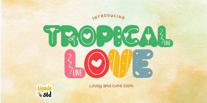 Tropical Love is a cute, quirky, friendly decorative font. It is suitable for cartoon designs, book cover or just any creation that requires a lovely touch, this font will be an fabulous choice.
 - Vintage Comics JNL by Jeff Levine,
$29.00 Vintage Comics JNL was inspired by the way the word “comics” was hand lettered on many of the comic book covers of the 1940s, and is available in both regular and oblique versions.
 - Catalog Sheet JNL by Jeff Levine,
$29.00 Catalog Sheet JNL is the digital version of an extra condensed serif typeface from the 1892 MacKellar, Smiths & Jordan type foundry specimen book. The font is available in both regular and oblique versions.
 - Bucknord by Sibelumpagi,
$15.00 Bucknord is a cool and playful handmade marker font. This font is designed to help your needs such as logos, product packaging, invitations, branding, headlines, signage, labels, book covers, posters, quotes, and more.
 - Sragera by ffeeaarr,
$14.00 Sragera is a rounded and bubbly display font offering you lots of creative space! You can use it to design outstanding titles, posters, book covers, magazine headers, product packaging, and so much more
 - Diamond Lake by Rillatype,
$15.00 Introducing, Diamond lake! This font have strong and bold charasteristics that will make your design more standout from the others. this font is perfect for magazine, headline, packaging, branding, logotype, badge,book, etc.
 - Czech Stencil JNL by Jeff Levine,
$29.00 Czech Stencil JNL was modeled from examples of a 1930s-era typeface from Czechoslovokia called "Patrona Grotesk" as seen in the Steven Heller-Louise Fili book "Stencil Type" (published by Thames and Hudson).
 - Penumbra Sans by Adobe,
$29.00Penumbra is a capitals only design. Based on inscriptional capitals, the style progresses from a sans serif to a serifed design. The Penumbra font family is useful for posters, book jackets and labels. - English1707 by PojolType,
$12.00 English1707 comes from combining two thick and thin and dashed lines. We can use this font for book titles, billboards, posters, logo designs, clothes, t-shirts, and can also be used for brands.
 - Love Bug by PizzaDude.dk,
$20.00Yet another one of those romantic looking fonts. The lowercase looks pretty ordinary, while the uppercase swings around with a mixture of tagging / grunge / comicscript and casual handwriting. It works out extremely well with letters and stuff!. For fun, try writing in uppercase only...looks swell!! - MidnightKernboy - Unknown license

- Carilliantine by Device,
$39.00 Carilliantine updates the organic curves of Art Nouveau typefaces typified by John F. Cumming's Desdemona, designed around 1886. A contemporary monoline sans reinterpretation rather than a more traditional serif, its high-waisted emphasis lends it an elegance and class. Carilliantine is replete with hundreds of two- and three-letter ligatures that bring a customised uniqueness to any headline. These are on by default, and can be toggled on or off in the Opentype palette of Adobe apps, or chosen individually according to taste from the Glyphs menu. Suitable for upmarket food packaging, wine labels, restaurants, folk bands, sword and sorcery trilogies, cosmetics and fashion brands that nod to the refinement of yesteryear, but are very much of today.
 - Janek by Pawel Fonts,
$35.00 Janek is a semi-serif typeface inspired by old Polish signage. Rather then mimic specific style, it synthesises various inspirations. It is named after an Author of a classic Polish manual, that kickstarted this project, „Techniques of Lettering“ by Jan Wojeński. Large character set and style selection allows for richness of expression. Pointy upright and slightly decorative italic bring unique blend of aesthetics. It works well in rich text and as a striking display. Janek consists of seven italic and seven upright styles ranging from Light, to Black. With extensive language support and wide selection of features, it is suited for range of latin use cases. Janek is a contemporary throwback to the past.
 - Rhythmic Revue JNL by Jeff Levine,
$29.00 The vintage sheet music for "Between the Devil and the Deep Blue Sea" yielded another bit of Art Deco-era lettering perfect for developing into a digital font. This time it wasn't the song title, but rather the name of the show it was from serving as the type inspiration - the Cotton Club's 1931 revue "Rhythm-Mania". Harlem's Cotton Club was an "exclusive, whites only" club; both famous for its talent and shows, yet infamous for hiring black acts but not allowing black patronage. On the sheet music, the show title was hand lettered in a bold, slightly stylized fashion which became the basis for Rhythmic Revue JNL; available in both regular and oblique versions.
 - Equines by Attractype,
$12.00 Equines Display is a versatile font family designed specifically for display purposes. Its modern, thick and strong appearance is perfect for branding, logos, banners and any lettering that requires bold and clear letters. To add an artistic image rather than just the thickness of the shape, Equines Display adds a rounding feature to the corners of the letters with a cross system, which makes the word display dynamic, strong and elegant. Until this description was published, Equines Display had 14 styles including condesed, expanded, outline and shaded in hopes of meeting the display font needs of designers and everyone at large. Enjoy working with the Equines Display font family. Best regards, Saefulloh - Attractype Foundry.
 - Ruzicka Freehand by Linotype,
$29.99In 1935, Rudolph Ruzicka approached W.A. Dwiggins at Linotype in the USA and handed him six typeface design sketches. These later led to the typeface family now known as Fairfield. The sketch called Script’ was forgotten until 1993, when sketches and designs were found in Ruzicka’s archives. Ruzicka Freehand was originally a more flowing calligraphy typeface which Ruzicka later developed into this strong and unusual form. The typeface is designed in two weights and their matching italics. The figures are clear, only just indicating the handwritten style in the italic forms, and combine into light and harmonic lines of text. Ruzicka Freehand gives texts a private and personal character and is suitable for middle length texts and headlines. - Valet by Canada Type,
$29.95 Valet is deco moderne the way it was meant to be: Big, bold, classy, flashy, and clean at the seams. Its message is rich, strong, confident and reliable. Valet tells you that it’s used to thorns being part of every rose, that it can handle sharp objects just fine, and that it'd much prefer buying the tuxedo rather than renting it. This font grew out of an uncredited early 1970s all-cap film type called Expression. An appropriate deco lowercase was added, along with small caps, zippy titling caps, and Pan-European language support. With over 9250 glyphs, we bow our heads with the admission that we kind of got carried away with it.
 - Dip Pen JNL by Jeff Levine,
$29.00 Answer Songs have been around for [probably] just as long as there have been songs. 1917's "If I Catch the Guy Who Wrote Poor Butterfly" was the answer to the 1916 hit "Poor Butterfly" [by Raymond Hubbell and John Golden], which in turn was inspired by the Puccini opera "Madame Butterfly". "Poor Butterfly" was so popular that this "answer" tune had as part of its lyrics "That melody haunts me in my sleep; it seems to creep." Nonetheless, the sheet music for William Jerome and Arthur Green's comic lament had the title hand lettered with an oval nib lettering pen and is now availably as a digital type face called Dip Pen JNL.
 - Radical Fortune by Hanoded,
$15.00 One day my kids asked me: ‘would you rather be healthy and poor or super rich and sick?’ Without a doubt I answered: ‘healthy and poor’. Having money is nice, but it is not what life is about. At least, that is what I believe. Radical Fortune is a font I made after a period in my life that could have ended with a really nice sum of money in my hands - but which I didn’t take. I had to give up too much of myself and that just didn’t feel right. I made Radical Fortune to keep me from thinking too much - and, symbolically, I used a really old and cheap marker pen to draw out the glyphs!
 - Jeunesse Sans by Monotype,
$29.99The design of the Jeunesse font family derives from a study of primers which the designer undertook earlier in his career. Jeunesse was designed with the intention of combining excellent legibility and character recognition with the ability to create compact, distinctive words and lines while maintaining basic flourishless letterforms. The sans serif style is pre-dominant in this design, but serifs or rather parts have been added where necessary, mostly at the top left hand parts of the characters, to aid readability. Use Jeunesse as a text and display face. There are also fully sans serif and slab serif versions available which can be used on their own or mixed with each other and the parent fonts. - Crisis by SIAS,
$29.90 Crisis is a child of the dictatorship of economics. Since time is money the time budget of its production has been rigidly limited. Crisis was designed and generated completely on one single day. The target was to make a useful font while investing nothing more than absolutely indispensable. The component-based glyph construction scheme of another font has been utilized, further detailing work has been strictly limited. Due to those restrictions some letters have rather unusual shapes. This straightforward and contemporary sans (320 glyphs) is of compact proportions and very legible even when set in small sizes. In printing you get more text on one page and thus save up to 30% of paper.
 - Sweet Treats by Jeff Levine,
$29.00 A piece of British sheet music for “You’re Sweeter than I Thought You Were” [from the 1935 film “Jack of All Trades” starring Jack Hulbert] provided inspiration for a digital typeface based on the credits for Hulbert and the film that rather than the song’s title. What’s interesting is the lettering style was influenced by Art Nouveau at a time when Art Deco was gaining in popularity. The result is Sweet Treats JNL, which is available in both regular and oblique versions. (According to Wikipedia, John Norman ‘Jack’ Hulbert (April 24, 1892 – March 25, 1978) was a British actor, director, screenwriter and singer, specializing primarily in comedy productions, and often working alongside his wife Cicely Courtneidge.)
 - Mochest Romantic by Ergibi Studio,
$20.00 Mochest Romantic, these fonts are of two types serif and script. This typeface has been made carefully to make sure its premium quality and luxury feel. The ligatures on script makes this typeface unique and stands out rather than the regular serif font, perfectly for headlines, logos, posters, packaging, T-shirts,coffee shops, restaurants, magazine’s headers, signs or gift/post cards,cafe’s and weddings or any type of advertising purpose. What's Included Mochest Romantic Script Mochest Romantic Serif Mochest Romantic include, numbers, punctuation,alternates, and it also supports other languages Mochest Romantic it also supports multilingual If there is a problem, question, or anything about my fonts, don't hesitate to ask! Ergibi Studio
 - Slandic by Vibrant Types,
$42.00 Headlines are transformed into clear-cut messages with the handwriting type family Slandic. Its robust appeal combines the elegance of script typefaces with the lightness of handwritten notes. What makes the Slandic so playful is the synergy between the quite narrow lowercase letters and the wide uppercase letters. Therefore it might rather be an upright chancery italic of a humanist sans. You can see it very clearly in its sharp upward angles and its long-limbed ascenders. Its visual appeal sets a reliable tone. It is precisely balanced with a solid stroke contrast and confidently angular-shaped curves. Slandic perfectly enhances exciting contrasting typography adding a personal note without giving it a comic spin.
 - Stencil Round Ends by Creative Juncture,
$15.00 Stencil Round Ends, is just that, a stencil typeface with rounded terminations to each line rather than the squared terminations found in your typical stencil font. This design was developed while designing a typeface for engraving. The end mill tools used to engrave a font are round, thus the lines will all end with a rounded edge. While designing the engraving font I also designed this font to make sure that the single line version will have the desired aesthetic. Unlike many stencil fonts that have a limited range of glyphs I made this to contain the majority of letters, accents, ligatures, and mathematic symbols commonly used in most latin based languages.
 - Regent Pro by Storm Type Foundry,
$39.00 This modernized rustic Baroque Roman face paraphrases freely its model from the first half of the 18th century. The shape of the letters has been cleared from all unevenness and softness, but has retained its lively expression. It is deliberately rather cooler than the reverently digitized Baroque Roman type faces, since it was necessary to adjust it with regard to the visual experience of the contemporary reader. In addition, it has bold designs and aligning figures, which also considerably extends the range of its application. It is an entirely reliable text type face for the most demanding extensive works. Thanks to its calm expression and excellent legibility it is widely used when printing series of professional literature.
 - Acklebury by Studio Buchanan,
$32.00 Acklebury is a chunky, reverse contrast, slab-serif typeface available in two styles. It has heaps of personality, plenty of open type features, and a whole host of special characters and dingbats. Although it's drawn from historical sources, Acklebury is not a straight revival, rather more of an homage to the many, varied, extended lining figures of the late 1800's. Acklebury celebrates the once labelled 'hideous' combination of wide rounded forms and hard slab serifs. Only using modern type technology to fix the spacing and kerning issues that would of been impossible with metal or wooden type. Acklebury is not a French Clarendon, neither is it really an Italienne... but it is phat, wide and hella funky.
 - Jeunesse Slab by Monotype,
$29.99The design of the Jeunesse font family derives from a study of primers which the designer undertook earlier in his career. Jeunesse was designed with the intention of combining excellent legibility and character recognition with the ability to create compact, distinctive words and lines while maintaining basic flourishless letterforms. The sans serif style is pre-dominant in this design, but serifs or rather parts have been added where necessary, mostly at the top left hand parts of the characters, to aid readability. Use Jeunesse as a text and display face. There are also fully sans serif and slab serif versions available which can be used on their own or mixed with each other and the parent fonts. - Realtime Stencil by Juri Zaech,
$30.00 Realtime Stencil is part of the Realtime type family which draws inspiration from information displays. The result is a technical yet friendly design with details that serve function and visual impact alike. As a monospaced typeface it lends itself to tabular designs, sturdy columns and tidy layouts. Nevertheless Realtime Stencil comes with a feature for setting continuous text — a proportional design employable through OpenType — it further comes in five weights, from light to black, and with a character set that covers over 200 latin languages. Please see the Realtime Stencil Type Specimen PDF in the gallery. A soft version of Realtime Stencil is available separately: Realtime Stencil Rounded. Its soft edges apply warmth to the otherwise rather technical appearance.
 - Mellnik Text by ParaType,
$25.00Mellnik is a sans serif of humanist style (in a way) that was developed by Oleg Karpinsky and released by ParaType in 2006. The type family contains 9 styles with a number of alternate characters in each ones. For use as a text font in long text passages of advertising booklets, catalogues or magazines, as well as for accident setting. Mellnik may be also applied as a corporate typeface. Giant ink traps (or something like that) produce an original image of the family. Five condensed styles were added in 2007 by the same designer. Mellnik Text in 12 styles (added in 2008) has more narrow proportions and it is rather appropriate for text setting. - Jeunesse by Monotype,
$29.99The design of the Jeunesse font family derives from a study of primers which the designer undertook earlier in his career. Jeunesse was designed with the intention of combining excellent legibility and character recognition with the ability to create compact, distinctive words and lines while maintaining basic flourishless letterforms. The sans serif style is pre-dominant in this design, but serifs or rather parts have been added where necessary, mostly at the top left hand parts of the characters, to aid readability. Use Jeunesse as a text and display face. There are also fully sans serif and slab serif versions available which can be used on their own or mixed with each other and the parent fonts.
