4,746 search results
(0.036 seconds)
- Nymph - Unknown license

- Skeleton Sketched - 100% free

- Chemical Gus - Unknown license

- QuickKleinSketches - 100% free

- Kinkie - Unknown license

- Dirty Ames - Unknown license

- The Tebal by Forberas Club,
$16.00 The Tebal font is funny font style. It's be nice if you application for cute, funny, happy, cartoon, comic or something abut funny.
 - Djs symbols - Personal use only

- Quasaria by Linotype,
$29.99Linotype Quasaria is part of the Take Type Library, selected from contestants of Linotype’s International Digital Type Design Contests of 1994 and 1997. The font was designed by German artist Armin Retzko and the characters are composed of disjointed pieces. The eye tries to complete the symbols into the forms they are used to. Linotype Quasaria with its unique forms is intended exclusively for headlines and displays. - Cubevano by Lafontiva,
$19.00 Cubevano is a geometric, modular display typeface. It is the result of fascination with geometry, impossible objects and work of artists such as Oscar Reutersvärd. Family was created in 6 styles for any type of graphic design, such as logos, covers, posters, signs, shirts, etc. It looks best in large sizes. Cubevano typeface comes with uppercase and lowercase letters, numbers, currencies, punctations and multilingual support.
 - ITC Stenberg by ITC,
$29.99ITC Stenberg was designed by Tagir Safeyev based on the forms characteristic of the Constructivism in the early days of the USSR. The brothers Vladimir and Georgii Stenberg were two of the creative artists of this movement who were turning older forms to revolutionary use. ITC Stenberg has a caps and small caps alphabet and is available in a bold and an inline version. - Monsieur des problemes by Woodcutter,
$55.00 The commercial typeface with its irregular appearance is an artistic expression,With uneven strokes and slightly chaotic shapes, it exudes authenticity and impression.Perfect for titles that capture attention and stand out from the crowd,Complete with accents and punctuation marks, it's ready to make your designs proud.This typography brings originality and freshness, an unmistakable style,A tribute to creativity that will make your projects worthwhile.
 - Killer Ants by Cool Fonts,
$24.00 There are two versions of Killer Ants, regular and bold. Regular is a very cool cracked up looking font that will be great for all kinds of stuff. Bold is on of the most distressed fonts I've ever seen - there's crap everywhere - adjust your leading (line spacing) so the grunge overlaps and you have one awesome effect. Yes, those dots are actually smashed ants. Killer!
 - Laughter JNL by Jeff Levine,
$29.00 Laughter JNL is a deconstruction of the vintage sign painter's design Brushmark JNL. By flattening most of the curved lines and making other minor adjustments to the original font, the end result was a fun and playful sanserif that is great for lighthearted ads, party invitations, special events, point-of-sale signage and many other applications where a less-than-formal type style is required.
 - Depot New by moretype,
$35.00 Original released in 2006 Depot has now been updated to Depot New. While staying true to its original robust charm Depot New has been reexamined from the ground up with improved outlines, spacing, kerning and opentype features. Depot New also boasts two new weights with Thin and Thin Italic added to its arsenal, making it the perfect choice for the most demanding of jobs.
 - Battle Cry by Comicraft,
$19.00 As Titans Clash in The Final Battle of Good versus Evil, Man versus Machine, God versus Mortal and Coke versus Pepsi, ace lettering artist, Ferran Delgado from Spain teams up with our very own John ‘JG’ Roshell for one last attack on the assembled Cover Lettering Styles of Yore. Fill your lungs and prepare for... BATTTTTTLECRRRRRYYYYYYYYYYY! See the families related to Battle Cry: Battle Scarred & Battle Damaged .
 - Theater Alley JNL by Jeff Levine,
$29.00 Found within the pages of the 1927 edition of the “Welo Studio Handbook - Letter and Design for Artist and Advertisers” is an elegant Art Deco multi-line alphabet. Digitally redrawn as Theater Alley JNL, it is available in both regular and oblique versions. The font takes its name from that of a street in New York, although the street’s name uses the old-fashioned spelling of “theatre”.
 - Toot Sweet Bistro NF by Nick's Fonts,
$10.00A 1928 poster for a café by German artist Karl Bauer informed the creation of this charming and expansive typeface. This font hops, bops, flip-flops and never stops, and is named after a fictitious café which offers cool jazz and fast service. Both versions contain the complete Unicode 1252 (Latin) and Unicode 1250 (Central European) character sets, with localization for Romanian and Moldovan. - Linotype Cerny by Linotype,
$29.99Linotype Cerny is part of the Take Type Library, selected from the contestants of Linotype’s International Digital Type Design Contests of 1994 and 1997. Dutch artist Mark van Wageningen designed an alphabet consisting exclusively of capital letters. The font’s most distinguishing characteristic is its irregular outer contour, almost as though they were ripped out of paper. Linotype Cerny is intended exclusively for headlines in larger point sizes. - BARONK by Twinletter,
$13.00 Introducing BARONK Font – a captivating display typeface that embodies the essence of authentic handwriting! Elevate your projects with the artistic touch of BARONK, a perfect blend of style and individuality. Explore BARONK now and witness your creations come to life! What’s Included : File font All glyphs Iso Latin 1 Alternate, Ligature Simple installations PUA Encoded Characters – Fully accessible without additional design software. Fonts include Multilingual support
 - Inkster by Typadelic,
$19.00Inkster breaks all the rules. The serifs vary from letter to letter, if they have any serifs at all. The upper and lower case letters intermingle and the contrasting characters bounce all over the baseline. Loosely based on the character shapes of Frisco, I developed a tightly spaced calligraphic version and called it Inkster. Use this artistic font when youre looking for a distinctive style! - Chwast Buffalo by Linotype,
$29.99Seymour Chwast designed the fun font Chwast Buffalo in 1981 and gave it his name. Its extremely robust figures are rendered in regular, even strokes, significantly reducing the inner white spaces. The typeface should therefore only be used in large and very large point sizes. A distinguishing characteristic of Chwast Buffalo is its half-circle serifs, which give the forms a technical, constructed appearance. - Xerym by Twinletter,
$13.00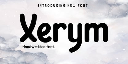 Introducing Xerym Font – a captivating display typeface that embodies the essence of authentic handwriting! Elevate your projects with the artistic touch of Xerym, a perfect blend of style and individuality. Explore Xerym now and witness your creations come to life! What’s Included : File font All glyphs Iso Latin 1 Alternate, Ligature Simple installations PUA Encoded Characters – Fully accessible without additional design software. Fonts include Multilingual support
 - Murisa Valeria by Murisa Studio,
$10.00 To start this year, we present a beautiful and attractive font. Font inspired by calligraphy strokes in the Middle East. Murisa Valeria is a beautiful font. With care and patience, we created and processed the font with a deep artistic effect. We believe that the fonts we create have high appeal. We make it with all our heart. Murisa Valeria is a font that you really deserve.
 - Regatta Condensed by ITC,
$29.00Regatta is a bold, narrow sans serif designed by Alan Meeks in 1987. Its strong, robust figures makes it a particularly good font for headlines in larger point sizes. Regatta is distinguished by its diamond shaped dots on i and j as well as the slanted strokes of several figures. These characteristics relax the closed, static image of Regatta and let the font seem cheerful and friendly. - Rumble Seat NF by Nick's Fonts,
$10.00British poster artist Cecil Wade provided the lowercase for this typeface, and his compatriot T. G. Birtles provided the uppercase. The result is a rollicking, frolicking, bouncy romp through the alphabet, not unlike a ride in the compartment for which it is named. Both versions of this font include the complete Latin 1252 and CE 1250 character sets, with localization for Romanian and Moldovan. - Return Pass JNL by Jeff Levine,
$29.00 Return Pass JNL is the solid version of Forward Passed JNL and can be used as a standalone font or in combination with Return Pass Fill JNL (the inline version with the main letters stripped away) for a dual color design. In some applications the inline fill may appear to create a cast shadow effect, so it may be necessary to manually adjust any overlaid copy.
 - Hillstate by Sabrcreative,
$25.00 Elevate your designs with the captivating charm of Billbest Brush Script Font. This versatile typeface combines the free-flowing elegance of brush strokes with a modern twist, making it a perfect choice for adding an artistic touch to your projects. Whether you're designing logos, branding materials, posters, or invitations, Billbest offers a seamless blend of lowercase and uppercase letters that create a harmonious and balanced visual appeal.
 - Ironwood by Adobe,
$29.00Ironwood is an Adobe Originals typeface designed by Joy Redick in 1990. Ironwood font is a homage to the old woodtypes made popular by the wanted posters in Western films. Adrian Frutiger designed his typeface Westside with the same idea in mind. Ironwood font is reminiscent of the Wild West and its shoot-out heroes, and its robust figures are particularly good for headlines. - Round Rock NF by Nick's Fonts,
$10.00Woodtype wizard Rob Roy Kelly identified the inspiration for this typeface in his 100 Wood Type Alphabets simply as "No. 154". Funky, chunky, round and robust, it’s clearly a barrel of fun. Named after a small town in Central Texas, which just happens to be the home of Dell Computer. Both versions of the font include 1252 Latin, 1250 CE (with localization for Romanian and Moldovan). - Silent Cinema JNL by Jeff Levine,
$29.00 “The Film Daily” issue for August 30, 1927 ran an ad for Tiffany Pictures in which all of the main text was hand lettered in a sans serif style displaying the beginnings of the Art Deco movement. With their rounded terminals, the characters were designed using a round nib lettering pen. Redrawn digitally as Silent Cinema JNL, it is now available in both regular and oblique versions.
 - Wacky Duck NF by Nick's Fonts,
$10.00A postcard for a 1952 DeSoto automobile, combined with the (non)sensibilities of legendary British lettering artist Cecil Wade, yielded this slightly tacky and thoroughly wacky gaggle of letters. Use liberally whenever levity, brevity (the soul of wit), or a bit of mischief is called for. Both versions of the font include 1252 Latin and 1250 CE (with localization for Romanian and Moldovan) character sets. - Anagram Shadow NF by Nick's Fonts,
$10.00This delightful dervish is based on handlettering from a 1928 poster for a steamship line by renowned British artist Austin Cooper. It’s essentially a monocase font, with the exception of the letter A, which twirls in one direction in uppercase, and the opposite direction in lowercase. This font contains the complete Latin language character set (Unicode 1252) plus support for Central European (Unicode 1250) languages as well. - Kunstschau by Hanoded,
$15.00 The 1908 art exhibition in Vienna (Kunstschau 1908) featured works by Josef Hoffmann, Cark Otto Czeschka and Gustav Klimt, who showcased his famous painting 'The Kiss'. Kunstschau font was modeled on a stamp, designed by Austrian artist Bertold Löffler, for the 1908 exhibition. Kunstschau is a loose, handwritten font which comes with a distinct all caps upper and lower case, plus an extensive language support.
 - MOLARUD by Twinletter,
$13.00 Introducing MOLARUD Font – a captivating display typeface that effortlessly captures the authenticity of handwriting! Elevate your projects with the artistic touch of MOLARUD, a seamless fusion of style and individuality. Explore MOLARUD today to see your creative visions come to life! What’s Included : File font All glyphs Iso Latin 1 Alternate, Ligature Simple installations PUA Encoded Characters – Fully accessible without additional design software. Fonts include Multilingual support
 - Babushka by Resistenza,
$39.00 This font, is dedicated to all the Russian and non-Russian Babushkas around the world. This font was created using a flat brush and Chinese ink. After that I scanned all the letters and numbers and created the real font. Designed by Giuseppe Salerno, in the 2011. You can even watch a video on YouTube showing how Babushka was hand-drawn by the artist.
 - Brenly by Valentino Vergan,
$16.00 Brenly is a modern variable sans serif font. Brenly has a unique and elegant look which makes it perfect for designing posters, brand packages & logos. Brenly also has a variable version, which makes it easy to manually adjust the slant from oblique to reversed oblique. If you are looking for something modern and unique for your next project, Brenly is the font for you.
 - Full Moon BT by Bitstream,
$50.99A collaboration based on lettering by Vermont illustrator/artist Mary Trafton and brought to typographic life by Charles Gibbons, the Full Moon Suite is a collection of casual typefaces called after folk names for full moons. A winner of the TDC2 2003 Type Design Competition. Family members include: Falling Leaves, Rustling Branches, Black Cherry, Black Cherry Alternate, Black Cherry Ligatures and Black Cherry Doubles. - Cuisine by Sudtipos,
$45.00 Cuisine originated from a how-to lettering book from the 1950s. It suggests the script style found on food and beverage labels in the early 20th century. This creamy font does for food advertising what Bodoni does for haute couture. Its simmering, hand-scribed charm captures the complexity of wine and the robust energy of coffee. It shines on luxe food packaging or high-end menus
 - Rainbowie by Stephan Kamperman,
$18.00 Rainbowie is a font that's ideally used for festivals, artists and logos. It has 3 different widths to make it ideal to use in small and wide spaces. The font has a stencil style that can be used in suprising ways for an unique touch in your design. It also provides several special characters with a star, sun, cloud, trees, guitar, lightning bold and heart.


