1,189 search results
(0.015 seconds)
- Wu by Gajana Aslanjan,
$34.99 Wu is a font that flows through the page like waves in the sea. The font is based on the shape of an Ancistrus fish swimming through water. The shapes of the letters flow into each other and move out again in perfect harmony. Purchase this font and come see it swim.
 - Fichte Fraktur by RMU,
$25.00 Walter Tiemann’s Fichte-Fraktur, released by Klingspor in 1934, has come to life again. This font contains the traditional long s which can be accessed by either the OT feature historical alternatives or by typing [alt] + b. Two framing elements can be reached by typing [alt] + shift + p and [alt] + p respectively.
 - BB Noname (Pro) by Bold Studio,
$49.00 BB Noname™ (Pro) is intended to imply the appearance of a conventional typeface in a contemporary context. Due to the frequent use in the public service (among other things), the style associates a supposedly objective face. The style is characterized by the proportions, the contradiction of the apparently perfect reduction and the retention of chirographic elements. In addition, the rapid further development of the input devices has meant that existing character sets have been added again and again, regardless of style and technical requirements. With this work, the properties were analyzed, the characteristic features highlighted and summarized in a complete typesetting: Anonymity (procedure), bureaucracy (style by category), convention (shape) and formality (optical corrections). ● 3 Variants: Human, Computer, Interaction ● 20 Stylistic-Sets ● 34 Styles ● 39 OpenType features ● 93 Languages Support ● 35,598 (1,047/Style)
 - Welcome Ramadhan by Letterara,
$16.00 Welcome Ramadhan is an Arabic-styled display typeface. This font features irresistible characters which make this font unique because it looks like the standard Arabian alphabet or is written in Arabic style. This Islamic Ramadhan Arabic font is perfect for any graphic design related to the Islamic style. Using this font, you will get an Arabic feel for every text you type. Made with serif characters so that it can be read internationally and does not have to be able to read by Arabic characters It is PUA encoded which means you can access all of the glyphs and swashes with ease! Add it confidently to your projects, and you will love the results.
 - Linotype Sansara by Linotype,
$29.99Linotype Sansara, from Swiss designer Grégoire Poget, is part of the TakeType Library, chosen from the entries of the Linotype-sponsored International Digital Type Design Contest 1999 for inclusion on the TakeType 3 CD. This fun font is a type experiment behind whose oriental facade hide Arabic letters, recognizable only at second glance. This font displays generous, pointed ascenders and descenders as well as a bar-like emphasis on the upper third of the figures which connects lines and words and gives them a decorative look. Linotype Sansara reveals an astounding variety of details which bring to mind 1001 Arabian Nights, flowing gowns and snake charmers. This font is best for display in point sizes of 14 or larger. - Joker by ParaType,
$30.00 The original sketch of Joker was drawn by Viktor Kharyk in 1978 as experiment on creation type by a method of subtraction. In 2000 the font was digitized, modified and Hebrew, Greek, Georgian, Armenian and Arabi? alphabets and outline style were added. As a display face, Joker allows the creation of decorative compositions, easily combining a vertical and horizontal arrangement of words. Its characters are easy for filling with images. In line the face creates ornamental effect very appropriate for logotype design. The font is good to set small expressive advertising texts also. Joker type family received the third prize at TypeArt 2001 Cyrillic type design competition in Moscow.
 - Hasta Luego by Hanoded,
$15.00 Hasta Luego means ‘see you later’ in Spanish. It is something you say when parting, but it doesn’t really mean you’ll have to see each other again. Hasta Luego is a happy, all caps font. It’s a bit random, a bit wobbly and it comes with some interesting discretionary ligatures for you to play with.
 - Maverick's Luck by FontMesa,
$20.00 From a few letters found on an old bank document from 1876, Maverick's Luck was born, and born again to give your projects that old western appearance. Maverick's Luck comes with multiple fill fonts, you will need an application that works in layers in order to use the fill fonts that come with FontMesa fonts.
 - Deportees is a remarkable font designed by the talented Ray Larabie, a prolific typographer known for his imaginative and broad-ranging font designs. Deportees captures the essence of Ray Larabie's u...
- Octin Sports Free - 100% free

- Octin Prison Free - 100% free

- Octin College Free - 100% free

- Octin Vintage Free - 100% free

- Octin Spraypaint Free - 100% free

- Funky Rundkopf NF by Nick's Fonts,
$10.00A 1990s-vintage Radiohead poster by Jermaine Rogers provided the go-by for this tight, trippy techno face. Jermaine's design, it turns out, was an adaptation of a Ray Larabie font, Dignity of Labour. This version cleverly combines stark geometry with Art Nouveau sensibilities to produce a kind of Digital DNA feel. This font contains the complete Latin language character set (Unicode 1252) plus support for Central European (Unicode 1250) languages as well. - Supper Club JNL by Jeff Levine,
$29.00After creating the all-caps version of Supper Club JNL, a conversation between Jeff Levine and fellow font designer Ray Larabie brought forth the idea that one of Ray's freeware fonts had a lower case that would perfectly fit Jeff's design. With Ray's permission, Jeff adapted the lower case to his capital letters and the final version of Supper Club was born. Two separate ideas become one stylish Art Deco type design. - Raqmi by Arabetics,
$45.00 Raqmi was designed as a serif like font with relatively uniform glyph thicknesses, perfect simplified straight lines and curves, and emphasized isolated letters. This font family supports all Arabetic scripts covered by Unicode 6.1, and the latest Arabic Supplement and Extended-A Unicode blocks, including support for Quranic texts. It includes two weights: regular and light, each of which has normal and left-slanted Italic versions. The script design of this font family follows the Arabetics Mutamathil Taqlidi style utilizing varying x-heights. The Mutamathil Taqlidi type style uses one glyph per every basic Arabic Unicode character or letter, as defined by the Unicode Standards, and one additional final form glyph, for each freely-connecting letter of the Arabic cursive text. Raqmi includes the required Lam-Alif ligatures in addition to all vowel diacritic ligatures. Soft-vowel diacritic marks (harakat) are selectively positioned with most of them appearing on similar high and low levels—top left corner—, to clearly distinguish them from the letters. Tatweel is a zero-width glyph.
 - Dearest Outline - Unknown license

- Dearest Open - Unknown license

- Yoshida Soft by TypeUnion,
$29.00 Yoshida Soft is the cheeky partner in crime to Yoshida Sans. Based on the original sans, we've gone heavy with the curves to create a unique font that again comes in 2 widths and 8 weights and which has a multitude of uses from branding to posters to digital applications. Have fun with this big softy.
 - Joyful Magnolia by Youngtype,
$18.00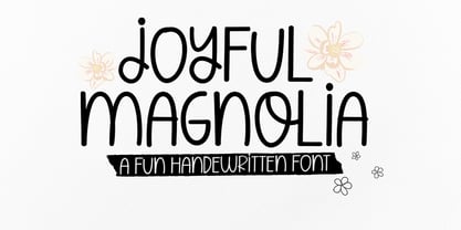 Joyful Magnolia handwritten. Contains a complete set of lowercase, uppercase, alternative, ligatures, punctuation marks, numbers and multilingual support. This font is ideal for use in watercolor designs or monoline styles, such as blog headers, posters, wedding elements, t-shirts, apparel, book covers, business cards, greeting cards, branding, merchandise, invitations and handmade quotes and more. again. Thank You :)
 - QSansPro by Fontop,
$11.00 Create bold headlines and elegant designs with a versatile QSansPro font family. Excellent for large type as well as logos, quotes, advertisements and more. QSansPro is a strong and sophisticated sans serif, yet classic and you'll keep coming back to it again. Each font in this family is full of character and can stand on its own.
 - Eat More Fruit JNL by Jeff Levine,
$29.00 Eat More Fruit JNL is an odd name for a typeface, but then again the lettering style of the font is just as unusual. Named for a 1940s-era poster espousing "Put more pep in your step... eat more fruit", the lettering (although Art Deco in nature) also evokes images of 1960s and 1970s hippie-era concert posters.
 - Rexlia Free - Unknown license

- Cardholder Dispute SRF by Stella Roberts Fonts,
$25.00 From the remnants of an old freeware font by Ray Larabie comes Cardholder Dispute SRF. Thoroughly rebuilt from the ground up by Jeff Levine, this post-80s techno lettering can also double as a pop culture font evoking 60s or 70s rock concerts and hippie colonies or (as the name implies) credit cards. The net profits from my font sales help defer medical expenses for mysiblings, who both suffer with Cystic Fibrosis and diabetes. Thank you.
 - Marginal Notes SRF by Stella Roberts Fonts,
$25.00 Marginal Notes SRF is from the creative pen of Ray Larabie whose Typodermic foundry graces MyFonts.com. Designed to emulate the look of handwritten words using a felt tip pen, this font can be perfectly applied to any project where notations, subtext, memos or other forms of personalization with a human touch is required. The net profits from my font sales help defer medical expenses for my siblings, who both suffer with Cystic Fibrosis and diabetes. Thank you.
 - Fitz Sans SRF by Stella Roberts Fonts,
$25.00 Fitz Sans SRF was contributed to the Stella Roberts Fonts project by graphic designer Matt Yow after receiving word of the project from Ray Larabie of Typodermic Fonts. A light, attractive text face, Fitz Sans SRF also lends itself well to headlines and titles. The font is available in both regular and oblique versions. The net profits from my font sales help defer medical expenses for my siblings, who both suffer with Cystic Fibrosis and diabetes. Thank you.
 - Ongunkan Proto Canaanite by Runic World Tamgacı,
$75.00 Proto-Sinaitic (also referred to as Proto-Canaanite when found in Canaan, or Early Alphabetic) is found in a small corpus of c. 40 inscriptions and fragments, the vast majority from Serabit el-Khadim in the Sinai Peninsula, dating to the Middle Bronze Age. They are considered the earliest trace of alphabetic writing and the common ancestor of both the Ancient South Arabian script and the Phoenician alphabet, which led to many modern alphabets including the Greek alphabet. According to common theory, Canaanites or Hyksos who spoke a Canaanite language repurposed Egyptian hieroglyphs to construct a different script. The earliest Proto-Sinaitic inscriptions are mostly dated to between the mid-19th (early date) and the mid-16th (late date) century BC.
 - Candombe Pro by Sudtipos,
$45.00 Prolific calligrapher Angel Koziupa and designer Alejandro Paul charm us once again with an imaginative typeface. Named after the Afro-Uruguayan drum-based rhythm, Camdombe conveys both a upbeat spirit and youthful joy. Its unique forms dance with each other, complementing their wild, brush-lettered origins. This inherent spontaneity makes it an ideal choice for signage, titles, and greeting cards.
 - Got That Bling NF by Nick's Fonts,
$10.00 Walter Foster art books strike again, this time with a bouncy script based on the work of Al Mack, from his Lettering: Brush & Pen in the Single Stroke. Light and lively, this typeface proves that it don't mean a thing if you ain't... The Opentype version of this font supports Unicode 1250 (Central European) languages, as well as Unicode 1252 (Latin) languages.
 - Dolphus Mieg Alphabet Three by Intellecta Design,
$14.00 The Dollfus Mieg Company was founded in 1800 by Daniel Dollfus (1769-1818) and Anne-Marie Mieg (1770-1852). In the 1890s and again in 1901 it published Monograms and Alphabets for Combination, a book with alphabets and monograms for cross-stitching. This book served as example for several digital fonts by Paulo W. Here you can get one of them,
 - Senatsfraktur by RMU,
$25.00 Friedrich Bauer’s Senatsfraktur, coming in two styles, regular and bold, released by Genzsch and Heyse, Hamburg, in 1912, has come to life again. Both styles contain the traditional long s which can be accessed by either the OT feature historical alternatives or by typing [alt] + b. To get access to all ligatures, it is recommended to activate both Standard and Discretionary Ligatures.
 - Reserve by Positype,
$29.00 First and foremost, Reserve is a companion typeface developed to complement the Scotch Suite of typefaces. With a focus on producing simpler forms with less contrast, Reserve evolved into a fantastic serif typeface for long-form text settings, exceptional clarity at low resolutions—for print and screen. Friendly and functional, Reserve is replete with features intended to make you feel comfortable going back to again and again, and with a complete set of condensed fonts, this typeface becomes more of a surprise. Small Caps, 4 sets of numerals, Case-Sensitive forms, Stylistic, Swash and Titling Alternates, Fractions, language support, and more… it’s all there, ready for you to use. The term ‘Reserve’ as it applies to the words of wine and spirits is typically used to alert a consumer of a higher quality, exceptional vintage, or special production of wine or whisky… it’s no different for this typeface’s name. Cheers.
 - Pen Nib Square JNL by Jeff Levine,
$29.00 The idea started with the 1934 sheet music of “Mazurka Amabile”. Its hand drawn title had most of the letters rendered in a rectangular shape [‘square’ in the sign trade] that featured rounded corners and terminals made by the shape of the lettering pen nib. A few letters were rounder in design than others, so those were scrapped in favor of a more consistent character shape throughout the font. Pen Nib Square JNL is available in both regular and oblique versions.
 - Khatt by Arabetics,
$39.00 Khatt tries to mimic the concept behind the meaning of the Arabic word Khatt: a straight horizontal line. The word Khatt is also the word for calligraphy in the Arabic language. Even though Khatt is a cursive style font it offers clearly distinguished and visually unified letter shapes in every position of a word. Khatt supports all Arabetic scripts covered by Unicode 6.1, and the latest Arabic Supplement and Extended-A Unicode blocks, including support for Quranic texts. It comes with five weights, regular, medium, bold, light, and ultra-light. Each weight has normal and left-slanted “italic” styles. The script design of this font family follows the Arabetics Mutamathil Taqlidi style and utilizes varying x-heights. The Mutamathil Taqlidi type style uses one glyph per every basic Arabic Unicode character or letter, as defined by the Unicode Standards, and one additional final form glyph, for each freely-connecting letter in an Arabic text. Khatt includes the required Lam-Alif ligatures in addition to all vowel diacritic ligatures. Katts’s soft-vowel diacritic marks (harakat) are positioned with most of them appearing on similar lower or upper positions to emphasize they are not part of letters.
 - Decora Arabic by Naghi Naghachian,
$65.00 Decora Arabic is a new creation of Naghi Naghashian. Decora Arabic's design fulfills the following needs: A. Explicitly crafted for use in electronic media fulfills the demands of electronic communication. A modern interpretation of Naskh which was invented as calligraphic style by Ebn Moghleh, a Persian savant in ninth century. This script is the most widely used and its popularity has increased through the centuries. Most recently, it has served as a basis for the typefaces that are in use today. B. Suitability for multiple applications. Gives the widest potential acceptability. C. Extreme legibility not only in small sizes, but also when the type is filtered or skewed, e.g., in Photoshop or Illustrator. Decora Arabic's simplified forms may be artificial obliqued in InDesign or Illustrator, without any loss in quality for the effected text. D. An attractive typographic image. Decora Arabic was developed for multiple languages and writing conventions. Decora Arabic supports Arabic, Persian and Urdu. It also includes proportional and tabular numerals for the supported languages. E. The highest degree of calligraphic grace and the clarity of geometric typography. This typeface offers a fine balance between calligraphic tradition and the Roman aesthetic common in Latin typography.
 - Nagham by Arabetics,
$45.00 Nagham was designed using uniform glyph thickness throughout and exaggerated letter heights to offer a vertical look and feel. It supports all Arabetic scripts covered by Unicode 6.1, and the latest Arabic Supplement and Extended-A Unicode blocks, including support for Quranic texts. This font family includes two letter spacing flavors: isolated for small text and overlapped for large or display text. The two flavors come with two weights, regular and bold, each of which has normal and left-slanted Italic versions. The script design of this font family follows the Arabetics Mutamathil Taqlidi style utilizing varying x-heights. The Mutamathil Taqlidi type style uses one glyph per every basic Arabic Unicode character or letter, as defined by the Unicode Standards, and one additional final form glyph, for each freely-connecting letter of the Arabic cursive text. Nagham includes the required Lam-Alif ligatures in addition to all vowel diacritic ligatures. Soft-vowel diacritic marks (harakat) are selectively positioned with most of them appearing on similar high and low levels—top left corner—, to clearly distinguish them from the letters. Tatweel is a zero-width glyph.
 - Thursday Afternoon by Bogstav,
$15.00 Nothing is as it really should be with Thursday Afternoon. The x-height is jumpy, letters are not in their right places, lines are crunchy, serifs are uneven...the list goes on...but in the end, Thursday Afternoon turns out as a legible and functional font. It has most of the moves from classic serif fonts, but then again it has a mind of its own!
 - PiS Creatinin Pro by PiS,
$38.00 PiS Creatinin pro is based on a vintage ABC learning game for kids found in my grandparents attic. The narrow and high hand-drawn letters combine delicacy and chunkyness in a wonderful way, so it can be used both in huge display sizes and in small text sizes. PiS Creatinin pro - Makes you want to go back to school and learn the alphabet all over again!
 - Song Publisher JNL by Jeff Levine,
$29.00 Song Publisher JNL features a design based on the 1945 Art Deco-era hand lettered sheet music title "When the Old Gang's back on the Corner (Singin' Sweet Adeline Again)". It's a good thing sheet music wasn't sold by the word count found in song titles, because this twelve word example would have been more costly than titles such as "Nola", "Tenderly" or "Ciribiribin".


