10,000 search results
(0.154 seconds)
- Schizophrenia G - Unknown license

- Remarkably Dressed by Bogstav,
$12.00 A handmade layered font that wants to be a part of your next creative project!
 - Primal Scream by Comicraft,
$19.00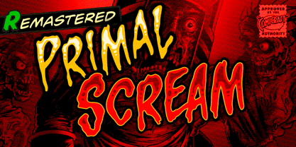 AAAAAAAARRRRRR RAGGGHHHHHHHHH HHHHGRRRRAAAAA GGHHHHHHHHHHAIE EEEEERGHHHHHHHH HHHGRAARGHHGHH HHHHKKKKKAAAAA IIIEEEEEEEEEEEEHHH HHHHHHHHGGGGGG HHHHHHHHRRRARRRRRRRRRGHRRRRR AAAAAAAAAAAARRRRRRR!!!!!!!!!!!!!! Ahhh. That felt good.
 - Tara by Haiku Monkey,
$10.00Tara is a bold, fun handwriting font that scales really well to large point sizes. - TDR by VSF,
$16.00 A heavy futuristic display font that can be strecthed and squiched without losing its identity.
 - Hastrico DT by DTP Types,
$46.00 Sans serif grotesque with a rounded feel that makes it suitable for text or display.
 - Wee Ian by m u r,
$10.00Searching for a font that resembled true children's handwriting. Ideal for anything related to children. - Janda Celebration Script by Kimberly Geswein,
$5.00 This beautiful script has lovely connections and swirls that create an elegant, hand-written look.
 - Gulerod by Bogstav,
$12.00 Gulerod is carrot in danish - doctors suggest that you eat at least one every day!
 - Babo by Nedamamo,
$15.00 A Handdrawn typeface that can be used to create almost all types of design projects.
 - Stomper by MADType,
$21.00 Inky and grungy, Stomper is perfect for your layouts that require the look of imperfection.
 - KG How Many Times by Kimberly Geswein,
$5.00 A cute, markered skinny font that is tall and neat with plenty personality to spare.
 - Buster by ITC,
$29.99Buster is a shadowed typeface that Tony Wenman designed in 1972 for Letraset transfer sheets. - Worstveld Sting by Typotheticals,
$10.00Not to be confused with Worstveld Sling, this is a further redesign of that font. - MHF Headbanger by MetalHead,
$14.95 A balance of ballad-meets-distortion that will make you want to Bang Your Head!
 - Gravtrac by Typodermic,
$11.95 Gravtrac is a slab serif headliner designed to deliver solid punches while taking up as little horizontal space as possible. Inspiration comes from mid twentieth century classics: Univers 59 Ultra-Condensed, Helvetica Inserat and Compacta. It’s all about flat sides, a steady rhythm and tight, precision curves. The widest style of Gravtac is Condensed—compact, yet a comfortable read, available in 7 weights from Ultra-Light to Heavy. Gravtrac Compressed is probably the width where most typefaces would quit. It's narrow enough for most...but not for you. That’s why we have Gravtrac Crammed. It’s audaciously narrow—perfect for times where you want the reader to slow down and truly pay attention to the message. Gravtrac Crushed is devilishly slender. Try it with wide tracking for a stark, opulent look. All styles are also available in obliques varying from 7 to 10 degrees—58 styles in total. Gravtrac includes Opentype fractions, numeric ordinals, a breadth of currency symbols and old-style (lowercase) numerals. Every skilled designer already has slab serif typefaces in their stockpile but some of us have the need to squeeze. Most Latin-based European, Vietnamese, Greek, and most Cyrillic-based writing systems are supported, including the following languages. Afaan Oromo, Afar, Afrikaans, Albanian, Alsatian, Aromanian, Aymara, Azerbaijani, Bashkir, Bashkir (Latin), Basque, Belarusian, Belarusian (Latin), Bemba, Bikol, Bosnian, Breton, Bulgarian, Buryat, Cape Verdean, Creole, Catalan, Cebuano, Chamorro, Chavacano, Chichewa, Crimean Tatar (Latin), Croatian, Czech, Danish, Dawan, Dholuo, Dungan, Dutch, English, Estonian, Faroese, Fijian, Filipino, Finnish, French, Frisian, Friulian, Gagauz (Latin), Galician, Ganda, Genoese, German, Gikuyu, Greenlandic, Guadeloupean Creole, Haitian Creole, Hawaiian, Hiligaynon, Hungarian, Icelandic, Igbo, Ilocano, Indonesian, Irish, Italian, Jamaican, Kaingang, Khalkha, Kalmyk, Kanuri, Kaqchikel, Karakalpak (Latin), Kashubian, Kazakh, Kikongo, Kinyarwanda, Kirundi, Komi-Permyak, Kurdish, Kurdish (Latin), Kyrgyz, Latvian, Lithuanian, Lombard, Low Saxon, Luxembourgish, Maasai, Macedonian, Makhuwa, Malay, Maltese, Māori, Moldovan, Montenegrin, Nahuatl, Ndebele, Neapolitan, Norwegian, Novial, Occitan, Ossetian, Ossetian (Latin), Papiamento, Piedmontese, Polish, Portuguese, Quechua, Rarotongan, Romanian, Romansh, Russian, Rusyn, Sami, Sango, Saramaccan, Sardinian, Scottish Gaelic, Serbian, Serbian (Latin), Shona, Sicilian, Silesian, Slovak, Slovenian, Somali, Sorbian, Sotho, Spanish, Swahili, Swazi, Swedish, Tagalog, Tahitian, Tajik, Tatar, Tetum, Tongan, Tshiluba, Tsonga, Tswana, Tumbuka, Turkish, Turkmen (Latin), Tuvaluan, Ukrainian, Uzbek, Uzbek (Latin), Venda, Venetian, Vepsian, Vietnamese, Võro, Walloon, Waray-Waray, Wayuu, Welsh, Wolof, Xavante, Xhosa, Yapese, Zapotec, Zarma, Zazaki, Zulu and Zuni.
 - Basenji by Typodermic,
$11.95 Basenji is a flowing headline typeface influenced by the modular geometric design trend of the 1970s. Herbert Bayer published his highly influential Universal Alphabet in 1924, which was based on circles and straight lines and had a modern, industrial appearance. Jan Tschischold’s typography popularized this simple, unconventional style but by the late 1950s, it had fallen by the wayside. Type designers Joe Taylor and Herb Lubalin inaugurated the 1970s with fresh takes on an old concept. These new typefaces were more practical than the original, and their blend of futuristic curves and funky curls fit the zeitgeist. The popularity of these types spawned a flood of similar designs like Pink Mouse, Bauhaus, Pump, and Harry. These typefaces were popular throughout the decade then fell out of favor by the mid-1980s, making a comeback in the year 2000. Many contemporary font designs have drawn inspiration from the beginnings of the Universal Alphabet, but Basenji is unique. This typeface amplifies of the 1970s elements of Rondo, Pump, Bauhaus and Blippo, and packs them into a practical, versatile design toolset. Basenji comes in nine weights and italics. Most Latin-based European, Vietnamese, Greek, and most Cyrillic-based writing systems are supported, including the following languages. Afaan Oromo, Afar, Afrikaans, Albanian, Alsatian, Aromanian, Aymara, Azerbaijani, Bashkir, Bashkir (Latin), Basque, Belarusian, Belarusian (Latin), Bemba, Bikol, Bosnian, Breton, Bulgarian, Buryat, Cape Verdean, Creole, Catalan, Cebuano, Chamorro, Chavacano, Chichewa, Crimean Tatar (Latin), Croatian, Czech, Danish, Dawan, Dholuo, Dungan, Dutch, English, Estonian, Faroese, Fijian, Filipino, Finnish, French, Frisian, Friulian, Gagauz (Latin), Galician, Ganda, Genoese, German, Gikuyu, Greenlandic, Guadeloupean Creole, Haitian Creole, Hawaiian, Hiligaynon, Hungarian, Icelandic, Igbo, Ilocano, Indonesian, Irish, Italian, Jamaican, Kaingang, Khalkha, Kalmyk, Kanuri, Kaqchikel, Karakalpak (Latin), Kashubian, Kazakh, Kikongo, Kinyarwanda, Kirundi, Komi-Permyak, Kurdish, Kurdish (Latin), Kyrgyz, Latvian, Lithuanian, Lombard, Low Saxon, Luxembourgish, Maasai, Macedonian, Makhuwa, Malay, Maltese, Māori, Moldovan, Montenegrin, Nahuatl, Ndebele, Neapolitan, Norwegian, Novial, Occitan, Ossetian, Ossetian (Latin), Papiamento, Piedmontese, Polish, Portuguese, Quechua, Rarotongan, Romanian, Romansh, Russian, Rusyn, Sami, Sango, Saramaccan, Sardinian, Scottish Gaelic, Serbian, Serbian (Latin), Shona, Sicilian, Silesian, Slovak, Slovenian, Somali, Sorbian, Sotho, Spanish, Swahili, Swazi, Swedish, Tagalog, Tahitian, Tajik, Tatar, Tetum, Tongan, Tshiluba, Tsonga, Tswana, Tumbuka, Turkish, Turkmen (Latin), Tuvaluan, Ukrainian, Uzbek, Uzbek (Latin), Venda, Venetian, Vepsian, Vietnamese, Võro, Walloon, Waray-Waray, Wayuu, Welsh, Wolof, Xavante, Xhosa, Yapese, Zapotec, Zarma, Zazaki, Zulu and Zuni.
 - Balister by Rotterlab Studio,
$15.00 Introducing Special creative products for you, our products will give you an extraordinary experience that will not be forgotten. Balister A popular and professional Handwritten font. Modern and elegant, this typeface is made of beautiful creative strokes. Balister This font is perfect for your creative ideas, both formal and informal. It has a modern style with a touch of creative ideas that is very suitable to be applied anywhere that requires creative ideas such as invitation cards, letterheads, website logos, social media, banners, advertisements, brochures, packaging products, leather products, and any product that requires writing. By using this font, all of your products will look luxurious, elegant, and attractive, please try and see the results. This font includes a complete set of beautiful upper and lowercase letters, numbers, a wide variety of punctuation marks, and ligatures. All lowercase letters include a start and end, providing a realistic style. everything you get. Encoded PUA Character – Can be accessed completely without additional design software., Please note that Stylistic Alternates will require professional design software such as Adobe Illustrator, Photoshop, InDesign or Inkscape. Thank you...
 - Mr Gabe by Leksen Design,
$- Check out Mr Gabe in motion! Mr Gabe is a typeface designed to dance. Not that it’s a flamboyant display face, but that it has a liveliness, especially in its heavier weights, that dances across the page. And the letters include a selection of exuberant flourishes that can be used to kick up a ruckus or make a sweeping gesture. Mr Gabe is a high-contrast serif typeface with vertical stress, a “modern” face in traditional type terms. Even in the regular weight, the contrast between thick and thin strokes is very obvious. Designer Andrea Leksen has given many of the lowercase letters ball terminals, teardrop shapes that make Mr Gabe seem decorated even when most of its letter forms are conservative. If you need more bells and whistles, or perhaps revolving mirror balls and dancing shoes, you can explore the font’s collection of ornaments and decorative borders. Mr Gabe comes in four weights, from Regular to Black, with italics for each. Each font includes over 57 ligatures, 31 illustrations and borders, small caps and proportional oldstyle numerals.
 - Mockey Clown by IKIIKOWRK,
$19.00 Proudly present Mockey Clown - Cloud Type, created by ikiiko Mockey Clown is a decorative hipster font in a cloud style. This font is a contemporary and stylish typeface that is ideal for any creative project looking for a distinctive and trendy look. This font style is ideal for designs that need to communicate a sense of movement and whimsy because it has rounded edges, flowing lines, and a slightly bolder appearance. This letter has 3 styles that you can mix or play with to make it more decorative with the addition of bold or contrasting colors, creating a trendy look that is perfect for modern designs. Overall, this typeface is a sleek, customizable choice for any design project that needs a fresh, trendy look. This typeface is perfect for an youth stuff, magazine layout, poster, fashion brand, urban style, quotes, or simply as a stylish text overlay to any background image. What's Included? 3 Styles: Regular / Outline / Fill Uppercase & Lowercase Numbers & Punctuation Ligature (Bonus) Multilingual Support Works on PC & Mac
 - Dumper by LetterStock,
$25.00 Introducing "Dumper" - Your Original Hand-Drawn 60's Retro Bold Font Step into the bold and vibrant world of "Dumper," a font that seamlessly blends original hand-drawn craftsmanship with the iconic style of the 60's retro era. Ideal for posters, headlines, and vintage-themed branding projects, this font exudes a dynamic energy that adds a bold statement to your designs. Key Features: Original Hand-Drawn Craftsmanship: Each character in "Dumper" is crafted by hand, bringing a unique and authentic touch to your creations. 60's Retro Bold Vibes: Immerse your designs in the bold and lively spirit of the 60's, making "Dumper" a perfect choice for projects seeking a retro aesthetic. Why Choose "Dumper": Craft posters and headlines that command attention with bold and dynamic lettering. Design branding materials that transport your audience back to the vibrant 60's era. Establish a brand presence with a font that effortlessly captures the essence of retro boldness. Download "Dumper" Now and Let Your Designs Boldly Embrace the 60's Retro Vibe!
 - Rakochuk by Twinletter,
$17.00 Rakochuk is the ideal font for your project if you want a typeface that has a classic, retro, and vintage vibe in a condensed form. This typeface has a unique shape that will bring a classic touch to your project and was designed with attention and detail in mind. Not only that, but Rakochuk includes ligature and alternate characteristics, providing you greater freedom in its application, especially when you need a more personal touch in your design. This typeface is appropriate for international projects due to its linguistic support. If you want to bring an elegant classic, retro, or vintage feel to your project, consider Rakochuk. Get it now and set your project out from the crowd! What’s Included : - File font - All glyphs Iso Latin 1 - Alternate, Ligature - Simple installations - We highly recommend using a program that supports OpenType features and Glyphs panels like many Adobe apps and Corel Draw so that you can see and access all Glyph variations. - PUA Encoded Characters – Fully accessible without additional design software. - Fonts include Multilingual support
 - Tin Lizzie JNL by Jeff Levine,
$29.00 One of the most unusual sets of antique stencils spotted for sale online comprises a set of twenty-four classic logos of early 20th Century automobile companies. For whatever purpose that is now lost to time, these stencils represented the logos of many of America's finest auto manufacturers; most now just historical memories. The logos were painstakingly redrawn, maintaining the distinctive look of the hand made cutting, although it was an exacting process - some of the images were taken at an angle, and a bit of artistic license had to be used as a compensatory factor. It is to be noted that any and all of the logos presented in this font are the intellectual property of the companies, successors or assignees that may still hold the rights to these symbols. No endorsements by such corporate entities are either expressed or implied. Additionally, it is advised that any use of these logos be restricted to historical or hobby purposes, and they should not be used in a way that would construe any authorized reproduction of the logos in a commercial fashion.
 - MGN Edinson Monospace by Morgana Studio,
$17.50 MGN Edinson is a modern typeface that is both stylish and versatile. This font is perfect for creating a sleek and contemporary design that will appeal to today's audiences. It has a minimalist design that is clean and easy to read, making it an ideal choice for modern digital applications. MGN Edinson is a monospace font that features a consistent width for each character, giving it a uniform look that adds to its modern aesthetic. Our new product, a cutting-edge mobile app, uses MGN Edinson font to give it a modern and professional look. The app features a sleek and intuitive design with a focus on user experience. The modern type of MGN Edinson font adds to the overall design of the app, creating a seamless and cohesive user interface. The monospace font is particularly useful for displaying data and statistics in a clear and organized way. The use of MGN Edinson font adds a touch of sophistication to the product, making it the perfect choice for users who demand high-quality design and functionality.
 - Tessie Some More by Ingrimayne Type,
$12.00 A tessellation is a shape that can be used to completely fill the plane without gaps or overlaps—simple examples are isosceles triangles, squares, and hexagons. Tessellation patterns are eye-catching and visually appealing, which is the reason that they have long been popular in a variety of decorative situations. TessieSomeMore has two family members, a solid style that must have different colors to be useful and an outline style. They can be used separately or they can be used in layers with the outline style on top of the solid style. For rows to align properly, leading must be the same as point size. To see how patterns can be constructed, see the “Samples” file here. Shapes that tessellate and also resemble real-world objects are often called Escher-like tessellations. Most of the shapes in TessieSomeMore are Escher-like. Over half are either bug-like and bird-like shapes. There are also a few animal and other object shapes as well as some geometric or abstract shapes that have visual appeal.
 - Remeeq by Twinletter,
$17.00 Introducing Remeeq, the futuristic font that will take your designs to the next level! With 53 alternate characters for uppercase letters and 49 ligatures, this font offers endless possibilities for creating unique and futuristic designs. The sleek and modern design of this font is perfect for those looking to create designs that are cutting-edge and ahead of their time. Whether you’re designing for a sci-fi movie poster or a tech startup, Remeeq is the font that will make your designs stand out from the crowd. Plus, with multilingual support, you can use this font for projects in any language. Upgrade your design project with Remeeq and impress your audience with your futuristic and innovative designs. What’s Included : - File font - All glyphs Iso Latin 1 - Alternate, Ligature - Simple installations - We highly recommend using a program that supports OpenType features and Glyphs panels like many Adobe apps and Corel Draw so that you can see and access all Glyph variations. - PUA Encoded Characters – Fully accessible without additional design software. - Fonts include Multilingual support
 - TessieBugs by Ingrimayne Type,
$23.95 A tessellation is a shape that can be used to completely fill the plane—simple examples are isosceles triangles, squares, and hexagons. Tessellation patterns are eye-catching and visually appealing, which is the reason that they have long been popular in a variety of decorative situations. These Tessie fonts have two family members, a solid style that must have different colors when used and an outline style. They can be used separately or they can be used in layers with the outline style on top of the solid style. For rows to align properly, leading must be the same as point size. To see how patterns can be constructed, see the “Samples” file here. TessieBugs contains shapes that resemble insects such as moths, ants, butterflies, and weevils. (Earlier tessellation fonts from IngrimayneType, the TessieDingies fonts, lack a black or filled version so cannot do colored patterns. The addition of a solid style that must be colored makes these new fonts a bit more difficult to use but offers far greater possibilities in getting visually interesting results.)
 - Centerpiece by Heyfonts,
$18.00 Centerpiece is Psychedelic typeface refers to a style of typography that emerged in the 1960s during the height of the counterculture movement. It is characterized by its bold, vibrant colors, and graphic designs that incorporate abstract shapes, curves, and patterns. The psychedelic typeface is often associated with the mystical and surreal since it draws inspiration from altered states of consciousness experienced through the use of psychedelic drugs. It also incorporates a variety of lettering techniques such as bending, twisting, and outlining. The typefaces have a distinctive look that evokes a sense of free-spirited creativity and experimentation. Psychedelic typefaces can be used for various purposes, including posters, album covers, and promotional materials. To sum it up, psychedelic typeface is a unique style of typography that was popularized during the 1960s and is still relevant today. It incorporates bold colors, graphic designs, and a range of lettering techniques that create an eye-catching and trippy aesthetic. It is a testament to the counterculture movement and the power of artistic expression.
 - Scratch SCF by Scholtz Fonts,
$15.00Scratch SCF is a grunge font with a difference. It has an irregular, almost random outline that suggests an old-fashioned quill pen that is leaking and scratching its way across the page. There are also connotations of simplicity, of a writer that is unsophisticated, possibly learning to write for the first time. This is a font that avoids all the associations of slick, worldly-wise urbanity, of cynicism and of "the medium being more important than the message". Instead the simplicity of Scratch SCF conveys a sincerity and integrity of design that bespeaks simplicity and old-fashioned honesty. All these associations are conveyed with a contemporary look, without resorting to rehashing the past with yet another retro font. Scratch SCF has a full character set: all upper and lower case characters, all special and accented characters and all punctuation, numerical and mathematical characters. All have been carefully spaced and kerned. Scratch SCF Staggered is a little more "grungy" than the regular style because the individual letters do not rest on the same baseline and thus have more vitality. - Nostalgic Typewriter by Typehead Studio,
$10.00 Nostalgic Typewriter is a typewriter font that exudes classic vintage charm with an irresistible allure. Inspired by the iconic typewriters that once dominated the world of manual typing, this font brings forth warm nostalgia and timeless appeal in every character. Key Features: Classic Aesthetics: Every letter in the Nostalgic Typewriter is meticulously crafted to create a classic look that harks back to bygone eras of manual writing. Vintage Power: The font captures invaluable retro vibes in its design, with rough edges and character placement that evoke an authentic feel from yesteryears. Character Diversity: Nostalgic Typewriter boasts a variety of characters, including uppercase, lowercase, numbers, and special symbols. All are designed to cater to your diverse design needs. Ease of Use: This font is ready to enhance a wide range of projects, such as poster designs, stickers, greeting cards, t-shirts, and more. With flexible licensing, you can confidently use it for personal or commercial projects. High-Quality: Nostalgic Typewriter is crafted with attention to detail and top-notch quality, ensuring that your printed or digital output will always captivate.
 - New Lincoln Gothic BT by Bitstream,
$50.99New Lincoln Gothic is an elegant sanserif, generous in width and x-height. There are twelve weights ranging from Hairline to UltraBold and an italic for each weight. At the stroke ends are gentle flares, and some of the round characters possess an interesting and distinctive asymmetry. The character set supports Central Europe, and there are three figure sets, extended fractions, superior and inferior numbers, and a few alternates, all accessible via OpenType features. Back in 1965, Thomas Lincoln had an idea for a new sanserif typeface, a homage of sorts, to ancient Roman artisans. The Trajan Column in Rome, erected in 113 AD, has an inscription that is considered to be the basis for western European lettering. Lincoln admired these beautiful letterforms and so, being inspired, he set out to design a new sanserif typeface based on the proportions and subtleties of the letters found in the Trajan Inscription. Lincoln accomplished what he set out to do by creating Lincoln Gothic. The typeface consisted only of capital letters. Lincoln intentionally omitted a lowercase to keep true his reference to the Trajan Inscription, which contains only magiscule specimens. The design won him the first Visual Graphics Corporation (VGC) National Typeface Competition in 1965. The legendary Herb Lubalin even used it to design a promotional poster! All this was back in the day when typositor film strips and photo type were all the rage in setting headlines. Fast forward now to the next millennium. Thomas Lincoln has had a long, illustrious career as a graphic designer. Still, he has one project that feels incomplete; Lincoln Gothic does not have a lowercase. It is the need to finish the design that drives Lincoln to resurrect his prize winning design and create its digital incarnation. Thus, New Lincoln Gothic was born. Lacking the original drawings, Lincoln had to locate some old typositor strips in order to get started. He had them scanned and imported the data into Freehand where he refined the shapes and sketched out a lowercase. He then imported that data into Fontographer, where he worked the glyphs again and refined the spacing, and started generating additional weights and italics. His enthusiasm went unchecked and he created 14 weights! It was about that time that Lincoln contacted Bitstream about publishing the family. Lincoln worked with Bitstream to narrow down the family (only to twelve weights), interpolate the various weights using three masters, and extend the character set to support CE and some alternate figure sets. Bitstream handled the hinting and all production details and built the final CFF OpenType fonts using FontLab Studio 5. - Telephoto by Typodermic,
$11.95 In the world of graphic design, the right typeface can make or break a project. It’s not just about choosing a font that’s legible, but one that speaks to the essence of your brand or message. If you’re looking for a typeface that embodies classic charm and warmth, then look no further than Telephoto. Telephoto is a sans-serif typeface that harkens back to the twentieth century when analog was king. Its gentle, analog feel sets it apart from other typefaces on the market. When you use Telephoto, you’ll notice that it has a smooth personality that immediately injects classic ambience into your projects. But what really sets Telephoto apart are the subtle letter pair ligatures. These ligatures are a true testament to the attention to detail that went into creating this typeface. They break up the monotony of plainly repeating letters, creating a soft and organic feel that’s hard to find in today’s digital world. OpenType-savvy programs are where Telephoto truly shines, so make sure to turn off your application’s “standard ligatures” function to fully appreciate this effect. Telephoto is perfect for photographers, designers, and anyone who wants to bring a soft, analog feel to their work. Its delicate rendering is truly one-of-a-kind and adds a level of sophistication to any project. So why settle for a run-of-the-mill typeface when you can use Telephoto to make your work stand out? Give it a try and see the difference it can make. Most Latin-based European writing systems are supported, including the following languages. Afaan Oromo, Afar, Afrikaans, Albanian, Alsatian, Aromanian, Aymara, Bashkir (Latin), Basque, Belarusian (Latin), Bemba, Bikol, Bosnian, Breton, Cape Verdean, Creole, Catalan, Cebuano, Chamorro, Chavacano, Chichewa, Crimean Tatar (Latin), Croatian, Czech, Danish, Dawan, Dholuo, Dutch, English, Estonian, Faroese, Fijian, Filipino, Finnish, French, Frisian, Friulian, Gagauz (Latin), Galician, Ganda, Genoese, German, Greenlandic, Guadeloupean Creole, Haitian Creole, Hawaiian, Hiligaynon, Hungarian, Icelandic, Ilocano, Indonesian, Irish, Italian, Jamaican, Kaqchikel, Karakalpak (Latin), Kashubian, Kikongo, Kinyarwanda, Kirundi, Kurdish (Latin), Latvian, Lithuanian, Lombard, Low Saxon, Luxembourgish, Maasai, Makhuwa, Malay, Maltese, Māori, Moldovan, Montenegrin, Ndebele, Neapolitan, Norwegian, Novial, Occitan, Ossetian (Latin), Papiamento, Piedmontese, Polish, Portuguese, Quechua, Rarotongan, Romanian, Romansh, Sami, Sango, Saramaccan, Sardinian, Scottish Gaelic, Serbian (Latin), Shona, Sicilian, Silesian, Slovak, Slovenian, Somali, Sorbian, Sotho, Spanish, Swahili, Swazi, Swedish, Tagalog, Tahitian, Tetum, Tongan, Tshiluba, Tsonga, Tswana, Tumbuka, Turkish, Turkmen (Latin), Tuvaluan, Uzbek (Latin), Venetian, Vepsian, Võro, Walloon, Waray-Waray, Wayuu, Welsh, Wolof, Xhosa, Yapese, Zapotec Zulu and Zuni.
 - Joanna Nova by Monotype,
$50.99 The Joanna® Nova design, by Monotype Studio designer Ben Jones, is an extensive update to Eric Gill’s original Joanna typefaces and brings this much admired – but underused – slab serif typeface into the 21st century. Joanna Nova features 18 fonts – more than twice as many as the original Joanna – with a wide range of weights including thin and ultra black, which were not available in the original design. Every glyph has been redrawn using a variety of reference sources, including Gill’s original sketches and the copper patterns used in Joanna’s initial production. When Jones set out to design Joanna Nova, he saw that the ‘real Joanna’ was not immediately evident. “Some of Gill’s original drawings have a sloped ‘M’; there is also a ‘K’ and ‘R’ with a curled leg and a letter ‘d’ without the flat bottom,” he explained. “Is this Joanna? Or is it the version used to print Gill’s Essay on Typography? Or is it the digital version with which most people are surely more familiar than any other version? Ultimately, I think, none of these and all of these were ‘Joanna’ because, as with any typeface, it is more the idea or concept behind the typeface that makes it what it is. My approach was to create a version of Joanna that appears in your mind when you think of Joanna.” Jones noted that one of the most distinguishing aspects of Joanna is the italics; and that, for reasons unknown, many of the characters in the current versions are much more condensed than those in the hand-set fonts of metal type., The newer designs being almost unusable at small sizes. The italics in Joanna Nova have been reworked to be more legible and closer to their original widths. Joanna Nova expands the original Joanna in several ways that open up new typographic possibilities, These additions include several new weights, support for Greek and Cyrillic scripts, small caps for all scripts in both upright and italic styles, several numeral options and a host of context-sensitive ligatures. The Joanna Nova typeface family is part of the new Eric Gill Series, drawing on Monotype's heritage to remaster and expand and revitalize Eric Gill’s body of work, with more weights, more characters and more languages to meet a wide range of design requirements. The series also brings to life new elements inspired by some of Gill’s unreleased work, discovered in Monotype’s archive of original typeface drawings and materials of the last century.
 - Beans Plain - Unknown license

- Freigeist by René Bieder,
$29.00 The story of Freigeist is a journey into the past, back to the early grotesk fonts and long before Helvetica and Co were standard fonts in operating systems. For what we take for granted today is the result of innovation and pioneering spirit of type foundries such as Caslon or Stephenson Blake in the 19th century, whose expressive designs are mostly forgotten today. The Freigeist family captures this untamed spirit — hence the name (German for “free spirit”) — and puts it into a contemporary context, resulting in a multi-faceted family with a wide range of applications, font styles and features for modern typesetting. Design Details Unlike other modern grotesk typefaces like Helvetica or Univers, Freigeist is characterized by a warm and dynamic appearance. It draws inspiration from various historical models such as Caslon’s Doric or the Grotesque variants of Stephenson Blake. Particularly noticeable are the narrow terminals, the serpentine S or the dynamic g in combination with ascenders that reach to the cap-height only. Italics Many italic grotesk fonts are strongly oriented towards their upright counterparts. Unfortunately, this often means that they cannot do justice to their actual task, which is to highlight words or sections of a text. The italic cuts of Freigeist try to remedy this situation by using the greatest possible formal distance while reinforcing the untamed spirit. What adds to this, is a reminiscent of handwritten forms, which can be found in a, n, y or g, as well as the German sharp s or the ampersand. Alternate Characters Alternative letterforms are ideal for customizing the overall appearance of a text, for usage in logos or they can even work as custom fonts for companies. Freigeist comes with ten stylistic alternatives that are easy to insert via the Opentype window, such as the single-storey a, a tail-less version of the a for compact text, when uses in condensed widths or a dialed down version of the r. Languages Freigeist has a built-in support for Latin and Cyrillic based languages and covers more than 210 languages. Opentype Features and Symbols The family comes with many opentype features to support modern typesetting. This includes ligatures, different number sets or alternative shapes for texts set in all caps. Styles Freigeist is available in five widths (XCon, Con, Normal, Wide, XWide) and six weights (Thin, Light, Regular, Medium, Bold, Black). Including the accompanying italics, the family comes in 60 cuts that are suitable for any application. Testfonts If you like to test the fonts before buying the full version, please follow the link below: https://www.renebieder.com/test-fonts Update 1 A lot has changed in this first update. It is more than just a 1.01 or 1.02. It is actually the 2.0! I’ve gone through all! single glyphs of the 18 master files, making the family more sharp and even a bit more modern. I’ve added some new opentype features and redesigned the italics, because I wasn’t happy enough with the result. I’ve added new kerning pairs, new metrics, and even new glyphs. Please check my website for more details on the new design and overview about the opentype features and alternate shapes. If you purchased the Freigeist family already, thanks a lot!! It is the most advanced family that I published so far. I hope that you’re happy with this new version. Thanks!
 - Winterbreak Trio by Ana's Fonts,
$14.00 Winterbreak is a playfont font and doodles set. It includes: 3 variations of the Winterbreak font that can be used together to create interesting hand-lettering compositions 1 set of doodles that complement the handwritten fonts perfectly Use Winterbreak in designs such as postcards and notes, posters, logotypes, social media posts, branding and packaging.
 - Bufon by DeMilán Studio,
$20.00 Bufon is a font that holds many ligatures (815); a characteristic that intervenes in the rhythm of words. For this aim, a study of the combination of signs in the text was made. The interest was to detect the most frequent duets and trios of letters. Three languages were studied; English, French and Spanish.
 - The Senden by Evo Studio,
$21.00 The senden is a Cool Blackletter that has been in the making for months. There is a combined use of negative space to create contrast. Elements from High German, Old English, and many other styles are incorporated into this beautiful display font. The result is a manuscript that appears with a cleaner, more modern feel.
 - Auntha Clear by Twinletter,
$17.00 Auntha Clear is an artistic touch that translates into stunning Script typography. This font is your constant companion for projects that need a pretty, modern, and playful touch. What’s Included : File font All glyphs Iso Latin 1 Alternate, Ligature Simple installations PUA Encoded Characters – Fully accessible without additional design software. Fonts include Multilingual support
 - Ames' Shaded by Greater Albion Typefounders,
$16.00 Ames’ Shaded is one of three display typefaces designed to complement the Ames’ Roman and Ames’ Text typeface families. Ames’ Shaded has that semi-industrial feel that somehow is evoked by diagonal cross-hatching. Delightful for use on its own of with the families mentioned. A delightful introduction to the Ames’ ‘Super’ typeface family.

