10,000 search results
(0.036 seconds)
- Ridasbin by Twinletter,
$17.00 Say hello to Ridasbin, a loyal friend in the world of design! With this classic serif font, you can feel the luxury of classic modernism in every project you work on. Whether you are creating posters, brochures, or other designs, Ridasbin will give you an elegant and unforgettable touch. The elegant and classy serif style on Ridasbin will make your designs look professional and classy. Each letter is designed with subtle details and perfect proportions, creating a timeless look. Not only that but Ridasbin is also equipped with special features such as ligatures and alternative characters that allow you to experiment with various interesting letter combinations. You also don’t need to worry about using various languages, because Ridasbin supports multilingualism. This means you can be creative and reach audiences from all over the world easily. With Ridasbin, you can present a stunning classic modernism charm in your designs. Display unforgettable elegance and charm, and make a lasting impression on your potential customers. Don’t miss the chance to own this beautiful classic serif font. Get ready for satisfaction and great design results with Ridasbin! What’s Included : File font All glyphs Iso Latin 1 Alternate, Ligature Simple installations We highly recommend using a program that supports OpenType features and Glyphs panels like many Adobe apps and Corel Draw so that you can see and access all Glyph variations. PUA Encoded Characters – Fully accessible without additional design software. Fonts include Multilingual support
 - LunchBox Slab by Kimmy Design,
$25.00 LunchBox Slab is the pair of LunchBox, a uniquely hand-drawn typeface that gives numerous customizable options and a fully authentic look. The serifs in LunchBox Slab are simple blocks, with bulbous terminals on curved letters, which creates a unique effect. Identical to its pair behind the scenes, LunchBox Slab’s OpenType features allow access to over 1,500 different characters. Contextual alternatives give each letter 4 different character styles, all cycling through each other to ensure that no two letters ever show up together. There is also a custom set of small caps, each with 4 style variations as well. Stylistic alternatives give an extra hand-drawn flourish, loop and slight variation, also with 4 different styles per letter. Discretionary ligatures pertain to both regular all caps LunchBox as well as stylistic alternatives. It gives special letter combinations a unique interaction, giving your design a unique and personalized look without spending hours creating it and outlining your text. Included are also a set of swashes that also have four style variations to both the regular and stylistic alternatives, as well as lowercase letters with ascenders and descenders. All of these options are available in Light, Regular and Bold. LunchBox Slab Ornaments includes nearly 200 different graphics, flourishes, frames, catchwords, text breaks and arrows. If you do not use OpenType but are using a program that includes a full glyph panel, you will be able to manually access each of the style variations you want. Enjoy!
 - ITC Panic by ITC,
$29.99ITC Don't Panic 's distressed shapes and craggy outlines evoke the feeling you get when you're just barely in control of a situation. This is type design on the edge. ITC Panic is further down the emotional track, when you've actually lost control and there is no hope in sight. Thompson says the inspiration for these faces arrived one day in the mail. I received an envelope that looked like it had a rough trip; the type that was stamped on it had a tired, ragged appearance. Ironically, the haggard envelope woke me up. I got excited and wanted to replicate the look as a font of type." Thompson designed ITC Don't Panic, then stood back and looked at it and decided it cried out for a more agitated companion. ITC Don't Panic gave birth to the positively psychotic offspring, ITC Panic. Both are all-cap designs with alternate characters in the unshift position. Creating an authentically disturbed appearance proved to be a challenge for Thompson. "I tried to design agitated characters, but they looked staged. So I tried multiple photocopies, but that didn't work. Eventually, I laser-printed the basic characters, wadded up the lasers, then flattened them out and stomped on them with heavy boots. The end result was scanned and used as the basis for the rest of the design." Thompson's work on web sites and multimedia has influenced his interest in type and typography that transcends the cool, unemotional nature of the computer." - Espiritu by Sudtipos,
$39.00 Espíritu is the first font illustrated and designed by talented Graphic Designer, lettering artist, illustrator and musician Agustín Pizarro Maire. For this entirely made-by-hand project, Agustín pushed his limits forward, significantly improving his notions in the type field, by applying his expertise and experience as an illustrator and letterer. With Type Direction and design assist by Guille Vizzari, both joined forces to face this voyage together. The result is a peculiar font family that seeks for a free spirit, one that is imperfect and unpretentious. With its soul deeply rooted in wanderlust, just enjoying the journey, like an endless road trip. Espíritu is a type family guided by the impulse of the hand, getting lost in the details of infinite drawn letters and icons, that perfectly fit meticulous designs, achieving also great impact when needed. Espíritu consists of five styles that complement each other to get different voice tones for each kind of design piece. Espíritu Regular, the heaviest one and most versatile; Espíritu Condensed, for tall and compact compositions; Espíritu Expanded, a wide serif style that’s great for billboards and short messages; Espíritu Script, a mono-weight cursive to add softness to the family; and finally a huge set of illustrations, symbols, badges and more in Espíritu Dingbats. Each of the alphabetical fonts offer an overflowing amount of alternates, swashes, and ligatures to maximize their capabilities. To all the wild spirits out there, meet Espíritu, join the ride.
 - Enocenta by insigne,
$22.00 Enocenta is fully featured script face. Like a wild, untamed beauty in the moonlight, Enocentaís flowing calligraphy dances across the page. This contemporary typeface is not slavishly devoted to convention, and instead it defies it repeatedly. The face has bit more character than most high contrast script faces and attracts your readers eye. This spicy and flavorful collaboration between Jeremy Dooley and Cecilia Marina Pezoa. Enocenta is a five weight script typeface that offers a variety of options for you to design beautiful things. Enocenta is friendly and warm, and it's hairline weight is simple and clean while its bold is strong and draws attention. Its contemporary appearance is right home on the web or wherever your canvas may be, whether that is packaging, magazines and invitations. It's also a fantastic choice for branding and can be quickly converted into a distinctive logo when applying its options to customize the look and feel so the brand is unique. Enocenta is packed with alternates, swashes, ligatures, and also other techy perks. To discover its complete feature set, please use it with software that supports OpenType options for sophisticated typography. There are a number of purchase options for the face. The Pro fonts are loaded with the full set of alternates, ligatures and ornaments. The Standard types are contain no decorative alternates but are an affordable starting point for designers that don't need the full features.
 - Prangs by Sudtipos,
$59.00 The late-19th-century Prussian-American printer and publisher Louis Prang, the “father of the American Christmas card”, was well-known for his efforts to improve art education in the United States. He published many instructional books and even founded a training school for art teachers. One of the books he published included a series of alphabets for sign painters, lithographers, illuminators, architects and civil engineers. There was nothing truly original there — in the book’s preface, Prang says that the alphabets were “based on foreign forms and adapted for American taste”. The one alphabet that caught my attention in that book was one simply called “Italic”. It’s a high- contrast modern, a Didone really, but with an interesting little twist: the lowercase is almost entirely connected, which makes for an interesting mix of modern typography and classic calligraphy. That stuff is right up my alley now. Whenever my eyes happen on a modern, it’s easy, even almost impulsive for me to envision swashes coming out of serifs and terminals. The caps melt and the minuscules dance with them. And so I brought my vision to life. Prangs is an italic set of three weights, each containing more than 1400 glyphs with plenty of OpenType features and Latin language support. This set celebrates the convergence of three centuries of fancy display alphabets. These fonts should work wherever moderns are used to elevate and scripts are used to appeal — namely today’s branding, packaging and glossy publications.
 - Frescito Variable by Mans Greback,
$69.00 Frescito is a modern sans-serif typeface that embodies a fresh, cool, and street-smart aesthetic. Designed to be both balanced and versatile, its clear and legible monoline style is designed for branding and advertising in editorial and digital design. Only one font file, but the file contains multiple styles. Use the sliders in Illustrator, Photoshop or InDesign to manually set any weight and width. This gives you not only the predefined styles, but instead more than a thousand ways to customize the type to the exact look your project requires. More info about Variable Fonts: https://mansgreback.com/variable-fonts Inspired by the energetic spirit of the city and its vibration, Mans Greback set out to create a typeface that would stand out against vivid moment; a type that would work in a traditional café just as well as for contemporary merchandise. The result is a font that combines the best of both worlds: an air of freshness and modernity with an unpretentious, timeless and classy appeal. The font is built with advanced OpenType functionality and has a guaranteed top-notch quality, containing stylistic and contextual alternates, ligatures, and more features; all to give you full control and customizability. It has extensive lingual support, covering all Latin-based languages, from Northern Europe to South Africa, from America to South-East Asia. It contains all characters and symbols you'll ever need, including all punctuation and numbers.
 - Condemned by Grype,
$16.00 Condemned is a light destructive sans typeface created from an old damaged ATF Specimen Book from 1912, and looks reminiscent of poorly transferred rub off type. It contains a complete alternate core character set for a subtly randomized look. Here's what's included with Condemned: 684 glyphs - including Capitals, Lowercase , Numerals, Punctuation and an extensive character set that covers multilingual support of latin based languages. (see the 5th graphic for a preview of the characters included) Contextual Alternates that auto-switches between Capitals & Alternate Capitals, Lowercase and Alternate Lowercase, as well as Numerals and Alternate Numerals for visual randomness. To access the Contextual Alternates feature, you will need to be using software with Opentype compatibility otherwise you can access the alternate glyphs via a Glyphs panel. Stylistic Alternates feature that swaps all standard Capitals, Lowercase, and Numerals with their Alternates Alternate Capitals and Lowercase are complete with all international accented characters Font is provided in TTF & OTF formats. The TTF format is the standard go to for most users, although the OTF and TTF function exactly the same. Here's why Condemned is for you: You're into legible but distressed typestyle that imitates a random distress to it You love condensed gothics, and want to pair them with a distressed condensed gothic You're a fan of old Letraset/Transfertype rub off lettering You're recreating weathered military ephemera and want a typeface with some tooth to it You just like to collect quality fonts to add to your design arsenal
 - Karlo by The Northern Block,
$28.95 Karlo is a super family of several branches, originating in the same lightweight skeleton. The lightweights are based on a pen of an even stroke-width. Inspired by the writings of calligrapher Edward Johnston, the family moves on in two directions in the heavier weights. Johnston demonstrated that the broad nib pen can produce different writing styles. Following this, one heavy weight has a humanistic low stroke contrast (KarloSerifBold and KarloSansBold), and another has a high stroke contrast of vertical axis with references to the 19th century jobbing typefaces (KarloOpen). The latter is inspired by Johnston’s demonstration of the broad nib pen, where he suggested fastening two pencils together. With each pencil representing an edge of the pen, it becomes more evident how the pen works in writing. The friendly informal look makes KarloSans and KarloSerif usable for both running text and for display sizes. KarloOpen, on the other hand, is solely designed for display purpose showing few words at a time. In Denmark, a guy named Karlo would typically be an old fellow with a slick hairstyle that makes an effort with his appearance. He is a handyman who can do a bit of this and that when needed. He is a happy go lucky kind of guy that takes one day at a time. To me, the typeface family has some of the same qualities. Check out Pyke which is a great pair for Karlo.
 - Thaun by Scholtz Fonts,
$19.00 I can best describe the Thaun family as a general purpose display family, inspired by Scholtz Fonts' " "Delikat". I wanted to produce a display font that was more robust than Delikat, without losing the delicacy of the original. In order to do this I thinned solid, curved strokes toward the baseline, and let them dwindle to gently rounded points. As a graphic designer I became aware that designs that used a number of styles from the same family seemed to work well. This was easily done using a standard sans serif font such as Arial or Helvetica. However, when a different look is needed, display fonts do not always have a the variety of different styles that are necessary to produce a coherent design. Thus with Thaun, the challenge was to create a coherent family based on a display font. The archetype of this family is Thaun Regular with six different widths forming closely related styles. There are also two variants of the archetype i.e. Thaun Black & Thaun Rough to add variety to the primary style. An additional sub-family, Thaun Accord, appears in two widths. Thaun Jazz is a wide three dimensional variation. Thaun has all the features usually included in a fully professional font. Language support includes all European character sets, Greek symbols and all punctuation. Opentype features include automatic replacement of some characters and discretionary replacement of stylistic alternatives.
 - Nafiri by HandletterYean,
$17.00 Every customer loves to see something unique, beautiful, exciting, and elegant, right? Don't be confused to find an interesting font that attracts their attention, we have a special font named Nafiri. Nafiri is a beautiful and attractive font that represents the excitement of Christmas and Winter holiday. Titling, swashes, alternates, & underline of this font makes your design unique and stand out. Nafiri was designed to have a simple look without losing its elegance and uniqueness. This font shows that you have a modern spirit on high-quality products and services. Features of this font give an artistic touch to your work. It is also applicable to any use like business logo, branding, wedding invitation, and anything you want. Check out our font collection for more great and artistic fonts. Pick your most favorite font and use it as you like to reach your goals. What’s included: 1. Nafiri font file 2. This font completed with: standard glyph, stylistic alternate, titling, swash, stylistic set 01-08 3. Works both on Mac & PC 4. Simple installation 5. Accessible in the Adobe Illustrator, Adobe Photoshop, Adobe InDesign, and CorelDraw 6. Support multilingual; ä ö ü Ä Ö Ü ß ¿ ¡ To access the alternate glyphs, you need a program that supports openType features such as Adobe Illustrator CS, Adobe Photoshop CC, Adobe Indesign and CorelDraw. More information about how to access alternate glyphs, check out this link ( goo.gl/ZT7PqK )
 - Minea by Bistatype,
$35.00 A characteristic of the Minea font family is the achievement of the calligraphic handwriting effect. In addition to basic, simple letter forms, it contains a large number of additional stylistic alternatives and ligatures that, by combining and changing without repetition, give the effect of calligraphic writing. Some of these characters can be changed by automatically turning on a particular OpenType function, when ligatures replace the combination of letters that are part of them, the letter is replaced by a certain alternative when found in a given context, and capital letters are replaced with decorative initials. Letter swap functions can be used in all programs that support OpenType programming. Minea is an attractive font that is sleek, clean, feminine, sensual, glamorous, simple and very easy to read. The Minea font family, based on original calligraphic sketches, contains a total of six weights. Thin, regular and medium weights have ligatures and alternate letter shapes, which help make the syllable look like an authentic calligraphic print. Semi-bold, bold, and black weights contain only basic letter shapes. The font family contains Latin and Cyrillic. Includes Russian and Serbian alternative letter forms. The family of calligraphic fonts Minea can be used on various occasions, and is intended for use in print and online. Can be used in the realization of certain tasks, unusual advertisements, packaging and invitations, diplomas ... as well as for all purposes where this type of letter is needed.
 - Jetworld by Nelson Borhek Press,
$12.00 Jetworld is the space-age typeface with the retro-forward look. Jetworld’s tapered and weighted parabolic-arch curves interplay with its rigid, straight verticals and horizontals to create an unexpected but pleasing motion and a rhythm that is constantly changing. Jetworld is an OpenType font that speaks of clean space-age design, midcentury optimism, and the promise of new frontiers. Jetworld gives a midcentury-modern or retro-futuristic look to book covers, magazine layouts, posters, and album covers. But Jetworld is adaptable, too. With hints of ancient cuneiform writings mixed with the look of markings on an alien spaceship, Jetworld spans eons. And Jetworld’s large character set includes multi-lingual support and many other special characters. That means Jetworld can be used for more than just headlines and more than just English. Jetworld combines a distinctive personality with surprising readability. Jetworld is unusual in that it is not descended from handwriting or calligraphy. Instead, Jetworld was inspired by midcentury modern architecture and consumer goods. Think of the parabolic arches seen in midcentury masterpieces like the Theme Building at Los Angeles International Airport, the TWA terminal at JFK Airport in New York, and even the cartoon architecture of “The Jetsons” television show. Think of boomerang-patterned Formica countertops and tabletops, or arch-shaped “hairpin” legs on midcentury furniture. Jetworld’s character shapes were inspired by all of these. Jetworld—direct from the world of the future to you.
 - Salad by Zetafonts,
$39.00 The island of Fuerteventura is more known for its white sand beaches and windsurf-friendly constant winds than for its typographic marvels. Still, it's on the walls of a ballroom next to its white-sand beaches that Debora Manetti found the hand-painted letterforms that she took as inspiration for her typeface Sala de Fiestas. The resulting font was a condensed sans serif full of curious details and a jumpy latino vibe that many years after still keeps its freshness and vernacular charme. Francesco Canovaro took the original typeface as a starting point for a grand tour into sign-painter aesthetics, developing a reboot of the original into a new type family: Salad. While being faithful to the original proportions and feeling, Salad provides extreme versatility through its five-weights range, its extended charset and its set of Open Type features including stylistic sets, alternates, positional numerals, small capitals and case sensitive forms. While the roman family with its italic counterpart provide a good workhorse tool for informal branding, packaging and editorial projects, the interlocking and the inline weights add additional possibilities for display purposes. This is enriched by the inclusion in the typeface of a set hand-drawn decorative dingbats that further complement the sign painting vibe of the family. All Zetafonts expertise in handmade lettering, typographic design and water sports has been put to test to assure Salad is the best typographical alternative to a a trip to Canary Islands!
 - Daenerys Signature by Ferry Ardana Putra,
$14.00 Daenerys is a thin, elegant signature font that is perfect for a wide range of design projects. It has a delicate, calligraphic style with smooth, flowing lines that give it a sense of grace and beauty. The letters have a slight slant, which gives them a hand-written feel, making it suitable for invitations, wedding stationery, and other special occasions. One of the most striking features of this font is the abundance of swashes. These are decorative flourishes that extend from the letters, adding a unique and ornate touch to your designs. The swashes come in a variety of shapes and sizes, and they can be used to add emphasis to specific letters or words. This makes the font perfect for creating elegant, eye-catching titles and headlines. The lowercase letters have a unique and modern touch, The uppercase letters are more formal and elegant, making them great for headlines and titles. Daenerys is a versatile font, it's perfect for branding, packaging, and web design. The thin lines make it easy to read in small sizes and it's also great for overlaying on top of other design elements. Overall, Daenerys is a beautiful and sophisticated font that can add a touch of elegance to any design project. Daenerys features: A full set of uppercase and lowercase Numbers and punctuation Multilingual language support PUA Encoded Characters OpenType Features +274 Total Glyphs +40 Signature Swashes
 - Skypilot by Ferry Ardana Putra,
$19.00 Hello there! We are introducing my new font - Skypilot! This font is carefully selected from hundreds of letters. We manually created this font using a flat pen and make it as close as possible to street graffiti style. Not only that, we also make another typeface that is perfectly suited for this theme, Skypilot extruded! With those fonts, you can combine them as a pair to make them a layered style! You will make exquisite real street graffiti art just like on the wall that you saw in the city! Besides all this, the Skypilot Swashes and ornaments are designed to make your designs more fun! You can apply this font to t-shirt designs, posters, covers, video thumbnails, merchandise, wall, and so on to make it look special. ——— Skypilot features: A full set of uppercase and lowercase Numbers and punctuation Multilingual language support PUA Encoded Characters OpenType Features Layered Style +379 Total Glyphs +100 Graffiti Swashes and Ornaments included! ——— ⚠️To enable the OpenType Stylistic alternates, you need a program that supports OpenType features such as Adobe Illustrator CS, Adobe InDesign & CorelDraw X6-X7, Microsoft Word 2010 or later versions. There are additional ways to access alternates/swashes, using Character Map (Windows), Nexus Font (Windows), Font Book (Mac) or a software program such as Pop Char (for Windows and Mac). ⚠️For more information about accessing alternative, you can see this link: http://adobe.ly/1m1fn4Y
 - Jazz Gothic by Canada Type,
$24.95Jazz Gothic is a digitization and expansion of an early 1970s film type from Franklin Photolettering called Pinto Flare. This type became an instant titling classic with jazz and soul album designers; then it caught on wildly with film and television designers. Blue Note and Motown would not have been the same without this face. Jazz Gothic is a simple geometric idea, quite likely originally inspired by the heavier display weights of Futura. The resulting product is a versatile message-driver that stands quite strong and cherishes the limelight, yet shows a playful and artistic side within its curvy thick swashes and rebellious unicase forms. In the hands of a good designer, Jazz Gothic eliminates any doubt about the delivery of the message or the attractive purposeful way it is delivered. It is the kind of typeface that loves a design program's bells and whistles. Knock it out of dark or light backgrounds, shade it, mask-alize it, roughen it, stretch it, squeeze it, and the message will still stand larger than life. Jazz Gothic comes in two fonts, a main one with a full character set to accommodate the majority of Latin-based languages, and a second one that contains about 50 alternates and swashed forms. The OpenType version is a single font that has all the alternates and swashes at the disposal of the buttons of OT-savvy program palettes. - P22 Klauss Kursiv by IHOF,
$29.95 P22 Klauss Kursiv is the first ever digital revival and expansion of the last face Karl Klauß designed for the Genzsch & Heyse foundry in Stuttgart before he died in 1956. Karl Klauß’s classical training in the graphic arts gave him solid chops to use as a springboard for design ideas that remained relevant among the countless trends fleeting around the turmoil of two world wars. By the mid-1950s, a kind of ornamental deco aesthetic was well on its way into mainstream design in post-war Europe, and demand was high for unique, lively and non-minimal ad faces. Klauß, a reliable designer with a proven track record of calligraphic faces, pushed the envelope on his own calligraphy and designed something that packages elegance in a boldness seldom seen before in luxury scripts. Quite a bit of talent is on display in Klauss Kursiv. In spite of the restraint this kind of design imposes on itself almost by default, the interplay between thick and thin never seems forced or challenging. Clear, natural strokes build a compact alphabet that demonstrates the wrist control of a veteran calligrapher. Creative nib angling segues into very clever start-and-stop constructs to make attractive forms that work quite well together, yet stand well to individual scrutiny. P22 Klauss Kursiv comes with a load of built-in alternates and ligatures in a font of over 470 glyphs, providing extended support for Latin languages.
 - Super Retro by RagamKata,
$14.00 Super Retro is a font that offers a classic groovy retro style with a unique hand-drawn sketch touch. It draws inspiration from the retro era, filled with vibrant colors and a sense of fun. Each uppercase letter has its own distinctiveness compared to the lowercase letters, providing an interesting visual variation. Super Retro features chubby and rounded letterforms, creating an impression that embodies cheerful and joyful characters. Each capital letter is written with winding and wavy lines, adding an artistic effect reminiscent of trendy hand-drawn art. The font showcases a style inspired by the energetic music scene of the retro era, characterized by freedom of expression. The letters appear to sway and move dynamically, as if they are dancing on stage. Rough lines and details add an authentic touch, capturing a strong vintage aura. Super Retro highlights each letter with its unique qualities and characteristics. Every uppercase letter has a special touch that sets it apart from the lowercase letters. Some letters may have extra extensions at the top or bottom, providing distinctive decorative elements. There are also letters written in a more eccentric style, with slightly elongated or condensed proportions, creating intriguing and refreshing differences. This font is ideal for designing posters, logos, titles, and various designs that require a strong retro impression. With its ability to adapt to different letter characteristics, Super Retro offers limitless variations in your design creativity.
 - Erotica by Lián Types,
$49.00 “A picture is worth a thousand words” and here, that’s more than true. Take a look at Erotica’s Booklet; Erotica’s Poster Design and Erotica’s User’s Guide before reading below. THE STYLES The difference between Pro and Std styles is the quantity of glyphs. Therefore, Pro styles include all the decorative alternates and ligatures while Std styles are a reduced version of Pro ones. Big and Small styles were thought for better printing results. While Big is recommended to be printed in big sizes, Small may be printed in tiny sizes and will still show its hairlines well. INTRODUCTION I have always wondered if the circle could ever be considered as an imperfect shape. Thousands of years have passed and we still consider circles as synonyms of infinite beauty. Some believe that there is something intrinsically “divine” that could be found in them. Sensuality is many times related to perfectly shaped strong curves, exuberant forms and a big contrasts. Erotica is a font created with this in mind. THE PROCESS This story begins one fine day of March in 2012. I was looking for something new. Something which would express the deep love I feel regarding calligraphy in a new way. At that time, I was practicing a lot of roundhand, testing and feeling different kinds of nibs; hearing the sometimes sharp, sometimes soft, sound of them sliding on the paper. This kind of calligraphy has some really strict rules: An even pattern of repetition is required, so you have to be absolutely aware of the pressure of the flexible pen; and of the distance between characters. Also, learning copperplate can be really useful to understand about proportion in letters and how a minimum change of it can drastically affect the look of the word and text. Many times I would forget about type-design and I would let myself go(1): Nothing like making the pen dance when adding some accolades above and below the written word. Once something is mastered, you are able to break some rules. At least, that’s my philosophy. (2) After some research, I found that the world was in need of a really sexy yet formal copperplate. (3) I started Erotica with the idea of taking some rules of this style to the extreme. Some characters were drawn with a pencil first because what I had in mind was impossible to be made with a pen. (4) Finding a graceful way to combine really thick thicks with really thin hairlines with satisfactory results demanded months of tough work: The embryo of Erotica was a lot more bolder than now and had a shorter x-height. Changing proportions of Erotica was crucial for its final look. The taller it became the sexier it looked. Like women again? The result is a font filled with tons of alternates which can make the user think he/she is the actual designer of the word/phrase due to the huge amount of possibilities when choosing glyphs. To make Erotica work well in small sizes too, I designed Erotica Small which can be printed in tiny sizes without any problems. For a more elegant purpose, I designed Erotica Inline, with exactly the same features you can find in the other styles. After finishing these styles, I needed a partner for Erotica. Inspired again in some old calligraphic books I found that Bickham used to accompany his wonderful scripts with some ornated roman caps. Erotica Capitals follows the essentials of those capitals and can be used with or without its alternates to accompany Erotica. In 2013, Erotica received a Certificate of Excellence in Type Design in the 59th TDC Type Directors Club Typeface Design Competition. Meet Erotica, beauty and elegance guaranteed. Notes (1) It is supossed that I'm a typographer rather than a calligrapher, but the truth is that I'm in the middle. Being a graphic designer makes me a little stubborn sometimes. But, I found that the more you don't think of type rules, the more graceful and lively pieces of calligraphy can be done. (2) “Know the forms well before you attempt to make them” used to say E. A. Lupfer, a master of this kind of script a century ago. And I would add “And once you know them, it’s time to fly...” (3) Some script fonts by my compatriots Sabrina Lopez, Ramiro Espinoza and Alejandro Paul deserve a mention here because of their undeniable beauty. The fact that many great copperplate fonts come from Argentina makes me feel really proud. Take a look at: Parfumerie, Medusa, Burgues, Poem and Bellisima. (4) Some calligraphers, graphic and type designer experimented in this field in the mid-to-late 20th century and made a really playful style out of it: Letters show a lot of personality and sometimes they seem drawn rather than written. I want to express my sincere admiration to the fantastic Herb Lubalin, and his friends Tony DiSpigna, Tom Carnase, and of course my fellow countryman Ricardo Rousselot. All of them, amazing.
 - KR A Day At The Zoo - Unknown license

- Feuerfeste Outline - Unknown license

- Alvia by Zane Studio,
$12.00 Alvia is a clean, modern script font that is carefully crafted with a touch of elegance. This font can be used to write letters, invitations, food products, headlines and more. It will turn any creative idea into a true work of art!
 - Inverness by Red Rooster Collection,
$45.00 In the 1930s, it was popular to take day-trips by train to the seaside in the British Isles. Many posters were designed by the various regions to advertise these excursions; it is from one of these posters that Inverness was created.
 - Copperplate Alt by Wiescher Design,
$39.50 Copperplate Alt is the sister font to Copperplate Wide. The »Alt« version stands for alternative and has lowercase letters that are slightly smaller than the uppercase. It gives you another possibility to use this elegant typeface. Your forever inventive type designer - Gert Wiescher
 - Vampliers by Remedy667,
$18.00 Vampliers is a handmade horror font, inspired by the lettering of classic sci-fi and horror film posters. It’s perfect for Halloween party invites, posters, packaging design… Any project you want to give that “vintage spooky” feel, Vampliers will protect your neck.
 - Ginthamy by Krakenbox Studio,
$16.00 Ginthamy is a cute and playful display font. Use this font to add that special cool touch to any design idea you can think of! It is perfect for any branding project such as logos, t-shirt printing, creative products, and more.
 - Schweimann Moderne NF by Nick's Fonts,
$10.00 Here's a typeface from the Art Nouveau era that is equally at home in the world of contemporary science fiction, which is quite an achievement. Both versions of this font support the Latin 1262, Central European 1250, Turkish 1254 and Baltic 1257 codepages.
 - Beverly Catherine by Attract Studio,
$16.00 Beverly Catherine is a bold hand-drawn all-caps marker font that has really original brush edges and is rough in every stroke. Great for logos, merchandise, product packaging, quotes, comic book text, and hard-hitting titles. It also includes multilingual support.
 - Six Feet Over by Brad Mead,
$10.00 Six Feet Over is tall, cool and near impossible to read - what's not to love? This super condensed and trippy typeface was designed to be elusive and is perfect for those that love condensed, compressed - or any other word for squished - fonts.
 - Saissant by Magpie Paper Works,
$54.00 Edgy and modern, Saissant is a hand-drawn font that leaves an impression. Bold capitals and kinetic lowercase letters have been designed for emotional impact. Saissant includes multi-language support as well as contextual alternates and discretionary ligatures for a convincing calligraphic effect.
 - Raytone by Nurf Designs,
$16.00 Raytone is a cute and delicate handwritten font, designed with the help of a brush pen. It has a cheerful style that will elevate your projects to the highest level. Use this lovely font to brighten up any kids and school projects.
 - Brown Chunkers by Letterhend,
$19.00 Brown Chunkers is an unique serif based display typeface containing many alternates, swashes, ligatures that can make your lettering/logotype become more interesting. The clean and neat of a serif combined with the swirl swashes makes this font one of a kind.
 - Birstein by Ilhamtaro,
$32.00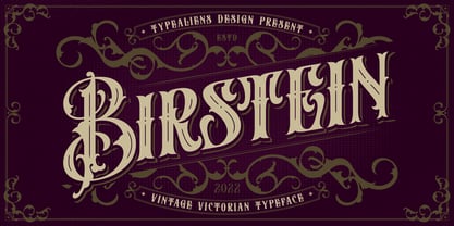 BIRSTEIN is a vintage decorative font, Victorian style. Perfect for vintage designs, vintage branding, liquor labels/brands. To enable the OpenType Stylistic alternates, you need a program that supports OpenType features such as Adobe Illustrator CS, Adobe Indesign & CorelDraw X6-X7. Cheers!
 - Trick Pony by Volcano Type,
$19.00Trick Pony is a typeface bastard that steals its characteristics from sans serif fonts and combines these with an ink brush appearance. The design is strictly reduced on the one hand, but on the other gets its handmade touch through varying stroke sizes. - Anonima by Gassstype,
$29.00 Hello Everyone, introduce our new product Font ANONIMA This Is Classic Bold Font.This is a Textured Natural Style and classy style with a clear style and dramatic movement. That is has charming, authentic and relaxed characteristic more natural look to your text.
 - Railyard Stencil JNL by Jeff Levine,
$29.00Railyard Stencil JNL is a stencil variant of Decal JNL that was set aside for a long time in a forgotten work folder. It's broad strokes and sharp serifs emulate the vintage look of old railway cars and other earlier forms of transportation. - Scripty by Turtle Arts,
$20.00Scripty is a hand drawn, calligraphy longhand handwritten font. With careful spacing, the letters can be used together to create words that look like theyπve been written with an old≠fashioned fountain pen, or used alone as embellishment to more plebean text. - Ladies by Creaditive Design,
$12.00 Ladies is a gorgeous yet thin and simple handwritten font. Ladies will add a luxury spark to design project that you wish to create! This font is PUA encoded which means you can access all of the glyphs and swashes with ease!
 - Easthallow by Rillatype,
$15.00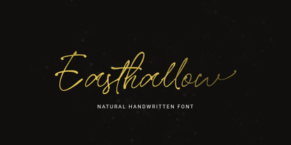 Introducing, Easthallow Handwritten Font! Easthallow is a natural handwritten font that gives a natural and feminine touch to your design. This font is perfect for signature logos, wedding invitation, branding, etc. Features : uppercase & lowercase numbers and punctuation multilingual ligatures alternates PUA encoded

