10,000 search results
(0.036 seconds)
- Gentlemens Script by Piñata,
$15.00 Gentlemen’s Script is a dynamic hand-written script in which the sharpness and speed of writing harmoniously coexist with elegance and a serious attitude. The script allows you to simulate fast inscriptions made by hand while keeping them elegant and classy. Working on the project, we wanted to develop a script that would harmoniously complement serifs or traditional sans-serifs and perfectly match them. Gentlemen’s Script is like an accessory in a gentleman’s wardrobe. It dilutes font traditions and adds brightness and dynamics to them. Despite the fact that the script was designed to be used as a complementary font, it has all the prerequisites to become the main character of your design story. It does not matter how you use it—Gentlemen’s Script easily adapts to reality and always works at the maximum level of efficiency. To make the script more harmonious and natural, we have drawn more than 60 ligatures. In order for the ligatures to be substituted automatically, we recommend always keeping the standard ligatures OpenType feature turned on! In addition, there are several alternative characters in the font that are programmed on the OpenType feature contextual alternates and which are used when the letter meets the service characters. To use the script to its maximum power, we recommend that you always keep the standard ligatures and contextual alternates OpenType features turned on. If you do not have access to applications that support OpenType features, it does not matter—even without these features you can use and enjoy our font!
 - FS Kim by Fontsmith,
$80.00 Unconventional beauty FS Kim is bold and intriguing – exuberant and unmissable, but playing a supporting role when needed. This typeface shines brightest as a display font, and is perfect for applications across fashion, theatre, cultural projects and pretty much any brand that wants to make a statement. While FS Kim is dramatic, it’s incredibly versatile, too, and works to showcase content in a stylish, striking way. This font makes you look, and makes you curious – perfect for brands and publishers that relish unconventional beauty. A playful text version While FS Kim’s text version is more constrained than the display, the strength and playfulness remain. Modifications for the text version include larger x-heights, longer ascenders and descenders, wider proportions and spacing, longer and more defined serifs and a lower contrast. “The overall idea is that it’s not an optical size,” Radoeva explains. Text and display maintain a strong connection that mean they can be used together. A display with a twist The calligraphic starting point helped to create familiar forms, while a contemporary display feel is achieved through short wedge serifs, with bold touches added through the font’s exaggerated forms and details. FS Kim’s narrow proportions, short ascenders and descenders, and tighter spacing make the font suitably compact for display use. The overall aesthetic feels bold and sharp, but closer inspection reveals that all the corners are softened. Decorative inlines In an unusual twist, FS Kim’s display version was first drawn using a broad-nib pen to create familiar forms and elegance while still breaking from serif traditions and making it all about standout character. There are also two additional styles, based on the Regular and Black with inlines – in uppercase, figures and symbols. The inline brings an extra option for an even stronger, more decorative display use.
 - AB One by AB Studio,
$23.99 AB One is a captivating sans-serif font family that effortlessly blends modern aesthetics with a dynamic, fluid formality inspired by the world of architecture. This versatile typeface offers three distinct weights, each carefully crafted to cater to a range of design needs. Key Features: Dynamic Fluidity: AB One embodies the dynamic essence of architectural forms, showcasing a graceful flow and a sense of movement. The font's letterforms possess an inherent flexibility that adds a touch of vibrancy to your designs, making it an excellent choice for contemporary projects that demand energy and liveliness. Sleek and Modern: The light weight of AB One radiates a modern, minimalist charm, perfect for creating a sleek and refined impression in your design projects. Its clean lines and well-balanced proportions ensure readability while evoking a sense of cutting-edge sophistication. Three Distinct Weights: The AB One font family offers three carefully crafted weights to provide versatility in your design work. Sans-Serif Elegance: As a sans-serif typeface, AB One represents a harmonious marriage of legibility and style. Its straightforward, elegant letterforms make it suitable for a wide range of applications, including branding, advertising, editorial design, and web interfaces. Inspired by Architecture: Drawing inspiration from the world of architecture, AB One captures the essence of structural elegance and sophistication. This font is an ideal choice for projects that require a touch of architectural finesse. Versatile Application: AB One's adaptability allows it to excel in a variety of design contexts. It seamlessly integrates with other design elements, providing a harmonious and engaging visual experience. AB One is a typeface that thrives on the principles of sleek modernity and architectural inspiration, making it a go-to choice for designers who seek to infuse their projects with a touch of dynamic fluid formality.
 - FS Kim Variable by Fontsmith,
$349.99Unconventional beauty FS Kim is bold and intriguing – exuberant and unmissable, but playing a supporting role when needed. This typeface shines brightest as a display font, and is perfect for applications across fashion, theatre, cultural projects and pretty much any brand that wants to make a statement. While FS Kim is dramatic, it’s incredibly versatile, too, and works to showcase content in a stylish, striking way. This font makes you look, and makes you curious – perfect for brands and publishers that relish unconventional beauty. A playful text version While FS Kim’s text version is more constrained than the display, the strength and playfulness remain. Modifications for the text version include larger x-heights, longer ascenders and descenders, wider proportions and spacing, longer and more defined serifs and a lower contrast. “The overall idea is that it’s not an optical size,” Radoeva explains. Text and display maintain a strong connection that mean they can be used together. A display with a twist The calligraphic starting point helped to create familiar forms, while a contemporary display feel is achieved through short wedge serifs, with bold touches added through the font’s exaggerated forms and details. FS Kim’s narrow proportions, short ascenders and descenders, and tighter spacing make the font suitably compact for display use. The overall aesthetic feels bold and sharp, but closer inspection reveals that all the corners are softened. Decorative inlines In an unusual twist, FS Kim’s display version was first drawn using a broad-nib pen to create familiar forms and elegance while still breaking from serif traditions and making it all about standout character. There are also two additional styles, based on the Regular and Black with inlines – in uppercase, figures and symbols. The inline brings an extra option for an even stronger, more decorative display use. - Hippie Comics JNL by Jeff Levine,
$29.00 In the 1920 edition of “How to Paint Signs and Sho’ Cards” by E. C. Matthews is an example of what is termed “poster lettering” that is so free form and unusual it borders on the eccentric. Resembling lettering more commonly found in 1960s “underground comics” of the Hippie generation rather than of the Art Nouveau period, it oddly enough works well in both styles. This novelty typeface is now available as Hippie Comics JNL in both regular and oblique versions.
 - Hyperon by ParaType,
$30.00 Hyperon is a text typeface, which is especially useful for math and physics literature. Its nature is defined by austere and humanist features that show the most in italic. The typeface includes weights from Regular to Black and widths from Condensed to Semi Expanded. What stands out for Hyperon is the extended character set, with added Greek and lots of mathematical signs. Some styles have small caps. The typeface was designed by Natalia Vasilyeva and released by Paratype in 2020.
 - Ballsye by Putracetol,
$28.00 Say Hello to Ballsye, a Superb bold display font. This font is a very bold font so it has a strong impression. But other than that, this font can also be a fun and playful font. Ballsye is perfect for branding design, posters, apparel, for logotype, website header, fashion design and any more. Come with Opentype feature with a lot of alternates, its help you to make great lettering. This font is also support multi language.
 - Rouvin by Objectype,
$20.00 Font Rouvin is a serif font designed by Candi Erwanto and produced by Objectype. This font is suitable for minimalist, luxurious, feminine, and elegant designs. This font can be used for various types of designs, such as logo design, packaging design, poster design, and so on. This font has ligature and alternative glyph features that allow for more interesting and unique characters. In addition, this font is also multilingual, so it can be used in various languages.
 - Freaky Story by Sarid Ezra,
$15.00 Freaky Story is a condensed serif with horror & creepy vibes! This serif is so unique that will make your design pop up. This font is suitable for poster movies especially thriller & horror movies. With unique lowercase, this font will make your poster more stand out and stylish! You also can use this font for any design because of the versatility in this font. Also, this font support multi language. Let's make your next halloween poster with this font!
 - Scary Things by Sarid Ezra,
$15.00 Scary Things is a sharp serif with horror & creepy vibes! This serif is so clean that will make your design pop up. This font is suitable for poster movies especially thriller & horror movies. With unique & sharp shape, this font will make your poster more stand out! You also can use this font for any design because of the versatility in this font. Also, this font support multi language. Let's make your next halloween poster with this font!
 - Apothecary by Pixel Colours,
$26.00 Apothecary is a modern stylish font duo that includes a sweet flowing script font and a typewriter font made from an authentic typewriting. Combine both fonts to create beautiful logos and branding. Design professional apothecary and botanical labels and packaging or make elegant wedding invitations. Includes: Apothecary regular: a script flowy monoline font Apothecary typewriter: an antique typewriter font perfect for small texts, taglines or info Lowercase and uppercase characters Numerals, alternates and ligatures. Language support
 - Aphrodite Slim by Typesenses,
$57.00 Aphrodite Slim Pro is not just a lighter version of its sister Aphrodite Pro. Aphrodite Slim Pro has duplicated the quantity of characters of its partner, and that means more than 500 new glyphs, reaching a total of more than 1000. More delicate and meticulous, Aphrodite Slim Pro is once more a new typography with deep calligraphic ideals: We immersed ourselves into the world of each calligraphy ductus and each calligraphy masters by studying from decoration to lettering books. This was the key for the logic of Aphrodite Slim’s behavior. The new concept of Aphrodite Slim Pro was to join diverse styles of calligraphy in one in order to achieve an autonomous expressiveness, in fact, this is what calligraphy aims to, and we agreed to bring those ideals to the world of typography: It is justifiable to be inspired in hundred-year-old calligraphies, but it is even better if the results you obtain have a plus. A personal plus. During the creation process we were wondering whether it was possible to mix certain strokes of such rigid styles as uncial, (Li·n’s favourite style), with strokes of the copperplate, (Sav’s favourite style), and also to take and mix cualities of cancelleresca cursiva, formata and moderna; finally giving our creation a roman-transition italic look. So Aphrodite Slim takes ideals and aspects from those formal styles, following its own logic though, and emphasizing the fact of being a decorative typography. Calligraphy masters of our past are who we are in debt with. They are the cause we have lovely letters now. They have been spontaneous at the moment of creation, what differs from the type-designers of nowadays, whose spontaneity is more limited. Digital faces that we are used to see these days are a result of long hours of optical adjustments, grids, macros and inspirations of other existing typography, but without personal contributions. Aphrodite Slim wants to refute this. Its mission is to rescue de spontaneity of the artesanal lettering in order to obtain unique words; those which only calligraphy masters of our past or lettering artists of our present could give us. We have worked hard to achieve this, making Aphrodite the most universal font we could: It was necessary to study the most common words, focalizing more in the ones referring to “sensitivity”, of four of the most spoken languages in the world. Aphrodite Slim has an enormous quantity of decorative characters and special ligatures for phrases and words in English, French, Spanish and German. (See English, Français, Español, Deutsch PDF in the gallery section). We promise there is no existing type that decorates/ligates glyphs and words like Aphrodite Slim does: It is the first time a font like this really considers its purpose. -The way glyphs are ligated is insane- : Aphrodite Slim rescues some ideals of persons like Jan van den Velde (Italian cancilleresca writing of XVI Century) who understands ascenders and descenders as possibilities to beautify the lines of writing with curved strokes that seem to be dancing above and below of the words. This master also creates ascenders and descenders even where they are not necessary, on letters that do not actually need them: Aphrodite Slim takes this ideal. The font counts with a wide range of glyphs that seem not to be satisfied with its more primitive form and prefer to extreme their parts to be decorative. It also existed masters of calligraphy like José de Casanova of XVII Century, who, with a magnificant skill and a really personal mark, had the particularity of ligating words that were actually separated with spaces. This is another innovative feature in Aphrodite Slim. An investigation of the most common beginnings and endings words of the English language was done. Having that feature activated (discretionary ligatures), common words will start to ligate or to be decorated even when they are separated by spaces. Impossible to forget Francesco Periccioli of XVII Century and our experience us designers to face with works of him: His letters, that today are included in the group of cancellerescas modernas, have been a direct inspiration to the oldstyle figures and historical forms variables in Aphrodite Slim. Giovanni Antonio Tagliente (XVI Century) and his particular way of making tails and diagonals longer than usual, qualities that our creation reflects too. Finally, our adventures in Biblioteca Nacional and Barrio San Telmo, Buenos Aires, were essential for us to make Aphrodite Slim more complete and interesting: Sav did an excellent work when studying how the decorative miscellanea and swirls of early XX century were. She also investigated what particularities made those roman titling characters look antique so she could rescue some ideals for the oldstyle figures and historical forms variables. This also leaded her to create the ornaments variable in Aphrodite Slim. We are really proud of presenting Aphrodite Slim Pro, a typography that was the result of days and nights of working hard, because we do love what we do; and we are glad we are living in a present that gives us the possibility to spread this kind of art, because that is the way we consider our job: Aphrodite Slim Pro is Art. Hope you can appreciate the enormous work this type has. Features. Aphrodite Slim Pro is the most complete variable. It includes more than 1000 glyphs. Thanks to the Open-Type programming, it counts with a easy way to change/alternate glyphs if the application in which the font is used supports this. The variables contained in Aphrodite Slim Pro are also offered separately. Aphrodite Slim Text: It is the variable for lines and paragraphs. Thus it is the least ornamental and the most accurate to achieve a satisfying legibility. It has the Standard Ligatures feature in order to improve the possible conflicts some glyphs could have by others. Aphrodite Slim Contextual: It is the one that makes emphasis in decorating. It has the particularity of ligating/decorating words of common use in English, French, Spanish and German. It also has the quality of ligating common beginnings and endings of the common words in English. Aphrodite Slim Stylistic: With similar features of Slim Contextual. It includes a set of decorative numbers for a display use. Aphrodite Slim Swash: This one has special beginnings and endings to decorate words. Aphrodite Slim Endings: It makes words look as a signature. Aphrodite Slim Historical: It adds an antique look to the written word. It also has the special historical ligature function. Aphrodite Slim Titling: This one is the most decorative. Its copperplate inspired ornaments give words a special color, in order to handle the quantity of decoration, it comes with the standard ligature feature, which has the most common ligatures plus others that make decorative swirls not to be conflictive. Aphrodite Slim Ornaments: A set of 52 ornaments. Aphrodite Slim Pro includes all this features plus the Stylistic Set 1; Stylistic Set 2 and the possibility of Slashed Zero. We recommend you to check out the gallery in order to see all these features in action.
 - Postale by Dear Alison,
$24.00 I recently came across an old travel journal I’d misplaced, and in it was a really rough sketch of an Italian post office. The sign lettering caught my eye while flipping through the pages, and while not my forte, I thought I’d take my stab at recreating sans-serif lettering as a font. The Postale family recaptures that old post signage and the vintage flair that appeals to me. A little reminiscing is always a good thing. You’ll find the Stylistic Alternates feature changes up the retro styled letters to a more modern sans serif styling for a handful of letterforms, if the vintage style of certain letters isn’t your cup of tea.
 - Poptis by Abbasy Studio,
$10.00 The combination of two different font styles 'script and sans' . Poptis font available in Regular, Bold, and Rough version as a choice to mix and match your design. This script font comes with multiple alternates that will make your words look like a custom lettering. With additional Serif font you will be able to create the beautiful combination. Both of these font is great for Logos, Lettering, Clothing Design, Poster, Label, Quotes, etc.
 - Palestra by Larin Type Co,
$12.00 Palestra - a modern sans serif font in four style : Regular, Italic, Bold and Bold italic. In this font, I can see many alternatives for the lowercase and most common ligatures that fit perfectly with this font style. This font can look more classic without serifs and more expressive with alternative substitutes, try to play with them and you will get the uniqueness in your project. All characters in this font are PUA-encoded.
 - No Bad Days by Cardigan,
$25.00 Get RAD with this unique, fun, handwritten font by Cardigan. This pack includes two fonts. A bold, brush font with a supporting thin, handwritten script font. These typefaces ooze good vibes, adding a fun and edgy style to any design. Whether you need a hand drawn feel to a logo or a bold organic font that jumps off any page. No Bad Days has your back and is a total dream to work with.
 - Norden Standard by Asgeir Pedersen,
$23.99 The Standard version of the Norden font family (see Round and Display) is "a standard sans serif" font. However, the significant detail and difference is that it comes with slightly rounded end corners, which makes the font “easier on the eye”, especially at large sizes compared to traditional fonts with sharp-edge corners. This little but important difference gives the font a commanding yet poised presence, without it imposing itself, as it were.
 - Troyline by Sarid Ezra,
$13.00 Troyline is my newest font duo. Contain two fonts, the organic script and sans. Comes with Rough and Stamp style. You can use this font for every project. Suitable for branding logo, hand lettering, or apparel design. This font duo also support multilingual, number and symbol, alternates, swash, and underline. Also this font already PUA Encoded. What will you get: Troyline Script (OTF/TTF) - Rough & Stamp Troyline Sans (OTF/TTF) - Rough & Stamp
 - Brotha Script by Khurasan,
$8.00 Brotha Script Font is a fun bold script, fresh and with a modern style . Brotha script font is good for you to apply as the main title of your design work, and for those of you who like thick fonts in the style of calligraphy. This font is very useful then if you don't have it. Brotha Script Font suitable for logos, branding, greeting cards, posters and any design that you create.
 - Vintage Machine by Balpirick,
$15.00 Vintage Machine is a Typewritter Typeface Font. This font captures the essence of vintage typewriters, with a distinct and easily recognizable aesthetic. This font is perfect for projects that require a vintage touch, such as vintage-inspired branding, editorial designs, and book covers. Embrace the nostalgia of analog writing with our typewriter fonts, a tribute to the timeless art of typography. - also multilingual support Enjoy the font! Feel free to comment or feedback! Thank you!
 - Martie by Canada Type,
$25.00From the heart of the Blue Ridge Mountains, by way of Toronto, comes Martie's handwriting. Martie Byrd is a school teacher in Roanoke, Virginia, and a friend of Canada Type's Rebecca Alaccari. After years of admiring the cheer and clarity of Martie's handwriting, we asked her to write out full alphabets for some cool font treatment. The intent was to do three different versions of her writing in two different pens, then use the auto-magic of OpenType to determine letter sequences and rotate character sets on the fly when the fonts are in use. A successful endeavor it was. Take a look at the images in the MyFonts gallery to see the character rotation in action, along with a visual explanation of why Martie is not just another handwriting font. Unlike other available felt tip and ballpoint handwriting fonts, the regular and bold variations are style-based, not weight-based. They are the handwritten expressions of two different Sharpie pens: The fine point one (Martie Bold), and the ultrafine one (Martie Regular). The style-based variation considerably helps the realism needed in design pieces that take advantage of the contrast of two different handwriting fonts. Weight thickening in handwriting is an obvious mechanical effect that only happens with computers. Weight changing by replacing pens is what happens in the real world. Martie Pro and Martie Pro Bold each contain three different character sets in a single font. Language support includes Western, Central and Eastern European languages for all three sets. This translates into each Pro font containing over 750 characters. Add OpenType code and stir, and you have true handwriting fonts with versatility unavailable out there in anything else of the genre. A software program that supports OpenType features is needed to use the randomization coded in Martie Pro and Martie Pro Bold. Current versions of QuarkXpress and Adobe applications (Photoshop, Illlustrator, InDesign) do contain support for the randomization feature. But if you don't have one of these apps, you can still use the interchangeable Type 1 or True Type fonts and change the characters manually to achieve the appearance of true handwriting. The Martie fonts come in a variety of price packages, from the affordable single fonts to value-laden complete sets. All the proceeds from these fonts received by Canada Type will be donated 50/50 to two primary schools: One in Roanoke (where Martie teaches), and one in Toronto (where the 10-year old, real Canada Type boss goes). So next time a design project needs a handwriting font, do the write thing and use Martie to keep it real. - 4th and Inches - Unknown license

- SURROUNDED large - Unknown license

- Mystery Typewriter by Ana's Fonts,
$16.00 Mystery typewriter is a realistic typewriter font with bonus misprints. What you'll get: Font with up to 3 alternatives for each letter, number and symbol, accessible through contextual alternates An extra set of 26 misprints to turn up the grunge volume in your designs This typewriter font is perfect for adding an authentic feel to your retro and vintage designs.
 - Hexxes by astroluxtype,
$15.00 Bold mutant light typography. Futuristic astroluxtype. Digital pixels and hex head wrenches from the toolbox were the influence for this font. Hexxes Light and Hexxes Bold are a minimal font set that includes upper and lowercase letterforms which can be used at various sizes but, we consider it to be a headline/display font, best applied larger than 24 points in size.
 - Molaka by Maulana Creative,
$12.00 Molaka Modern Script Font consisting of a fashionable sophisticated signature-style script with it's own unique curves and an elegant inky flow. Molaka Modern Script Font is perfect for branding projects, logo, wedding designs, social media posts, advertisements, product packaging, product designs, label, photography, watermark, invitation, stationery and any projects that need handwriting taste. Thanks for use this font, MaulanaCreative
 - Moonart by Scratch Design,
$12.00 Introducing “Moonart” It's handwritten with natural and rough character. This font is suitable for designs that emphasize the authenticity of slightly rough writing. Perfect for creating Instagram quote posts, novel or book typefaces, branding, invitations, labels, packaging, stationery, etc. This is a full font, which features all uppercase and lowercase letters, numbers and punctuation, stylish alternates, multilingual, alternates and ligatures. Enjoy this font!
 - Homemade Choco by Tlatous Type,
$19.00 Introducing Homemade Choco by Tlatoustype Homamade Choco is a Monoline handwritten Font. Homemade Choco is a cute, quirky and fresh handwritten font. It is ideal for holiday-themed greeting cards and for any crafting project that requires a sweet, romantic touch. Homemade Choco also multilingual support. Enjoy the font, feel free to comment or feedback, send me PM or email. Thank you!
 - Balpoine by Krntype Studio,
$18.00 Introducing Balpoine! a wonderful Handwritten, monoline font display. made with a unique and high curve style that makes it look different Balpoine is an eye-catching, and clean handwritten font. balpoine comes with an accent language and ligatures. This font is suitable for handwriting logos, Wedding invitation cards, T-shirts, merchandise, quotes, social media posts, advertising, and a lot more!
 - Kirani by Nirmalagraphics,
$14.00 Kirani is a beautiful fonts that I made with the aim to meet the needs of the industry in the creative world for those who are bored with ordinary script fonts. You can also use Kirani for your promotional needs, whether it's for logos, flyers, magazines, brochures or even for advertising. Oh yes, and this font also has multilingual support.
 - Punch of Love by Sipanji21,
$15.00 Punch Of Love is a lovely display font that radiates charm. It features gorgeous hearts in each letter which give it an incredibly romantic feel. this font suitable for valentine day poster, logo, t shirt, event banner and etc. you can use this font for any design, apparel, kids logo, logo type, with many swash for make your design awesome.
 - Briberra by Sarid Ezra,
$15.00 Introducing, Briberra - Realistic Rough Bold Script! Briberra is hand lettering script font that contain stylistic alternate, swash, etc to create your own customized design. You can using this font for quotes, t-shirt design, or whatever you want. This font is support multi language. Support PUA. PS: Type underscore + number (from 1 to 5). Or copy Brib_3erra in preview bellow.. Thank You!
 - Jarekuh by Differentialtype,
$10.00 Jarekuh is a neat decorative serif font. This font will look amazing in any context, whether it's used on a busy background or as a standalone title! Jarekuh has many alternative glyphs that can be combined to get an attractive and prominent impression. Of course this font is PUA encoded, which means you can access all of the glyphs and swashes with ease!
 - Extra C by Tipastype,
$28.00 It is an Extra Condensed, Extra Light, Extra experimental and Extra display font. Extra C is a fun font that doesn't take itself too seriously. Ideal for those who need a font with great character and personality but at the same time a delicate touch in their graphic pieces. EXTRA C has 4 static weights in addition to a variable version.
 - Rigid Display by Studio Fat Cat,
$20.00 Rigid Display is a sans serif font designed for display needs such as titles, logos, etc. with a different touch. Rigid Display provides 5 weights for its users to have freedom in handling. This fresh font is an alternative that will refresh your font library and also the viewers so feel free to choose it as the main pawn for your project
 - Grizzly Attack by Rometheme,
$25.00 Grizzly Attack is a brush and handdrawn font, this font looks urban, cool, readable, stylish, catchy and easy to use. Grizzly Font is the best choice for your professional design projects, including : logo, poster design, t-shirt, headline, flyer, cd cover album, quotes, business card, branding, magazines, social media, advertisements, product designs, or something that need urban or cool looks.
 - Royal Blossom by Wiescher Design,
$39.50 Royal Blossom belongs to my extended family of blackletter fonts that are derived from the famous Royal Bavarian Fraktur. Ayres Royal and Monkeytails also belong to this elaborate set of blackletter fonts; that's why I now offer the lot for an exceptional price. All fonts can be mixed and used together. Your type designer with a crunch for history, Gert Wiescher.
 - Biomorph by Rillatype,
$20.00 Proudly Introducing, Biomorph! Biomorph is a brand new condensed sans font family released by us. This font is very suitable for your projects especially for brandingm publishing, titles, book, magazine, website, etc. Biomorph is font family that comes from thin, extra light, light, regular, medium, semibold, and bold version, with all of these styles gives yoiu freedom to design as you like!
 - Jathafa by JprintStudio,
$15.00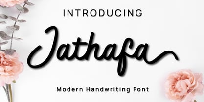 Jathafa is a cute and casual handwritten font with a very friendly feel. Whether you’re looking for fonts to make beautiful wedding invitations, beautiful artwork, interesting social media posts, and funny greeting cards. Jathafa also has several alternative letters that can make your project look modern, luxurious and classy. This font will turn any creative idea into a true work of art!
 - A Little of Love by Pixel Colours,
$19.00 A Little of Love is a handwritten font duo that includes lots of cute dingbats to decorate quotes, social media posts, greeting cards, etc. Make combinations between the uppercase sans and the script and design beautiful projects! Includes - A Little of Love Font: a combination of a sans and a script font - A Little of Love Dingbats: 80 cute illustrations

