10,000 search results
(0.018 seconds)
- Reveler JNL by Jeff Levine,
$29.00 The sheet music for "Good Night Angel" from the 1937 motion picture "Radio City Revels", had the movie's title hand lettered in a free form Art Deco sans serif design. This has been recreated digitally as Reveler JNL, which is available in both regular and oblique versions.
 - Persia BT by Bitstream,
$50.99Masoud Nejabati has drawn upon his capable calligraphic skills to create this typeface. Persia represents his first latin-based design. This gentle and finely rendered script reveals Nejabati's extensive background in Islamic calligraphic art. The slight back slant further enhances the appearance of hand-scribed pen calligraphy. - Mineola by Haiku Monkey,
$10.00 Mineola got tired of being like all the other serifed fonts, got some hip body art, and moved to the cool part of town. But every so often, when no one's watching, Mineola puts on a light blue oxford shirt and listens to top 40 radio.
 - Moulin Rouge by Solotype,
$19.95This came from a shop near Munich, Germany, and was a very poor proof with no font name on it. Never did identify it. When we cleaned it up, we liked it pretty well. We think it is typical of some early twentieth century art nouveau fonts. - Ornella by URW Type Foundry,
$39.99 Ornella is a very typical art nouveau typeface that perfectly fits into the series of URW++ Jugendstil fonts released in the last couple of years. Ornella was reworked, redesigned, completed and digitally remastered by Ralph M. Unger for URW++, based on specimen taken from old font catalogues.
 - Prebuga Signature by Balevgraph Studio,
$12.00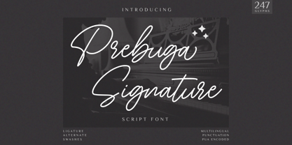 Prebuga Signature is a fragile, elegant and versatile script font. Fall for its ravishing style and use it to create gorgeous wedding invitations, beautiful stationary art, eye-catching social media posts, and much more! What's Included? Uppercase & Lowercase Numbers & Punctuation Alternate & Ligature Multilingual Support PUA Encoded
 - Musical Prelude JNL by Jeff Levine,
$29.00 Musical Prelude JNL is a thin Art Deco typeface with some interesting character shapes, and was inspired by the hand lettering on the cover of the 1933 sheet music for "Blue Prelude" by Gordon Jenkins and Joe Bishop. It is available in both regular and oblique versions.
 - AZ Tiki by Artist of Design,
$20.00 AZ Tiki font was inspired from Polynesian pop art Ephemera of the 1950's. This font utilizes an "old look" to the line work which is designed to have a "worn feel" to it. Ideal for use as headline or sub-head text in you design.
 - Moon Rays by Epiclinez,
$18.00 Moon Rays is a bold and playful display font, suitable for all children's designs, product packaging, stationary art, apparel designs, and more fun and creative ideas! So what's included: Basic Latin A-Z & a-z. Numbers, symbols, and punctuations Multilingual Support. Accented Characters : ÀÁÂÃÄÅÆÇÈÉÊËÌÍÎÏÑÒÓÔÕÖØŒŠÙÚÛÜŸÝŽàáâãäåæçèéêëìíîïñòóôõöøœšùúûüýÿžß Thank You.
 - Basic Nouveau JNL by Jeff Levine,
$29.00 The 1913 sheet music for "You’ll Be Welcome When You Get Back Home" had its title hand lettered in a simple, yet attractive Art Nouveau sans serif design which has been preserved as digital type. Basic Nouveau JNL is available in both regular and oblique versions.
 - P22 BlancoNeg by IHOF,
$24.95 BlancoNeg was inspired by the lettering of Saul Bass with some thoughts of Op-Art. Each character relies on the positive and negative spaces of its neighboring letters to help define its own shape. This font is casual with the look of cut out paper forms.
 - Qoxiem by Almarkha Type,
$29.00 Introducing our latest Modern Slab called Qoxiem can make your logotype become more interesting. inspired by the decorative arts and architecture movement Qoxiem fonts is perfect for your project and allows you to create designs, headlines, posters, logos, badges, t-shirts and many more that are beautiful.
 - Solid Deco JNL by Jeff Levine,
$29.00 Solid Deco JNL was modeled after a small sign with the word "restaurant" in an unusual Art Deco solid lettering style. It was spotted within the same image of the Lenox Lounge in New York which gave forth the neon letters that became Sign Sans JNL.
 - Streamlined Stencil JNL by Jeff Levine,
$29.00 Streamlined Stencil JNL is based on a photo of an Art Deco era shipping stencil saying "With Care" which was heavily influenced by the Futura Black style of lettering. The image was seen in the Steven Heller-Louise Fili book "Stencil Type" (published by Thames and Hudson).
 - Walahard by JprintStudio,
$10.00 Introducing Walahard, Walahard is a sweet, soft handwritten font. Get inspired by its authentic feel and use it to create gorgeous wedding invitations, beautiful stationary art, eye-catching social media posts, and cute greeting cards. Ready to use for projects, texts, letters, or whatever you want!
 - Sleuth JNL by Jeff Levine,
$29.00 The movie trailer for the1936 film "After the Thin Man" is filled with text lettered in this classic Art Deco condensed typeface. Sleuth JNL seems the appropriate name for this digital revival, as the romantic comedy centers around detective Nick Charles' and his wife Nora's adventures.
 - Movie Production JNL by Jeff Levine,
$29.00 Inside the pages of the August, 1930 issue of “The New Movie Magazine” is an ad for Warner Brothers-First National Pictures – hand lettered in a bold Art Deco sans. This was the basis for Movie Production JNL, which is available in both regular and oblique versions.
 - Show Card Elite JNL by Jeff Levine,
$29.00 One example in the 1919 instructional book “One Hundred Alphabets for the Show Card Writer” was for an elegant sans serif with a subtle Art Nouveau style to the letter forms. This is now available digitally as Show Card Elite JNL in both regular and oblique versions.
 - Street Power by Arendxstudio,
$17.00 Street Power is a free style font that has the characteristics of street art that shows freedom. It is filled with unique characters. Features : • Character Set A-Z • Numerals & Punctuations (OpenType Standard) • Accents (Multilingual characters) • Ligatures • Alternates There it is! I really hope you enjoy it.
 - Belgravia by Scriptorium,
$24.00Belgravia is an Art Nouveau period design based on hand lettering from the 1890s. Like our popular Pantagruel font it has a lot of the elements which would influence later Psychedelic poster lettering in the 1960s. Very nice looking with a good weight for title designs. - Discotheque JNL by Jeff Levine,
$29.00 A 1930s casual Art Deco type style with as much influence in 1970s graphic design as in its day was found within the pages of the 1930s French publication L'Art du Tracé Rationnel de la Lettre. Discotheque JNL is available in both regular and oblique versions.
 - Brand X JNL by Jeff Levine,
$29.00 Brand X JNL is a retro-inspired Art Deco typeface with its name being derived from the generic label given to competitor's brands. Whenever a product wishes to extol its virtues without directly naming its competitors and thereby giving reverse publicity to them, "Brand X" is mentioned.
 - The Overcook by Arendxstudio,
$22.00 The Overcook is a free style font that has the characteristics of street art that shows freedom and is filled with unique characters Features : • Character Set A-Z • Numerals & Punctuations (OpenType Standard) • Accents (Multilingual characters) • Ligature • Alternate There it is! I really hope you enjoy it
 - Waba by Lewis McGuffie Type,
$40.00 Waba Pronounced ‘Vah-bah’, is a font family that I designed. The name comes from a historical variation on the Estonian word ‘vaba’ – meaning ‘free’, or 'at liberty'. Back in 2017 I visited the Estonian Print & Paper Museum in Tartu to see its great collection of type (well worth a visit!). While I was there I saw some big woodcut blocks of Reklameschrift Herold - a super Art Nouveau/Jugendstil style display font. The Print & Paper Museum's collection covers both Latin and Cyrillic faces and as a foreigner in these parts I'm kind of fascinated by the exoticism of Cyrillic. How it is different but the same to the Latin letters I take for granted (as a humble Englander – no excuses). Not to mention, Jugendstil with its imitation of natural form, reverse-weights and looping-delicious curves (like you've left the window open all summer and the garden plants are climbing in). This mix of Jugendstil, Cyrillic letters and the beautiful historical border town of Tartu inspired me to start drawing Waba. Trimming the serifs from Herold, simplifying those angles and expanding the category of weights, then taking look at the magical logic of Berthold Block and doing a few things that just seemed right at the time – Waba is a bit of love letter to Estonia, the Baltics and the visual history of Eastern Europe. Waba Monogram Waba also contains a monogram face, which allows you to create any monogramming latin and cyrillic. Simply type out your 2-3-4 characters in Waba Monogram, making sure Contextual Alternates is turned on them voila! Monograms can be customised manually using the OpenType select-pop-up in Adobe. Also included are a few Discretionary Ligatures for Mc, De, Von etc. Monograms work best when Contextual Alternates is turned on.
 - ITC Bolthole by ITC,
$29.99I fell in love at the age of twelve in Wales, recalls Bernard Philpot. "My father brought me to a small graveyard in the Welsh hills to show me two headstones carved by the great Eric Gill. I instantly fell in love with the beauty of the carving and the perfection of the letterforms. I still go back to marvel at these works of art." However, the ITC Bolthole™ design, Philpot's first commercial typographic endeavor, is quite unlike the works of Eric Gill that first captured his heart. Bolthole is a craggy sans serif with a definite grumpy attitude. It's not terribly legible, and, if more than a few words are set in the design, it's not very readable. To round out its cranky personality, Bolthole does not like to be set in small sizes. Like Cheez Whiz® and bullfights, you either love or hate this typeface. But whichever emotion dominates, there is no denying that Bolthole has a personality to be reckoned with - one with ample magnetism to ensure reader attraction. If used to set brief blocks of display copy, the typeface makes a powerful statement. Bolthole was originally designed to complement a whimsical ad for the Royal Society for the Prevention of Cruelty to Animals. As Philpot recalls, "although the ad didn't win any awards, the type attracted some very positive comments for its original look and feel." Philpot studied graphic design and typography at the London School of Printing, and soon after graduation found himself working in a large advertising agency in London. According to Philpot, "After designing type for everything from packaging to ads, I thought it time to convert one of my designs into a complete font - and Bolthole was born." ITC Bolthole could very well be the Shrek™ of typeface design - which might not be such a bad thing." - Riona Sans by Melvastype,
$25.00 Riona Sans is a sans serif type family of 16 fonts, including true italics. It can handle every challenge you throw at it. Use it on websites, print, applications, games, logos, packaging, as a brand font: You name it. It looks good at large sizes and remains legible at small sizes. Rely on Riona Sans to convey a mood and make an impact, whether you want to be elegant and subtle, strong and dynamic, friendly or powerful.
 - Organic Tuesday by Bogstav,
$15.00 Sometimes you need things organised in a neat way. Organic Tuesday has that, but also a will to break free at the same time. Years ago I was at a restaurant where the menu was handwritten with a clumsy, but characteristic and charming, monospaced font. I must have focused so much on these letters that I can’t recall what I actually ate. But what I do remember is that it was a Tuesday, and the restaurant was organic!
 - Grunt Reaper - Unknown license

- DR Kruk Single by Dmitry Rastvortsev,
$49.99 Honorable Mention at Morisawa Type Design Competition 2019 (Tokyo, Japan).
 - Blazing Furnace by Kitchen Table Type Foundry,
$16.00 At home we have a wood stove. Last year, I bought a whole bunch of tree trunks, which I cut up with a chainsaw and then chopped with my Swedish axe. In Holland we have a saying that firewood keeps you warm three times: when you cut the tree, when you chop the wood and when you burn it in the stove. Our stove is rather small, so it is not exactly a blazing furnace, but I liked the name because it seems to fit this font. Blazing Furnace was made with ink and a brush. It is a bit messy and rough, but it comes with multilingual support and a nice set of alternates for the lower case letters.
 - Jugendstil Initials by HiH,
$16.00 Jugendstil Initials were designed by Heinrich Vogeler around 1905, based on the German blackletter tradition. A similar set of initials by Vogeler, but based on roman letters was released by Rudhardsche Geisserei of Offenbach at about this time. I believe the originals were woodcuts. The backgrounds to the letterforms may be seen as examples of Heimatkunst, an art movement within Germany that drew deliberate inspiration from the rural countryside. Like the Arts and Crafts Movement in England a little earlier, Heimatkunst may be seen, in part, as a romantic rejection of urban industrialization, while at the same time representing a back-to-roots nationalism. Like any river, it was fed by many streams. Jugendstil Initials is an experiment with which I am most pleased. It is far and away the most complex font HiH has produced and I was uncertain whether or not it could be done successfully. To oversimplify, a font is produced by creating outlines of each character, using points along the outline to define the contour. A simple sans-serif letter A with crossbar can be created using as few as 10 points. We decided to make a comparison of the number of points we used to define the uppercase A in various fonts. Cori, Gaiety Girl and Page No 508 all use 12 points. Patent Reclame uses 39 and Publicity Headline uses 43. All the rest of the A’s, except the decorative initials, fall somewhere in between. The initial letters run from 48 points for Schnorr Initials to 255 for Morris Initials Two, with 150 being about average. Then there is a jump to 418 points for Morris Initials One and, finally, to 1626 points for Jugendstil Initials. And this was only after we selectively simplified the designs so our font creation software (Fontographer) could render them. The average was 1678, not including X and Y. There was no X and Y in the original design and we have provided simple stand-ins to fill out the alphabet, without trying to imitate the style of the orginal design. We did a lot of looking to find a compatible lower case. We decided that Morris Gothic from the same period was the best match in color, design and historical context. We felt so strongly about the choice that we decided to produce our Morris Gothic font for the purpose of providing a lower case for Jugendstil Initials. The long s, as well as the ligatures ch and ck are provided. at 181, 123 (leftbrace) and 125 (rightbrace) respectively. This font was a lot of work, but I think it was worth it. I hope you agree.
 - Merge Pro by Philatype,
$25.00 Merge Pro is a soft family of sans, available in 2 weights with character sets for Cyrillic and Greek. Readable at small sizes, it sets open and wide. At display sizes, the softness makes for a friendlier, more casual alternative to other rounded sans.
 - Andy by Monotype,
$40.99This childish script by Monotype designer Steve Matteson strikes a great balance between informality and legibility. The TrueType versions have been extensively tuned (hinted) for high legibility at small sizes on screen at a quality level termed ESQ (enhanced screen quality) by the foundry. - Homage Script by GarageFonts,
$49.00 Graceful, elegant, and at times eccentric, Homage Script was inspired by James Hellmuth’s hand-lettered design for the cover of “Homage to the Alphabet” — a gigantic tome produced in 1980 to provide full-showings of photolettering fonts available for traditional typesetting at Phil’s Photo.
 - Standard Poster by ParaType,
$25.00 Designed at Polygraphmash type design bureau in 1986. Based on "English" bold styles of the Ossip Lehmann type foundry (St.-Petersburg), of mid-19th century. The digital version was developed at ParaType in 1992 by Vladimir Yefimov. For use in advertising and display typography.
 - RM Squarial by Ray Meadows,
$19.00 Based loosely on a square, this hair line design works best at 24pt and above. Due to the modular nature of this design there may be a slight lack of smoothness to the curves at very large point sizes (around 100 pt and above).
 - Freaky Vibes by Blankids,
$20.00 Elevate your design with the distinctive charm of “Freaky Vibes Font”, a unique font that seamlessly blends rugged textures with contemporary style. This versatile font is meticulously crafted to add character and personality to your projects, making it an ideal choice for various creative applications. Key Features: Unique Texture: The font boasts a captivating rough texture that exudes authenticity and individuality, setting it apart from conventional typefaces. Versatility: “Freaky Vibes Font” is designed to meet diverse design needs. Whether you’re working on branding, logotypes, displays, posters, or even food-related projects, this font is your go-to choice for a touch of rustic elegance. Bold Presence: Make a statement with the bold and impactful presence of “Freaky Vibes Font.” Its strong and confident strokes command attention, ensuring your message is conveyed with style. Perfect for: Branding: Establish a memorable and distinctive brand identity with the unique flair of “Freaky Vibes Font.” Logotypes: Craft logos that stand out and leave a lasting impression with this font’s rugged yet refined aesthetic. Display and Poster Design: Infuse your designs with a bold and eye-catching appeal, perfect for grabbing attention in displays and posters. Food-related Projects: Capture the essence of artisanal and rustic culinary experiences with a font that complements the visual language of the food industry. Embrace the rustic charm and modern appeal of “Freaky Vibes Font” – a font that goes beyond letters and becomes a visual signature for your creative endeavors.
 - Monaz by Craft Supply Co,
$20.00 Introduction to Monaz – Bubble Font Monaz – Bubble Font, a playful and airy display font, is inspired by the lightness and roundness of bubbles and balloons. Perfect for creating eye-catching headings, logos, and children’s books, this font not only grabs attention but also serves as an ideal choice for fun and whimsical projects. Design and Aesthetics In its design, Monaz – Bubble Font features characters that resemble bubbles, with rounded edges and a bouncy feel. Furthermore, the letters mimic the floating appearance of balloons, thus adding a cheerful and lighthearted touch to any design. Additionally, its rounded forms are easy on the eyes, ensuring readability while preserving its playful charm. Versatility and Usage Monaz – Bubble Font boasts high versatility, fitting a variety of design needs effortlessly. Not only does it shine in party invitations and product packaging, but it also excels in promotional materials. Moreover, its effectiveness extends to educational materials for children, making learning engaging with its friendly appearance. As a result, its readability and unique style make it a top choice for designers seeking to add a fun element to their projects. Accessibility and Appeal Designed for a wide audience, Monaz – Bubble Font features a simple and clear style that is easy to read. It appeals to all ages, capturing the whimsy of childhood while still being sophisticated enough for adult projects. In summary, this font brings a unique joy and playfulness to any design, making it a valuable addition to any font collection.
 - Nathaniel by Mevstory Studio,
$25.00 Nathaniel The "Nathaniel " font family epitomizes beauty and elegance in every character. With two distinct styles, Regular and Italic, this font is the perfect choice to infuse sophistication into your design projects. Key Features: Elegance and Beauty: Nathaniel has been meticulously crafted to ensure each letter is visually captivating. It's an ideal choice for creating stunning quotes and long paragraphs in your designs. Feminine Appeal: This font is perfectly suited for designs with a feminine touch, such as fashion, magazines, and logos with a simple yet enchanting design. Artistic Pairings: Nathaniel seamlessly complements script fonts, enhancing the artistic appeal of your projects. Combine these two font styles to create unique and attention-grabbing designs. Recommended Uses: Inspirational Quote Designs: Use Nathaniel to create motivational and inspirational quotes for social media, posters, or merchandise. Fashion and Magazine Design: Nathaniel is the perfect choice to create a luxurious and feminine look in magazine layouts and fashion promotions. Simple and Classy Logos: Craft simple yet character-filled logos using Nathaniel to represent your brand with unmatched style. Nathaniel is the perfect fusion of beauty and functionality, elevating your design projects to the next level. With this font, you'll be able to create impressive and captivating works. Get Nathaniel today and start making your design projects stand out. Don't miss out on this opportunity! Get Nathaniel now and start inspiring the world with your captivating designs.
 - Young RIEHUM by Twinletter,
$17.00 Regards! Say hello to Young Riehum, a superhero-style display font that will bring strength and tension to your projects. If you’re looking for a strong, bold, and bold font, Young Riehum is the perfect choice for creating an electrifying look in the worlds of film, gaming, and design. With a striking presence, Young Riehum grabs attention instantly and delivers an unforgettable message to your audience. Each letter exudes electrifying energy, giving your projects a new dimension and creating an extraordinary experience. In addition to extraordinary styles, Young Riehum is also equipped with features that enrich your creativity. With the available ligatures and alternative characters, you can explore a variety of unique and interesting typography combinations. Apart from that, this font also supports multiple languages, allowing you to reach an international audience with a strong and bold message. Join the forces of Young Riehum and let your every project be an epic adventure. With its stunning superhero style and special features, this font will provide unforgettable strength and tension. Don’t miss the opportunity to own Young Riehum and create extraordinary works that inspire and amaze your audience. What’s Included : File font All glyphs Iso Latin 1 Alternate, Ligature Simple installations We highly recommend using a program that supports OpenType features and Glyphs panels like many Adobe apps and Corel Draw so that you can see and access all Glyph variations. PUA Encoded Characters – Fully accessible without additional design software. Fonts include Multilingual support
