7,355 search results
(0.015 seconds)
- Carouselambra by Typodermic,
$11.95 Allow me to share with you the exquisite and elegant font, Carouselambra. This magnificent typeface pays homage to the typography on Led Zeppelin’s Houses of the Holy album jacket, and is sure to transport you back in time to the late nineteenth century. Carouselambra is a beautiful and intricate representation of the Arts and Crafts lettering style that was all the rage in that era. The font’s interlocking Art Nouveau effect is truly a sight to behold, and can be easily customized with OpenType-savvy software such as Photoshop, Illustrator, or InDesign. With Carouselambra, you have the option to use standard ligatures, which your application can automatically substitute to create a stunning and seamless design. However, if you prefer to have more control over the ligature replacement, you can simply turn off this option. Whether you’re looking to add a touch of elegance to your design or simply appreciate the beauty of Art Nouveau, Carouselambra is the perfect choice. Elevate your design today with this exquisite and timeless font. Most Latin-based European writing systems are supported, including the following languages. Afaan Oromo, Afar, Afrikaans, Albanian, Alsatian, Aromanian, Aymara, Bashkir (Latin), Basque, Belarusian (Latin), Bemba, Bikol, Bosnian, Breton, Cape Verdean, Creole, Catalan, Cebuano, Chamorro, Chavacano, Chichewa, Crimean Tatar (Latin), Croatian, Czech, Danish, Dawan, Dholuo, Dutch, English, Estonian, Faroese, Fijian, Filipino, Finnish, French, Frisian, Friulian, Gagauz (Latin), Galician, Ganda, Genoese, German, Greenlandic, Guadeloupean Creole, Haitian Creole, Hawaiian, Hiligaynon, Hungarian, Icelandic, Ilocano, Indonesian, Irish, Italian, Jamaican, Kaqchikel, Karakalpak (Latin), Kashubian, Kikongo, Kinyarwanda, Kirundi, Kurdish (Latin), Latvian, Lithuanian, Lombard, Low Saxon, Luxembourgish, Maasai, Makhuwa, Malay, Maltese, Māori, Moldovan, Montenegrin, Ndebele, Neapolitan, Norwegian, Novial, Occitan, Ossetian (Latin), Papiamento, Piedmontese, Polish, Portuguese, Quechua, Rarotongan, Romanian, Romansh, Sami, Sango, Saramaccan, Sardinian, Scottish Gaelic, Serbian (Latin), Shona, Sicilian, Silesian, Slovak, Slovenian, Somali, Sorbian, Sotho, Spanish, Swahili, Swazi, Swedish, Tagalog, Tahitian, Tetum, Tongan, Tshiluba, Tsonga, Tswana, Tumbuka, Turkish, Turkmen (Latin), Tuvaluan, Uzbek (Latin), Venetian, Vepsian, Võro, Walloon, Waray-Waray, Wayuu, Welsh, Wolof, Xhosa, Yapese, Zapotec Zulu and Zuni.
 - Caligari Pro by Elsner+Flake,
$99.00 The silent film »The Cabinet of Dr. Caligari« (1920) is undoubtedly one of the breathtaking milestones within the German Expressionist Movement, a time of extraordinarily creative works of art as a reaction to a world in rapid change. The original intertitles of Caligari were worked out by the set designers (and painters) Walter Reimann, Walter Röhrig, and Hermann Warm, using a unique expressionistic language of form for dramatic and iconic lettering. When in 2010 KOMA AMOK’s Joerg Ewald Meißner and Gerd Sebastian Jakob were commissioned by the Institut Mathildenhöhe Darmstadt and publisher Hatje Cantz to design the catalog for the exhibition »The Total Artwork in Expressionism«—showing works of art, architecture, film, literature, theater, and dance—it was soon perfectly clear that a new typeface, inspired by the Caligari intertitles, should speak for all the expressionistic arts. An intense process of research and analysis began. The original letters of the Caligari intertitles were individuals on their own. Furthermore, each of the three title designers had added his specific approach to the basic Caligari type style. From hundreds of different As to Zs a choice had to be made, which should be THE characteristic Caligari letter for a digital typesetting font. Finally the chosen letters were cut and drawn again, missing letters were added according to the formal priniciples, all-in-all 1000 glyphs were digitised to complete a usefull OpenType font ready for use. When in the autumn of 2010 the exhibition started successfully with great media interest, the posters all over Darmstadt announced »You must become Caligari!« – set in the brandnew typeface. The font Caligari Pro offers alternative forms for every letter and a whole bunch of ligatures, thus creating an expressive, individual image of headlines and text. By using included Stylistic Alternates the image will get even more vivid. Caligari comes with a complete set of expressionist ornaments and true old style figures—thus the heyday of the Expressionist Movement and the era of the silent films can be revived typographically by the means of today: »Express Yourself!«.
 - Kosnat Trunks by Alit Design,
$22.00 Kosnat Trunks is a striking sans-serif display font that seamlessly blends retro aesthetics with a touch of modern design. With its wavy ligatures and a whopping 920 meticulously crafted glyphs, this font is a typographic masterpiece that will elevate your design projects to new heights. Key Features: Retro Charm: Kosnat Trunks exudes a delightful retro charm that harks back to the styles of the past, making it perfect for vintage-inspired designs. Wavy Ligatures: The unique wavy ligatures add a playful and dynamic element to the font, making your text visually captivating and memorable. Vast Glyph Library: With an extensive collection of 920 glyphs, Kosnat Trunks offers you unparalleled versatility in your design work. This includes uppercase and lowercase characters, punctuation, symbols, and special characters. PUA Unicode: Kosnat Trunks supports the Private Use Area (PUA) Unicode, ensuring compatibility across various platforms and applications. This feature allows you to access alternate characters and glyphs effortlessly. Multilingual Support: Whether your project requires Latin-based characters or extends to various international languages, Kosnat Trunks has you covered with its comprehensive multilingual support. Ideal Usage: Vintage Branding: Create eye-catching logos and branding materials for retro-inspired businesses and products. Poster Art: Craft attention-grabbing posters and promotional materials that demand attention. Editorial Design: Elevate your magazine layouts, book covers, and editorial spreads with this unique font. Packaging: Design packaging that stands out on the shelf and tells a compelling story. Web Design: Use Kosnat Trunks to add a touch of nostalgia and personality to your website headers and titles. Kosnat Trunks is not just a font; it's a design tool that empowers you to infuse your projects with a sense of nostalgia and style. Elevate your typography game with this versatile and captivating typeface.
 - Copasetic NF Pro by CheapProFonts,
$10.00 Another typical Art Deco font from Nick Curtis. Uppercase only, but with alternate letterforms in the lowercase positions. I have completely redesigned all the diacritics (which were way too flimsy for this robust design) before expanding the character set in the usual fashion. Nick Curtis says: "Back in the Olden Days of Graphic Design B.C. (before computers), type freaks used to wait in anxious anticipation for each new release of the Letraset catalog. The inspiration for this font, Premiere Lightline, was one such release, and probably help spur my interest in Deco designs. The original font was VERY light indeed, suitable only for use in large sizes. My version is beefier, and includes an entire lower case of alternate letterforms, making this (at least) two fonts in one. The name is the 40’s hep talk equivalent of “Cool!”". ALL fonts from CheapProFonts have very extensive language support: They contain some unusual diacritic letters (some of which are contained in the Latin Extended-B Unicode block) supporting: Cornish, Filipino (Tagalog), Guarani, Luxembourgian, Malagasy, Romanian, Ulithian and Welsh. They also contain all glyphs in the Latin Extended-A Unicode block (which among others cover the Central European and Baltic areas) supporting: Afrikaans, Belarusian (Lacinka), Bosnian, Catalan, Chichewa, Croatian, Czech, Dutch, Esperanto, Greenlandic, Hungarian, Kashubian, Kurdish (Kurmanji), Latvian, Lithuanian, Maltese, Maori, Polish, Saami (Inari), Saami (North), Serbian (latin), Slovak(ian), Slovene, Sorbian (Lower), Sorbian (Upper), Turkish and Turkmen. And they of course contain all the usual “western” glyphs supporting: Albanian, Basque, Breton, Chamorro, Danish, Estonian, Faroese, Finnish, French, Frisian, Galican, German, Icelandic, Indonesian, Irish (Gaelic), Italian, Northern Sotho, Norwegian, Occitan, Portuguese, Rhaeto-Romance, Sami (Lule), Sami (South), Scots (Gaelic), Spanish, Swedish, Tswana, Walloon and Yapese.
 - Tipsy Waitress by Saja TypeWorks,
$12.00 The clock struck 2am. In the Wixendorf Café, a dingy diner off Route 75, the waitress behind the bar took another swig of whiskey—it was one of those nights. Ask to get a cup of coffee and you’re never sure how much will end up in your cup and how much will end up on the bar top. But it is hot, and paired with a plate of cherry pie? Why, that place is a slice of heaven. Tipsy Waitress, with a few too many swigs of liquor, is full of character and ready for any task—if you don’t mind a bit of sloppiness! The font includes: - A complete set of uppercase and lowercase letters, basic punctuation, numerals and currency figures, and diacritics - Western Europe language support - A whole heck of a lot of fun Need an extended license? Simply email us at hello@sajatypeworks.com and we’ll be happy to help! A collaboration between Dave Savage of Savage Monsters and Aaron Bell of Saja Typeworks. Get in touch: We’re here to help! If you have any questions or need assistance, please DM or contact us via hello@sajatypeworks.com Languages supported: Abneki, Afaan Oromo, Afar, Albanian, Alsatian, Amis, Anuta, Aragonese, Aranese, Arrernte, Arvanitic (Latin), Asturian, Aymara, Basque, Bikol, Bislama, Breton, Cape Verdean Creole, Cebuano, Chamorro, Chavacano, Chickasaw, Cofán, Corsican, Dawan, Delaware, Dholuo, Drehu, English, Faroese, Fijian, Filipino, Folkspraak, French, Frisian, Friulian, Galician, Genoese, German, Gooniyandi, Guadeloupean Creole, Haitian Creole, Hän, Hiligaynon, Hopi, Ido, Ilocano, Indonesian, Interglossa, Interlingua, Irish, Italian, Jamaican, Javanese (Latin), Jèrriais, Kala Kagaw Ya, Kapampangan (Latin), Kaqchikel, Kikongo, Kinyarwanda, Kiribati, Kirundi, Klingon, Latin, Lojban, Lombard, Makhuwa, Malay, Manx, Marquesan, Meriam Mir, Mohawk, Montagnais, Murrinh-Patha, Nagamese Creole, Ndebele, Neapolitan, Ngiyambaa, Norweigan, Novial, Occidental, Occitan, Oshiwambo, Palauan, Papiamento, Piedmontese, Portuguese, Potawatomi, Q’eqchi’, Quechua, Rarotongan, Romansh, Rotokas, Sami (Southern Sami), Samoan, Sango, Saramaccan, Sardinian, Scottish Gaelic, Seri, Seychellois Creole, Shawnee, Shona, Sicilian, Slovio (Latin), Somali, Sotho, Spanish, Sranan, Sundanese (Latin), Swahili, Swazi, Swedish, Tagalog, Tetum, Tok Pisin, Tokelauan, Tshiluba, Tsonga, Tswana, Tumbuka, Tzotzil, Uzbek (Latin), Volapük, Walloon, Waray-Waray, Warlpiri, Wayuu, Welsh, Wik-Mungkan, Wiradjuri, Xhosa, Yapese, Yindjibarndi, Zapotec, Zulu.
 - Evita by ITC,
$29.99Gérard Mariscalchi is a self-made designer. Born in Southern France of a Spanish mother and an Italian father, he has worked as a mechanic, salesman, pilot, college teacher – even a poet (with poetry being the worst-paying of these professions, he reports.) “Throughout all this, the backbone of my career has always been design,” Mariscalchi says. “I’ve been drawing since I was five, but it wasn’t until I was twenty-four that I learned that my hobby could also help me earn a living.” It was about this same time that Mariscalchi fell in love with type. He studied the designs of masters like Excoffon, Usherwood and Frutiger, as well as the work of calligraphers and type designers such as Plantin, Cochin and Dürer. With such an eclectic background, it’s no surprise that Mariscalchi’s typeface designs are inspired by many sources. Baylac and Evita reflect the style of the art nouveau and art deco periods, while Marnie was created as an homage to the great Lithuanian calligrapher Villu Toots. However, the touch of French elegance and distinction Mariscalchi brings to his work is all his own. Baylac Who says thirteen is an unlucky number? Three capitals and ten lowercase letters from a poster by L. Baylac, a relatively obscure Art Nouveau designer, served as the foundation for this typeface. The finished design has lush curves that give the face drama without diminishing its versatility. On the practical side, Baylac’s condensed proportions make it perfect for those situations where there’s a lot to say and not much room in which to say it Evita Mariscalchi based the design of Evita on hand lettering he found in a restaurant menu, and considers this typeface one of his most difficult design challenges. “The main problem was to render the big weight difference between the thin and the thick strokes without creating printing problems at small point sizes,” he says. Unlike most scripts, Evita is upright, with the design characteristics of a serif typeface. Mariscalchi named the face for a close friend. The end result is a charming design that is light, airy, and slightly sassy. Marnie Based on Art Nouveau calligraphic lettering, Marnie is elegant, inviting, and absolutely charming. Mariscalchi paid special attention to letter shapes and proportions to guarantee high levels of character legibility. He also kept weight transition in character strokes to modest levels, enabling the face to be used at relatively small sizes – an unusual asset for a formal script. Marnie’s capital letters are expansive designs with flowing swash strokes that wrap affectionately around adjoining lowercase letters. The design easily captures the spontaneous qualities of hand-rendered brush lettering. - Baylac by ITC,
$29.99Gérard Mariscalchi is a self-made designer. Born in Southern France of a Spanish mother and an Italian father, he has worked as a mechanic, salesman, pilot, college teacher – even a poet (with poetry being the worst-paying of these professions, he reports.) “Throughout all this, the backbone of my career has always been design,” Mariscalchi says. “I’ve been drawing since I was five, but it wasn’t until I was twenty-four that I learned that my hobby could also help me earn a living.” It was about this same time that Mariscalchi fell in love with type. He studied the designs of masters like Excoffon, Usherwood and Frutiger, as well as the work of calligraphers and type designers such as Plantin, Cochin and Dürer. With such an eclectic background, it’s no surprise that Mariscalchi’s typeface designs are inspired by many sources. Baylac and Evita reflect the style of the art nouveau and art deco periods, while Marnie was created as an homage to the great Lithuanian calligrapher Villu Toots. However, the touch of French elegance and distinction Mariscalchi brings to his work is all his own. Baylac Who says thirteen is an unlucky number? Three capitals and ten lowercase letters from a poster by L. Baylac, a relatively obscure Art Nouveau designer, served as the foundation for this typeface. The finished design has lush curves that give the face drama without diminishing its versatility. On the practical side, Baylac’s condensed proportions make it perfect for those situations where there’s a lot to say and not much room in which to say it Evita Mariscalchi based the design of Evita on hand lettering he found in a restaurant menu, and considers this typeface one of his most difficult design challenges. “The main problem was to render the big weight difference between the thin and the thick strokes without creating printing problems at small point sizes,” he says. Unlike most scripts, Evita is upright, with the design characteristics of a serif typeface. Mariscalchi named the face for a close friend. The end result is a charming design that is light, airy, and slightly sassy. Marnie Based on Art Nouveau calligraphic lettering, Marnie is elegant, inviting, and absolutely charming. Mariscalchi paid special attention to letter shapes and proportions to guarantee high levels of character legibility. He also kept weight transition in character strokes to modest levels, enabling the face to be used at relatively small sizes – an unusual asset for a formal script. Marnie’s capital letters are expansive designs with flowing swash strokes that wrap affectionately around adjoining lowercase letters. The design easily captures the spontaneous qualities of hand-rendered brush lettering. - Marnie by ITC,
$29.99Gérard Mariscalchi is a self-made designer. Born in Southern France of a Spanish mother and an Italian father, he has worked as a mechanic, salesman, pilot, college teacher – even a poet (with poetry being the worst-paying of these professions, he reports.) “Throughout all this, the backbone of my career has always been design,” Mariscalchi says. “I’ve been drawing since I was five, but it wasn’t until I was twenty-four that I learned that my hobby could also help me earn a living.” It was about this same time that Mariscalchi fell in love with type. He studied the designs of masters like Excoffon, Usherwood and Frutiger, as well as the work of calligraphers and type designers such as Plantin, Cochin and Dürer. With such an eclectic background, it’s no surprise that Mariscalchi’s typeface designs are inspired by many sources. Baylac and Evita reflect the style of the art nouveau and art deco periods, while Marnie was created as an homage to the great Lithuanian calligrapher Villu Toots. However, the touch of French elegance and distinction Mariscalchi brings to his work is all his own. Baylac Who says thirteen is an unlucky number? Three capitals and ten lowercase letters from a poster by L. Baylac, a relatively obscure Art Nouveau designer, served as the foundation for this typeface. The finished design has lush curves that give the face drama without diminishing its versatility. On the practical side, Baylac’s condensed proportions make it perfect for those situations where there’s a lot to say and not much room in which to say it Evita Mariscalchi based the design of Evita on hand lettering he found in a restaurant menu, and considers this typeface one of his most difficult design challenges. “The main problem was to render the big weight difference between the thin and the thick strokes without creating printing problems at small point sizes,” he says. Unlike most scripts, Evita is upright, with the design characteristics of a serif typeface. Mariscalchi named the face for a close friend. The end result is a charming design that is light, airy, and slightly sassy. Marnie Based on Art Nouveau calligraphic lettering, Marnie is elegant, inviting, and absolutely charming. Mariscalchi paid special attention to letter shapes and proportions to guarantee high levels of character legibility. He also kept weight transition in character strokes to modest levels, enabling the face to be used at relatively small sizes – an unusual asset for a formal script. Marnie’s capital letters are expansive designs with flowing swash strokes that wrap affectionately around adjoining lowercase letters. The design easily captures the spontaneous qualities of hand-rendered brush lettering. - StageDive - Unknown license

- Hartia by Tour De Force,
$25.00 Hartia is modern serif family designed to be tireless worker (aka workhorse) for all situations – from small size texts in different editorial situations to main webfont usage. Designed with asymmetric serifs in 5 weights and 5 true Italics, Hartia is gently different and enough recognisable to deserve attention for any serious project. With slightly taller x-height, Hartia comes with OpenType features (ligatures, tabular numbers, fractions, small caps and localisation for Poland, Netherlands and Serbia). It is fully packed for Latin language support and equipped with Russian Cyrillic as default Cyrillic set (with previously mentioned localisation for Serbia).
 - Dining Room JNL by Jeff Levine,
$29.00 Inspired by the basic letter concept of Walter Huxley's 1935 gem Huxley Vertical, Dining Room JNL is a completely re-drawn typeface, adding even more of an Art Deco feel to an already classic Deco-era letter form consisting of condensed, rounded letters. Thick vertical lines balance against lighter weight ones, giving a dramatic contrast so typical of the Streamline Era of design concepts. This font marks another milestone in the Jeff Levine library of retro-inspired type faces. Beginning in 2006 with only ten designs, the collection has grown steadily with Dining Room JNL being the 750th font in the library.
 - Collette by Scholtz Fonts,
$21.00Collette was named in honor of an art deco font called "Independent" designed in the 1930s by Collette and Dufour. Collette is influenced by the design of the original font, however, there are substantial differences: instead of small caps, a true lower case was created, the upper case character proportions and shapes have been greatly modified, and all missing characters have been created to make a truly modern font which nevertheless has all of the panache of the original. It is best used to create a retro feel and in headings, subheads and in short passages of text. - Saint Pauline by Keristyper Studio,
$14.00 Saint Pauline is a modern minimalist serif font. Elegant Vintage aesthetic design inspired by the Art deco era. This font is good for logo design, Social media, Movie Titles, Books Titles, short text even long text letters, and good for your secondary text font with sans or serif. Featured: Standard Uppercase & Lowercase Numeral & Punctuation Multilingual : ä ö ü Ä Ö Ü ß ¿ ¡ Alternate & Ligature PUA encoded We recommend programs that support the OpenType feature and the Glyphs panel such as Adobe applications or Corel Draw. so you can use all the variations of the glyphs. Hope you enjoy our fonts!
 - Mister Dangerous by Arterfak Project,
$16.00 Introducing Mister Dangerous, inspired by the graffiti tags found in urban street art. Designed with dynamic freestyle flair, it brings the spirit of graffiti to your creative ideas. This font is the perfect choice to add an urban touch to your designs, including films, posters, stickers, labels, flyers, apparel, packaging, and more. Mister Dangerous features All-Capitals with numerous special characters for endless combinations, along with additional swashes to make your work stand out. Embrace the artistic power of Mister Dangerous for unforgettable and edgy designs. What you'll get : All-capitals characters Numbers & punctuation Stylistic alternates
 - Ardagh by SIAS,
$44.90 Ardagh is the younger ›Irish brother‹ of Arthur Sans. I thought it was about time for a new Art-Deco exercise in Irish type. Ardagh will adorn your title settings and headings, ennoble a new menu card, festivity invitation or label design. For a perfect combination with other languages in mixed settings, go to the Arthur Sans or Arthur Cabinet series. Ardagh matches Arthur Sans Medium and Arthur Cabinet Diamond, Onyx, Pearl and Timber in proportions and stroke weight. • Please note that ARDAGH is a capitals-only product! For more new wonderful Irish fonts look at Andron Gaeilge and Hibernica!
 - Alegros by Letterara,
$16.00 Alegros is a stylish and elegant serif font. It is suitable for a wide variety of designs due to its neat and clean style. Incredibly versatile, this font fits a vast pool of designs, elevating them to the highest levels. Comes with some alternates and ligatures, so you can combine them to make a perfect typography design. It is ideal for your upcoming projects. Such as luxury logo and branding, classy editorial design, magazines, Packaging, poster, movie, cosmetic brand, fashion promotions, art gallery branding, and more. This font is PUA encoded which means you can access all of the glyphs.
 - Arigola by Hashtag Type,
$27.97 Arigola is a beautiful slab serif defined by its Art Nouveau spirit that gives it a particular charm; one that is eye pleasing and helps distinguish products against its competitors. Naturally highlighting words to give a striking title and create an extra visual weight, Arigola embraces natural forms inspired by the living world with great rhythm. Arigola offers an excellent range of alternative characters to add personality to projects and stand out from the crowd with its own voice. Full details include 4 weights with over 500 characters, manually edited kerning and a range of OpenType features.
 - Swan Song by Canada Type,
$24.95Swan Song is a digitization of gorgeous free form calligraphy by British artist Rachel Yallop. It first appeared in The Calligraphy Source Book edited by Miriam Stribley (Running Press, 1986). Rooted in day to day handwriting, Swan Song is a quick and irregular artistic jolt at first impression, and surprisingly richly-textured art at second glance. Whatever these letters are used to communicate, the communicator is content, confident, humorous, strong and experienced, and the reader will be glad to receive the personal contact of such a communicator. Swan Song comes in all popular font formats, and includes plenty of built-in alternates. - Scott McCloud by Comicraft,
$39.00 Whether you're Making, Understanding or Reinventing comics, you'll need a comic book font that makes your comic book—or comic book about making, understanding or reinventing comic books—look like a, um, comic book. Yes, it's all very well writing about the Invisible Art of Making Comics, but if you can't read about the Storytelling Secrets of Comics, Manga and Graphic Novels, they'll still be secrets, won't they? That's why Scott McCloud came to us to create the official "Making Comics: Storytelling Secrets of Comics, Manga and Graphic Novels" comic book font, or as we like to call it: McComicBookFont.
 - Linotype MhaiThaipe by Linotype,
$29.99Linotype Mhai Thaipe is part of the Take Type Library, chosen from the entries of the Linotype-sponsored International Digital Type Design Contests of 1994 and 1997. The work of German designer Markus Remscheid, the name is not hard to recognize as an English-Asian play on my type and describes its general character. The small circles which ornament the alphabet and the unusual flowing forms which look like a mixture of Arabic and Sanskrit combine to give the typeface an ornamental, exotic look. Linotype Mhai Thaipe is best used for headlines with point sizes of 12 or larger. - Disalina by Picador,
$29.00 Disalina is a typeface adjusted to your needs. You are looking for geometrical shapes, stylized ligatures or lettering reminiscent of Art Nouveau? Three stylistic sets that are included in every weight will make your project more creative. The Disalina family was inspired by the lettering and posters of late 1800s and the beginning of the 1900s. It merges beautiful vintage design and modern graphic thinking. The whole family consists of 7 weights – you will find different opentype features such as ligatures, stylistic sets, arrows, swashes and more. Disalina is a true friend – no more different fonts to mix & match different styles.
 - Hidalgo by Graphicfresh,
$16.00 Introducing our bold and versatile font collection, perfect for creating retro, classic, and vintage designs inspired by the iconic styles of the 70s, 80s, and 90s. Whether you're working on a poster, magazine layout, or logo for your brand, this font adds a touch of modern elegance to any creative project. Transform your designs into stunning works of art with our bold and vintage-inspired font, capturing the essence of the 70s, 80s, and 90s. From logos to branding and magazine layouts to posters, this modern and elegant typeface is the perfect choice for creating eye-catching visuals that leave a lasting impression.
 - Artographie by Mans Greback,
$49.00 Artographie is a Art Deco sans-serif family. The lettering was designed by Måns Grebäck during 2019 and 2020. It gives any project a moderist appearance, as a reinvention of the hundred-year-old style of design, adapted and adjusted to fit in present-time purposes and technology. The typeface is a family containing five styles: Thin, Light, Medium, Bold and Black. The weights are top quality and created to balance perfectly against each other. It has a very extensive lingual support, covering all European Latin scripts. The font contains all characters you'll ever need, including all punctuation and numbers.
 - Silex by Our House Graphics,
$14.00 A different kind of beauty. Silex began life in the labs of R.U.S.S.T Institute a number of years ago, starting with a skeleton of C.A.D./C.A.M system fonts, a disused tungsten carbide blade off an old milling machine for a soul and a little box of OpenType features for brains. This family of 3 solid, Silex is a hard-edged, hard-working display fonts. Suitable for headlines, logos, heavy equipment and... If you are a wrestler or mixed martial arts fighter, your resume. OpenType features include stylistic alternates, discretionarily ligatures, case sensitive glyphs, small caps, dozens of standard and discretionary ligatures.
 - Module by Sébastien Truchet,
$40.00 Sébastien Truchet designed a modular typographic system during his last year in the School of Fine Arts of Besançon. The system is made of a unique grid and 6 modules which are the components to build several typefaces. The most radical is the "2-2". The last one is the "10-12".This is the "2-3". The goal is to use a grid made of 2 modules in width and three in height. This version is the most pertinent minimalist typeface which keeps plasticity and legibility. There is a character set of capitals tied to the origin of the project
 - J Scott Campbell by Comicraft,
$29.00 Cliffhanger's top-selling DANGER GIRL creator and artist, Jeff Campbell, also topped our first MASTERS OF COMIC BOOK ART poll. Originally Jeff wanted his font to be wholly exclusive to the DANGER GIRL book, but we begged him, we pleaded with him and, eventually, we took photographs of him (in compromising positions with his "models") and he relented. Now, at long last we are making this slick and stylish font available as a part of our catalog, and you no longer need be a stranger to danger. See these families related to J Scott Campbell: J Scott Campbell Lower & J Scott Campbell Sketchbook .
 - Natural Curves OG by Kingpin Designs,
$9.00 'Natural Curves OG' is a friendly typeface that works seamlessly without any trimmings. It's perfect for giving any work a hand-drawn look and feel. The typeface is balanced so the eye doesn't move straight to any singular letter, which means that creating a hierarchy with other elements in your design is simple. Colour blocking to support brand identity is easy with this typeface, and it adds character simply and authentically. This typeface was created for my own brand's identity, and it's been great to add splashes of art in the form of type all over my website and collateral.
 - Adelios by Ilham Herry,
$20.00 Adelios is a display typeface with 12 styles that can stand alone or with layering system. There are 6 styles that can stand alone: Outline, Base 01, Inline, Block, Wireframe, and Monoline, and also allows for mix and match to make this font more decorative by adding Outline, Extrude, Line, Cast, Light, Bottom. Traveling posters, movie theater sign, and Building art deco were the main inspiration for this font. Geometric and decorative shapes are the main characteristics of this font. This font is perfect for Headline, Poster, Signage, Menuboard, Greetingcard, etc. Hope you enjoy with this font.
 - Ragtime Gal JNL by Jeff Levine,
$29.00 Amongst a batch of antique sheet musical instruction booklets offered for sale online was a piece with Art Nouveau hand lettering on the cover entitled “Seven Musical Travelogues for Piano”. This design served as the inspiration and model for Ragtime Gal JNL, which is available in both regular and oblique versions. The font’s name comes from the line ‘Hello my baby, hello my honey, hello my ragtime gal…’ from the 1899 song “Hello Ma Baby”; a tune that found a new burst of popularity in an odd way within a 1955 Warner Brother’s cartoon [“One Froggy Evening”].
 - Calathos by Gassstype,
$25.00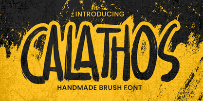 Introducing Calathos– Handmade Brush Font is a Signature Style and classy style, this font is great for your creative projects such as watermark on photography, and perfect for logos & branding, photography, invitation, watermark,advertisements,product designs, stationery, wedding designs,label ,product packaging, special events or anything that need handwritting taste. Calathos a natural handwritten feel. This handmade font will make your design has a beautiful natural touch for each details. It is perfect for any design project as Invitation,logo, book cover, craft or any design purposes. photos, photography overlays, signs, window art, scrapbooking, tags and so much more!
 - Torio by DSType,
$55.00 Our main purpose while developing this typeface was to reconstruct, in the most precise way, the first ten plates of the “Arte de Escribir”, in a chapter named “Enseñanza de la letra italiana, y sus principales variaciones, autores, sistemas, &c.”, dedicated to the analysis of the Italian Script. We decided by this plates because those are the few that don’t refer, directly or indirectly, to any author in particular. We strongly believe that these plates reflect the freedom of his very own calligraphy and are closely related to the calligraphic style that was a success among the spanish calligraphers: the Spanish Bastarda.
 - Monoway Groovey by Arterfak Project,
$18.00 Introducing our latest exploration, the "Monoway Groovey" font! Inspired by the iconic pop art and design trends of the 70s, this font boasts a stunning shape based on curves, giving your designs a dynamic and lovely impression that is sure to catch the eye. Perfectly suited for themes ranging from retro to modern-vintage, Monoway Groovey is a versatile typeface that will elevate any design. Whether you're creating a t-shirt, poster, flyer, label, branding, logo, emblem, or quote, this font is the ideal choice. Supported by multilingual characters, add a touch of playfulness and nostalgia to your work with Monoway Groovey.
 - Jutta by Spirit & Bones,
$9.00 As the basis for this new font artist and designer Lena Schmidt used an old font design by her mother Jutta. At a young age, her mother drew and illustrated a lot with pen and ink. She made beautiful illustrations and many font designs. Schmidt chose one of these drafts - delicately drawn Donovan lyrics - as the basis for this digital handwritten stencil font. What emerged from it is a stencil text and display typeface that relates to Auriol's art nouveau typefaces and the era of impressionism. More weights will be published in soon. Published by Spirit & Bones www.spiritandbonesdesign.com Designed by Lena Schmidt www.lenaschmidt.com
 - Elegant Hand Script by TypoGraphicDesign,
$19.00 KONZEPT/BESONDERHEITEN Der schludrige und raue handgeschriebene Charakter, geben der Schrift eine hohe Wiedererkennung und eine gewisse Einzigartigkeit. Das Motto lautet handgemacht, rau und elegant. EINSATZGEBIETE Das dreckige, elegante Aussehen der handgeschriebenen Schrift würde sich über folgende Gebiete sehr freuen und sich dort dreckig heimisch fühlen: Logos/Wortmarken aller Art, Flyer für fast jede Party, PlattenCover, Comic-Cover und Graphic Novel Lettering, Plakat Design, Movie-Font, als Headlineschrift für print und digitale Magazine, Bücher und Webseiten u.v.m. TECHNISCHE INFORMATIONEN Überschriften | Auszeichnungsschrift | dreckige Handschrift »elegant hand script«. OpenType Schrift mit 223 Glyphen & 1 Schriftschnitt (regular). Symbole und Ligaturen (mit diakritischen Zeichen & €)
 - Goby by Atlantic Fonts,
$26.00 Goby has several distinct personalities, and can definitely help you make some waves. Lower case Goby is sweet, lively, easy to read, bold, and always friendly. Goby also works great in all-caps, and if you turn on discretionary ligatures, discover a huge stash of funky two and three-letter ligatures that can make ordinary words look extraordinary. The Goby font family also includes Goby Graphics, an ocean-y collection of illustrations by Amy Dietrich. If you need some artful seaweed, a head of coral, a seahorse, or maybe a smiling hermit crab, the unique images of Goby Graphics will work swimmingly.
 - Rosina by Hashtag Type,
$28.49 Rosina is a geometric typeface with a distinctive charm. With a captivating fusion of dashing 1920s style and 21st Century sensibility, geometric forms have been taken and optically adjusted to create a sturdy typeface. Tall ascenders and descenders attempt to simulate architectural features of the Art Deco period, striving for a look of the future, nevertheless form always follows function. Rosina explores typographic boundaries and lends itself well to branding, posters and other display uses. Full details include 6 weights from Thin to UltraBold and include a range of OpenType features such as case sensitive punctuation.
 - M Qing Hua HK by Monotype HK,
$523.99 Among the world of Chinese commercial fonts, M Qing Hua has a relatively high flexibility to be used in different areas, for instance, media of advertising. Its design concept is to combine the neatness of Hei typeface with the roundedness of Yuen typeface. The typeface tries to revitalize the boring traditional design by adding energy, simplicity and modernness to it, which could be shown in the small features in strokes like delicate and curvy finishings. More is the appropriate mix of masculinity and femininity, so as to enable a more effective communication, stronger visual attractiveness and higher affections.
 - Bouncy Color by Mans Greback,
$59.00 Bouncy Color is a funny cartoon font with pre-set coloring, outline and shine effects! Drawn and created by Mans Greback in 2021, this comic-style lettering has a happy, quirky personality and optimistic humour. It has a colorful graffiti and street art look, while being a childish and cute sans-serif – a typeface for boys and girls alike. Bouncy Color is provided in five styles: White, Blue, Pink, Highlight and Outlined. Use it in Photoshop, Illustrator, InDesign or any other modern software that supports color fonts, and you'll give any project a fun and happy appearance.
 - Small Bunny by Illushvara,
$12.00 Small Bunny is a display font mix with two character styles. Made it special for Valentine's and Easter Season. Suitable for you who needs a typeface for greeting cards, logotype, Easter invitations, Valentines day, branding, book cover, packaging, advertising, watermark, merchandise or make a craft gift, etc. This typeface is comes in uppercase, lowercase, punctuation's, symbols & numerals, support opentype features in Private Use Area (PUA) Unicode. Stylistic set in 2 alternate, ligatures, etc. Also support multilingual. If you have any question, don’t hesitate to contact me by email or send me massage. Happy designing !!! Thank you, Bayu Suwirya
 - Amberes Grotesk by Two Type Foundry,
$9.00 Inspired by the Art Nouveau movement in Belgium we've created a new and bold typeface. Amberes® is a sans serif font, it can be a loud and proud hero or a humble supporting actor, upgrading your lay-outs in no time. 3 weights plus matching Obliques. The font is distributed in OpenType format, including kerning and other features. This font also includes Latin extended glyphs, so it supports languages such as: Dutch, French, Vietnamese, German, English, Afrikaans, Catalan, Croatian, Czech, Esperanto, Hungarian, Latin, Latvian, Lithuanian, Maltese, Northern Sami, Polish, Serbian, Slovak, Slovene, Sorbian, Turkish and Welsh.
