10,000 search results
(0.031 seconds)
- FM Clog by The Fontmaker,
$21.00 The Clog font family is represented by four different outlines - Normal, Open Face, Shadowed and Engraved. Each of them could be your best choice when designing a wine label, package or magazine headline. By using Open Face and Shadowed outlines you will discover how easy it is to produce unique design of its own style.
 - Mic 32 New Stencil by moretype,
$25.00 Mic 32 New Stencil is the third variation of the popular Moretype family Mic 32 New. This stencil version provides an industrial flavour to the futuristic rounded geometry of Mic 32 New. Mic 32 New Stencil still has all the normal Opentype features including small caps, tabular, proportional and old style numerals and ligatures.
 - Basis by MADType,
$19.00 Basis is a bitmap font family which is happy being used at both small and large sizes. Designed as a 9 point bitmap face for the web, it offers different styles than most normal bitmaps. The stencil style can be used for display purposes, while the SmallCaps lowercase is great for website navigation menus.
 - Britonix by Owl king project,
$47.00 Inspired by monospaced letters, Britonix is designed with normal spacing but seems mono. Uppercase Britonix can be used for headlines or displays giving it a minimalist, professional yet modern look. Britonix also carries 20 weights including italic style, minimalistic lowercase letters can also work well for long sentences or paragraphs. happy exploring with Britonix.
 - Snoogle by Linotype,
$29.00Snoogle is a friendly, round display typeface. Its character set contains 99 ligatures, which may be automatically implemented in OpenType-savvy applications. These give Snoogle the feeling of a script face, as opposed to normal rounded types. Snoogle's text variant is complimented by a Dingbats font, including further design elements as well as pictogram figures. - Calypso E by Typolar,
$72.00 Founded on a rigid structure of modernist type, Calypso E has a determined tone without an authoritative tang. It is an updated interpretation of a Neo-grotesque model Egyptian with a hint of Humanist lightness in its forms. Seriously big x-height, square basic form and sturdy serifs create firm text regardless of the weight. This makes Calypso E well suited for various media, from sharp plotter images to low-res television screens. Calypso E includes four suitable body copy styles. Book, Regular, Normal and Medium can be applied according to, for example, the size of text and quality of paper. All styles in the family are equipped with an expanded character set, small caps, case sensitive forms, discretionary ligatures and much more to make even the most elaborate typographic detailing possible.
 - Telder HT Pro by Huerta Tipográfica,
$45.00 Telder HT Pro is a humanist sans serif family with 10 weights, conceived as a web font with nice legibility at normal text sizes. Originally based on grid fitting shapes it became a multi-purpose typeface with low contrast, open counter forms, wide proportions and a touch of freshness. It is ideal for paragraph text on websites as blogs and news sites and works great for printed text. Its extreme weights are suitable for display sizes. This PRO version contains 10 weights and 2 styles. All the fonts contain small caps, alternate glyphs in stylistic sets (such as B, P, R, a, f, g, w, x, y & z), four number sets (lining and old style, proportional and tabular), ordinals, superiors, inferiors, fractions, disctretionary ligatures, arrows and more. Each font contains +1000 glyphs.
 - Abnormal by Jan Buble,
$20.00 Are you getting bored by the growing number of sans-serif fonts that absolutely lack character? Do clean typography and sleek curves repulse you? Maybe it’s time to forget the normal and set sail into the murky waters of abnormality. Abnormal features four styles, ranging from an almost monolinear Light to a reverse-contrast Bold. The design pays homage to 19th century poster typefaces, with their crude character and unconventional means of catching the eye. It is one of the few typefaces out there that features reversed contrast and no serifs. These properties make it an ideal choice for large headlines, posters, flyers and essentially all applications where getting attention is a paramount. Abnormal offers extended language support, standard ligatures, alternative lowercase “a”, fractions, ordinals and a plethora of quirkiness at your disposal.
 - Nougat Script by Sudtipos,
$59.00 The first glyphs of Nougat Script were born in 2010 to honor the birth of my first chubby and charming daughter, Siena. The ongoing project with significant progress was presented at Tipos Latinos, the biennal of Latin America typography where Nougat Script was selected among 70 of the best fonts. After a long pause, the project had a powerful restart at the begining of 2018. In those days, it not only grew in number of signs but in complexity of behavior. There are 4 different types of writing within the same font file accesible via opentype features: Script (base or normal), two glyphic alternatives with well differentiated swashes and finally a small cap version. Nougat Script has a fresh and relaxed lettering attitude combined with the typographic harshness for elegant text compositions.
 - Nosegrind by Scriptorium,
$24.00Nosegrind is a bit of a departure from our usual more traditional font offerings. It's based on skate-culture graffiti gleaned from various samples of similar style found on walls in Austin and online. The font includes two character sets, one which is plain and one which is enhanced with outlines. In normal usage the characters should nest, with slight overlap from one character to the next as shown in the sample to the right, but the lower case characters in the font are spaced evenly but not pre-nested, leaving the degree of overlap up to the user - nesting is easily adjusted with the tracking option in programs like Photoshop, Quark or InDesign. Ultimately Nosegrind will be added to our Modern Fonts collection, where it ought to fit in nicely. - Graftyne Display by Godbless Studio,
$23.00 Graftyne sans serif typeface with a unique personality. It comes in normal and display alternate, each with 7 weights variable. Graftyne sans serif typeface is flavor in motion and each part of its system works together to captivate you, combining emotion and usability, allowing you to create attractive and unique designs. graftyne is made experimentally following a futuristic style recipe with alternate characters made with inktrap and display that makes this font more stylish and varied. Graftyne is a variable font that has 7 weights from thin to bold. also includes alternates that are more varied with variables. Graftyne sans is a versatile font system, designed primarily for display uses with a need of visual impact. Feature : Alternate Ligature Discretionary Ligature Multilingual Numeral & Puctuation Wish you enjoy our font!
 - 1651 Alchemy by GLC,
$38.00 This family is a compilation created from a Garamond set in use in Paris circa 1651, but similar to those, eroded and tired, that were in use during centuries to print cheap publications, as well as in Europe than in America, and from a large choice of printed symbols—all specially redrawn—used for alchemical, pharmaceutical and astrological books, covering 1550 to late 1800s period. Each alphabet is doubled by a slightly different one, and a special OTF encoding allows to give an irregular effect with never the same twin letters in a single word. The Normal style is enriched by small caps, and the Italic style by Swashes. A lot of symbols, too, are given twice with differences. This font may be used with our calendar specialized 1689 Almanach.
 - City Boys Soft by Dharma Type,
$19.99 City Boys Soft is a fashionable contrasted sans-serif that can be used in almost any situation. City Boys has basic, natural and neutral letterforms and skeletons for a wide range of usage. The glyphs are somewhat humanist yet they have vertical stress for modern and sophisticated impression. The ratio of the contrast was carefully designed for modern usage –websites, digital, printings and merchandises–. City Boys consists of 7 weights and their matching Italics for a wide range of usages. Farther, City Boys is supporting international Latin languages and basic Cyrillic languages including Basic Latin, Western Europe, Central and South-Eastern Europe. Also CSS covers Mac Roman, Windows1252, Adobe1 to 3. This wide range of international characters expands the capability of your works. City Boys is a normal corner version of this City Boys Soft.
 - Razom Script by DizajnDesign,
$39.00 Razom Script is a typeface with deep roots in pointed brush calligraphy that takes advantage of current font technology to go beyond handwriting and reach new limits. A successful blend between printed and handwritten letterforms is visible when comparing upper and lowercase. The weight of the typeface evolve in a way that pushes the limits of a script typeface to suggest new uses. Normally, families are developed in weights, not proportions. Also, having several weights in a script family is rather rare. But in Razon Script, as the fonts gain weight, big differences show up in the font outlines: the thin weight looks soft and delicate but as we examine darker variables, they also seem to get broken. The counters of the letters rotate from vertical to horizontal during this process.
 - Actio by Gaslight,
$25.00 Actio is unicase serif typeface with spurs on lowercase characters. Actio slightly inspired by Bodoni style fonts. Actio have numerous alternatives, some decorative elements and 4 Stylistic Sets for characters decorative elements.
 - Fashionable JNL by Jeff Levine,
$29.00 For years, the print ads for the Hickok Jewelry Company [renowned for their line of men's belts, suspenders, wallets, cufflinks, etc.] featured its name and related main line ad copy hand-lettered in a condensed monoline with Art Deco styling. This has been reproduced in Fashionable JNL, available in both regular and oblique versions. For those of you who are wondering: yes, the founder of the company was a distant relative of "Wild Bill" Hickok.
 - Metropole by Greater Albion Typefounders,
$12.00 Metropole is an exercise in combing the curvaceous lines of the Art Nouveau with the solid character and simplicity of Art Deco. The resulting three display faces combine the spirit of the 20s and of the thirties, creating lively fun display faces for headings, signage and banners. These characterful faces with clear simple outlines are also ideal to lend a distinctive air to your web pages, or to create a distinctive 'house-style' for lettering.
 - Morguns by Ronny Studio,
$19.00 Morguns is a bold type of font that has a different character from other bold fonts, Morguns has a strong but soft character, with an elegant and fresh theme, supported by 4 choices of font types, Morguns is able to answer your current needs who are designing something great . Its weight excels in logos, posters, social media, magazine titles, clothing, large print formats - and anywhere you want to see it. Inspired by the design styles that are currently popular, let's make your imagination come true with Morguns. Features : Lowercase & Uppercase numbers and punctuation multilingual ligatures alternates PUA encoded Please contact us if you have any questions. Enjoy Crafting and thanks for supporting us! :) Thank you
 - Metropolis SG by Spiece Graphics,
$39.00 The revival of this 1932 classic design by W. Schwerdtner for the Stempel Foundry in Germany brings back the fashion and culture of those bygone days. Wedge-shaped vertical strokes are thicker at the top than at the bottom while serifs are somewhat elongated, thin, and pointy. Here is an excellent choice for large display settings where capturing the spirit of the 1920s and 30s is important. Metropolis SG is also available in the OpenType Std format. Some new characters have been added to this OpenType version. Advanced features currently work in Adobe Creative Suite InDesign, Creative Suite Illustrator, and Quark XPress 7. Check for OpenType advanced feature support in other applications as it gradually becomes available with upgrades.
 - Vershen by Page Studio Graphics,
$25.00A calligraphic roman sans-serif, with large x-height, the Vershen font is available in four weights, plus a series with small capitals and old-style figures, also in four weights, and finally, a four-weight set of universal fraction generators. The fonts are thoroughly pair-kerned, including all accented characters and letter pairs not commonly found in English, but frequent in other western European languages. Each font package includes both TrueType and PostScript versions, and is avialable in either PC/Win or Macintosh format. Numerals and currency symbols in the standard font set are monospaced for orderly columns; but a narrower numeral '1' is also provided, along with an alternate lowercase 'g' and ampersand. - Periwinkle by Jukebox Collection,
$36.99 Periwinkle is a fun and happy digital revival based on an old photo-typositing face. Filled with 1960s and 1970s charm, Periwinkle contains a full set of alternate swash caps as well as a few lowercase swashes and other alternate glyphs to add typographic variation. This font seems to take us back to our childhoods with its curly cues and slightly modulated baseline. Perfect for any project that needs fun, laughter and liveliness! Jukebox fonts are available in OpenType format and downloadable packages contain both .otf and .ttf versions of the font. They are compatible on both Mac and Windows. All fonts contain basic OpenType features as well as support for Latin-based and most Eastern European languages.
 - Almibar by Corradine Fonts,
$24.95 Almibar is a delicate and very elegant connected script font. Its classic style is perfect to be applied in any type of formal pieces such invitations, labels and menus.
 - Bonita by Monotype,
$40.99Bonita is a bold handlettering style based on movie poster lettering from the early 20th century. It's similar to the typeface Broadway, but much bolder and far less formal. - Hagit MF by Masterfont,
$59.00 Inspired by ancient Semitic Scripts and designed in broad nib calligraphy, this is one more great font by Dr. Ada Yardeni. A classic serif font, both formal and romantic.
 - Impregnable Personal Use Only - Personal use only

- Diploma - Unknown license

- Neufile Grotesk by Halbfett,
$30.00 Neufile Grotesk has its roots in some of the earliest commercially available sans-serif typefaces. This highly legible sans-serif design is well-suited for many display and text-based typographic uses. Users can apply the fonts effortlessly to a large number of messages and media, from advertising to book design. The typeface family ships in two different formats. Depending on your preference, you can install the typeface as a single Variable Font or use the family’s eight static OpenType font files instead. Those weights run from Extralight through Black. While the static-format fonts offer a good intermediary-step selection, users who install the Variable Font have vastly greater control over their text’s stroke width. The Neufile Grotesk Variable Font’s weight axis allows users to differentiate between almost 1,000 possible font weights. That enables you to fine-tune your text’s exact appearance on-screen or in print. But even the eight static fonts satisfy the need for flexibility, creating harmonious variations of texture and emphasis. Whichever format you choose, the Neufile Grotesk fonts include several sophisticated OpenType features. In addition to standard ligatures, there are a few discretionary ligatures and a stylistic set replacing “a”, “g”, and “R” with geometric-sans-style forms. Other features include numeral variants – there are proportional and tabular versions of lining figures and oldstyle figures – as well as fractions and numbers in circles. The fonts have arrows and a feature for setting case-sensitive forms, too.
 - Gator by Canada Type,
$24.95 Cooper Black's second coming to American design in the mid-sixties, after almost four decades of slumber, can arguably be credited with (or, depending on design ideology, blamed for) the domino effect that triggered the whole art nouveau pop poster jam of the 1960s and 1970s. By the early 1970s, though Cooper Black still held its popular status (and, for better or for worse, still does), countless so-called hippie and funk faces were competing for packaging and paper space. The American evolution of the genre would trip deeper into psychedelia, drawing on a rich history of flared, flourished and rounded design until it all dwindled and came to a halt a few years into the 1980s. But the European (particularly German) response to that whole display type trend remained for the most part cool and reserved, drawing more on traditional art nouveau and art deco sources rather than the bottomless jug of new ideas being poured on the other side of the pond. One of the humorous responses to the "hamburgering" of typography was Friedrich Poppl's Poppl Heavy, done in 1972, when Cooper Black was celebrating its 50th anniversary. It is presented here in a fresh digitization under the name Gator (a tongue-in-cheek reference to Ray Kroc, the father of the fast food chain). To borrow the title of a classic rock album, Gator is meaty, beaty, big and bouncy. It is one of the finest examples of how expressively animated a thick brush can be, and one of the better substitutes to the much overused Cooper Black. Gator comes in all popular font formats, and sports an extended character set covering the majority of Latin-based languages. Many alternates and ligatures are included in the font.
 - Rasgos Escritura Nuevos by Intellecta Design,
$16.00 a sort of decorative fleurons
 - Gaspa by La Boîte Graphique,
$19.00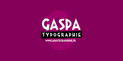 Fanciful, funny, hand-writting, decorative
 - Emilya Rown by Say Studio,
$15.00 Emilya Rown – An Classy Ligature Serif, art deco-inspired serif font with beautiful ligatures and multilingual support Emilya Rown is a Classy Ligature Serif Font. This wild and majestic typeface adds a dangerously elegant twist to any design. Although the inspiration for this typeface comes from the Art Deco era, Emilya Rown feels modern and contemporary. The large selection of stylistic alternations and ligatures makes this serif font extremely versatile. This is perfect for branding, magazine design, logo design, headlines, posters, packaging, cards or your wedding invitation. FEATURES : - Uppercase Characters - Lowercase Characters (which are smaller versions of uppercase) - Big range of numbers, symbols & punctuation - Comprehensive language support WHAT’S INCLUDED: - Emilya Rown Regular - Emilya Rown Itacic Thanks, Have a Wonderful Day SayStudio
 - Borest by Flavortype,
$20.00 Borest, a new carefully crafted roman sans serif display font. The ideas for this font has a wide range of reference, from vintage, classic, art deco, until the modern era. So the looks of this font must be in the wide range of the reference above. Borest has a versatile and luxury feel as you can see in our creations on the display, such as Branding, Header, Logotype, Poster, Magazine, Packaging, Wedding Invitation with art deco style, and more. It shows that Borest can accommodate various design style. Borest comes with OpenType Features. such as Stylistic Alternates as an Ascender swash and Descender Swash and Ligatures. Every glyphs for alternates are curated for the best and without eliminating the characteristics of this font.
 - John Speed by Scriptorium,
$18.00John Speed is an ornate, decorative calligraphic titling font based on the hand lettering of 17th century English mapmaker John Speed. It features extraordinary decorated letters, variant character forms and other unique features. - TOMO Haraka by TOMO Fonts,
$16.00 TOMO Haraka - a playful thin line decorative typeface. Haraka is a linear font in folk style, uppercase only decorated with geometric elements. Suitable for lettering posters, music albums, tattoos and photo overlays. Enjoy!
 - Miss Donna by Scholtz Fonts,
$15.00 Miss Donna - contemporary, powerful, versatile and casual. Curvy, sassy, fast-talking, and utterly useable, she takes you into the world of movie posters, decor ads, fashion posters and tags, greeting cards and invitations. Her lines are bold, clean and legible. The Miss Donna family comes in four styles: - REGULAR - clean good lines and generous curves - for decor ads, greeting cards, copy - NARROW - slim (more compact), and elegant with contained curves - for greeting cards, invitations, copy - BLACK - bold statement, round, generous curves - for movie posters, fashion posters - BLACK CAPS - especially designed for "all-caps" printed text. Use for headings & subheads. Miss Donna Black Caps contains capitals in two sizes and this gives you the ability to generate text of two types: - a correctly spaced and kerned upper case, OR - a TRUE Small Caps -- as opposed to the false Small Caps produced by a well-known word processing application. In a correctly proportioned Small Caps the stroke width should not be reduced in the same proportion as the letter height is reduced. The stroke width of the small capitals should rather be equal or close to the stroke width of the corresponding upper case characters. Note: When using script fonts it is NOT usually advisable to use text in ALL caps. The best effects for headings and subheads are obtained with an initial upper case letter followed by lower case characters. BUT, Miss Donna will still produce excellent results with all caps if you are using an application that supports kerning. If you are using upper and lower case then it is not necessary to use kerning, although it may make a slight difference on occasion. Miss Donna contains over 235 characters - (upper and lower case characters, punctuation, numerals, symbols and accented characters are present). It has all the accented characters used in the major European languages.
 - FabFours by Ingrimayne Type,
$5.00 A tessellation is a pattern in which a shape or tile fits together with copies of itself to fill the plane with no gaps or overlaps. One type of tessellation is formed with sides of center-point rotation, that is, one half of an edge is rotated 180 degrees to form the other half. If a square template is made with sides of identical center-point rotation, there are exactly four shapes that are possible. If these shapes or tiles are fit together not edge to edge but vertex to vertex, the result is a checkerboard-like pattern of tiles and voids. However, the voids have four edges formed by the four possible shapes that the tiles can have, so the voids are limited to the same four shapes that that make up the tiles. The FabFours have 22 tile families that allow a wide variety of fascinating patterns. They form one, two, three, and four tile tessellation. Eleven of the seventeen symmetry groups can be formed with these patterns. In each tile family two of the shapes have two possible orientations, one shape has four possible orientations, and one has eight, for a total of 16 tiles. Each font has two families, one on letters A-P the other on a-p. For some of the families there are also other tiles using the same edge but using triangular and hexagonal templates. To get proper results, the leading must be set equal to the point size of the font. I discovered these fabulous families and their decorative possibilities as I was working on a book about tessellations. I have not been able to find anyone else who has written about these families of four and their decorative possibilities when arranged vertex to vertex.
 - Cutesy Wootsy PW by Patty Whack Fonts,
$40.00A cutesy wootsy, love note-writing, school girl font. Cutesy Wootsy PW is available in OpenType, PostScript and TrueType format. The OpenType format includes a handful of ligatures and alternates. - Fibra by Los Andes,
$26.00 The font is actually not a revival of ‘Avant Garde’—by Herb Lubalin—but it takes its spirit. Fibra is a geometric sans serif, yet without the typical structural strictness of these kind of fonts, that represents experimental type design. This can be seen in the contrast between curves and straight lines in some characters such as ’n’ and ‘h’ unlike rounded ones such as ‘a’ and ‘d’; details of some display characters (e.g. three upper terminals in ‘W’ and projection off the stem in ‘A’); and exaggerated terminal in ‘R’. All these features give Fibra a strong personality—a sans serif typeface that ‘gives you the chills’. Fibra was specially designed for display use. The font has a very generous x-height that allows for use in corporate text, thanks to its good readability. Fibra comes with 2 subfamilies—a more ’normal’ Basic family, with a smaller amount of stylistic features, for use in subheadings or any other type of text that requires formality, and an Alt family that shows off the true potential of the font, making it the perfect choice for magazine headlines, posters and logotypes.
 - Marujo by PintassilgoPrints,
$15.00 Marujo is a highly decorative typeface inspired by painted pieces of Arthur Bispo do Rosário, a striking Brazilian artist who lived for 50 years in a psychiatric institution. Besides its spirited Regular and Light cuts, Marujo family brings nifty eye-catching variations adorned with dots and stripes. It also brings complementary fonts to spice things up even more: there are 2 shadow options and yet a picture font packed with doodles, mostly on nautical subjects (which are strongly present on Bispo do Rosário, a former seaman apprentice.) Bispo do Rosário's works employs a multitude of materials and are often very intricate. Words are everywhere, painted or embroidered at most. He produced a vast amount of works, and is now - posthumously - widely recognized in Brazilian art scene. The psychiatric institution in which he lived is now a museum dedicated exclusively to his work. Marujo draws inspiration not only from Bispo's works, but also from this man's potency, a persistent man who produced amazing art locked in such a tough environment for a life-long. Marujo fonts are positively adventurous and will safely navigate through a sea of feelings, reaching free spirits everywhere. To navigate is precise...
 - Fabrikat Kompakt by HVD Fonts,
$40.00 Fabrikat Kompakt (formally known as Fabrikat) is a type family designed by Christoph Koeberlin with creative input of Hannes von Döhren. The Sans Serif family is published by HVD Fonts and consists of seven weights plus matching italics. Its geometric design is based on German 20th century engineers’ typefaces and has a plain and precise appearance. The shapes are optically corrected, yet retain an uncut charm. They work best in display as well as text sizes. The type family is equipped for complex, professional typography with OpenType Features like alternate letters, arrows, fractions and an extended character set to support Central and Eastern European as well as Western European Languages.

