10,000 search results
(0.053 seconds)
- Modern Negra by Sohel Studio,
$14.00 Modern Negra is a Modern elegant serif typeface with Unique alternative , multilingual support with perfect kerning. This typeface is perfect for an elegant & luxury logo , classy editorial design, women's magazine, fashion brand , cosmetic brand, fashion promotion , modern advertising design, invitation card, art quote, home decoration , book/cover titles, special events, Tote bag, T-shirt, Advertising and much more.
 - Fleurons Initials by Wiescher Design,
$39.50Fleurons Initials is a set of elegantly decorated blocked initials, reminiscent of old Jazz and Circus Posters. I have added one set of flat underlays and one of blocked underlays, so you can easily add a little colorful touch here and there. Easy because those underlays have the the same spacing! Have fun. Your elegant designer, Gert Wiescher - Boho Breeze by Sohel Studio,
$16.00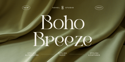 Boho Breeze is a Modern elegant serif typeface with Unique alternative , multilingual support with perfect kerning. This typeface is perfect for an elegant & luxury logo , classy editorial design, women's magazine, fashion brand , cosmetic brand, fashion promotion , modern advertising design, invitation card, art quote, home decoration , book/cover titles, special events, Tote bag, T-shirt, Advertising and much more.
 - Caitiff by Gustav & Brun,
$20.00 Caitiff is a unique hand drawn serif. It includes about 25 ornaments to compliment your text and a couple of stylistic alternatives to your capital letters. Caitiff Slanted is an oblique version of Caitiff. Caitiff is a decorative typeface. You can use Caitiff in any setting; children's books, beer labels, organic food packages, menus... the sky is your limit!
 - Mastji by Wildan Type,
$15.00 Proudly present- Mastji, created by Wildan Type, A serif modern and bold typeface, Mastji has decorative alternate & beauty ligature. This typeface is perfect for an elegant & luxury logo, book or movie title design, fashion brand, magazine, clothes, lettering, quotes, and so much more. Add to your most creative ideas and watch how they bring them to life!
 - Roughly Begather by Sohel Studio,
$16.00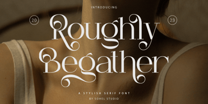 Roughly Begather is a Modern elegant serif typeface with Unique alternative , multilingual support with perfect kerning. This typeface is perfect for an elegant & luxury logo , classy editorial design, women's magazine, fashion brand , cosmetic brand, fashion promotion , modern advertising design, invitation card, art quote, home decoration , book/cover titles, special events, Tote bag, T-shirt, Advertising and much more.
 - Pyrocraft by Sohel Studio,
$16.00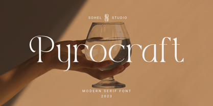 Pyrocraft is a Modern elegant serif typeface with Unique alternative , multilingual support with perfect kerning. This typeface is perfect for an elegant & luxury logo , classy editorial design, women's magazine, fashion brand , cosmetic brand, fashion promotion , modern advertising design, invitation card, art quote, home decoration , book/cover titles, special events, Tote bag, T-shirt, Advertising and much more.
 - Halliday JNL by Jeff Levine,
$29.00 Halliday JNL was redrawn from impressions made by a rubber stamp sign printing set, thus providing the slight imperfection of line widths that gives a hand-made approach to the typeface. The lettering style is based on Beton Open Condensed, a clean and popular slab serif used for decades in print display titling and rubber stamp manufacture.
 - Hostania by Attract Studio,
$17.00 Hostania is a beautiful and nostalgic serif typeface that looks amazing in both large and small settings as both display and body text. Best used as a showcase for titles and logos, sharp curves and a decorative alternative that give any project an extra touch of class. Includes: Alternative Styles Multiple Languages Supported PUA Encoded Characters.
 - Scinara by Sohel Studio,
$16.00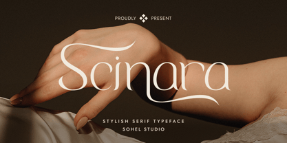 Scinara - is a Modern Elegant Serif typeface with Unique alternative , multilingual support with perfect kerning. This typeface is perfect for an elegant & luxury logo , classy editorial design, women's magazine, fashion brand , cosmetic brand, fashion promotion , modern advertising design, invitation card, art quote, home decoration , book/cover titles, special events, Tote bag, T-shirt, Advertising and much more.
 - Millerstown Races by Greater Albion Typefounders,
$16.00 Millerstown is full of that solid, 19th Century, transatlantic spirit of enterprise. It is an all capitals face, decorative but clear and legible, ideal for signage, posters and banners. "Millerstown Races" is a carefully constructed oblique which brings a sense of speed and motion. Bring a touch of American inspired flair to your next design project!
 - Vindeco by Andrew Footit,
$24.00 Vindeco is a classic typeface, vintage with a mix of decorative. It looks stylish and elegant in any layout with it’s slick lines, use it for your magazines, brochures and editorial layouts. Vindeco is designed to make eye-catching headings and typographic designs, use it on invites and in magazines, Vindeco looks beautiful on its own or with imagery.
 - Glow Bloom by RagamKata,
$16.00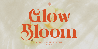 Glow Bloom is a Modern elegant serif typeface with Unique alternative , multilingual support with perfect kerning. This typeface is perfect for an elegant & luxury logo , classy editorial design, women's magazine, fashion brand , cosmetic brand, fashion promotion , modern advertising design, invitation card, art quote, home decoration , book/cover titles, special events, Tote bag, T-shirt, Advertising and much more.
 - Ten Oldstyle by Adobe,
$35.00Ten Oldstyle is a four-weight type family from Principal Designer Robert Slimbach at Adobe. He designed it as the Latin component of Ten Mincho, a Japanese typeface by Adobe?s Chief Designer Ryoko Nishizuka. As it began to take the form of a small type family, Robert decided to release Ten Oldstyle on its own as well. - Bromley Hatch by Attract Studio,
$12.00 Bromley Hatch & Extras is a modern scripts with handwriting, decorative characters, and basic dance lines! designed to perfectly combine informal, sassy, romantic, sweet scripts, and hand-drawn design elements allow you to create many beautiful typographic designs in an instant, just in time for branding, logos, web design and editorial, branding, prints , invitations, crafts, quotes, and more.
 - La Bamba by ITC,
$29.99La Bamba is the work of British designer David Quay and heavily influenced by the style of the 1950s. It comes with complete upper and lowercase alphabets as well as a set of decorated initialling capitals for added variety. La Bamba is a casual design with wedge-shaped serifs and radiates a gay, light-hearted mood. - Rookie Heat by Bogstav,
$17.00 Based upon classic typefaces such as Bodoni, you might find Rookie Heat familiar. However, the rough outline and handmade look and feel makes it perfect for your craft products. All in all, Rookie Heat is reflecting the beauty of decorative objects. Play around with the swashes for upper- and lowercase to make your designs stand more out.
 - Indigo Moon by Make Media Co,
$18.00 Introducing Indigo Moon - a decadent, classic serif with over 150 hand-illustrated alternates, and preserved texture, for a uniquely vintage, yet modern feel. Each letterform has a slightly rough exterior that works beautifully to enhance Indigo Moon's soft, conventional details. This versatile display typeface has enough character for logos and branding, as well as headlines, apparel, bridal and more.
 - Anegra by Sohel Studio,
$16.00 Anegra - is a Modern elegant Sans-serif typeface with Unique alternative , multilingual support with perfect kerning. This typeface is perfect for an elegant & luxury logo , classy editorial design, women's magazine, fashion brand , cosmetic brand, fashion promotion , modern advertising design, invitation card, art quote, home decoration , book/cover titles, special events, Tote bag, T-shirt, Advertising and much more.
 - Relisha by Sohel Studio,
$16.00 Relisha - is a Modern Elegant Serif typeface with Unique alternative , multilingual support with perfect kerning. This typeface is perfect for an elegant & luxury logo , classy editorial design, women's magazine, fashion brand , cosmetic brand, fashion promotion , modern advertising design, invitation card, art quote, home decoration , book/cover titles, special events, Tote bag, T-shirt, Advertising and much more.
 - Cabrito by insigne,
$24.00 After my son was born, I found myself reading him a lot of books. A LOT of books. Some were good, some were great, but I found myself wanting to develop something using my skills and interests to make something that only I could make. In short, I realized my son needed to be indoctrinated—I mean, introduced into the wonderfully wild world of fonts. So, I set about to make a board book to teach about typography, called “The Clothes Letters Wear.” You can learn more about the book here. I’ve made the captivating illustrations bright and colorful, and the use of different letter forms makes for a fascinating read to delight ages young and young at heart. And, as an added bonus, this children’s book has a custom designed font. I’m always looking for an excuse to design a new font, and this book created the perfect alibi. Drum roll, please. I now give you … Cabrito (“little goat” en Español). This new serif typeface incorporates the latest research on typographic legibility for children, features to make it—well, extra legible. A little background: studies show that Bookman Old Style is one of the most readable typefaces, and as a consequence or perhaps the reason why, it is used thoroughly for children’s books. This font became my initial inspiration for the typeface. Then, I found more legibility research saying that (brace yourselves) Comic Sans is also very legible for beginning readers, much due to the large x-height and softer, easily recognizable forms. In addition, forms that are closer to handwriting also seem to be more legible. Once I threw all that into my cauldron and stewed it a bit, the result was a pleasantly rounded typeface that includes not-so-strictly geometric, handwriting-inspired forms for the b, d, p, and q. Es guapo! Cabrito’s slender weights are simple and fun, with extras that turn any “bah humbug” into a smile. Add lighter touches to your project with the typeface’s included sparkles or rainbows (not included). Splash a little more color on the page with the firmer look of the thicker weights. Cabrito’s upright variations across all weights are matched by optically altered italics, too, giving you even more variety with the font family. This modern typeface’s bundle of alternates can be accessed in any OpenType-enabled software. The fashionable options involve a significant team of alternates, swashes, and meticulously refined aspects with ball terminals and alternate titling caps to decorate the font. Also bundled are swash alternates, old style figures, and small caps. Peruse the PDF brochure to check out these options in motion. OpenType-enabled applications like the Adobe suite or Quark allows comprehensive control of ligatures and alternates. This font family also provides the glyphs to aid a variety of languages. Cabrito is a welcoming, everyday font family by Jeremy Dooley. Use it to convey warmth and friendliness on anything from candy and food packages to children’s toys, company IDs or run-of-the-mill promotional material. Cabrito’s unique appearance and high legibility make it equally at home in print as it is on a screen.
 - Bojimtes by Twinletter,
$12.00 Introduce Bomjites font. Calligraphy fonts are made by hand in detail on each letter character so that they can be combined with various kinds of writing design needs. This font is designed to produce lovely and beautiful words and sentences, creating beautiful writing has never been easier. Not limited to that, the bold calligraphy font is designed to keep paying attention to the beauty of each letter, there are alternate options for the letters which are certainly easy for you to access, so you can automatically customize the letters you want to enhance the visual appearance of your design project. This charming font also offers the beauty of abstract typography harmony for a wide variety of design projects, including digital natural handwriting for designs, quote designs, for social media business designs, advertisements, trademarks, food and beverage promotion banners, text, posters, a signature, and all designs require handwriting or whatever design you want. ============================================================================================================ What’s Included : File font Web Fonts Standard glyphs Ligature Works on PC & Mac Simple installations Accessible in Adobe Illustrator, Adobe Photoshop, Adobe InDesign, even work on Microsoft Word. PUA Encoded Characters – Fully accessible without additional design software. Fonts include multilingual support for; Afrikaans, Albanian, Croatian, Czech, Danish, Dutch, English, Estonian, Finnish, French, German, Hungarian, Italian, Norwegian, Polish, Portuguese, Slovak, Slovenian, Spanish, Swedish Thank you for your purchase! Hope you enjoy our font!
 - Range Serif by Eclectotype,
$36.00 Range Serif is a sharp, contemporary, wedge serif typeface with just a hint of fraktur influence. There are five weights from light to black, each with corresponding italics. This is a typeface designed for demanding typographic work; it’s legible at small sizes, but unique at display sizes. There is an abundance of OpenType features in each font, including: Ligatures - all fonts contain standard f-ligatures. Contextual Alternates - Range Serif has been carefully designed to not ‘need’ ligatures. If you choose to deactivate them, the contextual alternates feature will make sure an alternative f is used before certain letters to avoid clashing. Fractions - When activated, numbers separated by a slash will automagically turn into fractions. Numerals - There are many different figure sets. These are Proportional Lining, Tabular Lining, Proportional Oldstyle, Tabular Oldstyle, Superiors and Scientific Inferiors. A slashed zero feature is also included. Small Caps - All styles include small caps, for both small caps and capitals to small caps functions. Ornaments - For convenience, the arrows are grouped in the ornaments feature. Case Sensitive Forms - There are different punctuation and bracket glyphs for all caps usage. Stylistic Alternates / SS01 - The italic fonts contain alternates for the letters A, K, R, U and X. Range Serif is a versatile and fully-featured typeface, ideal for corporate identities, contemporary art catalogs, even t-shirt slogans. The language coverage is impressive (Latin Extended A is fully covered) so Range Serif should prove a useful text and display workhorse for speakers of many different tongues. The typeface includes an array of currency symbols, including the new symbols for Indian Rupee and Turkish Lira. Also check out the accompanying sans serif version, Range Sans.
 - Groovy 3D Caps JNL by Jeff Levine,
$29.00 It all started with a simple idea back in 1998: do a digital version of a "lost" 70's typeface, and make up the missing letters that were not present in the only available example Jeff Levine had to work with. Jeff wasn't yet doing his own digital font creation, so he hooked up with Brad Nelson who owns a small foundry called Brain Eaters Fonts. Together, they collaborated on "Action Is"- a freeware font named after the source of the type example. This was a title page for a commemorative photo album of images from the 60's TV music show "Where the Action Is", formerly hosted by Jeff's employer at the time, singer-writer-producer Steve Alaimo. The free font took off like a rocket, being released just at the peak of the 60’s/70’s retro craze in the late 1990’s, and it was EVERYWHERE! It showed up on TV shows, packaging and web design -- and was even spotted on signage used on the side of a major amusement resort’s retro-themed hotel. From that point on, Jeff kept getting requests for a version with a lower case. Although they shared the copyright in the freeware version, Brad Nelson gave Jeff his blessing to re-work and take Action Is into the realm of commercial type. Newly improved and re-released as Groovy Happening JNL, it became one of Jeff's better selling type designs. A simplified, yet similar font was issued called Groovy Summer JNL. Now, after about a decade, Jeff had decided to clean up the 3-D (drop shadow) version that was originally freeware with many minute design flaws and re-release it commercially. Groovy 3D Caps JNL is an all-caps, limited character set font which ties in well with the previous releases, yet retains itís 1960s-1970s era charm. The font flag art is courtesy of Barbara D. Berney and is used by permission.
 - Honest by W Type Foundry,
$28.00 Honest draws inspiration from the serif fonts prevalent in print media during the 1970s and 1980s. Its letter shapes are well-suited for prominent uses like logos and striking headlines due to their distinctive style. The font's large x-height makes it suitable for tight leading in headlines. Honest offers a variety of options, including seven different weights and two styles: Standard and Italic.
 - Letter Delivery JNL by Jeff Levine,
$29.00 The combination of some Bodoni extra-wide wood type letters and an image redrawn from a 1940s package label from the long-defunct Railway Express Agency form the characters in Letter Delivery JNL. These initials are perfect for personalizing notes, gift labels, personal stationery and other creative projects. For retail commercial products, please consult the information within the Font License Agreement and contact the font's author directly.
 - Bunken Tech Sans Wide by Buntype,
$49.00 The Bunken Tech Sans superfamily: A reminiscence of constructed fonts of the modern age designed with considerably cleaner forms. •See other members of the Superfamily: Bunken Tech Sans •For further details, view the Specimen PDF. Bunken Tech Sans Wide follows in the best tradition of the straight-lined and somewhat angular structures of its predecessors while offering a much more open and mild design. The shapes of the letters are therefore reduced to the most essential elements: The spurs on a, b, n and other lower case letters occur just as little as decorative or style details, the lightly rounded inside edges are more pleasing to the eye than certain historic role models and make for a harmonic, flowing style. Use In particular Bunken Tech Sans Wide stands out as an easy, distinctive headline font with its straight-lined, technical design. Open counters and large x-height make it equally suited for use in shorter texts. It is also perfectly complemented by Bunken Sans or Bunken Slab in longer texts (available soon). Features Available in 16 styles with widths ranging from Light to Heavy with associated Italics. All of the styles are very extensive: Support for at least 58 languages, Small Capitals, 9 number sets (e.g. Lining, Oldstyle, Tabular and Small Cap Figures), ligatures, alternate characters, numerous Opentype functions, and lots of other small features that make it more pleasant to work with the font on a daily basis as well as fulfilling typographic desires. Each style contains more than 870 characters! Each style is available in a professional (Pro) standard (Std) and Small Caps (SC) edition with a different range of functions. (Language support, OpenType features and number of glyphs). Details can be found on the respective pages. Bunken Tech Sans Wide is part of the Bunken Tech superfamily and is available in Condensed, Normal and Wide. Also of interest: The slab serif variation Bunken Tech Slab Features in Detail: 16 Weights: -Light -Book -Medium -SemiBold -Bold -ExtraBold -UltraBold -Heavy and corresponding Italics 3 Widths: -Condensed -Normal -Wide Alternate Characters: A, E, F, L, S, e, f, t, s, y, etc. Small Capitals 5 Sets of Figures: -Lining Figures -Old Style Figures -Tabfigures -Old Style Tabfigures -Small Cap Figures Automatic Ordinals Automatic Fractions Extended Language Support and more...
 - Celtic Knots by Clanbadge,
$20.00 While it is obvious that this is an ornamental style font, it is more than that: it is a Celtic Knotwork design tool! Irish, Scottish, Welsh, even Norse and Viking cultures have used knotwork designs for millenia. These ancient traditional interwoven designs are experiencing a revival as Celtic culture gains exposure in the modern world. Intricate Celtic knots are featured everywhere from jewelry to tattoos. While many enjoy them simply for their beauty and fascinating twists, they can also be used to add an air of myth, magic and mystery to any project. The interlaced lines make them perfect for wedding invitations, borders, dividers and rules, web graphics, and logos. I began using Celtic knotwork designs in my own work as part of my knifemaking and jewelry making hobbies. I read all of the books I could find about Celtic knots and at first I drew them by hand with pencil and paper. Then as I realized how nice it would be to have "undos" I switched over to using Corel Draw. Draw proved to be a natural for this type of artwork with tools like contour and the trim function. But even with these great tools, it was still tedious to create these designs. I noticed that I was able to reuse a lot of parts in repetitive sections. I developed a small library of reusable bits and chunks of Celtic designs. I found them so useful and fun to work with that I began thinking about ways to market my Celtic design kit. I thought about CDR and EPS formats, but then I thought of creating this toolset as a True Type Font. That way anyone with ANY program that uses fonts could easily create Celtic knotwork designs. Word processors, embroidery programs, engraving programs, jewelry design programs, CAD/CAM programs...almost every program can use fonts. I was also interested in CNC work and thought that this font would work well for applications such as laser etching, vinyl signs, and machining. With that in mind, I designed each character of the font with extremes of accuracy. If one character from the font is used at one inch tall, every control point will be placed to an accuracy of better than 0.0001 inch. I wanted every piece to meet exactly with the next, with no possibility for misalignment. The different styles are all very carefully created to fit accurately with each other. So the Filled Style fits exactly into the Outline Style, and the Inverse Style fits precisely around the Outline Style so as to make up the background behind the knotwork. Combining the styles allows you to have complete creative control. By assembling the nearly 200 pieces it is quite easy to produce very complex designs. It is actually a bit like playing with a puzzle and many people really enjoy putting the pieces together to make designs. In fact, I have had many customers tell me of how they love playing with this font and making knots into the wee hours of morning. If you like puzzles then you will absolutely love this font! And creating the patterns is just the beginning of the fun! If you apply your favorite Photoshop tricks on them you can make anything from dazzling chrome knotwork to carved stone. Photoshop plug-ins like SuperBladePro are great for converting knotwork text into corroded bronze or rusted iron. Use your knotwork to add texture to a virtual landscape, or add them as surface embelishments on architecture and furniture. You can also make round knotwork by using this font with "WordArt" (WordArt is included with every copy of Microsoft Word. See http://clanbadge.com/round_knots.htm for a tutorial on how to make round knotwork). For Crafters there are limitless uses for this font. It has been used for embroidery, jewelry, leatherwork, stencils, stained glass, quilting, painting, pyrography, woodcarving and lots more. We have even sold copies to monks for use in decorating handmade books!
 - Kernig Braille by Echopraxium,
$5.00 This font is the younger sister of HexBraille with which it may be combined to create new patterns. This also explains why their introductory text are similar. Introduction The purpose of this monospace font is to display braille in an original and "steganographic" way. The Kernig prefix means "Robust" in German, this is because of the crank shapes . The core of the glyph design is a flat hexagon which can be read as 3 rows of 2 dots (i.e. regular braille glyph grid). Even if within a glyph, braille dots ("square dots" indeed) are placed on the vertices of a flat hexagon, the difference with HexBraille is that edges connecting vertices are not straight lines but "crank shapes" instead. This can be summarized by saying that the whole glyph is a Hexcrank (a flat hexagon where vertice pairs are connected by a crank shape) NB: The initial design is illustrated by glyphs 'ç' (no dot) and 'û' (6 dots) as shown by poster 6. A. "Kernig Lattice" In KernigBraille, glyphs are connected to each other, thus for each Hexcrank glyph there are 6 connections: 2 on left/right and 4 on top/bottom. In the final design some cranks were removed for esthetical reason (i.e. leave empty space for allowing patterns diversity). In summary, a text using this font won't display a honeycomb but a lattice instead. NB: Please notice that in order to obtain the lattice without vertical gaps, you must set the interline to 0. The lattice is made from 3 kind of shapes: a.1. Hexcrank a.2. Square a.3. Irregular cross (mostly unclosed) The design favored squares over crosses. The whole slightly resembling a PCB. B. Text Frames It's possible to frame the text with 4 sets of frame glyphs (as illustrated by poster 2) b.1. Kernig { € ° £ µ § ¥ ~ ¢ } b.2. Rectangular-High { è é ê ï î à â ä } b.3. Rectangular-Low { Â ù Ä Ê Ë Ô õ ö } b.4. Mixed Kernig+High: a mix of Kernig and Rectangular-High frame glyphs When using frame glyphs, it is advised to show Pilcrow (¶) and Non Breaking Space, which are replaced by empty shapes in this font (e.g. in Microsoft Word, use CTRL+8 or use [¶] button in the ribbon).
 - Minehead by Hanoded,
$15.00 As a family, we love to go camping. We have a big Norwegian tunnel tent (4 season - with room for a wood stove), some really warm down sleeping bags and a primitive field kitchen. Even though our camping trips are usually devoid of luxury, the kids love them! We always choose campsites that are close to nature, like a national park or in the mountains. A couple of years ago, we toured the southern part of England and one of our camping stops was in Exmoor National Park. Minehead is a small coastal town, not far from where we camped, so I named this font after a fond memory! Minehead is a handmade display font. It was loosely based on Haettenschweiler. Use it for your packaging, your tourist information leaflets and your book covers. And do visit Minehead one day!
 - Two Sugars by Set Sail Studios,
$16.00 Introducing the Two Sugars Script Font! Two Sugars is a playful yet striking clean monoline script font, available in 2 weights and includes bonus extra stars & underlines. It's chunky, hand-drawn letterforms are guaranteed to stand out whether that be on light hearted merchandise designs or more impactful quote designs. The Two Sugars family consists of; Two Sugars Regular • A clean, connecting script font containing upper & lowercase characters, numerals, and a large range of punctuation. Two Sugars Extras • A set of 26 hand-drawn stars & underlines designed to compliment your Two Sugars script fonts. Simply install this as it's own separate font, and type any A-Z character to generate one of the extras. Two Sugars Bold & Two Sugars Extras Bold • If you're looking for a chunkier version of the Two Sugars & Two Sugars Extras fonts, simply switch to the bold versions! Alternates • Are available for lowercase descenders g, j, z, & y. These have elongated tails to add some extra flair to your text, and are accessible by switching on 'Stylistic Alternates' or via a Glyphs panel. Language Support • Two Sugars supports the following languages; English, French, Italian, Spanish, Portuguese, German, Swedish, Norwegian, Danish, Dutch, Finnish, Indonesian, Malay, Hungarian, Polish, Croatian, Turkish, Romanian, Czech, Latvian, Lithuanian, Slovak, Slovenian
 - TT Bluescreens by TypeType,
$35.00 TT Bluescreens useful links: Specimen PDF | Customization options Please note! If you need OTF versions of the fonts, just email us at commercial@typetype.org Meet the upgraded TT Bluescreens! TT Bluescreens is a geometric sans serif with narrow proportions. The font has a memorable character, while remaining neutral, so it can be used in various design projects. The range of possibilities of the updated TT Bluescreens has become much wider! Condensed styles with narrowed proportions have been added. The classic styles of TT Bluescreens are universal and suitable for setting both in headings and in text arrays. Condensed styles are intended for non-standard design solutions. In small sizes, they are perceived as if having a texture, thanks to which they can become part of packaging or poster design. In large size they look extraordinary, but they are highly readable and convey information well. Variable font now changes along 3 axes: weight, width and slant. Even more options for those who love variety. The character set of TT Bluescreens was expanded, and additional extended Cyrillic and Latin characters were added. Expanded character set. Each style has 874 characters. This is 253 characters more than it there were in the previous version. New currency signs, arrows, punctuation and fractions were added. Number of OpenType features increased from 18 to 31! The font has become even more functional and convenient thanks to a large number of ligatures, stylistic alternatives and localizations. The quality of the contours has become even higher, diacritics were improved. The updated TT Bluescreens is suitable for the design of covers and posters, it will look aesthetically pleasing in packaging design. It can be used in the design of titles and disclaimers. Condensed styles are preferably used in large size. The TT Bluescreens font has 37 styles: 9 upright and 9 italics of standard width, 9 upright and 9 italics in Condensed, 1 variable style. Each style contains 874 characters. The font has 31 OpenType features, including ligatures, stylistic sets, and localizations.
 - Brother XL&XS by TipoType,
$19.00 Brother XL & XS is an expansion of Brother 1816, one of the best sellers of 2016: myfonts.com/fonts/tipotype/brother-1816 We decided to add new widths to the type system, designing a condensed version (XS) that is perfect for narrow spaces without loosing legibility, and an expanded version (XL) with a lot of character for display uses but without abandoning funcionality. Both typefaces where created to adapt in diverse design languages being able to be “retro” or “modern” making it very flexible and working well in texts or titles, in print or screens. Brother XL & XS mixies Geometric shapes with Humanistic strokes at the same time. You can choose between a pure geometric or humanistic style, condensed or expanded, or even mix between XS, XL, or its alternate characters to create the feeling that you need for your projects. Its humanistic nature makes it easy to read, legible in small sizes; perfect for branding, editorial and signage. It has a total of 32 fonts, which are divided into 2 groups: XS (16 condensed weights) & XL (16 expanded weights). Each weight has +460 characters, +20 alternates, angular and straight edges, swashes, fractions, ordinals and much more.... Brother has also been specially designed for web (using hinting instructions), making it work in small and large sizes on different types of screen resolutions.
 - Saeta Pro by DBSV,
$90.00 About family “SaetaPro” Wind games… The name is taken from an old paper toy made by someone who makes paper planes with teasing messages. But there are also songs with a strong feeling in flamenco style. It is also a way of expression in order to give way to emotion and interpersonal communication. They are wind games that people have been playing for a long time ago!!! This series is composed and includes twelve fonts with 632 glyphs each, with true italics, true Sloping and supports of course: Latin, Greek & Cyrillic.
 - Yolanda Love Script by Letterara,
$12.00 Yolanda Love Script is a stylish script font that features a varying baseline, smooth line, modern and with a depth love. For those of you who are need a touch of love and modernity for your designs or branding, it can be used for various purposes such as headings, wedding, invitation, signature, logos, branding, t-shirt, letterhead, signage, lable, news, posters, badges etc. A wide range of swashes (a-z), alternates (A-Z), and ligature are included so that you can give your logo or name a custom, hand-calligraphy look.
 - Daytona Variable by Monotype,
$209.99The Daytona™ typeface family grew out Jim Wasco’s desire to design a readable and legible typeface for video and on screen use. Because of its high levels of legibility, the Daytona family is additionally an ideal design for display usage in digital user interfaces and a wide range of print applications. Wasco drew each character with legibility as a primary goal, some of the letters having unique attributes to minimize the ambiguity. Daytona Variables are font files which are featuring two width axes and have a preset instance from Thin to Fat. - Anghones by Maculinc,
$18.00 Anghones Script is a simple typeface - easy to read and comfortable to wear! You can use them as logos, badges, badges, packaging, headlines, posters, t-shirts / clothing, greeting cards, business cards, and wedding invitations and more. The flowing characters are ideal for creating interesting messages to your taste. Mix and match a group of alternate characters to fit your project. It will be more interesting if you add swashes! Alternate characters in this font are divided into several OpenType features such as Stylistic Alternates, Ligatures and Ligature Alternates. Email support: maculinc@gmail.com Thank you! -Maculinc
 - Delima by Monotype,
$29.99The Delima font family has something of the Clarendon or Ionic influence but is distinguished by a lighter serif treatment. The contrast between thick and thin strokes is not pronounced, weight stress is vertical. Delima's serifs are short but strong, allowing close letter spacing to give good economy. Lowercase x-height is very generous, internal counters are open. This combines to give Delima excellent legibility in small sizes and an overall even colour when set in text. Delima works well for magazines, periodicals and display work in advertising, flyers and catalogues. - Display Explicit by Gerald Gallo,
$20.00 Display Explicit is a display font not intended for text use. It was designed specifically for display, headline, logotype, branding, and similar applications. Display Explicit has an uppercase alphabet located under the shift+character set keys with alternate characters for A, B, C, D, E, F, G, J, K, M, N, P, Q, R, and W located under the option+character and shift+option+character set keys. Under the character set keys are condensed uppercase characters. There are sets of numbers matching each of the uppercase sets, and punctuation.
 - 1751 GLC Copperplate by GLC,
$38.00 This family was inspired by an engraved plate from Diderot & Dalembert's Encyclopedia (publication beginning in 1751), illustrating the chapter devoted to letter engraving techniques. The plate bears two engravers names : "Aubin" (may be one of the four St Aubin brothers ?)and "Benard" ( which name is present below all plates of the Encyclopedia printed in Geneva ). It seems to be a transitional type, but different from Fournier or Grandjean. Small caps are included in fonts for TTF and OTF version, separate files are included in the family sets of the Mac TT version.