10,000 search results
(0.166 seconds)
- Heinyta by RGB Studio,
$19.00 Proudly Present a new font called Heinyta inspired by urban script fonts with sharp and beautiful letters that create fonts that are modern, trendy and elegant. Heinyta is a font intended for logotype creation. But with almost 500 glyphs inside the font, you can also create many of other typography designs. Stylistic Alternates, Swashes, Contectual Alternate and Ligatures is a list of features from OpenType which you can use to pairing the letters each other powerfully. Heinyta came with opentype features such stylistic alternates, stylistic sets & ligatures good for logotype, poster, badge, book cover, tshirt design, packaging and any more. Files Include : Basic Latin A-Z and a-z Numbers Symbols PUA Encode Multi-language Support Thanks and have a wonderful day, If you have any questions, please get in touch with us Don't forget to check out our other products.
 - Fettura by Gatype,
$10.00 Fettura Signature is a modern calligraphy font, each letter is carefully crafted to make your text look beautiful. With a modern script style, this font is suitable for a variety of projects, for example: invitations, greeting cards, posters, business cards, quotes, blog headers, branding, logos, fashion, clothing, letters, stationery and more! Fettura includes Stylistic OpenType alternatives, ligatures, and international language support. Fettura . OT Fettura . TF To enable the OpenType Stylistic alternative, you need a program that supports OpenType features such as Adobe Illustrator CS, Adobe Photoshop CC (With Glyphs Panel), Adobe Indesign & CorelDraw X6-X7, Microsoft Word 2010 or later versions. Coded PUAs are also supported. Access font characters compatible with Silhouette Studio, Cricut Design Space. Just copy and paste alternative characters using Character Map (Windows), Nexus Font (Windows), Font Book (Mac) or a software program like PopChar (for Windows and Mac)
 - Ultimate College Team by Fontscafe,
$39.00 College styles fonts are a "must have" for any designer just because of their really vast possibilities of uses. With our "Ultimate College Team" pack we're giving a whole range of "College style" fonts where you'll be able to select in any moment the perfect characteristic necessary for your next project. The pack includes 9 hand crafted fonts that capture these very emotions of team work and campus life. Our college fonts speak largely of sports activities, but also of those strong emotions that combines force, discipline, determination, confidence and that feeling to be “in the Team”. The "Hot Sports Elements" font, which consists of handy sports related graphic elements, is the last touch to reinforce and add meaning of a piece of text and create the best balance to your layout and it comes free when you buy the packs available!
 - Love Heart by Haksen,
$13.00 "Love Heart" is a hand lettered font style that is perfect for greeting cards, branding, stationery design, social media, packaging, magazine layouts, prints, logos and more! This unique font features complete lowercase alphabets and uppercase alphabets along with a few other ligatures and stylistic alternates to create a truly handwritten look and feel. "Love Heart" has a variety of unique, coded features to create compelling, handmade outcomes. Multilingual support is included for Western European languages. OTF is included for the full, "Love Heart" font. Including Product : - Love Heart (OTF) - Love Heart Fill (OTF) - Love Heart Sans (OTF) This is the personal license font that can be used for all personal needs. If you want to use this font on items you are going to sell or on anything promoting your business, please purchase the extended license version. Happy Designing! Haksen
 - Daily Smiles by Nathatype,
$29.00 Are you looking for a font that speaks beauty? Do you dream of creating headings that stand out and inspire creativity, imagination, and endless fun? Wait no more, we will give you the best choice. Daily Smiles-A Signature Font Inspired by the recent print design trend, the look of the script typeface is elegant and beautiful. Everything’s well with cursive! Show your opulence and decadence with this fancy font and blow your audience’s mind away as you put these cursive letters in your projects. Every detail of this beautiful font making it easy to present your brand or project in the best light. Go ahead and use it on your website, your social media branding, Pinterest banners, printed invitations, and more! Features: Ligatures Stylistic Sets PUA Encoded Numerals and Punctuation Thank you for downloading premium fonts from Nathatype
 - Wild & Brave by Krafted,
$10.00 do that. Make a statement! This bold brush font is perfect for anything indie, adventurous, and direct. A real head-turner for your presentation, designs, website illustrations, and much more. Enjoy the standard Latin characters along with multilingual character support, as well as numerals and punctuation characters. What you’ll get: Multilingual & Ligature Support Full sets of Punctuation and Numerals Compatible with: Adobe Suite Microsoft Office KeyNote Pages Software Requirements: The fonts that you’ll receive in the pack are widely supported by most software. In order to get the full functionality of the selection of standard ligatures (custom created letters) in the script font, any software that can read OpenType fonts will work. We hope you enjoy this font and that it makes your branding sparkle! Feel free to reach out to us if you’d like more information or if you have any concerns.
 - Eighty Starlight by Godbless Studio,
$17.00 Sneak a peak Eighty Starlight, a font with a futuristic and experimental concept created with a strong and charismatic character. following the current trend design style. Eighty Starlight is made experimentally following a futuristic style recipe with alternate characters made with inktrap and display that makes this font more stylish and varied. Eighty Starlight is a variable font that has 9 weights from thin to black. also includes alternates that are more varied with variables. Eighty Starlight is a versatile font system, designed primarily for display uses with a need of visual impact. Variable : Thin & Italic Light & Italic ExtraLight & Italic Regular & Italic Medium & Italic SemiBold & Italic Bold & Italic ExtraBold & Italic Black & Italic Feature : Alternate Character Ligature Discretionary Ligature Multilingual Support Numeral & Puctuation etc Wish you enjoy our font and if you have a question, don't hesitate to drop message & I'm happy to help.
 - Before Sunday by Asd Studio,
$12.00 Before Sunday is a script font created with love, sincerity, and patience. Can be used to make invitation writing, lettering, and all graphic design needs. I highly recommend using a program that supports OpenType featuresand Glyphs panels such as Adobe Illustrator, Adobe Photoshop CC, Adobe InDesign, or CorelDraw, so you can see and access all Glyph variations. This font is encoded with Unicode PUA, which allows full access toall additional characters without having special design software. Mac users can use Font Book, and Windows users can use Character Map to view and copy one of the extra characters to paste into your favorite text editor / application. Thank you if you are interested in purchase and using my font. I hope you enjoy the font, feel free to comment or feedback, send me PM or email. Thank you.
 - VTCTattooScriptTwo - Personal use only

- Molto by TypeTogether,
$49.00 Xavier Dupre’s Molto font family is a tonal master, creating tenderness in a slab serif and tempering toughness with flourishes. Slab serifs created their original niche by their ability to grab attention and overwhelm, which caused them to be seen as strong, dominant, and desired fonts, especially in advertising. Slab serifs are the result of placing defined edges on something meant to take up an inordinate amount of space, rather than meant to be graceful. Molto updates this concept to allow a greater, and gentler, range in the lighter weights. Molto’s nine weights are defined by their intended use. The two extreme weights (Hair and Fat) act as display partners for magazines, titles, and posters. The Hair weight is runway ready with its sturdy serifs, breathy internal space, and stable lettershapes that were designed both to perform and impress. Molto’s Fat weight packs maximum punch in a believable way. Its wide and deliberate curves contrast against thin connections and landing strip stems. Molto can be put to perfect use in a fashion magazine using swashy Hair headlines set against its darkest weight. Molto’s seven intermediate weights, with their classic and legible shapes, are meant for texts of all sizes. The notches on diagonals, distinct numerals, and acute terminals grant benefits from caption sizes up to headings. Molto’s refined light weights and punchy heavy weights set the stage for a swashy surprise — alternate capital letters act as refined garments laid atop its concrete skeleton. The Molto font family rejects saving space in favour of intensifying shapes, placing maximum weight on the edges for better legibility and impact. Latin-based digital and printed designs will benefit from Molto’s design voice and breadth. This means UI, video, and online text, and print materials like dictionaries, packaging, advertising, and branding can all put Molto’s robust forms to multipurpose use. Molto successfully creates balance in a slab serif design: an opinionated and striking type family, stalwart in captions and exuberant in display, thanks to swashes which add some originality to the slab category.
 - TT Phobos by TypeType,
$35.00 TT Phobos useful links: Specimen | Graphic presentation | Customization options TT Phobos is a pliable display serif with a soft and gentle character. The features of the typeface are the moderate contrast between bold and thin strokes, pliable visual compensators, and the counter-clockwise bend of internal ovals. In addition to 6 weights and 6 italic, TT Phobos also includes two original decorative fonts, inline and stencil. Despite its pliability and display character, TT Phobos is dynamic enough and is well suited for text arrays even in large text blocks. The serifs of letters are completely asymmetrical and bring in dynamics when reading the text from left to right. Thanks to the harmonious contrast of black and white forms and internal negative spaces of the letters, as well as its broad letter spacing, the typeface is well read in small sizes. In this case, the character of the letters is completely preserved, partially thanks to the exaggerated elegant visual compensators. The ornamental pattern used in TT Phobos Inline varies for capital and lowercase letters. Capital letters implement a more complex double inline with a rhombic element in the middle, and in the lower case features a simplified form of the inline, made in a single movement. Thanks to the original cutting, TT Phobos Stencil stands out for its expression, and the rounded cuts add even more visual style to the font. TT Phobos consists of 14 faces: 6 weights (Light, Regular, DemiBold, Bold, ExtraBold, Black), 6 Italics, inline and stencil. There are 17 ligatures in TT Phobos, including several Cyrillic ones. The typeface has stylistic alternates, which adds an italic effect to the upright fonts, and a little solemnity of the upright version to the italics. In addition, we have not forgotten about the old-style figures and other useful OpenType features, such as ordn, sups, sinf, dnom, numr, onum, tnum, pnum, liga, dlig, salt (ss01), frac, case.
 - Kiperman by Harbor Type,
$29.00 🏆 Selected for Tipos Latinos 9. 🏆 Selected for the 13th Biennial of Brazilian Graphic Design. 🏆 Hiii Typography 2018 Merit Award. Kiperman is a text typeface designed in honor of Henrique Leão Kiperman, founder of the publishing house Artmed, now Grupo A. Its forms are simple and straightforward, with no unnecessary embellishments that could disturb the reading. The fonts are slightly narrower than normal, which yields higher efficiency without compromising reading comfort. Besides that, its italics are not just a slanted version of the romans, but rather a separate drawing. With a slope of 8°, its calligraphic structure provides the right amount of emphasis when necessary. The Kiperman typeface works best when setting books, magazines, ebooks and websites. It will also work very well in branding and packaging projects where a sober typeface is needed. The inspiration for the design came from the personality of the honoree. Just as Henrique always wanted to stay away from spotlights, the Kiperman typeface was designed so that it would not call attention to itself or impose any obstacles in the understanding of the text. In this way, the fonts revere Henrique’s legacy by respecting and honoring the published content. Henrique Leão Kiperman began his career in 1958, selling medical books in travels through the interior of the Brazilian states of Paraná and Santa Catarina. In 1973, he opened a bookstore in downtown Porto Alegre, the Artes Médicas Sul, and a few years later edited his first book. Since then, his company has grown to become one of the most important publishers in Brazil in the area of scientific, technical and professional books, with more than 2400 active titles distributed among the McGraw Hill, Bookman, Artmed, Penso and Artes Médicas imprints. Henrique passed away in 2017 at the age of 79. The Kiperman type family has been commissioned by Grupo A and is available for licensing. This was the way found for the fonts to be read by more people, spreading some of his spirit around the world.
 - Sancoale Softened by insigne,
$22.00 Sancoale Softened is the new rounded companion to Sancoale. While the original Sancoale is crisp and defined, its delicate forms also lend themselves well to a lighter, more rounded version. The stems of Sancoale Softened are blunted, and its corners have been carefully rounded, avoiding the “sausage” look seen with some rounded fonts. This blend of definition and delicacy makes the Sancoale Superfamily versatile and appropriate for a variety of applications. The design minimizes the characters to their essence, leaving a default set of simple characters without notches or spurs. However, the typeface family’s slightly technological feel still appears friendly and approachable to the reader. It’s slightly condensed proportions and tall x-height also make the design readable at a wide range of sizes, which works especially well for web pages. These softer letterforms give Softened its unique, futuristic look--great for distinguishing your text or display. There are six weights with true italics. All insigne fonts are fully loaded with OpenType features. Sancoale Softened is also equipped for complex professional typography, including alternates with stems, small caps and plenty of alts, including “normalized” capitals and lowercase letters. The face includes a number of numeral sets, including fractions, old-style and lining figures with superiors and inferiors. OpenType capable applications such as Quark or the Adobe suite can take full advantage of automatically replacing ligatures and alternates. You can find these features demonstrated in the .pdf brochure. The Sancoale family also includes the glyphs to support a wide range of languages, including Central, Eastern and Western European languages. In all, Sancoale Softened supports over 40 languages that use the extended Latin script, making the new addition a great choice for multi-lingual publications and packaging. Sancoale Softened continues with Sancoale’s successfully simple, geometric and legible structure. With its suitability for a wide range of uses, the Sancoale superfamily is a very economical and versatile addition to any designer’s font collection.
 - Grava by Positype,
$35.00 Grava is Neil Summerour’s injection of warmth within the geometric sans font category. Historically, geometric sans families have been based on primal shapes — triangle, circle, square — and the more closely they held to those rigid rules, the more internal inconsistencies they showed. Angles won’t match up correctly, letters will lean, overshoots complicate clean typesetting, and idealized circles become grotesque and unwieldy in some weights. Because of issues like these, geometric sans fonts have a reputation of being cold, austere, even a bit “off”. Grava was made to hold a T-square and triangle in one hand while giving a welcoming handshake with the other. The Grava font family comes in two styles (a normal and a Display), each with 20 weights (Thin to Ultra) and paired with italics. Its design allowed the three scripts of Latin, Cyrillic, and Greek to emerge seamlessly, ensuring Grava will find its home in multilingual publications. Even better, each character in the three scripts is spaced with every other character for a beautifully matched fit, and it’s a buy-one-get-all-three deal since they are all packaged together. The normal style’s large x-height won’t let you down in paragraphs, headings, and any call-out text. And have you seen the angles on those numerals? Pairing Grava’s numerals on a jersey is sure to catch some eyes, just sayin'. Grava Display is purposefully quirky and sharp, and made for poster sizes, book and album covers, and those websites with a well-defined character — somewhere between playfully self-aware and overtly vintage. Flat edges are abandoned to make way for sharp points and conspicuousness, for geometrical attitude and respectful expressiveness. Corporate reports use Grava Display to take on a professional and current look. The optional ligatures (N–T, L–L, G–A, C–O, almost anywhere an ‘A’ is placed, and more) in both the normal and Display styles invoke a midcentury modernist and high art feel. Now that introductions are done, you can let go of Grava’s hand and put it to work for you.
 - Avenir Next by Linotype,
$97.99 Avenir Next Pro is a new take on a classic face—it’s the result of a project whose goal was to take a beautifully designed sans and update it so that its technical standards surpass the status quo, leaving us with a truly superior sans family. This family is not only an update though, in fact it is the expansion of the original concept that takes the Avenir Next design to the next level. In addition to the standard styles ranging from UltraLight to Heavy, this 32-font collection offers condensed faces that rival any other sans on the market in on and off—screen readability at any size alongside heavy weights that would make excellent display faces in their own right and have the ability to pair well with so many contemporary serif body types. Overall, the family’s design is clean, straightforward and works brilliantly for blocks of copy and headlines alike. Akira Kobayashi worked alongside Avenir’s esteemed creator Adrian Frutiger to bring Avenir Next Pro to life. It was Akira’s ability to bring his own finesse and ideas for expansion into the project while remaining true to Frutiger’s original intent, that makes this not just a modern typeface, but one ahead of its time. Complete your designs with these perfect pairings: Dante™, Joanna® Nova, Kairos™, Menhart™, Soho® and ITC New Veljovic®. Avenir Next Variables are font files which are featuring two axis, weight and width. They have a preset instance from UltraLight to Heavy and Condensed to Roman width. The preset instances are: Condensed UltraLight, Condensed UltraLight Italic, Condensed Thin, Condensed Thin Italic, Condensed Light, Condensed Light Italic, Condensed, Condensed Italic, Condensed Demi, Condensed Demi Italic, Condensed Medium, Condensed Medium Italic, Condensed Bold, Condensed Bold Italic, Condensed Heavy, Condensed Heavy Italic, UltraLight, UltraLight Italic, Thin, Thin Italic, Light, Light Italic, Regular, Italic, Demi, Demi Italic, Medium, Medium Italic, Bold, Bold Italic, Heavy, Heavy Italic. Featured in: Best Fonts for PowerPoints
 - Lonsdale by Typodermic,
$11.95 Introducing Lonsdale, the ultimate disconnected script typeface that’s going to take your designs to the next level. With its elegant curves and unique technical quality, Lonsdale is the perfect choice for those looking to add a touch of sophistication to their designs. Partially based on the iconic Parkway Script font produced by Emil Hirt in 1964, Lonsdale combines classic script elements with a contemporary twist. The result is a font that not only looks stunning, but also instills a sense of serenity in your designs. One of the most striking features of Lonsdale is its curved corners, which give it a soft, gentle look that’s sure to catch the eye. Whether you’re designing a logo, a poster, or anything in between, Lonsdale will help you create a design that’s truly unforgettable. So why wait? Add Lonsdale to your font collection today and start creating designs that are as sweet as they are beautiful! Most Latin-based European writing systems are supported, including the following languages. Afaan Oromo, Afar, Afrikaans, Albanian, Alsatian, Aromanian, Aymara, Bashkir (Latin), Basque, Belarusian (Latin), Bemba, Bikol, Bosnian, Breton, Cape Verdean, Creole, Catalan, Cebuano, Chamorro, Chavacano, Chichewa, Crimean Tatar (Latin), Croatian, Czech, Danish, Dawan, Dholuo, Dutch, English, Estonian, Faroese, Fijian, Filipino, Finnish, French, Frisian, Friulian, Gagauz (Latin), Galician, Ganda, Genoese, German, Greenlandic, Guadeloupean Creole, Haitian Creole, Hawaiian, Hiligaynon, Hungarian, Icelandic, Ilocano, Indonesian, Irish, Italian, Jamaican, Kaqchikel, Karakalpak (Latin), Kashubian, Kikongo, Kinyarwanda, Kirundi, Kurdish (Latin), Latvian, Lithuanian, Lombard, Low Saxon, Luxembourgish, Maasai, Makhuwa, Malay, Maltese, Māori, Moldovan, Montenegrin, Ndebele, Neapolitan, Norwegian, Novial, Occitan, Ossetian (Latin), Papiamento, Piedmontese, Polish, Portuguese, Quechua, Rarotongan, Romanian, Romansh, Sami, Sango, Saramaccan, Sardinian, Scottish Gaelic, Serbian (Latin), Shona, Sicilian, Silesian, Slovak, Slovenian, Somali, Sorbian, Sotho, Spanish, Swahili, Swazi, Swedish, Tagalog, Tahitian, Tetum, Tongan, Tshiluba, Tsonga, Tswana, Tumbuka, Turkish, Turkmen (Latin), Tuvaluan, Uzbek (Latin), Venetian, Vepsian, Võro, Walloon, Waray-Waray, Wayuu, Welsh, Wolof, Xhosa, Yapese, Zapotec Zulu and Zuni.
 - Auristela Script by Shape Studio,
$12.00 Auristela is a new modern script calligraphy font with an irregular baseline. Auristela Script looks lovely on wedding invitations, thank you cards, quotes, greeting cards, logos, business cards and more. Perfect for using in ink or watercolour. Including initial and terminal letters, alternates, ligatures and multiple language support. To enable the OpenType Stylistic alternates, you need a program that supports OpenType features such as Adobe Illustrator CS, Adobe Indesign & CorelDraw X6-X7, Microsoft Word 2010 or later versions. There are additional ways to access alternates/swashes, using Character Map (Windows), Nexus Font (Windows), Font Book (Mac) or a software program such as PopChar (for Windows and Mac).Thanks so much for looking and please let me know if you have any questions
 - Caitlin Script by Shape Studio,
$12.00 Caitlin is a new modern script font with an irregular baseline. Caitlin Script looks lovely on wedding invitations, thank you cards, quotes, greeting cards, logos, business cards and more. Perfect for using in ink or watercolour. It includes initial and terminal letters, alternates, ligatures and multiple language support. To enable the OpenType Stylistic alternates, you need a program that supports OpenType features such as Adobe Illustrator CS, Adobe Indesign & CorelDraw X6-X7, Microsoft Word 2010 or later versions. There are additional ways to access alternates/swashes, using Character Map (Windows), Nexus Font (Windows), Font Book (Mac) or a software program such as PopChar (for Windows and Mac).Thanks so much for looking and please let me know if you have any questions.
 - Angelta Script by Letterfreshstudio,
$12.00 A New modern Calligraphy font, with stylish and lovely. It comes with a handy set of opentype stylistic, use the beautiful ligatures, alternates and swashes. You need a program that supports OpenType features such as Adobe Illustrator CS, Adobe Photoshop CC, Adobe Indesign, Microsoft Word 2010. It is perfect for logo, greetings, branding, quotes, prints, invitations and crafting. All lowercase letters include alternates, beginning & end swashes, that makes the font look fabulous! Included in the pack: Angelta Script (OTF) These are all coded with PUA Unicode. Mac users can use Font Book and Windows users can use Character Map to view and copy any of the extra characters to paste into your favourite text editor/app. Thanks and have a wonderful day :)
 - Highshade by Ironbird Creative,
$15.00 Introducing, HIGHSHADE our stunning and unique Organic Blackletter font, hand-drawn with care and precision to capture the essence of strength and power. Every line and curve has been crafted by hand, giving this font an authentic and organic feel that sets it apart from other Blackletter fonts.Suitable for any graphic designs such as branding materials, t-shirt, print, logo, poster, t-shirt, quotes .etc NOTE : Please Check the Help File first and for all the characters are also available, accessible in the Adobe Illustrator Glyphs Panel, or in Adobe Photoshop Character Open Type Panel. We hope you enjoy the font, please feel free to comment if you have any thoughts or feedback. Thanks for purchasing and have fun! Regards, Ironbird Creative
 - Maylafaisha Script by Shape Studio,
$12.00 Maylafaisha is a new modern script calligraphy font with an irregular baseline. Maylafaisha looks lovely on wedding invitations, thank you cards, quotes, greeting cards, logos, business cards and more. Perfect for using in ink or watercolour. Including initial and terminal letters, alternates, ligatures and multiple language support. To enable the OpenType Stylistic alternates, you need a program that supports OpenType features such as Adobe Illustrator CS, Adobe Indesign & CorelDraw X6-X7, Microsoft Word 2010 or later versions. There are additional ways to access alternates/swashes, using Character Map (Windows), Nexus Font (Windows), Font Book (Mac) or a software program such as PopChar (for Windows and Mac).Thanks so much for looking and please let me know if you have any questions
 - Breve Title by DSType,
$50.00 Breve was designed for use in editorial projects. Simple but with enough personality to stand by is own, in a quest for a more forceful and contemporary appearance. All the fonts in Breve superfamily, share the same exact structure, both in terms of anatomy and functionality. The Text versions provide a softer and warm feel to the typographic palette and is intended for use in much longer passages of text, while the Title versions are distinguished by non-descending letterforms, making the titles and headlines much more uniform and interesting. The News version is more classic, with ball terminals and classic proportions, while the Display is, somehow, the set of fonts we had to design: extra-black, ultra-contrasted, proud-display fonts.
 - Bolgan. by IM Studio,
$18.00 Luxurious Bolgan serif with an elegant serif font style with a unique character by combining geometric shapes with organic curvy details. This is a unique typeface for your personal personality. Inspired by old style serifs and contemporary serif fonts. The extreme contrast between thick and thin strokes gives a harmonious and stylish look. The elegance and sensuality of serifs are enhanced by binding, alternating, and sweeping. Bolgan Features: multilingual PUA encoded alternative binder. Perfect for a variety of uses. From greeting cards to magazines, wedding invitations, logos to websites etc. To be able to access alternative fonts, make sure the software you use can support opentype features such as Microsoft Word, Paint, Adobe, Corel draw, Cricut and other applications. If you need any help please contact me :)
 - Beauty Queen Script by Letterfreshstudio,
$15.00 A New Calligraphy font, with stylish and lovely. It comes with a handy set of opentype stylistic, use the beautiful ligatures, alternates and swashes. You need a program that supports OpenType features such as Adobe Illustrator CS, Adobe Photoshop CC, Adobe Indesign, Microsoft Word 2010. It is perfect for logo, greetings, branding, quotes, prints, invitations and crafting. All lowercase letters include alternates, beginning & end swashes, that makes the font look fabulous! Included in the pack: Beauty Queen (OTF) These are all coded with PUA Unicode. Mac users can use Font Book and Windows users can use Character Map to view and copy any of the extra characters to paste into your favourite text editor/app. Thanks and have a wonderful day :)
 - Breve News by DSType,
$50.00 Breve was designed for use in editorial projects. Simple but with enough personality to stand by is own, in a quest for a more forceful and contemporary appearance. All the fonts in Breve superfamily, share the same exact structure, both in terms of anatomy and functionality. The Text versions provide a softer and warm feel to the typographic palette and is intended for use in much longer passages of text, while the Title versions are distinguished by non-descending letterforms, making the titles and headlines much more uniform and interesting. The News version is more classic, with ball terminals and classic proportions, while the Display is, somehow, the set of fonts we had to design: extra-black, ultra-contrasted, proud-display fonts.
 - Sandokan by Matyas Machat,
$30.00 Sandokan is a brush script font with a character and morphology that nears Oriental calligraphy, Art Nouveau typefaces, psychedelic “flower power” fonts from the Sixties and Tuscan poster fonts from the 19th century. Its main features are the high contrast between thick and thin strokes and the extreme slanted angle in the typewriter imprints, creating inverse shadowing. The letter set is further accentuated by exotic decorative details and the often unusual connectors between small letters. The typeface supports all languages using the universal Latin character set. Sandokan is a slightly sweetened cultural cocktail. As such it looks best on everything that needs to come across as exotic and rather solid but unmistakeably eccentric - such as labels and packaging on exotic delicacies or circus posters.
 - Modulus Pro by Arkitype,
$16.00 Modulus Pro, the extensive update to Modulus. This update was built around the original Modulus Font. This rounded sans-serif has a larger glyph set which covers many languages. Modulus Pro now comes in 8 weights from Extra-Light to Black. This updated version was designed with the designer in mind, you have many stylistic alternates to get creative with and make some really cool customised typography. A large range of examples have been designed to show just how versatile and creative you can get with this font family. It's fun but has a cool, edginess to it at the same time. Modulus Pro is not just another rounded sans-serif, you are going to want this in your font list.
 - Kristalena Script by Shape Studio,
$12.00 Kristalena Script is a new modern calligraphy font with an irregular baseline. Being trendy and feminine, Kristalena Script will look lovely on wedding invitations, thank you cards, quotes, greeting cards, logos, business cards and more. Perfect for using in ink or watercolor. Including initial and terminal letters, alternates, ligatures and multiple language support. To enable the OpenType Stylistic alternates, you need a program that supports OpenType features such as Adobe Illustrator CS, Adobe Indesign & CorelDraw X6-X7, Microsoft Word 2010 or later versions. There are additional ways to access alternates/swashes, using Character Map (Windows), Nexus Font (Windows), Font Book (Mac) or a software program such as PopChar (for Windows and Mac). Thanks so much for looking and please let me know if you have any questions.
 - Emilya Rown by Say Studio,
$15.00 Emilya Rown – An Classy Ligature Serif, art deco-inspired serif font with beautiful ligatures and multilingual support Emilya Rown is a Classy Ligature Serif Font. This wild and majestic typeface adds a dangerously elegant twist to any design. Although the inspiration for this typeface comes from the Art Deco era, Emilya Rown feels modern and contemporary. The large selection of stylistic alternations and ligatures makes this serif font extremely versatile. This is perfect for branding, magazine design, logo design, headlines, posters, packaging, cards or your wedding invitation. FEATURES : - Uppercase Characters - Lowercase Characters (which are smaller versions of uppercase) - Big range of numbers, symbols & punctuation - Comprehensive language support WHAT’S INCLUDED: - Emilya Rown Regular - Emilya Rown Itacic Thanks, Have a Wonderful Day SayStudio
 - Brush Type Michiko by Brush Art Design Office,
$45.00I have created the brush font named “ BrushType Michiko” in my unique brush style. This is wider than “BrushType Standard ”. I made it for ad designers. I believe this is the only one brush font in the world, so using it will enable them to get easily satisfied on their work. Brush handwriting in Japan has a long and proud Tradition and History. I tried to interject this feeling of Tradition into my font designs for you to comprehend its true meaning. I trust I have succeeded to convey my feelings to you. In addition, I can say each letter of the “ BrushType Michiko” is truly art. I am a pioneer of Brush Art. You are the first person to see and use it in the world. - Marceaux by Hexagon Foundry,
$17.00 Marceaux is a sophisticated font with a touch of elegance and modernity. The letterforms are sleek and slender, with clean lines that give this font a refined and graceful appearance. Whether you're creating a logo, a book cover, or a website, Marceaux will bring a touch of class to your project. Marceaux features a complete set of small caps, uppercase, and lowercase letters. The font has been developed in six weights, from light to black, with corresponding true italics and oblique letters, and two styles (serif and sans-serif) for a total of 24 styles, making it versatile enough to use in a variety of design applications. Marceaux includes an expanded character set that supports over a hundred latin-based languages.
 - Banafsha Script by Shape Studio,
$12.00 Banafsha is a new modern script calligraphy font with an irregular baseline. Banafsha looks lovely on wedding invitations, thank you cards, quotes, greeting cards, logos, business cards and more. Perfect for using in ink or watercolour. Including initial and terminal letters, alternates, ligatures and multiple language support. To enable the OpenType Stylistic alternates, you need a program that supports OpenType features such as Adobe Illustrator CS, Adobe Indesign & CorelDraw X6-X7, Microsoft Word 2010 or later versions. There are additional ways to access alternates/swashes, using Character Map (Windows), Nexus Font (Windows), Font Book (Mac) or a software program such as PopChar (for Windows and Mac).Thanks so much for looking and please let me know if you have any questions.
 - Armorel Script by Gatype,
$12.00 Armorel script is a romantic, bold, elegant and fun vintage script font. It can be used for various purposes such as logos, wedding invitation, t-shirt, letterhead, signage, news, posters, badges, and more. To enable the OpenType Stylistic alternates, you need a program that supports OpenType features such as Adobe Illustrator CS, Adobe Indesign & CorelDraw X6-X7. There are additional ways to access alternates/swashes, using Character Map (Windows), Nexus Font (Windows), Font Book (Mac) or a software program such as PopChar (for Windows and Mac). How to access all alternative characters, using Windows Character Map with Photoshop: https://www.youtube.com/watch?v=Go9vacoYmBw Need help? If you need help or advice, please contact me by e-mail "chaidirgata@gmail.com" Thank you for your purchase!
 - Black Sapphire by Silverdav,
$14.00 Black Sapphire font is a modern font with a luxurious retro style, carefully crafted to produce the best product, there are 4 styles that you can use and mix to produce a unique, luxurious, and elegant design. Black Sapphire consists of, Regular, Italic, Outline & Outline italic, combine and create your own design, plus a lot of uppercase and lowercase alternate letters will add to the uniqueness and luxury of the design you create. Black Sapphire is perfect for Branding, Logo, Magazine, T-Shirt, Mockup, Quotes, Poster, and more, try it yourself and create amazing designs with Black Sapphire font. What’s Included: Black Sapphire Black Sapphire Italic Black Sapphire Outline Multilingual Support 185 Uppercase & Lowercase Alternates Ligatures If you have any Question Please Contact Us
 - Breve Text by DSType,
$50.00 Breve was designed for use in editorial projects. Simple but with enough personality to stand by is own, in a quest for a more forceful and contemporary appearance. All the fonts in Breve superfamily, share the same exact structure, both in terms of anatomy and functionality. The Text versions provide a softer and warm feel to the typographic palette and is intended for use in much longer passages of text, while the Title versions are distinguished by non-descending letterforms, making the titles and headlines much more uniform and interesting. The News version is more classic, with ball terminals and classic proportions, while the Display is, somehow, the set of fonts we had to design: extra-black, ultra-contrasted, proud-display fonts.
 - Miskiani Script by Shape Studio,
$10.00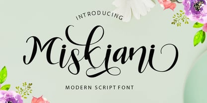 Miskiani is a new modern script calligraphy font with an irregular baseline. Miskiani Script looks lovely on wedding invitations, thank you cards, quotes, greeting cards, logos, business cards and more. Perfect for using in ink or watercolour. Including initial and terminal letters, alternates, ligatures and multiple language support. To enable the OpenType Stylistic alternates, you need a program that supports OpenType features such as Adobe Illustrator CS, Adobe Indesign & CorelDraw X6-X7, Microsoft Word 2010 or later versions. There are additional ways to access alternates/swashes, using Character Map (Windows), Nexus Font (Windows), Font Book (Mac) or a software program such as PopChar (for Windows and Mac).Thanks so much for looking and please let me know if you have any questions.
 - Longshanks by Mysterylab,
$21.00 Longshanks is a condensed serif display font with a low waist, blade-like strokes, and other unusual detailing. This font features a medium-low x-height and works very well at larger display sizes. It's an excellent choice for any headline, banner, or title that would benefit from an old-world, historical, fantasy, magic, or sword & sorcery vibe. It also harks back to the metallic foil stamped type treatments from 1980s – 1990s romance novel book cover design. The offbeat features are subtle enough to leave this font with a very high degree of legibility in spite of its strong and dynamic treatment of certain serifs and finials. The namesake for this typeface is King Edward I of England, whose nickname was Edward the Longshanks.
 - Just Girl by stiplinestudios,
$15.00 Lovely Present Just Girl ♥ Simple way to access is just type a number (1-10) after the letters (sample in pict no.1) Just Girl ♥ is perfect for wedding stationery, invitations, lovey cards, logos, business cards, branding and other projects that require a touch of love and luxury. This font was created with multilingual support and over 500+ glyph characters, allowing you to create a lovely look to your projects. What you get?? a full packed font which character has build in ligatures encoded. So you don't have to worry about accesing alternative character to use on any design project. Are you happy with this font? So let me know if you have any question at fittingline99.ac@gmail.com Thank you - Stipline Studios
 - Olivette Sans by VistaType,
$9.00 Introducing Olivette Sans. Olivette is a Clean and elegant typeface, best suitable for display headings, logos, branding, magazines, product packaging and invitations. Olivette is created in 02 styles and 09 weights. It has 18 fonts including true italics. Olivette is perfectly crafted for a wide variety of projects, such as signature, stationery, logo, wedding, typography quotes, magazine or book cover, website header, clothing, branding, packaging design and more. 18 fonts total 2 font styles Upper / lowercase glyphs Multilanguage Support Webfonts included Free updates and feature additions We really hope you enjoy it – please do let us know what you think, comments & likes are always hugely welcomed and appreciated. More importantly, please don’t hesitate to drop me a message if you have any issues or queries.
 - 1470 Sorbonne by GLC,
$21.00 This family was created inspired from the first font carved and cast in France, for the Sorbonne University’s printing workshop (Paris). The characters were drawn by Jean Heynlin, rector of the university - inspired from Pannartz’s - and in all probability was carved by Adolf Rusch. It has only one style, in one size (about 14 Didots points). We have added the U, J, W and Y, some accented characters and others not in use in the original, but the standard and historical ligatures and the numerous Latins abbreviations are these of the original font. The font is proposed in two choices : Basic Latin, MacTT & TTF, free for a private use, and “Pro”, TTF/OTF, available for standard basic Latin plus Central Europe, Baltic, Turkish, Croatian, Romanian, Celtic.
