10,000 search results
(0.027 seconds)
- Nelona by Mega Type,
$15.00 Nelona An elegant font designed when in a creative mood and perfect shape, inspired by the bold, natural look of serifs so beautiful for today's fashion. bold, balanced and varied, born for luxury and beauty. including uppercase letters, numbers, and various kinds of punctuation. Nelona is perfect for invitations, logos & branding, photography, advertising, watermarks, social media posts, product packaging, product designs, labels, wedding designs, stationery, special events or anything else needed to create a theme. Hope you enjoy our fonts and if you have any questions, feel free to message & I'll be happy to help :)
 - Anargya by IbraCreative,
$17.00 Anargya is a timeless beauty classic serif typeface that exudes elegance and sophistication. Its meticulously crafted letterforms showcase a harmonious balance between thick and thin strokes, creating a sense of timeless grace and legibility. With a refined, high-contrast design, Anargya brings a touch of traditional charm to contemporary designs, making it a versatile choice for branding, editorial, and luxury aesthetics. Its gracefully tapered serifs and graceful curves imbue it with an air of sophistication and refinement, making it a perfect choice for projects that demand a timeless, classic typographic style.
 - Four Seasons by Latinotype,
$39.00 Four Seasons is a display handwritten typeface inspired by nature and its four seasons. The font was designed by Coto Mendoza and Luciano Vergara during the winter of 2010 and 2013. Four Seasons’ real handmade stroke allows for an authentic lettering and makes the font perfect for photography and illustration composition. Four Seasons comes with an extensive character set and includes OpenType features such as titlings, endings, initials, swashes, ligatures and alternates plus a sweet set of ornaments, dingbats and words, all inspired by branches, leaves and flowers.
 - Anything by Supersemarletter,
$10.00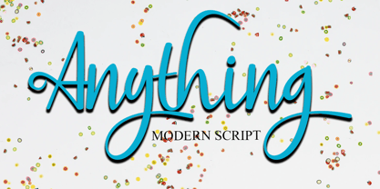 Anything is a handwritten script style in Uppercase and Lowercase feel nice balanced. Provide ligatures with special character make the design letter looks incredible. Honestly it works perfectly for headlines, logos, posters, packaging, T-shirts and much more. Font Features : • Regular version • Character set A-Z in uppercase and lowercase • Ligatures in Lowercase and special • Alternates option • Numerals & Punctuation • Accented Characters • Multiple Languages Supported Recommended to use in Adobe Illustrator or Adobe Photoshop with opentype feature. If you have questions, just send me a message and I'm glad to help.
 - Linotype Algologfont by Linotype,
$29.99Linotype Algologfont is part of the Take Type Library, chosen from the contestants of Linotype’s International Digital Type Design Contests of 1994 and 1997. Designed by German artist Bjorn Hansen, the font contains exclusively capital letters and the forms of the characters look like branches or driftwood bent to form an alphabet and punctuation. The font is very flexible and can give text either a myterious and strange impression or a free and natural one, dependent on context. Linotype Algologfont is best suited to headlines in larger point sizes. - ITC Novarese by ITC,
$40.99 Novarese font is the work of designer Aldo Novarese. He created 218 typeface cuts but as he was writing his book, Alfabeta, he decided to include only those he considered indispensable. He divided his fonts into 4 categories and in the designing of Novarese, took the best characteristics of each group and combined them into this font. In the style of Latin stone scripts of the second century BC. Novarese is a well-balanced and relatively wide text font with classic forms. ITC Novarese™ font field guide including best practices, font pairings and alternatives.
 - Histadia by IbraCreative,
$17.00 Histadia is a strikingly modern chic serif typeface that seamlessly blends timeless elegance with contemporary aesthetics. Its graceful, high-contrast letterforms exude sophistication and versatility, making it an ideal choice for a wide range of design projects. The font’s crisp lines and refined serifs convey a sense of refined luxury, while its clean, minimalist detailing ensures legibility and impact in both print and digital applications. Histadia captures the essence of classic serifs while embracing a modern sensibility, making it a versatile choice for those seeking a harmonious balance between tradition and innovation in typography.
 - Bricksram by Parker Creative,
$18.00 Bricksram is a sleek and modern geometric sans serif font that draws inspiration from popular typefaces like Futura, Gotham, and Proxima Nova. With its own unique flair and minimalistic design qualities, Bricksram is the perfect choice for those looking to achieve a clean and contemporary look across a variety of mediums. Featuring sharp angles and smooth mathematical curves, Bricksram's meticulous balance creates a super clean and eye-catching aesthetic. With a choice of eight different font weights, this versatile typeface is ideal for demanding design applications like websites, logos, mockups, apps, ads, and more.
 - Sraben Grotesk by Yukita Creative,
$14.00 Sraben Grotesk is a beautiful, versatile font that's perfect for all kinds of projects! It features balanced and harmonious proportions, plus bold variations to make certain elements stand out. This font offers classic characteristics inspired by Grotesk typography, making it an ideal choice for posters, flyers, brochures, brand identity designs, and magazine layouts. Whether you're looking to create something new or bring a creative twist to an existing project, Sraben Grotesk can be the perfect choice. Let its clean aesthetic fuel your imagination and inspire you as you achieve your design goals!
 - Kecumik by IbraCreative,
$17.00 Kecumik, a stunning Glamour Serif typeface, seamlessly blends elegance with modern sophistication. Its graceful letterforms exhibit a harmonious balance of curves and serifs, exuding a timeless allure that captivates the eye. Kecumik’s intricate details and refined strokes contribute to its distinctive personality, making it an ideal choice for projects that demand a touch of glamour and a nod to classical aesthetics. Whether used in editorial design, branding, or luxury packaging, Kecumik’s versatile charm elevates any visual composition, embodying a sense of refined beauty that resonates across diverse design applications.
 - Aprex Sans by S6 Foundry,
$20.00 Aprex Sans perfectly balances the minimalist quality associated with contemporary sans with flair within the width of the counters and comfortable, breathable apertures. — Throughout weights and sizes, the typeface has great legibility and good contrast between positive and negative space, making it stunningly versatile. — With a seamless combination of contemporary details and classic styles, Aprex Sans draws inspiration from the mid-century humanist and grotesque typefaces, and its solid and straightforward structure is characterized by angular connections between curves and stems. Aprex Sans is geometric in nature with humanist qualities rooted in the Swiss tradition.
 - Acello by Craft Supply Co,
$20.00 Acello – Geometric Sans Serif Font Modern Simplicity Acello, the Geometric Sans- serif font, effortlessly infuses modern simplicity into your display designs. Clean lines and a sleek aesthetic captivate your audience, ensuring a contemporary appeal. Versatile Elegance Crafted for diverse display purposes, Acello seamlessly adapts, adding a touch of versatile elegance to logos, headlines, and more. Its adaptability ensures a refined look for any visual project. Readability Redefined Prioritizing clarity, Acello’s balanced proportions enhance readability. Each character is meticulously crafted for optimal legibility, ensuring your message is clear and accessible to all.
 - Rustery Mirages by Fikryal,
$25.00 Introducing Rustery Mirage, a striking modern serif font that effortlessly blends timeless elegance with contemporary flair. With its sleek and sophisticated design, Rustery Mirage is the perfect choice for projects that demand a touch of refinement and versatility. Crafted with meticulous attention to detail, Rustery Mirage exudes confidence and professionalism. Its clean lines and balanced proportions create a harmonious balance between classic charm and modern aesthetics. The font’s serifs add a touch of traditional grace, while it's sleek curves and subtle flourishes lend a fresh and stylish appeal. Rustery Mirage is highly legible, making it an excellent choice for various applications. Whether you’re designing branding materials, editorial layouts, website headers, or social media graphics, this font will effortlessly enhance your project’s visual impact. Its versatility allows it to shine in both print and digital mediums, adapting seamlessly to any design environment. Experience the allure of Rustery Mirage and elevate your designs to new heights. Captivate your audience with this modern serif font that exudes elegance, versatility, and a touch of contemporary sophistication. Let Rustery Mirage be your go-to choice for creating stunning typographic masterpieces that leave a lasting impression. If you have any questions please don’t hesitate to contact me follow my Instagram: @fkryall Thank you
 - Patched by Mans Greback,
$39.00 Patches is a multi-faceted, victorian-era serif typeface for when you need something more than plain text. Get that extra attention while adding a genuine, original appearance to your message. Patches was designed from scratch to give a sense quality and depth. Its designer Mans Greback has created a typeface with a complex structure, yet one that will be easy to master. This work will suit every style, taste and skill level. It is a decorative and completely hand-drawn design in vintage lettering, with the perks and flexibility of present-day technology, which is exactly what you'd expect from a modern typeface. Whether you are making a decorative floral headline, drawing a cowboy logo, or creating a unique design based on this ornamental font, the hopes are that Patches can give you a set of tools and inspiration to bring out the best of your artistry. Standing on the shoulders of giants, it was inspired by a wide range of works, and will hopefully be able to continue to teach and inspire future artists. Or at least help you become a better designer when you're designing an elegant and classic headline. Set the coloring of Patches to light gold and cream tones to apply a luxurious look, or in dark tones for a more rugged impression. Bold, bright colors will make it appear In the mid-1800s, decorative design flourished in the Western major cities. Victorian style thrived and encouraged techniques such as enamelling, embroidery and calligraphy. From the 1880s onwards, there were a series of reactions to higher Victorian tastes, with Art Deco reaching the heights of the 20th century. However, the Victorian art persisted popularity, as it changed to more sophisticated designs which made it more attractive to specific professions and groups. The evolution of the Victorian style in the mid-20th century was a key factor in the succession of the movement. Classic shops and salons, sport designs and traditional festivals, and later Rock'n'Roll and Harley Davidson-themed graphics inspired the continued development of the art. Aspiring to carry on this tradition, this typeface family consists twelve different high-quality variations. The main ones are Patched and Patched In – an outlined variation – and each one provided in five weights: Thin, Light, Medium, Bold and Black. Additionally, the two rough fonts Hangaround and Prospects, that tries to grasp the rough, earthy atmosphere of a shady motorcycle club. The font is built with advanced OpenType functionality and has a guaranteed top-notch quality, containing stylistic and contextual alternates, ligatures and more features; all to give you full control and customizability. It has extensive lingual support, covering all Latin-based languages, from North Europa to South Africa, from America to South-East Asia. It contains all characters and symbols you'll ever need, including all punctuation and numbers.
 - Refinery by Kimmy Design,
$10.00 Refinery is the newest font in the Evanston Collection of square typefaces. With a similar capital structure to Tavern and Alehouse, Refinery includes both lowercase and small caps, making it an ideal typeface for paragraph text settings. It also comes in a wide array of weights and widths, with 85 font files in total. DESIGN Refinery has it’s roots in early 20th century signage and saloon typography, but has been modernized - even future-ized - to fit the 21st century digital landscape. The design was aimed at providing a type family that could work in many modern design fields, from sports, tech and military to gaming, HUD, virtual reality and augmented reality. ENGINEERING Essentially. Refinery is a simple mono-linear square design has been expertly refined into an easy-reading sans serif typeface. It was designed to be used in both display and text settings. From hairline to black in ultra-narrow or extended, the wide array of weight and width options makes it easy to find the right font for each text need. SPECS Refinery not only includes 85 font files, but each one include a wide array of Opentype Extras that allow even further customization. • Stylistic Alternatives: Letters A W Y have a styling variation that rounds the pointed apex into a square curve. The S and 2 variation straightens the spine, making all curves in the alphabet read as 90º angles. • Small Capitals: A shortened version of the capitals for alternate header settings. • Titling Alternatives: In this typeface, this feature turns on lifted small caps. Take the small capitals, raise them to level with capitals and underline at the baseline. When multiple lowercase or small capital letters are typed in a row, the underlines connect, creating unique ligatures. • Figures: There are different figure styles for different text needs. Options include, proportional lining, tabular lining (for math), old style and small capitals. • Discretionary Ligatures: A little funk to this otherwise serious typeface. Letters with a long baseline or cap height stem - F, L, T - get elongated to hug a small capital vowel. Other ligatures include Co. and No. • Catchwords: These are common words that bring emphasis to a design. In English these words include ‘and’ ‘as’ ‘by’ ‘in’ ‘of’ ‘the’ ‘to’ ‘when’, among others. Refinery also includes multilingual catchwords of ‘el’ ‘la’ ‘oder’ ‘go’ ‘para’ ‘pour’ ‘und’ ‘y’, among others. For the full list, please check out the specimen images. EXTRAS To round the typeface off, a set of over 150 ornaments, icons, arrows, patterns and line breaks is included to provide complimentary graphics. These can be found in the Ornaments labelled font, it is recommended to use the Glyphs panel to select which text glyph is needed.
 - Pariphoom Compressed by Jipatype,
$27.00 ขอแนะนำ Pariphoom Compressed ส่วนเสริมของฟอนต์ Pariphoom ด้วยอักษรอันโฉบเฉี่ยวและทันสมัย เหมาะสำหรับงานออกแบบหลากหลายประเภท ด้วยอักษรแบบ sans-serif condensed และมุมโค้งมน แบบอักษรนี้ให้ความสมดุลที่ระหว่างความเป็นทางการและความเข้าถึงได้ง่าย ชื่อปริภูมิมาจากภาษาไทย แปลว่า “Space” และเช่นเดียวกับชื่อของมัน ฟอนต์นี้สามารถให้พื้นที่มากขึ้นในงานออกแบบของคุณ ไม่ว่าคุณกำลังสร้างสื่อสำหรับสร้างแบรนด์ พัฒนาแคมเปญการตลาด หรือออกแบบเว็บไซต์ Pariphoom Compressed มอบความยืดหยุ่นและความอเนกประสงค์เพื่อให้ได้รูปลักษณ์ที่คุณต้องการ Pariphoom Compressed มาพร้อมกับรูปแบบที่แตกต่างกันถึง 18 รูปแบบ สิ่งนี้ทำให้คุณมีตัวเลือกมากมายและมีความยืดหยุ่นในการใช้งานในหลากหลายบริบท นอกจากนี้ ฟอนต์นี้รองรับหลายภาษาสำหรับภาษาต่างๆ มากมาย แต่นั่นไม่ใช่ทั้งหมด Pariphoom Compressed มาพร้อมกับฟีเจอร์ Opentype เจ๋ง ๆ เช่น Small Caps และ Tabular ซึ่ง Small Caps เป็นวิธีที่ยอดเยี่ยมในการเพิ่มความหลากหลายให้กับงานออกแบบของคุณโดยใช้ตัวพิมพ์ใหญ่แทนตัวพิมพ์เล็ก ในขณะเดียวกัน Tabular ก็สมบูรณ์แบบสำหรับการสร้างตารางและจัดตำแหน่งตัวเลขเพื่อให้ดูเป็นระเบียบมากขึ้น โดยรวมแล้ว Pariphoom Compressed ทำให้เป็นตัวเลือกที่ยอดเยี่ยมสำหรับนักออกแบบที่ต้องการสร้างผลงานการออกแบบที่น่าจดจำและมีประสิทธิภาพ Introducing Pariphoom Compressed, a extended of Pariphoom with sleek and modern typeface that is perfect for a wide range of design projects. With its condensed sans-serif design and rounded corners, this font offers a unique balance of professionalism and approachability. Derived from the Thai language, the name Pariphoom means "Space" and just like its name suggests, this font can give you more space in your design. Whether you're creating branding materials, developing marketing campaigns, or designing websites, Pariphoom Compressed offers the flexibility and versatility you need to achieve your desired look. Pariphoom Compressed comes with 18 different styles. This gives you plenty of options to choose from and the flexibility to use it in various design contexts. Additionally, this font offers multi-language support for a wide range of languages. But that's not all – Pariphoom Compressed comes with some cool Opentype features such as Small Caps and Tabular. Small Caps are a great way to add variety to your design by using small capital letters instead of lowercase letters. Meanwhile, Tabular is perfect for creating tables and aligning numbers for a more organized look. Overall, Pariphoom Compressed making it a great choice for designers who want to create memorable and effective design projects.
 - Belda by insigne,
$29.99 Step into the beauty of Belda’s elegant form and discover the richness flowing from both its historic influence and its strong elements. At its heart, Belda's graceful style embodies the classical calligraphy of the Roman capital, best known from such Roman monuments as Trajan's Column. To lessen the possibility for error, the builders of these defining structures brushed their templates onto the marble before taking their first cuts from the expensive stone. These simple strokes now mark a simple but wonderful path full of life and mystery. Beyond a copy of the past, Belda has grown from its roots to offer a brave, new world of potential through its still-simple structure. The new design strongly contrasts thickness and stroke. Its delicate shape, curves and sharp serifs provide a unique style of harmony and beauty. The resulting balance? The lighter weight design remains subtle and elegant, while the combination in its bolder counterparts provides an intense luster and sparkle, pulling the reader’s eye to the font’s captivating features. A quick look beyond its surface of standard forms also reveals Belda has more layers to discover with OpenType small capitals, titling capitals and more. With a wealth of weights and many widths beside, the font is capable of serving as both text and titling. While especially strong as a movie title or poster font, it’s also great for book jackets, advertising, and packaging. So start your journey with Belda. The possibilities to explore on this path are practically endless. Production assistance from Lucas Azevedo and ikern.
 - Cooker Cake by Sabrcreative,
$25.00 Elevate your design projects with Cooker Cake, a vibrant and playful sans serif display font. With its charismatic style and versatile nature, this font adds a touch of excitement and creativity to any typography-based endeavor. Whether you're designing logos, posters, headers, or website elements, Cooker Cake will captivate your audience and make your text pop. Cooker Cake features all capital letters, giving your designs a bold and impactful appearance. The font also includes a wide range of numbers and punctuation, ensuring that your compositions are complete and functional. Its multilingual support allows you to incorporate various languages seamlessly, making it ideal for global projects. One of the standout features of Cooker Cake is its PUA (Private Use Area) encoding. This means that you have access to additional special characters, glyphs, and ligatures, expanding your creative possibilities and enabling you to add unique flourishes to your designs. Let your imagination run wild as you explore the various alternates and stylistic options available in this font. With its sans-serif style, Cooker Cake strikes the perfect balance between modern aesthetics and a playful vibe. It works harmoniously in both digital and print formats, making it suitable for a wide range of applications. From branding and packaging to social media graphics and advertising campaigns, this font will bring a sense of joy and energy to your projects. Experience the versatility and captivating charm of Cooker Cake Sans Serif Display Font. Let its playful and dynamic personality infuse your typography with excitement.
 - Span by Jamie Clarke Type,
$25.00 Span is a modern chiseled style family that flaunts its engraved heritage with sweeping serifs and sculptural forms. Bridging the contemporary and traditional, Span appears exuberant yet dignified. Designed primarily for luxurious headlines and titles, Span’s strong vertical stress is softened by elegant organic curves while its compact height accentuates the deep serifs. The family offers five weights, each with three widths and italics. The condensed styles provide an invaluable advantage when designing within narrow spaces. Span’s italics strike a balance between true italics and oblique letterforms to create a change in rhythm while preserving its chiselled style. A variety of additional features enhance Span's typographic capabilities including restrained swashes and flourishes are available in both roman and italic styles. Span also introduces an additional set of capitals for exceptional typographic control over uppercase settings. ‘Mid Caps’ sit midway between full-height capitals and lowercase letters and extend Span's title setting options to All Capitals, Capitals with Mid Caps and Capitals with Small Caps. Choose Span and take full control over your title settings and produce classic typography with statuesque poise. Overview: 30 styles comprised of 5 weights, 3 widths and accompanying italics Additional features include alternate characters, swashes, Small Caps and Mid Caps 987 glyphs per style See the Specimen Supported Languages: Albanian, Asturian, Basque, Breton, Bosnian, Catalan, Croatian, Czech, Danish, Dutch, English, Estonian, Faroese, Finnish, Filipino, French, Galician, German, Hungarian, Icelandic, Indonesian, Irish, Italian, Kurdish, Latin, Latvian, Lithuanian, Malay, Maltese, Moldavian, Norwegian, Occitan, Polish, Portuguese, Romanian, Samoan, Serbian (Latin), Slovak, Slovenian, Spanish, Swahili, Swedish, Tagalog, Turkish, Walloon, Welsh, Wolof, Zulu
 - Masheu by Twinletter,
$17.00 Masheu is a classic serif font that depicts elegance and perfection in every line and curve of the letters. With a distinct touch of classic modernism, this font is the perfect solution for creating designs that exude a timeless beauty. Each Masheu character is designed with captivating detail and subtlety. With well-proportioned proportions and elegant serif forms, this font strikes a harmonious balance between simplicity and elegance. The typography styles brought to you by Masheu will add a touch of luxury and professionalism to any of your design projects. Not only has an attractive appearance but Masheu is also equipped with creative features. With the available ligatures and alternates, you can create unique and interesting style variations to suit your project needs. Also, multilingual support ensures that this font can be used in multiple languages easily. Are you looking for a font that combines classic beauty and modern sophistication in one perfect unit? Masheu is the answer. With benefits that include a stunning classic serif style, creative features such as ligatures and alternates, and extensive multilingual support, this font will quickly grab the attention of your potential customers and deliver eye-catching designs in no time. What’s Included : File font All glyphs Iso Latin 1 Alternate, Ligature Simple installations We highly recommend using a program that supports OpenType features and Glyphs panels like many Adobe apps and Corel Draw so that you can see and access all Glyph variations. PUA Encoded Characters – Fully accessible without additional design software. Fonts include Multilingual support
 - Dopelton by Variatype,
$22.00 Introducing Dopelton, a signature font that transcends the ordinary, embodying the essence of personal style and sophistication. Crafted with meticulous attention to detail, Dopelton is more than a font; it’s a stroke of individuality, a visual symphony that transforms signatures into works of art. Each letter in Dopelton carries a distinctive flair, reminiscent of a signature penned by a hand writer. The fluid strokes seamlessly merge, creating a harmonious rhythm that captures the art of the handwritten with a contemporary twist. The balance between elegance and readability is finely tuned, making Dopelton versatile for various design purposes. Dopelton is not confined to the limits of static characters; it adapts to the natural flow of the hand, ensuring a unique signature experience every time. The font’s dynamic nature brings authenticity to digital signatures, providing a touch of human warmth in the digital realm. The details of Dopelton are a testament to its craftsmanship. Subtle curves, refined loops, and a tasteful interplay of thick and thin lines give each letter a signature-worthy personality. Whether used for branding, invitations, or personalized stationery, Dopelton adds a touch of refined charm to any project. This signature font is designed to make a statement—bold yet graceful, modern yet timeless. Dopelton is more than a font; it’s an extension of your identity, a signature that leaves a lasting impression. Elevate your designs with Dopelton and let your words carry the unmistakable touch of personalized elegance. FONT FEATURES Additional Accents 68 Languages Kerning Alternates Ligatures Swashes
 - FF Signa Round by FontFont,
$72.99 FF Signa Rounded is a natural complement to the rest of the FF Signa super family – and can stand on its own in a variety of print and on-screen applications. The design is Ole Søndergaard’s rounded branch in his FF Signa family three. In it, he took the distinctive shapes and proportions of FF Signa Sans and created a warm, inviting design for text and display copy. Like its parent design, FF Signa Round is not a humanistic sans, nor is it based on 19th-century grotesques. Its characters are minimalist interpretations of letterforms – distinctive, yet easy to read. Thanks to FF Signa Round’s large x-height, open counters and simple character shapes, the design does not overpower the message – and draws the reader in. At substantial sizes, especially in the bolder weights, the design communicates with amiable conviction. At text sizes, FF Signa Round remains inviting and legible. It can be used as a companion to the rest of the FF Signa family, providing depth of style and breadth of reach. The collection of designs can also be used on their own for brand, brochure, publication, and way-finding design in digital and hard copy environments. Like the rest of the FF Signa family, OpenType® Pro fonts of FF Signa Round provide for the automatic insertion of ligatures and alternate characters, and also offer an extended character set supporting over 100 languages, including most Central European and many Eastern European – in addition to Cyrillic and Greek.
 - Aphrodite Slim by Typesenses,
$57.00 Aphrodite Slim Pro is not just a lighter version of its sister Aphrodite Pro. Aphrodite Slim Pro has duplicated the quantity of characters of its partner, and that means more than 500 new glyphs, reaching a total of more than 1000. More delicate and meticulous, Aphrodite Slim Pro is once more a new typography with deep calligraphic ideals: We immersed ourselves into the world of each calligraphy ductus and each calligraphy masters by studying from decoration to lettering books. This was the key for the logic of Aphrodite Slim’s behavior. The new concept of Aphrodite Slim Pro was to join diverse styles of calligraphy in one in order to achieve an autonomous expressiveness, in fact, this is what calligraphy aims to, and we agreed to bring those ideals to the world of typography: It is justifiable to be inspired in hundred-year-old calligraphies, but it is even better if the results you obtain have a plus. A personal plus. During the creation process we were wondering whether it was possible to mix certain strokes of such rigid styles as uncial, (Li·n’s favourite style), with strokes of the copperplate, (Sav’s favourite style), and also to take and mix cualities of cancelleresca cursiva, formata and moderna; finally giving our creation a roman-transition italic look. So Aphrodite Slim takes ideals and aspects from those formal styles, following its own logic though, and emphasizing the fact of being a decorative typography. Calligraphy masters of our past are who we are in debt with. They are the cause we have lovely letters now. They have been spontaneous at the moment of creation, what differs from the type-designers of nowadays, whose spontaneity is more limited. Digital faces that we are used to see these days are a result of long hours of optical adjustments, grids, macros and inspirations of other existing typography, but without personal contributions. Aphrodite Slim wants to refute this. Its mission is to rescue de spontaneity of the artesanal lettering in order to obtain unique words; those which only calligraphy masters of our past or lettering artists of our present could give us. We have worked hard to achieve this, making Aphrodite the most universal font we could: It was necessary to study the most common words, focalizing more in the ones referring to “sensitivity”, of four of the most spoken languages in the world. Aphrodite Slim has an enormous quantity of decorative characters and special ligatures for phrases and words in English, French, Spanish and German. (See English, Français, Español, Deutsch PDF in the gallery section). We promise there is no existing type that decorates/ligates glyphs and words like Aphrodite Slim does: It is the first time a font like this really considers its purpose. -The way glyphs are ligated is insane- : Aphrodite Slim rescues some ideals of persons like Jan van den Velde (Italian cancilleresca writing of XVI Century) who understands ascenders and descenders as possibilities to beautify the lines of writing with curved strokes that seem to be dancing above and below of the words. This master also creates ascenders and descenders even where they are not necessary, on letters that do not actually need them: Aphrodite Slim takes this ideal. The font counts with a wide range of glyphs that seem not to be satisfied with its more primitive form and prefer to extreme their parts to be decorative. It also existed masters of calligraphy like José de Casanova of XVII Century, who, with a magnificant skill and a really personal mark, had the particularity of ligating words that were actually separated with spaces. This is another innovative feature in Aphrodite Slim. An investigation of the most common beginnings and endings words of the English language was done. Having that feature activated (discretionary ligatures), common words will start to ligate or to be decorated even when they are separated by spaces. Impossible to forget Francesco Periccioli of XVII Century and our experience us designers to face with works of him: His letters, that today are included in the group of cancellerescas modernas, have been a direct inspiration to the oldstyle figures and historical forms variables in Aphrodite Slim. Giovanni Antonio Tagliente (XVI Century) and his particular way of making tails and diagonals longer than usual, qualities that our creation reflects too. Finally, our adventures in Biblioteca Nacional and Barrio San Telmo, Buenos Aires, were essential for us to make Aphrodite Slim more complete and interesting: Sav did an excellent work when studying how the decorative miscellanea and swirls of early XX century were. She also investigated what particularities made those roman titling characters look antique so she could rescue some ideals for the oldstyle figures and historical forms variables. This also leaded her to create the ornaments variable in Aphrodite Slim. We are really proud of presenting Aphrodite Slim Pro, a typography that was the result of days and nights of working hard, because we do love what we do; and we are glad we are living in a present that gives us the possibility to spread this kind of art, because that is the way we consider our job: Aphrodite Slim Pro is Art. Hope you can appreciate the enormous work this type has. Features. Aphrodite Slim Pro is the most complete variable. It includes more than 1000 glyphs. Thanks to the Open-Type programming, it counts with a easy way to change/alternate glyphs if the application in which the font is used supports this. The variables contained in Aphrodite Slim Pro are also offered separately. Aphrodite Slim Text: It is the variable for lines and paragraphs. Thus it is the least ornamental and the most accurate to achieve a satisfying legibility. It has the Standard Ligatures feature in order to improve the possible conflicts some glyphs could have by others. Aphrodite Slim Contextual: It is the one that makes emphasis in decorating. It has the particularity of ligating/decorating words of common use in English, French, Spanish and German. It also has the quality of ligating common beginnings and endings of the common words in English. Aphrodite Slim Stylistic: With similar features of Slim Contextual. It includes a set of decorative numbers for a display use. Aphrodite Slim Swash: This one has special beginnings and endings to decorate words. Aphrodite Slim Endings: It makes words look as a signature. Aphrodite Slim Historical: It adds an antique look to the written word. It also has the special historical ligature function. Aphrodite Slim Titling: This one is the most decorative. Its copperplate inspired ornaments give words a special color, in order to handle the quantity of decoration, it comes with the standard ligature feature, which has the most common ligatures plus others that make decorative swirls not to be conflictive. Aphrodite Slim Ornaments: A set of 52 ornaments. Aphrodite Slim Pro includes all this features plus the Stylistic Set 1; Stylistic Set 2 and the possibility of Slashed Zero. We recommend you to check out the gallery in order to see all these features in action.
 - Hand Stamp Gothic Rough by TypoGraphicDesign,
$25.00 “Hand Stamp Gothic Rough” is based on real vintage rubber stamp letters from Germany. A classic american gothic face mixed with a modern condensed sans serif type. Rough & dirty with a authentic hand stamped look for a warm analogue vintage charm. It started analogous with only a few rubber stamps and finally it was digital 776 glyphs. With 4 × A–Z, 4 × 0–9, 4 × a–z and many other alternative glyphs like @. Plus modern OpenType Features like contextual alternates (automatic generated loop for letter variation). The different variations from the dynamic pressure by hand intended to show the hand-made nature and creates a liveliness in the display font. The font has 80 decorative extras in the form of symbols & dingbats like arrows, hearts, smileys, stars, further numbers, lines & shapes. A range of figure set options like oldstyle figures, lining figures, superiors & inferiors. Additionally standard ligatures, decorative ligatures (type the word “show” for ☛ and “love” for ❤ … ), Versal Eszett (German Capital Sharp S) and many emojis & symbols. Example of use It’s your turn … for example everywhere where it makes sense. The hand stamped font would look good at headlines. Advertising (big headlines), Corporate Design (type for logos & branding), Editorial Design (magazine or fanzine headlines), Product Design (typographical packaging) or Webdesign (headline webfont for your website), flyer, poster, music covers or web banner … How To Use – awesome magic OpenType-Features in your layout application: ■ In Adobe Photoshop and Adobe InDesign, font feature controls are within the Character panel sub-menu → OpenType → Discretionary Ligatures … Checked features are applied/on. Unchecked features are off. ■ In Adobe Illustrator, font feature controls are within the OpenType panel. Icons at the bottom of the panel are button controls. Darker ‘pressed’ buttons are applied/on. ■ Additionally in Adobe InDesign and Adobe Illustrator, alternate glyphs can manually be inserted into a text frame by using the Glyph panel. The panel can be opened by selecting Window from the menu bar → Type → Glyphs. Or use sign-overview of your operating system. For a overview of OpenType-Feature compatibility for common applications, follow the myfonts-help http://www.myfonts.com/help/#looks-different ■ It may process a little bit slowly in some applications, because the font has a lot of lovely rough details (anchor points). Technical Specifications ■ Font Name Hand Stamp Gothic Rough ■ Font Weights Regular & Dirty (Bold) ■ Font Category Display for headline size ■ Font Format.otf (OpenType Font for Mac + Win) ■ Glyph Set 776 glyphs ■ Language Support Basic Latin/English letters, Central Europe, West European diacritics, Turkish, Baltic, Romanian, OpenType Features, Dingbats & Symbols ■ Specials Alternative letters, stylistic sets, automatic contextual alternates via OpenType Feature (4× different versions of A–Z & 0–9 + a–z), Euro, kerning pairs, standard & decorative ligatures, Versal Eszett (German Capital Sharp S), 80 extras like Dingbats & Symbols, arrows, hearts, emojis/smileys, stars, further numbers, lines & shapes. ■ Design Date 2016 ■ Type Designer Manuel Viergutz ■ License Desktop license, Web license, App license, eBook license, Server license
 - Octin Sports by Typodermic,
$11.95 Octin Sports is a typeface that commands attention and exudes a sense of strength and resilience. The seven available weights—light, book, regular, semi-bold, heavy, and black—provide a range of options for designers looking to add a bold, dynamic element to their work. But make no mistake, this typeface is not just for the sports world. Octin Sports has a versatility that extends beyond the playing field and can lend a rugged, no-nonsense vibe to a variety of themes. Whether you’re designing for a school, construction site, or law enforcement agency, Octin Sports is up to the challenge. The sleek, angular lines of this typeface give it a distinct sporty feel, making it an ideal choice for designs that seek to convey energy and excitement. The bold weight options are particularly striking and provide a strong visual impact that demands attention. Overall, Octin Sports is a solid choice for designers who want to infuse their work with a sense of toughness and vitality. Its versatility and sporty design make it a font that can rise to any challenge, whether it’s on the field or in the boardroom. Check out the rest of the Octin families: Octin College, Octin Prison, Octin Stencil, Octin Vintage & Octin Spraypaint. Most Latin-based European writing systems are supported, including the following languages. Afaan Oromo, Afar, Afrikaans, Albanian, Alsatian, Aromanian, Aymara, Bashkir (Latin), Basque, Belarusian (Latin), Bemba, Bikol, Bosnian, Breton, Cape Verdean, Creole, Catalan, Cebuano, Chamorro, Chavacano, Chichewa, Crimean Tatar (Latin), Croatian, Czech, Danish, Dawan, Dholuo, Dutch, English, Estonian, Faroese, Fijian, Filipino, Finnish, French, Frisian, Friulian, Gagauz (Latin), Galician, Ganda, Genoese, German, Greenlandic, Guadeloupean Creole, Haitian Creole, Hawaiian, Hiligaynon, Hungarian, Icelandic, Ilocano, Indonesian, Irish, Italian, Jamaican, Kaqchikel, Karakalpak (Latin), Kashubian, Kikongo, Kinyarwanda, Kirundi, Kurdish (Latin), Latvian, Lithuanian, Lombard, Low Saxon, Luxembourgish, Maasai, Makhuwa, Malay, Maltese, Māori, Moldovan, Montenegrin, Ndebele, Neapolitan, Norwegian, Novial, Occitan, Ossetian (Latin), Papiamento, Piedmontese, Polish, Portuguese, Quechua, Rarotongan, Romanian, Romansh, Sami, Sango, Saramaccan, Sardinian, Scottish Gaelic, Serbian (Latin), Shona, Sicilian, Silesian, Slovak, Slovenian, Somali, Sorbian, Sotho, Spanish, Swahili, Swazi, Swedish, Tagalog, Tahitian, Tetum, Tongan, Tshiluba, Tsonga, Tswana, Tumbuka, Turkish, Turkmen (Latin), Tuvaluan, Uzbek (Latin), Venetian, Vepsian, Võro, Walloon, Waray-Waray, Wayuu, Welsh, Wolof, Xhosa, Yapese, Zapotec Zulu and Zuni.
 - FF Infra by FontFont,
$50.99 FF Infra™ is a fresh take on the robust sans serif typefaces of the early 20th century. Drawn by Gabriel Richter, it’s a friendly, inviting – and multi-talented family. Whether long blocks of editorial text, or snackable copy in web pages and blog posts, FF Infra’s 20 typefaces are easy on the eyes in both print and digital environments. The design also performs as well at petite sizes, as it does at supersized display settings. Pair FF Infra with an old style or Didone serif design and you’ll have powerful and distinctive typographic pages! FF Infra is available in 10 weights, ranging from a delicate light to a commanding black, each with an italic companion. OpenType® Pro fonts of FF infra have an extended character set supporting most Central European and many Eastern European languages, in addition to providing for the automatic insertion of ligatures and fractions. Each font also contains four sets of figures and a bevy of arrows that are ideal for wayfinding and similar info-graphic projects. A generous lowercase x-height, open counters and subtle graduations between family weights, make for a family that is at home in a wide range of sizes, and comfortable in everything from large signage, content for mobile apps, product manuals and full-scale branding projects. In addition, to provide design diversity, Richter drew alternate designs for the a, G and ß. Richter first became interested in fonts and the art of creating typefaces while studying communication design at Düsseldorf University of Applied Sciences. His first designs were experimental, but these lead a position at FontShop International in 2013, where he developed his typeface design skills. A strong background in font production, hinting and font marketing were also part of his FontShop experience. Richter worked as freelance graphic and type designer until he founded übertype in 2017. He also invests back into the type community through the type design courses he teaches at his alma mater. FF Infra is Richter’s first commercial design for Monotype. We’re sure that you’ll find it as versatile and powerful as we do.
 - Anselm Sans by Storm Type Foundry,
$63.00One of the good practices of today’s type foundries is that they release their type families as systems including both serif and sans serif type. Usually, the sources of inspiration need to be well tried with time and practice, since production of a type family is such a laborious and complex process. From the beginning, it needs to be clear that the result will be suited for universal use. Such systems, complete with the broad, multi-lingual variations permitted by the OpenType format, have become the elementary, default instrument of visual communication. Non-Latin scripts are useful for a wide scope of academic publications, for packaging and corporate systems alike. And what about outdoor advertisement designated for markets in developing countries? Cyrillics and Greek have become an integral part of our OpenType font systems. Maybe you noticed that the sans serif cuts have richer variety of the light – black scale. This is due to the fact that sans serif families tend to be less susceptible to deformities in form, and thus they are able to retain their original character throughout the full range of weights. On the other hand, the nature of serifed, contrasted cuts does not permit such extremes without sacrificing their characteristic features. Both weights were drawn by hand, only the Medium cut has been interpolated. Anselm Ten is a unique family of four cuts, slightly strengthened and adjusted for the setting in sizes around 10 pt and smaller, as its name indicates. The ancestry of Anselm goes back to Jannon, a slightly modified Old Style Roman. I drew Serapion back in 1997, so its spirit is youthful, a bit frisky, and it is charmed by romantic, playful details. Anselm succeeds it after ten years of evolution, it is a sober, reliable laborer, immune to all eccentricities. The most significant difference between Sebastian/Serapion and Anselm is the raised x-height of lowercase, which makes it ideal for applications in extensive texts. Our goal was to create an all-round type family, equally suitable for poetry, magazines, books, posters, and information systems. - Anselm Serif by Storm Type Foundry,
$63.00 One of the good practices of today’s type foundries is that they release their type families as systems including both serif and sans serif type. Usually, the sources of inspiration need to be well tried with time and practice, since production of a type family is such a laborious and complex process. From the beginning, it needs to be clear that the result will be suited for universal use. Such systems, complete with the broad, multi-lingual variations permitted by the OpenType format, have become the elementary, default instrument of visual communication. Non-Latin scripts are useful for a wide scope of academic publications, for packaging and corporate systems alike. And what about outdoor advertisement designated for markets in developing countries? Cyrillics and Greek have become an integral part of our OpenType font systems. Maybe you noticed that the sans serif cuts have richer variety of the light – black scale. This is due to the fact that sans serif families tend to be less susceptible to deformities in form, and thus they are able to retain their original character throughout the full range of weights. On the other hand, the nature of serifed, contrasted cuts does not permit such extremes without sacrificing their characteristic features. Both weights were drawn by hand, only the Medium cut has been interpolated. Anselm Ten is a unique family of four cuts, slightly strengthened and adjusted for the setting in sizes around 10 pt and smaller, as its name indicates. The ancestry of Anselm goes back to Jannon , a slightly modified Old Style Roman. I drew Serapion back in 1997, so its spirit is youthful, a bit frisky, and it is charmed by romantic, playful details. Anselm succeeds it after ten years of evolution, it is a sober, reliable laborer, immune to all eccentricities. The most significant difference between Sebastian/Serapion and Anselm is the raised x-height of lowercase, which makes it ideal for applications in extensive texts. Our goal was to create an all-round type family, equally suitable for poetry, magazines, books, posters, and information systems.
 - Mariage by Linotype,
$40.99Morris Fuller Benton, the principal designer of the American Type Founders, designed Mariage in 1901. Mariage, which has been sold under a plethora of different names during the last century, is a blackletter typeface belonging to the Old English category. The term blackletter refers to typefaces that stem out of the historical printing traditions of northern Europe. These letters, called gebrochene Schriften, or "broken type" in German, are normally elaborately bent and distorted. Their forms often print large amounts of ink upon the page, creating text that leaves a heavy, black impression. The Old English style is a subset of blackletter type that dates back to 1498, when Wynken de Worde introduced textura style printing to England. Continental printers had been printing with textura style letters since Gutenberg's invention of the printing press fifty years earlier. Italian printers stopped using them around 1470. For northern Europeans, texturas remained the most popular form of typeface design until the invention of the fraktur style in Nuremberg. Mariage is heavily classicized sort of Old English type. During the Victorian era, designers admired the Middle Ages for its chivalric, community-based values and its pre-industrial lifestyle. Yet they also found the basic medieval textura letterform too difficult to read by present standards. They desired to modernize this old style. Today, this sort of update is often referred to not as "modernization" but as classicism. Benton's design for ATF builds upon earlier Victorian classicist interpretations of Old English/textura letters. For an example of what these Victorian designs looked like, check out the popular 1990 revival of the genre, Old English . Old English style types often appear drastically different from other blackletters. For contrast, compare Mariage to a classical German fraktur design, Fette Fraktur , a schwabacher style face, or the popular early 20th Century calligraphic gothic from Linotype, Wilhelm Klingspor Gotisch . Especially in the United States, classicist Old English typefaces are thought to espouse tradition and journalistic integrity. These features, together with the inherent, complex beauty of Mariage's forms, make this typeface a perfect choice for certificates, awards, and newsletter mastheads. - Dupla by Tipo Pèpel,
$22.00 When Dupla was designed, its DNA shown the best of the typographic heritage from the XIX century types, the oldest san serif known, also named as “Grotesk”, a soft synonym for bizarre, unnatural weird. XIX century Germans' eyes were surprised, astonished by the formal strangeness that provoked the mutilation of the well known serifed types. But the skeleton and DNA are barely perceptible, an invisible part of the nature of objects. We are interested in the epidermis, the outer, the visible, which directly speak to the eyes, and Dupla tells us with overwhelming presence, that is a formal, traditional type, covered with a childlike sweetness, with slight curves, epidermic, sweetening even ink’s traps up. Frutiger said that Latin alphabet letter’s minimum skeleton is like a lock where you should fit all the letters you see, but that skeleton allows many skins. We use a different skin for every specific use. And Dupla’s skin points to how generous, how friendly it is; the sweetness of the big and good-natured. They do not feel very comfortable in low-cost airplanes company’s seats, but in the proper location with enough room, they'll fill the atmosphere with kindness. Do not ask for narrow columns, or terse captions in squalid sizes; do not ask for ridiculous “small print” in dark contracts where «The party of the first part shall be known in this contract as the party of the first part …» That’s not for Dupla. Large headlines, generous width columns to cover, rude pullquotes half-breaking columns, loud exclamations, great sizes, with black weights. It’s in the insultingly generous, almost obscene use where Dupla is felt. And if you consider this a obscene, gargantuan, typographical feast, Dupla brings you everything to demonstrate that quantity does not mean less quality. Multi-language support, Latin plus full coverage, complete sets of small caps, fractions, old numerals, modern, tabular, bonds and all the “gourmet” paraphernalia that Patau has accustomed us, after many years of work. If you want to be obscene and pass the censorship, use Dupla. Hedonism is just a venial sin.
 - Kirsty by Typodermic,
$11.95 Introducing Kirsty, the typeface that will give your designs a cutting-edge, contemporary feel. With its sharp, Latin-serif design, Kirsty is a modern take on the classic nineteenth-century railroad lettering. Released in 2000, this typeface quickly became a favorite for its unique octagonal shape and bold, commanding presence. Now, with a proper lowercase, five weights, and obliques, Kirsty is more versatile than ever. Its sleek, angular lines make it perfect for graphic design, branding, and advertising, while the small caps add a touch of sophistication to any layout. Just be aware that not all languages are available in small caps, so be sure to check if your application supports them. Whether you’re looking to create eye-catching headlines, standout logos, or striking marketing materials, Kirsty has the style and versatility to make your designs pop. So why settle for bland, generic typefaces when you can make a statement with Kirsty? Try it out today and see the difference for yourself. Most Latin-based European, Vietnamese, Greek, and most Cyrillic-based writing systems are supported, including the following languages. Afaan Oromo, Afar, Afrikaans, Albanian, Alsatian, Aromanian, Aymara, Azerbaijani, Bashkir, Bashkir (Latin), Basque, Belarusian, Belarusian (Latin), Bemba, Bikol, Bosnian, Breton, Bulgarian, Buryat, Cape Verdean, Creole, Catalan, Cebuano, Chamorro, Chavacano, Chichewa, Crimean Tatar (Latin), Croatian, Czech, Danish, Dawan, Dholuo, Dungan, Dutch, English, Estonian, Faroese, Fijian, Filipino, Finnish, French, Frisian, Friulian, Gagauz (Latin), Galician, Ganda, Genoese, German, Gikuyu, Greenlandic, Guadeloupean Creole, Haitian Creole, Hawaiian, Hiligaynon, Hungarian, Icelandic, Igbo, Ilocano, Indonesian, Irish, Italian, Jamaican, Kaingang, Khalkha, Kalmyk, Kanuri, Kaqchikel, Karakalpak (Latin), Kashubian, Kazakh, Kikongo, Kinyarwanda, Kirundi, Komi-Permyak, Kurdish, Kurdish (Latin), Kyrgyz, Latvian, Lithuanian, Lombard, Low Saxon, Luxembourgish, Maasai, Macedonian, Makhuwa, Malay, Maltese, Māori, Moldovan, Montenegrin, Nahuatl, Ndebele, Neapolitan, Norwegian, Novial, Occitan, Ossetian, Ossetian (Latin), Papiamento, Piedmontese, Polish, Portuguese, Quechua, Rarotongan, Romanian, Romansh, Russian, Rusyn, Sami, Sango, Saramaccan, Sardinian, Scottish Gaelic, Serbian, Serbian (Latin), Shona, Sicilian, Silesian, Slovak, Slovenian, Somali, Sorbian, Sotho, Spanish, Swahili, Swazi, Swedish, Tagalog, Tahitian, Tajik, Tatar, Tetum, Tongan, Tshiluba, Tsonga, Tswana, Tumbuka, Turkish, Turkmen (Latin), Tuvaluan, Ukrainian, Uzbek, Uzbek (Latin), Venda, Venetian, Vepsian, Vietnamese, Võro, Walloon, Waray-Waray, Wayuu, Welsh, Wolof, Xavante, Xhosa, Yapese, Zapotec, Zarma, Zazaki, Zulu and Zuni.
 - Metro Nova by Linotype,
$57.99 Metro Nova comprises seven weights, from ultra thin to extra black in regular proportions, and six weights as condensed designs. Each has an italic counterpart for a total of 26 fonts. The family is available as OpenType® Pro fonts, which provide for the ability to easily insert typographic features such as ligatures, fractions and alternate characters. Pro fonts also offer an extended character set to support most Central European and many Eastern European languages.
 - Kesmod Font by Softulka,
$10.00 Kesmod is a clean display typeface that excels in urban posters, music covers, clothing print design, impactful headlines, large page headers, billboards, signs, bold headlines, modern acid typography, Brutal Bold design, and much more. This modular Sans Serif typeface features 12 styles spanning from delicate thin to bold black, which really can help in modern experimental design. You will receive: - 12+1 styles - including Uppercase Alphabet, numbers, punctuation, and common additional glyphs.
 - Jams And Jellies JNL by Jeff Levine,
$29.00 Based on a vintage set of kitchen labels, Jams and Jellies JNL is a font containing 52 of the most common names for jams, jellies and preserves as well as a blank label for creating your own flavor choices. Note: While this font may be used in many commercial advertising applications, any manufacture for retail sale of a complete set (or portion thereof) of these labels requires a special license from the font's author.
 - Bermula by Typehill Studio,
$25.00 Bermula is a Contemporary, Classy, and Warm Serif typeface. Bermula has a Clean and Smooth details. The design was intended to improve upon the Legibility. Bermula included 16 Fonts. Regular and matching Italic, from Light to Black weight. Also included Variable Font support. OpenType features allow for the implementation of typographic such as Ligatures. and added Latin Language support. It’s a perfect choice for Branding, Magazines, Posters, Advertising, Print, Packaging, Headlines, Logos, Web Design etc.
 - Bitumen by Hanoded,
$12.00 Bitumen is a sticky, black, and highly viscous liquid form of petroleum. When I created this font, it reminded me a bit of asphalt, hence the name. Bitumen is a handmade font based on Schmallfette Grotesk by Walter Haettenschweiler and Haettenschweiler font. The font was made with a Japanese brush pen, hence the bold lines. Bitumen comes in two styles: the regular, fat display font and a lighter version - both with italics.
 - Gliker by Studio Sun,
$8.00 Gliker was designer in the early 2019 and published in June 2020. Gliker is inspired by the characteristics of Hobo Typefaces. All corners of this typeface is founded, giving a more dynamic and vintage feel. Gliker is available in 4 Weights (Regular, Semi Bold, Bold, Black) and 7 Widths (Extra Condensed, Condensed, Semi Condensed, Normal, Semi Expanded, Expanded, Extra Expanded) with a total 28 Styles. Also includes support for 75+ Latin (Extended) Languages.
 - Postmodern Moderne by Jeff Levine,
$29.00 First published in 1938, Letters and Lettering by Paul Carlyle and Guy Loring was a textbook on lettering examples and how to do them. On one of the pages was found a solid black (counterless) Art Deco sans serif design that in its many variations so typified the era. The example shown in that book served as the model for Postmodern Moderne JNL, which is available in both regular and oblique versions.
 - Boleo by Salsipuedes,
$19.00 Boleo is a typeface designed to work in short texts such as headlines, banners, logos, signs, packaging and posters. It is a display font but has a good legibility thanks to well-proportioned shapes which let it works fine both on paper and screen. Boleo’s shapes remind to ribbons in motion, so that its lines, all curved, can be traced all at once. Boleo displays in three weights: regular, bold and black.
 - Rosting Gapertas by Mega Type,
$18.00 Rosting Gapertas is a soft and elegant yet sturdy serif family that mixes retro casual undertones with a modern feel. Designed to convey a sense of tenderness and natural expression with a sense of the present to function as a bold tool and a beautiful communicator. Morning Georgian comes in 9 different weights from Thin to Black with 2 styles (Standard & Italic). Rosting Gapertas is perfect for branding, editorial, packaging or logos and more.