10,000 search results
(0.041 seconds)
- KoreanJeju by Beewest Studio,
$10.00 Korean Jeju Font, is a cool and modern display font and a great companion for your Korean-themed designs. It’s perfect for movie posters, greeting cards, social media content, youtube videos, even logo design, etc.
 - Cavendish by Essentials Studio,
$15.00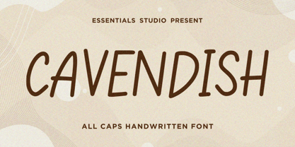 Introducing by Essentials Studio Proudly Present, CAVENDISH CAVENDISH Is a A Cute Handwritten Font CAVENDISH is perfect for product packaging, branding project, megazine, social media, wedding, or just used to express words above the background.
 - Walytime by Stringlabs Creative Studio,
$29.00 Walytime is a relaxed and timeless handwritten font. Fall in love with its incredibly versatile style and use it to create gorgeous wedding invitations, beautiful stationary art, eye-catching social media posts, and much more!
 - Donut & Candy by Tlatous Type,
$19.00 Introducing Donut & Candy by Tlatous Type. Dinut & Candy is a Modern Handwritten Font. This font is perfect for product packaging, branding project, megazine, social media, wedding, or just used to express words above the background.
 - Thescound by Mifiq,
$14.00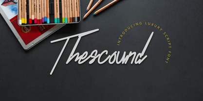 Thescound is a smooth and elegant handwritten font. Thescound is suitable for social media posts, advertisements, logos & branding, invitations, product design, photography, watermarks, labels, wedding designs, product packaging, any event that requires a handwritten look.
 - Monthier by Aestherica Studio,
$9.00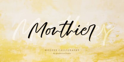 Monthier is a modern and original handwritten font perfect for branding projects, logos, wedding designs, social media posts, advertisements, product packaging, product designs, label, photography, watermark, invitation, stationery, and any projects that need handwriting taste.
 - Lonely Together by Dumadi,
$20.00 Lonely Together is a unique handwritten-style font created with brush tools. if you have a project in the form of romantic nuances, invitation cards, social media designs, branding, valentine events, crafting designs, and more.
 - Bristow by Danielle Eneh,
$10.00 Bristow is a friendly, uppercase display font that's perfect for your next project. Branding, social media posts, advertisements, product packaging, and invitations. It includes 2 uppercase options for more customization. Multilingual Support: AÀÁÂÃÄÅCÇDÐEÈÉÊËIÌÍÎÏNÑOØÒÓÔÕÖUÙÜÚÛWYÝŸ?ŸÆŒßÞþ dis
 - Santaria by Essentials Studio,
$16.00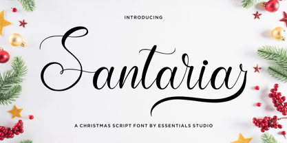 Introducing by Essentials Studio Proudly Present, Santaria Santaria Is a Modern Christmas Script Font Santaria is perfect for product packaging, branding project, megazine, social media, wedding, or just used to express words above the background.
 - Boldetton by Rockboys Studio,
$26.00 Boldetton is an elegant and bold script font. Fall in love with its incredibly versatile style and use it to create gorgeous wedding invitations, beautiful stationary art, eye-catching social media posts, and much more!
 - Newtoon by Good Java Studio,
$18.00 Newtoon is a modern signature font. Perfect for logos, invitations, stationery, wedding designs, social media posts, advertisements, product packaging, product designs, labels, photography, watermarks, special events and more. This family includes: Newtoon Regular & Newtoon Italic.
 - Vigallse by Krakenbox Studio,
$17.00 Vigallse – Vintage Modern Serif Typeface. It has vintage, modern, classic & elegant. It’s a great font for fashion, apparel projects, signature, album cover, logo, branding, magazine, social media, & advertisements, but also works great for other projects.
 - Untlang by Essentials Studio,
$16.00 Introducing by Essentials Studio Proudly Present, UNTLANG UNTLANG Is a A Bold Handwritten Font UNTLANG is perfect for product packaging, branding project, megazine, social media, wedding, or just used to express words above the background.
 - Bitters by Aboutype,
$24.99A grotesque style with extended caps, true short caps and a thin mono-weight drop shadow. Bitters was designed for all media in a wide point size range. Bitters requires subjective display kerning and compensation. - Bellarosse by Nissa Nana,
$26.00 Bellarosse is a delicate, elegant and flowing handwritten font. Get inspired by its authentic feel and use it to create gorgeous wedding invitations, beautiful stationary art, eye-catching social media posts, and cute greeting cards.
 - Bottania by Rockboys Studio,
$23.00 Bottania is an elegant and bold script font. Fall in love with its incredibly versatile style and use it to create gorgeous wedding invitations, beautiful stationary art, eye-catching social media posts, and much more!
 - Blocky by Garisman Studio,
$22.00 Blocky combines attractive curves with a fresh urban edge; delivering a stylish script which is guaranteed to add an eye-catching appeal to your logo designs, brand imagery, quotes, product packaging, merchandise & social media posts
 - Mountisa by Lemonthe,
$15.00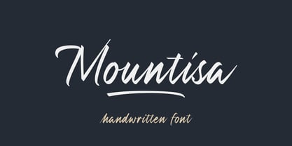 Mountisa is a script font with a dynamic and energetic style. It’s perfect for signature, stationery, photography, social media posts, product packaging, greeting cards, and every other design that needs a unique and striking font.
 - Chiselle NF by Nick's Fonts,
$10.00 This font is a straight-up revival of Rustikalis, a typeface designed for the VGC Phototypositor in the 1960s. This face combines medieval flair with contemporary design sensibilities into one attractive package. Both flavors of this font feature the 1252 Latin, 1250 Central European, 1254 Turkish and 1257 Baltic character sets.
 - University Roman by ITC,
$40.99University Roman font is based on Speedball hand-lettering. Designed at the Letraset Type Studio in 1983. University Roman is notable for its narrow capitals with crossbars that sit well above the median line. This unique roman design evokes a romantic air in display work such as packaging and advertising. - Illuminations Woodcut by Just My Type,
$10.00 Illuminations Woodcut is inspired by the decorated initial capitals of Medieval manuscripts… and an old book of clip art in which they were found. Try decomposing them in Adobe Illustrator and coloring the pieces or dropping color into them in Photoshop: you can get some stunning results. Caps and TrueType only.
 - The HenryMorganHand font by Manfred Klein is a distinctive typeface that carries the essence of personality and flair, drawing its inspiration from the handwriting of historical and possibly mythical...
- Bowling Script by Sudtipos,
$69.00 There is plenty of lyric and literature about looking over one's shoulder in contemplation. What would you have done differently if you knew then what you know now? This is the kind of question that comes out of nowhere. When it does and whether its context is personal or professional make very little difference. It's a question that can cause emotions to rise and passions to run hot. It can trigger priority shifts and identity crises. It's never easy to answer. Three years ago, I published a font called Semilla. My aim with that was to distill the work of Bentele, a lettering artist from early 1950s Germany. Picking such an obscure figure back then was my way of pondering the meaning and efficiency of objectivity in a world where real human events and existences are inevitably filtered through decades of unavoidably subjective written, printed and oral history. And maybe to pat myself on the back for surviving surprises mild and pleasant. Having been fortunate enough to follow my professional whims for quite some time now, I took another, longer look at my idea of distilling Bentele's work again. I suppose the concepts of established history and objectivity can become quite malleable when personal experience is added to the mix. I say that because there I was, three years later, second-guessing myself and opining that Bentele's work can be distilled differently, in a manner more suited to current cultural angles. So I embarked on that mission, and Bowling Script is the result. I realize that it's difficult to reconcile this soft and happy calligraphic outcome with the introspection I've blathered about so far, but it is what is. I guess even self-created first world problems need to be resolved somehow, and the resolution can happen in mysterious ways. Bowling Script is what people who like my work would expect from me. It's yet another script loaded with all kinds of alternation, swashing and over-the-top stuff. All of that is in here. These days I think I just do all that stuff without even blinking. But there are two additional twists. The more noticeable one is ornamental: The stroke endings in the main font are of the typical sharp and curly variety found in sign painting, while the other font complements that with ball endings, sometimes with an added-on-afterwards impression rather than an extension of the actual stroke. In the philosophical terms I was mumbling earlier, this is the equivalent of alternate realities in a world of historical reduxes that by their very nature can never properly translate original fact. The second twist has to do with the disruption of angular rhythm in calligraphic alphabets. Of course, this is the kind of lettering where the very concept of rhythm can be quite flexible, but it still counts for something, and experimenting with angular white space in a project of a very dense footprint was irresistible. After playing for a bit, I decided that it would interesting to include the option of using optically back-slanted forms in the fonts. Most scripts out there, including mine, have a rhythm sonically comparable to four-to-the-floor club beats. So the weirdly angled stuff here is your chance to do the occasional drumroll. Everyone knows we need one of those sometimes. Bowling Script and Bowling Script Balls fonts comes with 1600 characters and features extended Latin-based language support. There are also a basic version of both fonts without all the alternates and extra OpenType features. Bowling family ships in cross-platform OpenType format. We also want to present “Mute”, a visual essay narated by Tomás García and Valentín Muro, about digital life created specially to introduce Bowling Script.
 - TE Classic 2 by Tharwat Emara,
$79.00 TE Classic2 Tharwat Emara is an exquisite Arabic Thuluth font that is designed to add a touch of elegance and sophistication to any project. This font is named after the renowned calligrapher Tharwat Emara, who is widely celebrated for his outstanding work in the field of Arabic calligraphy. One of the most remarkable features of TE Classic2 Tharwat Emara is its impeccable balance between the thick and thin lines. The font's curves and strokes are carefully crafted to create a seamless and harmonious flow, giving it a unique and mesmerizing appearance. The intricacies and details of the font's characters reflect the skill and artistry of the calligrapher and demonstrate the perfect balance between tradition and modernity. TE Classic2 Tharwat Emara is a perfect choice for designers and artists who want to add a touch of Arabic culture and tradition to their projects. The font comes with a full set of Arabic characters, including ligatures, diacritical marks, and numerals. The characters are designed to be easily legible and readable, making it suitable for use in both print and digital media. One of the most striking aspects of TE Classic2 Tharwat Emara is its versatility. It can be used for a wide range of applications, from branding and advertising to editorial and publishing. Its unique and captivating design will make any project stand out and attract customers, making it a valuable investment for designers and artists. The font's exquisite design is not only limited to its characters, but it extends to its overall layout and spacing. TE Classic2 Tharwat Emara has a perfect balance between its characters' shapes and spaces, giving it a smooth and consistent look. The font's spacing is also carefully crafted to ensure that the characters are well-organized and easy to read. TE Classic2 Tharwat Emara is not just a font; it's a work of art. Its unique design and intricate details make it stand out from other Arabic fonts in the market. The font's exquisite design is a result of the meticulous attention to detail paid by the calligrapher, which is evident in every stroke and curve of the font's characters. Overall, TE Classic2 Tharwat Emara is a font that celebrates the beauty and elegance of Arabic calligraphy. Its captivating design and versatility make it an excellent choice for designers and artists who want to add a touch of tradition and culture to their projects. With its unique and mesmerizing appearance, TE Classic2 Tharwat Emara is sure to attract customers and make any project stand out.
 - TessieStandingBirds by Ingrimayne Type,
$13.95 A tessellation is a shape that can be used to completely fill the plane—simple examples are isosceles triangles, squares, and hexagons. Tessellation patterns are eye-catching and visually appealing, which is the reason that they have long been popular in a variety of decorative situations. These Tessie fonts have two family members, a solid style that must have different colors when used and an outline style. They can be used separately or they can be used in layers with the outline style on top of the solid style. For rows to align properly, leading must be the same as point size. Shapes that tessellate and also resemble real-world objects are often called Escher-like tessellations. This typeface contains Escher-like tessellations of birds. A number of years ago I decided to see how many of the 28 Heesch types of tessellations I could use to make birds standing on the backs of other birds. I found standing bird patterns for all 17 of the types that had either translated or glided edges. The TessieStandingBirds typefaces contain the standing-bird shapes that I discovered. At first glance they seem to be quite similar, but small differences matter in how they fit together. Most of the patterns require more than one character. The sample file here shows how pieces fit together to give tessellating patterns. (Earlier tessellation fonts from IngrimayneType, the TessieDingies fonts, lack a black or filled version so cannot do colored patterns.)
 - Gearing by Heyfonts,
$15.00 Gearing is a typeface that is widely associated with the extreme music genre of death metal. It is characterized by its dark and aggressive appearance, evoking a sense of brutality and chaos. The font is typically designed with sharp edges, bold and angular letterforms, and intricate or distorted shapes. The death metal font typically features strong upper and lowercase letter variations, often with sharp, exaggerated serifs or thorn-like spikes. These embellishments contribute to its menacing and threatening aesthetic. The letters may also have broken or damaged elements, giving them a weathered or decayed look. Though death metal fonts come in various styles and variations, they often prioritize legibility and impact over ease of reading. This means that certain parts of the letters may be missing or disconnected, making them appear jagged or incomplete. Ligatures, which are unique letter combinations, are sometimes included in the font to add a sense of continuity or artwork to the overall design. In terms of color, death metal fonts are commonly depicted in monochromatic shades such as black, grey, or dark red to maintain their sinister appearance. The color contrast often enhances the sharpness and intensity of the font, making it more visually striking. Due to its association with the underground music scene, the death metal font has become an essential element in album covers, band logos, posters, and merchandise. It effectively conveys the aggressive and rebellious spirit of the genre, becoming instantly recognizable to fans and enthusiasts.
 - The Cartel by Say Studio,
$12.00 About the Product The Cartel is a elegant serif font . This typeface has been made carefully to make sure its premium quality and luxury feel. The ligatures makes this typeface unique and stands out rather than the regular serif font. Very suitable for logo, headline, tittle, and the other various formal forms such as invitations, labels, logos, magazines, books, greeting / wedding cards, packaging, fashion, make up, stationery, novels, labels or any type of advertising purpose. Features : numbers and punctuation multilingual ligatures alternates PUA encoded FAQ's : Where are the TTF's? They are included in a download link( in a text file) in your main download file. 1 user 2 computers installation (Desktop License) You may NOT use for broadcast or Cinema/Motion Picture. You may NOT resell this font in any platform without further permission from designer. Do NOT embed font files in app/game/e-pub (for desktop license) You may NOT use the fonts in templates for sale/free. ( web/print/app ) For other license use please contact us. SOFTWARE REQUIREMENTS : Fonts and alternate : No special software required they may be used in any basic program /website apps that allows standard fonts That's it folks! You can go ahead and get cracking :) Follow My Shop For Upcoming Updates Including Additional Glyphs And Language Support. And Please Message Me If You Want Your Language Included or If There Are Any Features or Glyph Requests, Feel Free to Send me A Message. Have a Good Day !
 - Fabiola by Lián Types,
$49.00 -Fabulous, beautiful, friendly, talkative, sweet, caring, a little on the odd side, very desirable by many, good at almost everything- That's the definition of Fabiola according to the slang dictionary of americans. If you were you looking for something delicious, a font that covers a really wide range of uses and always looks amazing, Fabiola should be your choice. Although it may look as another of my scripts with juicy swashes, this time I explored in depth the pairing and interaction with capital letters for more unique results. Why? We are going through some crazy days where the number of people interested in letters is only growing. We see lettering everywhere: I can say that finally our field is shouting out loud; letters are THE protagonist more than ever. Hence the need of combining and pairing different styles is booming. Fabiola Script and Fabiola Caps were done in a way that they seem to need each other. There's nothing better than the above images to prove this. But, how does it work? The big swashes of the Script style were designed so they can surround, wrap and mingle with the Caps styles. The smaller swashes are meant to be used when the Script is alone. Simple, right? I hope you find Fabiola useful on your projects and enjoy using it like I did when making the posters! Have a super fabulous day!
 - Chiq by Ingo,
$36.00 The name suggests it: the Chiq is based on a well-known system font from Apple's classic Mac OS operating system. By revamping and expanding good old “Chicago“, I want to make that 90s tech charm available for the future. The model consisted of just a single style and inspired me to create “Chiq Bold,” which later became the starting point for the entire font family. The shapes of the Chiq are constructed according to a very simple principle. The contrast of stems and hairlines becomes more pronounced towards the bolder cuts. A few basic shapes form the framework for all characters. The shapes are very regular and sometimes form somewhat unusual figures, which has a negative effect on readability and makes the font rather unsuitable for long passages of text, but results in a very even typeface. This is particularly true for the extra-wide “UltraExpanded,” which is so wide that you can no longer recognize word images but literally have to spell them out. In this way, words are turned into letter bands with a great decorative effect. With variants from “Light” to “Black”, from “Normal” to “Ultra Expanded” and the italics, Chiq reaches beyond its archetype. This opens up a wide range of uses. It is even clearer, even more sober, and to a certain extent speaks an even more modern formal language. Chiq is also a variable font!
 - Gibon by Juraj Chrastina,
$29.00 Gibon draws inspiration from the fascinating comic book universe, inhabited not only by many legendary superheroes, monsters and superbadass antiheroes, but also by its own legendary typefaces. Every cartoonist and hand letterer needs a pencil, a T-square and on and on. For digital lettering, books Gibon is an option. This handy toolkit helps you easily letter your comic strips, but even if you have nothing to do with cartooning, this bundle can simply add some comic book feel to your design or make some noise with layered sound effects. The basic font for speech balloon inking is Gibon Lettering, while Gibon Bold and Heavy let you emphasize certain text. Gibon Bold is further developed as a multilayer type where different styles are designed to be overlaid on top of each other, letting you work with built-in shadows, 3D effects and outlines to create striking SFX. Gibon Balloons offers different types of layered speech balloons and a few halftone patterns. The OpenType contextual alternate feature is set to automatically apply the random effect using two sets of glyphs. Traditionally, comic books are lettered in caps only, which explains why Gibon is an all caps font. To easily access alternate characters they are encoded as lowercase letters. For example, type the uppercase “I” to access the crossbar “I” and the lowercase “i” to access the crossbar-less “I”. Turn on stylistic set number one to use only crossbar-less “I”.
 - Quorthon by Monotype,
$18.99 Quorthon is a collection of blackletter style fonts in 3 distinct voices – Black, Dark, and Grey. Each style has a more contemporary feel than the centuries-old blackletter standard, the capitals in particular were drawn to aid legibility in today’s world rather than to follow tradition. All the fonts contain a number of alternates that will help you embellish your typography – when used subtly, they can add flair to your titles and logo designs. BLACK is the most severe of the three styles, its lowercase forms were inspired by text I discovered on a marble tomb in a remote countryside church in England. The aggressive barbs and spurs give these fonts an imposing stature, ideal for branding, advertising and logotype, where a forceful message is required. DARK is a little more subtle, while retaining a barbed style, more contemporary serifs are present. The highly-contrasted, calligraphic glyphs are full of character and subtle nuances that give these fonts a unique personality. Again, these fonts are perfect for branding, advertising and logotype designs... and maybe even a tattoo? GREY is the softest of all the Quorthon styles, its minimal design and clean, straight lines make it ideal for creating stunning titles and headlines. It evokes the past with its blackletter pedigree, yet is imbued with a modern architectural influence. Key Features: • 15 font family – 5 weights across 3 styles • 17 Alternates in each font • Western European Language Support (Latin only) • 250+ glyphs per font.
 - Parfait Script by Lián Types,
$37.00Parfait Script Pro takes its inspiration from Spencerian script and pointed brush lettering. Technical Parfait Script has more than 850 glyphs. It’s up to you to choose, it’s up to you to have fun. Parfait would love to play. The font has lots of alternates. They'll certainly either embellish your words or provide more legibility. The alternates are: Standard Ligatures; Contextual Alternates; Discretionary Ligatures; Swashes; Stylistic Alternates; Titling Alternates; Terminal Forms; Historical Alternates * ; Stylistic Ligatures; Stylistic Set 1 and 2 * ; Ornaments. (* These Alternates are only included in Parfait Script Pro). Parfait Script Pro contains everything. Advice: Use designing programs that support the OpenType features named above, so you can easily alternate glyphs. However, for those who don't have this kind of program, or for those who don't want the entire font, we offer Parfait Script Pro as several separate fonts: Parfait Script Standard (the best for text); Parfait Script Contextual (decorative); Parfait Script Stylistic (decorative); Parfait Script Swashes (for giving the last letter a nice touch); Parfait Script Titling (both decorative and more Roman); Parfait Script Endings (for giving the word the look of a signature); and Parfait Script Ornaments (a set of swirls). These versions of Parfait Script Pro are Open-Type programmed too, in order to include the Standard, Discretional and Stylistic Ligatures. Pssst!... Take a look at Parfait Script Pro’s Guide in the gallery section in order to discover this beauty! - Et Cetera by Scholtz Fonts,
$25.00 Et Cetera is a beautiful, hand-lettered script. It abounds in OpenType features such as terminal swashes and ligatures and is best used with OpenType savvy software with the “standard ligatures” and “contextual alternates” features turned ON. Et Cetera is comprehensive and vigorous. Most letters in the font are connected, but, as in typical handwriting fonts, not all are connected. Most characters have a consistent shape within the font, but not all. Some characters in Et Cetera are sensitive to their position in the text and change depending on the adjoining characters. This contributes to the casual and relaxed style of Et Cetera; not allowing the features of the font to get between the reader and the message. A wealth of OpenType features lie beneath the mellow exterior of Et Cetera. These Open Type features make few demands on the user which makes for a versatile script font that requires no expertise from the user, performs well at larger sizes, and remains legible even when setting copy at very small sizes. Et Cetera comes in three styles, Black, Regular & Line. Et Cetera Black is dramatic and bold, making a powerful statement. Et Cetera Regular is elegant and romantic, perfect for wedding stationery and clothing brands. Et Cetera Line is delicate and feminine, portraying a smooth, flowing effect. Et Cetera is a breezy, light, yet expressive font that is perfect for titling work, product packaging and romantic stationery.
 - AZN Knuckles Varsity by AthayaDZN,
$10.00 Introducing "AZN Knuckles Varsity" font by AthayaDZN. Revolutionizing a varsity slab serif, combining sharp and rounded edges, angled serif, and a variety of weights, fitting it into the modern scene. Equipped with 3 styles ( Defined, Regular, Stencil ) Use the Defined version if you are aiming for that slab serif look, just like the name suggested, it defines the modernized slab serif on each letter, giving it that retro look yet still in the modern scene. Especially on the light weight of this version, the slab serif is really prominent. Use the Regular Version if you are aiming for any type of design that you see this font fits especially the modern scene, just like how it's advertised. Use the Stencil version if you are aiming to make a statement, my favorite one is the Bold and Italic version of the Stencil if I was to make a statement, just like the preview where it says "Anarchy", the separated shapes of the letter combined with it's bold and slanted shape is perfect to make a strong statement. Language Support : Afrikaans, Albanian, Danish, Dutch, English, Estonian, Filipino, Finnish, French, Galician, Indonesian, Irish, Italian, Luxembourgish, Norwegian, Portuguese, Romansh, Scottish Gaelic, Spanish, Swedish, Swiss German, Uzbek (Latin). And that's it for this font, thank you for purchasing the product, I wish you success on your projects. Please enjoy the font and let me know if you needed any help or if you have any questions -Athaya twitter.com/Athaya_DZN behance.net/athayadzn
 - ITC Chivalry by ITC,
$29.99ITC Chivalry is a calligraphic hybrid that honors the tradition of combining Roman capitals with italic lowercase letters. Drawn by Missouri lettering artist Rob Leuschke, who used a flat-nib pen on textured watercolor stock and then converted the drawings into a digital font, the design combines an old world" feel with "new world" legibility. A companion set of black letter caps completes the suite of characters. "I've loved drawing letters for as long as I can remember," says Leuschke. "Even in kindergarten, I tried to draw letters like my teacher." After graduating from college, Leuschke worked for a short time at a sign company in St. Louis, and in the early 1980s began working at Hallmark Cards in Kansas City. His talent as a calligrapher and lettering artist eventually brought him back to St. Louis to begin a freelance career. Since then Leuschke has created over 250 fonts, primarily for the greeting card industry, that are now being used on work for his clients all over the world. Leuschke first conceived of the face as just the black letter caps; he later added the Roman letters to give the design more versatility. The Roman caps of ITC Chivalry combined with the lowercase are well suited to blocks of copy, while the more decorative black letter caps are ideal for showcasing short text of just a few words. Both sets of capitals also make great initial letters." - FS Rosa by Monotype,
$52.99 FS Rosa is a free-spirited and optimistic serif typeface – reminiscent of those used on fanzines, film sequences and book covers of the 1970s, such as Cooper and Windsor, it has a laid-back nature with a touch of rebellion. It also reminds of type used in colourful protest graphics by nun-turned-designer Corita Kent, and its personality is akin with brands like Whole Foods - positive rather than preachy. While unconventional, it’s sensible enough to work perfectly for socially conscious brands, magazines, websites and campaigns that want a fairer and more responsible world. Hand-drawn digitally, FS Rosa is warm and open-minded – its irregular letterforms are rounded, with soft terminals, a large x-height and wide apertures. But it is also quirky and eclectic, with irregular shapes – its short ascenders and descenders have slanted serifs, its uppercase forms have unusually low crossbars and the letters are filled with oddities and surprises. The typeface looks to stand out against a sea of homogenous, geometric sans serifs, and celebrates beauty through imperfection. It comes in five weights of Thin, Light, Regular, Bold and Black. The heavier weights make an impact and are great for loud, headline statements. The Regular weight is functional, balanced and robust for text, and the lighter weights have an elegance and contemporary beauty. FS Rosa is eclectic yet with its soft roundness, also positive and progressive. Its name, inspired by the phrase “rose-tinted glasses”, reflects its optimism.
 - Unigeo by Zetafonts,
$39.00 Designed by Cosimo Lorenzo Pancini with the help of Francesco Canovaro, Unigeo is an eulogy to the design style of vintage computing, with its obsession for geometric modularity, ultra-tight tracking and striped rainbow overload. It aims at giving a new perspective to the ever-useful geometric sans genre, by adding a vintage flair to selected letters while keeping optical adjustments to the minimum, to prioritize the modular, constructed look aspect of the typeface. Furthermore, like every vintage gaming system, Unigeo has been developed with different "memory versions":32, 64 and 128. The main family, Unigeo 64, is display and logo-design oriented, featuring tight tracking and iconic signature letterforms, and referencing vintage design and typefaces from the photo-lettering era. These letterforms are substituted in the Unigeo 32 variant with more contemporary shapes, resulting in a workhorse geometric sans, highly optimized for text use but still suited for logo design and display use thanks to its wide weight range. Last but not least, the Unigeo 128 subfamily gives the same skeleton a striped treatment reminescent of optical art and modernist computer logos. All Unigeo families are developed in eight weights, ranging from Thin to Extrabold, for a total of 40 styles, each provided with an extended character set covering languages using latin, cyrillic and greek glyphs. Full Open Type Features are provided, including positional numbers, legatures and alternate glyphs, as well as a variable font version for each subfamily.
 - Plener by LetterPalette,
$20.00 Plener is a type family of layered fonts available in four weights: Light, Regular, Bold, and Heavy. The properties of layered fonts are matched with the classical type family structure, which makes Plener specific. The letters have humanist origins, interpreted expressively with short brush strokes separated in layers. These humanist forms keep the text set in Plein Air surprisingly legible. Layer structure allows the user to play with colors and transparency, giving the text a more personal feel. Plener comes in two additional styles, made of layers from the Light and Heavy weight. These new, display styles, named Plener LLH and Plener LHH are separated from the main family. To make the work easier, we created basic fonts out of merged layers (for every weight and style). We recommend users to set the text using these basic fonts first, then apply an opacity value lower than 100%. When satisfied, copy the text on multiple layers, changing the font to Layer A, B, and C. Apply a unique color to the text on each layer or use the same color but different opacity value. Plener fonts have the following features: ligatures, oldstyle figures, proportional and tabular lining figures, fractions, etc. Besides, there are fifteen dingbats set as discretionary ligatures. Contains Latin and Cyrillic. For some extra tips on how to work with the Plener family, see the pdf file attached to the gallery.
 - Marleen Script by Ingo,
$81.00 An authentic style of feminine handwriting with a pencil Who still writes by hand? And who still writes nicely? What constitutes beautiful handwriting anyway? In Marleen Script nearly 100 stylistic alternates for individual letters and more than 400 ligatures are included. With these options it is finally possible to convincingly simulate the effect of true handwriting with a typeface. So, the form of the single character seldom repeats itself since it is mostly replaced with a ligature; and, with each combination of characters the result is a slightly different form of the individual character. Type set in Marleen Script appears remarkably similar to a text actually handwritten with a pencil. The characters of Marleen Script have intentionally been digitalized as a bit loose and irregular. Stylistic alternates are available for many of the letters, some even with various alternates to choose from, in order to produce a font with a very lively appearance. This typeface also fills a completely different kind of gap: finally, a ”typically female“ font. Spirited capital letters, the tendency toward loops and the obvious inclination toward the left are all common characteristics of ”female scripts.“ The original for Marleen Script was created by Marleen Baumann from Augsburg in the spring of 2010 using a sharp pencil on rough handmade paper. In spite of irregularities, this font is aesthetical. Although most people rarely put forward an effort with their handwriting, in Marleen Script one can see the desire for an attractive form.
 - Fantastic ML by HiH,
$12.00 Fantastic ML is an exuberant Art Nouveau font. It was originally released as “Modern Style” by Fonderie G. Peignot & Fils, Paris, France sometime before 1903. Since “Le style moderne” was the generic French name for Art Nouveau, it is possible that someone decided a less generic name was needed. The typeface became known as Fantastic. Compared to conventional text letters, it is just that. Fantastic has a whimsical, architectural feel. The typeface reminds me of a cross between Hoffmann’s Palais Stoclet in Brussels and Gaudi’s Sagrada Familia church in Barcelona. The letterforms themselves are similar to those by Ludwig von Zumbusch on the cover of “Jugend” in March, 1896, but with the addition of serifs. Fantastic ML is a decorative, all-cap font intended for display use and functions best at 18 points or larger. There are a total of 306 glyphs. In addition to the standard 1252 Western Europe Code Page with character slots up to decimal position 255, there are glyphs for the 1250 Central Europe, the 1252 Turkish and the 1257 Baltic Code Pages. However, some older applications may only be able to access the Western Europe character set (1252). The zip package includes two versions of the font at no extra charge. There is an OTF version which is in Open PS format and a TTF version which is in Open TT format. Use whichever works best for your applications.