10,000 search results
(0.126 seconds)
- BAQ Rounded by Thinkdust,
$10.00 BAQ Rounded sets itself up as a simplistic and blocky font, but it hides a deeper form. With indents in all the right places, this font creates a double image in our mind, of the form we see and the form we know, letters that bulge into blobs and letters that are easy to follow. This double image results in a casual, over the top yet easy to read font designed for relaxing and carefree messages.
 - Waterloo Bold by ITC,
$29.99The slab serif Waterloo Bold was designed by Alan Meeks. He chose unique and individual forms to give this alphabet its unmistakable character. The cross strokes of the capitals are not in the optical center, the serifs have light furrows, and the figures have a slight slant tot he right, giving this font a dynamic, flowing look. Waterloo Bold is reminiscent of cigars, whiskey and the 1930s and should be used only in headlines in large point sizes. - Venose by Reyrey Blue Std,
$14.00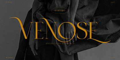 Venose is a serif typeface crafted with elegance and luxury. For those of you who are needing a touch of elegant, stylish, classy, chic and modernity for your designs, this font was created for you! This font is perfect for branding projects, fashion, logos, magazine imagery, jewelry, wedding invitations, posters, apparel, packaging, website headers, or simply as a stylish text overlay onto any background image. Features : · All Uppercase and Lowercase · Number & Symbol · Supported Languages · Alternates and Ligatures · PUA Encoded
 - Original Surfer Pro by Stiggy & Sands,
$29.00 Our Original Surfer Pro is an offbeat sans serif font bursting at the seams with lively personality. Inspired by a vintage advertisement for the "California Cliffs Caravan Park", this font exudes all of the fun of a summer vacation anytime of the year. The letterforms are clear and cleanly legible, while nothing is formal or uptight about this font. The SmallCaps and extensive figure sets offer Original Surfer Pro an even wider range of design options.
 - Dwiggins Deco by MADType,
$21.00 This typeface was originally designed in 1930 by W.A. Dwiggins as the cover for the book American Alphabets by Paul Hollister. Only the 26 letters of the alphabet were included on the cover, so the rest of the numbers, punctuation, symbols, and accented characters have been crafted in a matching style. This strongly geometric Art Deco lettering style has been lovingly revived and is now available as an OpenType font. Over 3,300 kerning pairs are included.
 - Merel by Inhouse Type,
$33.78 Merel is a modern geometric typeface with humanist attributes. Geometry and logic are at the heart of this 6 weight font family. Humanist touches give it a number of distinctive characteristics, as well as aid legibility. Despite being rational and function driven in its nature, Merel has a soft and gentle touch. It was designed to tackle both print and onscreen challenges of the modern environment. Details include reduced x-height, mild stroke contrast and vertically sheared terminals with cushioned finish across the typeface. Merel features a number of alternative characters, manually edited kerning and Opentype features.
 - Fan Script by Sudtipos,
$99.00 A friend of mine says that sports are the ultimate popular drug. One of his favorite things to say is, “The sun’s always shining on a game somewhere.” It’s hard to argue with that. But that perspective is now the privilege of a society where technology is so high and mighty that it all but shapes such perspectives. These days I can, if I so choose, subscribe to nothing but sports on over a hundred TV channels and a thousand browser bookmarks. But it wasn't always like that. When I was growing up, long before the super-commercialization of the sport, I and other kids spent more than every spare minute of our time memorizing the names and positions of players, collecting team shirts and paraphernalia, making up game scenarios, and just being our generation’s entirely devoted fans. Argentina is one of the nations most obsessed with sports, especially "fútbol" (or soccer to North Americans). The running American joke was that we're all born with a football. When the national team is playing a game, stores actually close their doors, and Buenos Aires looks like a ghost town. Even on the local level, River Plate, my favorite team where I grew up, didn't normally have to worry about empty seats in its home stadium, even though attendance is charged at a high premium. There are things our senses absorb when we are children, yet we don't notice them until much later on in life. A sport’s collage of aesthetics is one of those things. When I was a kid I loved the teams and players that I loved, but I never really stopped to think what solidified them in my memory and made them instantly recognizable to me. Now, thirty-some years later, and after having had the fortune to experience many cultures other than my own, I can safely deduce that a sport’s aesthetic depends on the local or national culture as much as it depends on the sport itself. And the way all that gets molded in a single team’s identity becomes so intricate it is difficult to see where each part comes from to shape the whole. Although “futbol” is still in my blood as an Argentinean, I'm old enough to afford a little cynicism about how extremely corporate most popular sports are. Of course, nothing can now take away the joy I got from football in my childhood and early teens. But over the past few years I've been trying to perceive the sport itself in a global context, even alongside other popular sports in different areas of the world. Being a type designer, I naturally focus in my comparisons on the alphabets used in designing different sports experiences. And from that I've come to a few conclusions about my own taste in sports aesthetic, some of which surprised me. I think I like the baseball and basketball aesthetic better than football, hockey, volleyball, tennis, golf, cricket, rugby, and other sports. This of course is a biased opinion. I'm a lettering guy, and hand lettering is seen much more in baseball and basketball. But there’s a bit more to it than that. Even though all sports can be reduced to a bare-bones series of purposes and goals to reach, the rules and arrangements of baseball and basketball, in spite of their obvious tempo differences, are more suited for overall artistic motion than other sports. So when an application of swashed handlettering is used as part of a team’s identity in baseball or basketball, it becomes a natural fit. The swashes can almost be visual representation of a basketball curving in the air on its way to the hoop, or a baseball on its way out of the park. This expression is invariably backed by and connected to bold, sleak lettering, representing the driving force and precision (arms, bat) behind the artistic motion. It’s a simple and natural connective analysis to a designer, but the normal naked eye still marvels inexplicably at the beauty of such logos and wordmarks. That analytical simplicity was the divining rod behind Fan Script. My own ambitious brief was to build a readable yet very artistic sports script that can be a perfect fit for baseball or basketball identities, but which can also be implemented for other sports. The result turned out to be quite beautiful to my eyes, and I hope you find it satisfactory in your own work. Sports scripts like this one are rooted in showcard lettering models from the late 19th and early 20th century, like Detroit’s lettering teacher C. Strong’s — the same models that continue to influence book designers and sign painters for more than a century now. So as you can see, American turn-of-the-century calligraphy and its long-term influences still remain a subject of fascination to me. This fascination has been the engine of most of my work, and it shows clearly in Fan Script. Fan Script is a lively heavy brush face suitable for sports identities. It includes a variety of swashes of different shapes, both connective and non-connective, and contains a whole range of letter alternates. Users of this font will find a lot of casual freedom in playing with different combinations - a freedom backed by a solid technological undercurrent, where OpenType features provide immediate and logical solutions to problems common to this kind of script. One final thing bears mentioning: After the font design and production were completed, it was surprisingly delightful for me to notice, in the testing stage, that my background as a packaging designer seems to have left a mark on the way the font works overall. The modern improvements I applied to the letter forms have managed to induce a somewhat retro packaging appearance to the totality of the typeface. So I expect Fan Script will be just as useful in packaging as it would be in sports identity, logotype and merchandizing. Ale Paul
 - America by Peliken,
$14.00 America otf color font. Letters and numbers in national flag design, stripes of red and blue, white stars ornament for festive decoration.You can use this font for design logos, quotes prints on t-shirts, Presidential election posters and other. OpenType-SVG Font was designed with Fontself Maker in Illustrator CC. WARNING Color fonts are pretty new technology - they currently show up in Photoshop CC 2017+, Illustrator CC 2018 and some Mac apps. Learn more about color font support on third-party apps here: https://www.colorfonts.wtf/
 - Banchero by Jehoo Creative,
$25.00 Banchero is inspired by charming vintage designs, bringing a relaxed and elegant feel to contemporary typography. The strong sans base features graceful discretionary ligatures between sensitive letters, so this font family is useful for all kinds of design needs from headlines to body, from posters to editorials, Banchero will stand out. Its power and versatility also comes from its 9 complete weights and each weight contains over 520 glyphs. These weights are carefully crafted and cut to achieve the best desired result for your next design.
 - Tisdall Script by Fine Fonts,
$29.00 Tisdall Script is based upon the brush-drawn script lettering of Hans Tisdall, who was the designer of many distinctive lettered book jackets for Jonathan Cape in the 1950s. Michael Harvey, also a designer of lettered book jackets, long admired Tisdall’s style and so, with the blessing of his widow, designed this typographic tribute. The augmented Tisdall Script Plus version, has many alternative characters and ligatures, together with Opentype features, to enable their automatic substitution where the application in which they are used permits.
 - Traction by Schriftlabor,
$36.99 Traction was originally conceived and designed by Swiss astronomer Christian Thalmann. Schriftlabor designers Chiara Mattersdorfer and Miriam Surányi expanded, completed and produced the font family. This typeface sports signature serifs, soft edges and a fluid, organic design. Enlarged, the organic letters are reminiscent of the profiles of off-road tyres and hiking boots. In text sizes, it is the humanistic forms that set the tone to ensure fluid legibility. Totalling at 18 styles in nine weights, all fonts come with small capitals and all possible numerical variations.
 - Thesis Typewriter by Ana's Fonts,
$15.00 Thesis typewriter is a typewriter font collection that includes 3 typewriter fonts, sampled from three different thesis and reports from the 60s and 70s. Thesis Typewriter Weary has a textured look, while Thesis Typewriter and Thesis Typewriter Bold are smooth and include math symbols and Greek letters that will look great in digital collages. This collection is perfect for authentic vintage designs and digital collages, but will also look great in modern logo design, in branding and packaging.
 - Mountain Expedition by Vozzy,
$10.00 Introducing a vintage label font named Mountain Expedition. It contains capital and small characters. The small letters I created to support main design of the capital letters. Therefore the punctuation characters are designed to be used just with the capitals. Also the capital characters have a lot of ligatures. All available characters you can see on the preview. This strong typeface will be good viewed on vintage style posters, t-shirts, greeting cards, logo and more.
 - Tomate by Re-Type,
$45.00 Tomate started in 2006 as a brush lettering exercise for a poster and was later used for the ReType identity. In 2008 its author decided to turn it into a super fat typeface suitable for packaging and mass consumption products. The possibilities of ultra heavy forms are explored in this alphabet; trying to solve the design problems that these sort of forms present. Tomate shows influences from the beautiful Goudy Heavyface Italic which is a design the author admires.
 - Supra Condensed by Wiescher Design,
$29.00 »Supra-condensed« – designed by Gert Wiescher in 2013 – is the condensed version to this new sans typeface family of eight weights with matching italics. The condensed version is designed for space-saving typography but with high legibility in mind. The light and normal weights and the dominant x-height with its high ascenders make for easy reading of long copy. The heavy and x-light weights are great for elegant headlines. Supra is an OpenType family.
 - Smokin Hot by Olivetype,
$21.00 Make a statement that will set your design on fire with the "Smokin' Hot" font! Get ready to turn up the heat and create designs that will make an unforgettable impact. With playful, vibrant characters that will turn any project up a notch, this font is sure to add some positive energy to any project. Whether you are creating posters, flyers, or other marketing materials, "Smokin' Hot" is here to get your message noticed. Thank You.
 - Marxis by Juru Rancang Studio,
$15.00 Introducing a retro condensed font called "Marxis". Best font to use as a headline to bring back the propaganda era inspired by Soviet posters, movie titles and book covers. The letterforms are straight and condensed and come in 2 styles: uppercase and small caps with the ligatures. This font will suited well for titles, poster design, web design, branding and packaging works, illustrations, badges and other typography works. Thank you, I hope you like it as I do!
 - Riky by Eurotypo,
$28.00 Riky is a heavy sans typeface carefully hand-drawn made, with different letter shapes, full of ligatures, and stylistic alternates that will provide great flexibility for your designs. Ricky's typeface is lively, dynamic and energetic. This font has an informal and decorative style. Riky fonts come in 2 versions: Shadow and solid. These fonts are quite perfect for packaging design, posters, children books and many other purposes. Play with them, be creative with them and enjoy them.
 - Work Yard Stencil by Jeff Levine,
$29.00 The image of a set of vintage French tin stencils spotted online was the starting point in designing Freight Yard Stencil JNL. A more traditional ‘B’ and ‘R’ replaces the original characters (which looked kind of awkward due to extra ‘stencil breaks’ within the letters). However, there are a few interesting variants in other characters to set the design apart from similar stencil fonts. Work Yard Stencil JNL is available in both regular and oblique versions.
 - Pontiff Wide by Jehoo Creative,
$19.00 Designed to stand out is perfect for giving bold impressions, Pontiff Wide is a display typeface with sharp edges and has a wide shape referring to the neo vintage trend. Equipped with italic style and outline increasingly make this font striking and prominent in all its shapes and styles, bold format provides a great personality type in the title. Characters that are well-suited for a wide variety of applications from editorial design to branding, advertising, publicity and digital.
 - Autumn Love by BeckMcCormick,
$10.00Autumn Love is a new font duo, pairing a sweet, bouncy calligraphy script with a handwriting-style sans font. Let’s not forget the best features - swashes & hearts! There are so many ways to customize your text! Add left & right swashes to your text, or use the heart connector, or use the heart doodles included in the script font! This duo gives you everything you need to create beautiful designs like wedding invitations, shirt designs, social graphics, brands, & more! - Novaria Vista by Sipanji21,
$20.00 "Novaria Vista" is a futuristic display font. Fonts with a futuristic theme often embrace technological and forward-looking aesthetics. They are commonly used in various design projects that aim to convey modernity, innovation, and a vision of the future. With "Novaria Vista," you can create designs that exude a sense of advancement and a futuristic touch. This font is suitable for projects related to technology, science fiction, space exploration, and other themes where a futuristic style is desired.
 - Sailor Gothic by Design is Culture,
$39.00A font by Christian Acker (2003), based upon the practice of the Americana folk art tradition of tattoo design. Throughout the late 19th and 20th Centuries sailors would popularize and spread motifs, designs and styles by carrying this art around the world on their sleeves. A family of four fonts representing traditional styles is now available as a digital font. An accompanying collection of over 60 eps illustrations of tattoo "flash" are also available at cubanica.com. - Arfelick Feather by Ergibi Studio,
$20.00 Proudly Present Arfelick Feather. This Fonts Comes is a bold connected script font with a clear style and dramatic movement. Every single letters have been carefully crafted to make your designs looks better. inspired by urban script fonts with beautiful letters that create fonts that are modern, tendy and elegant. Arfelick Feather came with opentype features such stylistic alternates, stylistic sets & ligatures good for logotype, poster, badge, book cover, tshirt design, packaging and any more. Best Regards Ergibi Studio
 - Carilliantine by Device,
$39.00 Carilliantine updates the organic curves of Art Nouveau typefaces typified by John F. Cumming's Desdemona, designed around 1886. A contemporary monoline sans reinterpretation rather than a more traditional serif, its high-waisted emphasis lends it an elegance and class. Carilliantine is replete with hundreds of two- and three-letter ligatures that bring a customised uniqueness to any headline. These are on by default, and can be toggled on or off in the Opentype palette of Adobe apps, or chosen individually according to taste from the Glyphs menu. Suitable for upmarket food packaging, wine labels, restaurants, folk bands, sword and sorcery trilogies, cosmetics and fashion brands that nod to the refinement of yesteryear, but are very much of today.
 - Caslon Bold by ParaType,
$30.00 The Bitstream version of Caslon Bold of the American Type Founders, 1905. Based on William Caslon I’s first English Old Style typefaces of 1725. Caslon modeled his designs based on late 17th century Dutch types, but his artistic skills enabled him to improve those models, bringing a variety of forms and subtlety of details. Strokes in Caslon fonts are somewhat heavier than in earlier Old Style fonts, serifs are thicker and a bit stubby. Italic letters have uneven slope. A text set in Caslon looks legible and aesthetically appealing. Caslon is a favorite font of English printers for setting of classical literature. Cyrillic version was developed for ParaType in 2002 by Isay Slutsker and Manvel Shmavonyan.
 - Caslon 540 by ParaType,
$30.00 The Bitstream version of Caslon 540 of the American Type Founders, 1902. Based on William Caslon I's first English Old Style typefaces of 1725. Caslon modeled his designs based on late 17th century Dutch types, but his artistic skills enabled him to improve those models, bringing a variety of forms and subtlety of details. Strokes in Caslon fonts are somewhat heavier than in earlier Old Style fonts, serifs are thicker and a bit stubby. Italic letters have uneven slope. A text set in Caslon looks legible and aesthetically appealing. Caslon is a favorite font of English printers for setting of classical literature. Cyrillic version was developed for ParaType in 2002 by Isay Slutsker and Manvel Shmavonyan.
 - Kwalett by Ingrimayne Type,
$5.50 Kwalett is a sans serif typeface family with low contrast and a high x-height. Kwalett has two widths, each with five weights and each weight has an italics. The family is derived from the thinnest member of the Qualettee family. As members of that family get bolder, their contrast increases. As members of the Kwalett family get bolder, their contrast remains very low. Kwalett is designed to work better as text than the Qualettee family. The family has two ways to get fractions. A few fractions are preformed and are accessed with the OpenType discretionary ligatures feature. The OpenType fraction feature uses the superscript and subscript numbers to create any fraction.
 - Brown Amsonia by Nathatype,
$29.00 Brown Amsonia is a lovely script font of which letters are in handwriting to express unique, personal nuances in your designs. Such a handwriting font is available in high contrasts having noticeable differences between the bright and the dark letter parts to produce clear, firm displays making the designs look professional and modern. Besides, Brown Amsonia can express personal, artistic displays to create more interesting, noticeable designs. The letters are interconnected and their details show sharp, curvy scratches on the edges. Due to the complex font style details, this font is better to apply for big text sizes. In addition, you may enjoy the available features here. Features: Ligatures Stylistic Sets Multilingual Supports PUA Encoded Numerals and Punctuations Brown Amsonia fits best for various design projects, such as brandings, invitations, greeting cards, name cards, quotes, printed products, merchandise, social media, etc. Find out more ways to use this font by taking a look at the font preview. Thanks for purchasing our fonts. Hopefully, you have a great time using our font. Feel free to contact us anytime for further information or when you have trouble with the font. Thanks a lot and happy designing.
 - Western Sans JNL by Jeff Levine,
$29.00 Take a classic Western wood type where the horizontals are thicker than the verticals and remove the slab serifs… The result is Western Sans JNL, which is available in both regular and oblique versions.
 - LineDrive by Ingrimayne Type,
$12.95 LineDrive was inspired by an obscure 19th century type design. It has no curved lines and what are normally circular elements in the lower-case letters are diamond-shaped. It might work best with only upper-case letters, which have a Victorian feel to them. In addition to the two weights of plain and bold, the family includes a shadowed version and an inline (or outlined) version.
 - Laser by ITC,
$40.99 Laser is the work of British designer Martin Wait. The typeface family includes Laser, a slick and modern script typeface, and Laser chrome, its glossy, chromium alternative. The capitals are meant to be used only as initials in combination with the lowercase alphabet and are best used slightly overlapping each other in a display text. Laser is ideal wherever an energetic style is needed.
 - Algoria by Sealoung,
$15.00 Algoria is a functional sans serif that includes open character openings, a uniform distribution of white and black, and excellent readability. The general neutrality of the font patterns is not without elegance, and all the details of the typeface are crafted with mathematical precision and love. Typographic designs are developed for the widest possible range of tasks that any quality corporate font must accomplish.
 - Scandiebox by My Creative Land,
$25.00 It’s time to have some fun! The Scandiebox Hadlettering Collection was inspired by simplicity of the modern Scandinavian style and also have some influence of Japanese kawaii. All handwritten fonts in this collection perfectly compliment each other as well as the set of more than 100 illustrations created in the same happy style. You can find Scandiebox Extras Manual here. The collection’s childish look-and-feel makes it perfect for all sorts of designs for children - books, cards, invitations, packaging, apparel, children shop ads, etc. If you are an Adobe Suite user, you’ll find that working with illustrations is extremely easy - just select a stylistic alternate you want in either drop down list or using the glyphs panel. If you are using an application that doesn’t support opentype features, you can use all the fonts additional features with a help of either your default font management software or using the pdf reference guide mentioned above. Enjoy!"
 - NorB Architect CF by NorFonts,
$32.00 NorB Architect Condensed fonts are the condensed and the extra-condensed version of my NorB Architect font. It comes with 12 weights from Light to Condensed to Extra Condensed along with their Bold and Felt version. These Architectural fonts will add a beautiful architectural hand-lettering style to all your CAD project drawings. Architects have always wanted their CAD drawings to look more like they were drawn by hand, rather than by a CAD program. These AutoCAD fonts are the first step in bringing back that “artistic hand-drawn” feel to your CAD drawings or any graphic design project that can use true type fonts. They also can be used with any word processing program for text and display use, print and web projects, apps and ePub, Comics, graphic identities, branding, editorial, advertising, scrapbooking, cards and invitations … or even just for fun! NOTE: For more variations of 'NorB Architect CF' font please visit click on this link.
 - Tereiya by IbraCreative,
$17.00 Tereiya is a timeless embodiment of modern serifs, seamlessly blending classical elegance with contemporary design. Its gracefully sculpted letterforms boast a harmonious balance of thick and thin strokes, exuding a sense of sophistication and refined aesthetics. Tereiya’s serifs are striking yet understated, delivering a distinguished presence that elevates any typographic composition. With its meticulously crafted details and graceful curves, Tereiya remains a paragon of typographic artistry, ideal for conveying a sense of timelessness and enduring style in both print and digital applications.
 - Rohn by Nine Font,
$29.00 Rohn is a modern squarish typefamily with a large x-height. Its letterforms are based on the shape of square with rounded corners. With particular details and large x- height, it is more legible at small sizes both on screen and paper. It has seven weights from Thin to Black with corresponding oblique styles and each weight includes ligatures, fractions, old style numbers, case-sensitive forms and more. Rohn is ideally suited for branding, logo, packaging, magazine, poster and editorial design.
 - Pax by Linotype,
$29.99Pax is clearly a didone, using Vox classification. The contrast between the thin lines and the thicker ones is noticeable, as you would expect from a didone. The basic form is relatively narrow, therefore I designed another Pax, slightly wider and darker, and called it Pax #2. Otherwise they are more or less identical. Pax is Latin for peace, on everyone's want list in 1995 - as well as every single year before and after that. Pax was released in 1995. - Qotho by Scholtz Fonts,
$7.50 Qotho is a clean, geometric sans serif font, available in five weights. Qotho Dark, Qotho Medium, Qotho Light and Qotho Thin also come in two widths, regular and Cond. Clear and versatile, Qotho is designed for magazine pages, newspapers etc. Its large x-height and simple lines make it extremely legible. The font contains over 235 characters - (upper and lower case characters, punctuation, numerals, symbols and accented characters are present). It has all the accented characters used in the major European languages.
 - BD Roylac by Typedifferent,
$30.00 The BD Roylac typeface has its roots in some lowercase glyphs drawn by Jacques Loison in 1972. Some of these characters are included in the use of stylistic alternates. Filed under a retro-futuristic design the font separates two filled shapes by a thin and curvy line; sometimes following to the path leaning readability and sometimes interfere with it. The font is dedicated to the BD fanboy Monsieur «Eric de Broche des Combes» aka «Roy La Combe» to his fiftieth anniversary.