10,000 search results
(0.045 seconds)
- Aquari by Dominik Kowalik,
$50.00 A geometric typeface. Smooth corners are mixed with straight angles to form a strong. These make Aquari ideal for almost any type of graphic design. Its unique look is well suited for corporate identity, its precise drawing for branding and poster design. The character set includes various OpenType features and a broad language support with German and Polish special signs. Details include 3 weights, with European character set, manually edited kerning, stylistic alternatives and Opentype features.
 - Generisch Sans by Akufadhl,
$29.00 Generisch - a german equivalent of generic - sans serif typeface has gain its own place among designers and earn such popularity due to its "simple" design. Generisch is influenced by early grotesk typefaces from early 1900's when sans was starting to get popular and used as a body type. Some old ligatures such as ch ck and ng are present in generisch (not the ct and st tho), old style numeral for better typesetting experience and more.
 - The Reading Display by Great Studio,
$19.00 The Reading Display is a new editorial serif with all clean and soft lines, tight curves, and a trendy elegant look. The Reading Display has two versions of the font, namely Regular Serif & Condensed Serif which are equipped with an italic version style, very suitable for your design needs such as very suitable for creating nostalgic designs but still clean and elegant such as headlines, magazines, logos, packaging, editorial, and so on. much more. Cheers, Great Studio
 - Organa by TypeFaith Fonts,
$5.00 Now that we're done with the hipster stuff, the handwritten and the brush fonts, it is time for something new: Organa, a stylish geometric font family. Create a new feel for your designs. Organa is a unique and creative font that can be used for logo design and branding, posters flyers and book covers. Organa will help you to shake off the old feel and to create something new. It comes in three styles that are easy to combine.
 - Cuttie Beary by Good Java Studio,
$18.00 Introducing Cuttie Beary - Fun Handwritten Font Cuttie Beary is the perfect font for all your fun designs. The main font file is equipped with ordinary characters. Everything is made with a funny brush so you can be sure all leters will work well together! It is suitable for you to use in making t-shirt design, quote, labels, packaging, logo types, or long writing because we have compiled kerning and matrices that are tailored to your needs.
 - Niko by Ludwig Type,
$50.00 Niko is a contemporary, humanist sans with a friendly yet clear and distinct personality. It is designed for excellent legibility, particularly for long continuous reading. The wedge-shaped stem heads add liveliness and variety to the carefully crafted letterforms. Niko, a highly versatile type family consisting of 54 styles that are designed to work equally well on paper and on screen. The family includes condensed, as well as extra-condensed variations, for situations where space-saving typography is required.
 - Mr Dj Signature by Attractype,
$17.00 Mr. Dj Signature is a script typeface specially designed for signature fonts. With a balanced thickness, it is also suitable for various lettering purposes, such as greeting cards, invitations, branding, crafts, wedding decorations, even looks good for text. Mr. Dj Signature comes in two variants, regular appearing like calligraphy and monoline with the same line thickness. both are equipped with several ligatures, alternates and 3 signature swashes placed under the underline character (_) . Happy designing with Mr. Dj Signature.
 - Peace by Burghal Design,
$29.00Don't you HATE it when this happens? You're protesting the war in Iraq, and the other protesters keep pointing at you and giggling. You can't figure out what they could possibly be laughing at...You look up and then it hits you: you're holding a sign that looks like it was made by your 5-year old kid brother. It's sloppy, the words are crooked, hell, it's BARELY READABLE. How is anyone ever going to take you seriously with THAT SIGN???? There's only one solution...To further your cause, you need Burghal Design's Peace font. Peace contains upper and lower letters, numbers, punctuation, even foreign accented characters! Clean, concise, and oh, SO legible, you'll have no problem getting your message across with this typeface. Who knows, you might even make the evening news. - Nolan by Kastelov,
$55.00 The idea behind Nolan is to create emotional response due to its inviting character and legibility. It is ideal for headlines, presentations, product signage and bespoke logotypes. Due to the structure of the letters, Nolan can also stand its ground in body text, although this is not its primary purpose. Nolan is created slightly wider than what is to be expected from a typical sans font, yet not to the point of being considered a wide typeface. This uniqueness lends the family an air of originality while adhering to already established standards in the creation of contemporary sans typefaces. Nolan has a large x-height, so as to deliver a better punch and be legible at a glance . Its clean and modern lines are reminiscent of architectural aesthetic.
 - Hattori by Zane Studio,
$15.00 Elegant, graceful and timeless. Hattori is a versatile font with timeless classic appeal, over 50 alternatives & ligatures, multilingual support, (And we think this is our best work so far!) Each letter has been hand-drawn and made with great care. The variety of weights provides a variety of options that will help you find the best typographic character for your project. All 3 weights are perfect for big screen use and high impact headlines. The available binding and style alternatives offer a number of different options that give your logo or business card a unique look. This high-contrast serif typeface has a glyph and offers comprehensive language support. If you have any questions, just send us a message and we'll be happy to help! Stay sweet, Sweetest Stuff
 - Cyclic by ArtyType,
$29.00 Cyclic is a stylish and modern slab serif in three practical, highly legible weights. The name ‘cyclic’ suits this typeface in several ways. Firstly because I wanted to create an ‘all-round’ typeface (pun intended) that could adapt to most applications, but also, as the dictionary definition explains - “occurring in circles, regularly repeated”. The basis for a lot of the characters did begin with a circle or sections of one; the equally distributed, rounded forms of this font are complemented however by the vertical strokes, and further counter-balanced by angular slab serifs on the remaining glyphs. Curved alternates with a celtic vibe are also included in the fonts and feature on the default slots in the separate Cyclic Uncial set. In summary, the whole Cyclic type family comprises a combined palette of circles and straight lines; something the cubist movement would have been proud of!
 - Gothiks Round by Blackletra,
$50.00 Gothiks Round is the rounded version of Gothiks. It is a narrow 6-weight display sans-serif influenced by Texturas. The rhythm and verticality of Texturas can be easily identified on the letters with diagonal strokes like A N M K k V v W w X x Y y Z z: here they are all vertical. This kind of morphology was chosen because it accepts condensation in a very natural way, giving to this sans-serif a very unique personality. The intermediate weights can be used for short texts while extreme weights are excellent for big sizes. It has an extensive character set—with extensive language support—and many OpenType features like fractions, small capitals and different figure sets. Default figures align with lowercase. The typeface’s name refers to the plural of the word Gothic, which in turn can refer to both sans-serifs or Blackletter, depending on geographic location.
 - Cyclic Uncial by ArtyType,
$29.00 Cyclic is a stylish and modern slab serif in three practical, highly legible weights. The name ‘cyclic’ suits this typeface in several ways. Firstly because I wanted to create an ‘all-round’ typeface (pun intended) that could adapt to most applications, but also, as the dictionary definition explains - “occurring in circles, regularly repeated”. The basis for a lot of the characters did begin with a circle or sections of one; the equally distributed, rounded forms of this font are complemented however by the vertical strokes, and further counter-balanced by angular slab serifs on the remaining glyphs. Curved alternates with a celtic vibe are also included in the fonts and feature on the default slots in the separate Cyclic Uncial set. In summary, the whole Cyclic type family comprises a combined palette of circles and straight lines; something the cubist movement would have been proud of!
 - Delizius Script Latin Pro by Saffatin.co,
$27.00 Delizious! A combination of retro, vintage and modern calligraphy styles to find exotic nuances in the characters. Vintage-style swashes, it's simple and still looks elegant. Consistent thickness is a characteristic of retro fonts. The position of letters that look up and down makes them look like they are dancing, a characteristic of modern calligraphy letters that are trending today. Basically this is a simple font, you can see it. Specific OpenType features include Contextual Alternates, Stylistic Alternates, Swashes, Standard Ligatures, also Multilingual accent support. With Opentype features, You can access glyphs very easily. An advantage of Opentype and I like it very much. In Adobe software, You ca turn off your “opentype” feature to accesses random/selected letters. This font support Multilingual Latin Pro accent letters of Central Europa, Western (À Â Æ È Ë ã ä æ è...) Hope you all love it. Thank you!
 - Humblest Pro by Gleb Guralnyk,
$15.00 Hi. Introducing a new version of my one of the most popular fonts. Now Humblest Pro includes much more characters and has west european multilingual support. This font has a smooth and clean shape without any grain unlike the original one. Almost all of the capital leters has two version, for the begining and for the ending of the word. The final alternative letter will be automatically replaced if you type a big last letter in the word (check out if the "contextual alternates" opentype feature is activated). Decorative swashes are now a part of the font. To use this decorative lines just type an underscore character and the corresponding number from _00 to _39 (make sure that “standard ligatures” opentype feature is activated). Also a lot of ligatures for small letters are available, please check out the previews with all available glyphs. Thank you and have fun!
 - Mela by Resistenza,
$39.00 Mela was created with a pointed brush and walnut ink using thick brushstrokes. The original idea was to make a kind of urban graffitti with a fat brush, but the final result is more refined and elegant. Something new - light and bold together. The letters are a little bit slanted using sharp strokes, the brush gives the illusion of a fat-tipped marker. This handmade typeface has a lot of contrast, it brings together the beauty of the calligraphic shapes and strokes with the esthetics of a modern urban style. It creates a carefree feeling, contemporary, adding a perfect modern touch to your work. The possibilities for customized layouts are limitless, using the opentype ligatures and alternates to you make Mela your own. Mela Pro contains 473 glyphs: alternates, ligatures, icons, ornaments, and much more. Mela regular is limited to letters, figures and punctuation. Mela & Mela Pro are perfect for headlines and short texts. Use it for magazines, packaging, advertising, branding, posters, editorials, TV, movies and websites to give to your projects the unmistakable human touch of beautiful handwritten letters.
 - Parabrite by Okaycat,
$19.50Parabrite arrives as a vision of the future. The future is brite - Parabrite - this is unavoidable now. The composition of Parabrite is found to be based on a set of technical behaviors defined from a set of four sub-glyphs and their interactions, similar to the make up of our D.N.A. (A,C,G,T). Likewise, Parabrite's block matrix is composed of four units (S,L,I,C). These units are only allowed to group together according to predefined set of mathematical rules, and affect each other symbiotically. The smallcase letters stand five feathers high, while the capitals add an extra two feathers width. Parabrite is extended, containing the full West European diacritics & a full set of ligatures, making it suitable for multilingual environments & publications. Use Parabrite when you dream of a future world. Since Parabrite is adapted to be quickly read by a wide assortment of electronic scanners, legibility to humans suffers a little, although robots report it is much easier on the eyes. They are happy to read it for you too, if you are having trouble. - Faber Fraktur by Ingo,
$22.00 A modern black-letter, so to speak. Composed of a few basic elements with a wide-quill ductus. Faber Fraktur was based on the idea that it must be possible to create a modern black-letter type. The typeface is ”constructed“ according to the same principles as a script without serifs: as few varied basic forms as possible, omission of frills which make the type difficult to read and repetition of similar forms. The typical contrasting strokes of the original handwritten black-letter script are retained nonetheless. The elements of this typeface were even pre-formed with the quill. All characters are reduced to their basic skeleton. The fanciness and manifold ”breaks“ or fractures typical of black-letter typefaces are considerably reduced to just a few essentials. Faber Fraktur is a very legible type perfectly suitable for long texts. It does not appear nearly as foreign and archaic as the old black-letter fonts. The capital letters especially have a charm of their own radiating a kind of playfulness in spite of their severe form.
 - Escalope by Antipixel,
$15.00 Escalope is a hand-drawn font with a quirky and unique personality: low midline, unicase, all-caps, matching icons, textures, and the playful Stylistic Sets. 'Escalope Soft' has smooth outlines and sharp terminals. 'Escalope Crust One' is relatively clean but rugged, with an ink stamp outcome. 'Escalope Crust Two' is harsh in texture, with large coarse grains in its jagged outlines. 'Escalope Crust Three' is rather heavy-built, stout, defined, and less grainy. This type family has three alternating alphabets that slightly differ from one another. Thanks to the Contextual Alternates, the alphabets are automatically replaced, in turn, repeatedly to avoid the same letterforms and textures appearing next to each other. Stylistic Sets are also available. SS01 has underlined characters, SS02 has double-underlined characters, and SS03 has a mixture of graphic ornaments. These Sets can be used separately or combined. If the Contextual Alternates are running, the Stylistic Sets will alternate automatically. Escalope includes a set of 150 icons consistent with the four styles of the typeface. They share weight, texture, and font characteristics for a perfect match.
 - TessieStandingBirds by Ingrimayne Type,
$13.95 A tessellation is a shape that can be used to completely fill the plane—simple examples are isosceles triangles, squares, and hexagons. Tessellation patterns are eye-catching and visually appealing, which is the reason that they have long been popular in a variety of decorative situations. These Tessie fonts have two family members, a solid style that must have different colors when used and an outline style. They can be used separately or they can be used in layers with the outline style on top of the solid style. For rows to align properly, leading must be the same as point size. Shapes that tessellate and also resemble real-world objects are often called Escher-like tessellations. This typeface contains Escher-like tessellations of birds. A number of years ago I decided to see how many of the 28 Heesch types of tessellations I could use to make birds standing on the backs of other birds. I found standing bird patterns for all 17 of the types that had either translated or glided edges. The TessieStandingBirds typefaces contain the standing-bird shapes that I discovered. At first glance they seem to be quite similar, but small differences matter in how they fit together. Most of the patterns require more than one character. The sample file here shows how pieces fit together to give tessellating patterns. (Earlier tessellation fonts from IngrimayneType, the TessieDingies fonts, lack a black or filled version so cannot do colored patterns.)
 - Shnixgun by Typodermic,
$11.95 In the world of graphic design, the typeface is everything. It’s the foundation on which you build your message, the first impression your reader gets of your brand. And when it comes to creating a unique and memorable brand, there are few typefaces more distinctive than Shnixgun. Based on the venerable Franklin Card Gothic, this inky, textured typeface takes inspiration from the age-old tradition of metal type, infusing it with a modern, edgy twist. Its rustic, weathered appearance is the perfect choice for anyone looking to add a touch of authenticity to their work. But Shnixgun is more than just a pretty face. Thanks to its custom letter pairs, it breaks up the monotony of repetitive letters and adds a level of nuance and sophistication to your message. With Shnixgun, your words become more than just a series of letters—they become a work of art. But what really sets Shnixgun apart is its rusty texture. This is a typeface that wears its age proudly, with every letter infused with the character and patina of a bygone era. Whether you’re designing a vintage-style poster, a hand-crafted logo, or an art magazine spread, Shnixgun is the perfect choice for anyone looking to infuse their work with a sense of warmth, authenticity, and honesty. So don’t settle for a bland, soulless typeface. Let Shnixgun’s rusty glyphs permeate your message with affection and depth, and bring your designs to life with a touch of artistic flair. Most Latin-based European writing systems are supported, including the following languages. Afaan Oromo, Afar, Afrikaans, Albanian, Alsatian, Aromanian, Aymara, Bashkir (Latin), Basque, Belarusian (Latin), Bemba, Bikol, Bosnian, Breton, Cape Verdean, Creole, Catalan, Cebuano, Chamorro, Chavacano, Chichewa, Crimean Tatar (Latin), Croatian, Czech, Danish, Dawan, Dholuo, Dutch, English, Estonian, Faroese, Fijian, Filipino, Finnish, French, Frisian, Friulian, Gagauz (Latin), Galician, Ganda, Genoese, German, Greenlandic, Guadeloupean Creole, Haitian Creole, Hawaiian, Hiligaynon, Hungarian, Icelandic, Ilocano, Indonesian, Irish, Italian, Jamaican, Kaqchikel, Karakalpak (Latin), Kashubian, Kikongo, Kinyarwanda, Kirundi, Kurdish (Latin), Latvian, Lithuanian, Lombard, Low Saxon, Luxembourgish, Maasai, Makhuwa, Malay, Maltese, Māori, Moldovan, Montenegrin, Ndebele, Neapolitan, Norwegian, Novial, Occitan, Ossetian (Latin), Papiamento, Piedmontese, Polish, Portuguese, Quechua, Rarotongan, Romanian, Romansh, Sami, Sango, Saramaccan, Sardinian, Scottish Gaelic, Serbian (Latin), Shona, Sicilian, Silesian, Slovak, Slovenian, Somali, Sorbian, Sotho, Spanish, Swahili, Swazi, Swedish, Tagalog, Tahitian, Tetum, Tongan, Tshiluba, Tsonga, Tswana, Tumbuka, Turkish, Turkmen (Latin), Tuvaluan, Uzbek (Latin), Venetian, Vepsian, Võro, Walloon, Waray-Waray, Wayuu, Welsh, Wolof, Xhosa, Yapese, Zapotec Zulu and Zuni.
 - Grrr by ParaType,
$30.00 Grrr is a headstrong modular display typeface with a large amount of alternative glyphs. It consists of eight weights ranging from Thin to Black. A variable font is also available. The typeface is designed on a modular grid and it proudly ignores the rules of optical compensations: the horizontal and vertical strokes have identical thickness, and round and triangular letters have no overshoots at all! All these peculiarities are making the typeface usable at sizes from 21pt and larger in print and approximately from 24px on non-retina screens. Grrr is especially good at extremely large sizes. The typeface includes three stylistic sets with even more bizarre letterforms. These sets activate a cyclic pseudorandom substitution of letters from a range of alternates — the letterforms keep changing as you type! The typeface was designed by Dmitry Goloub and Alexandra Korolkova and released by Paratype in 2019.
 - Branding SF by Latinotype,
$29.00 Branding Super Family is an extension of the Branding project , including new variables that cater to a wide array of requirements, still maintaining its essence. It is a super family for modern needs! Additional to its particular design, different widths are included: now Branding Ultra Condensed is a reality. The project also considers a variety of alternate characters, making Branding Super Family a great tool for graphic designers and art directors. It is ideal for use in logotypes, isotypes, short texts, and others. Branding Super Family is a Sans Serif spurless font with medium-large x-height, straight curves and convex terminals. It has 7 weights and 4 widths that vary from thin to black, and from ultra condensed to medium, each with their matching italics. It also includes a set of 544 characters supporting 128 languages. OpenType characteristics include European accents, old style numbers and 4 sets of alternates.
 - Ferguson by Arterfak Project,
$14.00 Ferguson is a geometric slab serif which made with a mono-line concept and versatile style. Inspired by old western and magazine designs. Ferguson has a straight and consistent line to give neat looks. Ferguson is made for editorial and formal purposes. but still flexible to use it in other typographic projects. This font family has 6 weights and 2 widths that gives you many options on your designs projects. - Regular versions: Comes from Light, Normal, Medium, Bold, Black, and Ultra Black. Very recommended for editorial use such as body text, sub-headline, and tagline. The bolder weights are goods for headline too. Strong and geometric! Suitable for sports themes, social movement, masculine and logotypes. - Condensed versions: Available in Light, Normal and Bold. Great choice for a headline, and display. This condensed designed a bit minimalist than regular version to keep the readability. Also, there is Bold Shadow style to complete the vintage movement which happening now. Suitable for a poster, magazines, and clothing project. Ferguson font family has up to 28 accents: Afrikaans, Albanian, Catalan, Croatian, Czech, Danish, Dutch, English, Estonian, Finnish, French, German, Hungarian, Icelandic, Italian, Latvian, Lithuanian, Maltese, Norwegian, Polish, Portuguese, Romanian, Slovak, Spanish, Swedish, Turkish, Zulu. Fonts featured : - Uppercase - Lowercase - Numerals - Some symbols - Diacritics Thank you. Hope you like it and enjoy!
 - Isonorm by Linotype,
$29.99Isonorm was created in 1980 by the International Standards Organization (ISO). The font's design is simple, clean, and geometric, with strokes that all have rounded ends. Isonorm is a font whose forms are very legible by both the human eye and machine readers. The font is also a good choice for drafting and architectural purposes, as well as for technical charts and graphics. - Neo Neo by ITC,
$29.99Neo Neo is the work of British designer Timothy Donaldson, a type style straight out of a 1950s time capsule. It can be set in all caps or a mixture of capitals and lowercase. The casual, slightly condensed forms with their smooth, soft lines are reminiscent of highway diners and motel ads of the time and convey a bright, inviting mood. - Anything Script by Aldedesign,
$16.00 Anything Script is a stylish script font that features a varying baseline, smooth line, modern and with a depth love. For those of you who are need a touch of love and modernity for your designs or branding, it can be used for various purposes such as headings, wedding, invitation, signature, logos, branding, t-shirt, letterhead, signage, lable, news, posters, badges etc.
 - Canoe Handwriting by Angie Makes,
$10.00 Canoe is a fun, all-caps font with a delightfully hand-written feel. It comes “water ready” to be used in the wild on the web, save the dates, and other design projects that need a homemade touch. Its characters are wiry and tall with crossbars that hit at varying heights. Canoe also includes 1st, 2nd, 3rd ordinal capabilities as well as fractions.
 - Raregold Script by Aldedesign,
$19.00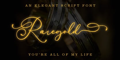 Raregold Script is a stylish script font that features a varying baseline, smooth line, modern and with a depth love. For those of you who are need a touch of love and modernity for your designs or branding, it can be used for various purposes such as headings, wedding, invitation, signature, logos, branding, t-shirt, letterhead, signage, lable, news, posters, badges etc.
 - Shootout by Arendxstudio,
$14.00 Shootout - Street Typeface with sharp and beautiful letters that create fonts that are modern, trendy and elegant. Came with opentype features such stylistic alternates, stylistic sets & ligatures good for logotype, poster, badge, book cover, tshirt design, packaging and any more. Features : • Character Set A-Z • Numerals & Punctuations (OpenType Standard) • Accents (Multilingual characters) • Ligature • Alternate There it is! I really hope you enjoy it
 - Retro Signs JNL by Jeff Levine,
$29.00 Retro Signs JNL collects nearly 50 designs modeled from old water transfer sign decals once manufactured by the Duro Decal Company of Chicago, Illinois and adds in a generous amount of additional phrases newly-drawn in the same hand lettered style. These vintage sign panels are perfect for creating nostalgic signage to fit projects centered around the 1950s and early 1960s.
 - Infoma by Stawix,
$40.00 Infoma is designed based on simplicity results in easy and comfortable usage which allows Infoma to perform flawlessly in every layouts. If meticulous, flexible, eye-pleasing and easy to use typeface you are looking for, we recommend Infoma. Infoma consists of 18 styles from Line to Ultra, supporting many OpenType features, such as tabular numerals, inferiors & superiors, numerators & denominators, fractions, ligatures etc.
 - Shard by Device,
$39.00 Shard was originally commissioned for Nickelodeon’s 3D reboot of the Teenage Mutant Ninja Turtles franchise. It complemented the show’s new angular logo, which Rian Hughes also designed. There are alternative versions of many letters available in the upper and lower case keys, and a selection of around 90 ligatures that automatically substitute themselves in running text to give a tight, interlocked fit.
 - Rudolf by Zuzanna Rogatty,
$19.99 Rudolf typeface was designed on the basis of medals made by author's grandfather, the sculptor Rudolf Rogatty. He used lettering that was very typical of monuments, medals and commemorative plaques during communist times in Poland, which can still be seen today in any Polish city. These letters are beautiful for their imperfection and they have very strictly defined rules governing their structure.
 - Champers by ITC,
$29.99Alan Meeks originally designed the Champers typeface in 1991. Champers is a robust, classic Roman-style display typeface whose nature includes an underlying handwriting twist! A distinguishing feature is the mixture of a condensed lowercase alphabet with more regular capitals. Both are best used with close-fit letter spacing. Champers is perfect for almost any headline, display, or logo application. - Smartburst by Bogstav,
$14.00 Are you throwing a party, growing eco friendly potatoes or having a babyshower? Is so - go ahead and give Smartburst a try for the design. The friendly and rounded edges makes the letters look soft and legible. I've added 5 different versions of each letter, and they automatically cycle as you type. Or, you can choose them individually from the glyph menu.
 - WIP Sugar Baby by WIP Fonts,
$49.00WIP Sugar Baby depicts the handwriting of a young woman with opulent curves that spread juvenile charm and warms the hearts of all of us. The (lower case) characters are joined as it is usual in German speaking countries. Originally designed in 1995 the font has been extended by a lot of new characters such as accented characters, punctuation, symbols and currency symbols. - Onitsha by Arendxstudio,
$14.00 Introducing a new font called Onitsha - Handwritten Font inspired by urban fonts with sharp and beautiful letters that create fonts that are modern, trendy and elegant. Onitsha came with opentype features such stylistic alternates, stylistic sets & ligatures good for logotype, poster, badge, book cover, tshirt design, packaging and any more. Features : • Character Set A-Z • Numerals & Punctuations (OpenType Standard) • Accents (Multilingual characters) • Ligature
 - Morover by Greater Albion Typefounders,
$14.00 Morover is a lively display Fraktur, which manages to combine legibility with hand-drawn charm. All letterforms are carefully hand constructed to bring great legibility and clarity to the family of two faces-ideal for seasonal or festive work, or anywhere that vintage charm is required. The regular face offers an elaboately incised decorative design; the plain face offers solid black letterforms.
 - Deco Spot Initials JNL by Jeff Levine,
$29.00 A set of rounded Art Deco initials set inside circular borders was found amongst the pages of the vintage French lettering book "Modèles de Lettres Modernes par Georges Léculier”. Now made into a digital font called Deco Spot Initials JNL, these classic letter forms are available in both the original white-on-black version and as a black-on-white alternate design.