10,000 search results
(0.042 seconds)
- Archaic Penpoint Pro by Hackberry Font Foundry,
$24.95 This is a stylized blackletter font with many OpenType features and 403 characters -- many of which are presently unknown for blackletter fonts: Caps, lower case, small caps, old style figures, numerators, denominators, accents characters and so on. The idea is a modern blackletter that is readable and usable for the American eye.
 - Erler Titling by RMU,
$30.00 Herbert Thannhaeuser’s 1953 titling font Erler-Versalien which was distributed by Typoart in hot-metal times, was carefully redrawn and redesigned. To preserve its handwritten character, irregularities in the letters’ strokes were left as they are. This font spreads best its beauty in book titles, magazines, diplomas, greeting cards or as initials.
 - Eurasian Stencinitials JNL by Jeff Levine,
$29.00Eurasian Stencinitials JNL are modeled from a set of crudely die-cut Old English capital letter stencils that were made in Japan in the Early 1960s. The interesting treatment of the letters (with a slight hint of Japanese calligraphy) has some added bamboo plants for balance and decoration in this digital version. - Cal Cursive Modern by Posterizer KG,
$16.00 Calligrapher Cursive Modern, is one of the calligraphic group of fonts called “21 alphabets for Calligraphers“. All graphemes are taken from calligraphic pages written on Cursive Modern calligraphic style. This font is ideal for calligraphic sketches or for imitation of ancient manuscripts. Cal Cursive Modern contains all the Latin and Cyrillic glyphs.
 - Morning Paper JNL by Jeff Levine,
$29.00 Morning Paper JNL is part of a small series of fonts re-drawn from screen captures of original vintage newspaper headlines. The typefaces are classic wood and metal faces that were popular in all forms of print of the time. This sans is a companion to Final Edition JNL and Evening Paper JNL.
 - Dark Witches by Rillatype,
$17.00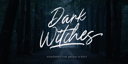 Introducing, Dark Witches a handwritten brush font. dark witches is one kind of a font that is made for you who are looking for a handwritten textured brush font. this font work perfectly for branding, packaging, advertising, headline, logotype, etc. Features : numbers and punctuation multilingual ligatures alternates swash PUA encoded Thank You!
 - Meltdown by Comicraft,
$19.00 Misshapen Muck Monster Mutations are on the loose... Their creepy hyper-irradiated bodies have emerged from the blasted desolate wastes of The Forbidden Zone! Could this be Doomsday... or did we just leave one of our typefaces on the radiator? Either way, Meltdown is the perfect font for monstrous inhuman atrocities everywhere.
 - MPI Egyptian Ornamented by mpressInteractive,
$5.00 Egyptian Ornamented is a decorative font based on the shapes found in a French Clarendon. Serifs are chunky and bifurcated, and “spurs” have been added to the strokes. This font emits the feeling of Old West wanted posters, rodeo broadsides, etc. It was first introduced by William H. Page & Company in 1870.
 - Ghoist by Canden Meutuah,
$20.00 is a fun and unique display font, a cool scary font for Halloween and other scary themed activities. Add this unique and spooky display font to any of your creative ideas and watch how it makes it stand out! Enjoy, I hope you are satisfied with the results of my font. thank you
 - Cal Humanistic Cursive by Posterizer KG,
$16.00 Calligrapher Humanistic Cursive is one of the calligraphic group of fonts called “21 alphabets for Calligraphers“. All graphemes are taken from calligraphic pages written on traditional cursive calligraphic stile. This font is ideal for calligraphic sketches or for imitation of ancient manuscripts. It contains all the Latin and specially-created Cyrillic glyphs.
 - Sugary Pancake by Hanoded,
$15.00 Sugary Pancakes - ahh, my kids love them. We don't make them too often, as they are 'energetic' enough as it is. This calorie-rich font is ideal for Children's Books and posters: it is fun, bouncy, very legible and full of character. Comes with a topping of diacritics and a stack of happiness.
 - FS Kitty by Fontsmith,
$50.00 Cute FS Kitty is the type equivalent of Bagpuss: plump, cute, cuddly and not fond of exercise. So don’t go giving it a run-out on body copy; FS Kitty is an all-caps font made for showing off in posters and headlines, and on products, point-of sale and especially sweets. Blubber Kitty had been quietly curled up in Phil Garnham’s sketchbook for a year before he brought it out to be brushed up. “It was in the mix as a basic form when I started thinking about FS Lola. It was a twisted, bubbly beauty – quite squishable and huggable. The working file was called Blubber. “At that time it was a basic construction of strokes. I created the ‘A’ first, purely as a shape to play with, not as type. I flipped it for ‘V’, and copied that for a ‘W’. I flipped the ‘W’ for an ‘M’... I thought, ‘This looks a bit wacky, but I like it,’ and just carried on. The most tricky characters were the ‘B’ ‘P’ and ‘R’. I must have drawn about 20 kinds of B for this, just to get it to fit.” Variety “When the regular weight of Kitty had been designed,” says Jason Smith, “it just felt like a natural progression to go on and explore how far we could go with it: Light, Solid, Headline, Shadow.” Phil Garnham thinks there’s still more to come. “There are some really individual characters in this font that I think have yet to be exploited: the Greek Omega symbol, the strange face in the ampersand. Like Bagpuss, Kitty has kept a low profile so far. “We know people are using Kitty. In fact, it was the first of any of our fonts that we sold on the day it was released. But I still haven’t seen it out there in the wild. It’s going to be a exciting moment.”
 - FS Kitty Variable by Fontsmith,
$199.99Cute FS Kitty is the type equivalent of Bagpuss: plump, cute, cuddly and not fond of exercise. So don’t go giving it a run-out on body copy; FS Kitty is an all-caps font made for showing off in posters and headlines, and on products, point-of sale and especially sweets. Blubber Kitty had been quietly curled up in Phil Garnham’s sketchbook for a year before he brought it out to be brushed up. “It was in the mix as a basic form when I started thinking about FS Lola. It was a twisted, bubbly beauty – quite squishable and huggable. The working file was called Blubber. “At that time it was a basic construction of strokes. I created the ‘A’ first, purely as a shape to play with, not as type. I flipped it for ‘V’, and copied that for a ‘W’. I flipped the ‘W’ for an ‘M’... I thought, ‘This looks a bit wacky, but I like it,’ and just carried on. The most tricky characters were the ‘B’ ‘P’ and ‘R’. I must have drawn about 20 kinds of B for this, just to get it to fit.” Variety “When the regular weight of Kitty had been designed,” says Jason Smith, “it just felt like a natural progression to go on and explore how far we could go with it: Light, Solid, Headline, Shadow.” Phil Garnham thinks there’s still more to come. “There are some really individual characters in this font that I think have yet to be exploited: the Greek Omega symbol, the strange face in the ampersand. Like Bagpuss, Kitty has kept a low profile so far. “We know people are using Kitty. In fact, it was the first of any of our fonts that we sold on the day it was released. But I still haven’t seen it out there in the wild. It’s going to be a exciting moment.” - Cigar by Durotype,
$22.00 Cigar is a revival of a 1970s and 1980s typeface called Cucumber or Nassel Black or Scanner. It has been carefully redrawn and expanded into a full-featured OpenType font. Cigar Octo and Cigar Quarto are new angular reinterpretations of Cigar. In Cigar Octo, most round shapes have been replaced by octagonal shapes. In Cigar Quarto, most round shapes have been replaced by rectangular shapes. Use Cigar to get attention. Use it for headlines, advertisements, magazines, brochures, book covers, corporate design, presentations, websites, signs, event announcements, and for other things that need attention. For more information about Cigar, download the PDF Specimen Manual.
 - ITC Quorum by ITC,
$29.99Australian typographer Harry Pears continues to explore ancient type forms while maintaining his consultancy business Typeface Research Pty. Ltd., of Lake Cathie, Australia. Born in Quirindi, Australia, Harry has had a long career in printing and graphic arts and has been the guiding force behind the creation of the Lindisfarne Nova family. Lindisfarne Nova Incised and Lindisfarne Runes are wonderful illustrative companions to the Lindisfarne Nova text fonts. In a unique partnership, Harry develops the concepts, and calligrapher Margaret Layson brings the designs to life. They both then work on the digital incarnation in a true collaboration. - Carneys Gallery by Letteralle,
$29.00 Carneys Gallery a classy font duo, with a classic sans and script font. Carneys Gallery is handmade and carefully crafted so it will offer balance and beauty in your designs. Carneys Gallery includes 2 fonts : - Carneys Gallery : Sans serif font including Uppercase, Lowercase, Number, Punctuation, and multilingual support. - Carneys Gallery Script: Uppercase, Lowercase, Number, Punctuation, multilingual support, and a tons of ligatures that will enhance the natural impression. That’s it! I really hope you enjoy it and please do let me know what you think, feel free to comment if there are issues or queries. Thank You!
 - Foro by Hoftype,
$39.00 Foro was designed in 2012 to be a slab serif with an appealing flow, warm, and less harsh than many slab serifs. It evinces an attachment to humanistic shapes, models and proportions. Foro’s demonstrated strength renders it excellent for texts, and its clear and distinct details are an advantage in display sizes. Foro comes in 16 styles and in OpenType format. All weights contain standard ligatures, proportional lining figures, tabular lining figures, proportional old style figures, lining old style figures, matching currency symbols, fraction- and scientific numerals and arrows. Foro supports Western European, Central and Eastern European languages.
 - Planton Script by Genesislab,
$15.00 Planton Script is a new script calligraphy, hand lettered, modern variant font. There are more than 433 glyphs in the font including stylistic sets, Contextual Substitute & Special Unicode Code etc. OpenType features with the Stylistic Alternates, a few characters that allows you to mix and match pairs of letters according to your design. To access alternate glyphs, you need a program that supports OpenType features such as Adobe Illustrator CS and Adobe InDesign, Corel Draw, Microsoft Word 2010. Can be used for various purposes such as title, signature, logo, wedding invitations, t-shirts, letterhead, signage, labels, newsletters, posters, badges etc.
 - Munish by Factory738,
$15.00 Introducing MUNISH, a playful and nostalgic font that is in style. It has an unique 1970s feel because to its massive curves. MUNISH seems really at work among those vintage designs, logos, and brands. It has separate lowercase and uppercase letters, numerals, punctuation, and multilingual letters, in addition to punctuation. Ligature typefaces are useful for anything you can think of! 2 Styles Basic Latin A-Z and a-z Numerals & Punctuation Stylistic Ligatures Multilingual Support for ä ö ü Ä Ö Ü ... Free updates and feature additions Thanks for looking, and I hope you enjoy it.
 - Price Didone by Eclectotype,
$25.00 PUBLIC SERVICE ANNOUNCEMENT: Price Didone has inspired a full alphabetic font - Mastadoni, so if you're after more than numerals, head over there! Price Didone is a font with a singular purpose: The setting of elegant, stylish price tags. As such it is non-alphabetic, featuring instead numerals, a large array of currency symbols, and a smattering of typographic niceties such as quotes, brackets, pilcrow, daggers and a very curvaceous ampersand. Certain currency symbols that are not independent glyphs (Q, Ft, kr etc.) are included as their constituent letters, some of which also have automatic ligatures for that little something extra. There are currency symbols included which have not (yet) been accepted to unicode, such as the Russian Ruble and Bitcoin symbols. For ease of access, these can be typed using the standard ligatures feature. See features below for the full list. Features: Automatic Fractions - with fractions feature engaged, arbitrary fractions are a doddle. Stylistic Sets: SS01 - an alternate look for 4 SS02 - a double stroked dollar symbol SS03- the # sign becomes a stylish numero Stylistic Alternates - for software that doesn't support stylistic sets, the above three features are grouped into the one SALT feature. Standard Ligatures - certain typed combinations automatically change to different glyphs: B|| = Bitcoin symbol P- = Russian Ruble RM = Malaysian Rimgit symbol Rp = Indonesian Rupiah Rs = Rupees Ft = Hungarian Forint kr = Kroner symbol % off;%off;%ff = Special percent off ligature Discretionary Ligatures - this feature sets decimal prices like $5.95 with the numerals after the period smaller and raised from the baseline, underlined by a nice swoosh. It also shrinks the dollar, sterling, and Euro symbols for a more authentic look. While intended for one sole purpose, Price Didone could nevertheless be quite versatile. Quote marks and typographic symbols can be used for decoration. Everybody loves a nice ampersand and this is one I'm really proud of. Or you might just want some pretty numbers for your house, or sports jersey, or just to stand out a little from the rest of your text. Whatever use you may have in mind, go for it. And do let me know if your currency symbol isn't included, and I'll quickly add it to the glyph set in future versions.
 - Regave by Wahyu and Sani Co.,
$25.00 Introducing Regave, a typeface inspired by Danish style lettering based off the work of Knud Valdemar Engelhardt (1882–1931) who designed the street signs for the Copenhagen suburb of Gentofte. The Engelhardt's design was loosely based on the lettering of two Danish architects of the time: Thorvald Bindesbøll (designer of the Carlsberg logo) and Anton Rosen. The signs were so successful that they’re still in use today. The most noticeable characteristic of Danish style are: a flat apex of the A the widening of diagonal terminals a double-storey g with its loop terminating before it forms the bottom most stroke (Erik Spiekermann coined this a Danish g) a single-story g with a stumpy tail a K with an almost laterally moved crotch, connected to the stem by an extra horizontal stroke widened diagonal connecting strokes forming flat apex or baseline strokes Regave comes in 11 weights from Thin to ExtraBlack with matching italics and also available in Variable Font format for more flexibility in weight selection. This family also equipped with useful OpenType features such as Ordinals, Superscripts, Subscripts, Stylistic Alternates, Stylistic Sets, Proportional Lining, Standard Ligatures, Fractions, Numerators & Denominators. Each font has 490+ glyphs which covers Western & Eastern Europe, and other Latin based languages – over 200 languages supported! Regave will be suitable for many creative projects. This masculine, strong and unique typeface will be suitable for logos, posters, presentations, headlines, lettering, branding, quotes, titles, magazines, headings, web banners, mobile applications, art quotes, advertising, packaging design, book title, and more!
 - Haboro Squared by insigne,
$25.00 Haboro Squared is a formidable typeface, created for a variety of uses. Clean and consistent, it evokes the 1950s and 1960s. Haboro Squared conveys accuracy and utility with its clean, consistent strokes. In the 1950s and 1960s, designers and the general public began to reject the austerity of the war years in favor of a new sense of American optimism. This era is reflected in Haboro Squared’s gently rounded letters, playful alternates, and multi-purpose use. Whether you are creating a logo, crafting a website, or designing a magazine article, Haboro balances modernity with a hint of nostalgia. Haboro Squared achieves a balance between fashion and practicality. Even though it has an angular, modern design, it radiates friendliness and warmth. Haboro Squared works well for headings and brief texts. This collection of fonts consists of eight weights, from Thin to Black, each with a corresponding italic. Your design will seem robust and fashionable with so many options. Haboro plenty of alternate glyphs from which you can select an alternative or adjust the appearance of each letter. You’ve found a secret weapon. The Haboro Hyperfamily features a whole array of options, from Haboro Sans, Serif, to Haboro Didone. Take a look at the entire family. Even the most serious texts have a touch of whimsy thanks to the quirky alternate terminals in this multipurpose text face. Impress clients with your next branding package, web site, or magazine spread. Let the nostalgia of America’s post WWII heyday fill you with inspiration! Supercharge your next branding package, web site, or magazine spread with Haboro Squared!
 - Stay Love by Din Studio,
$29.00 It can be a tough challenge to find a visually best font for your project as an inappropriate font may ruin the project and make it seem unprofessional and careless. Therefore, Stay Love, through which your project will be outstanding, is here for your perfect font to show lovely nuances and displays leaving the best impressions to your project. Stay Love designs are beautifully crafted to look as similar as the artistic humans’ handwritings for unique, interesting displays. The letters, which connect to each other to create continuity and consistency, have high contrasts to show clear differences between the thick and the thin parts of the letters for stronger and more legible writings. Moreover, the swinging letter ends can add feminine touches and elegant beauty to your designs, which you can use in big text sizes for a legibility reason. In addition, you may indeed enjoy the available features here. Features: Alternates Ligatures Multilingual Supports PUA Encoded Numerals and Punctuations Stay Love fits best for any design projects requiring artistic, elegant displays such as wedding invitations, greeting cards, merchandise designs, and more. For such artistic and elegant displays, this script font is also applicable for logo designs, posters, and packaging. Find out more ways to use this font by taking a look at the font preview. Thanks for purchasing our fonts. Hopefully, you have a great time using our font. Feel free to contact us anytime for further information or when you have trouble with the font. Thanks a lot and happy designing.
 - Whiskey Tango by Missy Meyer,
$15.00 I've been in a vintage-meets-modern mood in my most recent font construction, and this is no exception. Whiskey Tango is a fun retro-style tall and narrow sans-serif font with a scoop of variety: it includes over 110 items in the Private Use Area, including small caps, alternates, ligatures, and ordinal indicators. There's just enough imbalance in stroke widths to make this font a little goofy and quirky, and really charming. All of the lines and curves are clean and sharp, making it great for text that's large, medium, or small. And it's great for crafting as well! As usual for me, this font contains over 300 extended Latin characters for language support, as well as full uppercase and lowercase sets of Greek and Cyrillic characters. And everything, as always, is fully PUA-encoded so all characters are easy to access, no matter what method you use.
 - PAG Demokratie by Prop-a-ganda,
$19.99Prop-a-ganda offers retro-flavored fonts inspired by lettering on retro propaganda posters, retro advertising posters, retro packages all the world over. This is perfect font for your retrospective project. When you type in this font, the typography looks like that small guards are marching in the street. This retro font is pretty, but it also has a punctual impression. PAG Demokratie is a perfect font for posters, magazines, product packages and all of your creations. - Mages by Graphicfresh,
$12.00 Magès is a modern and elegant font. This font is made with a shape that sticks out more to the classics. So you'll find this font emphasizes an artist's feelings for his work. Masculin and feminine flavors are contained in this font. We created a different character for each letter so that it is easy to stick to the mind. Modern and minimalist character! it's perfect for logos, name card, magazine layouts, invitations, headers, or even large-scale artwork.
 - Nickburg by Nathatype,
$29.00 Nickburg is a display font that exudes timeless charm. The oversized uppercase letters of this font are impossible to ignore. Each character of this font commands attention with its substantial size. What sets Nickburg apart is its sharp corners. The unique combination of vintage and sharpness creates a captivating contrast that elevates your text and makes it unforgettable. This font includes ornaments as a special bonus. Nickburg fits in headlines, logos, branding materials, and many more.
 - Snoodle Toons NF by Nick's Fonts,
$10.00Lettering on a menu from a Pennsylvania hotel, circa 1930, provided the inspiration for this happy-go-lucky take on the alphabet. Lowercase letters are variants of the uppercase and kerning has been applied to every possible letter combination, so feel free to double-clutch the shift key to create a truly handlettered feel with this font. Both versions of this font include the complete Latin 1252 and CE 1250 character sets, with localization for Romanian and Moldovan. - Mister Luston by Gian Studio,
$16.00 Mister Luston is a bold, retro display with lots of ligatures and alternatives that will make your presentation or logo stand out! This font will make your project look retro, chic and neat. You can use this font for your posters, events or social media posts. Get your nostalgic feeling with this font character! Features Include: Uppercase & Lowercase Ligature Numbers & Symbols Multy languages Please contact us if you have any questions, we are happy to help you! Enjoy!
 - Double Take JNL by Jeff Levine,
$29.00Hey, what the hey! You'll have to look twice at this unusual typeface from Jeff Levine. Utilizing the sans serif lettering found in Trade Printer JNL, this novelty font combines two staggered outline versions that are blended together to give a double-image effect. This works best at large point sizes and with minimum word count. Use it for attention-getting phrases such as "You'll See Double" or "You Won't Believe Your Eyes" (or similar ad copy). - Danki by Twinletter,
$15.00 Danki, our newest font, is a display typeface created with natural hand strokes and a joyful and playful background. This typeface has two alternates for each character, making it simple to select the appropriate character for each of your unique projects. This font is ideal for usage in a variety of unusual graphic projects, including games, book titles, outdoor activities, posters, banners, quotes, branding, and other unique projects. So, what are you waiting for? Get this font now!
 - Grim N Gritty by Comicraft,
$49.00 Thought Balloons. No use for them any more. You can't be taken seriously when your thoughts are floating above your head in cute, puffy clouds. Doesn't look good. When the streets are extended gutters and the gutters are full of blood, a thought bubble just isn't noir enough, is it? It's gotta be GRIM. It's gotta be GRITTY. Let's face it... It's gotta be GRIM'N'GRITTY. In Italic and Bold Italic. Also Regular and Bold. But I've little use for them either. Talk is cheap.
 - LTC Christmas Ornaments by Lanston Type Co.,
$24.95The Lanston Christmas Ornaments collection has a definite nostalgic feel for classic Christmas and Winter iconography. An indispensable set for the Christmas season, they are perfect for custom card creation or any other winter holiday graphics. LTC Christmas Ornaments One features over 80 images. LTC Christmas Ornaments Two-Part features over 30 of the same icons found in LTC Christmas One, but they are set up for two-color combinations. LTC Holly Leaves are available in one and two part for endless holly leaf combinations. - FiveOh by Ingrimayne Type,
$9.95 The FiveOh fonts are caps-only with extreme contrast.. They are decorative or display fonts with a carefree, wobbly look. FiveOh-One and FiveOh-Shadowed contain the same set of letters on upper and lower-case keys. FiveOh-Two, Three, and Stars contain different interior decorations on upper and lower cases. Thus there are eight different sets of letters in the five typefaces. FiveOh-One can serve as a base layer with the other four fonts layered on top of it to give letters with two colors.
 - Heptal by deFharo,
$11.00 - Heptal is a typeface family with five weights including true italics. The geometry of the characters is neo-gothic and the serifs are polygonal concave or inverted Tuscan. - Heptal fonts offer a complete set of lowercase alternatives and advanced open type functions. - The proportions, the metrics and the Kerning are meticulously configured so that the texts are shown fluid and the graphic stain is compensated. - These fonts have a wide table of characters (530 glyphs) with support for all the languages derived from Latin.
 - Praho Pro Stencil by Picador,
$29.00 Praho Pro is a part of Warsaw Types – a project based on Warsaw’s local typographic heritage. The project, presented at the Museum of Praga, is a collaboration of 12 young Polish typographers. Praho Pro Stencil is a multilingual family inspired by the unique, historical character of Praga district of Poland's capital - Warsaw. High contrast, thin serifs, sharp terminals and large x-height are key features for distinctive headlines. Now available as a stencil version!
 - FF Kaytek Sans by FontFont,
$50.99 Kaytek™ Sans is a fresh take on the correspondence typefaces of the 90s - which were originally designed for the demands of office environments. Just like its predecessors, this text typeface is robust and hard-working - meaning it works well in challenging design or printing environments - but it’s not without personality. Look closer at the lowercase g and a, especially in the italic, and you can see some unexpected elements of subversiveness within the design. This blend of sturdiness and quirkiness means it’s just as relevant for information-heavy projects, such as annual reports, as it is in more expressive environments. Although first and foremost designed for text, Kaytek Sans’ details shine through in its heavier weights and larger sizes, meaning it also has display potential. Every style of the typeface takes up exactly the same amount of space, thanks to the way Radek Łukasiewicz created the design. He based the entire typeface on a single, master set of proportions. This means designers can switch between styles without the text being reflowed, making it particularly useful in magazines, where space might be limited, and also on the internet, where hover links appear in a different style. As well as its roots in the office, Kaytek Sans draws on a little bit more 90s nostalgia. It’s named for the first and only Polish walkman, and embodies the same solid, no-nonsense shapes that made the analogue technology of the era so charming. Just like these early personal music devices, Kaytek Sans is practical, but not clinical, able to work hard while still exuding warmth and personality. It pairs effortlessly with Kaytek Slab, which is a sturdier and more expressive take on the design. Kaytek Sans comes in 12 weights, from Thin to Black Italic, and offers multi-language support. Kaytek Slab, Kaytek Headline and Kaytek Rounded are also available.
 - Franca by René Bieder,
$29.00 Franca is a neo-grotesk family in nine weights plus matching italics. The inspiration for the design came through the constant interest in new interpretations of the classic grotesk model and a study of "neutral“ typefaces like Helvetica, Univers or Normal Grotesk. During the studies, additional attention was given to the American representatives of the genre, resulting in the initial impetus for a reinterpretation, combining both paths into one contemporary design. This is reflected in the name, blending together the names of the most popular typefaces of each genres, (Fran)klin and Helveti(ca). Due to its large x-height and plain design, the family is perfectly suited for all kinds of text. Its mid-weights are optimized for usage in long paragraphs, while the bolder weights, due to a short descender and ascender, create a compact and confident look in headlines or short copy. In order to create strong and dynamic italics, the oblique glyph shapes come with a faint calligraphic hint, defined by a higher stroke contrast and a steeper connection between stems and arcs in, for example, h n m and u. This is followed by different standard shapes for a and y, supporting the dynamic movement of the lowercase in general. A wide range of OpenType features such as ligatures, old style figures, fractions, case-sensitive shapes and many more, are available for professional and contemporary typesetting. This is completed with eleven alternative glyph sets, enabling a quick customization of the typeface. The family supports up to 92 languages and comes with 500+ glyphs per font.
 - Helios Antique by W Type Foundry,
$25.00 Helios Antique & Helios Stencil Check our PDF specimen for more details Helios type family is the result of a mixture between the early sans serif and the modern trends of our era. Its rational structure is subtly wider than the majority of the first sans, generating a higher impact in its uses. All the typeface terminals are more open in order to balance better the whites and blacks of Helios, and where the strokes meet it has a deeper contrast giving more legibility to the reader. Furthermore, in some letters it is possible to see some prominent features such as the leg of the "R" and the tail of the "Q", which are particular gestures that identify this type family. Helios Stencil is the tough version of this type family. All the stencil gaps were measured rigorously, thus in small sizes it conveys a neutral aesthetic whereas in big sizes a display logic appears. Helios Antique is composed by 36 styles, 782 glyphs and small caps. Besides, it has powerful OpenType features for each style, including alternates characters, ligatures, fractions, special numbers, arrows, extended language support and many more.
 - Donut Catchy by EmbunStudio2018,
$9.00 You came to the right place, if you need a Bold Clean Script font to make your project perfect such a logo design project, poster design, brand identity, heading, wedding, greeting cards, invitation and more this script handwritten font is into it ! I Created this font for social media need first, but i think this logo is great for corporate branding or logo design project too and boom ! Of Course !