10,000 search results
(0.029 seconds)
- Crazy David No 2 by 066.FONT,
$9.99 Crazy David No 2 is a display font that draws inspiration from the distinctive aesthetic of 90s zines, and exudes a varied and extravagant style that lends a certain nonchalance to projects. Its expressive and daring letters are perfect for creative projects such as posters, invitations or branding materials. Crazy David No 2 perfectly captures the striking look and distinctive character of the text, which is associated with the unique spirit of that decade. Remastered in 2022.
 - Qiduwy by Twinletter,
$15.00 Qiduwy is a futuristic and stylish font perfect for designing labels, retro, stamps, badges, Oktoberfest posters, packaging, titles, beer, logos, barbershops, whiskeys, tattoos, music, movies, or certificates. This font is perfect for a dark and mysterious look. Bold black lines make this font perfect for a classy and stylish look. The wide, bold typeface gives this font an upscale look. Sharp corners and edges add a touch of class. This is the perfect font for a dark and mysterious look.
 - PaperCutAlmondDark by PineStreet,
$25.00 This is the 'dark' version of our font PaperCut Almond. It has all of its openings closed to enhance the effect of handcut lettering.
 - Quorthon by Monotype,
$18.99 Quorthon is a collection of blackletter style fonts in 3 distinct voices – Black, Dark, and Grey. Each style has a more contemporary feel than the centuries-old blackletter standard, the capitals in particular were drawn to aid legibility in today’s world rather than to follow tradition. All the fonts contain a number of alternates that will help you embellish your typography – when used subtly, they can add flair to your titles and logo designs. BLACK is the most severe of the three styles, its lowercase forms were inspired by text I discovered on a marble tomb in a remote countryside church in England. The aggressive barbs and spurs give these fonts an imposing stature, ideal for branding, advertising and logotype, where a forceful message is required. DARK is a little more subtle, while retaining a barbed style, more contemporary serifs are present. The highly-contrasted, calligraphic glyphs are full of character and subtle nuances that give these fonts a unique personality. Again, these fonts are perfect for branding, advertising and logotype designs... and maybe even a tattoo? GREY is the softest of all the Quorthon styles, its minimal design and clean, straight lines make it ideal for creating stunning titles and headlines. It evokes the past with its blackletter pedigree, yet is imbued with a modern architectural influence. Key Features: • 15 font family – 5 weights across 3 styles • 17 Alternates in each font • Western European Language Support (Latin only) • 250+ glyphs per font.
 - TaitDemo - Unknown license

- Rezak by TypeTogether,
$36.00 Nothing is hidden in the simplistic forms and overt aesthetic of Anya Danilova’s Rezak font family. Rezak is not a type family directly from the digital world, but was inspired by the stout presence of cutting letters out of tangible material: paper, stone, and wood. With only a few cuts, the shapes remain dark and simple. With more cuts, the shapes become lighter and more defined, resulting in a dynamic type family not stuck within one specific category. The Black and medium weights began as one approach before separating into display and text categories. The four text weights were created through pendulum swings in design direction that experimented with contrast, angles, tangent redirections, and the amount of anomalies allowed. The text weights are vocal when set larger than ten points and subtle at smaller sizes. The tech-heavy Incised display style came last, employing a surprising range of trigonometric functions to make it behave exactly as desired. Its look can result in something distinctive and emotional or completely over-the-top. Most normal typefaces change only in thickness; Rezak changes in intention, highlighting the relationship between dark and light, presence and absence, what’s removed and what remains. Rezak’s Black and Incised display styles are like a shaft of light in reverse and are perfect in situations of impact: websites, headlines and large text, gaming, call-outs, posters, and packaging. The tone works for something from youthful or craft-oriented to organic and natural products. Try these two in logotypes, complex print layering, branding, and words-as-pattern for greater experimentation. The text styles are bold, energetic, well informed, and round out the family with four weights (Regular, Semibold, Bold, Extrabold) and matching italics for a family grand total of ten. These jaunty styles work well in children’s books, call-outs, movie titles, and subheads for myriad subjects such as architecture, coffee, nature, cooking, and other rough-and-tumble purposes. Rezak’s crunchy letters are meant to expose rough, daring, or dramatic text. A further benefit is that this family is not sequestered within one specific genre or script, so it can be easily interpreted for other scripts, such as its current Latin and extended Cyrillic which supports such neglected languages as Abkhaz, Itelmen, and Koryak. Rezak’s push toward creativity and innovation, with an eye on typography’s rich history, reinforces our foundry’s mission to publish invigorating forms at the highest function and widest applicability.
 - Aerle by Hackberry Font Foundry,
$24.95 My first font for 2009 was Aerle. It is a new dark sans serif font in my continuing objective of designing book fonts that I can really use. It made a little ripple in the industry, but more than that I found that I loved it with Aramus and Artimas — my latest book font family with the same proportions. In many ways, Aerle is a very different direction for me built on what I have learned on Aramus and other recent developments in my style. The concept came to me while using Bitstream's Mister Earl on a site online—though there is no direct reference. I wanted a more playful heavy sans with a much smaller x-height than I have been using lately, plus taller ascenders. As I was using Aerle, I constantly needed a light and bold version. The new direction I am taking is a result of a decision that my fonts, though I loved the character shapes, produced an even type color that is too dark or a little dense. Aerle was an attempt to get away from that look even though the letterspacing is quite tight. For Aerle Thin I pushed a little further in that direction and increased the letterspacing. The hand-drawn shapes vary a lot, many pushing the boundaries of the normal character. This gives a little looseness and helps the lightness in feel I am looking for. It will be interesting to see where this all goes. Most new type around the world is far too perfect for my taste. While the shapes are exquisite, the feel is not human but digital mechanical. I find myself wanting to draw fonts that feel human — as if a person crafted them. In most ways this is a normal font for me in that it has caps, lowercase, small caps with the appropriate figures for each case. These small caps were very small (x-height as is proper). So Aerle's small caps are a little oversize because they plugged up too bad at x-height size. The bold is halfway between. These size variations seem important and work well in the text. This font has all the OpenType features in the set for 2009. There are several ligatures for your fun and enjoyment: bb gg sh sp st ch ck ff fi fl ffi ffl ffy fj ft tt ty Wh Th and more. Like all of my fonts, there are: caps, lowercase, & small caps; proportional lining figures, proportional oldstyle figures, & small cap figures; plus numerators, denominators, superiors, inferiors, and a complete set of ordinals 1st through infinity. Enjoy!
 - Gearing by Heyfonts,
$15.00 Gearing is a typeface that is widely associated with the extreme music genre of death metal. It is characterized by its dark and aggressive appearance, evoking a sense of brutality and chaos. The font is typically designed with sharp edges, bold and angular letterforms, and intricate or distorted shapes. The death metal font typically features strong upper and lowercase letter variations, often with sharp, exaggerated serifs or thorn-like spikes. These embellishments contribute to its menacing and threatening aesthetic. The letters may also have broken or damaged elements, giving them a weathered or decayed look. Though death metal fonts come in various styles and variations, they often prioritize legibility and impact over ease of reading. This means that certain parts of the letters may be missing or disconnected, making them appear jagged or incomplete. Ligatures, which are unique letter combinations, are sometimes included in the font to add a sense of continuity or artwork to the overall design. In terms of color, death metal fonts are commonly depicted in monochromatic shades such as black, grey, or dark red to maintain their sinister appearance. The color contrast often enhances the sharpness and intensity of the font, making it more visually striking. Due to its association with the underground music scene, the death metal font has become an essential element in album covers, band logos, posters, and merchandise. It effectively conveys the aggressive and rebellious spirit of the genre, becoming instantly recognizable to fans and enthusiasts.
 - Lunda Modern by MAC Rhino Fonts,
$36.00 Based on the typeface Lunda originally made by Karl Erik Forsberg , (1914–1998) in 1941. The name Lunda was a tribute to Berlingska Stilgjuteriet in Lund, a Swedish type foundry (1837–1980) which supported him from the start. The design is close to the original but some significant details have been changed. Several signs are designed from scratch. An additional bold weight has been added.
 - Knitting And Sewing Doodles by Outside the Line,
$19.00Knitting & Sewing Doodles are just that. If you type all caps you get 15 knitting icons and lower case is 15 sewing doodles. Knitting items include yarn, knitting, needles, ball winder, spinning supplies, stitch counter, etc. Sewing machine, buttons, thread, pin cushion, bobbin, thimble and needles, scissors, label, tape measure, darning egg, zipper, seam ripper, and pins, all in the Outside the Line style. - Armature Neue Sans by fontBoy,
$15.00 Armature Neue Sans is an extension of the original Armature Neue family released in 2010. Like Armature Neue, Armature Neue Sans consists of six weights with accompanying italics. Armature is one result of my interest in typefaces that are constructed, rather than drawn. Although it is basically a monoline design, there are subtle details throughout that compensate for a monoline’s evenness. As with all fontBoy fonts, there are dingbats hidden away in the dark recesses of the keyboard. When I first started designing this face in 1992, I called it Dino - I thought I would name all my fonts after famous pets, so the dingbats for Armature are dinosaurs. To access the alternate characters (closed counter B and R, and others) use Stylistic Set 1 or the glyphs palette in your OpenType-enabled application. Designed by Bob Aufuldish with editing and production by Psy/Ops.
 - KrazyKool - Unknown license

- Nieanana by 066.FONT,
$9.99 Nieanana is a display font whose design is inspired by the distinctive style of 8-bit computers. It exudes a varied and extravagant style, reminiscent of the retro aesthetic of games and graphics from that era. Its distinctive and daring letters are perfect for creative projects such as posters, invitations or branding materials. Nieanana blends in with the atmosphere of nostalgia, adding a unique touch to projects that reminds us of the old days of computer entertainment. Remastered in 2023.
 - Tecna Light Down Triangle BNF by Descarflex,
$30.00 The Tecn@ Dark&Light Triangle Background Nomenclature Font family is differentiated by the direction of the triangle tip in the 4 cardinal points. The family were designed to head, enumerate, indicate or highlight writings or design plans, for this reason, the characters are available only in capital letters and some signs or symbols that can serve such purposes. A triangle or empty character is included so that the user can use it overlaying any character of his choice or to be used alone.
 - Tecna Light Left Triangle BNF by Descarflex,
$30.00 The Tecn@ Dark&Light Triangle Background Nomenclature Font family is differentiated by the direction of the triangle tip in the 4 cardinal points. The family were designed to head, enumerate, indicate or highlight writings or design plans, for this reason, the characters are available only in capital letters and some signs or symbols that can serve such purposes. A triangle or empty character is included so that the user can use it overlaying any character of his choice or to be used alone.
 - Tecna Light Right Triangle BNF by Descarflex,
$30.00 The Tecn@ Dark&Light Triangle Background Nomenclature Font family is differentiated by the direction of the triangle tip in the 4 cardinal points. The family were designed to head, enumerate, indicate or highlight writings or design plans, for this reason, the characters are available only in capital letters and some signs or symbols that can serve such purposes. A triangle or empty character is included so that the user can use it overlaying any character of his choice or to be used alone.
 - Tecna Light Up Triangle BNF V1.0 by Descarflex,
$30.00 The Tecn@ Dark&Light Triangle Background Nomenclature Font family is differentiated by the direction of the triangle tip in the 4 cardinal points. The family were designed to head, enumerate, indicate or highlight writings or design plans, for this reason, the characters are available only in capital letters and some signs or symbols that can serve such purposes. A triangle or empty character is included so that the user can use it overlaying any character of his choice or to be used alone.
 - Sanctum Sanctorum by Comicraft,
$19.00 By the enchanted amulet of the all-seeing eye of Agamotto, by the Seven Moons of Munipoor and the beards of the eternal Vishanti, there are Strange Magicks in the Crimson Circles of Cyttorak that only a Sorcerer Supreme -- a Master of the Mystic Art Nouveau -- can comprehend. This font, transcribed by the Hoary Hand of the Host of Hoggoth, will admit you to the inner sanctum of The Ancient One. Not transferable. Void where Dark Arts prohibited by supernatural law.
 - Chivels by Adam Fathony,
$20.00 Chivels : Vintage Chiseled 3D Type System This vintage type family combines chisel effects and pinstripe styling to give it more life. Chivels comes with six fonts that you can combine with each other to get different effects. Starting with a base, you can add more fonts in front to get inner, chisel light, and chisel dark effects. You can also add fonts behind to add outline and shadow effects. Alternate characters are available for every single alphabetical character. In the OTF version, you can select the alternate characters in the Glyphs or Open Type panels. If you're using software that doesn't include Open Type features, you can use the TTF version.
 - Demon Beast Blackmetal by Sipanji21,
$19.00 Demon Beast is a font filled with dark and menacing vibes, making it a perfect choice to evoke an intense Black Metal atmosphere that aligns well with Halloween themes. Inspired by terrifying creatures and symbols associated with darkness, each character in the Demon Beast font portrays power and fear. With sharp lines and angular shapes, it exudes a strong and mysterious impression, creating an eerie and captivating aura. This font embraces gothic elements, featuring intricate artistic touches and sharp details. Each letter resembles icons related to the supernatural world, as if conjuring up frightening creatures from the depths of darkness. With Demon Beast, you can create text that is captivating, powerful, and enchanting. It is well-suited for use in designing posters, stickers, greeting cards, or graphic elements to celebrate Halloween, adding a mystical and spine-chilling touch necessary to set the right atmosphere for Halloween-related projects. If you're seeking a font that exudes a strong Black Metal aura and embodies terrifying darkness, Demon Beast is the perfect choice. With its captivating and mesmerizing appearance, this font will serve as a powerful asset in embodying the aesthetics associated with Halloween and the Black Metal music genre.
 - One-Eighty - Unknown license

- Eerie House by Seemly Fonts,
$12.00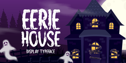 Eerie House is a creepy and dark-looking display font. It is perfectly suitable for any Halloween-related project or crafty idea! The only limit is your imagination.
 - Willow Pumpkin by Seemly Fonts,
$14.00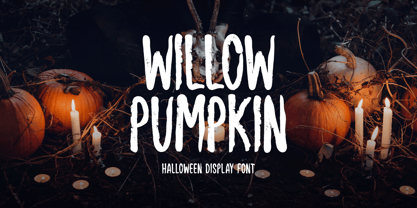 Willow Pumpkin is a creepy and dark-looking display font. It is perfectly suitable for any Halloween-related project or crafty idea! The only limit is your imagination.
 - Magicstar by Rockboys Studio,
$23.00 Magicstar is a daring handwritten font created with brush pen strokes. This bold font will beautify and emphasize your design. Add it confidently to your projects, and you will love the results.
 - Crayon Works by Hanoded,
$15.00 My kids had been playing with crayons, so I stole a nice dark one to make a fonts with. Meet Crayon Works - a rounded, handmade childlike font made with my kids’ crayons!
 - Drunk & Proud by Woodcutter,
$55.00 "Drunk and Proud" is a bold and rebellious typeface that embodies the essence of the punk movement. Its chaotic and distinctive letters are designed to challenge convention, adding a wild touch to your designs. With carefully incorporated accents and punctuation marks, this typeface maintains its versatility. Perfect for projects seeking a disruptive and daring image, "Drunk and Proud" is the ideal choice for posters, album covers, and edgy designs.
 - Blippo by Linotype,
$40.99Blippo Black with its constructed style is a typical headline typeface. Its robust figures with their even strokes were composed using the basic forms of the circle and rectangle. Its curves are often not completely closed. The figures of Blippo Black form dark, heavy lines, making the typeface suitable only in middle and larger point sizes. Blippo Black will make an impression when used for flyers and correspondence. - Dubrove by Dima Pole,
$36.00 Dubrove is a wedge serif typeface inspired by Moravian (Czech) type designs of the 1930-50s. The character font is expressive: free, daring and graceful, delicious and attractive. Here are more than 1100 glyphs, all 102 European languages, all Ancient Slavic Alphabet (49 characters), Latin and Slavic small capitals and OpenType features with many solutions. Dubrove has several stylistic sets, historical forms, localized forms of several languages, interest contextual ligatures and many other delicacies. In the Dubrove typeface several stylistic sets of Slavonic lowercase letters are made. In addition to font basic style (in fact it is close to the natural lowercase character) is a traditional [ss02] set (postpreliminary, the Soviet Union, when most copy lowercase letters are uppercase) and lowercase the natural character [ss03], the style of which, in particular, is often used in the Bulgarian script.
 - MarkyMarker - Unknown license

- Black Slider by Blankids,
$20.00 Are you looking for a layering display font? Do you want of creating Something that stand out and inspire creativity, imagination, and endless fun? Wait no more, we will give you the best choice. Black Slider a Layering Dark Display Font Black Slider a Layering Dark Display Font, Inspiring from old western typography. This font is perfect for a design that makes it more attractive and playful. made with a very good level of aesthetics making this font suitable for book cover, poster, packaging, merchandise, logotype and much more. Black Slider font includes Multilingual Support, among others : Afrikaans, Albanian, Asu, Basque, Bemba, Bena, Breton, Catalan, Chiga, Cornish, Danish, Dutch, English, Estonian, Faroese, Filipino, Finnish, French, Friulian, Galician, German, Gusii, Indonesian, Irish, Italian, Kabuverdianu, Kalenjin, Kinyarwanda, Luo, Luxembourgish, Luyia, Machame, Makhuwa, Meetto, Makonde, Malagasy, Manx, Morisyen, North Ndebele, Norwegian Bokmål, Norwegian Nynorsk, Nyankole, Oromo, Portuguese, Quechua, Romansh, Rombo, Rundi, Rwa, Samburu, Sango, Sangu, Scottish Gaelic, Sena, Shambala, Shona, Soga, Somali, Spanish, Swahili, Swedish, Swiss German, Taita, Teso, Uzbek (Latin), Volapük, Vunjo, Zulu FEATURES : Uppercase Lowercase Number Punctuation Multilingual PUA Encode Opentype
 - Vampetica - Personal use only

- Dark11 - Unknown license

- Evil Cow - Unknown license

- TRUEblood - Personal use only

- Remontoire by MAC Rhino Fonts,
$36.00 The original sketches who formed the base for Remontoire is known as one of the first typefaces drawn by Karl-Erik Forsberg . It was a result of a competition set up by various typographic organizations in the early 1930. The typeface was never completed and sketches are only to be found on paper. Made only as a single font but some the character can later on be found in other of examples of his work; Carolus and Ericus. MRF developed and expanded the family into 5 weights.
 - Masberco by Arterfak Project,
$18.00 Introducing Masberco, a dark blackletter style seamlessly merging street art and gothic typography. Crafted with meticulous letter spacing, it radiates an elegant yet fierce typographic presence. Masberco is a standout display font, especially effective in medium to large sizes. It exudes dark vibes, making it an ideal choice for underground styles like posters, flyers, logos, logotypes, branding, book covers, emblems, and more. Here’s what you’ll get : Uppercase Smallcaps Numbers & symbols Stylistic alternates Stylistic set
 - Serapion by Storm Type Foundry,
$39.00Another variation on the Renaissance-Baroque Roman face, it extends the selection of text type faces. In comparison with Jannon, the contrast within the letters has been enhanced. The dynamic elements of the Renaissance Roman face have been strengthened in a way which is illustrated best in the letters "a", "b" and "s". These letters contain, in condensed form, the principle of this type face - in round shapes the dark stroke invariably has a round finial at one end and a sharp one at the other. Another typical feature is the lower-case "g"; the upper part of this letter consists of two geometrically exact circles, the inner of which, a negative one, is immersed down on the right, upright to the direction of the lower loop and the upright knob. The vertical strokes slightly splay out upwards. Some details of the upper-case letters may seem to be too daring, but they are less apparent in the text sizes. It has to be admitted that typographers tend to draw letters in exaggerated sizes, as a result of which they stick to details. Serapion Italic are italics inspired partly by the Renaissance Cancelleresca. This is obvious from the drop-shaped finials of its lower-case descenders. The type face is suitable for illustrated books, art posters and short texts. It has a rather ugly name - after St. Serapion. - Chimera Tail Rough by Gleb Guralnyk,
$14.00 Hello! Presenting a vintage dark font "Chimera Tail". It's a wide textured typeface with automatically replaceable initial and final extended characters. Also a clean version without texture is included.
 - Young Best by RGB Studio,
$16.00 Young Best is a font inspired by the Blackletter typeface, made with a modern impression but still looks strong and unique. Supported by alternative options such as swash and alternative characters, making Young Best font very easy to create designs with strong or dark themes. In addition, Young Best font is also supported with multilingual characters that can be used in several international languages. Young Best font is very suitable for use in making music album cover designs, tattoo logos, wishkey labels, packaging pomades and so on which are made with dark and strong concepts. Files Include : Basic Latin A-Z and a-z Numbers Symbols PUA Encode Multilanguage Support In order to use the beautiful swashes, you need a program that supports OpenType features such as Adobe Illustrator CS, Adobe Photoshop CC, Adobe Indesign and Corel Draw. but if your software doesn't have Glyphs panel, you can install additional swashes font files. Thanks and have a wonderful day, If you have any questions, please get in touch with us Don't forget to check out our other products.
 - Publicity Headline by HiH,
$8.00 Publicity Headline is an allcaps advertising font. Its heavy weight and robust strength allows it to be used against complex backgrounds or reversed out on dark backgrounds without getting lost. It also has a warm, friendly feeling for the conventional headlines indicated by the name. Publicity Headline is a distinctive and appealing font for creating bold and unusual headlines. This font includes the alternate R & S and the CO, LY & ST ligatures that were part of Gaunt’s original design. In addition, the ligatures AV, AW, WA, WO & YO are provided; along with AT, OF, AND & THE in the form of underlined small caps.


