10,000 search results
(0.058 seconds)
- Moon Star Soul by Dharma Type,
$14.99 Based on retro vinyl records in the early and middle of 20th century. the mixture of funky, hippie and mid-century’s futuristics. There are three other fonts designed by in the same concept. -Rebel Train Goes -Word From Radio -African Elephant Trunk -Moon Star Soul
 - M Yuppy HK by Monotype HK,
$523.99 M Yuppy HK is a handwritten style Traditional Chinese typeface. Handwritten font designs are derived directly from hand-drawn lettering or handwriting using analogue tools. Handwritten style Traditional Chinese fonts can include typefaces that reference or reinterpret traditional calligraphy, using classical exemplars by calligraphic masters.
 - Jackers by ErlosDesign,
$17.00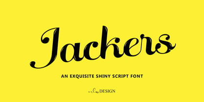 Jackers - An Exquisite Shiny Script Font by erlosDESIGN Jackers is an exquisite shiny script font. Whether you are using it for designs, quotes, titles, brand names, book covers, posters, or just any creation that requires a touch of beauty, this font is a great choice.
 - Christmas Combine Script by AEN Creative Studio,
$15.00 Christmas Combine consists of two fonts designed to complement each other perfectly. Together or apart, these fonts are ideal for adding a chic and cheery touch to your crafts. This font is PUA encoded which means you can access all glyphs and swashes with ease!
 - Coptek by ITC,
$29.00 Coptek is the work of David Quay and gets its name from the high tech look imposed on the design of copperplate script. The capitals are initials which fit well with a lower case alphabet whose letters join in the style of true handwriting.
 - M Li PRC by Monotype HK,
$523.99 M Li PRC is a handwritten style Simplified Chinese typeface. Handwritten font designs are derived directly from hand-drawn lettering or handwriting using analogue tools. Handwritten style Simplified Chinese fonts can include typefaces that reference or reinterpret traditional calligraphy, using classical exemplars by calligraphic masters.
 - CS Courthand by URW Type Foundry,
$39.99 CS are the initials of Carsten Strinkau, a young German graphic and type designer who studied in Hamburg. CS Courthand is based on 16 hundred century English monks handwriting. Text in CS Courthand looks like a pattern, like a text-carpet, but still readable.
 - M Dynasty HK by Monotype HK,
$523.99 M Dynasty HK is a handwritten style Traditional Chinese typeface. Handwritten font designs are derived directly from hand-drawn lettering or handwriting using analogue tools. Handwritten style Traditional Chinese fonts can include typefaces that reference or reinterpret traditional calligraphy, using classical exemplars by calligraphic masters.
 - Blue Sapphire by Skinny Type,
$14.00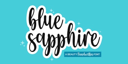 Blue Sapphire is a modern handwritten script font - perfect for crafter project! This font is perfect for farmhouse decor, svg designs, shirts, crafts, websites, branding, blogs, logos, invitations and more! This purchase includes TTF & OTF font files. Most accent characters are included. Thank you!
 - Cosmic Dream Sans by Carpiola Studio,
$10.00 Cosmic Dream consists of two fonts designed to complement each other perfectly. Together or apart, these fonts are ideal for adding a chic and cheery touch to your crafts. This font is PUA encoded which means you can access all glyphs and swashes with ease!
 - M Bei HK by Monotype HK,
$523.99 M Bei HK is a handwritten style Traditional Chinese typeface. Handwritten font designs are derived directly from hand-drawn lettering or handwriting using analogue tools. Handwritten style Traditional Chinese fonts can include typefaces that reference or reinterpret traditional calligraphy, using classical exemplars by calligraphic masters.
 - M Yuppy PRC by Monotype HK,
$523.99 M Yuppy PRC is a handwritten style Simplified Chinese typeface. Handwritten font designs are derived directly from hand-drawn lettering or handwriting using analogue tools. Handwritten style Simplified Chinese fonts can include typefaces that reference or reinterpret traditional calligraphy, using classical exemplars by calligraphic masters.
 - Country Charm by Okaycat,
$28.50 Country Charm is a picture font. A cute collection of vectored sketches brought to life by designer Natsuko Hayashida. More than 50 unique illustrations. Her depictions of fruits, vegetables & herbs are beautiful organic shapes, perfect for you to use on signs, posters, invitations, and more.
 - Koufiya by Linotype,
$187.99 Koufiya is designed by Nadine Chahine in 2003 as part of her MA project at the University of Reading, UK and later released by Linotype in 2007. It is the first typeface to include a matching Arabic and Latin designed by the same designer at the same time with the intention of creating a harmonious balance between the two scripts. The Arabic part is based on the Early Kufi style popular in the 7th to 10th century AD. It is characterized by a strong horizontal baseline, horizontal stacking order, clear and open counters, and a general open feeling. Though based on the earliest styles on Arabic manuscript, the design paradoxically appears quite modern and fresh. The Latin part of Koufiya recalls a Dutch influence in its shallow top arches and rather squarish proportions. Both Arabic and Latin parts have been carefully designed to maintain the same optical size, weight, and rhythm. However, no sacrifices were made to make them appear closer to each other. They are designed so that they work well together on the printed page, and to make sure that the two scripts are harmonious when they are mixed together even if within the same paragraph. The font includes support for Arabic, Persian, and Urdu. It also includes proportional and tabular numerals for the supported languages.
 - Antoine by Anastasia Kuznetsova,
$19.00 Introducing Antoine — is a vintage retro display typeface. The three font combinations I launched are very compatible if for the victorian classic design concept. As for if the font was worn by itself, without combinations are also brave!! In addition to many get unique character, luxury, brave and elegant. You also have a collection ornament, very suitable if in the gradient. This font is also very easy to use with other design programs or with out design program. Antoine Typeface is perfect for beverage label design project. coffee label. logotype design, badges, classic wedding concept. victorian design concept and so on. gig poster, letterhead, droop cap, titles, and any artworks. Now it’s your time to go crazy and explore the uniqueness of this typeface!! I invite you to familiarize yourself with the preliminary images and hope that you will be imbued with my vision of this creative font, which, I am sure, will be suitable for all the interesting projects you are working on. Fonts can be opened and used in any software that can read standard fonts, even in MS Word. No special software is required to get started. It is recommended to use it in Adobe Illustrator or Adobe Photoshop. Made with love and magic ♡ Thank you for reading it, and do not hesitate to send me a message if you have any questions! ~ Anastasia
 - Today We Escape by PizzaDude.dk,
$20.00 Today We Escape has got rugged edges and a slightly worn surface without overdoing it. The letters are ALL CAPS, but upper and lower case are different. Today we escape comes with substitution characters for double letters!
 - Classic Grotesque by Monotype,
$40.99 Classic Grotesque by Rod McDonald: a traditional font with a modern face. The growing popularity of grotesque typefaces meant that many new sans serif analogues were published in the early 20th century. Setting machines were not compatible with each other but all foundries wanted to offer up-to-date fonts, and as a result numerous different typeface families appeared that seem almost identical at first glance and yet go their separate ways with regard to details. One of the first fonts created with automatic typesetting in mind was Monotype Grotesque®. Although this typeface that was designed and published by Frank Hinman Pierpont in 1926 has since been digitalised, it has never achieved the status of other grotesque fonts of this period. But Monotype Grotesque was always one of designer Rod McDonald’s favourites, and he was overjoyed when he finally got the go-ahead from Monotype in 2008 to update this “hidden treasure”. The design process lasted four years, with regular interruptions due to the need to complete projects for other clients. In retrospect, McDonald admits that he had no idea at the beginning of just how challenging and complex a task it would be to create Classic Grotesque™. It took him considerable time before he found the right approach. In his initial drafts, he tried to develop Monotype Grotesque only to find that the result was almost identical with Arial®, a typeface that is also derived in many respects from Monotype Grotesque. It was only when he went back a stage, and incorporated elements of Bauer Font’s Venus™ and Ideal Grotesk by the Julius Klinkhardt foundry into the design process, that he found the way forward. Both these typefaces had served as the original inspiration for Monotype Grotesque. The name says it all: Classic Grotesque has all the attributes of the early grotesque fonts of the 20th century: The slightly artificial nature gives the characters a formal appearance. There are very few and only minor variations in line width. The tittles of the ‘i’ and ‘j’, the umlaut diacritic and other diacritic marks are rectangular. Interestingly, it is among the uppercase letters that certain variations from the standard pattern can be found, and it is these that enliven the typeface. Hence the horizontal bars of the “E”, “F” and “L” have bevelled terminals. The chamfered terminal of the bow of the “J” has a particular flamboyance, while the slightly curved descender of the “Q” provides for additional dynamism. The character alternatives available through the OpenType option provide the designer with a wealth of opportunities. These include a closed “a”, a double-counter “g” and an “e” in which the transverse bar deviates slightly from the horizontal. The seven different weights also extend the scope of uses of Classic Grotesque. These range from the delicate Light to the super thick Extrabold. There are genuine italic versions of each weight; these are not only slightly narrower than their counterparts, but also have variant shapes. The “a” is closed, the “f” has a semi-descender while the “e” is rounded. Its neutral appearance and excellent features mean that Classic Grotesque is suitable for use in nearly all imaginable applications. Even during the design phase, McDonald used his new font to set books and in promotional projects. However, he would be pleased to learn of possible applications that he himself has not yet considered. Classic Grotesque, which has its own individual character despite its neutral and restrained appearance, is the ideal partner for your print and web project.
 - MGN Kinetic by Morgana Studio,
$18.00 MGN Kinetic is an innovative font iconography type product released by Morgana Studio in 2023. This unique font set offers a fresh and dynamic approach to incorporating icons into your designs. MGN Kinetic features a one-of-a-kind design that sets it apart from other font sets, making it an ideal choice for designers who want to create eye-catching and memorable designs. One of the standout features of MGN Kinetic is its ability to bring movement and energy to your designs through its dynamic icons. These icons are designed to convey a sense of motion and fluidity, adding a new dimension of interest to your work. With MGN Kinetic, you can create designs that are not only aesthetically pleasing but also convey a sense of action and movement, making your work more engaging and memorable. Whether you're designing for a website, app, or other digital media, MGN Kinetic is the perfect choice for designers who want to elevate their work and stand out from the crowd
 - Oceanwide Pro by California Type Foundry,
$47.00 A font perfect for not just one, but many projects! Introducing Oceanwide Pro, a sans that loves to be used in just about any situation! Designed with ultra clean lines and versatility in mind, Oceanwide wants to be your new favorite sans! Oceanwide’s ultra clean letters work anywhere you want to communicate orderliness and competence, and designed to build trust and rapport with your audience. Its wide proportions make it ideal for display and logo use. Oceanwide especially shines for white/bright letters on black/dark backgrounds! That’s because the inside shapes are nearly perfect circles in many weights. Here's a quick video tour of Oceanwide Pro by Dave Lawrence, including all the great things Oceanwide can be used for! We've tested Oceanwide for these industries, with stunning results!: Tech Arts Fashion & Style Business & Branding Corporations Logistics Architecture Food and many more... Oceanwide can be used for: Headers Subheadlines Logos Even body text, if tracked. Print & Screen The styles it can take are also many. It's great for: Modern/minimalist design Flat design Cut out design User Interface (UI) Technical designs In combination with text effects, even for grunge and other situations. And many others... DESIGN FEATURES Simplicity Tall x-height Hand-sloped obliques (italics) Narrow spacing Semi-wide proportions Expert kerning Well proportioned, usable lights & extra lights Large caps Great ALL CAPS MODE Uppercase punctuation Uppercase spacing with California Type Foundry’s Smart Tracking™ Advanced fraction support Proportional lining figures Thick joins Smooth curves Sturdy—great for textures and effects Variable font available Latin Pro character set for Central European languages. That's the writing for over 782 languages and transliterations worldwide! DESIGN STORY—THE FORGOTTEN SANS by Dave Lawrence, Lead Designer, California Type Foundry Adrian Frutiger was the 20th century master of sans, but I didn't realize he had made—not one—but TWO geometric sans! It wasn't until I had purchased the book “Adrian Frutiger: Typefaces”. I had hoped to someday meet Adrian Frutiger, but he passed away that very same year. Here is the story of Frutiger's forgotten sans. Back in 1968, Frutiger was approached by Pentagram to make a design for British Petroleum. They wanted a "new version of Futura". However, they wanted him to make a couple adjustments. First, they felt that Futura was "too fiddly." By this, they meant that it narrowed too much at the joins. (Joins are for example where the round and straight parts of the 'd' meet.) This is something that is necessary for small print text (to prevent ink clogging), but is not necessary at large sizes. Second, they wanted it to be entirely geometric, using the circular shape with minimal optical corrections. Unfortunately this font was not even used very consistently in the BP brand. A haphazard mix of Futura and Frutiger's BP font ensued. It was then replaced by another font design very soon after. My design is different in several ways. First, the commas and quotes are a more modern style. I tried his original commas, but these just didn’t work to 21st century eyes. Second, in his drawings, Frutiger went for a more standard u with a downstroke on the right. However, Oceanwide has a simpler u. Third, I made more optical adjustments. At the direction of his employer, Frutiger reluctantly put no font optical corrections into the letters. So I think my optical adjustments are similar to what Frutiger would have wanted. Fourth, I extended the weight into the light and extra light ranges. Fifth, the rest of the font I created according to the principles of Adrian Frutiger, but with no sources for inspiration. Here is Frutiger’s design philosophy, in his own words: “If you remember the shape of your spoon at lunch, it has to be the wrong shape. The spoon and the letter are tools; one to take food from the bowl, the other to take information off the page... When it is a good design, the reader has to feel comfortable because the letter is both banal and beautiful.” The words about the spoon were the ones I kept in my mind as I tried to make the curves ultra smooth, and the shapes ultra simple. Hopefully this font is a worthy successor to the font that inspired it. Released on the 93rd birthday of Adrian Frutiger, to celebrate the life and achievements of this amazing designer. ——————— Simplicity. Versatility. Oceanwide.
 - KG Fractions by Kimberly Geswein,
$5.00 This font was created with math teachers in mind. It is hard to represent fractions in a way that can print easily in black and white on worksheets or tests. The extra outlines on these shapes are created just for that purpose- so your student can easily identify how many parts are shaded in the image. Blanks are also included so students can color in parts of a whole.
 - Devendra by Wooden Type Fonts,
$20.00 A very distinctive style of font, in a kind of art deco style form the '30s. This font is unique in that there are no open, negative spaces in glyphs such as upper and lower case o, or p, or others which would usually have them. Instead the glyphs are solid. The only letters or glyphs which have triangular sides are A and V, X, and Y. This is unusual.
 - Balide by Adam Fathony,
$10.00 Balide are inspired from a something simple, elegant, usable and versatile. So I've made as simple as possible on this fonts. Made it with very careful to get the clean looking Serif fonts with Bold Characteristic. Balide comes with 3 Weight, Regular, Wide & SuperWide. Perfectly suited for Headline, Logotype, Poster, Branding, Etc. The opentype features are available are just some of standard ligatures and a few alternate characters.
 - Grante by PintassilgoPrints,
$19.00 As you can see above, Grante can smartly fit pretty different needs. While lowercase letters are bold-with-soft-edges, caps are magic: this font counts more than 100 ligatures for you to play in an OpenType-aware application. It is worth mentioning that even without OpenType tricks it is possible to use these ligatures, setting them "by hand". We hope you enjoy. Hey! Have we said that dingbats are included?
 - Lucky Days by PizzaDude.dk,
$19.00 This is your Lucky Day, and if you are really lucky...it could turn into Lucky Days! :) Just go ahead and type with Lucky Days, it has 6 different versions of each letter...and they are all handmade. The letters are super legible, and can be used for a great variety: posters, postcards, invitations, comics or crafts. I even imagined a label for a beer, using this font!!!
 - Sassa Mixed by Celebrity Fontz,
$24.99Uninhibited by typographic demands, this artistic font freely expresses individual creativity. The use of line in conjunction with deceptively simple patterns of squares or dots and the occasional solid infilling gives the letters a lively vigor lacking in many modern designs. The joins between the letters' uprights and curves and the balance between thin and thick strokes are executed with impressive simplicity. The alphabet letters were inspired by Swiss art from 1939. The numbers were patterned after a design cut in stone dating back to the year 1692, while the punctuation and mathematical characters are a simple and modern typeface that is both pleasing to the eye and a whimsical contrast to the other characters. - Gore Girl by Remedy667,
$18.00 Are you ready for a scream? Gore Girl is your one-stop font for all the horror your heart desires. Inspired by teenage horror novels from the 90s, Gore Girl will keep you on the edge of your seat. Unleash your creativity and give your designs an unforgettable look with Gore Girl! Our Doubles Elimination feature is great for vintage posters, t-shirts, logos, and more - with menacing letterforms and spooky numbers that are sure to make a statement. Get ready to bring some horror to your designs - Gore Girl is here! Give your projects the splatter of life your fans love. Step into the darkness and show off your love for horror with Gore Girl today!
 - Morguns by Ronny Studio,
$19.00 Morguns is a bold type of font that has a different character from other bold fonts, Morguns has a strong but soft character, with an elegant and fresh theme, supported by 4 choices of font types, Morguns is able to answer your current needs who are designing something great . Its weight excels in logos, posters, social media, magazine titles, clothing, large print formats - and anywhere you want to see it. Inspired by the design styles that are currently popular, let's make your imagination come true with Morguns. Features : Lowercase & Uppercase numbers and punctuation multilingual ligatures alternates PUA encoded Please contact us if you have any questions. Enjoy Crafting and thanks for supporting us! :) Thank you
 - Arthemis by Hanzel Space,
$25.00 Featuring the latest font "Arthemis Handwriting Font" This font is made with original handwriting, with a quick technique so that the font looks natural and textured. Each letter has a character, so it looks different from a regular font. This font is very suitable for use as movie titles, branding, packaging, quotes, taglines, trademarks, logos, and other promotional media. If you are interested in buying this font for your design needs, then you will get 3 types of files that will be installed on your computer. The attached files are: Artemis OTF Arthemis TTF Artemis WOFF Opentype feature, including 5 Set Alternates, Ligatures, End Swash, and Underlines. PUA Encoded Foreign Languages Support: ÀÁÂÃÄÅÇÈÉÊËÌÍÎÏÐÑÒÓÔÕÖØÙÚÛÜÝßàáâãäåæçèéêëìíîïðñòóôõöøùúûüýÿ Happy Designing!
 - Rachel Brown by Fargun Studio,
$25.00 Introducing Rachel Brown! A chic & modern serif font. This font is perfect for branding, logos, social media, prints, stickers, shirts, svg files and more! Rachel Brown is unique as it can be used for a variety of design styles. It fits in wonderfully for free-spirited, boho designs and also for more classy editorial looks! There are a lot of fun stylistic alternates available to use with this font. These letters are embedded into the font file and easily accessible in programs such as photoshop and illustrator. Rachel Brown comes with a wide range of OpenType -features. Keep Standard Ligatures on in normal use. Try Discretionary Ligatures, Swash, Stylistic or Titling Alternates for custom headlines or logos.
 - Schwennel by Linotype,
$29.00Linotype Schwennel is part of the Take Type Library, selected from the contestants of Linotype’s International Digital Type Design Contests of 1994 and 1997. This prize-winning font was designed by the German artist Svenja Voss. The figures seem to have been somehow eroded, parts of some strokes are completely missing, contours seem washed away. The eye works to put the pieces together to form a meaningful series of figures. The second weight, lila+negro, completes the letter fragments of the lila weight. Missing pieces are filled in and contours completed, making the resulting text stronger and a bit more legible. Linotype Schnwennel is intended exclusively for headlines in larger point sizes. - Bondist by Fargun Studio,
$12.00 Introducing Bondist Display! A chic & modern display font. Bondist Display is unique as it can be used for a variety of design styles. It fits in wonderfully for free-spirited, boho designs and also for more classy editorial looks! This font is perfect for branding, logos, social media, prints, stickers, shirts, svg files and more! There are a lot of fun stylistic alternates available to use with this font. These letters are embedded into the font file and easily accessible in programs such as photoshop and illustrator. Bondist Display comes with a wide range of OpenType -features. Keep Standard Ligatures on in normal use. Try Discretionary Ligatures, Swash, Stylistic or Titling Alternates for custom headlines or logos.
 - Nimbus Sans Arabic by URW Type Foundry,
$35.99 Nimbus Sans ME is the expansion within the Nimbus Sans family for the Middle East range: Arabic (incl. Farsi) and Hebrew. Volker Schnebel has designed both scripts, which each include five upright and five cursive styles. The design is contemporary and fits the Latin Nimbus Sans. Besides the basis characters, the Arabic also includes the presentation forms: the variations for initial, medial and final letters. The correspondent OTF features are included in the fonts. All three scripts are perfectly combinable. Nimbus Sans is one of the best supported and most favored URW fonts ever. It is available as a Global Font in 4 weights and contains up to 65.000 characters per font.
 - Seebad by Linotype,
$29.99Silvan Kaesar designed Seedbad after observing the unique sign lettering along the shores of Lake Geneva's bathing area. Seebad's four different settings represent the cutting edge new style of Swiss design, which spans the bridge between modern and contemporary. Containing geometrically forms, Seebad has a narrow base. Some characters (the lowercase t", for example) display unicase, even uncial-like tendencies. If you are looking for a face to spice up your layouts with an ultra-modern, cutting-edge flair, while not sacrificing copy length, Seebad is the face for you! The four fonts making up the Seebad family are all included in the Take Type 5 collection, released by Linotype GmbH in 2003." - Merona Island by Krismagraph,
$19.00 Merona Island is a Modern Ligature Serif Font. Its soft curves mixed with high contrast glyphs, give it a feminine and masculine quality. It comes with 107 unique ligatures and 45 alternates. Great in layout design for quotes or body copy, best used as a display for headings, logos, branding, magazines, product packaging, and invitations. Accessible in Adobe Illustrator, Adobe Photoshop, Adobe InDesign, and even work on Microsoft Word. PUA Encoded Characters – Fully accessible without additional design software. Fonts include multilingual support. Image used: All photographs/pictures/vectors used in the preview are not included, they are intended for illustration only. Feel free to follow, like, and share. Thanks so much for checking out my shop!
 - Fuse V.2 by W Type Foundry,
$25.00 Fuse Vol 2 is an extension to our popular Fuse type family. All of the corners of the typeface’s character are rounded, making Fuse Vol 2 friendlier and more amiable variant of the original Fuse. Designed with a powerful OpenType features in mind. Each weight includes alternate characters, ligatures, fractions, special numbers, arrows, extended language support , small caps and many more.. Perfectly suited for graphic design and any display / text use. The 32 fonts are part of the larger Fuse super family. We’re proud to introduce: Fuse Vol 2. Learn about upcoming releases, work in progress and get to know us better! On Instagram W Type Foundry On facebook W Type Foundry wtypefoundry.com
 - Stencil Patterns JNL by Jeff Levine,
$29.00Stencil Patterns JNL collects into one digital file a number of decorative stencil patterns from decades past. These charming illustrations were re-drawn by Jeff Levine using images of vintage oilboard stencils made over fifty years ago. While these are useful as stand-alone embellishments for any print projects, they can also be scaled and printed out onto card or acetate stock for hand-cutting as new stencil templates. A special note of thanks goes to fellow type designer and author, Leslie Cabarga. He supplied the bulk of the images used in designing this font file. There are left and right pointing hands on the parenthesis keys, and a decorative ampersand on its respective key. - Urbanregent by Kenn Munk,
$26.00The font is largely undesigned, but is bound together by a thick connected band which forms the word-blocks. At the same time, parts of Urbanregent are very designed, glyphs have been re-designed to reflect changes in the way we speak and write. The exclamation mark is louder and more manic, because people tend to write two or three exclamation marks after each other anyway. The full stop is more stopping and the hyphen kicks you on to the next word. Kenn Munk's fonts are generally hard to use - Urbanregent is no exception, but a tip would be to start each word with a capital letter. Because Every Word Is Important. - Zeta by Roy Cole,
$34.00 Zeta was developed by Roy Cole, the British typographer and book designer. It is his second typeface family, completed in 2006, and comprises six fonts. As with his other typeface families - Lina, Colophon and Coleface - Zeta is a sans-serif typeface, particularly notable for its fluidity and strong legibility. Whilst the proportions of Zeta are derived from classical models, the letter forms themselves are totally modern in concept. For example, when used for blocks of text little line spacing is needed to achieve good readability. Zeta is conceived as an easy reading typeface presenting an up-to-date impression wherever it is utilized. Due to its origins it really comes into its own when used for book design.
 - Inkston by Fenotype,
$35.00 Inkston is a hand drawn font collection of six different types and several versions and a set of extras. All the fonts are drawn using the same grid and scale so that they play together well. Inkston Extras is a set of pictograms, swashes, ornaments and catchwords designed to support the font. Inkston fonts work nice as they are yet they’re equipped with OpenType features to give you even more tools to customise your design. Try combining any two or more of the fonts for impressive results. Purchase the whole collection for the best price and go crazy with the possibilities! Inkston collection will go for anything from cute to artisanal to streetwise hand lettering style.
 - Dyna Pro by Anatoletype,
$33.00 Elena Albertoni on Dyna: “While studying in Paris, I worked for a design studio specialized in packaging. French supermarkets are full of lettering with a handwriting flavor, which seems to go very well with a wide range of very different products. With the aim to analyze and summarize the qualities of these letterings in one typeface, I faced choices and limits similar to the ones encountered with handwriting. The letters are sloped at different angles, which gives them rhythm; their open shapes suggest movement and gesture. Letters want to dance!” Dyna Pro’s extended character set provides support for a wide range of European languages that share the Latin and Cyrillic scripts. Cyrillic characters designed by Elena Novoselova