10,000 search results
(0.282 seconds)
- Robinsan by Silverdav,
$20.00 Introducing “Robinsan” is a premium calligraphy font with a very elegant shape, the curves produced by this font are very charming so it will add an elegant impression to your design. Robinsan Font was created to meet your design needs such as logos, branding, wedding invitations, handicraft products, quotes, magazine covers, and many more. Robinson Font has so many alternatives and ligatures that you can use to make your designs look more elegant and multilingual support for approximately 90 languages.
 - Khanza Script by Suamzu Art,
$12.00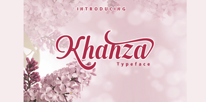 Khanza is a script font that is connected with clear style and dramatic movements. Khanza comes with uppercase, lowercase letters, numbers, punctuation, and so many variations on each character including alternative opentypes, common binders, and also additional cuts to allow you to customize your design. Perfect for use for Logotype, Letterhead, Posters, Clothing Designs, Labels and others. khanza font will help all the design projects that you are working on Khaza script features: Uppercase & lowercase Alternates & swashes Ligatures Standart international characters Punctuation & symbols
 - Getone by Robert Corseanschi,
$14.99 Getone is an exotic font, based on the Sereno font made by the same designer. It has a modern touch which makes it to stand out, all the glyphs are designed "out of the box" to combine each other in harmonious way. Getone is coming in ten styles : thin, ultra light, light, regular, bold and italics. Is ideally suited for advertising and packaging, festive occasions, editorial and publishing, logo, branding and creative industries, poster and billboards as well as web and screen design.
 - Cherry Blossoms Script by Zeenesia Studio,
$12.00 Introducing Cherry Blossom Font Cherry Blossom is sweet handwritten font duo, come with beauty font, script, serif and included doodles who makes your project will be perfect. Cherry Blossom comes with many alternate character and . Together or separate they are perfect for Invitation, wedding, tshirt design, quotes, mug, bag canvas, greeting cards, branding, stationery design, social media, packaging, prints and many more! If you combine them with the illustrations - you can create even more typographic designs, logos, labels and seasonal cards.
 - Scratch That by Matthias Luh,
$25.00 “Scratch That” is a decorative font available in 16 different styles. All subfamilies are consistent in width, position and spacing, so multiple fonts can be layered to create even more variety - have a look at our Family Pack offers! We designed “Scratch That” with layered design in mind and for both good legibility at smaller sizes and perfect look at large dimensions. This allows widespread use: for fashion, headlines, flyers, food, packaging, posters, souvenirs, web design, invitations and many more...
 - Growing Boy by Brenners Template,
$19.00 Growing Boy Display Font Family is designed with a rather high x-height and consists of cute and creative glyphs. Nine weights include regular and rounded styles, the rounded styles are designed for soft edge. The really uniquely drawn glyphs can work well with any composition to create the layout you want. In addition, rounded styles increase readability and simplicity, so they can be applied in a variety of ways, including editorial publishing, logo design, brand identity, and on-screen channels.
 - PSI Leaves by FontFuel,
$19.00 This is a leaves symbols font. Font elements are created from a base set of leaves. What that means is they work perfectly together. Professional artists and designers will appreciate all the ways you can combine these elements or use a single one for a simple elegant logo design. PSI Leaves works great for borders by simply creating a repeating pattern. Scrap-bookers can create beautiful and complex page designs with a few clicks. Thousands of uses equal thousands of ideas!
 - Open Case JNL by Jeff Levine,
$29.00 Open Case JNL is the distant cousin to the 2009 release by Jeff Levine Fonts called Cold Case JNL, as both were based on sets of lettering stencils designed and manufactured by the Huntington Oil Cured Stencil Company (originally of Huntington, New York and later of Delray Beach, Florida). While sharing similar design traits, there are enough differences to have both type designs work well together in a complimentary setting. Open Case JNL is available in regular and oblique styles.
 - Warzone by Arterfak Project,
$23.00 Warzone is a minimalist techno font. Based on sans serif design, developed to techno style with the minimalist stencil concept and sharp edges. Quipped with extra alternate characters that give you more variations on your design. This font has geometric shapes that are perfect for a futuristic theme, techno, digital, sci-fi, and hipster style. Warzone is an all-caps font that has a solid version in the lowercase. A great choice to apply for many purposes. Thank you and happy designing!
 - Braxton by Fontfabric,
$39.00 Braxton - brush flavored script font family includes 5 unique font weights. The font family is characterized by excellent legibility in both - web & print design areas, well-finished calligraphic designs, optimized kerning etc. Braxton is most suitable for headlines of all sizes, as well as for text blocks that come in both maximum and minimum variations. The font styles are applicable for any type of graphic design – web, print, motion graphics etc and perfect for t-shirts and other items like posters, logos.
 - Cafgone by Wildan Type,
$14.00 Cafgone is a modern display sans serif with modern and elegant style. This fonts is designed to pair harmoniously, and lend themselves to high end branding, logo designs, product packaging & invitation designs. With two fonts style (Regular and Oblique), Cafgone clean lines and subtle contrast give any project a touch of luxury and class. There are also decorative alternates and ligature available for uppercase letters and lowercase, so you can mix and match to add extra character and interest to logos and wordmarks.
 - Linotype Bariton Paneuropean by Linotype,
$92.99Linotype Bariton is part of the Take Type Library, chosen from contestants of Linotype's International Digital Type Design Contests of 1994 and 1997. Designer Alexei Chekulayev designed his font in one weight to mirror the Zeitgeist of the early 1930s. The characters of this extremely bold font are based on the form of a rectangle though its rounded edges soften its look a bit. Linotype Bariton should be used only in larger point sizes in headlines which should really catch the eye. - FF Mark Paneuropean by FontFont,
$79.00Geometric sans fonts in the Bauhaus tradition were the inspiration for the design of FF Mark®, for example the Universal font by Herbert Bayer, Erbar® Grotesk, Kabel®, Neuzeit Grotesk and of course Paul Renner's Futura®. From an aesthetic point of view, FF Mark is a descendant of these classics of German typeface design that intends to meet the needs of modern communication. Hannes von Döhren and Christoph Koeberlin had the support of the entire FontFont Type Department in the design of FF Mark, including Erik Spiekermann, who took over the artistic direction of the project. The teamwork resulted in carefully planned, balanced forms, which are responsible for the harmonious overall impression of the font. The capitals are not based on Roman square capitals; rather, they have a uniformly wide letter form in a comfortable ratio to the x-height. Thanks to the x-height, which is significantly larger compared to the historical models, FF Mark is also very legible in small sizes. This makes it a very flexible font in terms of its range of applications. A contrast in the stroke width is barely noticeable. At the same time, light modulation supports readability, especially in the bold styles in small sizes. The uniform line ends are obvious for a contemporary sans family nowadays (unlike some of the historical precedents, which evolved over years). Other details from the predecessors are consciously maintained and provide for added individuality in FF Mark. For example, the limbs in the uppercase "K" and "R" are offset slightly from the stem. Alternative characters with crossbars are available for the numbers "0", "1", "7" and the uppercase "Z" and the lowercase "a" also has an alternative with an open form. German typesetters have the option of uppercase umlauts with points that are set lower, as well as a long "s" from the Fraktur. And last but not least, FF Mark has the very characteristic ft-ligature of Futura. FF Mark is available in ten finely tuned weights ranging from Hairline to Black. A Book style for text setting further emphasizes the well-rounded features of this contemporary typeface. When the font was published, it also included ten carefully designed cursives for all weights. Users also have the option of various numeral sets with old-style and uppercase numbers as well as small capitals. FF Mark also has some geometric shapes and arrows based on the features of Futura. FF Mark is a modern, full-featured, geometric sans serif that you can use without hesitation for large projects in headlines as well as in texts. FF Mark's design is a nod to the historical models and transports their charm, elegance and in some cases unusual design applications into a modern font family equipped with the most current typographical features. NEW: the new FF Mark W1G versions features a pan-European character set for international communications. The W1G character set supports almost all the popular languages/writing systems in western, eastern, and central Europe based on the Latin alphabet and also several based on Cyrillic and Greek alphabets. - Ambra Sans by Zetafonts,
$39.00 Designed by Cosimo Lorenzo Pancini with Francesco Canovaro as a development and reinvention of Tarif by Andrea Tartarelli, Ambra Sans is a humanist sans typeface family, drawn around a lively, expressive skeleton but developed with a contemporary, post-digital sensibility that implies low contrast and tall x-height. In designing Ambra Sans, the authors wanted to research the elusive natural signature of handmade humanist letter shapes, in the effort of preserving it while still developing all the capabilities of type as a technical tool in the digital age. Like a frail insect preserved in amber, humanist design is the "ghost in the machine" of this font, that aims at seducing the viewers with its soft, welcoming text flow, firmly opposing the rigid, formal tone of most sans serif fonts. Born to provide a useful tool to graphic designers with branding and editorial needs, Ambra Sans develops around two subfamilies with slight but fundamental differences. The display family offers a taller x-height, optimizing readability and spacing in headings and display use, while offering a single story lowercase g to provide more consistent branding usage. The text family, on the other side, goes for a smaller x-height to give more traditional proportion to the text and removes the slight tapering in the stems to provide better rendering on screen in small formats. Both subfamilies of Ambra Sans develop around a wide range of seven weights with corresponding true italics, with Ambra Display sporting an extra heavy weight for maximum versatility. In total the family counts 30 fonts, each with over 600 glyphs for a wide language coverage. Open type features and glyph alternates further enrich the usage possibility of this typeface that wants to offer contemporary designer an alternative, unexpectedly human approach to contemporary sans type, softly preserving the spirit of handmade calligraphy while encasing its frail nature in a transparent, strong and powerful design language.
 - Adinah by Brink,
$30.00 Adinah is a lively brush script with a strong sense of rhythm. Adinah’s expressive letterforms are based on pointed brush calligraphy with a hint of sign painting. This Sign painting influence reveals itself the further you dig into the family styles. Eight combined styles are complimented by a sub family of Six Layered Font options.
 - Patty Day by Ingrimayne Type,
$14.95 March may be a good time to use this typeface. PattyDay is a caps-only typeface in which the letters are decorated with shamrocks or clovers. Some but not all of the lower-case letters are different from the upper-case letters. If you want a version of this face without the shamrocks, try Ingone.
 - Beyond Comfort by Tom Chalky,
$16.00 Introducing Beyond Comfort - A classy and stylish font duo inspired by 80's editorial type. At first glance, they look pixel perfect, but on further inspection, you'll notice perfect imperfections, revealing that the fonts are in fact entirely hand-drawn; As all of my fonts are, adding to the overall character of the duo.
 - Breeze by Linotype,
$29.99Breeze is a fun font from Frank Marciuliano where the letters are formed like the sails from the boat. He may have been inspired from the sailboats which he sees on the walks along the shore on the Hudson River. There are two forms available. Left and right define the direction of the blowing wind. - Tristero by Illuminaut Designs,
$10.00 “Behind the hieroglyphic streets there would either be a transcendent meaning, or only the earth.... Another mode of meaning behind the obvious, or none.” Tristero is an expansive geometric sans with letter forms that are both classic and quirky. There are over 550 characters in 3 weights. A versatile typeface with a friendly character.
 - Quare Zombie by Struggle Studio,
$10.00 Quare Zombie is an old typeface, comes in a clean and elegant style. There are 5 files in this font such as: Regular and Engraving with tattoo additions and Monoline Fonts. Quare Zombie is great for all types of looks from branding, emblems, advertisements, t-shirts, etc. Notes: (Quare Zombie Extras Tattoos are sold separately)
 - The Candy by DainType,
$15.00 When the conditions are met, a heart is attached to the capital letter. It feels soft and lovely. It goes well with wedding cards, invitations, elegant brochures, web images, and promotional materials. If you do not apply the open type feature, the letters without hearts are applied, so you can use it in two moods.
 - Brandon Grotesque Office by HVD Fonts,
$40.00 This special Office version of Brandon Grotesque is especially for all Microsoft Office applications (Word, Excel, Powerpoint …). It contains just the 4 basic styles which are stlye-linked and can be easily accessed by the "I" or "B" button in Office. The fonts are manually hinted so their appearance is also optimized for these applications.
 - Latinate by K-Type,
$20.00 LATINATE is a condensed Latin typeface whose sharp serifs are not as fiercely pointed as traditional Latins. The fonts are derived from the serial numbers of bus tickets issued by the Bell Punch Company in the mid twentieth century, and the LATINATE ROUGH font is a distressed version based on scans of coarsely printed tickets.
 - TOCinRings by Ingrimayne Type,
$14.95 TOCinRings has letters in circles. The letters are from a typewriter font called TiredOfCourier. The typeface contains characters that can add color to letters. There are two ways to do this. One uses layers and the other a combination of characters, some with zero width. This pdf file explains the how this can be done.
 - Batticuore by Resistenza,
$39.00 Batticuore means “palpitation” in Italian and is a powerful word. This font family is inspired by brush lettering, Batticuore provides two variants, Regular and caps. Both scripts are based on a brush strokes with a little contrast. A large set of ligature and alternates are included. More about Opentype Features: https://bit.ly/opentype-rsz
 - ALS Dulsinea by Art. Lebedev Studio,
$63.00 Decorative font based on XIX century Cyrillic handwriting. Dulsinea is a handwriting-based font, that is why most of the letters are tied to each other. Such handwriting is often seen in documents dated 2nd half of the XIX century. Its special features are rounded lengthy movements and unusual for present days sequence of strokes.
 - Block Paper by Dumadi,
$20.00 Block Paper – Playful Typeface is a square font inspired by squares/cubes. a font specially designed for designers with fun and colorful kids projects. Block Paper is perfect for design, logos, social media, branding, advertising, product design, handwritten quotes, product packaging, headers, posters, merchandise, and other designs. What’s Included : + Standard glyphs + Ligature + Multilingual Accent + Works on PC & Mac, Simple installations This Font Support Languages : Afrikaans, Albanian, Asu, Basque, Bemba, Bena, Breton, Catalan, Chiga, Cornish, Danish, Dutch, English, Estonian, Faroese, Filipino, Finnish, French, Friulian, Galician, German, Gusii, Indonesian, Irish, Italian, Kabuverdianu, Kalenjin, Kinyarwanda, Luo, Luxembourgish, Luyia, Machame, Makhuwa, Meetto, Makonde, Malagasy, Manx, Morisyen, North, Ndebele, Norwegian, Bokmål, Norwegian, Nynorsk, Nyankole, Oromo, Portuguese, Quechua, Romansh, Rombo, Rundi, Rwa, Samburu, Sango, Sangu, Scottish, Gaelic, Sena, Shambala, Shona, Soga, Somali, Spanish, Swahili, Swedish, Swiss, German, Taita, Teso, Uzbek (Latin), Volapük, Vunjo, Zulu. Accessible in Adobe Illustrator, Adobe Photoshop, Adobe InDesign, even work on Microsoft Word. PUA Encoded Characters – Fully accessible without additional design software. Fonts include multilingual support + Image used: All photographs/pictures/vectors used in the preview are not included, they are intended for illustration purposes only.
 - Secession by HiH,
$14.00 Secession is a very readable typeface, suitable for short blocks of text. If you have grown weary of the standard sans-serif faces one sees all the time, you may want to use Secession as a fresh and distinctive substitute. Like Kunstler Grotesk, Secession is one of a number of typeface designs that attempts to reconcile Germany’s blackletter tradition with the international familiarity of roman letterforms in a simple, robust design suitable for meeting the demands of a modern industrial economy, while rejecting the extraneous ornamentation of the departing Victorian era. Unlike Kunstler Grotesk, Secession was designed with a lower case. Secession Bold was originally jointly released as Halbfette Secession by Bauer & Company of Stuttgart and H. Berthold AG of Berlin around 1898. The rest of the family was designed by HiH. The basic family of four: Text, Oblique, Bold and BoldOblique are available in two versions: one set with the standard contemporary lining or ranging numerals for spreadsheets and tables and one set of old-style figures (with OSF in font name) for use with text. The two versions of the basic family, Secession and Secession OSF were released in July 2006. Cousins include ExtraBold, SCOSF Text, and two multi-lingual versions of the text weight. Secession ML includes the Latin Extended-A character set in unicode format plus 17 ligatures and a few strays. Secession GreekML has all the characters of the ML version plus the unicode Greek set and 17 Greek ligatures. Release of the cousins took place in August and October of 2006. Click on BUYING CHOICES. Click on GLYPHS and use drop-down menus and slider to see the all the glyphs for the various fonts. Similar: Birmingham (Ref 100 Ornamental Alphabets, Solo); Spartana (Art Nouveau Display Alphabets, Solo)
 - Morl by Typesketchbook,
$55.00 Developed from condensed san serif families of the 90’s to 00’s, Morl brings together the distinctive features of the time but presented in a simpler design. Its potential is increased with Original, Sans, and Rounded options which offer varied moods. Suitable for publications, web and product designs, Morl can fit either headlines or body. It’s also effectively supported in various devices. The family comes in 10 weights, making it available to use for your required tasks in 60 styles.
 - Monoline Fighter by Nathatype,
$29.00 Are you looking for a way to enhance your copy? Looking for a way to stand out from your competition? Maybe you are missing that “something”. Monoline Fighter-A Script Font Monoline Fighter was fully thought out to easily meld inside your designs. These fonts make a good foundation of what you want it to be! Discover the beauty in your own imagination while this font gives you a quick kickstart to what it can be. Wait no more, this beautiful font can be yours right now! This custom made font was specifically designed to fit whatever you need! Perfect for social media posts and ads, printed quotes, t-shirt designs, packaging, or even as a modern text overlay to any background image. Monoline Fighter includes Multilingual Options to make your branding globally acceptable Features: Stylistic Sets Swashes Bonus Ornament PUA Encoded Numerals and Punctuation Thank you for downloading premium fonts from Nathatype
 - June by Schriftlabor,
$26.99 June is a contemporary neo-grotesque sans-serif typeface designed to be highly legible, readable, and usable. The clarity and mathematics were inspired by the research into type form by Adrian Frutiger. June was designed by developing a modern and unique approach to his findings. June's legible features include a near uniform stroke width, open apertures and counters, angular cut stems, and a large x-height. Italics are angled at eight degrees and have been redesigned to provide a stylistic difference without reducing legibility. June comes in seven weights, from Thin to Bold, each equipped with OpenType features. June can be used for all print sizes, and has characteristics that are more visible at larger sizes. June was inspired by a close family member of the designer. A part of all sales will be donated to Alzheimer's Society. Free Variable Font: If you buy the full family, you will also receive the Variable Font version of June, without extra charge.
 - Cervantes by Gatype,
$12.00 Cervantes is a beautiful modern calligraphy typeface, I hope you will be interested in this font, if you want to use it for your work. This font can be used easily and simply because there are many features in it. contains a full set of lowercase and uppercase letters, a wide variety of punctuation marks, numbers, and multilingual support. Cervantes would be perfect for invitations, logo & branding, photography, advertising, watermarks, social media posts, product packaging, product designs, labels, wedding designs, stationery, special events, or anything that needs a handwritten feel. Cervantes comes with 353 glyphs. Alternate characters are divided into several Open Type features such as ,Alternative Style. The Open Type feature can be accessed using intelligent Open Type programs such as Adobe Illustrator, Adobe InDesign, Adobe Photoshop version of Corel Draw X, and Microsoft Word. And this Font has provided PUA unicode (custom coded font). so that all alternative characters can be easily accessed in full by a craftsman or designer. Thank you for your purchase.
 - MGT American Copper by Magetype,
$29.00 American Copper Family is a vintage font inspired by an old American motorcycle logo. The logo looks very manly and strong, just like the motorbike. American Copper Script is the dominant one that turns the logo into a font. Whereas the Sans and Block family is a complement to the Script. But all three are a very good unit to be juxtaposed together. American Copper is a font made for you (designers) who love automotives: old cars and motorbikes. Anything related to automotive. Besides these two objects, this font is also very cool for music-themed design needs; rock n roll, metal, rockabilly, and others. Oh yes, Custom Culture is another very interesting thing to be depicted with this font. Workshop logo for example. It will look very unique with Interlock on American Copper Script. Pair it with American Copper Block. And, BOOM! The logo will look very manly. If you are curious, you can download the American Copper Script Demo version to try. Happy Designing. Cheers
 - Fitriyah by Din Studio,
$29.00 Are you looking for a way to enhance your copy? Looking for a way to stand out from your competition? Maybe you are missing that “something”. Introducing Fitriyah-A Display Font Fitriyah was fully thought out to easily meld inside your designs. These fonts make a good foundation of what you want it to be! Discover the beauty in your own imagination while this font gives you a quick kickstart to what it can be. Wait no more, this beautiful font can be yours right now! This custom made font was specifically designed to fit whatever you need! Perfect for social media posts and ads, printed quotes, t-shirt designs, packaging, or even as a modern text overlay to any background image. Fitriyah includes Multilingual Options to make your branding globally acceptable. Features: Standard Ligatures Alternates Stylistic Sets Swashes Multilingual Support PUA Encoded Numerals and Punctuation Thank you for downloading premium fonts from Din Studio
 - Pictures Signature by ryan creative,
$10.00 hello creatives. Introducing the latest fonts. Pictures Signature are designed to be inspired by a photo wall with signature-like inscriptions, giving a personal and exclusive impression. This typeface is characterized by steep, curved strokes, with some letters appearing to connect to each other as in handwriting. and is suitable for use in various media such as brand names, name logos, magazines, posters and other digital media. FEATURES Uppercase, lowercase. Support Foreign, Numbers and Punctuation. Alternative, Ligatures, Swash. Input Otf, ttf & Woff Files. Works on PC. Simple installation. Accessible in Adobe Illustrator, Adobe Photoshop. Adobe InDesign, it even works in Microsoft Word. Fully accessible without additional design software. Pictures Signatures are encoded with Unicode PUA, which allows full access to all additional characters without having to design any special software. Mac users can use the Font book, and Windows users can use the Character map to view and copy any extra characters to paste into your favorite text editor/app. thank you for visiting ;)
 - VLNL Berlagebrug by VetteLetters,
$30.00 VLNL Berlagebrug Designer Donald DBXL Beekman daily crosses the Berlage bridge spanning the Amstel river in Amsterdam. The Berlagebrug was built as part of the city planning project ‘Plan Zuid’ by H.P.Berlage and opened in May 1932. Its name, carved out of two granite headstones, sparked the design of this font family. The original lettering is attributed to Anton Kurvers in the early 19th century, and can be seen on many Amsterdam buildings and bridges. It’s typical lettering of the Amsterdamse School, the Dutch equivalent of the expressionist art deco architectural style, and mostly known for its extravagant brick work. VLNL Berlagebrug is a rounded display font that comes in three outline styles matching the building materials used in the bridge. Gietijzer (cast iron) is smooth, Zandsteen (sandstone) has a softly distressed outline, and Graniet (granite) is outspoken rough and crumbled. The capital letters in VLNL Berlagebrug are in the Amsterdamse school style, the lowercases are more straight alternate capitals, giving you more design options.
 - Merel by Inhouse Type,
$33.78 Merel is a modern geometric typeface with humanist attributes. Geometry and logic are at the heart of this 6 weight font family. Humanist touches give it a number of distinctive characteristics, as well as aid legibility. Despite being rational and function driven in its nature, Merel has a soft and gentle touch. It was designed to tackle both print and onscreen challenges of the modern environment. Details include reduced x-height, mild stroke contrast and vertically sheared terminals with cushioned finish across the typeface. Merel features a number of alternative characters, manually edited kerning and Opentype features.
 - SK Parnik by Shriftovik,
$32.00 SK Parnik is a modern display font inspired by the culture of vegetarianism. This font is based on the shape of a bean pod, which gives the symbols a unique playful character, perfect for working with the branding of companies that are aimed at a children's audience, as well as engaged in restaurant activities. The character composition consists of uppercase and lowercase letters and supports extended Cyrillic and Latin letters. This allows you to expand the scope of this font. Despite the pronounced decorative component, thanks to its tools, the font will fit perfectly into the collection of any designer.
 - Veto Sans by Monotype,
$50.99 Veto® Sans is both highly legible and handsomely distinctive – a rare blend in a typeface. It’s a design that stands out and fits in. Veto Sans is equally competent on screen and in print. It’s four carefully determined weights in both normal and condensed proportions, each with an italic complement, give the family an exceptionally deep range of applications. All the designs in the family are valuable design tools. None are superfluous. Advertising, brand, corporate, editorial and interactive design are all in Veto Sans’ wheelhouse. It also shines in wayfinding and other signage projects. And to all these, it brings a warmth and personality. An ample x-height, open counters, vertical stroke endings and subtly condensed capital letters enable Veto Sans fonts to perform with grace in print and digital environments while being space efficient. An added benefit is that all-capital typography set in Veto Sans is not only space saving, it’s also easy to read. Drawn as a complete reimaging of his earlier Veto design, Swiss designer Marco Ganz worked to create character shapes distilled to their purest forms while maintaining a relaxed and natural demeanor. Ganz, who is also a three-dimensional artist, is acutely aware that the negative space between letters and the internal space within letters is as important as the positive shape of the letters themselves. This dynamic balance between the negative and positive aspects of character forms gives Veto Sans a sense of immediacy without looking hurried. Ganz also took great care to draw a suite of italic designs that not only complement the roman weights perfectly, but also give the family a dynamic verve. A large international character set also ensures ease of localization. “Veto Sans,” says Ganz, “is a typeface for designers that search for a new and different solution to age-old typographic challenges.”
 - Silent Cinema JNL by Jeff Levine,
$29.00 “The Film Daily” issue for August 30, 1927 ran an ad for Tiffany Pictures in which all of the main text was hand lettered in a sans serif style displaying the beginnings of the Art Deco movement. With their rounded terminals, the characters were designed using a round nib lettering pen. Redrawn digitally as Silent Cinema JNL, it is now available in both regular and oblique versions.