10,000 search results
(0.031 seconds)
- Quakerhack by Almarkha Type,
$29.00 Introducing Quakerhack is a best handwritten brush that is written casually and quickly. Letters are made with brushes on Procreate. Then scanned and carefully drawn into vector format. That is why Quakerhack has charming, authentic and relaxed characteristic more natural look to your text with a more natural look to your text. You can activate Ligature OpenType panel to make these two styles. It also has many alternatives and underlines that make your text and design more interesting. Quakerhack is perfect for homeware designs,branding projects, Logo design, Quotes product packaging.
 - Ramesty by Twinletter,
$12.00 Ramesty is a handwriting bunch of fonts that are charming and elegant in each of their writings. very suitable for all designs that require a touch of handwriting, of course, using this font will make your design charming This font is designed with a natural touch of handwriting which is refined to create a portion and composition that suits your needs. So this font is suitable for craft, children's writing, adventure posters, food banner titles, wedding invitations, product packaging logos, quotes, social media page covers, furniture banner headlines, book covers, and much more.
 - Evenstar by Kereatype,
$10.00 Introducing the new ‘Evenstar’ Serif Family font with 9 Weight is a fashionable and modern elegant serif font with some sexy stylish extras:). Based on our experience as a graphic designer who works for a lot of companies, we often are requested to design a logo in a unique style but with an elegant shape. So, we try to brainstorm and create this font to make the idea is going out. This is perfect for BRANDING and LOGO DESIGN. You will get classy, elegant, and certainly unique logos with this font.
 - Amicable by Gassstype,
$25.00 Introducing Amicable is a handwritten brush that is written casually and quickly. Letters are made with brushes on Procreate. Then crafted carefully drawn into vector format. That is why Amicable has charming, authentic and relaxed characteristic more natural look to your text with a more natural look to your text. You can activate Ligature OpenType panel to make these two styles. It also has many alternatives and underlines that make your text and design more interesting. Amicable is perfect for homeware designs,branding projects, Logo design, Quotes product packaging.
 - Murray Corn by Gassstype,
$23.00 Introducing Murray Corn is Rough Display Font Typeface that is written casually and quickly. Letters are made with brushes on Procreate. Then crafted carefully drawn into vector format. is great for your creative projects such as watermark on photography, and perfect for logos & branding, photography, invitation, watermark,advertisements,product designs, stationery, wedding designs,label ,product packaging, special events or anything that need handwritting taste. That is why Murray Corn has charming, authentic and relaxed characteristic more natural look to your text with a more natural look to your text. design more interesting.
 - Specialist by Trim Studio,
$12.00 The Specialist is a beautiful signature script. It has a great readability and is perfect for adding a striking, yet elegant look to your designs. The two included styles are perfect for signatures, branding, wedding invites, business cards, quotes, travel designs, playful events and more! Its perfectly suited for crafter and graphic artist to complete their design such as invitation, advertisement, poster, logo, birthday, product sign, and many more! The Specialist Font is also Lightweight and contains All Standard glyphs and punctuations and can be used beside any font.
 - Alitun incanor by Propertype,
$24.00 The Alitun incanor font is inspired by Gothic style typography and calligraphy. It has clean, sharp lines making it easier to read by combining old and new. If you are looking for a font with these features, Alitun incanor can meet your needs. This font is equipped with natural calligraphy - characteristic of gothic synthesis and multilingual support.Font; ideas for headlines, flayers, greeting cards, product packaging, book and magazine covers, logo types, clothing designs, tattoo designs, album covers. With this font you can create your own unique design. Have a good time.
 - Bettawork by Almarkha Type,
$25.00 Introducing Bettawork - Brush Script Bold is a Authentic brush script that is written casually and quickly. Letters are made with brushes on paper. Then scanned and carefully drawn into vector format. That is why Bettawork has charming, authentic and relaxed characteristic more natural look to your text with a more natural look to your text. You can activate Ligature OpenType panel to make these two styles. It also has many alternatives and underlines that make your text and design more interesting.Crash Soul is perfect for homeware designs,branding projects, Logo design, Quotes product packaging.
 - Steelhead by Gassstype,
$22.00 Introducing Steelhead is a cartoon font brush that is written casually and quickly. Letters are made with brushes on Procreate. Then crafted carefully drawn into a vector format. That is why Steelhead has a charming, authentic, and relaxed characteristic more natural look to your text with a more natural look to your text. You can activate Ligature OpenType panel to make these two styles. It also has many alternatives and ligatures that make your text and design more interesting. Steelhead is perfect for homeware designs, branding projects, Logo design, Quotes product packaging.
 - Urban Maxim 3d Graffiti by Sipanji21,
$15.00 Urban Maxim" is a graffiti font that features three different layers: solid, shadow, and inner shadow. By using this combination of layers in your design, you can create a three-dimensional (3D) effect on your text. Fonts like this are often used in street art, posters, or other designs that aim to add depth and dimension to their typography. With "Urban Maxim," you have the flexibility to create text that looks distinct and more pronounced by using the various layers. This allows you to customize the appearance of your text to fit your design aesthetics.
 - Stand Alone by Gassstype,
$25.00 Introducing Standalone is a handwritten brush font that written casually and quickly. Letters are made with brushes on Procreate. Then crafted carefully drawn into vector format and make it into a font. That is why Standalone has charming, authentic and relaxed characteristic more natural look to your text with a more natural look to your text. You can activate Ligature OpenType panel to make these two styles. It also has many alternatives and ligatures that make your text and design more interesting. Standalone is perfect for homeware designs,branding projects, Logo design, Quotes product packaging
 - Qibtiyah by Arendxstudio,
$16.00 Qibtiyah is a brush script font with distinctive handwritten characters perfect for branding projects, logos, wedding designs, media posts, advertisements, product packaging, product designs, labels, photography, watermarks, invitations, stationery, and any project who need handwritten designs. Features : • Character Set A-Z • Numerals & Punctuations (OpenType Standard) • Accents (Multilingual characters) • Ligature • Swash There it is! I really hope you enjoy it - comments & likes are always welcome and accepted. More importantly, don't hesitate to send a message if you have a problem or question. Now just read this, go there and make it happen :)
 - 99 Names of ALLAH Linear by Islamic Calligraphy75,
$12.00 We have transformed the “99 names of ALLAH” into a font. That means each key on your keyboard represents 1 of the 99 names of ALLAH Aaza Wajal. The fonts work with both the English and Arabic Keyboards. We call this Calligraphy "Linear" for obvious reasons. The first "Alef" has a "fatha", this indicates that the name can be pronounced only one way, "AR-RAHMAAN". (in the zip file you will find a pdf file explaining the differences in the "harakat", pronunciation and spelling according to the Holy Quran). This calligraphy is very clear and no letters overlap. Decorative letters used in this calligraphy: "Mim, Aain, Sin, HHe, He, Kaf, Ta & Saad". Purpose & use: - Writers: Highlight the names in your texts in beautiful Islamic calligraphy. - Editors: Use with kinetic typography templates (AE) & editing software. - Designers: The very small details in the names does not affect the quality. Rest assured it is flawless. The MOST IMPORTANT THING about this list is that all the names are 100% ERROR FREE, and you can USE THEM WITH YOUR EYES CLOSED. All the “Tachkilat” are 100% ERROR FREE, all the "Spelling" is 100% ERROR FREE, and they all have been written in accordance with the Holy Quran. No names are missing and no names are duplicated. The list is complete "99 names +1". The +1 is the name “ALLAH” 'Aza wajal. Another important thing is how we use the decorative letters. In every font you will see small decorative letters, these letters are used only in accordance with their respective letters to indicate pronunciation & we don't include them randomly. That means "mim" on top or below the letter "mim", "sin" on top or below the letter "sin", and so on and so forth. Included: Pdf file telling you which key is associated with which name. In that same file we have included the transliteration and explication of all 99 names. Pdf file explaining the differences in the harakat and pronunciation according to the Holy Quran.
 - Mother VP by VP Creative Shop,
$20.00 Introducing Mother Serif Typeface - 5 fonts Mother is named after all the moms and children left behind. This typeface is feminine, fragile typeface with 5 fonts loaded with ligature glyphs, alternates and multilingual support to enchant your next project. Very versatile fonts that works great in large and small sizes. Mother is perfect for branding projects, home-ware designs, product packaging, magazine headers - or simply as a stylish text overlay to any background image. Uppercase, lowercase, numeral, punctuation & Symbol Light Regular Medium Bold Black ligature glyphs ab ac ad ae ag ai al am an ap ar as at au ba be bi bl bo br ca cc ce ch ci cl co cr cs ct cu da de di do dr ea ec ed ee ei el em en eo ep er es et eu fa fb ffb fh ffh fj fk ffk ft fft ga gi gl gn go gr ha he hi ho hy ic id ie il im in io ip ir is it iv ka ke la le li ll lo lu ma me mi mo mp na nc nd ni no nt oc od ol om op or os ot ou pa pe pi po ra rc rd re ri ro sh si sm sp su ta te th ti to tr ts tt ul um un ur us ut ff fi fl ffi ffl st alternates Multilingual support How to access alternate glyphs? To access alternate glyphs in Adobe InDesign or Illustrator, choose Window Type & Tables Glyphs In Photoshop, choose Window Glyphs. In the panel that opens, click the Show menu and choose Alternates for Selection. Double-click an alternate's thumbnail to swap them out. Feel free to contact me if you have any questions! Mock ups and backgrounds used are not included. Thank you! Enjoy!
 - Aramus by Hackberry Font Foundry,
$24.95 Aramus is a new serif font in my continuing objective of designing book fonts that I can really use. In many ways, Aramus is a very different direction for me. It comes from a scan of an old display face that has been radically modified to a much smaller x-height than I have been using lately, plus taller ascenders. Many of the characters needed a lot of correction to bring them into my taste. In general, I have decided that many of my fonts create a type color that is too dense. Aramus is an attempt to get away from that look. Although Amitale has been a very successful book family and excellent to work with, I find I still need something more open with a lighter color. Aramus is the first look at the new direction. The original hand-cut serifs vary a lot, different for almost every character. This gives a little looseness and helps the lightness I am looking for. It will be interesting to see where this all goes. This is a normal serif for me in that it has caps, lowercase, small caps with the appropriate figures for each case. This font has all the OpenType features in the set for 2009. I didn't bother with the CE accents (though I can add them upon request. They will be in the final new book family). There are several ligatures for your fun and enjoyment: bb gg ff fi fl ffi ffl ffy fj ft tt ty Wh Th and more. Like all of my fonts, there are: caps, lowercase, small caps, proportional lining figures, proportional oldstyle figures, & small cap figures, plus numerators, denominators, superiors, inferiors, and a complete set of ordinals 1st through infinity. Enjoy!
 - Defense by Reserves,
$49.00 Defense is an unyielding rectangular slab-serif stencil face designed with consistently balanced letterforms and a refined finish. It’s extremely angular geometric form commands attention in display settings, yet is also legible in short text blocks. The stencil mark width varies accordingly with each weight, helping to further define each style. Numerous alternate character sets allow room for customization, while the expanded ligatures push letter combinations to the limit. Stylistically, Defense’s almost crude, sharp-cornered construction is balanced by it’s sophisticated finish and attention to detail, often unrealized in similar faces of this genre. The upright weights are complimented by pairings of true italics, completely rebuilt, slightly narrower in width with modified letterforms, increasing their contrast and flow. Features include: Precision kerning Standard Ligatures set including 'f' ligatures (fi, fl, ff, fh, fj, ffl, ffi, ffj) Discretionary Ligatures set including (ft, rt, ae, oe, st, ft, ct, oc, oo, ry, AE, OE, AL, TH, HE, AK, AN, TT, HD, AM, AP, AR, NF, NE, NH, NL, NB, FL, ND, FE, AB, OB, OD, OF, OG, OH, OK, OL, OM, ON, OO, OP, OQ, OR, OU, AH, UE, UF, UB, UD, UH, UK, UL, UM, UN, UP, UR, UU, MP, XY, YX, KY, WY, VY, AF, FF, FI) Alternate characters (O, o, S, s, a, h circumflex, @, ®, ™, ¶, $, &, _, and various ligature alternates) Case forms (shifts various punctuation marks up to a position that works better with all-capital sequences) Capital Spacing (globally adjusts inter-glyph spacing for all-capital text) Slashed zero Full set of numerators/denominators Automatic fraction feature (supports any fraction combination) Extended language support (Latin-1 and Latin Extended-A) *Requires an application with OpenType and/or Unicode support.
 - St Croce Pro by Storm Type Foundry,
$29.00 Our eye is able to join missing parts of worn letters back into undisturbed shapes. We tend to see things better than they really are. Thanks to this ability we ignore faults of those close to us as we can’t accept the fact that every once in a while we convene with an impaired entity. Typography is merely a man’s invention, hence imperfection and transience, albeit overlooked, are its key features. This typeface is based on worn-out letterings on tombstones in the St. Croce basilica in Florence. For hundreds of years, microscopic particles of marble are being taken away on the soles of visitors: the embossed figures become fossilised white clouds, fragments of inscriptions are nearing the limits of legibility. First missing are thin joins and serifs, then the main strokes finally slowly diminish into nothingness over time. Unlike an archaeologist, for whom even completely featureless stele is valuable, the typographer must capture the proper moment of wear, when the type is not too “new” but also not too much decimated. Such typeface is usable for catalogue jackets, invitations and posters. Calligraphy is a natural human trait. To write is to create characters of reasonable beauty and content, according to the nature of the writer. A natural characteristic of architecture is to create an aesthetic message very similar to the alphabet. A doric column, the gabled roof, the circle of the well plan: these are the basic shapes from which all text typeface is derived.
 - Brass by HiH,
$8.00 The Brass Family has a lineage that extends into English history. About five hundred years ago a devout, but anonymous Englishman gave glory to the God he worshipped by designing the capital letters and decorations of these two fonts. Originally recorded in The History Of Mediaeval Alphabets And Devices by Henry Shaw (London 1853), they are described by Alexander Nesbitt in his Decorative Alphabets And Initials (Mineola, NY 1959) as “Initials and stop ornaments from brasses in Westminster Abbey.” I wish I could say I remember seeing them when I was there, but that was forty-two years ago and all I remember was seeing the tomb of Edward the Confessor. One definition of “stop” as a noun is a point of punctuation. I have heard people from the British Isles speak of a “full stop” when referring to a period. Some may remember a 19th century form of communication called a telegram being read aloud in an old movie, with the use of the word “stop” to indicate the end of a sentence or fragment. A full dozen of these stop ornaments are provided. They occupy positions 060, 062, 094, 123, 125, 126, 135, 137, 167, 172, 177 & 190. The Brass Family consists of two fonts: Brass and Brass Too. Both fonts have an identical upper case and ornaments, but paired with different lower cases. Although the typefaces from which the lower cases were drawn are both of modern design, both are interpretations of the textura style of blackletter in use in England when the upper case and ornaments were fashioned for the Abbey. Brass is paired with Morris Gothic, which matches the color of the upper case quite well. Brass Too is paired with Wedding Regular, which is distinctly lighter than the upper case. I find it very interesting how each connects differently. The resulting fonts are unusual and most useful for evoking an historic atmosphere.
 - Racers Energy by Din Studio,
$29.00 Do you want energetic designs? Racer energy is a font created in capital letters with the racing theme producing courageous strong impressions in no time making it worth adding to your design list. Letters are made similar to firm rectangle blocks with sharp-angles. Enjoy other incredible features available on this font. Features: Multilingual Supports PUA Encoded Numerals and Punctuation This font looks great on any design projects such as posters, banners, logos, book covers, headings, printed products, merchandise, social media, etc. Find out more ways to use this font by taking a look at the font preview. Purchase it now. Happy designing.
 - Most Faster by Din Studio,
$29.00 Most Faster’s cool designs and spectacular features will bring your designs into a brand new level. It is a font created in capital letters with the racing theme reflecting courageous masculine impressions. The strokes on each letter are similar to a sharp-angled rectangle. Features: Multilingual Supports PUA Encoded Numerals and Punctuation Use Most Faster for any design projects such as posters, banners, logos, book covers, headings, printed products, merchandise, social media, and so on. Find out more ways to use this font by taking a look at the font preview. Get it now. Happy designing.
 - Saint Regus by Sonar Hubermann,
$22.00 The story begin from Condensed, Standard & Expanded style. Saint Regus built and designed with a super family typeface in mind. Its still growing and growing by uniquely bold charismatic persona. The family itself have total 8148 glyphs with a standard glyphs and multilingual context.The possibilities are have a huge prospect in various design project, digital and print. Saint Regus development tried to explore the impact by its proportional display form. The project started from a Standard weights (Roman) and then it become a big families with 21 styles that you can use for a large design assets in any kind of design works.
 - Benord by Valentino Vergan,
$16.00 Benord is a bold elegant modern serif, it comes with stylistic alternates and creative ligatures. The idea behind Benord was to modernise an old style serif for today’s design industry. The main aim was too creative a serif take has a nostalgic vintage feel with a modern twist. Benord is an ideal font for graphic designs and advertising agencies who are looking to create beautiful logos and designs. Benord was designed to look great in both large and small type settings, making it perfect for cover and layouts. With its great multilingual support, Benord can produce a large number of different languages.
 - Avris by Miosis,
$30.00 This is Avris, an exceptional and feminine stencil font. The base was designed in 2015. The word ‘avris’ derives from the latin rara avis, which means “rare bird”. Stencil fonts were initially designed for mass production and transportation companies. Unlike this one, Avris’ curvy and minimalistic design feels and looks like the wings of birds, flying above the quiet ocean. It also has a roman, calligraphic and cryptographic touch to it. It can be used for editorial (fashion) magazines and poster designs. Looks great in headlines! Also the numerals are a must see when you put it in use.
 - Beneficha by Almarkha Type,
$35.00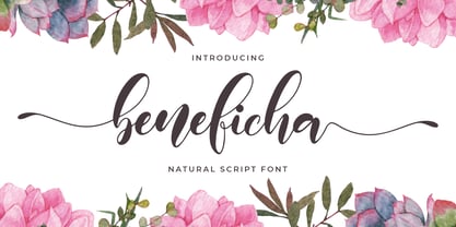 Hello Font lovers, Introducing New Collections Beneficha – Natural Script Font Beneficha – is a Natural Script Calligraphy font with a natural handwritten feel. It has lovely ligatures and alternates that are perfect for any creative design. This handmade font will make your design has a beautiful natural touch for each details. It is perfect for any design project as Invitation,logo, book cover, craft or any design purposes. This font is PUA encoded which means you can access all of the magical glyphs and swashes with ease! It also features a wealth of special features including alternate glyphs and ligatures.
 - Fonde SS by Sensatype Studio,
$15.00 fonde is a elegant chic font for brand, logo and quotes design. Based on our experience as a graphic designer who works for a lot of companies, we often are requested to design a logo in a unique style but with an elegant shape. So, we try to brainstorming and create this font to make the idea is going out. This is perfect for BRANDING and LOGO DESIGN. You will get classy, elegant, and certainly unique logos with this font. fonde is also included full set of: uppercase and lowercase letters multilingual characters numerals punctuation Wish you enjoy our font. :)
 - Two Race by Alit Design,
$10.00 Introducing Two Race Typeface 🏁The Two Race font 🏁 is inspired by the sporty racing display font. This bold, italic and strong font with an impression of speed is perfect for making sports racing themed designs. Can be used for making logo designs, car stickers, racing event titles and so on with sport race themes. In addition to the regular Two Race, there is also an italic version which makes it look faster and cooler. Apart from that this font is very easy to use in both design and non-design programs because all alternates and glyphs are supported by Unicode (PUA).
 - Badge Robo 3d Display Graffiti by Sipanji21,
$15.00 "Badge Robo" is a 3D display graffiti font with very bold and impactful characters. Fonts like this are often used in designs where you want to create a bold, attention-grabbing, and three-dimensional text effect. This style can be seen in various design applications, including street art, posters, or any project where you want your text to stand out prominently. With "Badge Robo," you can create designs that feature powerful and visually striking typography. The bold and 3D nature of this font can make your text appear dynamic and attention-grabbing, helping your design make a strong impact.
 - Librum by Hackberry Font Foundry,
$24.95 This is the serif text family for the book design group of font families which David designed in the process of writing "Practical Font Design With FontLab 5". The letterspacing is set wide for body copy use. The main purpose is readability and reading comfort. There are several whimsical graphics, plenty of OpenType features: oldstyle figures [tabular and not], small cap figures, lining figures [tabular and not], discretionary ligatures, small caps, and so on. The feature set is limited for the italic and bold versions. It produces an exceptional book. See Librum Book Design Group for a package containing all fifteen fonts,
 - Star Candy 3d Display by Sipanji21,
$15.00 "Star Candy" is a display font with cute and thin characters. Fonts like this are often used in designs that aim to convey a charming and adorable feel. The thin and cute letterforms give a cheerful and enchanting appearance, making it suitable for a variety of design projects that want to emphasize a sense of cuteness, such as children's designs, greeting cards, decorations, or products that want to attract attention with their adorable appeal. If you have further questions about using this font or need assistance in a specific design context, please feel free to ask!
 - Menthox by Alit Design,
$19.00 Introducing Menthox Typeface The Menthox font is designed with a script font concept that has a decorative stencil style. Strong characters with stencil styles make Menthox fonts look different and unique from other script fonts. A script typeface like "Menthox" is very easy to apply to any design, especially those with dynamic, relaxed, and retro fashion concepts, besides that this font is very easy to use in both design and non-design programs because all glyps in the Menthox font are supported by Unicode. (PUA). The "Menthox"contains 700 glyphs with many unique and interesting alternative options.
 - FreeSet by ParaType,
$30.00 The type family in four basic styles was designed in ParaType (ParaGraph) in 1992 by Tagir Safayev. Based on Frutiger, of Mergenthaler Linotype, 1976 by Adrian Frutiger. Frutiger font was originally designed for use on signs at the new Charles de Gaulle Airport at Roissy. The straightforward sans serif shapes are suited well for both text and display setting. Six additional styles were added in 1998-2000. Multilingual versions of 6 styles (Light, Demi and Extrabold) include Armenian alphabet designed by Manvel Shmavonyan in 1997. Two condensed Cyrillic styles (Demi Condensed and Bold Condensed) designed by Manvel Shmavonyan in 2005.
 - Ingleby II by David Engelby Foundry,
$25.00 Ingleby II is a typeface with firm roots in the classic stroke of the pen. The digital design of Ingleby II is legible and distinct in small sizes as well as expressive when used for larger display design. It contains small caps, an innovative range of subtle ligatures, dingbats and adjusted variations of numerals. The glyphs have many detailed designs for better legibility and precise kerning. Also, the italic glyphs are designed with optical accuracy in relation to the skewing of stem width and height. I hope you will welcome the Ingleby II family as a part of your personal font toolbox.
 - FF DIN Slab Variable by FontFont,
$419.99 FF DIN: the famous, faithful and first revival of DIN 1451. FF DIN originates in the lettering models from the German standard DIN 1451, and is considered the perfect standard typeface due to methodical and engineered design. FF DIN Slab is a robust compliment to the FF DIN family. Designed by Antonia Cornelius and Albert-Jan Pool, it offer designers tools to create greater rhythm and design depth. FF DIN Slab’s proportions have been meticulously aligned with its Sans origins, offering the perfect balance between positive and negative space. The serifs are assertive, sturdy and balanced, they are engineered to emphasis a strong horizontal flow through text, a grounded utility and assurance in headlines. The result of this attention to detail is a typeface that harmonizes beautifully with other FF DIN styles. Pushing font technology to its limits, FF DIN Slab is also available as a Variable font. Allowing creatives to design hyper specific variations which thrive in any design space, and even seamlessly animate movement from one state to the next. FF DIN Slab distinctively carries on its parent’s DNA, speaks the same native language — but with a strong peculiar dialect. It expands the DIN family worthily — independent but integrated — and opens totally new possibilities of uses with the whole DIN family.
 - Kometa by Kiril Zlatkov Type Foundry,
$40.00 Kometa Sans is a contemporary grotesk with a certain personality. She has a steady geometric skeleton, but its appearance is rather humanistic. The precise details of the artwork, the carefully drawn true italics, the six types of numerals, the variety of alternates, the broad range of open-type features and the extensive glyph set can meet most of the contemporary typographer’s demands for a neutral, but not boring type family for both long text and display use. Among the distinctive qualities of Kometa are also the forms of ligatures (both default and discretionary). They follow the natural constructive transitions between oval parts and stems, which is an advantage to mark, at least for designers who respect the beauty of clean forms. Note the specially designed Kometa Unicase sub-family, substantially enough to exist as a separate typeface. Its elegant and expressive letterforms are boosting further the power to create outstanding design work. Kometa Unicase has original and playful, yet reasonable approach to letterforms variety. Kometa has a very broad usability range – from logotypes and poster designs to corporate identities and complex editorial projects. The contemporary Cyrillics of Kometa allows easily completion of graphically consistent multilingual corporate and artistic design projects. Designed by Kiril Zlatkov and Vassil Kateliev.
 - FF DIN Slab by FontFont,
$50.99FF DIN: the famous, faithful and first revival of DIN 1451. FF DIN originates in the lettering models from the German standard DIN 1451, and is considered the perfect standard typeface due to methodical and engineered design. FF DIN Slab is a robust compliment to the FF DIN family. Designed by Antonia Cornelius and Albert-Jan Pool, it offer designers tools to create greater rhythm and design depth. FF DIN Slab’s proportions have been meticulously aligned with its Sans origins, offering the perfect balance between positive and negative space. The serifs are assertive, sturdy and balanced, they are engineered to emphasis a strong horizontal flow through text, a grounded utility and assurance in headlines. The result of this attention to detail is a typeface that harmonizes beautifully with other FF DIN styles. Pushing font technology to its limits, FF DIN Slab is also available as a Variable font. Allowing creatives to design hyper specific variations which thrive in any design space, and even seamlessly animate movement from one state to the next. FF DIN Slab distinctively carries on its parent’s DNA, speaks the same native language — but with a strong peculiar dialect. It expands the DIN family worthily — independent but integrated — and opens totally new possibilities of uses with the whole DIN family. - PF Champion Script Pro by Parachute,
$125.00 PF Champion Script Pro is perhaps the most advanced and powerful calligraphic family ever made. It received an award for Excellence in Type Design from the International Type Design Competition ‘Modern Cyrillic 2009’ which was held in Moscow. Most recently, it received another award from the 3rd International Eastern Type Design Competition - Granshan Awards 2010. This typeface was first presented in June 2007 at the 3rd International Conference on Typography and Visual Communication (ICTVC) and was met with rave reviews. It is based mainly on the manuscripts of the 18th century English calligrapher Joseph Champion. Developed over a period of two and a half years, each one of the 2 weights is loaded with 4300 glyphs(!), offering simultaneous support for all European languages based on the Latin, Greek and Cyrillic scripts. Furthermore, a wide selection of alternate forms and ligatures is included for all languages, in order to accommodate diverse design aesthetics. These alternates are either applied automatically through an advanced programming scheme, or manually through several OpenType features. An attempt was made to design a contemporary script typeface with classic roots, by following certain guidelines, i.e. lowercase characters were designed so they are less inclined, have a higher x-height and are less condensed than the original. Several characters were stripped-off their connecting lines in order to enhance legibility. Four sets of alternate swashed capitals as well as a plethora of ornaments and frames (117) was included. Small caps and their alternate forms were designed to replace the capitals which disrupt the flow of text within a sentence with their extravagant swashes. All characters were carefully designed with the proper weight in order to sustain harsh printing conditions (on special papers), a situation which affects mainly the light connecting parts of calligraphic typefaces. Finally, it was programmed in such a way as to preserve handwriting qualities, by designing an extensive array of ligatures and alternate glyphs in all languages, never before released or incorporated within the same font.
 - Zaftig Pro by Typeco,
$49.00Many current poster artists like to reference the graphic type styles that were popular in the ’60s and ’70s. Zaftig is a contemporary font that takes the geometric and blocky inspiration from that era but then steps off in a modern direction. At first glance, it may appear that the capitals of Zaftig all take up the same amount of space, but certain letters have been designed proportionally for a better flow. However, if the designer would prefer to stack the capital letters in even columns, like blocks, then one can use the Titling Alternates feature. In this feature the metrics of all the capital letters are the same, and certain letters have been designed narrower, allowing for seamless stacking. The space, bullet, asterisk have also been given the same monospaced metrics in this feature to make stacking easy. The Small Caps feature in Zaftig is designed so that the small cap glyphs are the same height as the lowercase. This allows the graphic designer not only the option of small caps, but also the ability to mix and match both kinds of letters to create a distinctive style. There are also alternate numerals in the Small Caps feature that match the height of the small caps. In Stylistic Alternates 1 you will find alternate designs for the Q, A, I, J, L, n, and u glyphs. Or you can find alternates in the Glyph Pallet of your favorite OpenType savvy application. Zaftig is more than it appears on the surface. This OpenType font contains over 1200 glyphs and language support. That makes it an international font which contains letters for most languages that use Latin, Central European, Cyrillic, and Greek scripts. - Typist Slab Prop by VanderKeur,
$25.00 The Typist SlabSerif is part of a big family, the Typist Family. The family consists of a monospaced, a SlabSerif and a SansSerif version. The idea behind this family originated from the research into the design of typewriter typestyles, which is also the reason why the monospaced version was released first. Since it was decided from the start to make a SlabSerif and a SansSerif version of these monospaced fonts, it was also a logical consequence that the proportional variants also became available in these versions. The monospaced SansSerif fonts have been given the name 'Code' since they are designed to be used while writing code for a software program, for example. The proportional variants with each 6 weights of the Typist Slab Serif and Code (SansSerif) are now available. Although the name may seem a bit strange, it is a logical consequence from the monospaced variant. The SlabSerif variant therefore has Typist Slab Prop, written in full the Typist SlabSerif Proportional. After all, who wants to be bothered with long font names in their font menu. The entire Typist family is designed as a font for use in editorial and publishing publications. A lot of attention has been paid to the spacing and kerning of the fonts. Due to the many variants and weights, this font is versatile. Typist Font Family was designed by Nicolien van der Keur and published by vanderKeur design. Typist Slab Prop and Typist Code Prop contains each 6 styles (Thin, Light, Regular, Medium, SemiBold and Bold, each weight also designed as a true italic) and has family package options. The links to the monospaced version of The Typist are here: https://www.myfonts.com/collections/typist-slab-font-vanderkeur https://www.myfonts.com/collections/typist-code-font-vanderkeur
 - Typist Code Prop by VanderKeur,
$25.00 The Typist Code SansSerif is part of a big family, the Typist Family. The family consists of a monospaced, a Slab Serif and a SansSerif version. The idea behind this family originated from the research into the design of typewriter typestyles, which is also the reason why the monospaced version was released first. Since it was decided from the start to make a SlabSerif and a SansSerif version of these monospaced fonts, it was also a logical consequence that the proportional variants also became available in these versions. The monospaced SansSerif fonts have been given the name 'Code' since they are designed to be used while writing code for a software program, for example. The proportional variants with each 6 weights of the Typist Slab Serif and Code (SansSerif) are now available. Although the name may seem a bit strange, it is a logical consequence from the monospaced variant. The SansSerif variant therefore has Typist Code Prop, written in full the Typist Code Proportional. After all, who wants to be bothered with long font names in their font menu. The entire Typist family is designed as a font for use in editorial and publishing publications. A lot of attention has been paid to the spacing and kerning of the fonts. Due to the many variants and weights, this font is versatile. Typist Font Family was designed by Nicolien van der Keur and published by vanderKeur design. Typist Slab Prop and Typist Code Prop contains each 6 styles (Thin, Light, Regular, Medium, Semi-Bold and Bold, each weight also designed as a true italic) and has family package options. The links to the monospaced version of The Typist are here: https://www.myfonts.com/collections/typistslabfont-vanderkeur https://www.myfonts.com/collections/typist-code-font-vanderkeur
 - PixelZoo by Just in Type,
$20.00PixelZoo gathers over 70 animal species turned into pixels. They are wild and domestic animals, mixing mammals, fishes and birds.