10,000 search results
(0.057 seconds)
- Klothilde by Fontroll,
$20.00 Klothilde is a handwriting font which came to life in one of my doodling sessions (I must admit I still doodle with pen and paper). The idea was to create a font which resembles writing with a quill on paper with exaggerated ball terminals. Sometimes there is too much ink which makes the letters fat and the strokes uneven. The paper soaks the ink resulting in blurred line crossings. The form gets blurry. On the other hand, when the quill runs out of ink the stroke gets thinner looking like the light version of Klothilde. In order to emulate the different looks, I created six fonts with a common skeleton but different appearance which can be altered seamlessly by using the Variable Fonts technology (e.g. in latest Adobe apps or CorelDRAW Graphics Suite) along the Weight and Blurred sliders. But even without, Klothilde can be used even in longer copy. Use it from 18 pt upwards, flush left with tight leading and intersecting ascenders and descenders. Due to extensive manual kerning, it gives your text an even colour. To my knowledge, Klothilde is one of the first script Variable fonts in different weights. No, Klothilde’s letters are not connecting. But I added a whole bunch of connecting ligatures which are simply activated by the ligature feature of your app. Even Microsoft Word can do that. Thus Klothilde comes to life, as it should be expected from a handwriting font. In order to add to variety there are additional glyphs for some critical initial and standalone letters. Repeating letter combinations like nn, mm or rr are avoided by replacing the second letter by an alternative form. All features are activated by the standard ligature feature. Ligatures are available for most European languages, some even in Cyrillic (some special Serbo-Croat letters included and accessible through localization or Style Set 08 features). Romanian comma-accent characters and ligatures are accessible through the OpenType locl feature. For the topping on the cake, I added an alternate ampersand (stylistic set 1) and asterisk (ss04), an alternate Cyrillic b (ss02) and t (ss03), a few fleurons, arrows and a skull (OpenType feature ornm), fractions (frac feature), circled numbers (ss06) and an interrobang (ss07) which result in exactly 900 glyphs in each of the six fonts. There should be enough to play with. Should you be missing a special character, do give me a hint.
 - 99 Names of ALLAH Clear by Islamic Calligraphy75,
$12.00 We have transformed the “99 names of ALLAH” into a font. That means each key on your keyboard represents 1 of the 99 names of ALLAH Aaza Wajal. The fonts work with both the English and Arabic Keyboards. We call this Calligraphy "Clear" because of how clear and easy to read the design is. The first "Alef" has a "hamzit wasel", this indicates that you can pronounce it as both "AR-RAHMAAN" or "R-RAHMAAN" (in the zip file you will find a pdf file explaining the differences in the "harakat", pronunciation and spelling according to the Holy Quran). The "Ye" in this calligraphy doesn't have the two dots, nor does it have a decorative "Ye", just like the Holy Quran. Also, we went for the traditional "soukoun" instead of the Quranic "soukoun" & decorative symbols are at a minimum. Decorative letters used in this calligraphy: "Mim, Aain, Sin, HHe, He, Kaf, Tah & Saad". Purpose & use: - Writers: Highlight the names in your texts in beautiful Islamic calligraphy. - Editors: Use with kinetic typography templates (AE) & editing software. - Designers: The very small details in the names does not affect the quality. Rest assured it is flawless. The MOST IMPORTANT THING about this list is that all the names are 100% ERROR FREE, and you can USED THEM WITH YOUR EYES CLOSED. All the “Tachkilat” are 100% ERROR FREE, all the "Spelling" is 100% ERROR, and they all have been written in accordance with the Holy Quran. No names are missing and no names are duplicated. The list is complete "99 names +1". The +1 is the name “ALLAH” 'Aza wajal. Another important thing is how we use the decorative letters. In every font you will see small decorative letters, these letters are used only in accordance with their respective letters to indicate pronunciation & we don't include them randomly. That means "mim" on top or below the letter "mim", "sin" on top or below the letter "sin", and so on and so forth. Included: Pdf file telling you which key is associated with which name. In that same file we have included the transliteration and explication of all 99 names. Pdf file explaining the differences in the harakat and pronunciation according to the Holy Quran. --------------------------------------------------------------------------------------------------------------------------- Here is a link to all the extra files you will need: https://drive.google.com/drive/folders/1Xj2Q8hhmfKD7stY6RILhKPiPfePpI9U4?usp=sharing ---------------------------------------------------------------------------------------------------------------------------
 - Kernig Braille by Echopraxium,
$5.00 This font is the younger sister of HexBraille with which it may be combined to create new patterns. This also explains why their introductory text are similar. Introduction The purpose of this monospace font is to display braille in an original and "steganographic" way. The Kernig prefix means "Robust" in German, this is because of the crank shapes . The core of the glyph design is a flat hexagon which can be read as 3 rows of 2 dots (i.e. regular braille glyph grid). Even if within a glyph, braille dots ("square dots" indeed) are placed on the vertices of a flat hexagon, the difference with HexBraille is that edges connecting vertices are not straight lines but "crank shapes" instead. This can be summarized by saying that the whole glyph is a Hexcrank (a flat hexagon where vertice pairs are connected by a crank shape) NB: The initial design is illustrated by glyphs 'ç' (no dot) and 'û' (6 dots) as shown by poster 6. A. "Kernig Lattice" In KernigBraille, glyphs are connected to each other, thus for each Hexcrank glyph there are 6 connections: 2 on left/right and 4 on top/bottom. In the final design some cranks were removed for esthetical reason (i.e. leave empty space for allowing patterns diversity). In summary, a text using this font won't display a honeycomb but a lattice instead. NB: Please notice that in order to obtain the lattice without vertical gaps, you must set the interline to 0. The lattice is made from 3 kind of shapes: a.1. Hexcrank a.2. Square a.3. Irregular cross (mostly unclosed) The design favored squares over crosses. The whole slightly resembling a PCB. B. Text Frames It's possible to frame the text with 4 sets of frame glyphs (as illustrated by poster 2) b.1. Kernig { € ° £ µ § ¥ ~ ¢ } b.2. Rectangular-High { è é ê ï î à â ä } b.3. Rectangular-Low { Â ù Ä Ê Ë Ô õ ö } b.4. Mixed Kernig+High: a mix of Kernig and Rectangular-High frame glyphs When using frame glyphs, it is advised to show Pilcrow (¶) and Non Breaking Space, which are replaced by empty shapes in this font (e.g. in Microsoft Word, use CTRL+8 or use [¶] button in the ribbon).
 - Rosart and Fleisch Hi Res by California Type Foundry,
$129.00 This font is not just historic, but classy, timeless, and in its current form, a modern classic. The original Titling Caps and icons Jacque François Rosart painstakingly carved, now meticulously digitized to be a true, accurate, and complete representation of the original designs. You can get the fully matching family with "ALL", or choose the set that meets your immediate needs: Zodiac and Constellations - The Stars Have Aligned into a Great Font So what's your sign? Whatever it is, R&F has it, and in so many ways! Pictograph, symbol, constellation and picto-constellation are all included. Constellations are useable even in scientific and education settings: based on current star charts and matched to Bayer designations, these stars shine both in design and accuracy! Includes Rosart's original moon and sun faces. Faces for the planets to match those for the sun and moon. Rosart's symbols for the planets. Astrology symbols including, Rosart’s pictographs for the twelve signs. Constellations of the Zodiac from precise star charts. Precise small star shapes, so you can design other constellations. Pinwheel, saltires, asterisks, solid stars, and even the Christmas star. Dave Lawrence, "Each symbol was carefully designed to match the main font." Alchemy Symbols - Turns A Design into Gold From labeling your cupboard of magical ingredients to getting one step closer to the golden goose, these rare alchemical symbols are a treasure trove of possibilities. Including: classic symbols for elements combinations medicinals chemistry mathematical symbols Includes music symbols for titling, as well as Verse and Response symbols. Seasons - Symbols to Keep Things Organized Throughout the Year Classic weather stylings, including old fashioned lightning and an eclipsing moon with the four-o'clock shadow. Map Markers Religious Symbols Phases of the moon. Pointing symbols: fingers, arrows, triangles, with circles Matching Italics CAL's Dimension Slant™ Instead of sloping all the pictures and drawings to an even slant, a multidimensional approach was used. And each symbol was evaluated and crafted individually. Pro World1 Font The pro world font contains all of these: Latin Standard set Rosart's original backwards X alternate. Alternate U shape. In the italic: swash variants for the J, Q, and Y. Proportional Lining (default), proportional old style, small caps figures. CAL Dimension Slant, for dynamic italics Includes Rosart's original moon and sun faces, along with additional faces for each planet. Rosart’s symbols for the planets and pictographs for the twelve signs of the zodiac. Constellations of the Zodiac along with small star shapes. Large stars, pinwheel, saltires, asterisks Symbols for chemistry Medicine Music symbols Mathematical symbols Pointing symbols like the finger, acorn, arrow and triangle. Geometrical shapes. Plus these more: Latin Pro character set for central European languages and Turkish. Rare kerns for Polish, Czech, Slovakian and others. Ligatures needed for some central European orthographies. Lowered German Umlauts for better line spacing. Cyrillic uppercase and small caps for eastern Europe, southern Europe, and Russia, with kerning. Rosart’s original Greek uppercase and small caps, but also tonos for monotonic Greek. Vietnamese, which has been kerned. Pinyin, including a special form of the Ü so that titles can be set closer. Numbers: A set of stacking (nut) fractions, along with very elegant automatic fractions A large set of currency symbols in lining, old style, small caps, denominator and numerator sizes. Our first Retail Pricing Feature: (ss03 + ss04) Just turn on the feature and type $1.99 and Rosart will do the rest. Ampersand alternates. Numerator sized musical sharp and flat symbols. Dave Lawrence, “From the moment I saw these letters I knew I had to make this typeface. What I didn’t know was that I would end up drawing most of Rosart’s special symbols... But it was too hard to resist."
 - FF Fago Monospaced by FontFont,
$67.99 FF Fago Thanks to his many years of involvement in major corporate type projects, Ole Schäfer had the necessary resources from which to construct his FF Fago™. The result is an extended family that provides comprehensive typographic support and whose qualities come to the fore in all relevant contexts ? from print to office through internet and wayfinding systems. FF Fago The sizable x-height together with the generous and open design of the characters ensure that the sans serif Fago remains clearly legible even in small point sizes or in potentially difficult situations, such as on wayfinding systems. A subtle contrast in line weight and letter forms that are reminiscent of those of an antiqua typeface provide the font with a restrained yet friendly and lively tone. Available in five weights, each with three different kerning widths and matching genuine italic variants, FF Fago is equipped for practically every situation. There are also small caps, oldstyle and lining figures, a selection of ligatures and geometric symbols. The range of potential applications of this universal font is almost inexhaustible ? it can be used in packaging design, on signs, posters and even for setting longer text sections. Fago is the ideal partner for those working on major corporate projects! FF Fago Correspondence Sans und Correspondence SerifThe Correspondence versions of Fago have been optimized for use in the business environment and in office communication. The carefully modified characters have a particularly robust feel, so that the clear, easily differentiated glyphs allow for straightforward communication even on screen. With these aims in mind, Schäfer has not only adjusted the x-height, but has provided certain letters in the sans variant ? such as the lowercase "i", the "r" and the uppercase "I" ? with serifs. Correspondence Serif, on the other hand, has been conceived as a slab serif throughout and in appearance has the look of the letters produced by the old office typewriting machines. An individual note has been added by providing a few unusual serif forms, as for example in the case of the "m", the "v" and the "y". Both Correspondence Sans and Serif are available in two weights with complementary italic versions and thus are ideally suited for use with standard office programs. This is all rounded off with a selection of office symbols. FF Fago Monospaced The use of a few typographic tricks is necessary to ensure that the letters of the alphabet appear to have the same width. Narrow letters such as "r" and "i" have been made to seem more expansive by using prominent serifs while the broader letters ? a good example is the "m" ? have the forms seen in a condensed font. And it is thanks to this design strategy that Fago Monospaced has the character of old typewriter text. What was once unavoidable because of the technology of the time is now a welcome alternative that can be used for the purposes of emphasis. As an additional supplement to the Fago superfamily, Fago Monospaced can be used, for example, to set short notes or draw attention to special text passages. There are three weights, in their original form without italic variants or small caps, but offering an alternative, technical form of the "0" with a crossbar.
 - Milkdrops - Unknown license

- Sign Designer JNL by Jeff Levine,
$29.00 Sign Designer JNL was inspired by a set of 1960s-era gold foil embossed self-adhesive letters.
 - Yorkten by insigne,
$- Clean and welcoming, the distinct look of Yorkten is remarkably satisfying to the eye. Straight to the point, Yorkton features a fashionable, geometric composition with angled main stems. There are no fewer than fifty-four fonts in the family, all of which are characterized by one of three widths – extended, normal or condensed. Each individual subfamily is equipped with eight weights from Thin to Black with respective Italics, giving Yorkten a breathtaking range of fonts to boast. The greater value for you, though, is its members’ ability to work well together. With a deep toolbox of weights and widths to choose from, this family provides you with significant value and a broad number of design solutions, making sure you have the tools you need for each challenge. So where should you use the font? Jeremy Dooley designed Yorkten’s underpinning structure to be compact. Combined with its superior features and terrific legibility, this versatile font can be used effectively for many jobs, whether in print or on screen. Use it freely for e-books and apps. Yorkten is particularly great for headlines, banners, posters, and websites. As with all insigne fonts, fonts that are well received by the market are expanded into future variants such as rounded or slab serif types. Yorkten’s later expansions will increase the versatility and functionality of the family. There’s no need to wait for these future releases, though. This new face already complements a number of other insigne faces, such as Grayfel, Look, or the Cabrito Superfamily. So what are you waiting for? Get Yorkten today and bask in the rich potential it offers! Get Yorkten and luxuriate in its straightforward multifunctionality!
 - Range Serif by Eclectotype,
$36.00 Range Serif is a sharp, contemporary, wedge serif typeface with just a hint of fraktur influence. There are five weights from light to black, each with corresponding italics. This is a typeface designed for demanding typographic work; it’s legible at small sizes, but unique at display sizes. There is an abundance of OpenType features in each font, including: Ligatures - all fonts contain standard f-ligatures. Contextual Alternates - Range Serif has been carefully designed to not ‘need’ ligatures. If you choose to deactivate them, the contextual alternates feature will make sure an alternative f is used before certain letters to avoid clashing. Fractions - When activated, numbers separated by a slash will automagically turn into fractions. Numerals - There are many different figure sets. These are Proportional Lining, Tabular Lining, Proportional Oldstyle, Tabular Oldstyle, Superiors and Scientific Inferiors. A slashed zero feature is also included. Small Caps - All styles include small caps, for both small caps and capitals to small caps functions. Ornaments - For convenience, the arrows are grouped in the ornaments feature. Case Sensitive Forms - There are different punctuation and bracket glyphs for all caps usage. Stylistic Alternates / SS01 - The italic fonts contain alternates for the letters A, K, R, U and X. Range Serif is a versatile and fully-featured typeface, ideal for corporate identities, contemporary art catalogs, even t-shirt slogans. The language coverage is impressive (Latin Extended A is fully covered) so Range Serif should prove a useful text and display workhorse for speakers of many different tongues. The typeface includes an array of currency symbols, including the new symbols for Indian Rupee and Turkish Lira. Also check out the accompanying sans serif version, Range Sans.
 - Starlight Sans JL - Unknown license

- Allaina by Creativemedialab,
$22.00 Allaina is a stylish and elegant Serif family consisting of three styles, Regular, Medium and Bold with matching italics. It has many alternates and some unique attractive ligatures. This pretty serif family could be used for fashion, label packaging or elegant vintage style lettering. Combining standard letters with alternative letters wil give you beautiful and unique words.
 - Blackheat by Almarkha Type,
$19.00 Blackheat is a bold, condensed sans with 4 styles inspired by the title of the sports poster. We designed it to look very energetic, taking into account the thickness and density of each glyph. Extra ligatures give you even more possibilities. This family is suitable for the titles, clothes, posters, magazines, brochures, packaging, websites and much more.
 - Nuovo Deco by Ben Burford Fonts,
$20.00 Following from the continued popularity of the original MB Deco, here is Nuovo Deco, its new and improved big brother. Nuovo Deco comes in three weights, Light, Regular and Bold. A full character set of Caps and lower case letters, alternate characters, plus some very nice Ligatures to give some added art deco style and a much wider scope.
 - Badmood by Sohel Studio,
$14.00 "Introducing Badmood, a sleek and modern bold font designed to make a statement. With its clean lines and strong presence, Badmood adds a touch of sophistication to any project. Perfect for headlines, logos, branding, and more, this font exudes confidence and style. Embrace the power of modern design with Badmood and elevate your creative projects to new heights."
 - Lanvier by Greater Albion Typefounders,
$12.00 Lanvier is an all capital display face, inspired by the thirties streamline era look. The family is offered in four style, Regular, Oblique, Double Oblique and Reverse Oblique, as well as two weights, Regular and bold. Bring the thirties back to life in all their chromium plated, streamlined and fast moving glory with the Lanvier family.
 - Bestters Supply by Burntilldead,
$13.00 Bestters Supply is a hand made script font, bold, classic and fun vintage script. Can be used for various purposes such as logos, t-shirt, letterhead, signage, news, shopping bag, posters, badges etc. Bestters Supply comes with Opentype features with 400 glyphs inside. Including alternate characters upper and lower case, ligatures, discretionary ligatures, and multiple language support.
 - Okomito Next by Hanken Design Co.,
$30.00 Okomito Next is a sans serif inspired by the classic typefaces that were imbued with a sense of functionality, boldness and industrial strength. OpenType features: Access All Alternates, Case-Sensitive Forms, Glyph Composition / Decomposition, Discretionary Ligatures, Fractions, Kerning, Standard Ligatures, Localized Forms, Mark Positioning, Mark to Mark Positioning, Ordinals, Proportional Figures, Stylistic Alternates, Stylistic Set 1, Superscript, Tabular Figures
 - Misty Black by Balpirick,
$15.00 Proudly Present, Misty Black Font. Misty Black is a Stylish Bold Script Font. Misty Black is perfect for product packaging, branding project, magazine, social media, wedding, or just used to express words above the background. Misty Black also multilingual support. Enjoy the font, feel free to comment or feedback, send me PM or email. Thank you!
 - Alstoria by Bombastype,
$35.00 Alstoria is a Bold Serif Display font. Suitable for your projects like branding, packaging, printing, header, and many more. Contains 320+ glyphs and 10 ligatures. You could check the full glyph map at this link. This font also contains many swash alternates option to play. Works well for vintage and modern style like you see in our preview images.
 - Unconscious by Pavel Boog,
$18.00 When we fall asleep, we become free in our thoughts, in our judgments, in our choice, we decide on bold actions and words. This font will bring all this to life. UNCONSCIOUS-This font is for brave, free and liberated creators. For people with a good sense of humor and able to derive joy even from bad things.
 - Qwatick by Ingrimayne Type,
$7.95 Qwatick is a decorative serifed family with three weights, each with an italic style. It is squarish and has small serifs. The bold style has high contrast and the regular style remains readable even at small point sizes. The family originated as a reworking of the odd display font Quidic, moving it toward normality and greater legibility.
 - The Morille by Wildan Type,
$15.00 The Morille is display bold serif typeface. The shape is classic and unique style. You can also get more elegant serif in alternate and ligature. With vintage fill It's great for logotypes, wedding invitations, romantic cards, labels, packaging, spelling of names and others. Add to your most creative ideas and watch how they bring them to life!
 - Insans by Gassstype,
$23.00 Hello Everyone, introduce our new product Insans - Bold Handmade Carefully All Caps Display, inspired by the title of the sports poster and We make it very energetically. Insans font with strong and challenging nuances. very suitable for the title, typography, Poster, magazines, brochures, packaging,Websites and much more for your design needs, making your designs more modern and professional.
 - Nesora GT by Gartype Studio,
$10.00 Lookin for unique logo font? we present to you Nesora, a bold handwritten font that was comes with alternates font and multilingual glyphs to easily use this uniwue logotype font Nesora is very suitable like as logo, tagline, adventure project, posters, book cover & etc.To use alternate this font just change the regular font to alternate font.
 - Tulip Algarve by Brenners Template,
$19.00 Tulip Algarve font family showcases elegant and trendy glamour through a bold contrast between horizontal and vertical stems. The basic glyph design was inspired by the beautiful silhouette of a tulip flower, and a classical beauty was added to the typeface system. With a modern display sans serif personality, this type system will interact well with any layout design.
 - Concrete Forge by Get Studio,
$10.00 ConcreteForge: A fearless brutalist font with extended shapes, exuding strength, and resilience. Captivating and impactful, it embraces simplicity while making a bold statement for branding and design projects. Inspired by the raw aesthetics of brutalist architecture, this typeface exudes strength and confidence. The family includes 9 fonts in a variety of weights and supports Variable Font.
 - Metalsoup by Alit Design,
$20.00 "Metal Soup" is a captivating blackletter font that exudes a unique blend of boldness and a dynamic, distressed aesthetic. With its robust design, this font is perfect for making a striking statement in your design projects. "Metal Soup" boasts 720 characters and offers comprehensive multilingual support, making it versatile and adaptable for a wide range of creative applications.
 - Paragon by Greater Albion Typefounders,
$12.50 Paragon is a display Roman family of nine faces, combining elements of formality and fun. It embodies a high degree of contrast between near hairline horizontal strokes and bold vertical strokes. The family is offered in three widths and in regular, small capitals and title faces. Use Paragon to lend impact to your next design project.
 - Meriase by Deeezy,
$14.00 Trendy, bold, unique, artistic & modern style sans font for your fancy projects. Futuristic, fashion and sharp style on Meriase font will be great for any branding project. Some alternates and ligatures will help you to create unique and original logo design or website header! Enjoy :) Multilingual support Alternate characters Ligatures Web font Great for modern branding projects!
 - Loathing by Arendxstudio,
$13.00 Loathing is a bold Display Font with its distinctive character that can be easily implemented in your various design projects . Loathing came with opentype features such stylistic alternates, stylistic sets & ligatures good for logotype, poster, badge, book cover, tshirt design, packaging and any more. Features : • Character Set A-Z • Numerals & Punctuations (OpenType Standard) • Accents (Multilingual characters) • Ligature • Alternate
 - Sidiqie by Chococreator,
$5.00 Sidiqie is a modern sans serif with a monoline and minimalist style. With smooth, neat lines, and with just a hint of contrast, Sidiqie works beautifully for logos, branding, and web titles. See examples for some examples of how you can use them. Includes Sidiqie Light Sidiqie Reguler Sidiqie Bold Sidiqie Black Support for western languages
 - Guitar Rocker by Letterara,
$25.00 Dive into the rhythm of design with Guitar Rocker, a compelling serif typeface that harmoniously blends bold elegance with distinctive character forms. Perfect for a myriad of design projects, from product packaging to branding, this font's PUA encoding guarantees seamless access to a wealth of unique glyphs and swashes, promising exceptional outcomes for your creative endeavors.
 - Gestura by NamelaType,
$17.00 Gestura is a Connecting script font that has an angled terminal upturned tail at the end of the ascender, and a flat terminal at the end of each letter, giving a bold impression in a script font. Gestura consists of 14 styles from Light to Black with each matching italics, 2 Variable Font; Upright and Oblique.
 - Brisella by Letterara,
$14.00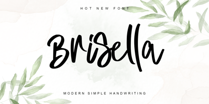 Brisella is a simple modern handwritten font with a wonderful choice of bold and elegant to choose from. Its natural and unique style makes it incredibly fitting to a large pool of designs. The only limit is your imagination! This font is PUA encoded which means you can access the available glyphs and ligature with ease!
 - Neue Metana by Dirtyline Studio,
$20.00 Neue Metana is a modern minimalist design typeface with geometric type and more feature alternative character. there include some ligature. It is inspired by hype and urban design - a font suited for lifestyle with trend design. It was designed to be versatile, to blend in your design with light through bold weights add touch a lot of personality.
 - Shaunte by Trophy Font,
$21.00 Shaunte is eye-catching display bold typeface that comes in four styles: normal, inktraps, rounded, inktraps rounded. a display sans-serif with an inverted or reverse contrast. Its imperfections keep it casual while still providing legibility. Shaunte is a powerful option at large sizes for use on headings, posters, billboards, magazines, advertisements, from casual to hipster. etc.
 - Milkyway by RagamKata,
$14.00 Milkyway, a bubbly-bold font that is perfect for making your project looks even more fun! It’s rounded and curvy shape makes it more unique. Milkyway is very ideal for variety design projects, such as posters, Invitations, greeting cards, logo, and many more. Milkyway will jolly up you and your audiences! Get this font now to magnify your design!
 - Jungle Drums JNL by Jeff Levine,
$29.00 Jungle Drums JNL is based on the hand-lettered title on the 1929 sheet music of its musical namesake. A bold, free form design with a hint of the Art Deco movement of the coming decades, this casual typeface has the vintage charm to enrich many design projects. Jungle Drums JNL is available in both regular and oblique versions.
 - Horsefeathers by Patricia Lillie,
$29.00Play a while with Horsefeathers, and you'll find yourself feeling kind of a combination of giddy and up. a lively, animated font that draws attention in short bursts yet has remarkable balance in longer text blocks, even at smallish point sizes. And that can be said for all three styles: Regular, Bold, and the aptly-named Horsefeathers Buzzsaw. - Alumina by Rafaeiro Typeiro,
$27.00 Discover Alumina, a typeface that exudes elegance and authority. Its robust weights demand attention, while lighter variants display grace. From bold statements to subtle emotions, Alumina empowers your creativity effortlessly. Suitable for diverse mediums, Alumina remains legible and versatile. Unleash customization with OpenType features like ligatures and fractions. Embrace Alumina as your creative companion, sparking change and expression.

