10,000 search results
(0.041 seconds)
- Quarter Braille by Echopraxium,
$20.00 Presentation QuarterBraille (Abbreviated as "QB" thereafter) is a decorative, steganographic and lattice font. Its core design concept is that Braille dots are represented as "quarters of a square"[1]. This is illustrated by posters 1 and 2 (NB: these glyph parts will be called "QB dots" thereafter). The other glyph parts (see poster 3) are purely decorative and meaningless in terms of Braille dots encoding[2]. All glyph parts are meant to generate a wide variety of patterns from horizontal and vertical combinations of glyphs. There is also a graphic convention to differentiate uppercase from lowercase letters with the presence or absence of shape subparts (in the "endings", "quarter of a circle with a ring" and "quarter of a diamond with a small square in the middle") like shown by poster 4. This font is suitable for very short texts (e.g. logos, acronyms, quotes, ambigrams, pangrams, palindromes, etc...) but on the other hand it may be used for steganographic purpose like geocaching as well as fictive alphabets (e.g. Alien/SciFi/Fantasy/Antique civilizations). Posters 1. Font Logo: the displayed text is " Quarter " followed by " Braille". There's a rainbow layer above the text to highlight the "QB dots", this is achieved by A..Z glyphs with "only QB dots" (codes 230..255) 2. Anatomy of a Glyph (L) and "QB Dots" (quarters of a square) 3. Glyphs Parts: Square and Cross (Inverted square), Circle and Inverted Circle (with or without the small circle in the middle), Diamond (with or without the small square in the middle), Inverted Square and Circle, Shape combos, Ending 4. Uppercase vs Lowercase (tiny shape subparts are shown in red) 5. Sample 1: Bathroom sink with QB tiles on the credence 6. Sample 2: Hands knuckle tatoos: "LOVE/HATE"[4] 7. Sample 3: Poker Hand: pocket Aces. It's an Ace of Hearts (Ah) on the left and an Ace of Spades (As) on the right. Like in regular cards, the card value (e.g. Ah) is displayed twice: at the top and rotated by 180 degrees at the bottom. This poster also illustrates that QB could be used to print embossed playing cards with tactile and visual display of card values. 8. Sample 4: Pangram: "Adept quick jog over frozen blue whisky mix" 9. Sample 5: Latin Magic Square: "SATOR AREPO TENET OPERA ROTAS" (NB: for compensation of the 2/3 glyph ratio, letters on each line are separated by a space: "S A T O R", ...). 10. Sample 6: Quote of Mahatma Gandhi: "Learn as if you will live forever, live like you will die tomorrow.". This is also a demonstration of border glyphs combinations. 11. Sample 7: Steganography use case: the text is a sequence of 64 aminoacids (1 Letter notation), this protein was described in a research paper "The complete Aminoacid sequence of an amyloid fibril protein AA of unusual size (64 residues) 1975". 12. Sample 8: Border Glyphs with the provided styles and mixed styles. The words are the same than in poster 9 ("SATOR AREPO TENET OPERA ROTAS"). Despite the 2/3 glyph ratio, the "TENET cross" was achieved by both inserting spaces in horizontally ("T ENE T") and by using the "thin borders glyphs". Notes a. Border glyphs[3] are meant to enhance the esthetics of text samples displayed with QB b. Special characters (e.g. *$()[].,;:&@# ...) are provided and follow the NABCC (North American Braille Computer Code) convention. c. A..Z Glyphs with only the "QB dots" are provided as demonstrated by posters 1 and 2 (A/N: this was very useful to create them). d. Glyph Map: 32..64: Special characters - 161..187: "Thin variant" of Border glyphs, 192..229: Border glyphs, 230..255: A..Z with only the "QB dots" - Codes 176 an 181 are "regular SPACE" (empty glyph). Footnotes 1. There is indeed two shapes which represent the braille dot: the "quarter of a square" and the "quarter of a cross". It's because a cross may be considered as an "inverted square" because the square corners are merged in the center. 2. That's why the SPACE glyph is only made of decorative/meaningless glyph parts (i.e. no "QB dots"). 3. For other fonts with border glyphs, please take a look at my other "decorative Braille fonts" (GoBraille, HexBraille, KernigBraille, StackBraille, MaBraille, DiamondBraille, LorraineBraille). 4. LOVE/HATE knuckle tatoos are inspired by the anthology scene from "The Night of the Hunter" movie (Charles Laughton 1955), it also appearead in "Do The Right Thing" movie (Spike Lee 1989). Disclaimer This font is not appropriate and not meant to print text documents in Braille for the blind readers audience.
 - TT Tsars by TypeType,
$39.00 TT Tsars useful links: Specimen | Graphic presentation | Customization options The TT Tsars font family is a collection of serif display titling fonts that are stylized to resemble the fonts of the beginning, the middle and the end of the XVIII century. The project is based on title fonts, that is, the fonts that were used to design book title pages. The idea for the project TT Tsars was born after a small study of the historical development of the Cyrillic type and is also based on Abram Shchitsgal’s book "Russian Civil Type". At the very beginning of the project, we had developed a basic universal skeleton for the forms of all characters in all subfamilies of the family, and later on, we added styles, visual features, artifacts and other nuances typical of the given period onto the skeleton. Yes, from the historical accuracy point of view it might be that such an approach is not always justified, but we have achieved our goal and as a result, we have created perfectly combinable serifs that can be used to style an inscription for a certain time period. The TT Tsars font family consists of 20 fonts: 5 separate subfamilies, each of which consists of 4 fonts. Each font contains 580 glyphs, except for the TT Tsars E subfamily, in which each font consists of 464 characters. Instead of lowercase characters in the typeface, small capitals are used, which also suggests that the typeface is rather a display than text one. In TT Tsars you can find a large number of ligatures (for Latin and Cyrillic alphabets), arrows and many useful OpenType features, such as: frac, ordn, sinf, sups, numr, dnom, case, onum, tnum, pnum, lnum, salt (ss01), dlig. Time-related characteristics of the subfamilies are distributed as follows: • TT Tsars A—the beginning of the 18th century (Latin and Cyrillic) • TT Tsars B—the beginning of the 18th century (Latin and Cyrillic) • TT Tsars C—the middle of the 18th century (Latin and Cyrillic) • TT Tsars D—the end of the 18th century (Latin and Cyrillic) • TT Tsars E—conditionally the beginning of the 18th century (only Latin) TT Tsars A and TT Tsars B families (both the beginning of the 18th century) have different starting points: for TT Tsars A it is Latin, for TT Tsars B it is Cyrillic. The development of the TT Tsars A family began in Latin, the font is based on the royal serif Romain du Roi. The Cyrillic alphabet is harmoniously matched to the Latin. The development of the TT Tsars B family began in Cyrillic, which is based on a Russian civil type. Characteristic elements are the curved one-sided serifs of triangular characters (A, X, Y), drops appear in the letter ?, the middle strokes ? and P are adjacent to the main stroke. Latin was drawn to pair with Cyrillic. It is still based on the royal serif, but somewhat changed: the letters B and P are closed and the upper bar of the letter A rose. This was done for the visual combination of Cyrillic and Latin and at the same time to make a distinction between TT Tsars A and TT Tsars B. TT Tsars C is now the middle of the 18th century. Cyrillic alphabet itself did not stand still and evolved, and by the middle of the 18th century, its forms have changed and become to look the way they are shown in this font family. Latin forms are following the Cyrillic. The figures are also slightly modified and adapted to the type design. In TT Tsars C, Cyrillic and Latin characters are created in parallel. A distinctive feature of the Cyrillic alphabet in TT Tsars C is the residual influence of the flat pen. This is noticeable in such signs as ?, ?, K. The shape of the letters ?, ?, ?, ? is very characteristic of the period. In the Latin alphabet, a characteristic leg appears at the letter R. For both languages, there is a typical C characterized by an upper serif and the appearance of large, even somewhat bolding serifs on horizontals (T, E, ?, L). TT Tsars D is already the end of the 18th century when with the development of printing, the forms of some Cyrillic characters had changed and turned into new skeletons of letters that we transposed into Latin. The figures were also stylized. In this font, both Cyrillic and Latin are stylistically executed with different serifs and are thus logically separated. The end of the century is characterized by the reduction of decorative elements. Straight, blueprint-like legs of the letters ?, R, K, ?. Serifs are very pronounced and triangular. E and ? are one-sided on the middle horizontal line. A very characteristic C with two serifs appears in the Latin alphabet. TT Tsars E is a steampunk fantasy typeface, its theme is a Latinized Russian ?ivil type (also referred to as Grazhdansky type which emerged after Peter the Great’s language reform), which includes only the Latin alphabet. There is no historical analog to this typeface, it is exclusively our reflections on the topic of what would have happened if the civil font had developed further and received a Latin counterpart. We imagined such a situation in which the civil type was exported to Europe and began to live its own life.
 - Asylum - Unknown license

- Valerose by Selvia Design,
$15.00 "Valerose" is a very unique and elegant handwritten display font. This font is decorated with roses in alternate letters. Uppercase, lowercase, swashes, titling, uppercase alternates, multilingual support, numerals, and punctuation are all included. Ideal for logos, weddings, valentines, and other occasions.
 - Avebury by Parkinson,
$25.00 An ultra black blackletter, Avebury Black and Avebury Inline were inspired by an early blackletter from the Caslon Foundry. Early blackletters from the Bruce Type Foundry are also reflected in this slightly modernized and more readable typeface. Caution. For display only.
 - Hey Bombshell by Make Media Co,
$12.00 Are you looking for a fun, bouncy lettering set for envelopes, logos, typography, branding and greeting cards?! Well look no further! Created with stationary in mind, Hey Bombshell is sweet, sassy and LOADED with extras to make your work stand out!
 - Venice Initials by Wiescher Design,
$39.50 Venice Initials are my redesign of a 15th century venetian original by an unknown calligrapher. Unfortunately only parts of the letters existed, so I had to design about half of them myself. Of course I enjoyed doing that. Yours Gert Wiescher
 - Creepy Face by Forberas Club,
$16.00 This font was created with horror genre inspiration but packed with cute shapes. Also suitable for children's horror story books or cartoons. Or maybe you have something interesting that you are interested in using this font? Hope you like it.
 - Ginko by Monotype,
$29.99Ginko is a capitals only display font with an obvious Asian influence. The characters are formed with short tapered strokes, reminiscent of those produced by a broad pen. An ideal face for signage, menus, advertising, wherever an Asian feel is required. - Dolce Caffe 3D by Resistenza,
$39.00 Dolce Caffe was a handwritten font designed in the 2011 inspired in some berliner menu. Now we developed a 3D, 3D Rough and a Shadow version. They are very legible and high in style and carefully constructed all-uppercase letters.
 - Estonia Nouveau Pro by TypeSETit,
$39.95 Estonia Nouveau is based on the calligraphic style found in the East European country of Estonia. The traditional lowercase forms are combined with the more non-traditional script uppercase alternates to give a truly up-to-date, yet traditional look.
 - Oklean by Pengedar Seni,
$15.00 Oklean is a special font for your logo & branding. Every character is designed for a good logo, so they are not suitable for long texts. Oklean has a concept that is : Bright / Clean / Clear / Cool / Nature / Minimal / Smart / Urban / Balanced.
 - C&lc Uncial Pro by Hackberry Font Foundry,
$24.95 This is a radically modernized uncial with many OpenType features and 415 characters: Caps, lower case, small caps, numerators, denominators, accents characters and so on. There are 21 ligatures. It is an experimental look at medieval writing for the 21st century.
 - Rockstyle by Letterafandi Studio,
$16.00 Rockstyle is a natural, dry brush display font. It is a tough-looking font with a strong brush touch, ready to rock every design you are willing to create. It’s perfect for logos, quotes, posters, clothing, and so much more!
 - Hola Delight by Jafar07,
$15.00 Hola Delight serif font was a very unique retro style-obsessed in the past, but now we are giving this font a unique touch by providing 100+ alternative characters, which can be combined at your command for your best designs.
 - Ardenwood by Scriptorium,
$18.00Ardenwood is based on a wood-carved alphabet from the early 1500s. It features gothic characters with elaborate floral decorations. The lower case has the more basic versions of the letters while the upper case characters are more extensively decorated. - Madering by Stringlabs Creative Studio,
$25.00 Madering is an elegant and classic font. It’s perfect for logos, packaging, branding, invitations and much more! The Madering font is a great choice to increase the prominence in your project. Although the typography is traditional, the basic elements are great.
 - 21 Emmerson by Deniart Systems,
$20.00 A bit grungy, a bit stern, 21 Emmerson is a tribute to my birthplace and was designed with punky headline posters in mind. The simple lines of this font are angular and sharp - great for party posters, invitations, labels, etc.
 - Hister Bunga 1 by Sulthan Studio,
$10.00 Hister Bunga Font Duo Comes with a modern handwriting style and a font with an extraordinary typeface combined with a classy touch making it suitable for any project you are working on that requires two touch script and display fonts.
 - Extreme Junction by Elemeno,
$10.00Extreme Junction was created for use in designing logos, signs and letterheads and has a limited character set. The uppercase letters are outline versions of the plain lowercase letters. Characters can be overlapped or merged to indicate movement or direction. - LTC Squareface by Lanston Type Co.,
$24.95 Designed by Sol Hess in 1940 as a variation of Stymie Extrabold but with squared corners where round shapes would normally be. This striking display face is found in only some Lanston Monotype catalogs and specimens are somewhat hard to find.
 - Grapo by EclipseType,
$12.00 Grapo - are handwritten fonts with a unique bounded shape, is perfect for any titles, logo, product packaging, branding project wedding invitations, stationery, photography, social media posts, product packaging, greeting cards, and much more! Grapo also come with Multi-Lingual Support.
 - Happy arila script by Sulthan Studio,
$10.00 Happy arila Hello, I made two handwritten fonts, one with thickness and can be used for whatever you are working on clarifying what you want to display, and a smooth script font is also here to make your work be sweeter
 - Delichan by Prioritype,
$19.00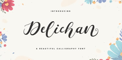 Introducing. Delichan: Beautiful and modern fonts that are so special to use in your projects. It is suitable for wedding invitation designs, social media posts, blogs, crafts, quotes etc. Features: Uppercase, Lowercase, Numeral, Punctuation, Multilingual, Ligature, Alternates & PUA Encoded. Thanks!
 - LCS Amsterdam by Mevstory Studio,
$25.00 LCS Amsterdam is a condensed sans-serif typeface, inspired by college sports and football (soccer) jerseys. Features both outline and regular solid fill versions. Perfect for titles and headlines, included are uppercase and lowercase letters, numbers, symbols and European language support.
 - Wondershine by Handpik,
$13.00 wondershine is elegant,beauty and smoothless serif display .This font is suitable for invitation cards, decorations, clothing products, greeting cards and others. This font also has uppercase, lowercase, numeric, puntuation and multilingual. and there are several ligature and stylistic alternate.
 - LD Buttercream by Illustration Ink,
$3.00LD Buttercream is such a great font...it mimics the look of a frosted remembrance on a birthday cake...but it's uses are so universal and fun, you'll find many ways to put this font to work in your clever creations! - Skammefy by Andreas Søren Johansen,
$69.00 Skammefy holds a detailed set of letters, that are intended to be both readable when small - and charismatic when large. Strong details of letters like e, a, g, f, y draws attention to headlines, signs or wherever it might be used.
 - Aventura by Sudtipos,
$59.00 Aventura is burlesquely round, stylishly seductive, eternally sugar-fixed, and loving to a fault. Plenty of stylistic alternates are included to heighten the mood or soften it. Either way you look at it, there's a lot of love in the air.
 - Tramp Steamer JNL by Jeff Levine,
$29.00Tramp Steamer JNL is a re-interpretation of an old metal typeface that's been around for years. This is a bit different from many of Jeff Levine's other stencil revival fonts, which are modeled from actual paper and metal stencil guides. - KlipJoint by Ingrimayne Type,
$14.95 KlipJoint is a novelty font in which all the characters are formed from paper clips. It does not have a true set of lower case letters, but in their place is a second and often different set of upper-case letters.
 - Black Isometric by Funk King,
$10.00 The Black Isometric Family is the progression of the Isometric series from funk_king. Currently two fonts that evoke science and engineering. These are full sets with 99 characters each. Designed for use as display type and for limited text use.
 - Propeller by Gleb Guralnyk,
$15.00 Introducing a script font named "Propeller". This font has a trendy look inspired by vintage aircraft ads. It has connected letters with smooth shape and round endings. Intersecting lines are made with a small overlay that gives a tiny volume effect.
 - Nottingham Stencil JNL by Jeff Levine,
$29.00 Nottingham Stencil JNL and its companion oblique version are the third set of fonts modeled from vintage lettering stencils made in England. These designs join British Stencil JNL and Trafalgar Stencil JNL in Jeff Levine's large library of stencil-themed typefaces.
 - Faqro Extended by ffeeaarr,
$9.00 Ditch the generic, embrace the expressive. In a world saturated with pixels and noise, your brand deserves to stand out. Our meticulously crafted digital tech fonts are more than just letters – they're the secret weapon to unlocking your brand's full potential
 - HU Blackout KR by Heummdesign,
$25.00 HU BlackoutKR is a typeface for titles that feels like letters are trapped in a square and has a constant and very narrow inner space. It is composed of three types of family typeface to increase usability. HU BlackoutKR includes Korean.
 - Plance by Hsan Fonts,
$16.00 Plance is a font for simplified logo design. The font is suitable for creating headlines, logos, text and advertising tags All alternate options for characters are included in each font. You can use the alternatives in most major photo editors.
 - Letoys by Zamjump,
$19.00 Letoys are inspired by 70s typography with a touch of psychedelic and retro vibes. This type is perfect for creating posters, magazine layouts, brand logos, sleeve covers, party flyers, quotes, or simply as a stylish text overlay on any background image.
 - Hvala by Etewut,
$35.00 Hvala is a display typeface based on slab serif. All european languages are included. 'Hvala' means praise. Remember it when you design your graphics using my font. It's a pure magic to express your respects or/and expect them back.
 - Anabelia by Rockboys Studio,
$23.00 The Anabelia is a handcrafted monoline font. It has a vintage and classic feel with an old, handmade look. Included in this download are various styles which gives you the opportunity to create unique designs, every time you use it!
