10,000 search results
(0.018 seconds)
- Began by Atlantic Fonts,
$26.00 Began is square and round, athletic and unapologetic. It may be just what you are looking for.
 - Fat Face No. 20 by Solotype,
$19.95This is almost a necessity if you are doing reproductions of mid-19th century posters and playbills. - NorB Chalk by NorFonts,
$28.00 NorB Chalk is a handwritten text font with an angled fat chalk style. You can use this font with any word processing program for text and display use, print and web projects, apps and ePub, comic books, graphic identities, branding, editorial, advertising, scrapbooking, cards and invitations and any casual lettering purpose… or even just for fun!
 - Styla Pro by URW Type Foundry,
$39.99 Styla is a refined romantic sans, in the best tradition of Didot and Bodoni. The combination between Styla’s feminine grace and sharp endings creates an air of seduction, ideal for magazines, ads and books on fashion, fine arts, philosophy, luxury goods, women and love. A typographic jewel, Styla brings romantic sensuality and refinement to the world of sans-serifs.
 - Breakiss by Dumadi,
$20.00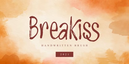 Breakiss – Handwritten Brush is a crafted font created with the app using the brush tool in a relaxed and freestyle. Breakiss is perfect for those of you who like to make craft designs, you will feel amazing when used for social media design, branding, advertising, product design, handwritten quotes, product packaging, posters, merchandise, and other designs.
 - Cajito by Rosario Nocera,
$19.99 Cajito is a font family with a medium contrast, developed for numerous uses, ranging from app to website and catalogue to corporate design especially for logo design, Cajito has ten alternative capitals and his terminal looks like the fins of a fish. Cajito font family consists of five weights from extra light to extra bold with matching italics.
 - White Risolles by pentagonistudio,
$19.00 White Risolles Is Clean Script Font Inspired By Handwritting Characters. Font Features : White Risolles OTF ( Open Type ) White Risolles WOFF ( Web Font ) SOFTWARE REQUIREMENTS : Fonts and alternate : No special software required they may be used in any basic program /website apps that allows standard fonts That's it folks! You can go ahead and get cracking :) Have a Good Day !
 - Nokio by TypeUnion,
$25.00 Nokio is a clean, minimalist Sans Serif typeface designed in 2013 by TypeUnion. Nokio uses clean lines and curves matched with smooth, rounded terminals to produce a structured typeface with a subtle playfulness. Nokio is made up of 5 weights, and is built for multiple uses, from digital applications such as Apps and Websites to logotypes and print applications.
 - Steel Grrrder Groove by ULGA Type,
$9.00 A single-weight display font, Steel Grrrder Groove is a constructivist inline stencil design best used in short display settings or as an introductory drop cap to grab attention. The design is sharp, angular and slightly condensed with a striking inline groove giving it an air of chiselled chunkiness. It’s groovy but in a slightly robotic way.
 - Bright Clones by Letterhend,
$17.00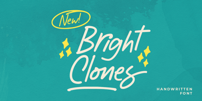 Introducing, Bright Clones! this handwritten font is perfect for branding, packaging, headline, title, etc. Features : uppercase & lowercase numbers and punctuation multilingual alternates and ligatures PUA encoded \We highly recommend using a program that supports OpenType features and Glyphs panels like many of Adobe apps and Corel Draw, so you can see and access all Glyph variations.
 - Qadar by Dumadi,
$18.00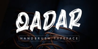 Qadar is an elegant looking brush font, created using the perfect brush app for any design project. very beautiful if used as a font for your branding media so that your design is very impressed with character. This font is perfect for collaboration with tumbler design, skateboard, web design, poster design, t-shirt design, and other designs.
 - Aesthetic Notes by Letterhend,
$19.00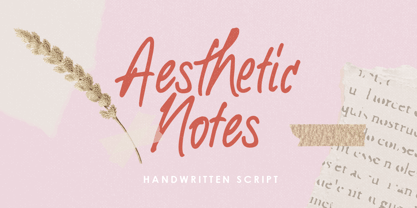 Introducing Aesthetic Notes! This font is perfect for branding, packaging, logotype, headline, wedding, invitation, quotes, etc. Features : uppercase & lowercase numbers and punctuation multilingual alternates and ligatures PUA encoded We highly recommend using a program that supports OpenType features and Glyphs panels like many of Adobe apps and Corel Draw, so you can see and access all Glyph variations.
 - Lambo by Wahyu and Sani Co.,
$19.00 Lambo is a contemporary italic calligraphy script designed to work together in harmony that makes it very suitable for your graphic design project. It is consists of 7 styles from thin to bold and comes with stylistic alternated. To get the most out of this font, be sure to use an apps that support OpenType features.
 - Polanix by Outerend,
$25.00 This unique geometric design will make your projects stand out from the crowd! If you're looking for a futuristic but with an edgy twist, "Polanix" could be the one. The interesting deformation of its variable version also works great with animation, game design and film/TV credits & titles as well as interface, app and web designs.
 - Heroe by Lián Types,
$37.00 DESCRIPTION Now my feelings about didones are more than evident. After some years of roman-abstinence (1) I present Heroe, an interesting combination of elegance and sensuality. Heroe, spanish for hero, takes some aspects of roman typefaces to the extreme like my main inspiration, the great Herb Lubalin, did in the majority of his works: Thins turned into hairlines, altered proportions (for display purposes), unique ball terminals, poetic curves and a graceful way of placing them together on a layout. Its classy style makes the font perfect for a wide range of uses. Imagine Heroe Inline (my favorite) dancing over a bottle of perfume; printed on the cover of a fashion magazine; lighting wedding invitations up. Its partner, Heroe Monoline, may help you to make more elaborated pieces of design. Just combine it with Heroe, or Heroe Inline and see how perfect they match. TECHNICAL The difference between Pro and Std styles is the quantity of glyphs. While Pro styles have all the decorative characters available, Standard ones have only the basic set of them. Heroe Monoline Big and Heroe Monoline Small were made for better printing purposes. If you need to print the font in small sizes, then your choice should be Small. Heroe Monoline has the same alternates (and open-type code) as Heroe Pro and Inline, plus some decorative ligatures. NOTES (1) After fonts like Breathe , Aire , and the award winning Reina , I started experimenting with scripts a little more. Erotica , Bird Script and Dream Script are examples of that.
 - Faya by Clevus,
$16.00 Proudly present Faya stencil modern ligature. Faya is a font designed with a modern stencil style that blends classic elements with elegant contemporary touches. Featuring ligatures that offer design flexibility, Faya is suitable for various graphic design needs, including posters, banners, logos, and more. Don't forget to use all caps too in your mixing and matching - it adds contrast and impact to your type design. Design tips! : Tighten your letterspacing for larger titles to create a range of looks. Crafted with meticulous attention to detail, Faya's letterforms are bold, sharp, and geometrically-shaped, catching the eye with their visually appealing design. The font boasts high clarity and legibility, offering a range of different letter variations such as elegant uppercase and lowercase letters. With its clean yet stylish appearance, Faya is perfect for modern and minimalist design applications. Font Features : Lettres, numbers, symbols, and punctuation, alternates and ligatures No special software required they may be used even in canva, any basic program /website apps that allows standard fonts That's it folks! Multilingual Support Language Support: Danish, English, Estonian, Filipino, Finnish, French, Friulian, Galician, German, Gusii, Indonesian, Irish, Italian, Luxembourgish, Norwegian Bokmål, Norwegian Nynorsk, Nyankole, Oromo, Portuguese, Romansh, Rombo, Spanish, Swedish, Swiss-German, Uzbek (Latin) Follow My Shop For Upcoming Updates Including Additional Glyphs And Language Support. And Please Message Me If You Want Your Language Included or If There Are Any Features or Glyph Requests, Feel Free to Send me A Message. Kindly check over on Instagram! https://www.instagram.com/clevustudio/ Have a Good Day !
 - Chordette for Guitar by Ukefarm,
$10.00 Description Chordette for Guitar Chord Fonts are tuned EADGBE. Create a guitar chord chart or chord sheets quickly and easily. Guitar Chord Fonts Chordette contains high quality guitar chord fonts. Each guitar chord is mapped to a specific key on the keyboard, so you can type out chords. It’s a lot easier than dealing with images to create a guitar chord chart or song sheet. It’s a favorite tool for teachers, music therapists, and musicians. What instruments are supported? Chordette for Guitar is tuned EADGBE and supports Guitar. Chordette is available in multiple tunings for most stringed instruments. Most versions of Chordette support multiple instruments. App / Instruments Supported / Tuning Chordette for Guitalele / Guitalele, Baritone Guitar / ADGCEA Chordette for Ukulele / Concert Ukulele, Banjolele / GCEA Chordette for Soprano Uke Soprano Ukulele ADF#B Chordette for Baritone Uke / Baritone Ukulele / DGBE Chordette for Mandolin / Mandolin, Irish Tenor Banjo, Irish Bouzouki / GDAE Chordette for Banjo / Banjo /gDGBD Chordette for Tenor Banjo / Tenor Banjo, Tenor Guitar, Mandola / CGDA Chordette for Guitar / Guitar / EADGBE Each version of the Chordette font uses the same chord sets and keyboard mappings. If you play multiple instruments, you can create a chord sheet for one, then use another Chordette font to transpose the song to another. For example, you can create a song for Mandolin, then instantly transpose it for Guitar and Ukulele - just by changing fonts! Chordette for Guitar is priced at $10, which includes the guitar chord font sets for both Mac and Windows. For help and support, please visit http://ukefarm.com/chordette/help.html
 - Anabella by RNS Fonts,
$33.00 Anabella is a typeface made for the Master’s Degree in Typography at the University of Buenos Aires. It is inspired by the posters of pizzerias located in Naples, Italy; in order to be used in the pizza franchise Giuseppe in Buenos Aires, Argentina. The font preserves and rescues gestural features of these posters, adding a vertical axis and high contrast, typical of the Italian types that arrived in the city product of the immigration. The stroke with brush provides a more organic quality to the sign and provides connotative features. The family has three variables for the different applications that may be required in a pizza place: Italic for bodies greater than 16 pt, Roman for short texts up to 14 pt, and Stencil for use in brands and titles. Anabella was selected to participate in the eighth typography biennial Tipos Latinos.
 - URW Geometric by URW Type Foundry,
$35.99 URW Geometric® is a sans serif typeface inspired by the German geometric typefaces of the 1920s but designed for modern usability. The character shapes have optimized proportions and an improved balance, the x-height is increased, ascenders and descenders are decreased. Special glyphs, which are often designed afterwards for the original geometric typefaces from the 1920s, are perfectly integrated in the URW Geometric® . These design characteristics increase the usability and legibility tremendously. With its 10 weights ranging from Thin to Black, plus 10 additional oblique styles, it has a great versatility in mind. The extreme light styles shine bright in large sizes, the middle weights are perfect for body copy and the bolder variants for the use of emphasis information or bring a strong impact to headlines and information. The optically balanced styles are designed to work in perfect harmony together. URW Geometric® is functional, strong, simple and harmonized in form, and at a glance appears as a modern variant of its predecessors. Apart from the basic characters the design has an extra focus on the special glyphs. These are designed for todays needs. For example: the email glyph looks modern and unique, including a perfectly balanced spacing. The numero sign, in modern use called “hashtag”, is space saving and optically balanced for body text. Additionally, various extra and alternate glyphs are designed to provide a friendly usability. Including a wide Latin language support and character sets, URW Geometric® is perfectly designed for today’s requirements. Please have a look at the URW Geometric® Type Specimen (PDF) for further information.
 - Woozee by Gerald Gallo,
$20.00 Woozee is a serif font with characters that appear to be wobbly and are not clean and crisp.
 - Easy Fleurons by Intellecta Design,
$18.95 Easy Fleurons are highly decorative yet generic enough to add very interesting detail to just about any design.
 - GothBlocks by Dingbatcave,
$10.00Great for making all sorts of tiling backgrounds, borders and edging, the numbers of different possibilities are limitless. - CA 12c13c by Cape Arcona Type Foundry,
$28.00 CA 12C13C was designed by sticking letters together with tape. Use it when right angles are strictly forbidden!
 - Rhomus by Typotheticals,
$4.00A Blocky face with a slight hint of angularity. The Omnilots are a free addition to the set. - WaterWorksCaps by Ingrimayne Type,
$12.95 In WaterWorks the letters are formed from pipes. Its origins were in a specialized font for constructing mazes.
 - Fatty Pantz by Ingrimayne Type,
$5.00 FattyPans is a strange, bizarre font with spiky serifs that bulges where letters are not supposed to bulge.
 - Hyperspit by PizzaDude.dk,
$20.00Hyperspit is really the CAPS of my other font Family Cat. They are just messed up pretty good! - Clarendon Extra Condensed by Wooden Type Fonts,
$25.00 Another variation of the many Clarendons created in the 19th century and there are probably more out there.
 - Carattere by TypeSETit,
$24.95 This beautiful italic style is perfect for invitations and other uses where formal elegance and beauty are essential.
 - Ah, PonsonbyNF by the illustrious Nick Curtis, a font that captures the essence of a bygone era with a modern twist. Picture this: an adventurous soul from the early 20th century, sporting a dapper m...
- Haboro by insigne,
$- Haboro is a powerful workhorse. It’s a neoclassical font developed for numerous uses, ranging from editorial and corporate to web pages and apps. This new face from insigne Design takes a modern twist on the high-contrast typeface genre known as the Didone. Recognized for their ability to convey clarity, the geometric simplification of the Didone genre adds a level-headed rationality to whichever work it’s applied. Didones are used to lend style and sophistication to a wide number of applications—everything from style or cosmetic labels to annual reports. With its unique take on this classic genre, Haboro—with its slight wedge-shaped serifs and unique terminals—is still defined by elegance, tradition and timelessness. Even more to its versatility, this multi-purpose text face features whimsical terminals, which liven up even the most serious texts. If you desire, you can also opt for the more usual ball terminals by activating OpenType alternates. The Haboro family consists of seven weights from a Thin to a Black along with matching italics. The contrast from the letters’ thick strokes and thin strokes draws the eye to your design, making Haboro a powerful visual tool for communicating your message. The typeface also contains numerous ligatures and alternates. Choose between serif variants such as ball terminals or standard serifs by utilizing OpenType alternates. We recommend using the default contextual alternates and discretionary ligatures in order to benefit from all members of this fantastic font family. In addition, Haboro has a sizable set of option glyphs and numerous other OpenType variables to give your text the unique touches it needs. Haboro has all of the attributes you need to undertake your next project. Use its modified elegance to shape and mold your next design, whether a web site, app, branding package, or magazine. You’ll find there’s no job Haboro can’t take on.
 - Lubaline by Lián Types,
$39.00 Who haven't heard the phrase that ‘any past time was better’?. Although I sometimes find this phrase a little too pessimistic (because I try to think that the best is yet to come), it may be true regarding my passion, typography. I'm too young (29) unfortunately, and this means I did not have the pleasure of being contemporary with maybe the man who has influenced my work the most (1). The man that showed that letters are more than just letters to be read. Herb Lubalin (1918-1981), also called sometimes as ‘the rule basher’ (2), smashed the taboos and sacred rules of type design and gave it personality. He rejected the functionalist philosophy of europeans in favor of an eclectic and exuberant style. To him, letters were not merely vessels of form, they were objects of meaning. (3). Nowadays, when looking at his portfolio, who dares to deny that the term ‘typography’ and ‘beauty’ may go hand-in-hand without any problem? Ed Benguiat, one of Herb’s partners, still likes making jokes with the phrase “screw legibility, type should be beautiful” and what I understand of this is not to forget the rules, but to know and break them carefully. In an era of pure eclecticism, we, the lovers of flourishes and swashes, can't do nothing but admire all the legacy that Lubalin, this wonderful type-guru, left. My font Lubaline read as “the line of Lubalin” is my humble tribute to him. Those who know his work, may see the influences easily like in his ‘Beards’ (1976) and ‘The Sound of Music’ (1965) posters; the art-deco forms in many of his amazing logos and practically in all his creations where letters seem to be alive just like you and me. I really hope that the future finds me still learning more and more about type-design and letterforms, and like him, always willing to make innovations in my field: Because letters are not just letters to be read. NOTES (1) These are some of my fonts in which some of Lubalin’s influences can be seen (in order of creation): Reina, Aire, Erotica, String, Beatle, Heroe, Selfie, Model, Seventies, and many others that are still in progress. (2) (3) Steven Heller. Herb Lubalin: Rule Basher. U&lc (1998) http://www.printmag.com/imprint/my-favorite-lubalin/
 - But by Nicole Fally,
$40.00 Bold, black and square. But was first drawn as a logotype for the magazine "BUT – Bilder und Texte" (pictures and texts) which was published by an experimentally-oriented non-commercial initiative. In consideration of the unusual dimensions of the magazine (6 x 14 cm / 2,4 x 5,5 inch), I decided to fill as much space as possible with the body of type. This formal idea refers to the meaning of the title by blurring the border between legible letters and abstract shapes. Because of its origin, But is ideal for short messages in headline point size. Despite its blocky shapes, But creates a friendly atmosphere. The details are as playful as the restrictions that are given by the concept allow them to be. Punctuation marks and other special characters contrast the boldness of the design since they are matching the thin parts of upper- and lowercase letters. This also avoids gaps when longer texts are set. But is available in open type format and has an extended character set (Latin extended A). Two sets of numerals, one matching the x-height and another one matching the cap-height, are provided.
 - Senkron by Gurup Stüdyo,
$19.00 Senkron is composed of "normal" and a "blok" styles. Senkron ("normal") was designed as a pure and modern neo grotesk font. The anatomy of the letters are designed to achieve an equal text color. For this purpose, the legs of the letters “R” and "K" are designed with a vertical angle to prevent the white space that would occur in the middle of these letters. In the minuscule, the characteristic features of letters such as ‘a’, ‘l’, ‘t’ are concretized and legibility is supported in the text. Considerable attention has been paid to the harmony between the anatomical structures of the letters and the diacritical mark’s structure. Senkron Blok is arranged for situations which have diacritical marks overflow to leadings of the headline and headline typographical color is affected negatively from this situation. For this purpose, majuscule diacritical letters are resolved within the letter height. However, when this is done, new forms are obtained by integrated diacritical marks with letters instead of directly merging them. The idea behind this approach is to preserve the typographic value of diacritical marks and emphasize the semantic value of diacritical letters. 82 letters have been redesigned in this way.
 - Fulgate by Flavortype,
$15.00 “Luxury in simplicity”. A Family of Luxury Fonts called Fulgate. A Hype of summer themed bring us to expressing a thirsty of creating a product that can help you to choosing a fonts to your creations. Like as we are on the preview above, how the fonts can "stands" within your design. Since Fulgate are created on a 6 weight from Thin, Light, Regular, Medium, Semibold, Bold. You won’t be worried which one to fit to your creative design. Also, You can Mix it up all of it without worrying design collision. Fulgate also comes with opentype features. The one was stand out was Capital Swash, it’s replacing the First letter that typed on Capital. even if you are type with all caps, it still stand out. If you think that all caps are not quite fit, write on with lowercase and turn on the features of Small Caps, a shape of capital but with lower heights. Lowercase also have a few make up with Alternate Characters, just to be noted, not all lowercase characters have an alternates, to keep a luxury feel and avoiding messy. The last are a feature on the numerical, Ordinals, Subscript, Superscript, and Fraction.
 - Lovingly Friends by My Creative Land,
$35.00 Introducing “Lovingly Friends” - a community of fonts that get along together as good as best friends do. All of the fonts - Sans, Serif, Notes, Script and Extras are packed with stylistic alternates and ligatures, you can combine them the way you like - they will look balanced together as well as individually. Script and Engraved fonts also have a Shadow style - to add more personality to your designs. You can download the Specimen & Instructions pdf here http://bit.ly/2x975US Since the Christmas is not that far away (time flies!), the Extras font has a set of Winter Holidays elements - so you could create and send your best wishes to your friends in no time. While all the fonts are fully unicode mapped so you can use them in ANY application, they are still best used in an OpenType aware application. If the application you are using doesn’t support OpenType features, you can use Character Map (Windows) or Font Book (Mac) to select the glyphs you need. Hope you enjoy the fonts as much as I enjoyed creating them! P.S. The flowers used in the preview images are from Liza Glanz 4 in 1 Elegant Watercolor Collection https://crmrkt.com/do4Wpb
 - Marujo by PintassilgoPrints,
$15.00 Marujo is a highly decorative typeface inspired by painted pieces of Arthur Bispo do Rosário, a striking Brazilian artist who lived for 50 years in a psychiatric institution. Besides its spirited Regular and Light cuts, Marujo family brings nifty eye-catching variations adorned with dots and stripes. It also brings complementary fonts to spice things up even more: there are 2 shadow options and yet a picture font packed with doodles, mostly on nautical subjects (which are strongly present on Bispo do Rosário, a former seaman apprentice.) Bispo do Rosário's works employs a multitude of materials and are often very intricate. Words are everywhere, painted or embroidered at most. He produced a vast amount of works, and is now - posthumously - widely recognized in Brazilian art scene. The psychiatric institution in which he lived is now a museum dedicated exclusively to his work. Marujo draws inspiration not only from Bispo's works, but also from this man's potency, a persistent man who produced amazing art locked in such a tough environment for a life-long. Marujo fonts are positively adventurous and will safely navigate through a sea of feelings, reaching free spirits everywhere. To navigate is precise...
 - Quijote Sauvage by Lián Types,
$45.00 It was in the beginning of 2008 when I designed a font named Quijote, its predecessor. In the middle of 2009, I looked at it again and thought it could be a good idea to make an update of it. Variables and Features: Quijote Sauvage Pro is the most complete variable. It includes all the ligatures, alternates and swashes. It has the OpenType function in order to alternate glyphs easily when running applications which support this. The font is also offered separately. Quijote Sauvage Standard has the right glyphs to get an equilibrium between wildness and softness. It includes standard and discretionary ligatures. Quijote Sauvage Stylistic has the sharpest glyphs. Its decorative traces are discreet in order not to have problems as regards legibility. Its upper case are less wild than the other variables. Quijote Sauvage Text is the most discreet of its partners. This one was thought in order to improve legibility. Its ascenders and descenders are shorter, so the words are easier to read in small sizes. Quijote Sauvage Contextual, Swash and Titling, are the ones with wonderful terminals. They decorate words, adding a wonderful look of wildness or passion.
 - Lougra by Creativemedialab,
$22.00 Monograms or connected letters are very popular; apart from looking elegant, the monogram will also present an impression that sticks in the eyes of the audience. Lougra has more than 100 monograms or ligatures, making designing an initial or logo easier. Lougra is elegant and minimal modern sans serif. It has three contrast options which are display, regular and text.
 - FeggoliteKeyed by Ingrimayne Type,
$9.00 FeggoliteKeyed has letters on rounded rectangles with shadows. The letter shapes are from a decorative, monospaced font called FeggoliteMono. The typeface contains characters that will add color to letters. There are two ways to do this. One uses layers and the other a combination of characters, some with zero-width. A file in the gallery explains the ways that this can be done.