10,000 search results
(0.046 seconds)
- P22 Amelia Jayne by IHOF,
$39.95Amelia Jayne is Ted Staunton's updated revision and expansion of his own Amelia decorative cap font. Amelia Jayne started as a Roman font to accompany the Amelia initials but has taken on a new life as a Pro Roman font with small caps and several variations of new matching initial companion fonts. (The initials are not included in the pro font but come bundled with the set.) - Neue Frutiger Paneuropean by Linotype,
$79.00During planning for the new Roissy Charles de Gaulle airport in Paris at the beginning of the 1970s, it was determined that the airport's signage system had to include the clearest and most legible lettering possible. The development of all signage was put into the hands of Adrian Frutiger and his studio. The team carried out their task so effectively that a huge demand for their typeface soon arose from customers who wanted to employ it in other signage systems, and in printed materials as well. The Frutiger® typeface not only established new standards for signage, but also for a range of other areas in which a clear and legible design would be required, especially for small point sizes and bread-and-butter type. The typeface family that which emerged as a result of this demand was added into the Linotype library as "Frutiger" in 1977. Frutiger Next, created in 1999, is a further development of Frutiger, not necessarily a rethinking of the design itself. It was based on a new concept, the most obvious visual characteristics of which is the larger x-height, as well as a more pronounced ascender height and descender depth for lower case letters in relation to capitals. This new design created a balanced image and included considerably narrower letterspacing. Frutiger Next meets the demand for a space-saving, modern humanist sans. 2009's Neue Frutiger is a rethink of the 1977 Frutiger family, now revised and improved by Akira Kobayashi in close collaboration with Adrian Frutiger. Despite the various changes, this "New Frutiger" still fits perfectly with the original Frutiger family, and serves to harmoniously enhance the weights and styles already in existence. The perfect mix, guaranteed Neue Frutiger has the same character height as Frutiger. As a result of this, already existing Frutiger styles can be mixed with Neue Frutiger where necessary. Likewise, Neue Frutiger is perfect for use alongside Frutiger Serif. Newly added are the "Neue Frutiger 1450" weights. Especially for the requirements of the newly released German DIN 1450 norm we have built together with Adrian Frutiger specific weights of the Neue Frutiger. The lowercase l" is curved at the baseline to better differentiate between the cap "I", additionally the number "0" has a dot inside to better differentiate between the cap "O", and the number "1" is now a serifed 1. The font contains additionally the origin letterforms from the regular Neue Frutiger font which can be accessed through an Opentype feature." - Neue Frutiger Cyrillic by Linotype,
$89.00During planning for the new Roissy Charles de Gaulle airport in Paris at the beginning of the 1970s, it was determined that the airport's signage system had to include the clearest and most legible lettering possible. The development of all signage was put into the hands of Adrian Frutiger and his studio. The team carried out their task so effectively that a huge demand for their typeface soon arose from customers who wanted to employ it in other signage systems, and in printed materials as well. The Frutiger® typeface not only established new standards for signage, but also for a range of other areas in which a clear and legible design would be required, especially for small point sizes and bread-and-butter type. The typeface family that which emerged as a result of this demand was added into the Linotype library as "Frutiger" in 1977. Frutiger Next, created in 1999, is a further development of Frutiger, not necessarily a rethinking of the design itself. It was based on a new concept, the most obvious visual characteristics of which is the larger x-height, as well as a more pronounced ascender height and descender depth for lower case letters in relation to capitals. This new design created a balanced image and included considerably narrower letterspacing. Frutiger Next meets the demand for a space-saving, modern humanist sans. 2009's Neue Frutiger is a rethink of the 1977 Frutiger family, now revised and improved by Akira Kobayashi in close collaboration with Adrian Frutiger. Despite the various changes, this "New Frutiger" still fits perfectly with the original Frutiger family, and serves to harmoniously enhance the weights and styles already in existence. The perfect mix, guaranteed Neue Frutiger has the same character height as Frutiger. As a result of this, already existing Frutiger styles can be mixed with Neue Frutiger where necessary. Likewise, Neue Frutiger is perfect for use alongside Frutiger Serif. Newly added are the "Neue Frutiger 1450" weights. Especially for the requirements of the newly released German DIN 1450 norm we have built together with Adrian Frutiger specific weights of the Neue Frutiger. The lowercase l" is curved at the baseline to better differentiate between the cap "I", additionally the number "0" has a dot inside to better differentiate between the cap "O", and the number "1" is now a serifed 1. The font contains additionally the origin letterforms from the regular Neue Frutiger font which can be accessed through an Opentype feature." - Neue Frutiger 1450 by Linotype,
$71.99 During planning for the new Roissy Charles de Gaulle airport in Paris at the beginning of the 1970s, it was determined that the airport's signage system had to include the clearest and most legible lettering possible. The development of all signage was put into the hands of Adrian Frutiger and his studio. The team carried out their task so effectively that a huge demand for their typeface soon arose from customers who wanted to employ it in other signage systems, and in printed materials as well. The Frutiger® typeface not only established new standards for signage, but also for a range of other areas in which a clear and legible design would be required, especially for small point sizes and bread-and-butter type. The typeface family that which emerged as a result of this demand was added into the Linotype library as "Frutiger" in 1977. Frutiger Next, created in 1999, is a further development of Frutiger, not necessarily a rethinking of the design itself. It was based on a new concept, the most obvious visual characteristics of which is the larger x-height, as well as a more pronounced ascender height and descender depth for lower case letters in relation to capitals. This new design created a balanced image and included considerably narrower letterspacing. Frutiger Next meets the demand for a space-saving, modern humanist sans. 2009's Neue Frutiger is a rethink of the 1977 Frutiger family, now revised and improved by Akira Kobayashi in close collaboration with Adrian Frutiger. Despite the various changes, this "New Frutiger" still fits perfectly with the original Frutiger family, and serves to harmoniously enhance the weights and styles already in existence. The perfect mix, guaranteed Neue Frutiger has the same character height as Frutiger. As a result of this, already existing Frutiger styles can be mixed with Neue Frutiger where necessary. Likewise, Neue Frutiger is perfect for use alongside Frutiger Serif. Newly added are the "Neue Frutiger 1450" weights. Especially for the requirements of the newly released German DIN 1450 norm we have built together with Adrian Frutiger specific weights of the Neue Frutiger. The lowercase l" is curved at the baseline to better differentiate between the cap "I", additionally the number "0" has a dot inside to better differentiate between the cap "O", and the number "1" is now a serifed 1. The font contains additionally the origin letterforms from the regular Neue Frutiger font which can be accessed through an Opentype feature."
 - Sachiko - Personal use only

- Comply Slab by Arkitype,
$12.00 Comply Slab is inspired by action and extreme sports, Comply gets it's name from the well known skate trick the “No Comply”. This type family doesn't mess about! With 9 weights from thin to black, Comply Slab will give you some great options to use. This font family will “kill it” in both print and digital, in headlines for editorial, posters, banners, websites, apparel, packaging, logos or magazines just to name a few. If you want to make a statement that gets the message across in a slick way with some cool looking glyphs Comply Slab is the font! There is an alternate R and S so you can choose to go with the cool default sharp glyphs or swap them for a more traditional chamfered corner version. Each of the 9 weights has an italic version to add even more action.
 - Atto Sans by Wilton Foundry,
$29.00I set out to design a contemporary font that is condensed with thick and thin strokes. The highly structured forms of this condensed font was made more interesting and softer by giving it a slightly calligraphic tone and by adding round corners. Atto's express purpose is to be both utilitarian, compact and technical but with a friendly face. The name "atto" was adopted since it refers to the measurement of "smallness" or detail. You will no doubt discover all the many pleasant nuances within Atto. Adopted in 1964, "atto" comes from the Danish "atten", meaning eighteen. Atto - (symbol a) a SI prefix to an unit and means that it is 10 to the power- 18 times this unit. Examples are one attosecond or one attometer/attometre. Atto is available in for Mac and Windows in Postscript, Truetype and Opentype. - Sedona by Jeff Kahn,
$29.00 Sedona is a quirky, all capitals, display font that evokes the American West, Native Americana, vacations, travel, campgrounds, rustic lodges, needle point, Christmas, holidays, Arts and Crafts movement, quilts, tiles, and alpine resorts. It is based on an isometric grid and individual shapes that conform to the grid's structure. Each letter or glyph is made up of numerous triangular shapes. The letters have gaps of space that create a dynamic texture. Our mind connects the triangles to complete the letter and recognize the familiar letterform. Sedona will create a unique identity for book cover titles, editorial headings, packaging, logotypes and signs. Create multicolored letters by selecting individual shapes within each letter and apply various colors. Simply convert type in Adobe Illustrator or InDesign with these two steps: 1. "Creating Outlines", 2. "Release Compound Path". You may also want to "Ungroup" the letters. Great care was taken to align the shapes perfectly. There are no overlapping or misaligned shapes. Sedona includes punctuation, numerals, and basic math glyphs.You will find some additional and alternate glyphs in the "Glyph Palette". Sedona does not include a lowercase or diacritics for foreign languages. You may type in lowercase but the letters will appear as uppercase.
 - Innova by Durotype,
$49.00 Innova. A new grotesque for the 21st century. More open. More squarish. More legible. After the many grotesques which have been designed over the years, is it still possible to improve this genre? Innova is a new design — a contribution to the tradition of grotesque typefaces. It is an attempt to improve both this genre’s legibility and versatility. Innova consists of two families: Innova and Innova Alt. The Innova family has rectangular dots. The Innova Alt family has round dots — making its personality a little friendlier. Innova is well suited for both text and display use — for graphic design, corporate identity design, magazines, newspapers, books, reports, editorials, web, advertising, signage, etc. Innova includes 16 uprights and 16 matching italics. It includes small caps, arbitrary fractions, and extensive language support. It includes nine numerical styles: lining and oldstyle figures (proportional and tabular), small cap figures, superiors, inferiors, numerators, and denominators. Innova embodies the renewal needed for the traditional grotesques. It is a grotesque which is fit for the 21st century. In order to see whether you agree with this, please try the free Innova Alt Demi. For more information about Innova, download the PDF Specimen Manual.
 - Automobile Contest by Asd Studio,
$15.00 Introducing the new font Automobile Contest - Handbrush, the new version of Qillsey Einstein Font, a type of script that has a natural scratch texture. I made by using a brush pen that makes the impression seem natural. My font is complete with two StylisticSet which will make the writing more beautiful and charming. This typeface is suitable for use in a variety of design fields, such as event advertisements, product promotions, book titles, activity titles, logos, adventure, and others. This font can when paired with serif font types will make your design project more beautiful and perfect. I highly recommend using a program that supports OpenType featuresand Glyphs panels such as Adobe Illustrator, Adobe Photoshop CC, Adobe InDesign, or CorelDraw, so you can see and access all Glyph variations. This font is encoded with Unicode PUA, which allows full access toall additional characters without having special design software. Mac users can use Font Book, and Windows users can use Character Map to view and copy one of the extra characters to paste into your favorite text editor / application. I hope you enjoy the font, thank you.
 - Arapix by Anatoletype,
$69.00 Arapix is a 12 pixel high multilingual Latin-Arabic pixel font with incredible capabilities. The Arapix is an almost traditional Naskh. It is elegant and easy to read even in very small sizes. It includes almost every feature you would expect from a high range Naskh font. Its humanistic look and feel fit perfectly to its Latin counterpart. Arapix was originally designed for a web project that didn't see the light a few years back. It started with the idea of fitting both Latin and Arabic into a 12 pixel vertical grid. The latin glyphs fit properly within the vertical limits, but when it came to the arabic glyphs, it proved to be more challenging. Arabic letters with lower diacritic dots like the (Yeh-fina) or letters with accents above like the (Alef-Hamza-above) need much more space than any Latin letter. Add to this the fact that accents needs to be positioned above and below the glyphs. It is technically impossible to fit a (Yeh-fina-kasratan) or a (Alef-Hamza-above-shadda-damma) into 12 pixels. Initially the accents were dropped and not included in the design. Although it seemed impossible at the start, Sylvain found a solution in the end, including as many contextual alternates and contextual kerning as needed to avoid every collision between letters and diacritics, letters and accents, and diacritics and accents. The contextual kerning was added to achieve an even letter and word spacing in longer text. Arapix is amazingly legible in small size on screen and in print. On the other hand, it also works perfectly as display titling font due to its unique and contemporary pixel approach. It can be used for screens with very low resolution as well as for high resolution screens and prints. The new Arapix comes with various new features and new glyphs including Persian and Urdu letters, stylistic set, old style figures, contextual kerning, contextual alternates and a few icons too. Enjoy the new Arapix and have fun with it.
 - Jackrabbit's Bar & Grill - Unknown license

- Story of Alundra by Typefactory,
$14.00 Story of Alundra is a handmade brush display font. It has cute yet cheerful feel. No matter the topic, this font will be an incredibly asset to your fonts’ library, as it has the potential to elevate any creation.
 - Halena by Sakha Design,
$12.00 Halena is a modern and adaptable sans serif font. Suitable to a wide variety of designs due to its neat and simple style, this font has the potential to become your favorite go-to font, no matter the occasion!
 - Story Element by Ali Hamidi,
$10.00 Story Element is a friendly, simple, and fun display font. Whether you’re using it for crafts, digital design, presentations, or making greeting cards, this font has the potential to become your favorite go-to font, no matter the occasion!
 - Qareluna by Typebae,
$12.00 Qareluna is a beautiful and elegant sans serif font. Suitable to a wide variety of designs due to its neat and simple style, this font has the potential to become your favorite go-to font, no matter the occasion!
 - Dino Dingbats by Beewest Studio,
$10.00 Dino Dingbats Font is cute and adorable Dinosaurus dingbats font. Whether you’re using it for crafts, digital design, presentations, or making greeting cards, this font has the potential to become your favorite go-to font, no matter the occasion!.
 - Hearthaliso by Maulana Creative,
$13.00 Hearthaliso is a fancy flourish script font. With thin high contrast stroke, fun character with a bit of ligatures and alternates. To give you an extra creative work. Hearthaliso font support multilingual more than 100+ language. This font is good for logo design, Social media, Movie Titles, Books Titles, a short text even a long text letter and good for your secondary text font with sans or serif. Make a stunning work with Hearthaliso font. Cheers, Maulana Creative
 - Blowfisher by Maulana Creative,
$11.00 Blowfisher is a signature script font it's thin monoline and clean stroke with fun character. It has Opentype features ligature rich to give you an extra creative work. Blowfisher signature support multilingual more than 100+ language. This font is good for logo design, Social media, Movie Titles, Books Titles, a short text even a long text letter and good for your secondary text font with sans or serif. Make a stunning work with Blowfisher signature font. Cheers, MaulanaCreative
 - Dailytrust by Maulana Creative,
$14.00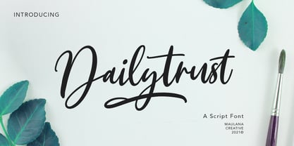 Dailytrust is casual signature font, with feminine thin stroke, super slanted and fun character. It has Opentype features ligatures of character, To give you an extra creative work. Dailytrust font support multilingual more than 100+ language. This font is good for logo design, Social media, Movie Titles, Books Titles, a short text even a long text letter and good for your secondary text font with sans or serif. Make a stunning work with Dailytrust font. Cheers, MaulanaCreative
 - Mc Havoks by Maulana Creative,
$14.00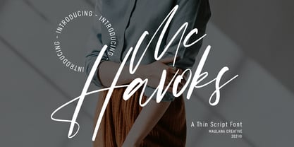 Mc Havoks is a super casual signature font. With thin stroke, slanted, unique and fun character with a bit of ligatures. To give you an extra creative work. Mc Havoks font support multilingual more than 100+ language. This font is good for logo design, Social media, Movie Titles, Books Titles, a short text even a long text letter and good for your secondary text font with sans or serif. Make a stunning work with Mc Havoks font. Cheers, MaulanaCreative
 - Konstanhigh by Maulana Creative,
$11.00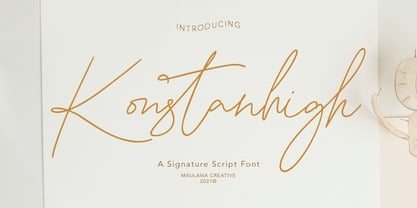 Konstanhigh is signature script font, with thin mono-line stroke, super slanted and fun character. It has Opentype features ligatures of character, To give you an extra creative work. Konstanhigh font support multilingual more than 100+ language. This font is good for logo design, Social media, Movie Titles, Books Titles, a short text even a long text letter and good for your secondary text font with sans or serif. Make a stunning work with Konstanhigh font.
 - Norlandy by Maulana Creative,
$22.00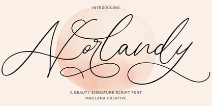 Norlandy is a beauty signature script font. With thin tall contrast stroke, fun character with a bit of ligatures and stylistic alternates. To give you an extra creative work. Norlandy font support multilingual more than 100+ language. This font is good for logo design, Social media, Movie Titles, Books Titles, a short text even a long text letter and good for your secondary text font with sans or serif. Make a stunning work with Norlandy font. Cheers, Maulana Creative
 - Nickjones by Maulana Creative,
$14.00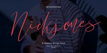 Nickjones is feminine script font, with clean thin contrast stroke, super slanted and fun character. It has Opentype features ligatures of character, To give you an extra creative work. Nickjones font support multilingual more than 100+ language. This font is good for logo design, Social media, Movie Titles, Books Titles, a short text even a long text letter and good for your secondary text font with sans or serif. Make a stunning work with Nickjones font. Cheers, MaulanaCreative
 - Sportage by Burntilldead,
$10.00 Sportage is a sports font family from thin to extra bold. The Italic styles bring another vibe of speed. This family is built for people who are enthusiasts with racing, workouts, and other athletic activities. Its shape is rooted in the the competitive sports spirit. The Idea is to bring the dynamic shape mixed with weight , elevating athletic performance through progressive innovation of font, so whenever people see the font they think of hard work and sports.
 - Anestacilla by Maulana Creative,
$11.00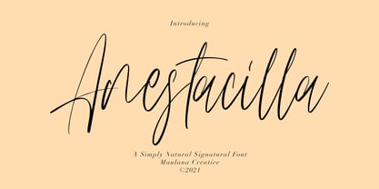 Anestacilla is girly signature font, with clean thin contrast stroke, slanted, condensed and fun character. It has Opentype features ligatures of character, To give you an extra creative work. Anestacilla font support multilingual more than 100+ language. This font is good for logo design, Social media, Movie Titles, Books Titles, a short text even a long text letter and good for your secondary text font with sans or serif. Make a stunning work with Anestacilla font.
 - Mondayslove by Maulana Creative,
$11.00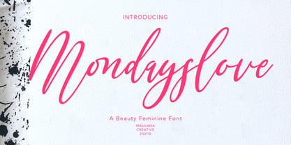 Mondayslove is casual signature font, with feminine thin stroke, super slanted and fun character. It has Opentype features ligatures of character, To give you an extra creative work. Mondayslove font support multilingual more than 100+ language. This font is good for logo design, Social media, Movie Titles, Books Titles, a short text even a long text letter and good for your secondary text font with sans or serif. Make a stunning work with Mondayslove font. Cheers, MaulanaCreative
 - Silvia Norlin by Maulana Creative,
$14.00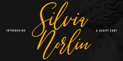 Silvia Norlin is a beauty signature script font. With thin contrast stroke, slanted and fun character with a bit of ligatures. To give you an extra creative work. Silvia Norlin font support multilingual more than 100+ language. This font is good for logo design, Social media, Movie Titles, Books Titles, a short text even a long text letter and good for your secondary text font with sans or serif. Make a stunning work with Silvia Norlin font. Cheers, MaulanaCreative
 - Tiffanka by Maulana Creative,
$11.00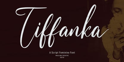 Tiffanka is a Modern Script font. With thin contrast stroke, fun character with a bit of ligatures and lowercase alternate. To give you an extra creative work. Tiffanka font support multilingual more than 100+ language. This font is good for logo design, Social media, Movie Titles, Books Titles, a short text even a long text letter and good for your secondary text font with sans or serif. Make a stunning work with Tiffanka font. Cheers, MaulanaCreative
 - Zapatos by Maulana Creative,
$11.00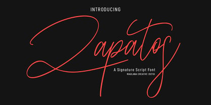 Zapatos is a fancy feminine script font. With thin stroke, super slanted and Unique Upper and lower character with a bit of ligatures. To give you an extra creative work. Zapatos font support multilingual more than 100+ language. This font is good for logo design, Social media, Movie Titles, Books Titles, a short text even a long text letter and good for your secondary text font with sans or serif. Make a stunning work with Zapatos font. Cheers, MaulanaCreative
 - Grandheron Sans by André Simard,
$11.99 If you are looking for a font with very good readability, even with its square appearance and condensed design, Grandheron is for you. You should find attractive the design of some glyphs like those one: a,f,k,l,v,y and also AJKMNVXY to name a few. Grandheron could be use as well in small size as in huge size. You will certainly like its Thin or Light font which give an awsome effect for titles, subtitles, caption for magazines related to fashion, architecture or even cultural in general. You could easily mix Grandheron with serif typeface as Harfang Pro. There is no limit to create great designs with this large typeface family, so enjoy!
 - Melania by Letterhend,
$12.00 Melania is a script font that is created by natural hand writing and gives you the feminine touch that you've been looking for. The irregular spacing brings the personal and unique feels which is very suitable for signatures, wedding invitations, fashions, headlines, quotes, and more. It also comes in uppercase, lowercase, punctuations, symbols & numerals, stylistic set alternates, ligatures, and more, as well as including multi-lingual support. This font have 2 styles: Script and Monoline. The Script version gives you feel the brush stroke with thin and thick. The Monoline version gives you the consistency feel on every stroke, so it only has one weight from start to end, no weight difference.
 - PF Fuel Pro by Parachute,
$79.00 This typeface was inspired by the rough surroundings of a modern city and reflects the contradicting nature of an emerging global youth culture. Ever since its first release—back in late 1999— it is constantly on our ‘most wanted’ list and has been part of numerous product campaigns. Music, mobile telephony, food and beverages, politics, you name it. Coca-Cola used it, José Cuervo used it for about 3 years. The new ‘Pro’ version goes one step ahead. You may now capture the essence of the younger generation in every major European language. PF Fuel has been extended with the full array of Cyrillic characters as well as matching frames for this extra stamped look. Furthermore there more alternate characters than ever. Create a custom look, when same characters sit close, or one next to the other. You may find these useful—alternate characters either in the lowercase positions, or access them through the ‘stylistic alternates’ OpenType Pro feature. If you need some extra fuel, this is where to get it!
 - Galvantur Grand by Ivangard Studios,
$10.00 Galvantur Grand is an uppercase-only display font, intended to be used for attention demanding titles and headers, or generally any form of text that needs to take center stage. An offshoot of the Galvantur font, Galvantur Grand takes things one step further towards the extreme, to really give your design projects that special flair. Characterized by the double lines and negative space between them, this powerful font can make any form of text stand out strongly. The multiple styles included can further help customize your designs and projects, to get the perfect feeling you're going for. Comes in 7 different styles - Regular, Oblique, Light, Light Oblique, Outlines, Light Outlines and Oblique Outlines. To get an idea of the various styles, please check out the images or use the preview field to type in text. Galvantur Grand supports Latin and Cyrillic based languages. IMPORTANT: This is an uppercase-only font. Typing out lowercase characters will look exactly like typing out uppercase ones. Furthermore, it is recommended that this font is used with bigger sized text.
 - Historic Warehouse by Just My Type,
$25.00 Gotta tell ya: think out of the box and this font is addictingly fun to use! Introducing Historic Warehouse, a substantial, yet elegant family, invoking advertising fonts of the early 20th century. Why the name? When asked to design a banner for Tucson’s Historic Warehouse District, I couldn’t find the look I wanted from any known fonts. After drawing what I wanted in Illustrator, there were three (and in the process, four) fonts just waiting to be realized. Happy to oblige. Here’s Historic Warehouse Regular, setting the stage. It’s sturdy, bold, and plays curves against rounded angular shapes. To its left is Historic Warehouse Condensed, trim, elegant and at its best at very large sizes; to the right is Historic Warehouse Wide, with charming style and presence. Finally, there’s Historic Warehouse Extended, extravagant in its proportions, with a beautifully-crafted form like a fine carriage. As the song says, “Everything Old Is New Again,” and this family looks as fresh and clean at the beginning of this century as it might have at the beginning of the last.
 - TELETYPE 1945-1985 - Unknown license

- VIDEO - Unknown license

- Electamine - Unknown license

- Tanqueray by Funk King,
$10.00 Tanqueray is a modern new and sleek modular font. It is contemporary in its design; but also playful and dramatic. Intoxicating.
 - Wildflower by Calamar,
$15.00 Introducing my new handwriting font - Wildflower. It's perfect for creating quotes, logos, or just adding a handmade touch to any project.


