10,000 search results
(0.027 seconds)
- Rotunda by TipoType,
$24.00 Rotunda blends the best of three worlds: it’s geometric, humanist and grotesque. But, far from being a tasteless hybrid, it has a strong personality and British undertones that turn it into a stylish and sober classic font face. Thanks to its ample character set and many variables, it stands as a versatile, all-terrain font. Strong and elegant, modern and classic, firm and humanistic. It truly is a 21st Century classic. It includes a very thorough coverage for a wide variety of Latin alphabet-based language families.
 - Doc Holliday by Type Innovations,
$39.00 Doc Holliday is an original design by Alex Kaczun. It's a classic revival of a Western-style slab serif font extended to include Eastern European Latin and Baltic languages. Doc Holliday has a mid to late 1800s wood type feel, and one can envision a sign over the O.K. Corral in Tombstone, Arizona, and the legendary Gunfight between the three Earp brothers and "Doc" Holliday and the Claytons and McLaurys. This font can be applied to sports team promotions and other nostalgic projects. "Howdy pardiner!"
 - Vintage Stencil Art JNL by Jeff Levine,
$29.00 Vintage Stencil Art JNL collects another twenty-six charming designs, all re-drawn from antique and vintage stencil sources. These images make for the perfect embellishment to typographic projects which utilize stencil type, or the designs can be applied as decorative thematic backgrounds (such as a flower show, nature walks and so forth). For reproduction as saleable commercial products such as stencils, decals, stickers, transfers, etc. please refer to the terms and conditions which are clearly stated in the font's End User License Agreement regarding specialized licensing.
 - Merryas Signature by Letterhend,
$17.00 Merryas Signature is a beautiful signature script based on manual hand writing. The stylistic alternate, ligatures and the tick and thin stroke make this font looks a real hand writing instead of typing a font. This type of font perfectly made to be applied especially in logo, and the other various formal forms such as invitations, labels, logos, magazines, books, greeting / wedding cards, packaging, fashion, make up, stationery, novels, labels or any type of advertising purpose. Features : Uppercase & lowercase Numbers and punctuation Alternates & Ligatures Multilingual PUA encoded
 - Tres Tres Chic by dooType,
$39.00 First partnership between Firmorama.com & dooType studios, Très Très Chic is a display font, developed to be versatile and illustrative, with strong features that provide personality to the drawing. The characters were built based in primary geometric forms and the gentle delicate lines, in their main purpose, make this font very appropriate to the feminine universe. On the other hand, this font has its form filled with black, that could be applied evenly for a composition more dynamic and amazing, with variation of shapes and weight.
 - Bayview JNL by Jeff Levine,
$29.00Around the turn of the 20th Century, the Inland Type Foundry produced a display face named Studley. It was a variation on a design by another foundry called Florentine. A condensed face with a bold, clean look, the design resembled the warmth and feel of a classic wood type. Best applied to headlines and titles, the font reads amazingly well at even 18 point renderings. Jeff Levine had added his own personal touch to his digital version of this old favorite and renamed it Bayview JNL. - Bazar by Linotype,
$29.99German Designer Klaus Sutter digitized Bazar, a brush script typeface from the 1950s originally drawn by Imre Reiner (1900-1987) and published in 1956 by D. Stempel AG. Bazar is a calligraphic brush type free from accurate horizontal and vertical strokes and a contrast to the objective body type. It has a more static character and could be perfectly applied in headlines or as a figurative word mark. Like tradional chinese calligraphers, Imre Reiner was also a painter; this is reflected in the glyphs of Bazar. - Anggelica Merona by Aldedesign,
$16.00 Introducing Anggelica Merona is a heavenly and light handwritten font with amazing characters. It will put a romantic spin on any design idea. This is a font which has a unique hand lettering brush style and it looks naturally handmade. This font is best used for your design project that has the concept of fun, girly, romantic and elegant. Can also be applied to the design of a logotype, header website, wedding logo, romantic design, make some lettering a quote, t-shirt design etc.
 - Rockeby SemiSerif by My Creative Land,
$25.00 Rockeby SemiSerif is a font family that joins a well known collection - Rockeby Typography Toolbox. With 14 fonts included, it can be used for any sort of design project including but not limited to branding, websites, brochures, greeting cards etc. Rockeby SemiSerif Rough has a unique feature - the grunge texture that is applied not only to the letters but to the surrounding space as well. You can successfully mix and match all 50 fonts within Rockeby Typography Toolbox to get your design a stylish look.
 - Relevance by Chromatype Studio,
$20.00 Every Weight of font can create relevance for any purpose and feel, RELEVANCE is a geometric grotesque sans serif typeface that was created to connect that. done with modern appeal to blend with modern needs. Ranging from extra light to black weights, Relevance offers many possibilities to be applied in many graphic or editorial projects. The lighter weights are suitable for short paragraphs, and the heavier weights are perfect for headlines, perfectly suitable for display purposes such as book covers, web headlines, branding, or editorial.
 - Butter Mellow by Aldedesign,
$19.00 Introducing Butter Mellow is a heavenly and light handwritten font with amazing characters. It will put a romantic spin on any design idea. This is a font that has a unique hand lettering brush style and it looks naturally handmade. This font is best used for your design project that has the concept of fun, girly, romantic, and elegant. Can also be applied to the design of a logotype, header website, wedding logo, romantic design, make some lettering a quote, t-shirt design, etc
 - Hello Walter by Fonts of Chaos,
$14.00 Hello Walter is a nice and clean typography I made for my little boy Walter. The story behind is I want to create a bold font with less holes and funny shapes. More naive but still serious with a lot of glyphs easy to use in many language cyrilic included. Perfect for web and print, for making logos or children book and app. Have lot of fun.
 - Vulgary by Etewut,
$24.00 Vulgary is a script family that includes 4 fonts. They match each other but can be used separately as well. It supports all euro languages based on Latin alphabet. To use swashes you have to open glyphs panel in menu Window. The font is compatible on both Windows and Mac. You can use it in all popular apps like Adobe, Corel Draw, Microsoft, Final Cut etc.
 - Mariné STD by TipoType,
$19.90Mariné STD is a geometric sans but with the softness of humanistic strokes. It’s mild contrast and multiple different styles allow Mariné to work well as both a text and display font. Mariné STD is a selected version of Mariné Family. - Ideal for print and identity works. - Works well for text or display uses. - Designed for web and apps. - Look serious or look casual. - NorB Marker by NorFonts,
$28.00 NorB Marker is a handwritten text font emulating a marker pen. The fonts set can be used with any word processing program for text and display use, print and web projects, apps and ePub, comic books, graphic identities, branding, editorial, advertising, scrapbooking, cards and invitations and any casual lettering purpose… or even just for fun! The fonts set features 4 weights: Regular Italic Bold Bold Italic
 - Caleb Grotesk by Brenners Template,
$19.00 It seeks a stable balance through the pairing of plain contrasts and ink trap interfaces. The ordinary yet sophisticated ink trap digging is designed to minimize the discomfort caused by the change in weight. This stability is consistent no matter what weight or style you choose. So it has a wide coverage area ranging from logo design, editorial design, web UI, and app design.
 - Lava Cookies by Letterhend,
$17.00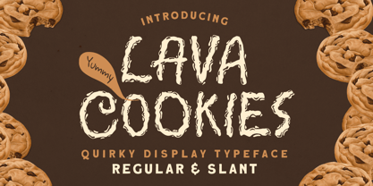 Introducing, Lava Cookies - A quirky display typeface. The unusual quirky style make this font looks great and standout for tittle, branding, logo, packaging, etc. Features : uppercase & lowercase numbers and punctuation multilingual alternates & ligatures PUA encoded We highly recommend using a program that supports OpenType features and Glyphs panels like many of Adobe apps and Corel Draw, so you can see and access all Glyph variations Thank You!
 - Knicknack by Great Scott,
$12.00 It's here! Lumbering down the grassy slope towards us, the lovable round sans serif of KNICKNACK. It's warm, it's smooth, it's round and it's fuzzy. It's perfect for display use, print, posters, branding, packaging or kids friendly apps and web! KNICKNACK is a typeface that will put a smile on your face. It features 2 styles, regular and fuzzy and comes in at least 5 weights.
 - Fenton by Fatih Güneş,
$19.00 Fenton Font family comes with 6 weights. The design was inspired by (convex) camber. It has a higher lowercase structure than the normal ones. It has a modern, rounded and squared character. Each weight contains 364 glyph. It is a type family which you can use in brand and model names of technological devices, newspaper and magazine ads, jerseys, logos, posters, apps, banners and promo images.
 - Ruined Dreams by Gleb Guralnyk,
$14.00 Hello! Introducing an original bold font with crashed letters. A unique feature of "Ruined Dreams" font is few variations for each English letter which creates more natural broken effect. Using OpenType feature (contextual alternates) each next letter will be replaced automatically. Note: Multilingual characters has only 2 variants for capital and small letters. Please make sure that OpenType features in your app are supported & enabled.
 - NorB Casual by NorFonts,
$28.00 NorB Casual is a handwritten text font which my daily casual writing, it can be used with any word processing program for text and display use, print and web projects, apps and Comic Books, graphic identities, branding, editorial, advertising, scrapbooking, cards, and invitations or even just for fun. This font comes with 16 styles, Light, Normal Bold and Heavy each with their Italic and Condensed version.
 - Love Struck by Letterhend,
$14.00 Combining handcraft serif and simple script, Love Struck is an authentic typeface that gracefully marries a delicate and refined aesthetic with a hint of rustic charm. Features : Uppercase & lowercase Numbers and punctuation Multilingual PUA encoded We highly recommend using a program that supports OpenType features and Glyphs panels like many of Adobe apps and Corel Draw, so you can see and access all Glyph variations.
 - Gilhaus by Parker Creative,
$18.00 Inspired by the classic German Antiqua style, Gilhaus is a totally original modern serif rooted in iconic history and built for modern projects including branding, web and digital apps, large format printing, and more. While subtle serifs and soft edges bring in an element of warmth and approachability, Gilhaus is balanced out by the bold angular strokes and high contrast letterforms typically found in classic Antiqua typography.
 - Tromso by Moontesk,
$9.00 Tromso is an extra wide sans serif font typeface. The family includes 3 fonts in a variety of styles. The uppercase alphabet in each font / style has been wide extended to allow for easy customization and creative control of character widths. Includes uppercase multilingual letters, numbers and punctuation. Well kerned. Including cyrillic. Perfect for logotypes, posters, app, etc. Characters Basic Latin Latin-1 Supplement
 - Kiwiberri by Melonaqua,
$10.00 Introducing Kiwiberri, a fun and playful handwritten font that you can use for your home or work projects. You can put it on shirt designs, mug designs, printable chalkboards, printable planners, websites, note-taking apps, wall art, greeting cards, and many more. The sky is the limit. This is multilingual so it is compatible with other languages. Kiwiberri is created to showcase handwritten fonts using brushes.
 - Gineso by insigne,
$- Michaelangelo. da Vinci. Bellini. Rafael. Masters of Italian art whose names have dwarfed those of many other great Italian artists. Yet relics from these other artists remain, though often unnoticed because of their practical nature. These unknowns are the Italian Masters of vernacular sign painting, and insigne now gives a nod to their work with its new sans serif, Gineso. Based on its inspiration, Gineso was created for posters, headlines and logotypes. (It does well in apps, too, though the sign painters probably weren’t thinking about that at the time.) Aesthetically remedied, yet still with an uncut charm, Gineso’s condensed qualities make it especially nice for signs and titling where horizontal space is at a premium. The tight, narrow forms of its geometric design leave you with a robust flavor that will remind you of mamma’s spaghetti. But don’t worry; the font’s ample counters ensure your audience won’t be reading through a bowl of pasta. These condensed forms look great on their own or when their seven different weights and matching italics are utilized together. With the included OpenType features, fractions and superior/inferior positions are also available to broaden your palette. Even more, this font is ready for complex, professional typography with OpenType features like alternate letters and a large character set including Central and Eastern European Languages. So when you find yourself (or your project) in a tight space, stir in Gineso to get the right taste for your copy. It may just make all the difference.
 - Flexible by Art Grootfontein,
$40.00 Inspired by late 19th century’s gothic typefaces from broadsides, Flexible uses the latest font technology to allow designers to play with each letter height and width easily. This versatile uppercase typeface is available in 8 widths and 8 heights, and as a variable font which gives you unlimited font possibilities! By using the variable version you only need to install one font file instead of the entire family and you take full advantage of the tremendous scope for design. Flexible was also developed with animation in mind to create amazing kinetic typography videos. Please have a look at this video to see animation examples. This family is a perfect choice for standout headlines, displays, packaging, flyers, logos, and works well in both print and digital environments like sophisticated web design or kinetic typography. The complete family pack includes the variable font. Language support : Afrikaans, Albanian, Azerbaijani, Basque, Bosnian, Catalan, Croatian, Czech, Danish, Dutch, English, Estonian, Faroese, Filipino, Finnish, French, Galician, German, Hungarian, Icelandic, Indonesian, Irish, Italian, Latvian, Lithuanian, Malay, Norwegian Bokmål, Polish, Portuguese, Romanian, Slovak, Slovenian, Spanish, Swahili, Swedish, Turkish, Welsh, Zulu
 - Chilada by Image Club,
$29.99Chilada is an outrageous display family by designer Patricia Lillie for Image Club. Across four versions, the decorate treatment inside Chilada's letters becomes more intense. Chilada characters exude an energy of their own. Their design could be described as a cross between Bank Gothic and Neuland, with a spoonful of funk mixed in. Big and chunky, Chilada's forms are made up of straight lines only. There are no curved elements. The resulting design is angular and cuts a good figure on the page. Of the Chilada family's four members, the basic font is named Chilada Uno. Uno is Spanish for one!" The forms of Chilada Uno's letter are solid black-or whatever color you choose to set them in! Chilada Dos, Tres, and Quatro each offer their own decorative treatments: Chilada Dos's letters sport a zigzag inline, Chilada Tres is decorated or an ornamented leaving leaves more black from the letters than white, while Chilada Quatro's level of decoration is just crazy. Its letters are made up more more from white space than from black marks. Chilada Quatro is almost an outline font!" - Xpress by Wiescher Design,
$12.00 »XPress« is a very distinct, expressive, typical new Sans. »XPress« is my new Sans-Serif that impresses – especially in small sizes – with its outstanding readability. Seven precisely calibrated weights from »Thin« to »Heavy« and its corresponding italics make this font-family universally usable. »XPress« got its bearings from the fabulous American »Gothic« fonts of the twenties of last century. Modern, present day elements, high lowercase letters and infinitesimal elegant slight curves in start- and end strokes make the font family not only great for body copy, but also very useful in advertising. »XPress« ist eine individuelle, expressive, typische neue Sans. »XPress« ist meine neue Serifenlose die – speziell in kleinen Schriftgraden – durch aussergewöhnliche Lesbarkeit auffällt. Sieben präzise aufeinander abgestimmte Schnitte von »Thin« bis »Heavy« und dazu passende Kursive machen die Schriftfamilie vielseitig einsatzfähig. »XPress« orientiert sich bewusst an den grossen amerikanischen Groteskschriften der zwanziger Jahre des letzten Jahrhunderts. Durch moderne Formelemente, große Mittellängen und unendlich leichte, elegante An- und Abstriche ist die Schrift jedoch nicht nur als Textschrift, sondern auch im gesamten Bereich der Werbung vielseitig einsetzbar.
 - ITC Kabel by ITC,
$40.99 The first cuts of Kabel appeared in 1927, released by the German foundry Gebr. Klingspor. Like many of the typefaces that Rudolf Koch designed for printing use, Kabel is a carefully constructed and drawn. The basic forms were influenced by the Ancient Roman stone-carved letters, which consisted of just a few pure and clear geometric forms, such as circles, squares, and triangles. Koch also infused Kabel with some elements of Art Deco, making it appear quite different from other geometric modernist typefaces from the 1920s, like Futura. Linotype has two versions of Kabel in its library. Kabel has a shorter x-height, with longer ascenders and descenders, making it a bit truer to Koch's original design than the second version, ITC Kabel, which was designed by Victor Caruso. This version, also known in the United States as Cable, has a larger x-height, shorter ascenders and descenders, more weights ,and a diamond shaped i-dot. Typefaces in the same oeuvre include Avenir Next, ITC Avant Garde Gothic, Metrolite, Metromedium, Metroblack, and Erbar, just to name just a few."
 - Bordonaro Script by Estudio Calderon,
$35.00 Bordonaro Script - Bordonaro Spur’s partner - is an interpretation of the “English Roundhand” style with a strong influence by the logos of American basketball and baseball teams. It is designed from simple shapes ideal to be used in long titles and fits perfectly into the branding design. Psss...Check out the NEW Bordonaro Script with Rounded corners , same version but soft! Bordonaro has a complete set of special and original characters: Stylistic Ligatures, Discretionary Ligatures, Swashes, Contextual Alternates, Titling, ss01,ss02, ss03 & apostrophes' ligatures that work as complements to enrich the text composition. Bordonaro Script and Bordonaro Spur are two typographic styles that were designed under the same characteristic features with the idea of combining them to obtain better results, for that reason, we recommend merging them in a creative way and you will realize everything you can design with them. The banners designs are based on old brands of beer labels, coffee packaging, sports logos and in some cases we use Copperplate Gothic but only as a complementary font in order to harmonize the layout of the elements in each banner.
 - Lotter by Kaer,
$19.00 Lotter blackletter with Drop caps One fine day I found a vintage book, it called “A treatise by the Dominican friar-writer Marcus von Weida on the Brotherhood of the Holy Rosary”. It was printed in 1515 by Melchior Lotter in Leipzig. The text was illustrated by hand-colored engravings on religious and liturgical themes and beautiful initials I like. Lotter was the last name of a family of German printers, intimately connected with the Reformation. An innovation by the elder Lotter was his use of Roman types for Latin, reserving the Gothic types for German. I'm happy to present to you my new font family. Lotter font family has Drop cap and Regular styles. It's all you need to precisely imitate medieval style text. Use Drop cap style as a decorative element at the beginning of a paragraph or section, other part of the paragraph should be in Regular style. You’ll get: * Drop cap & Regular styles * Uppercase and lowercase * Multilingual support * Numbers * Symbols * Punctuation * Ligatures Please feel free to request any help you need: kaer.pro@gmail.com Best, Roman.
 - DF Dejavu Pro by Dutchfonts,
$39.00 This font is an orphanage where all the beautiful details of classical grotesque typefaces from the early twentieth century are gathered, and thus living together, are forming a ‘new’, happy family. The aim was to collect my favorite characters in one font. The start was an eclectic collection orientated on British types from the Caslon Doric No. 4, the Monotype Grotesque, the Gill, the Franklin Gothic up to the Transport. In this amalgamation I avoided the narrow apertures in the ‘e’, ‘c’ and in the numerals ‘5’, ‘6’ and ‘9’ and enlarged the x-height dramatically. To the classical slanted form of the italics I added real italic forms for ‘a’, ‘e’ and ‘g’ in order to obtain a more distinguished italic style. DF-Dejavu Pro supports all Latin-based languages (Western, Central-European, Eastern-European, Baltic and Turkish) and includes small capitals, ligatures, inferior & superior numerals and letters, fractions, various numeral styles: proportional lining, tabular lining, proportional old-style, tabular old-style and last but not least a slashed zero.
 - Vinicius by Jehoo Creative,
$19.00 Introducing the Vinicius font, a gorgeous typeface that combines the timeless allure of gothic typefaces with a contemporary twist. Inspired by the rich heritage of medieval calligraphy, Vinicius offers beautiful forms that attract attention and inspire courage. Vinicius offers a range of Stylistic Alternate, allowing you to explore artistic possibilities and customize your typography creations. One of Vinicius' standout features is his striking collection of ligatures. These skillfully crafted letter combinations enhance the flow and coherence of your text, giving it a harmonious and seamless appearance. Whether you're crafting a headline, invitation or logo, Vinicius ligatures add a signature touch that sets your design apart. Italic variants add a touch of dynamism and flair to your text, allowing you to emphasize specific words, phrases or paragraphs with a visually appealing slant. Vinicius font is ideal for a variety of creative projects, including branding, editorial design, packaging, and more. Its ability to seamlessly blend tradition and modernity makes it a powerful tool for conveying both classic and contemporary aesthetics.
 - Pacific Clipper SG by Spiece Graphics,
$39.00 Pacific Clipper has its roots in an old 1930s showcard lettering style. An extra bold version of this sign painter’s relic is shown in Carl Holmes' wonderful book on lettering. It may be described as what happens when Rudolf Koch's Kabel Heavy meets ATF's Novel Gothic. Also known as Sam’s Tune, Pacific Clipper’s noteworthy features include wedged crossbars in the capital A, E, F, and H. Overcurving is present in the capital B, D, P, and R while vertical strokes in the lowercase b, d, h, k, l, and t are chopped off obliquely. Figures in Pacific Clipper are also refreshingly different, particularly the number 4. This lettering favorite turned retro typeface has been extended to include a variety of weights. Pacific Clipper is now available in the OpenType format. Some new characters have been added to this OpenType version as Stylistic Alternates and Historical Forms. These advanced features work in current versions of Adobe Creative Suite InDesign, Creative Suite Illustrator, and Quark XPress. Check for OpenType advanced feature support in other applications as it gradually becomes available with upgrades.
 - Trovoada Mono by SullivanStudio,
$25.00 Trovoada Mono is a monospaced font for use in print (but also looks great on display). Hand-drawing glyph by glyph, my intention was to get that old manual typewriter look, with uneven inks, but with a totally up-to-date, emotional and admittedly humorous attitude. Trovoada Mono borrows from classics like Courier and Letter Gothic, reinventing serifs here and there. The result is a font that is both familiar and unusual. As I love Greek typography, I made sure to include a full polytonic alphabet, in the same vintage spirit: the text looks very legible and matches the Latin characters. The font has no kerning, obviously, and no ligatures (this is a typewriter, my friend!), but it has important OpenType features: fractions, subscripts/superscripts, slashed zero and stylistic alternatives for some characters. The italics are 11 degrees, which brings a strong personality. Some characters have true italics, giving the text an overall texture different from the upright type. All that is missing is that nervous typewriter noise. Enjoy!
 - Bernhardt Standard by Linotype,
$40.99Bernhardt Standard, which was designed in 2003 by Julius de Goede, is a flowing Bastarde script. Bastarde is one of the sub-categories of Blackletter typefaces. The term Blackletter refers to typefaces that have evolved out of Northern Europe’s medieval manuscript tradition. Often called gothic, or Old English, these letters are identifiable by the traces of the wide-nibbed pen stroke within their forms. Of all of the various sorts of Blackletter styles, Bastarde scripts are the most flowing, or Italic. The first Bastarde typefaces, cut in the late 1400s, were based on French handwriting styles, especially those styles popular in Burgundy. The flowing nature of Bernhardt Standard makes it similar to some other sorts of Blackletter typefaces as well. Bernhardt Standard, because of its handwritten roots, is also similar to Kurrent, a style of handwriting that was popular in Germany prior the 20th Century. Bernhardt Standard is a very calligraphic face, suitable for formal applications. This typeface would be an excellent choice for certificates or awards. The old style figures in the font allow for nice short settings of text as well. - Black Child by Blankids,
$23.00 Hello, Are you looking for a Blackletter font? Do you want of creating Something that stand out and inspire creativity, imagination, and endless fun? Wait no more, we will give you the best choice. Black Child a Natural Blackletter Font Black Child a Blackletter Font, Inspiring from gothic style typography. This font is perfect for a design that makes it more attractive and playful. made with a very good level of aesthetics making this font suitable for book cover, children book, comic, poster, packging, merchandise, logotype and much more. Black Child font includes Multilingual Support, among others : Afrikaans, Albanian, Asu, Basque, Bemba, Bena, Breton, Catalan, Chiga, Cornish, Danish, Dutch, English, Estonian, Faroese, Filipino, Finnish, French, Friulian, Galician, German, Gusii, Indonesian, Irish, Italian, Kabuverdianu, Kalenjin, Kinyarwanda, Luo, Luxembourgish, Luyia, Machame, Makhuwa, Meetto, Makonde, Malagasy, Manx, Morisyen, North Ndebele, Norwegian Bokmål, Norwegian Nynorsk, Nyankole, Oromo, Portuguese, Quechua, Romansh, Rombo, Rundi, Rwa, Samburu, Sango, Sangu, Scottish Gaelic, Sena, Shambala, Shona, Soga, Somali, Spanish, Swahili, Swedish, Swiss German, Taita, Teso, Uzbek (Latin), Volapük, Vunjo, Zulu FEATURES : Uppercase Lowercase Number Punctuation Multilingual PUA Encode Opentype
 - Seibi Isarago by Nihon Literal,
$169.00 Gothic in a contemporary style designed with a broad skeleton. Considering line alignment, we have aimed for a sense of harmony in both vertical and horizontal typesetting. フトコロ(画と画の間の空間)を広くデザインした現代的感覚のゴシック体。組み版時のライン揃えを考慮し、タテ組ヨコ組で違和感のない書体を目指しました。木版時代から手書きレタリングへと引き継がれてきた精美堂ゴシック体をデジタルフォントで再現。手書き文字を組んだ印象はそのままに、フトコロを広く現代風にアレンジしました。遠くからでも近くからでも読みやすい、目を引く見出し用ゴシックです。
 - The Fraga Script by Typehill Studio,
$14.00 The Fraga Script is Retro inspired style and combination with hand lettering style.The Fraga Script has many alternative swash and ligatures character and have opentype features like a stylistic alternative, stylistic set, ligature and swash so you can mix and match like a you want. The Fraga Script came with open type features such stylistic alternates, stylistic sets and ligatures good for logotype, posters, badges, book covers, tshirt design, handwritten quotes, product packaging, header, poster, merchandise, social media and greeting cards. To enable the OpenType Stylistic alternates, you need a program that supports OpenType features such as Adobe Illustrator CS, Adobe Indesign & CorelDraw X6-X7, Microsoft Word 2010 or later versions. How to access all alternative characters, using Windows Character Map with Photoshop: https://www.youtube.com/watch?v=Go9vacoYmBw How to access all alternative characters using Adobe Illustrator: https://www.youtube.com/watch?v=XzwjMkbB-wQ The Fraga Script is coded with PUA Unicode, which allows full access to all the extra characters without having special designing software. Mac users can use Font Book , and Windows users can use Character Map to view and copy any of the extra characters to paste into your favourite text editor/app. Thank you for your visit.