6,846 search results
(0.017 seconds)
- Mijas by Eurotypo,
$42.00 Mijas Ultra font was designed specially as a headlines and caption text for advertising, packaging and Publishing design. It has strong visual impact, a persuasive personality and seduction appeal throughout its organic shapes. This versatile typeface is quite useful for creating logotypes, a variety of alternates and swash tails in three different styles and length were drawn for most letters, plenty of vowel-focused ligatures, it covers all Latin-based languages. Please refer to quick reference manual included. Mijas is a little white town located at a mountainside above the blue Mediterranean Sea, in the heart of the Costa del Sol. It has high contrast, small counterforms and friendly climate.
 - Milliard by René Bieder,
$39.00 Milliard is a sharp and contemporary family of 22 fonts, taking inspiration from grotesk typefaces developed in the early twentieth century. Its open counters on lowercase "a", "c" or "e" allow for great legibility in small text sizes, supporting an unobtrusive, clear and modern appearance. When set in headlines, Milliard reveals a part humanistic, part geometric voice ranging from elegant and open thin weights to athletic and powerful heavy weights. Milliard comes with many opentype features including stylistic sets, old style numbers, arrows and many more making it a perfect choice for professional type setting in any digital or analog surrounding that requires a clear and modern voice.
 - Avocado Candy by Balpirick,
$15.00 Avocado Candy - a Modern Monoline Script Font that's clean, elegant and perfect for a range of design projects! With its smooth, effortless lines and understated sophistication, this font is the perfect choice for those who want a modern look that's still timeless in its appeal. Crafted with precision and care, this font is incredibly versatile and can be used for a range of design projects, including logos, branding, invitations, packaging, and more. With its simple yet refined aesthetic, it's sure to make a lasting impression on anyone who sees it. - also multilingual support Enjoy the font! Feel free to comment or feedback! Thank you!
 - Arp by W Type Foundry,
$35.00 Arp is a neo-grotesk type system exploring the relations between contrast, functionality, and graphic character in one family. This typography comes in 5 different weights including fine strokes with inverted contrast (20), a sharp sans serif (80), and a high contrast heavyweight (240). Moreover, its design is formed by short ascenders and descenders aiming higher legibility, ink traps for display-functional purposes, and includes a wide range of icons, arrows, and symbols which allow creating consistent compositions in digital and print designs. All styles of 640 characters include a display weight with geometric and glyphic style alternates, which expand the proprieties and versatility of the system.
 - Smart Chameleon by Cititype,
$17.00 We are pleased to offer a unique typewriter font. Consists of two versions, namely regular and italic, Smart Chameleon has more than 650 glyphs and can be used in more than 150 languages. We present it in a handwritten version with untidy curve that makes you even more exasperated. Smart Chameleon has a vintage style that is packaged in the current version. Suitable for all styles, you only need to replace the color and background of the design and the appearance will totally change, from children's style to fancy, retro or modern youth style. Just like a chameleon that changes according to the conditions. Enjoy.
 - Calera by Gian Studio,
$16.00 Elegant, graceful and timeless. Calera is a versatile font with timeless classic appeal, more than a dozen alternatives & ligatures, multilingual support and great precision for you to incorporate into your designs! Each letter has been hand drawn and crafted with great care. The various weights provide a variety of options that will help you find the best typographical character for your project. Perfect for logos, notes, posters, t-shirts, stickers, posters, mugs, labels, etc. To access alternative glyphs, you'll need a program that supports OpenType features such as Adobe Illustrator CS and Adobe Indesign. How to use the open type feature https://helpx.adobe.com/illustrator/using/special-characters.html
 - Trade Convention JNL by Jeff Levine,
$29.00 An ad for the annual Variety Club Convention appeared in the March 18, 1940 issue of "The Film Daily. The main headline was hand lettered in a classic Art Deco "solid" style of sans serif - ultra bold and with no counters - but had one additional feature: 'engraved' lines to the left of each character. This has now been expanded into the digital typeface Trade Convention JNL, which is available in both regular and oblique versions. Variety Clubs (now know as Variety - The Children's Charity) was founded in Pittsburgh, Pennsylvania in 1928 by entertainers specifically to aid children. Their history can be found at https://variety.org/who-we-are/history
 - Decaf by Twinletter,
$15.00 DECAF is a display typeface with male features, as well as being robust and bold. Don’t be afraid to use this font since it will make your project charismatic, impress all audiences, make it stand out from the crowd, and, of course, it will appear classy, sophisticated, and stunning. This graffiti font is great for product logos, poster titles, headlines, packaging, film titles, logotypes, gorgeous writing, and trendy graffiti designs, among other things. Of course, if you utilize this font in your numerous creative projects, they will be perfect and outstanding. Use this typeface right away for your one-of-a-kind and remarkable projects.
 - Alga by Nova Type Foundry,
$42.00 Alga is a high contrast modern typeface with a contemporary look. It has subtle details that make it appealing for big sizes and headlines. It is a lively and charming serif typeface with lots of fancy curves. It is a serif typeface that will shine in headlines and short pieces of text. It also works in smaller sizes, but it is not for the tiny text sizes. Alga started from an exploration of the thinner weight with this idea of a tall and elegant serif typeface with low contrast. Then it evolved to be a high contrast font in the bold weight. But always keeping its style and personality.
 - Bottle Party by PizzaDude.dk,
$20.00 A bottle party is a party where you are supposed to bring whatever you wish you drink. When using my Bottle Party font, you need not bring anything at all! The font does all the partying itself - all you need to do is type, and the contextual alternates makes sure that your text doesn’t repeat the same letters over and over again! How is that? As I said, it happens automatically as you type, because the font cycles through the 4 different versions of each lower-case letter! The font is handmade with a brush feeling to it, legible at even very small sizes and it’s quite full of international characters!
 - Street Stronger by Sipanji21,
$13.00 "Street Stronger" is a graffiti font with three layers that can be used to create a three-dimensional (3D) effect on your text. By using these three layers in your design, you can add depth and dimension to your typography. Fonts with these layers are often used in street art, posters, or other designs that aim to create a prominent 3D effect. With "Street Stronger," you have the ability to create text that looks different and adds a strong 3D impression by using the various layers. This allows you to customize the text's appearance to fit your design vision and add a powerful three-dimensional touch to your project.
 - The Blackmore by Letterhend,
$19.00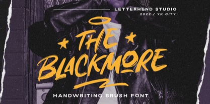 The Blackmore is a bold hand drawn brush script which is purposely made for headline, display or logotype, and signature which need a standout appearing. This font is also suitable to be applied especially in logo, and the other various formal forms such as invitations, labels, logos, magazines, books, greeting / wedding cards, packaging, fashion, make up, stationery, novels, labels or any type of advertising purpose. Features : uppercase & lowercase numbers and punctuation multilingual PUA encoded We highly recommend using a program that supports OpenType features and Glyphs panels like many of Adobe apps and Corel Draw, so you can see and access all Glyph variations.
 - Mixta by Latinotype,
$29.00 Mixta is a contemporary serif typeface with characteristic and defined features. This font was inspired by the idea of mixing different types of terminals in order to give the font a singular appearance. Its design is composed of diverse styles such as Didone and contemporary faces. You can create unique designs by combining any of the upright weights with matching italics. Mixta includes Cyrillic support, small caps, different types of figures and a wide variety of alternates. Mixta comes with a set of 1,200 characters that support over 200 Latin-based languages. This font was specially designed for branding, advertising, editorial design, and use on Tv and social media.
 - Kamila by SevenType,
$29.90 Kamila is a connected script typeface with an elegant feel. It is based on custom lettering and works well in all letter combinations in a harmonious way. This typeface has over 900 glyphs and includes 6 sets of stylistic alternates with swashed letters, standard ligatures, ornaments and other alternates for more versatility. Kamila is suited for most latin languages both in its basic and alternate letterforms. It also has initial and final letters that appear automatically when you type, which makes it feel more similar to writing. Every letter was carefully crafted and connections are smooth. Kamila is great especially for titles, posters, magazines, books, wedding invitations and logos. Enjoy!
 - Strayhorn MT by Monotype,
$29.99 Strayhorn is a sans serif development of the popular typeface family, Ellington. Although classified as a sans serif, the Strayhorn font family has markedly flared stems and calligraphic terminal treatment. A fairly condensed face with vigorous letter shapes, Strayhorn makes an eye-catching display face and an economical, legible text type. The contrast between thick and thin strokes is more apparent than in most sans serif designs, resulting in an open, rather striking appearance on the page. Strayhorn is ideal for use in advertising, flyers, labels and packaging. It will also make a refreshing alternative to the more monotone sans serifs used in magazines, periodicals, newsletters etc.
 - Maintenance Stencil JNL by Jeff Levine,
$29.00 In the opening scenes of the 1938 Three Stooges comedy “Tassels in the Air” the Stooges are working as maintenance men inside an office building. Their immediate job requirement is to paint the tenants’ business names on the corresponding office doors with pre-cut stencils. Of course, they get it all wrong. Nonetheless, the stencils appear to be a hand cut sans serif design in a squared or ‘block’ style with rounded corners, and some of the applied lettering made for an interesting challenge to recreate as a typeface. The end result is Maintenance Stencil JNL, which is available in both regular and oblique versions.
 - Eurostile Unicase by Linotype,
$29.99 Akira Kobayashi modified his Eurostile Next design into a fun unicase version. Ascenders and descenders have been traded in for alternates of letters that all share the same height. The effect is similar to using all caps, although this is quite a bit more quirky. For example, letters like the lowercase a and e are now the same height as their capital versions and the lowercase y has been raised to fit between the baseline and top height. Odd relationships such as these give Eurostile Unicase a fresh and funky feeling. Try using it for headlines and titles, then use Eurostile Next for the body text!
 - PM Doorbuster Script by Paper Moon Type & Graphic Supply,
$20.00 A new font inspired by vintage hand-painted paper grocery store signs. The Doorbuster Collection is based on retro hand-painted paper signs primarily seen in grocery stores from the 1920s through the 1970s. We meticulously hand-drew each font, modeling the spacing and uneven baseline found in vintage sign painting. The purposely organic ascenders and descenders, along with a huge set of ligatures/contextual alternates to avoid the same letters repeating when paired, give it a real hand-lettered look. Doorbuster Script is perfect for both vintage-inspired and contemporary marketing, branding, and packaging designs. Check out a few of the samples included in the thumbnails above.
 - Linotype Go Tekk by Linotype,
$29.00Linotype Go Tekk is a part of the Take Type Library, selected from the contestants of Linotype’s International Digital Type Design Contest. The font was designed by the German artist Critzler and is available in three weights, thin, medium and black. Go Tekk is a cool, constructed with unusual cross strokes, appearing in almost every character at exactly the same height. The capital letters do not end on the baseline, rather drop even farther down than the descenders of the lower case letters, making it necessary to allow for generous line spacing. Linotype Go Tekk is a relatively static font designed exclusively for headlines and displays. - Autumn Melody by PeachCreme,
$22.00 Autumn Melody is a modern calligraphy font that adds a classy and deluxe touch to your designs. The main pursuit of this font is to give you that authentic hand-calligraphy feel. Autumn Melodycomes with a full set of uppercase and lowercase letters as well as ligatures and beautiful letter alternates. The font provides several (up to15) alternates of some frequently used letters such as a, t, h, n, s, etc. The number and look (length, width) of the swashes vary depending on the frequency of this or that letter's usage. Autumn Melody is suitable for many projects related to the wedding industry (stationery, logo, etc.)
 - Gimana by Hazztype,
$20.00 Introducing gimana sans serif display font, meticulously designed with deep inktrap details. Crafted for optimal legibility and aesthetic appeal, this font seamlessly blends modernity and tradition. Its generous proportions and balanced letterforms provide exceptional clarity and readability across various digital and print mediums. With its deep inktraps, this font showcases subtle details that enhance its overall visual texture, adding a touch of sophistication to your projects. Its humanist characteristics ensure legibility and readability, making it an ideal choice for a wide range of applications. The deep experimental inktraps add an intriguing element to the font, creating an interplay of light and shadow that captures attention.
 - Baghira by Identity Letters,
$39.00 Like its feline namesake from Kipling’s “Jungle Book”, Baghira has an elegant, smooth appearance and an impressive set of large, sharp teeth. With smoothly drawn curves, precisely placed corners, and rectangular dots, Baghira is a design rooted in the here and now. Its true italics gently allude to calligraphic roots, but overall, Baghira doesn’t follow any historical model. This cool cat sets his own standards. Designed by Christian Gruber & Moritz Kleinsorge, the Baghira font family consists of 8 fonts, with 4 weights ranging from Regular to Bold. Its character set contains 800 characters per style and is suited to quality typography in editorial design, corporate design and advertising.
 - Bulbis by Azzam Ridhamalik,
$10.00 Introducing Bulbis, the latest addition to our font collection. This unique bubble font is inspired by graffiti and street art, infused with a modern layout that is sure to stand out. The font also incorporates a mix of y2k culture and streetwear visuals, which are currently trending in design identities. With its eye-catching appearance, Bulbis captures attention right from the start, drawing the viewer in to explore its fun and dynamic features. The font is versatile and can be used for a variety of design projects, from logos and branding to social media graphics and more. Give your designs a fresh and modern edge with Bulbis font today!
 - F2F Prototipa Multipla by Linotype,
$29.99The techno sound of the 1990s, a personal computer, font creation software, and some inspiration all came together to inspire the F2F (Face2Face) font series. Alessio Leonardi and his friends had the demand to create new unusual typefaces, which would be used in the leading German techno magazine of the day, Frontpage. Even typeset as small as 6-points, in nearly undecipherable layouts, it was a pleasure for the kids to read and try to decrypt the messages. The glyphs in F2F Prototypia Multipla have been turned into mini letter collages. Text set in this font will take on a quilt-pattern-like appearance. - Kinger by Twinletter,
$15.00 We designed Kinger as a display font with the notion of excellent graffiti writing in mind. We have polished Kinger into a typeface that is ideal for use in a variety of projects since when you use this font, your complete project will appear more beautiful and pleasant in the eyes of many people. This graffiti font is great for product logos, poster titles, headlines, packaging, film titles, logotypes, gorgeous writing, and trendy graffiti designs, among other things. Of course, if you utilize this font in your numerous creative projects, they will be perfect and outstanding. Use this typeface right away for your one-of-a-kind and remarkable projects.
 - Rosabella by ParaType,
$30.00 Rosabella is a script typeface with plenty of decorative details — flourishes, swashes, twists and other elements, which impart to the face a gorgeous festive look. An unusually large number of alternates and ligatures make it possible to imitate live calligraphic writing. Lower case letters are divided into several stylistic sets from relatively modest variants to the most decorative contextually-dependent swash shapes. Besides that there are two sets of upper case letters — the second one contains larger and more complex shapes. Letters from the different stylistic sets can be used in a wide variety of combinations with the different levels of embellishments. Rosabella was designated for display material, greetings and advertising.
 - Nylon and Draylon by Barnbrook Fonts,
$30.00 Nylon is an interpretation of pre-16th century letterforms, in particular those found in mediaeval portraits at the National Gallery, London. The source material contains many unusual and manic shapes—it appears as if these classical forms have, over time, become perverted, almost demonic. Draylon is the more restrained counterpart to Nylon; it is based on letterforms found on 18th century ceramics—some 200 years after the source material of Nylon. Nylon and Draylon have been designed so that they can be mixed together with ease. Both typefaces have been drawn with a kind of crude digital awkwardness—acknowledging the tool of the present moment, the computer, in the design process.
 - Castellar MT by Monotype,
$29.99 Castellar is a capital letter typeface from John Peters, named after a location in the Alps. It first appeared in 1957 with Monotype. Peters modelled the design on the Roman script Scriptura Quadrata as it was used in the first two centuries of the Roman Empire. One distinguishing characteristic is the quadratic proportions of many letters, which are however mixed with circular and narrow forms. The original script was called Scriptura Quadrata because the ancient engravers used rectangular stone plates for their work. Castellar is a typical title typeface and is best used in large and very large point sizes to highlight its classic elegance.
 - Belha by Eurotypo,
$48.00 Sometimes we feel that we need something fresh, sometimes you may use something like an informal style, or even a little bit of spicy taste in a provocative message. Belha is a curly cursive typeface that can express a seductive atmosphere of casual style. All their glyphs were made carefully and were hand-drawn. The font contains different letter shapes, full of ligatures, swashes and stylistic alternates that can provide great flexibility for your designs. Belha includes diacritics signs for CE languages. It may be used for advertising, packaging design, flyers, posters, children books and many other purposes. How it will work, just depends on you.
 - Rimbomba by Muykyta,
$13.00 Rimbomba is a freehand style font with long ascenders and descenders and a steep slant making it elegant yet casual. It is inspired by writing letters by hand, as it was done before, with strokes that in the normal style imitate the tip of a pen and in the medium and bold styles they imitate a round pen stroke. It is a font with strength in its movements and finesse in its curves, which creates a homogeneous set that is easy to read and which produces a certain reading speed. It is complemented with stylistic alternatives for the beginning and the end of the words.
 - Devoid by Dropper,
$35.00 Devoid is a sans serif typeface with a no frills stripped down design. The design has all the features of the neo grotesk typeface, horizontally cut endings, modern capitals, oval counters, with a bare bones appearance. The typeface comes in three subtle widths, Devoid Slim, which is spaced most narrowly, Devoid and Devoid Set, which have a wider letterspacing. There are regular, medium and bold weights with accompanying italics. The vertical metrics align across weights and widths, this allows for optical size adjustment as well as adjusting for same size text fit. Dutch designer Pier Taylor designed the typeface in 2020 for use in catalogs, lists and registers.
 - Sweynheym Pannartz by Proportional Lime,
$19.99 The font SweynheymPannartz is strongly modeled after an example Conrad Sweynheym and Arnold Pannartz used in their early printing venture in Subiaco, Italy which began around 1465. Their efforts were supported by Pope Sixtus the IV after they enthusiastically printed more books than they could sell. They not only brought printing to Italy, but also developed the first Roman style type. This font has over 600 defined glyphs to cope with modern needs, and also the ability to use several abbreviations common to that period. It also has an alternate minuscule “k” more modern in appearance for those that find the original too unusual.
 - Ritafurey by Device,
$39.00 Ritafurey is an extended sans in seven weights, with characteristic low bowls on the P and R. Modern, sleek and corporate, but with a dash of character. It has been used on tech logos, summer blockbuster movies and Playstation skateboarding games. This new version reinstates the original Unicase versions of the M and N (available through the Glyph palette or Opentype options), adds extensive international character support, redrawn and respaced glyphs, a new Regular weight for better weight flow distribution, and many other additional glyphs. (Note the the new weights differ slightly from the old of the same name, so may change the appearance of existing files.)
 - Fd Parfume by Fortunes Co,
$19.00 Modern serif fonts are a contemporary twist on traditional serif typefaces, striking a perfect balance between classic elegance and modern aesthetics. Combining clean lines with refined serifs, they exude a sophisticated and professional vibe, making them a popular choice for digital and print media alike. Their versatility enables them to work well in both body text and headlines, ensuring readability and visual appeal across various platforms. Modern serifs often showcase a higher contrast between thick and thin strokes, elevating legibility while preserving their distinctive character. Embraced by designers for their timeless charm with a contemporary edge, modern serif fonts continue to shape the visual language of our digital era.
 - Fd Massive by Fortunes Co,
$19.00 Massive moon is headline font with a retro feel transports readers to a bygone era, invoking nostalgia and charm. Its bold strokes and quirky serifs harken back to the golden age of design, reminiscent of vintage posters and classic advertisements. The typeface exudes a timeless appeal, seamlessly merging the flair of yesteryear with modern readability. Each character carries a sense of character, mirroring the craftsmanship of mid-century typography. The warm color palette and slightly distressed texture further amplify the retro vibe, adding a touch of authenticity. This font doesn't just convey information; it tells a story, bridging the gap between the past and present.
 - Brown Holmes by Letterhend,
$19.00 Introducing, Brown Holmes - A fun and playful bold display font. The bulky shape make this font looks appealing, especially when it comes to casual fun theme design. This font also perfectly made to be applied especially in logo, and the other various formal forms such as invitations, labels, logos, magazines, books, greeting / wedding cards, packaging, fashion, make up, stationery, novels, labels or any type of advertising purpose. Features : numbers and punctuation multilingual alternate (uppercase & lowercase) & ligature PUA encoded We highly recommend using a program that supports OpenType features and Glyphs panels like many of Adobe apps and Corel Draw, so you can see and access all Glyph variations.
 - Americana EF by Elsner+Flake,
$35.00Americana was designed by typeface artist Richard Isbell in 1965. The generous forms of this typeface contain large inner spaces. Lines of text look light and airy and require generous line spacing. The high cross strokes and the open inner spaces make this font highly legible even in small and very small point sizes. The triangular serifs are a distinguishing characteristic of Americana. These first appeared in the 19th century in France and inspired by the developments in lithography, which allowed for freer forms. The forms were typical for advertisement and display typefaces. The sophisticated Americana is particularly suitable for advertisements and personal correspondence. - LTC Camelot by Lanston Type Co.,
$24.95 Camelot was the first of over 100 typefaces designed by Frederic Goudy. The upper case characters were drawn in 1896 for the Dickinson Type Foundry. Goudy was so encouraged by his check for $10 (double what he asked for the drawings), that he spent the next 50 years designing type. The lower case was added by the Dickinson foundry. This Lanston digital release includes a Text version based on the smaller point sizes of the metal type and a Display version based on the larger sizes. The two appear different in size but share the exact same line weight when at the same point size.
 - Neue School by Daniel Brokstad,
$29.00 Neue School is a modern sans serif font with extra tight tracking & deep ink traps. Designed to maximize the available space, make impactful headlines. Inspired by old school narrow poster fonts, presented in a “neue”-way. The font consists of 8 weights, across 2 widths, plus italics. Symbols are fixed weight throughout, as a contrast to the font weights. There are 2 additional OpenType stylistic sets. Stylistic Set 1 adds more rounded edges to specific characters for a softer look. Stylistic Set 2 makes lowercase ascenders and symbol height equal to capital height, making it ideal for stacking type more easily with all same height.
 - Porcelain by Up Up Creative,
$16.00 Introducing Porcelain, a hand-lettered condensed sans serif font with subtle dip-pen texture and some fun OpenType features. Porcelain is perfect for invitations, branding, and editorial design and can be dressed up or down depending on your needs. Porcelain comes with more than 430 glyphs and includes OpenType features like stylistic sets, multilingual support (including multiple currency symbols), and discretionary ligatures. The OpenType features can be very easily accessed by using OpenType-savvy programs such as Adobe Illustrator and Adobe InDesign. (To access these awesome features in Microsoft Word, you'll need to get comfortable with the advanced tab of Word's font menu. If you need help with this, ask me!)