6,846 search results
(0.016 seconds)
- Orelia Display by Orenari,
$20.00 Introducing our latest retro font design: Orelia Display font, a modern take on classic mid-century typography. Our simple retro font is designed to be humble yet eye-catching, with clean lines and simple shapes that evoke a sense of nostalgia while remaining relevant and contemporary. This font is perfect for projects that require a touch of retro charm without overwhelming the design. Its understated appearance makes it ideal for minimalist designs, logos, and branding, while the bold letterforms ensure that it still catches the eye. Crafted with care and attention to detail, our simple retro font is available in a variety of weights and styles, allowing you to customize your design and make it truly unique. Whether you're creating a retro-themed website, designing a product with a vintage twist, or simply want to add a touch of nostalgia to your work, our simple retro font is the perfect choice. With its timeless appeal and modern design, our simple retro font is sure to become a go-to choice for designers and creatives who appreciate the beauty of simplicity. Purchase now and add a touch of retro charm to your next project!
 - Bodrum Sans by Bülent Yüksel,
$19.00 You can download usiful link: Bodrum Sans PDF Type Specimen Bodrum Sans is a sans serif type family. Designed by Bülent Yüksel in 2018/19. The font, influenced by style serifs, popular in the 1920s and 30s, is based on optically corrected geometric forms for better readability. Bodrum Sans is not purely geometric; it has vertical strokes that are thicker than the horizontals, an “o” that is not a perfect circle, and shortened ascenders. These nuances aid in legibility and give Bodrum Sans a harmonious and sensible appearance for both texts and headlines. Bodrum Sans provides advanced typographical support for Latin-based languages. An extended character set, supporting Central, Western and Eastern European languages, rounds up the family. The designation “Bodrum Sans 14 Regular” forms the central point. "Bodrum Sans" is available in 10 weights (Hair, Thin, Extra-Light, Light, Regular, Meduim, Bold, Extra-Bold, Heavy and Black) and 10 matching italics. The family contains a set of 650+ characters. Case-Sensitive Forms, Classes and Features, Small Caps from Letter Cases, Fractions, Superior, Inferior, Denominator, Numerator, Old Style Figures just one touch easy in all graphic programs. Bodrum Sans is the perfect font for web use.
 - Presley Slab by Sudtipos,
$49.00 The lightest weight of Presley Slab takes inspiration from a late nineteenth-century type specimen, but what began as a decorative and delicate contrasted serif stirred Alejandro Paul’s imagination to conjure voluptuous reverse contrasted letterforms. These became the heaviest weight of Presley Slab, which nods to the lacquered hairstyles from the birth of rock ’n roll with its idiosyncratic ball terminals. Its playful allure and swagger remains visible in the weights that stand between these two extremes but as the curls loosened, many things happened in the design process including the appearance of swashes and alternates. Presley Slab’s personality has breadth; it is a fun, confident and contemporary palette of letters that will perfectly perform for any job, from editorial design to branding. The Extra Bold and Black weights are a powerful option at large sizes for use on posters and billboards; the graceful Thin and Extra Light weights are delicate options for packaging design or fashion branding. Despite it conjuring images of mid-century music halls, Presley Slab is also staunchly European in it’s aesthetic, offering everything from good-humour to elegance with its unique touches.
 - Bodrum Style by Bülent Yüksel,
$19.00 "Bodrum Style" is a serif Style family designed by Bülent Yüksel in 20018/19. The font, influenced by serif styles that were popular in the 1920s and 30s, is based on optically corrected geometric forms for a better readability. "Bodrum Style" is not purely geometric; it has vertical strokes that are thicker than the horizontals, an “o” that is not a perfect circle, and shortened ascenders. These nuances help the legibility and give "Bodrum Style" an harmonious and sensible appearance for both texts and headlines. Bodrum Style provides advanced typographical support for Latin-based languages. An extended character set - supporting Central, Western and Eastern European language - rounds up the family. “Bodrum Style 14 Regular” forms the central point. "Bodrum Style" is available in 10 weights (Hair, Thin, Extra-Light, Light, Regular, Medium, Bold, Extra-Bold, Heavy and Black) and 10 matching italics. The family contains a set of 650+ characters. Case-Sensitive Forms, Classes and Features, Small Caps from Letter Cases, Fractions, Superior, Inferior, Denominator, Numerator, Old Style Figures just one touch easy In all graphic programs. Bodrum Style is the perfect font for web use. Enjoy using it.
 - Smother Spoon by Create Big Supply,
$15.00 Introducing Smother Spoon, a remarkable font that mimics natural handwriting with its authentic and organic style. This font is designed to evoke the charm and individuality of real handwriting, instantly infusing your projects with a personal touch. With its exquisite handwritten appearance, Smother Spoon brings out the natural characteristics of your designs. Whether you're creating invitations, logos, posters, or any other creative endeavor, this font adds a unique and artistic flair to your work. Smother Spoon offers both uppercase and lowercase letters, providing flexibility in creating captivating compositions. It also includes numbers and punctuation, ensuring seamless integration with your text. The font's multilingual support enables you to communicate your message effectively in various languages, reaching a broader audience. Featuring PUA Encoding, Smother Spoon allows easy access to special characters and glyphs, expanding your typographic possibilities. Let your creativity flow as you embrace the authentic essence of handwritten artistry. Unleash the natural beauty of Smother Spoon in your designs and captivate your audience with its genuine handwritten appeal. From logos to branding materials and beyond, this font adds a touch of artistic elegance to every project.
 - Bella Donna by Canada Type,
$24.95The famous Italian type designer and Nebiolo director Alessandro Butti designed Rondine in 1948. Not so surprisingly - given its beauty - it quickly became quite a commonly copied metal type. But for some reason Rondine was spared during the massive “phototyping” that happened with the introduction of film type. Perhaps this is why no digital version of it ever existed until now. Bella Donna is an upright round script that can be used both formally and informally, in almost any design where an elegant script completes the equation. The almost dramatic grandeur of the majuscules is very nicely complemented by pouty low-x-height minuscules that sprout graceful and very visible ascender and descender loops. Titles, sentences and paragraphs set in Bella Donna are meant to delightfully tease the reader and make hearts skip a beat. Bella Donna can deliver a subtle promise of joyful playfulness, inviting elegance, memorable romance, sensuality, or sincere understanding. Bella Donna was redrawn and digitized from original specimen by Rebecca Alaccari, who also extended the character set with plenty of alternates and some add-on swashes built within the font. - Bodrum Slab by Bülent Yüksel,
$19.00 “Bodrum Slab” is a slab serif type family. Designed by Bülent Yüksel in 20018/19. The font, influenced by style serifs, popular in the 1920s and 30s, is based on optically corrected geometric forms for better readability. “Bodrum Slab” is not purely geometric; it has vertical strokes that are thicker than the horizontals, an “o” that is not a perfect circle, and shortened ascenders. These nuances aid in legibility and give “Bodrum Slab” a harmonious and sensible appearance for both texts and headlines. Bodrum Slab provides advanced typographical support for Latin-based languages. An extended character set, supporting Central, Western and Eastern European languages, rounds up the family. The designation “Bodrum Slab 14 Regular” forms the central point. “Bodrum Slab” is available in 10 weights (Hair, Thin, Extra-Light, Light, Regular, Meduim, Bold, Extra-Bold, Heavy and Black) and 10 matching italics. The family contains a set of 650+ characters. Case-Sensitive Forms, Classes and Features, Small Caps from Letter Cases, Fractions, Superior, Inferior, Denominator, Numerator, Old Style Figures just one touch easy In all graphic programs. Bodrum Slab is the perfect font for web use.
 - Lecturia by Ingo,
$42.00 Lecturia is a modern humanist sans serif typeface. Ascending dynamic movement characterizes the structure of it’s characters -- the stylistic alternates emphasize this impression. The family comprises eight weights from the most delicate "Hairline" to the strong "Bold" -- each upright and italic. Using the variable font, the intermediate levels can be controlled fluently. The forms and proportions of Lecturia have been selected to be very legible as body type for longer texts. Lecturia ist still legible from a great distance or under unfavorable conditions. In large sizes as a heading, the font is very eye-catching. The shapes of the individual characters follow the "humanistic" form language of modern faces. In addition to ligatures for problematic letter combinations, it contains stylistic alternates for some characters that make the appearance even livelier. Small caps provide a restrained opportunity for emphasis. In addition, Lecturia offers several sets of numerals: proportional standard figures, lining figures, proportional oldstyle figures, non-proportional tabular figures, superscripts and subscripts, numerator and denominator to represent fractions, circled numbers. The very good legibility of Lecturia makes it the ideal typeface for information systems -- a selection of directional arrows is included.
 - P22 Kilkenny by IHOF,
$69.95Kilkenny is a decorative, Victorian-style font based on the metal type named Nymphic that was designed by Hermann Ihlenberg. Ihlenburg was born in Germany in 1843 where he studied art and worked for several German type foundries. He moved to the USA in 1866 and worked for the L. Johnson & Co. foundry, later MacKellar, Smiths & Jordan. American Type Founders acquired this typeface when they took over the MacKellar, Smiths & Jordan foundry and Nymphic appears in the ATF catalog of 1896. For this digital version, the character set has been expanded to include accented characters, punctuation, and currency symbols—and most everything you would expect to find in a digital font. The original metal font consisted of swash caps, upper case characters, and a “morticed” lower case, which was raised off the baseline. This mortcied form was designed to nestle inside the ornate swash caps as well as to work with the upper case. The five digital versions contained in this set are basically different configurations of these different alphabet sets, they differ as follows: Kilkenny—the original upper case version with a modified lower case that has been enlarged, shifted to align along the baseline, and given taller ascenders to give it a more “regular” appearance. Kilkenny Eureka—true to the original design with the “morticed” or superior lowercase forms. Kilkenny Swash—original swash caps with the modified lower case. Kilkenny Swash Caps—original swash caps with the original caps as the lower case. Kilkenny Swash Eureka—swash caps that have been adjusted to match the weight of the original lower case forms. The OpenType version contains all of the above, plus additional Central European and Cyrillic characters for a total of almost 1000 glyphs. - Palmona Plus by Ingo,
$46.00 A rustic black letter from the 1930ies — with stylistic alternates. The high degree of abstraction of this typeface allows it to appear modern, even though its shapes clearly show an origin from Fraktur and Gothic. The letters present the effect of woodcarving or silhouette cuttings as they are defined exclusively with straight lines and sharp corners. By doing without any bowls, the typeface becomes a stylistic entity with a decorative effect. Palmona is especially appealing in combination with bold illustrations. Some of the characters of Palmona are available in one or more alternate forms which can be accessed manually or automatically. Use of these alternates is most easily operated with OpenType-Functions Standard-Ligatures and Discretional Ligatures in the user program. With Standard Ligatures activated, problematic letter compositions are substituted with appropriate ligatures. Likewise, in certain letter combinations the alternates are inserted. The Discretional Ligatures include additional alternatives. Configuration of the characters of the Palmona font is according to Unicode ISO 8859-1 (Latin1). Consequently all characters for all European languages with Latin type are covered — including Turkish, the Baltic languages, East European and Scandinavian languages. Congruent with the time of its origin and typical for black letter typefaces, Palmona also includes a long s as well as — uncommon but definitely reasonable — a capital ß. Both characters are automatically applied with the activation of Discretional Ligatures, and the associated ligatures appear automatically as well. When using ”long s,“ you must ensure the correct use of the rules for the Fraktur font: ”round s“ is always at the end of the word, also in compound words. For those of you who want to be even more correct, read the corresponding >> article in Wikipedia.
 - Fractus by Eurotypo,
$36.00 The requirements of Middle Ages scribes who copied and produced books in monasteries were fundamentally to preserve space, due to the high cost of the writing surface. During this long period of the development of Gothic forms, many other variations of the style of black letters appear: Textur or “Gothic-antique”, another group called Rotunda preferred by Italian and Spanish scribes. In 1490, the style "Bâtarde" (according to the the French classification) began to be widely used in Germany with more rounded shapes and named Scwabacher (probably derived from the city of Schwabach, but not certified) Fractur is a more condensed and narrower form than Schwabacher. This style is attributed to Johann Neudörfer of Nuremberg, cut in 1513; it was quickly imitated, therefore a few years later became to be a German national identity that extended over the next four centuries. The shape of its characters can be considered as a fusion of Texture and Schwabacher: the lowercase actually has medium strictly vertical and half curved strokes. The first expressions of the baroque influence this writing whose appearance of movement is due to the ornaments applied to the uppercase letters and the ascending and descending features of the lowercase. Despite having spent so many years and being a typeface not suitable for extensive reading texts, the Gothic Fractur has endured over time for possessing a strong and solid characteristic, as well as being closely linked to the spirit of gothic cathedrals of countries in northen Europe. In fact, it is probably that this expressive feature leads them to be chosen in the most varied graphic communication needs, which run from from banks and financial companies, insurers, law offices, publishers, newspapers and TV networks, till alcoholic drinks, funeral tombstones, packaging and even tattoos.
 - KR Jigsaw Joey - Unknown license

- YT Steel Latin by Yangtype,
$9.00 The concept of this letter is a tall, well-dressed man with moderate muscles, decent appearance, and manners. We are always impatient. I miss someone who can give me some space. This letter gives you some leeway that you can rely on for a moment.
 - Lily Wang by Dharma Type,
$19.99 Based on some script in the 19th century. Inky texture gives realistic handwriting appearance. Smooth writing feeling creates antiqued and nostalgic atmosphere. Big flourish and elegant script! There are two other script designed by in the same concept. -Daisy Lau -Lily Wang -Pansy Bo
 - Cross Ornaments by Gerald Gallo,
$20.00 The cross appears globally even reaching the remote corners of the earth. Primitive man used it as an emblem as did many following civilizations. Associated with reverence and spiritual power, the cross is represented in many forms. Cross Ornaments contains a total of 106 ornaments.
 - Rauda by Graviton,
$12.00 Rauda font family has been designed for Graviton Font Foundry by Pablo Balcells in 2017. It is a display, sans serif, geometric typeface, with sharp angles that provides a strong and solid appearence. Rauda consists of 8 styles. Each containing glyph coverage for several languages.
 - Shepila by Motokiwo,
$15.00 Shepila is a beautiful, modern and elegant calligraphy script. And is perfect for weddings, fashion, brands, blogs, boutiques or any business that wants to appear upscale and pretty. Features: Uppercase & Lowercase Standard Ligatures Contextual Alternates Numerals & Punctuations (OpenType Standard) Multilingual characters (AÀÁÂÃÄÅÇEÈÉÊËIÌÍÎÏNÑOØÒÓÔÕÖUÙÜÚÛÝŸÆŒß) PUA Encoded
 - Heliotype by ITC,
$29.99Heliotype was created by British artist Lee McAuley, who was inspired by Soviet Constructivist designs. Heliotype adds serifs to a sans serif model, allowing the characters to connect to one another. The strong, aggressive geometric appearance of Heliotype make it a great font for experimentation. - Vandalust Graffiti by Sipanji21,
$18.00 Vandalust is a unique display font with a graffiti-like appearance. Use this font for any crafting project, apparel design, logotype, advertising, wall decoration, and pretty much anything that requires a personalized look. Take your designs to the next level with this stunning font!
 - Dream Sparks Bubble by Typebae,
$17.00 Dream Spark Bubble Font is a bubble font with a lively appearance that will fill your designs with cheerfulness! It's great for covers, posters, spring designs, marketing materials, and anything that needs to stand out! What Includes? Uppercase and Numeral Punctuation Multilingual PUA Encoded
 - The Ponkys by Sipanji21,
$18.00 The Ponkys is a Strong display font with a graffiti-like appearance. Use this font for any crafting project, apparel design, logotype, advertising, wall decoration, and pretty much anything that requires a personalized look. Take your designs to the next level with this stunning font!
 - After Dark BB by Blambot,
$20.00All good things happen After Dark! This handwritten font has delicate, long lowercase characters and huge, care-free caps. Both dangerous and feminine, perfect for signing your signature, After Dark has a large assortment of European characters to assist in your late-night adventures. - Impossible Ornaments by Gerald Gallo,
$20.00 Impossible Ornaments was inspired by the designs of Swedish artist Oscar Reutersvärd and Dutch artist M. C. Escher whose drawings may initially appear feasible yet cannot be physically constructed, therefore impossible. There is an assortment of 47 ornaments all located under the character set keys.
 - Dichigan by Motokiwo,
$15.00 Dichigan is a modern, beauty calligraphy font, and will work perfectly for weddings, food, e-commerce brands, trend blogs, boutiques or any business that wants to appear upscale and sweet. Features: Uppercase & Lowercase Standard Ligatures Contextual Alternates Numerals & Punctuations (OpenType Standard) Multilingual characters PUA Encoded
 - Kerad by Lemonthe,
$12.00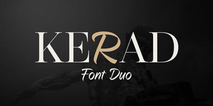 Kerad Font Duo is a captivating combination of modern serif and handwritten font, both seamlessly mixable to create a unique and appealing impression. It is suitable for various design projects such as logos, branding, packaging design, web design, titles, posters, printing, advertising, and much more.
 - Sweet Titling No. 11 by Sweet,
$39.00 Sweet Titling No. 11 is a 2009 addition to the Sweet Collection of engraved lettering styles from the 20th Century. This obscure, art deco design would have been used for engraved letterhead, business cards, etc., and likely first appeared in the 1920s or ’30s.
 - Bobbin by Typoforge Studio,
$19.00 To design a font Bobbin I was inspired by a You And Me Monthly published by National Magazines Publisher RSW Prasa that appeared from Mai 1960 till December 1973 in Poland. In the Bobbin family, every variety contains 3 alternative characters with automatic replacement.
 - Brink by 4RM Font,
$23.00 Inspired by the modern world, the Brink font appears with an extra expanded style combined with geometric letterforms, making this font look stylish, this font is included in the display font category that is suitable for use in graphic design, especially those with futuristic themes.
 - Find Peace by Seemly Fonts,
$12.00 Presenting Find Peace is a standout display font that's ideal for giving your designs a special touch. If you use this font, your design will seem appealing. Apply it for print design, photo frames, flyers, record covers, stationery, t-shirts, image sliders, paper, and more.
 - Walden by Fenotype,
$35.00 A heavy serif font with a handmade feel, Walden gives a hearty impression. Despite its rustic appearance, Walden is perfectly adaptable to contemporary use, wherever a bit more character is needed. Decidedly kept simple, these three weights with matching italics is all you need.
 - Ronsect by Fontron,
$35.00The idea for this came from a logo I saw which was adapted and simplified to make this font. Almost italic in appearance, it can be used as an alternative sans stencil although that wasn't envisaged at the start. An Italic is also available. - Satin by Lizzy Hartley Design,
$32.00 This simple design keeps its elegance through slight curves like satin draped over skin. Satin is tall and sleek. The curves are not completely symmetrical. The curves are perfectly balanced with long curves on the bottom half and shorter more dramatic curves in the ascenders.
 - Kursk 105 by Talbot Type,
$19.50 A text and display font with square proportions, inspired by the type styles of soviet-era Russia. Very shallow ascenders and descenders and a large relative x-height, exaggerate the compact and geometric look. Related to Kursk 205 , its cousin with a rounder look.
 - Wooden Head by Sipanji21,
$18.00 Wooden Head is a unique display font with a graffiti-like appearance. Use this font for any crafting project, apparel design, logotype, advertising, wall decoration, and pretty much anything that requires a personalized look. Take your designs to the next level with this stunning font!
 - AZ Wings by Artist of Design,
$20.00 AZ Wings font has some inspiration from an old "Gull Wing Trucks" Skateboard sticker and also borrows from blackletter styles, but for the most part is is completely original. This font was designed solely for use as a headline with unique complementing ascenders and decenders.
 - Bicicleta by Dear Alison,
$24.00 The Bicicleta family recaptures the ambiance of a bicycle journey I took many years ago along the Portuguese coast and embodies a vintage flair that appeals to me. A little reminiscing is always never a bad thing. The Bicicleta family is classic, clean and stylish.
 - Diplomatic by Sudtipos,
$59.00 Diplomatic is another script from the Koziupa and Paul duo. It relies on calligraphic simplicity to reach its artistic sophistication. Prominent ascenders and descenders work alongside calculated but casual strokes to produce an unmistakably elegant typesetting. Designed by Koziupa and digitized by Ale Paul.
 - Tuzonie by Aah Yes,
$9.95Tuzonie imitates misprinted or degraded and distressed type. It especially imitates type where the outline has only small imperfections, (which at smaller sizes might even appear fairly-well defined) but where the imperfections in the interior of the letter shapes are more obvious and frequent. - Hustle Faster by Arendxstudio,
$14.00 Hustle Faster font is very suitable for type & logotype. This font is very stylish and with 2 different styles so it gets variations and flavors that will appear more retro style and I think this is perfect for the needs of your design projects
 - Daisy Lau by Dharma Type,
$19.99 Based on some script in the 19th century. Inky texture gives realistic handwriting appearance. Smooth writing feeling creates antiqued and nostalgic atmosphere. Rising Star on March 2007. There are two other script designed by in the same concept. -Daisy Lau -Lily Wang -Pansy Bo
