10,000 search results
(0.017 seconds)
- Vernata by IbraCreative,
$17.00 Vernata, an enchanting and elegant serif font, captivates with its timeless sophistication and refined charm. Each letter is meticulously crafted, embodying a perfect balance of curves and straight lines that exude a sense of grace and luxury. The delicate serifs add a touch of classic flair, while the overall design maintains a modern sensibility. The spacing and proportions of Vernata are expertly calibrated, ensuring readability and an effortless flow of text. Whether used for invitations, branding, or editorial design, Vernata brings a magical allure to any project, seamlessly blending tradition with contemporary aesthetics.
 - QEWUR by Twinletter,
$15.00 Introducing QEWUR, our newest font, an authentic font with a Japanese style theme, with an attractive and decent font shape to make your project elegant, special, gorgeous, and charming, and easy to remember for the audience. Logotypes, food banners, branding, brochure, posters, movie titles, book titles, quotes, and more may all benefit from this font. Of course, using this font in your various design projects will make them excellent and outstanding; many viewers are drawn to the striking and unusual graphic display. Start utilizing this typeface in your projects to make them stand out.
 - French Kiss by Robert Arnow,
$25.00 French Kiss is an expressive brush font that was drawn by hand on paper to ensure that it captured an intimate and personal quality. The texture of the brush has been left in, and can be seen when displayed at large sizes. French Kiss contains 28 alternates and ligatures for enhanced diversity and legibility. Unfortunately, the MyFonts display engine does not show the contextual alternates. Additionally, the entire font has been meticulously kerned, letter by letter to ensure a smooth flow, in spite of the expressiveness of the letters.
 - Klamp 205 by Talbot Type,
$19.50 Talbot Type Klamp 205 is an elegant and streamlined, geometric sans-serif. A legible text font, its narrow proportions mean it’s economical with space; while at larger sizes it makes a confident, modern display face. Klamp 205 is available in a comprehensive family of seven weights, featuring an extended character set to include old style numerals, as well as accented characters for Central European languages. It is also available with some character variations as Klamp 105, most notably featuring a more modern, single-storey lower case a and g.
 - Karben 205 Mono by Talbot Type,
$19.50 Karben 205 Mono is a monospaced variation of Karben 205. The clean and pure geometry of Karben 105 makes it highly suitable for adaptation to this monospaced variant. It has an even look and retains its legibility at very small sizes. Karben 205 Mono is available in a family of five weights and includes an extended character set to include accents for Central European languages. Karben 105 Mono is also available as a monospaced variant of Karben 105. There is also a stencil version of Karben 105 available.
 - Kawara by Twinletter,
$15.00 Kawara, our newest font, is now available. We produced this display font with a Japanese theme or an Asian font to fulfill the needs of your project with a Japanese theme, but it’s impossible to use an authentic Japanese font because not everyone understands Japanese letters, therefore we present this font as an intermediate alternative. To make your project gorgeous, strong, and bold, we produced this font with the most unique shape imaginable. So, what are you waiting for? Use this font to realize your ambition of having a wonderful project. Logotypes, food banners, branding, brochure, posters, movie titles, book titles, quotes, and more may all benefit from this font. Of course, using this font in your various design projects will make them excellent and outstanding; many viewers are drawn to the striking and unusual graphic display. Start utilizing this typeface in your projects to make them stand out.
 - Hive Mind by Okaycat,
$7.50This font has 2 styles in one keyboard layout! There is a solid style, and an outline style. The capital letters match the small-case. The capitals are all solid letters, while the small-case are the same, but an outline version. Same with your numbers, there is 2 styles (Outlined hollow numbers, or press shift and a number to get it's matching solid version). Common punctuation marks, brackets, etc., are included too, in both styles (There's even a hexagonal euro and dollar sign). To make these characters easier to find, repeats are spread throughout your alternate keys. The two styles can be used together, nicely complimenting each other. Hive Mind is NOT appropriate for important business presentations, lengthy novels, or anything you want to be an easy read. Use this font anywhere you want to create a funky look or need to be cryptic... Have fun with it! - Tanger Serif by Typolar,
$72.00 Inspired by New Transitional and Egyptian fonts, Tanger Serif has elements of a sturdy work-horse text face and finely detailed headline font. A wide variety of widths and weights support many text sizes. Typically Narrow is used in headlines, Medium in body and Wide in smaller print. Nothing is predefined, though. By combining the right widths with the right weights this traditional approach can easily be challenged. Let’s take an oversized (over 10 pt) body copy for instance. In conjunction with using a bigger size to enhance readability, a narrow and slightly lighter weight will save space and brighten text color. Tanger Serif Narrow is a slim normal rather than a condensed face. As an Open Type “Pro” font each weight includes an expanded character set, small caps, old style figures, tabular figures, ligatures, fractions etc. All these are easily accessible through OpenType features.
 - Gamon by Eko Bimantara,
$19.00 Gamon is an innovative and daring unicase display font that is a perfect example of modern typography. The absence of traditional lowercase letters and the integration of multiple glyphs in the uppercase letters create a distinct and captivating design. The uniform size of the letters adds to the font’s appealing appearance, making it an ideal choice for large display layouts, branding, posters, and titles. Gamon’s typography is perfect for designers who are looking for a fresh and unusual aesthetic. It can transform any digital or print design stand out from the rest. Gamon’s versatility makes it suitable for a broad range of design applications, including logos, packaging, and marketing materials. Gamon’s boldness and uniqueness make it an excellent choice for designers who want to break free from the conventional design constraints. With Gamon, designers can create designs that are not only visually appealing but also memorable and impactful.
 - Kurri Island by Mans Greback,
$29.00 Kurri Island is a positive sans-serif typeface. It was drawn and created by Måns Grebäck between 2017 and 2020. With its slightly irregular strokes and bends the font has a characteristic fun and comical and look. The sans is easy-going and relaxed while being serious enough to be used professionally. Kurri Island is an extensive multi-style font family, composed of 24 high quality fonts. The weights are Thin, Light, Regular, Medium, Bold and Black. Being favorably used as a block letter sans-serif, it has an additional Caps style to maximize the impression, and each font are provided as Italic. Its range of styles gives the typeface great flexibility, while also giving the ability to emphasize phrases or words. Kurri Island contains all characters you'll ever need, including all punctuation and numbers. It has an extensive lingual support, covering all European Latin-based scripts.
 - Quatie by insigne,
$24.00 Originally a conceptual approach from the Chatype project of Jeremy Dooley and Robbie de Villiers, Quatie has been restructured to add a new industrial element to Insigne’s offerings. Like the Official Font of Chattanooga, Tennessee, Quatie definitely carries a contemporary, hipster feel. Quatie similarly draws much of its inspiration from the industrial brawn of the railroad and the unique characteristics of Cherokee letterforms, giving it an atypical form not usually found in an industrial slab. While the Quatie concept was originally set aside for the more technological look of Chatype’s final image, Jeremy revived this face from its dormant state and refined it for its commercial release in 2013. This bracketed slab with its slightly rounded, soft edges adds a warm, retro, industrial element to Insigne’s offerings. The resulting quirky, ‘hipster’ vibe of Quatie lends its voice to give an unparalleled edge to your designs.
 - React by RagamKata,
$16.00 React is a classy, bold upper and lowercase typeface that looks incredible in both large and small settings. Best used as a display for headings and logos, React clean lines and smooth curves give any project an extra touch of class. A serif modern and classic typeface that has own unique style & modern look. This typeface is perfect for an elegant & luxury logo, book or movie title design, fashion brand, magazine, clothes, lettering, quotes, and so much more. Features: - Lowercase and Uppercase - Beautiful Alternates - Numerals & Punctuation - Accented characters - Multilingual HOW TO ACCESS ALTERNATE CHARACTERS Open glyphs panel: In Adobe Photoshop go to Window – glyphs In Adobe Illustrator go to Window - Type – glyphs I really hope you'll get pleasure using Reactfont and it will be perfect addition to your font collection! Contact me with an inbox message If you have any question. Thank you and enjoy!
 - Cornelius by Artcity,
$19.00 Cornelius is a playful hand-drawn font family designed by Daniel Bak (Artcity). It is available in three handy weights: regular, bold and screaming. It contains international language accent marks and diacriticals, including Greek and Cyrillic in both OTF and TTF formats. Font family name is inspired by the main male ape character from the 1968 science fiction film Planet of the Apes and Pierre Boulle novel of the same name. Boulle published his La Planète des singes in 1963, which was originally translated in 1964 as Monkey Planet by Xan Fielding, and later re-issued as Planet of the Apes . Dr. Cornelius is a chimpanzee archaeologist and historian who appears in the original novel, and also the first three installments of the classic movie series, from the 1960s and 1970s. He was portrayed mainly by actor Roddy McDowall, but also by David Watson.
 - Big Stripes Mono by Ingrimayne Type,
$9.00 BigStripesMono is another typeface family from IngrimayneType that explores the possibilities of alternating letters sets. The family is monospaced with four fonts: a base or solid style, an outlined style, and two styles in which each character is cut diagonally and the halves are separated to form two characters. These split styles are not designed to be used alone but layered with the base style, outlined style, or both to form colorful lettering with an unusual striped appearance. The stripe is not apparent in single letters but only in words or lines of text. For best results use an application that supports the OpenType feature Contextual Alternatives (calt) to alternate the letters of the split styles. The four styles can be combined in several ways to create unusual lettering appropriate for titles, headlines, and similar uses. And if one wants a bold, monospaced, sans-serif face, BigStripesMono has that too.
 - P22 Curwen by IHOF,
$24.95 P22 Curwen was originally designed by an unknown designer. This version was created by Colin Kahn. P22 Curwen Poster is a digitized version of a rare wood type used by the Curwen Press in England in the early 20th Century for poster work. The font was known to have been cut in 6 sizes—from 3-line (3/4 inch) to 16-line (3 inch) in height. The font was based from impressions made of the 6-line type. P22 Curwen Maxima is a hyper-stylized re-interpretation of Curwen Poster by Colin Kahn. As a post-modern poster type, it evokes an organic nature within a novel maximalist framework. It is reminiscent of early phototype display faces with an illogical three-dimensionality which serves to give the font continuity. The capitals are buried beneath stylistic wood shavings complementing the sculpture like quality of the lowercase. Perfect for (almost) any project.
 - Amrys by Monotype,
$65.00 There's an appealing quirkiness about Amrys, which offers a confidently unusual alternative to more conventional designs. Its charm lies in its tapering tips, flexing stems, and unexpected notches, which combine to suggest something of the chiseller's tool at work. As a modulated serif, its letter shapes live between serif and sans serif, lending the design a sense of pleasing irregularity – something that's really highlighted at larger sizes. However this is also a typeface that works for text, injecting rhythm and texture into reading. “It's distinctive, idiosyncratic, and weird,” says its designer, Ben Jones. He started designing Amrys while studying an MA at Reading University, creating it in response to a brief for a magazine typeface. Amrys features an extensive and impressive character set. In addition to Latin, Amrys covers several scripts including Cyrillic, Greek, Arabic and Armenian. The family consists of 8 weights, from Light to Black, with matching italics.
 - Museum Fournier by T4 Foundry,
$16.00Museum Fournier is inspired by a set of Rococo capitals designed by Pierre Simon Fournier le Jeune circa 1760. The matrices are part of a set imported to Sweden by J.P. Lindh in 1818 from Breitkopf & Härtel in Leipzig, Germany. They are now in the Nordiska Museum in Stockholm. Type designer Torbjörn Olsson has expanded the original 31 lead matrices in the collection to 55 characters. Please note that the font contains capitals only, no lower case letters and no figures either. Museum Fournier is an OpenType creation, for both PC and Mac. Swedish type foundry T4 premiere new fonts every month. Museum Fournier is our ninth introduction. Museum Fournier is part of the growing Museum type family. Museum also includes three different border fonts, an ornament font with some of Granjon's arabesques and Museum Tertia Cursive, an exquisite 1700's typeface with modern additions. - Rue Display by Winnie Tan,
$29.00 Rue is an organic, casually ornamental, narrow-faced sans serif. It is a display type structured with random traces of calligraphic tendencies. It does not begin with any noble ideals, other than to mediate between the muse of imagination and the act of realization. The spirited and exploratory design is the materialization of a feeling about fonts as a family of organisms taking on a life of its own, in work and play. Rue is the epitome of vanity and indulgence which seems to purpose itself well in aesthetics, wellness and botanicals. Its whimsical quality also suggests applications in the form of gifts and ornamentation. In retrospect, Rue was conceived as a typeface, used as an image and discovered as an ornament. It comes in 5 weights of light, regular, medium, semibold and bold, and their matching italics. Rue Display was published in 2010 by TypeTogether. http://www.behance.net/gallery/Rue/373854
 - CA Oskar by Cape Arcona Type Foundry,
$40.00 CA Oskar came into being as a custom typeface for the international Traumzeit music festival. As a substantial part of the new corporate identity, it had to be characteristic, but also flexible in use. Starting with the design of compressed caps for headlines, the typeface was soon expanded by a condensed weight for setting of text and further developed into a fully functional font with two widths and two weights. Both weights are very space-efficient, which was -- apart from aesthetic considerations -- an important issue in the process of the design. CA Oskar is a mixture of industrial harshness and friendly round forms, reflecting the spirit of fusion, which is basically what the whole festival is about. Its very slim proportions in two widths make it an attractive alternative to fonts like Alternate Gothic, but CA Oskar adds an extra portion of personality and a coherent choice of weights.
 - Halogen Flare by Positype,
$29.00 When I released Halogen, I asked ‘Who doesn't want or need an expansive contemporary extended sans that has a sense of style and swagger… what if it had a lowercase, small caps and various numeral options… how could you say no?’ Go, click on the Halogen link and read on, if you're interested. Halogen was well-received, so I decided to take it further with Halogen Flare (the name kinda tips you off as to what kind of typeface it is, don't ya think?). As always, I prefer not to take short cuts and provide an anemic offering of glyphs — a modern typeface offered today must provide more than just the basics and this one does — lowercase, smallcaps, old style numerals, tabular forms, stylistic and titling alternates, fractions, case-sensitive features, and even an alternate uppercase ordinal set is included. Now, go make cool print and digital things with it.
 - Wermut by Brownfox,
$45.00 An intoxicating blend of rare flavours is what makes the new transitional typeface Wermut (German for vermouth) resemble its alcoholic namesake. Bitter and thorny at first glance, it proceeds to surprise the palate with a complicated taste that leaves a pleasant aftertaste. Wermut may not be taken in hastily, but needs to be thoughtfully enjoyed at a measured pace. Its dark colour, compressed, spring-like, shapes, well-built proportions, and agreeable letterforms all look safe enough until one is jolted to encounter the clipped serifs that lend the page an unexpectedly edgy appearance. The font comes in two weights with an extended character set in Latin and Cyrillic scripts supporting 66 languages. A product of slow, careful distillation, this infusion of multiple ingredients comes together to form a unique mature taste which will be appreciated by true connoisseurs of typographic cocktails. Desined by Gayaneh Bagdasaryan and Vyacheslav Kirilenko.
 - Optima Nova by Linotype,
$57.99 With the clear, simple elegance of its sans serif forms and the warmly human touches of its tapering stems, the Optima family has proved popular around the world. In 2002, when it was finally possible to produce digital alphabets without technical limitations and compromises, and more than fifty years after the first sketches, an expansion and redesign of the Optima family was completed and released as Optima nova. Hermann Zapf and Japanese type designer, Akira Kobayashi, collaborated on the project, which included re-working of the existing weights and the addition of several new weights: small caps, old style figures, light, heavy, and condensed. The original Optima was never manufactured with a real italic, only an oblique version of the roman. Optima nova has a complete range of beautifully designed real italics; the new italic forms, of the e, f and g are especially notable. The titling face includes capital letters with special and unusual letter combinations and ligatures, making it an excellent choice for headlines, logos and advertising purposes. Optima continues to be an all-purpose typeface; and Optima nova works for just about anything from book text to signage. Optima Nova® font field guide including best practices, font pairings and alternatives.
 - Spitzkant by Julien Fincker,
$29.00 About the design Spitzkant is a serif typeface family that is characterized by strong contrasts. Pointed, sharp serifs and edges contrast with round and fine forms, making it very individual and expressive. This makes it particularly suitable for branding, editorial, packaging and advertising. The high-contrast display version has been complemented by a lower-contrast text version, making Spitzkant in combination suitable for both strong headlines and extensive body text. An allrounder that can be used for many purposes. Features The Spitzkant Head and Text family has a total of 2 optical sizes, 5 weights and 20 styles, from thin to bold and matching italics. With over 850 characters, it covers over 200 Latin-based languages. It also has an extended set of currency symbols and a whole range of open type features. For example, there are alternative characters as Stylistic Sets, Small Caps, automatic fractions and many other features. Ligatures Especially the extensive selection of ligatures (standard and optional) is a special feature which was an important part during the design process. With over 95 different ligatures there are many possibilities to give headlines and logos an individual touch. Get the Variable Font here: https://www.myfonts.com/fonts/julien-fincker/spitzkant-variable/
 - Arta by Olivier Blanc,
$34.00 ARTA is an ArtDeco style font, inspired by classic font like Newport Classic with elongated typeface with high waisted uppercase letters which curve in an geometric and elegant way. It consisted of really condensed lettering which had little space available. It's a well complet font with 315 Glyphs for most latin languages as "English, French, Spanish, German, Icelandic, Afrikaans, Catalan, Czech, Esperanto, Hungarian, Latin, Latvian, Lithuanian, Maltese, Northern Sami, Polish, Serbo-Croatian, Slovak, Slovene, Sorbian, Turkish and Welsh". ARTA will give to your design an chic presentation, you will be able to generate beautiful writings,thanks to 3 differents type "Light, Regular & Bold". It can be used for Shop, Restaurant, Jewelry, Cosmetic, Press identity & more. I started to work on this typeface at the creation of a logo in 2017 for the butcher shop of my uncle in Luchon in France named "Le Louchébem". I always had in mind to complete & share it. So after some years, I decided that it was time to finish it. This was my first Typography creation and I wanted to make it as an Art Deco typeface. I really love this elegant, high & classy lettering style. I want to bring this 1910's vibes back to be more use in our days.
 - Times New Roman Windows compatible by Monotype,In 1931, The Times of London commissioned a new text type design from Stanley Morison and the Monotype Corporation, after Morison had written an article criticizing The Times for being badly printed and typographically behind the times. The new design was supervised by Stanley Morison and drawn by Victor Lardent, an artist from the advertising department of The Times. Morison used an older typeface, Plantin, as the basis for his design, but made revisions for legibility and economy of space (always important concerns for newspapers). As the old type used by the newspaper had been called Times Old Roman," Morison's revision became "Times New Roman." The Times of London debuted the new typeface in October 1932, and after one year the design was released for commercial sale. The Times New Roman World Version is an extension of the original Times New Roman with several other scripts like with the Helvetica World fonts. It is part of the Windows Vista system. The following code pages are supported:1250 Latin 2: Eastern European 1251 Cyrillic 1253 Greek 1254 Turkish 1255 Hebrew 1256 Arabic Note: The Roman and Bold versions include the arabic scripts but they are not part in the corresponding italic versions. 1257 Windows Baltic 1258 Windows Vietnamese
- Bion by Type Forward,
$38.00 Bion is a contemporary geometric sans serif with a down-to-earth attitude. It is distinguished by a high x-height, vertically cut terminals, and a minimal stroke contrast, giving it a distinctive, sharp look that is both timeless and universally appealing. Bion comes with 40 weights in a single variable file, ranging from Hairline to Black. We also included Upright, Italic, and Condensed variations to give you a fresh and diverse look for poster and title designs. Whatever message you want to get across, Bion has you covered - with support for 220 languages and 1,220 glyphs in total, as well as Extended Latin, Cyrillic and Greek scripts and an exhaustive list of typographic symbols. Our latest typeface also arrives packed full of OpenType features, including an alternative glyph set that will transform the way your text looks, giving it a more squarish appearance and offering additional visualization options. The Bion type family also includes an extensive set of standard and discretionary ligatures, tabular and small figures, fractions, and language localizations. These features work in static and variable fonts alike, providing a ready-made solution to all your advanced typographic needs. This functional, pragmatic typeface is clean and easily readable, making it an ideal choice for both print and on-screen media.
 - Nexa by Fontfabric,
$29.00 Improved kerning of the Updated Version of 2020 - New Features: • Cyrillic language support • Bulgarian Localization • Completely New Nexa Text subfamily • New ExtraLight weight with a corresponding italics • Stylistic Set suitable for Display purposes - ss02 • Tabular Figures Even the most recognizable typefaces of our time, such as Nexa, should be updated sometimes. We proudly present you with the latest upgraded version of the notorious geometric sans serif. The completely refined family design comes with an addition of one more weight—Extra Light—and its matching italic, alongside an entirely new subfamily—Nexa Text, optimized for longer text, and even a futurist stylistic set of Nexa for an alternative display look. The outcome is altogether 9 weights and 36 fonts! The glyph case now covers not only an improved Extended Latin but a new set of Cyrillic with adequate language localization. The fluent functionality of Nexa is achieved with multiple OpenType features, such as case-sensitive forms, contextual and stylistic alternates. The standard numerals set encompasses tabular figures and symbols, superiors and inferiors, numerators and denominators, plus fractions. The unique appearance of Nexa combined with rich variety places it beyond the scope of regular geometric typefaces for all kinds of scales and purposes and designs that speak for themselves.
 - Artifex Regina by Adorae Types,
$29.00 Created for designs that require a handcrafted and handwritten look with a majestic touch. Artifex Regina is a blend of fantasy, wizardry, and charming delight. What's even better? IT'S VARIABLE! Designed to be a fun variable font, it allows Artifex Regina to be used as an animated typography adding a hint of magic through styles & transitions. Need a brighter inline? Need a softer shade? We got you! As an extra feature, you might want to try and play with its sliders and navigate throughout its 2 axes plus a swirly style handler to get a fully customized style! FEATURES: · Alternates: With an easy access at hand and through various stylistic sets that may contain many or a few alternates, leaving the choice to the designer for the right combination of sets and alternate characters. This includes a set of swirly ends available for static fonts as well as an axis for the variable font. · Contextual alternates: a few characters that provide some variety when used together. · Ligatures: Common used connectors with a playful twist. · Swashes: Accesible through OpenType Swashes feature there's a set of initial, final and middle swashes with passionate, elegant, and expressive strokes. Also, through stylistic sets, there's a set of monoline swashes for a cleaner look or limited spaces.
 - Taglio by Wilton Foundry,
$29.00 Taglio’s name is derived from intaglio, which means “incised carving” or “an impression from an engraving”. Indeed, Taglio looks like an incised engraving with a contemporary calligraphic interpretation. The down strokes start with a single horizontal line that curves into a dual vertical line and ends with the same single line at the base. The dual elongated strokes create a bold overall impression but is literally twice as sophisticated than if the two lines were solid. That was exactly the goal in creating this font. We managed to create a font that is distinctive, elegant, and crisp that is also intentionally stencilled for more flexibility. For instance, it is ideal for laser cutting signage. One of the unique features in using the capital glyphs is that they stack perfectly without losing legibility, primarily because of the slanted ends of the dual vertical lines - see the example “Miami Fashion Week” display ad. Taglio’s unusual style was carefully crafted to come to life at display sizes. It is therefore ideal for use in branding fashion, restaurants, buildings, packaging, museums, signage, etc. An ideal pairing font is our WERK family which can be seen on some of the display ads below. Taglio has a sparkling and sophisticated personality that will absolutely delight!
 - Brun by Eurotypo,
$34.00 The font family Brun includes two styles Regular & Clean. Brun is a casual, modern and hand brushed font. I've designed Brun carefully with the intention to preserve in its glyphs the original tell-tale dry brush imperfections and a bouncy baseline for a more personalized effect even more authentic. Brun Clean preserves the characteristics of a brush font without being dry brush stroke. As an exclusively Open Type release, with 575 glyphs and 35 ornaments, it has several special alternatives for all letters with lots of possibility an an infinity of combinations. There are plenty of options to allow you to create something unique and special: standard and discretionary ligatures, swashes and stylistics alternates for each letter, beginning and ending letters. These lovely fonts have already an extended character set to support Central and Eastern as well as Western European languages. This will help your creativity and make it easier to make the impressive and elegant typographic work. This font is a perfect choice for greeting cards, posters, labels, t-shirt design, logos, and more. Brun was made to make your project more beautiful and attractive! Have fun with it! To activate the optional glyphs you may click on buttons in any OpenType savvy program or manually choose the characters from Glyph Palette. Enjoy it!
 - Farmland JNL by Jeff Levine,
$29.00Farmland JNL is an unusual Western version of Cornfield JNL. The shape of the original letters (inspired by a 1950s popcorn box) create a new variation on the lettering of the Old West. - Brass Stencil JNL by Jeff Levine,
$29.00 Brass Stencil JNL takes its place amongst the many retro stencil fonts designed by Jeff Levine, and was inspired by a set of vintage brass stencils spotted for sale in an online auction.
 - Legnano by Nick's Fonts,
$10.00 Here's something you don't see every day—Italian Art Deco woodtype. It's suave but unsophisicated, an unpretentious charmer. Both versions support the Latin 1252, Central European 1250, Turkish 1254 and Baltic 1257 codepages.
 - Miver by Sakha Design,
$12.00 Miver is a bold and thick lettered serif font. No matter the topic, this font will be an incredible asset to your fonts’ library, as it has the potential to elevate any creation.
 - ThinPen by Authentic,
$39.50 ThinPen is based on an ancestor of the German DIN-Schrift. The font was traced with a plastic template on transparent paper, scanned and worked over carefully to keep the handmade, authentic touch.
 - Bloque by Corradine Fonts,
$19.95 Bloque is a heavy slab font family which contains six fonts. It has three layers for both roman and italic styles, including an inline and a shadow versions to make different color combinations
 - Sobriquet by Hanoded,
$15.00 Sobriquet means 'nickname'. The font is a narrow, handmade typeface, in an art-deco-ish style. It comes with a bunch of ligatures, distinct upper and lower case letters and extensive language support.
 - Funny Toys by Letterafandi Studio,
$14.00 Funny Toys is a fun and bubble display font. No matter the topic, this font will be an incredible asset to your fonts’ library, as it has the potential to elevate any creation.
 - Ditho by Mifiq,
$14.00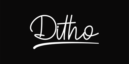 Ditho is an excellent handwritten script font. Ditho is suitable for social media posts, advertisements, logos & branding, invitations, product design, photography, watermarks, labels, wedding designs, product packaging, any event that requires a handwriting.
 - Postillon by RMU,
$30.00 Herbert Post’s (1903-1978) blackletter fonts redesigned for nowadays’ use. Both font styles contain adorning swash caps. Typing N, o, and period, and activating the OT feature Ordinals produces an oldstyle number sign.