10,000 search results
(0.044 seconds)
- Do It Again by Thinkdust,
$10.00 Do It Again is a new stencil based rounded sans serif with great language support, designed by Thomas Averin.
 - Neue Frutiger Paneuropean by Linotype,
$79.00During planning for the new Roissy Charles de Gaulle airport in Paris at the beginning of the 1970s, it was determined that the airport's signage system had to include the clearest and most legible lettering possible. The development of all signage was put into the hands of Adrian Frutiger and his studio. The team carried out their task so effectively that a huge demand for their typeface soon arose from customers who wanted to employ it in other signage systems, and in printed materials as well. The Frutiger® typeface not only established new standards for signage, but also for a range of other areas in which a clear and legible design would be required, especially for small point sizes and bread-and-butter type. The typeface family that which emerged as a result of this demand was added into the Linotype library as "Frutiger" in 1977. Frutiger Next, created in 1999, is a further development of Frutiger, not necessarily a rethinking of the design itself. It was based on a new concept, the most obvious visual characteristics of which is the larger x-height, as well as a more pronounced ascender height and descender depth for lower case letters in relation to capitals. This new design created a balanced image and included considerably narrower letterspacing. Frutiger Next meets the demand for a space-saving, modern humanist sans. 2009's Neue Frutiger is a rethink of the 1977 Frutiger family, now revised and improved by Akira Kobayashi in close collaboration with Adrian Frutiger. Despite the various changes, this "New Frutiger" still fits perfectly with the original Frutiger family, and serves to harmoniously enhance the weights and styles already in existence. The perfect mix, guaranteed Neue Frutiger has the same character height as Frutiger. As a result of this, already existing Frutiger styles can be mixed with Neue Frutiger where necessary. Likewise, Neue Frutiger is perfect for use alongside Frutiger Serif. Newly added are the "Neue Frutiger 1450" weights. Especially for the requirements of the newly released German DIN 1450 norm we have built together with Adrian Frutiger specific weights of the Neue Frutiger. The lowercase l" is curved at the baseline to better differentiate between the cap "I", additionally the number "0" has a dot inside to better differentiate between the cap "O", and the number "1" is now a serifed 1. The font contains additionally the origin letterforms from the regular Neue Frutiger font which can be accessed through an Opentype feature." - Neue Frutiger Cyrillic by Linotype,
$89.00During planning for the new Roissy Charles de Gaulle airport in Paris at the beginning of the 1970s, it was determined that the airport's signage system had to include the clearest and most legible lettering possible. The development of all signage was put into the hands of Adrian Frutiger and his studio. The team carried out their task so effectively that a huge demand for their typeface soon arose from customers who wanted to employ it in other signage systems, and in printed materials as well. The Frutiger® typeface not only established new standards for signage, but also for a range of other areas in which a clear and legible design would be required, especially for small point sizes and bread-and-butter type. The typeface family that which emerged as a result of this demand was added into the Linotype library as "Frutiger" in 1977. Frutiger Next, created in 1999, is a further development of Frutiger, not necessarily a rethinking of the design itself. It was based on a new concept, the most obvious visual characteristics of which is the larger x-height, as well as a more pronounced ascender height and descender depth for lower case letters in relation to capitals. This new design created a balanced image and included considerably narrower letterspacing. Frutiger Next meets the demand for a space-saving, modern humanist sans. 2009's Neue Frutiger is a rethink of the 1977 Frutiger family, now revised and improved by Akira Kobayashi in close collaboration with Adrian Frutiger. Despite the various changes, this "New Frutiger" still fits perfectly with the original Frutiger family, and serves to harmoniously enhance the weights and styles already in existence. The perfect mix, guaranteed Neue Frutiger has the same character height as Frutiger. As a result of this, already existing Frutiger styles can be mixed with Neue Frutiger where necessary. Likewise, Neue Frutiger is perfect for use alongside Frutiger Serif. Newly added are the "Neue Frutiger 1450" weights. Especially for the requirements of the newly released German DIN 1450 norm we have built together with Adrian Frutiger specific weights of the Neue Frutiger. The lowercase l" is curved at the baseline to better differentiate between the cap "I", additionally the number "0" has a dot inside to better differentiate between the cap "O", and the number "1" is now a serifed 1. The font contains additionally the origin letterforms from the regular Neue Frutiger font which can be accessed through an Opentype feature." - Neue Frutiger 1450 by Linotype,
$71.99 During planning for the new Roissy Charles de Gaulle airport in Paris at the beginning of the 1970s, it was determined that the airport's signage system had to include the clearest and most legible lettering possible. The development of all signage was put into the hands of Adrian Frutiger and his studio. The team carried out their task so effectively that a huge demand for their typeface soon arose from customers who wanted to employ it in other signage systems, and in printed materials as well. The Frutiger® typeface not only established new standards for signage, but also for a range of other areas in which a clear and legible design would be required, especially for small point sizes and bread-and-butter type. The typeface family that which emerged as a result of this demand was added into the Linotype library as "Frutiger" in 1977. Frutiger Next, created in 1999, is a further development of Frutiger, not necessarily a rethinking of the design itself. It was based on a new concept, the most obvious visual characteristics of which is the larger x-height, as well as a more pronounced ascender height and descender depth for lower case letters in relation to capitals. This new design created a balanced image and included considerably narrower letterspacing. Frutiger Next meets the demand for a space-saving, modern humanist sans. 2009's Neue Frutiger is a rethink of the 1977 Frutiger family, now revised and improved by Akira Kobayashi in close collaboration with Adrian Frutiger. Despite the various changes, this "New Frutiger" still fits perfectly with the original Frutiger family, and serves to harmoniously enhance the weights and styles already in existence. The perfect mix, guaranteed Neue Frutiger has the same character height as Frutiger. As a result of this, already existing Frutiger styles can be mixed with Neue Frutiger where necessary. Likewise, Neue Frutiger is perfect for use alongside Frutiger Serif. Newly added are the "Neue Frutiger 1450" weights. Especially for the requirements of the newly released German DIN 1450 norm we have built together with Adrian Frutiger specific weights of the Neue Frutiger. The lowercase l" is curved at the baseline to better differentiate between the cap "I", additionally the number "0" has a dot inside to better differentiate between the cap "O", and the number "1" is now a serifed 1. The font contains additionally the origin letterforms from the regular Neue Frutiger font which can be accessed through an Opentype feature."
 - Steinweiss Script by Alphabet Soup,
$59.00 Steinweiss Script began its journey towards daylight when Michael Doret was asked by Taschen Publishing to do cover lettering for the huge commemorative edition they were putting together on the work of Alex Steinweiss—“The Inventor of the Modern Album Cover”. The lettering was to be created to appear similar to the famous “Steinweiss Scrawl” the calligraphy that Steinweiss had used on countless album covers. While designing this piece of lettering, Michael realized that there was great potential for a font that was designed in the spirit of that famous “scrawl”. Through his contacts at Taschen Publishing, he was fortunate enough to be able to contact the Steinweiss family, and get the official Steinweiss approval to proceed with his “Steinweiss Script” project. Michael decided that in addition to giving the font his name as an homage, that he would donate a portion of the proceeds from the sale of this font to the man himself: Alex Steinweiss. Read more about the background of Steinweiss Script in Steven Heller’s article in Imprint. Steinweiss Script is a family of fonts in three weights: Light, Medium, and Bold. Additionally, within each weight there are three variations: Simple, Fancy, and Titling. These variations relate to the size/ratio of the caps to the lowercase, the complexity of those caps, and the size of the ascenders/descenders on the lowercase characters. These variations add usefulness to the font, making it accessible not just for headlines, but for longer passages of text as well. For a better understanding of its unique features please download The Steinweiss Script Users Guide from the Gallery section. PLEASE NOTE: the three Steinweiss Script fonts are cross-platform fonts which depend to some extent on certain advanced OpenType features, therefore they can be used to their full potential only with programs that support those features. When setting Steinweiss Script one should almost ALWAYS select the “Standard Ligatures" and “Contextual Alternates” buttons in your OpenType palette. See the “Read Me First!” file in the Gallery section.
 - Birch by Adobe,
$29.00Birch was designed in 1990 by Kim Buker Chansler, who based her forms on the designs of the turn of the 20th century. The new age needed new typefaces for an ever-increasing commerce and its advertisements. This time period therefore saw a profusion of new typefaces, all of which were meant first and foremost to catch the eye of consumers. To this end, style elements of past ages were reused, changed, and combined. Birch is modelled after a woodtype, a style made famous by its use on wanted posters in western movies. The narrow and space-saving Birch is perfect for headlines in display point sizes. - Fulmar by CAST,
$45.00Named after a practical seabird, Fulmar is a modern Scotch intended for extended reading. More European than American, it draws on a range of influences from around the North Sea, from Fife’s Alexander Wilson to 17th-century French experiments in modulation and 18th-century Belgian flash, and combines them with contemporary structure and proportions. The result is crisp yet warm, steadfast yet lively, sharp yet robust, rational but humane. It can be appropriate for new translations, new histories and new understanding. With five weights, ten styles, small caps, a clamjamfry of OpenType features and unicorn manicules, Fulmar dispenses with sprawl while retaining range and dexterity. - Ritafurey by Device,
$39.00 Ritafurey is an extended sans in seven weights, with characteristic low bowls on the P and R. Modern, sleek and corporate, but with a dash of character. It has been used on tech logos, summer blockbuster movies and Playstation skateboarding games. This new version reinstates the original Unicase versions of the M and N (available through the Glyph palette or Opentype options), adds extensive international character support, redrawn and respaced glyphs, a new Regular weight for better weight flow distribution, and many other additional glyphs. (Note the the new weights differ slightly from the old of the same name, so may change the appearance of existing files.)
 - Retroxoid by PizzaDude.dk,
$20.00 You may recognize the looks of Retroxoid - if not, then let me help you out: Retroxoid is actually a font I made back in 2007. I ran prints of the font, through a very bad copymachine, used a wet cloth to make the print look worn, scanned the prints and voila! Retrozoid, my very first Open Type font, was born! Now in 2010, Retroxoid has risen from the past, and is ready to burst your designs with clean, round and futuristic shapes!
 - Impressionable JNL by Jeff Levine,
$29.00 Impresssionable JNL is a font created from samples printed from a vintage rubber stamp toy set. This is a limited character design without spacing or kerning in order to preserve the hand-made look of inkpad printing on paper. A few extra punctuation glyphs, a percent sign and Euro were added to the original characters. At smaller sizes (72 point or less), the letters resemble the imprints of the stamps, but at higher sizes, they take on a different look of deconstructed lettering.
 - Areaman OT by AdultHumanMale,
$20.00 Areaman OT is a fun chunky ALL CAPS display font. I wanted it to look blocky and loud, So it can scream from Posters and Headlines. It has over 300 glyphs, several variations on the standard alphabet and all those extra pesky foreign features. It also has various letter pairing with extra ligatures and flourishes available through OpenType or your Glyphs palette. This upgraded version is now coded with OpenType features to create a randomised bespoke look and feel to your copy.
 - Reimbrandt by IKIIKOWRK,
$19.00 Proudly Present Reimbrandt - Art Nouveau Type, created by ikiiko. Reimbrandt is a classic typeface that is a perfect representation of the timelessness and romance of the past, inspired by the beautiful Art Nouveau era. This alluring typeface transports you back to a time when elegance and grace were the norm. This font exudes beauty and romance with its simple, decorative shapes reminiscent of the painstaking craftsmanship of the Art Nouveau era. This typeface is perfect for an vintage vibes, classic & vintage poster layout, fashion look book, book cover, packaging, food & beverages and also good for quotes, or simply as a stylish text overlay to any background image. What's included? Uppercase & Lowercase Number & Punctuation Multilingual Support Works on PC & Mac
 - Pascual Ferry by Comicraft,
$39.00 The slick and sexy letterforms of Ace ACTION COMICS artist, Pascual Ferry, are the latest to join our MASTERS OF COMIC BOOK ART font line. Pascual's work on the SUPERGIRLS storyline in ACTION made us want to lick each page -- but, y'know, not when anyone was looking... we know they're just comic book characters, they're not REAL and we don't fancy them or anything -- Uhhh... so we were delighted when Pascual invited us to create this stylin' sans souciant family of fonts for him. All we asked for in return was this smokin' alternate cover for the next issue of HIP FLASK... Hey, don't lick your monitor, you might get an electric shock...
 - Sagarana by Eller Type,
$35.00 Sagarana is an elegant display typeface rooted in the style of romantic or didones letterforms; however, it is a sans serif with a cleaner appearance. The contrast and the vertical stress maintain the modern style, while the terminals, the finials, the proportions and the narrow look enhance its stylish personality. It could be suitable for editorial projects such as magazines, books or even for sophisticated environments, let’s say, fashion, department store, perfumes, cosmetics and so on. Sagarana was initially inspired by a Brazilian book cover from 50’s. The name itself combines the words “saga” (as in the English sense of “story”) and “rana,” a Tupi word (Indigenous language) that roughly means “showing similarities”.
 - Liceum by Posterizer KG,
$19.00 Liceum is a calligraphic script with attractive look, created in the name of Gymnasium in ancient Athens, where Aristotle and the Peripatetics taught philosophy. The OpenType feature includes Stylistic Alternatives, Swash, Ligatures, Discretionary Ligatures, more than 150 Dingbats and Ornaments, Diacritical, and Cyrillic letters. It allows you to mix and match letter pairs to fit your design into a harmonious typographic whole (headlines). Liceum font is attractive but classical, smooth, clean, simple, elegant, and very legible. Liceum is very suitable for various purposes and design of logos, posters, brands, t-shirts, letterhead, signage, book covers, magazines, invitations, labels, menus, fashion, stationery, letterpress, book covers, diplomas, certificates, greeting cards, packaging, and other beautiful and creative things.
 - Lemands by Arterfak Project,
$18.00 Lemands is a strong-sharp serif font in condensed height. Designed with medium contrast and inspired by the modern-classic typography and the High Octane Rock genre. The serif is quietly sharp and has assertive lines and curves, giving the letterform looks solid and strong as a display font. Lemands is a display typeface that is perfect for many purposes such as a headline, sub-headline, logo, and short body text for magazines, books, fashion, quotes, youth t-shirt, signboards, logos, and many more! Available in 4 weights: Regular - Book - SemiBold - Bold. A great choice for a brave concept! Zip file featured: Uppercase Lowercase Numbers Symbols Punctuation Standard ligatures Accents : ÀÁÂÃÄÅÆÇÈÉÊËÌÍÎÏÐÑÒÓÔÕÖØÙÚÛÜÝÞßàáâãäåçèéêëìíîïñòóôõöøùúûüýþÿ ĀāĂ㥹ĆćĈĉĊċČčĎďĐđĒēĔĕĖėĘęĚěĜĝĞğĠġĤĥĦħĨĩĪīĮįİıIJijĴĵĹ弾ĿŀŁłŃńŇňŌōŎŏŐőŔŕŘř ŚśŜŝŞşŠšŤťŦŧŨũŪūŬŭŮůŰűŲųŴŵŶŷŸŹźŻżŽžẀẁẂẃẄẅ Thank you, Ramz
 - Capitolium 2 by TypeTogether,
$58.00 Capitolium was designed in 1998 at the request of the Agenzia romana per la preparatione del Giubileo for the Jubilee of the Roman Catholic Church in 2000. This type design was the central part of the project for a wayfinding and information system to guide pilgrims and tourists through Rome. Capitolium also continues Rome’s almost uninterrupted two-thousand-year-old tradition of public lettering . It is a modern typeface for the twenty-first century and strongly related to the traditions of Rome. Soon after the completion of this project Unger began contemplating the possibility of bringing the atmosphere of this design to newspapers. Though Capitolium works well in most modern production processes and also on screens, it is too fragile for newsprint. For newspapers sturdier shapes were required as well as more characters to a line of text, and Capitolium News has a bigger x-height than Capitolium. Capitolium News is a thoroughly modern newsface, with classic letterforms linked to a strong tradition. Capitolium News for running text comes in the variations regular, italic, semibold, semibold italic, bold and bold italic. As is possible with most of Unger’s type designs, Capitolium News can be condensed and expanded without any harm to the letterforms. The update to this beautiful font family, Capitolium News, includes the addition of over 250 glyphs featuring full Latin A language support, new ligatures, 4 sets of numerals, arbitrary fractions and superiors/inferiors. Furthermore, kerning was added and fine tuned for better performance.
 - Sassoon Primary Cond by Sassoon-Williams,
$48.00 Those who design books for young children should consider the different needs of their readers. When laying out pages for young readers, particular care should be taken over word spacing. Don't forget that justifying short lines disrupts spacing. Justification should be used only when absolutely necessary. In the research undertaken with young readers the importance of consistent spacing was clear. It also appeared that the poorer readers profited from wider word spacing, while spacing that suited the poorest readers, positively annoyed the better readers. These typefaces have built-in letter spacing because of their exit strokes, as well as extra clarity designed into them. Sassoon Primary Medium Condensed is a compact style for headlines combining the right amount of weight, yet in a friendly style. When used at large sizes the friendliness of Sassoon types really shines. Why not use it for headings throughout a book. You can find many other new ways to use this typeface. Ideal perhaps for the masthead or a magazine? Free to download resources: How to access Stylistic Sets of alternative letters in these fonts
 - Authemart by Great Studio,
$17.00 Introducing a new quality calligraphy font is Authemart Script. High-quality script fonts come with modern and vintage touches in them. Inspired by a mixture of copper calligraphy with handlettering style. OpenType feature with Stylistic Alternatives, Swash, Ligatures, Stylistic sets. It allows you to mix and match letter pairs to fit your design, and also comes with modern ornaments to make this font look elegant and perfect. Authemart is attractive like a smooth, clean, feminine, sensual, glamorous, simple and very easy to read. The classic style is perfect to be applied in various formal forms such as invitations, labels, menus, logos, fashion, make up, stationery, letterpress, romantic novels, books, greeting / wedding cards, packaging, labels, and more. Authemart also supports in pragram, Adobe Illustrator, Adobe Photoshop, Adobe InDesign, Corel Draw X version, Microsoft Word, Language Support : Albanian, Basque, Breton, Chamorro, Danish, Dutch, English, Faroese, Finnish, French, Frisian, Galician, German, Icelandic, Italian, Malagasy, Norwegian, Portuguese, Spanish, Swedish. How to access all alternative characters using Adobe Illustrator: • https://www.youtube.com/watch?v=XzwjMkbB-wQ How to use stylistic sets fonts in Microsoft Word 2010 or later versions: • https://www.youtube.com/watch?v=NVJlZQ3EZU0 There are additional ways to access alternates / swashes, using the Character Map (Windows), Nexus Font (Windows) Font Book (Mac) or a software program such as PopChar (for Windows and Mac). How to access all the alternative characters, using the Windows Character Map with Photoshop: • https://www.youtube.com/watch?v=Go9vacoYmBw Need help? If you need help or advice, please contact me by e-mail : "Greatstudio92@gmail.com" Thank you for your purchase!
 - Lust Text by Positype,
$29.00 Yes, finally. This one took the most time and the most restarting. Years went into imagining what Lust Text should look like and how it should structurally behave in order to truly improve upon a setting that includes any of the Lust typefaces. I approached it as much from the side of the type designer, as I did a potential user. The flow, the warmth, the personality needed to be there, but all of the excess had to be removed responsibly. In the process, and in need of inspiration, I looked backward to historical artifacts and precedent. In each early Lust Text approach, the solution was lackluster and/or vanilla and not actually a ‘Lust’ typeface. The exercise was not in vain though. By exploring past examples, I found my footing drawing for media now and how it might be used later—all the while, producing seamless, elegant curves and restrained indulgence (that sounds almost silly to say, but I like it). The Lust Collection is the culmination of 5 years of exploration and development, and I am very excited to share it with everyone. When the original Lust was first conceived in 2010 and released a year and half later, I had planned for a Script and a Sans to accompany it. The Script was released about a year later, but I paused the Sans. The primary reason was the amount of feedback and requests I was receiving for alternate versions, expansions, and ‘hey, have you considered making?’ and so on. I listen to my customers and what they are needing… and besides, I was stalling with the Sans. Like Optima and other earlier high-contrast sans, they are difficult to deliver responsibly without suffering from ill-conceived excess or timidity. The new Lust Collection aggregates all of that past customer feedback and distills it into 6 separate families, each adhering to the original Lust precept of exercises in indulgence and each based in large part on the original 2010 exemplars produced for Lust. I just hate that it took so long to deliver, but better right, than rushed, I imagine.
 - Nicolette Script by Cooldesignlab,
$13.00 Nicolette is a handwritten script font that is given a modern touch and front and back swashes. Can be used for various purposes. Suitable for Branding, Happy New Year, Logos, Greeting Cards, Stationery, Weddings and Offers. Such as titles, signatures, wedding invitations, t-shirts, letterhead, signboards, labels, music titles, news, posters, badges etc. if you want to use it for your work, this font can be used easily and simply because there are many features in it to load a lower complete set of letters and include initial letters and terminals, alternatives, binding and support for many languages. File included: Nicolette. otf To activate the OpenType Stylistic alternative, you need a program that supports the OpenType feature such as Adobe Illustrator CS, Adobe Indesign & CorelDraw X6-X7, Microsoft Word 2010 or a newer version And this Font has provided a PUA key code (special letters coded). There are additional ways to access alternatives / swash, using Character Map (Windows), Nexus Fonts (Windows), Font Books (Mac) or software programs like PopChar (for Windows and Mac). If you need help or advice, please contact me via email "cooldesignlab@gmail.com"
 - FM Bolyar Ornate Pro by The Fontmaker,
$29.00 FM Bolyar Ornate Pro is the latest member of our renowned Bolyar mega family and the perfect companion for our very successful FM Bolyar Pro . Developed to a new level of excellence this new improved ornate design is quite able to satisfy every typographic taste and meet the ever growing design requirements for high quality typefaces. If you are addicted to classic vintage style, then you could easily use Bolyar Pro Ornate for almost any project of desire - from letterheads, logos and catchy headlines to elegant packaging, book covers and wine labels. Alternates, Swashes and Ligatures will help you customize almost every single letter and fit perfectly to your artwork. Bolyar Ornate Pro provides a broad range of advanced typographical features such as: Five weights ranging from thin (100) to black (900) with full multilingual support of all Latin based languages as well as Cyrillic; 1000 glyphs per weight including three multilingual stylistic sets, swash designs and useful discretionary ligatures; Sub- and superscript basic Latin and Cyrillic glyphs as well as figures. Two positional models for lowercase accessed as OpenType case sensitive forms ñ base to base (default) and spur to spur (vertical center).
 - Innova by Durotype,
$49.00 Innova. A new grotesque for the 21st century. More open. More squarish. More legible. After the many grotesques which have been designed over the years, is it still possible to improve this genre? Innova is a new design — a contribution to the tradition of grotesque typefaces. It is an attempt to improve both this genre’s legibility and versatility. Innova consists of two families: Innova and Innova Alt. The Innova family has rectangular dots. The Innova Alt family has round dots — making its personality a little friendlier. Innova is well suited for both text and display use — for graphic design, corporate identity design, magazines, newspapers, books, reports, editorials, web, advertising, signage, etc. Innova includes 16 uprights and 16 matching italics. It includes small caps, arbitrary fractions, and extensive language support. It includes nine numerical styles: lining and oldstyle figures (proportional and tabular), small cap figures, superiors, inferiors, numerators, and denominators. Innova embodies the renewal needed for the traditional grotesques. It is a grotesque which is fit for the 21st century. In order to see whether you agree with this, please try the free Innova Alt Demi. For more information about Innova, download the PDF Specimen Manual.
 - Alathenas Signature by OldStudioo,
$15.00 We introduce our new product called Alathenas Signature Brush Alathenas Signature Brush is a signature brush font that you can use to make a design. This is perfect for BRANDING,funny logos with this font and poster headline, magazines, book titles, business cards, beautiful fashion designs, advertisements, product designs, wedding invitation, signature or handwritten quote. The added fonts will be completely new releases with full character sets in .OTF, .TTF formats. Alathenas Signature Brush is PUA encoded so you can access extra characters in any graphic design app even without OpenType support. Alathenas Signature Brush also includes full set of uppercase and lowercase letters, multilingual symbols, numerals, punctuation. The font has brush wet ink texture, so would be perfect for all types of printing techniques you can do embroidery, gold foil etc. Features you get : Latin A -Z and a – z Number International Symbol International glyphs Alternatif Ligature Languages supported: Breton, Catalan, Czech, Danish, Estonian,French, German, Hungarian, Icelandic, Italian, Romanian, Scottish Gaelic, Slovak, Latvian, Lithuanian, Norwegian, English, Finnish, Polish, Portuguese, Slovenian, Spanish, Swedish, Turkish, Welsh. Basically, all european languages that are based on latin alphabet. THANK YOU
 - Gilded Majestic by Letterhend,
$17.00 Introducing, Gilded Majestic- a high contrast bold script with a touch of quirky looks. This type of font perfectly made to be applied especially in logo, headline, signage and the other various formal forms such as invitations, labels, logos, magazines, books, greeting / wedding cards, packaging, fashion, make up, stationery, novels, labels or any type of advertising purpose. Features : Uppercase & lowercase Numbers and punctuation Alternates & Ligatures Multilingual PUA encoded
 - Quite Something by Hanoded,
$15.00 I have always liked the word ‘quite’ - you can stick it in a sentence and all of a sudden that sentence looks quite sophisticated! Quite Something may not be all that sophisticated; in fact, it is a rather messy font. But that’s where the fun begins! Use it for your children’s book covers, toy packaging and posters. I am sure people will say that your designs are Quite Something!
 - Brazza by Scholtz Fonts,
$17.00Brazza is a a font that fuses the look of handwriting, brush and comic script. It is loose, very versatile and informal, yet it is very readable. Suggestions for use: - music video marketing - greeting cards - valentines day media - comic books - captions The font is fully professional: carefully letterspaced and kerned. It contains over 235 characters - (upper and lower case characters, punctuation, numerals, symbols and accented characters are present). - The Rouged by Letterhend,
$19.00 The Rouged is a display script. This typeface has bold monoline which make it looks stand out, and the unique swashes make you easy to create a nice logotype or cool lettering. This font perfectly made to be applied especially in logo, and the other various formal forms such as invitations, labels, logos, magazines, books, greeting / wedding cards, packaging, fashion, make up, stationery, novels, labels or any type of advertising purpose.
 - Epidemic by Gatype,
$10.00 Epidemic is a bold display font that is simple and unique looking.This customizable font will look great on a variety of design ideas such as Christmas themes,valentines, posters, invitations, weddings, branding projects, social media posts, magazines, book covers and more.This will add a fun and friendly touch to any of your projects.This font is PUA encoded which means you can access all the glyphs and sweeps easily.
 - Hoffers by Konstantine Studio,
$17.00 Say hello to Hoffers. A bold and casual script typeface with implementation of markers handwriting vibes. Some are connected and the others aren't. Perfectly fit for casual logotype, food and beverage branding, book covers, anytime you need to tell fun stories, Hoffers is the answer. Packed up with 30 ligatures to make it look seamlessly handwritten. Carefully crafted click by click to keep it clean in every strokes.
 - Andala Script by Auratype Studio,
$9.00 Andala has inspirated from retro style and funky designs. This font comes with an extra extrude to make the font look more retro/unique and save your time on making it. Font has an opentype features that allow you to modify it as you like as needed. Andala perfect for poster, logo, book covers, tshirt designs, packaging and more. Features : Uppercase Lowercase Number Punctuation Ligature Multilingual Language PUA encode Opentype Features
 - Muggy Feet by PizzaDude.dk,
$17.00 Muggy Feet is my handpainted and layered font. Mix the five different layers for realistic looking results. What makes it even more realistic is that the font uses "contextual alternates", which means that every letter of Muggy Feet has 5 different versions. Also, try to play around with the transparency of each layer of Muggy Feet. Muggy Feet is ready for your invitation, poster, book cover, packaging or signs.
 - Angel Cry by Stefani Letter,
$12.00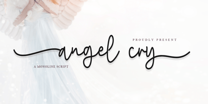 Angel cry is a beautiful monoline script font that will effortlessly add a perfect look to any craft! Your imagination and this font will make a perfect combination. Get inspired by its unique charm and create amazing greeting cards, Weddings, books, logos, stationery, and much more! This font is PUA encoded which means you can access all of the cute glyphs with ease! It also features a wealth of including ligatures.
 - Sagitha Serif by Typehill Studio,
$10.00 Sagitha Serif attracts such a subtle, clean, feminine, sensual, glamorous, simple and very readable typeface. The classic style is perfect to apply in various formal forms such as invitations, labels, menus, Logos, fashion, make up, stationery, letterpress, romantic novels, magazines, books, greeting / wedding cards, packaging, labels Sagitha Serif also features a strong neoclassical serif typeface with high contrast, cool, stylish and unique look with alternative fonts, Ligatures, and multilingual support
 - Mezz by Adobe,
$29.00Clarinetist Milton ?Mezz? Mezzrow (1899-1972) was a remarkable jazz musician, as becomes evident upon reading his autobiography Really the Blues. His sharp tone and serpentine lines inspired English lettering artist and jazz lover Michael Harvey to create a condensed, oblique display typeface with the look of a chiseled alphabet in the musician's honor. Vertical formats such as book jackets and posters will be invigorated by Mezz as the display face. - Core Gaon by S-Core,
$59.00 CoreGaon is a modern sans-serif font. The main characteristics of the typeface are rounded edges of strokes and soft look & feel. Restrained angles of diagonal make text be in good order and it is helpful for legibility and readability. Supported codepages are MS Windows 1252 Latin1 and MS Windows 949 Korean consisting of 11,172 Korean letters and Symbols except Chinese. We suggest to use for books, magazines and posters.
 - Muara by Surotype,
$22.00 A typeface with a classic look, very suitable to make a design choice for books, magazines, packaging, branding, signage and other creative projects. All-caps characters, with over 330 glyphs, MUARA’s also has alternative characters such as Stylistic Alternates, Stylistic Set, and Swash variant. To enable the OpenType Stylistic alternates, you need a program that supports OpenType features such as Adobe Illustrator CS, Adobe Indesign & CorelDraw X6-X7.
 - Ghost Childs by Jehansyah,
$9.00 Ghost Childs this is a light and thick brush font that looks very charming, and bold, this design can make you more confident, for you to pour it into your design that smells of horror or something else, very suitable for all types of designs, brochures, invitations, billboards, books, magazines and much more include : Ghost Childs otf Ghost Childs otf Bold punctuation numeric latin Thank You Very Much
 - Glow Night by Letterena Studios,
$17.00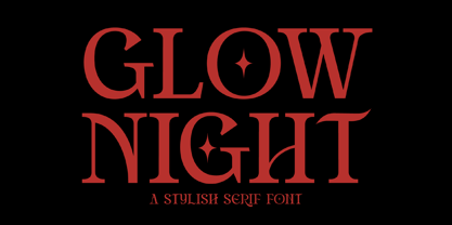 Glow Night is a classic serif font with a unique style and modern look. It is perfect for elegant and luxury logos, book or movie title design, fashion brands, magazines, clothes, lettering, quotes, and much more. Add it to any of your creative projects, and you will be amazed by the results. This font is PUA encoded, which means you can access all of the glyphs and swashes with ease!
 - Fadella by Stefani Letter,
$12.00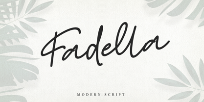 Fadella is a beautiful monoline script font that will effortlessly add a perfect look to any craft! Your imagination and this font will make a perfect combination. Get inspired by its unique charm and create amazing greeting cards, Weddings, books, logos, stationery, and much more! This font is PUA encoded which means you can access all of the cute glyphs with ease! It also features a wealth of including ligatures.