10,000 search results
(0.02 seconds)
- Kali Maya by Creativemedialab,
$20.00 Kali Maya is a modern variable gothic font consisting of 5 weights and 2 types, regular and sharp. Simple and Plain Gothic combined with a square curve stylistic alternates is ideal for use as title, logo text, t-shirt designs, posters, and more. Comes with a variable format as well as multilingual support, numbers, and currency symbols.
 - Maya Samuels by Samuelstype,
$20.00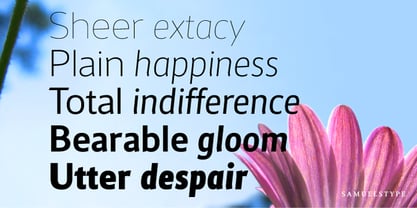
- abc - Unknown license

- abc - Personal use only

- Apres by Font Bureau,
$40.00 David Berlow and staff drew Apres as part of a series designed originally for the Palm Pre smart phone, for use both on the device and in print marketing. Simple, open letterforms and generous proportions provide a clear, comfortable, and inviting experience for navigation and readability. The plain-spoken geometry is regular and balanced, without being static or mechanical, for a friendly and forthright familiarity; FB 2008
 - ABC by Fontmill Foundry,
$15.00ABC is based on a set of children's stickers bought in a second hand shop. - Apice by Stefano Giliberti,
$15.00 Apice is a font family made for precise bursts of data. It supports 111 languages, features a total of 310 glyphs and includes an italicized and outline version for each of the 3 weights.
 - Janda Elegant Handwriting - Personal use only

- Mottingham Elegant Calligraphy by Axara Creative,
$49.00 Mottingham Script is handwritten stylish calligraphy font, with a dancing baseline, and classic and elegant touch. Can be used for various purposes.such as headings, signature, logos, wedding invitations, t-shirts, letterhead, signage, labels, news, posters, badges etc. Mottingham Script features 338 glyphs alternate characters. Including initial and terminal letters, alternates, ligatures and multiple language support.
 - Elegant Hand Script by TypoGraphicDesign,
$19.00 KONZEPT/BESONDERHEITEN Der schludrige und raue handgeschriebene Charakter, geben der Schrift eine hohe Wiedererkennung und eine gewisse Einzigartigkeit. Das Motto lautet handgemacht, rau und elegant. EINSATZGEBIETE Das dreckige, elegante Aussehen der handgeschriebenen Schrift würde sich über folgende Gebiete sehr freuen und sich dort dreckig heimisch fühlen: Logos/Wortmarken aller Art, Flyer für fast jede Party, PlattenCover, Comic-Cover und Graphic Novel Lettering, Plakat Design, Movie-Font, als Headlineschrift für print und digitale Magazine, Bücher und Webseiten u.v.m. TECHNISCHE INFORMATIONEN Überschriften | Auszeichnungsschrift | dreckige Handschrift »elegant hand script«. OpenType Schrift mit 223 Glyphen & 1 Schriftschnitt (regular). Symbole und Ligaturen (mit diakritischen Zeichen & €)
 - Nouveau Elegance JNL by Jeff Levine,
$29.00 The gently spurred serif hand lettering found on an advertisement for Berkshire Stockings (circa the 1920s) was the inspiration for Nouveau Elegance JNL, which is available in both regular and oblique versions.
 - Janda Elegant Handwriting by Kimberly Geswein,
$5.00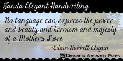 Realistic, connected script handwriting.
 - The New Elegance by Great Studio,
$18.00 The New Elegance is a new editorial serif with all clean and soft lines, tight curves, and a trendy elegant look! The New Elegance has two versions of the font, namely serif & Sans Serif which are equipped with an italic version style, very suitable for your design needs such as very suitable for creating nostalgic designs but still clean and elegant such as headlines, magazines, logos, packaging, editorial, and much more. Thank you, Great Studio
 - Pen Elegant JNL by Jeff Levine,
$29.00 A 1918 lettering instruction book by William Hugh Gordon presented a number of lettering styles that were geared toward sign and show card painters along with tips and tricks regarding the correct construction of such signs for maximum effect. One pen lettered Roman alphabet with a beautiful set of numerals has been recreated digitally as Pen Elegant JNL, which is available in both regular and oblique versions. To note, Gordon was the co-inventor of the Speedball lettering pen with Ross F. George in 1915.
 - Elegant Script Pro by SoftMaker,
$7.99 This typeface was created in 1972 and reworked by SoftMaker in 2010. Elegant Script Pro is perfect for invitations to weddings, celebrations, and dinner parties. Elegant Script Pro comes with a huge character set that covers not only Western European languages, but also includes Central European, Baltic, Croatian, Slovene, Romanian, and Turkish characters. Case-sensitive punctuation signs for all-caps titles are included as well as many fractions, an extensive set of ligatures, and separate sets of tabular and proportional digits.
 - Decadence Avec Elegance by Intellecta Design,
$26.90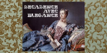
- Elegant Showcard JNL by Jeff Levine,
$29.00 "Baker’s Showcard Book" (1916) was an early 20th Century instructional book on sign lettering. One of the sample alphabets entitled “Decorative Roman” was a spurred serif, Art Nouveau design that has been recreated digitally as Elegant Showcard JNL in both regular and oblique versions.
 - Maya Day Names by Deniart Systems,
$15.00 Contains the 20 day names of the Maya calendar as well as (in outline and silhouette mode) as well as the 19 Maya numerals. NOTE: this font comes with an interpretation guide in pdf format.
 - Oro De Maya by Fat Hamster,
$25.00 Oro de Maya is a hand drawn ancient sans serif / display typeface. Oro de Maya font was inspired by the Maya civilization culture, their marvelous art, architecture and glyphs. This fantastic ancient font has a bold character.
 - Maya Month Glyphs by Deniart Systems,
$15.00 Contains the 19 months of the Maya solar year (in outline and silhouette mode) as well as the 19 Maya numerals. NOTE: this font comes with an interpretation guide in pdf format.
 - Elevator Buttons - Unknown license

- Elevator Boy by PizzaDude.dk,
$20.00Watch Elevator Boy bounce up and down, a playful, whimsical display type that looks like fun and tastes like Saturday morning cartoons. Mmmmmm.... it's like font candy! - Elen Sans by Hurufatfont,
$19.00 The first design of Elensans consisted of 4 styles that are including two weights and their italics which I designed in my student years in 2002. It was designed with a little Art Nouveau style touch with inspired by classical geometric based fonts such as Friz Quadrata and Eras. It was updated with according to the orientations of the day in 2012 and eventually it took its final form with actual touches in 2020. The family has 18 weights, ranging from Thin to Black in normal styles and including their italics. It is ideally suited for advertising and packaging, editorial and publishing, logo, branding and creative industries, poster and billboards, small text, wayfinding and signage as well as web and screen design.
 - Elevator Music by PizzaDude.dk,
$16.00 When was the last time you listened to elevator music and found yourself humming along? And perhaps the tune you were listening to, got stuck in your ears for the rest of the day...the rest of the week? That's often what happens with elevator music: maybe you don't notice it - but it is there, and it could most likely be one of your all time favourites! :) My Elevator Music font does somewhat the same: it's nice and pretty harmless - but it works, perhaps even without you noticing! :) I've added 4 slightly different versions of each lowercase letter - and that goes for both Regular and Scratch versions. And they both have multilingual support, because elevator music is universal!
 - Simple Elevation by Funk King,
$5.00 Simple Elevation is a progression of architectural-inspired fonts. The glyphs as font-bats designed as buildings that can be read.
 - FF Elegie by FontFont,
$68.99 French type designer Albert Boton created this script FontFont in 2002. The family contains 2 weights: Regular and Italic and is ideally suited for advertising and packaging, festive occasions, film and tv as well as poster and billboards. FF Elegie provides advanced typographical support with features such as swashes, ligatures, alternate characters, and case-sensitive forms. It comes with a complete range of figure set options – oldstyle and lining figures, each in tabular and proportional widths.
 - ABC-LongLegs - Personal use only

- ABC Idea by Alphabets by Chileans (A.B.C.),
$18.00 ABC Idea is a contemporary geometric sans full of opentype features in Regular, Bold and very "fast" Italic. The design is an experimental fusion or mix between Humanist, Geometric and Grotesque models. The fine drawing in all letters and signs has precise ink traps to highlight contrast jus like lettering and calligraphy does, then ABC Idea re-creates this exquisite graphic details into the digital world. Designed by Miguel H. Montoya Fonts in Use Images by letargo.cl Magazine. Art Direction by studioprado.cl
 - TG APM by Weishan Gao,
$39.00 The font "TG APM" was designed by me for a boutique coffee shop. This font is used in the coffee shop's logo and draws inspiration from the sun and the moon. The sun represents daytime, while the moon symbolizes nighttime. The intention is to convey that coffee is available throughout the day, helping you stay awake and composed.
 - ATC Arquette by Avondale Type Co.,
$20.00 ATC Arquette, is a best-selling geometric sans-serif font created with minimal ornamentation to adhere with accessibility and visibility guidelines, and be as visually legible as possible. Contains 400+ glyphs, full alphabet, ligatures, numberals, accents and punctuation. ATC Arquette was released in 2018.
 - Apres RE by Font Bureau,
$40.00 Apres is a clear and comfortable typeface from David Berlow, originally designed for the Palm Pre smart phone. This humanist geometric design projects a friendly and forthright familiarity, without being static or mechanical. This version of the family is part of the Reading Edge series of fonts specifically designed for small text onscreen, having been adjusted to provide more generous proportions and roomier spacing, and having been hinted in TrueType for optimal rendering in low resolution environments.
 - ATC Harris by Avondale Type Co.,
$20.00 ATC Harris is a a workhorse monospaced geometric font with a focus on simplicity and legibility. Font contains 580+ glyphs, full alphabet, ligatures, numerals, accents and punctuation. ATC Harris was released in 2016.
 - Arc Neuvo by Funk King,
$5.00 Arc Neuvo has a retro, art deco feel and provides a few quirky glyphs to add to the fun.
 - Jasmine UPC by Microsoft Corporation,
$49.00Jasmine™ UPC Regular is a Thai font designed by Unity Progress and offered under license from Microsoft. The Jasmine UPC Regular Font includes the Thai code page 874 and Latin 1 character sets. You should be familiar with the use of Thai fonts and multilingual fonts before purchasing Jasmine UPC. - ABC Basisschrift by Elsner+Flake,
$35.00 During the last ten years of his life, Hans Eduard Meier (dec. July 17, 2014), together with Max Schläpfer, developed an innovative concept of a new Swiss Schulschrift (handwriting script for schools) called ABC Basisschrift®. His life’s work is crowned by the fact that now, since the fall of 2014, and beginning in Lucerne, this new didactic will replace the old Schnürlischrift in Switzerland. In contrast with the Schnürlischrift, the idea is to guide a child in three steps to learning a personal handwriting. ABC Schule 1 is for the first grade, ABC 2 starts to introduce the first connections and ABC 4 Ligaturen is designed with many ligatures to serve as a good example for handwriting. ABC Schule is also available with ruling and for visually impaired students.This version of the Basisschrift®, available from here, is the original version by Hans Meier.
 - Nastaleeq Asc by Ascender,
$155.99Nastaleeq (Nasta?l?q) ASC is a script font supporting Urdu. Urdu is the nation language of Pakistan. The Nastaleeq ASC font is Unicode encoded. The Nastaleeq ASC font requires an application program which supports Arabic fonts (right-to-left composition). Urdu is also spoken in Afghanistan, Bahrain, Bangladesh, Botswana, Fiji, Germany, Guyana, India, Malawi, Mauritius, Nepal, Norway, Oman, Qatar, Saudi Arabia, South Africa, Thailand, the UAE, the UK and Zambia. - Lily UPC by Microsoft Corporation,
$49.00Lily™ UPC Regular is a Thai font designed by Unity Progress and offered under license from Microsoft. The Lily UPC Regular Font includes the Thai code page 874 and Latin 1 character sets. You should be familiar with the use of Thai fonts and multilingual fonts before purchasing Lily UPC. - ATC Oneshot by Avondale Type Co.,
$20.00 ATC Oneshot, is a handwritten script font based on neighborhood bodega signage. Contains 160+ glyphs, full alphabet, ligatures, numberals, accents and punctuation. File type included in download is .otf. ATC Oneshot was released in 2019.
 - ABC Hand by Intellecta Design,
$15.90 A source of hand signals. This alphabet is presented in two forms with one and two hands.
 - Kodchiang UPC by Microsoft Corporation,
$49.00Kodchiang™ UPC Regular is a Thai font designed by Unity Progress and offered under license from Microsoft. The Kodchiang UPC Regular Font includes the Thai code page 874 and Latin 1 character sets. You should be familiar with the use of Thai fonts and multilingual fonts before purchasing Kodchiang UPC.


