10,000 search results
(0.03 seconds)
- Mere by Josh Grzybowski,
$19.99 Loosely based on a Jan Tschichold specimen, Mere is a clean geometric sans-serif with simple lines that are best viewed as larger print but still have an impact at smaller point sizes. In addition to ligatures and fractions, Mere’s other OpenType features include old style numbers and small caps.
 - Really Big Shoe NF by Nick's Fonts,
$10.00This quaint headline typeface is based on an offering from the Cleveland Type Foundry, originally named Oxford. The centered small caps treatment makes for unusual and alluring headlines. All versions of this font include the Unicode 1250 Central European character set in addition to the standard Unicode 1252 Latin set. - Plug by Superfried,
$32.50 Plug is an experimental, curvy, display typeface designed by Superfried. As its name suggests, it features ‘plugs’ within all the glyph counters. Plug has a very retro feel and its chunky structure leads to a distinct, high-impact display font. Plug has been featured on the Behance curated typographic gallery TypographyServed.com.
 - Art Class JNL by Jeff Levine,
$29.00 Art Class JNL was re-created from the titling of a lettering booklet called "Drawlet Portfolio", published by the Esterbrook Pen Company in the 1930s. Drawlet pens were Esterbrook's answer to the popular Speedball lettering pens, and the booklet was an instructional manual on hand lettering with the pen nibs.
 - Dundee Castle NF by Nick's Fonts,
$10.00An offering by lettering artist Harvey Hopkins Dunn for the 1930 classic, American Alphabets, provided the inspiration for this graceful, engaging typeface. Use it liberally to exude elegance, or to turn on the charm. Both versions of the font include 1252 Latin, 1250 CE (with localization for Romanian and Moldovan). - Melvin Eustace NF by Nick's Fonts,
$10.00Here’s a simple, classic hand-lettered gem, based on an old photoface named Adonis. Suitable for headline or text use, it’s a refreshing and lively alternate to Comic Sans. All versions of this font include the Unicode 1250 Central European character set in addition to the standard Unicode 1252 Latin set. - Erratic JNL by Jeff Levine,
$29.00 Erratic JNL earns its name from the varying widths and shapes of the hand lettering found on some old Art-Deco era sheet music. Following this unusual pattern throughout the complete typeface, the user finds a mix of traditional Deco type design and an overly wide M, N, W and 8.
 - Innovate P Rounded by NicolassFonts,
$29.00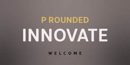 Innovate is a modern versatile sans-serif typeface based on Innovate font family. What differentiates Innovate from the other fonts is an exceptionally distinctive design. It is brilliantly suited for graphic design and display use and perfect for logotypes, t-shirts, packaging, brand identity, books, magazines, newspapers, posters, billboards, and advertising.
 - Stroganov by ParaType,
$25.00 PT Stroganov™ was designed in 2002 by Oleg Karpinsky and licensed by ParaType. An original low-contrast typeface with irregular one-sided serifs. It has been named after Count Sergey Stroganov, the founder of the Stroganov School of Industrial Art in Moscow. For use in advertising and display typography.
 - Unitext Variable by Monotype,
$155.99Unitext Variable Regular is a single font file that features one axis: Weight. TFor your convenience, the Weight axis has preset instances from Hairline to Black. This Roman (upright) font is provided as an option to customers who do not need Italics, and want to keep file sizes to a minimum. - Joe Kubert by Comicraft,
$39.00 The official Joe Kubert font has been digitally mastered by John 'JG' Roshell based on Joe's own specifications for an upcoming SGT ROCK project for DC Comics. Pull up a chair at our Thanksgiving table and marvel at Joe's legendary work in comics ranging from TOR to FAX FROM SARAJEVO.
 - Kirillik by Irina Mir,
$17.00 Kirillik is a hand-drawn font, based on early Russian cyrillic script (“Ustav”), elegant calligraphy written with flat ink brush. Traditional Slavic feel for ethnic Russia-inspired design. This is an all caps font that includes Latin and Cyrillic alphabet with extra characters (covering most European languages), numbers, punctuation and symbols.
 - Barbara Script BH by BluHead Studio,
$25.00 Barbara Script is an OpenType font released by BluHead Studio. Based on the handwriting of a friend, Barbara Script is a connecting typeface that uses the OpenType ligature and contextual swash features to substitute 59 ligatures and 93 alternates to automatically recreate the look and feel of natural variations in handwriting!
 - Ongunkan Greek Alanya Script by Runic World Tamgacı,
$125.00 It is a Latin-based Greek font that I developed by taking the typography used in ancient Greek monuments and inscriptions in cities in the Aegean region of Turkey as an example. I am working on the Latin font of this model. Karamanli version is finished, I will upload it soon.
 - Landscape Alphabet by Celebrity Fontz,
$24.99A set of charming letters of the alphabet combining picturesque landscapes with inventive lettering. This entrancing and uniquely inventive font depicts a beautiful and decorative alphabet representing an idyllic era now gone. Includes one set of A-Z ornamental initials conveniently assigned to both the upper and lower case alphabet characters. - Hello Lovely by Fargun Studio,
$12.00 Hello Lovely! A new fresh ans modern hand lettered font with decorative characters and a dancing baseline. So beautiful on invitation like handicraft, greeting cards, branding materials, business cards, quotes, posters, and more design concepts. Features : Stylistic sets Basic Latin A-Z and a-z Numbers International Symbols included Punctuation
 - Nightowl JNL by Jeff Levine,
$29.00 Nightowl JNL is a headline font encased in rectangles inspired by an Art Deco hand-lettered alphabet found in a 1941 edition of the Speedball® Lettering Pen instruction book. There is only a basic character set plus two different width blank rectangles located on the greater and lesser keys.
 - Amilionia Calligraphy by Shape Studio,
$14.00 Amilionia is a new modern script calligraphy font with an irregular baseline. Trendy and feminine style.Amilionia Script looks lovely on wedding invitations, thank you cards, quotes, greeting cards, logos, business cards and more. Perfect for using in ink or watercolour. Including initial and terminal letters, alternates, ligatures and multiple language support
 - Jerash by Scriptorium,
$18.00Jerash was developed jointly by Dave Nalle and Mike Scarpitti. It draws on the look of several classic fonts from the 1920s and 30s which evoked the look of Middle-Eastern calligraphy. The synthesis is a font with style, strength and regularity. It's an excellent counterpoint to our Caliph font. - Best Hero by Yoga Letter,
$16.00 "Best Hero" is an elegant and unique font with star decoration on each letter. This font is equipped with uppercase, lowercase, numerals, punctuations, multilingual support. Very suitable for the nuances of struggle, 4th of july, teacher, father's day, graduation, film titles, magazines, book titles, promotions, banners, branding, stickers and others.
 - Chumpsy by PizzaDude.dk,
$17.00 Chumpsy is clumsy - I did my best to make an awkward and bouncy hand-written font that was funky, but still legible. I added 11 slightly different versions of each lowercase letter, which automatically cycle as you type, or you can manually choose the one that suits you the best.
 - Faux Hebrew by Page Studio Graphics,
$24.00 The simulated font is based on the characteristic Hebrew calligraphy. Some of the original Hebrew characters have been given new roles, others modified to resemble modern Latin characters. The font includes an upper case alphabet, numerals, and basic faux punctuation, plus Harp of David, Menorah, and Star of David symbols.
 - Moonshine Script NF by Nick's Fonts,
$10.00This casually elegant script, similar to the logotype lettering found on Mason jars (hence the name), is patterned after an offering from the 1930s chapbook 60 Alphabets by The Hunt Brothers. The Opentype version of this font supports Unicode 1250 (Central European) languages, as well as Unicode 1252 (Latin) languages. - Eurocrat by Club Type,
$36.99 Everyone in each member country of the European Economic Community is represented by a Member of the European parliament. An MEP. The Eurocrat font family celebrates the work of these Eurocrats. Several features have been incorporated which, together, go to make a characteristically European style without any single one being dominant.
 - Original Script by Monotype,
$29.99This script collection is used in advertising, invitations, greeting cards, and wherever a formal hand-lettered or engraving look is desired. Original Script has an elegant connecting alphabet based on formal handwriting. The Original Script font is a safe choice for invitations to weddings and formal occasions, and personal stationery. - Asia by Superfried,
$32.50 Asia by Superfried is an ornate, display typeface inspired by trips throughout the continent. Its distinct, bold style has been designed to evoke the curves and beautiful intricacy of Asian typographic characters and patterns. Asia has been featured on Creative Boom and named font of the day by Creative Bloq.
 - Manic Mood PB by Pink Broccoli,
$14.00 An offbeat alternate caps typestyle inspired by the cover of a vintage LP titled, Organ Moods by Jerry Thomas. A playful and childish font from a sexy cheesecake album! Go figure. Switching on Contextual Alternates enables automatic alternations between caps and alt caps like AlTeRnAtIoNs to create a more randomized look.
 - Blattwerk by Volcano Type,
$39.00 The shapes of "Blattwerk" (german for leafage) are based on an abstract leaf. The geometrical sans serif font has several standard and decorative ligatures and will work best as a display typeface for logos, headlines and short texts. The individual letters can also be used to form symbols or patterns.
 - Quaint Notions NF by Nick's Fonts,
$10.00This rollicking fun face is based on legendary lettering artist Alf Becker's Super Thick-and-Thin, his twenty-third offering in "Signs of the Times" magazine. The package includes two fonts: a full Adobe Standard character set, and an Alternates version, which features the more extreme elements of Becker's original design. - AZ Script by Artist of Design,
$25.00 AZ Script font was inspired from a need to have a "worn look" on bold headline script of letters This font utilizes an "old look" to the line work which is designed to have a "worn feel" to it. Ideal for use as headline or sub-head text in you design.
 - Lindisfarne Nova BT by Bitstream,
$50.99 Lindisfarne Nova is an uncial-like design based on the script found in the Lindisfarne Gospels. Created by Harry Pears and Margaret Layson, it is available in two weights, regular and bold. Lindisfarne Nova is Harry’s first completed font. There are also two companion styles, Lindisfarne Nova Incised and Lindisfarne Runes.
 - Bradbury Five by Device,
$39.00 A stylish cartoon sans reminiscent of lettering by Harvey Kurtzman on early issues of Mad, or other casual mid-century types. The three widths give full versatility for expressive, customised headlines and layouts, while the lighter weights can be used for text. Conveys an approachable, light touch with style and finesse.
 - Sweet Azalea by Fromletterel,
$14.00 Sweet azalea is an all rounder font, very easy to adjust following your needs, it can be used as signature, branding, web design and of course used as casual script font to add a handwriting touch, all is available in just one file. Plus featured with ligatures and swash alternates.
 - Lexikos by ITC,
$29.00Lexikos was designed by Vince Whitlock and based on the design of the typeface Corinthian. It is a condensed sans serif typestyle with heavier horizontal weights as vertical. Lexikos is best used with close letter and word spacing and is an excellent choice for applications requiring a clean, contemporary look. - Lance Corporal NF by Nick's Fonts,
$10.00This font was inspired by Arts and Crafts lettering found on the cover of the Austrian journal Ver Sacrum (Sacred Spring), 1898. Primarily an uppercase-only font, there are several variants in lowercase positions. Both versions of the font include 1252 Latin, 1250 CE (with localization for Romanian and Moldovan). - Brevet by Solotype,
$19.95Authentic copy of the original, with a couple of minor changes to the caps, making them fit better. Although made for the American market by an American typefounder, we found this font in a York, England printshop when we went on a second visit to the famous DeLittle Wood Type factory. - Retail Price JNL by Jeff Levine,
$29.00 Redrawn from lettering found on a British publication circa the 1930s, Retail Price JNL is an extra bold display inline sans that’s great for catchy headlines, price cards, banners or any other attention-getters. Retail Price JNL is offered in regular, oblique, solid and solid oblique versions. Caps only Fonts.
 - Art Week JNL by Jeff Levine,
$29.00 Art Week JNL is a wider variant of the lettering style used on many WPA (Works Progress Administration) posters for the arts in the Depression-era 1930s. Wider than the version used for Concert Series JNL, it also features an ‘A’ with a rounded top rather than the flat, square version.
 - Varidox by insigne,
$35.00 Varidox, a variable typeface design, allows users to connect with specific design combinations with slightly varied differences in style. These variations in design enable the user to reach a wider scope of audiences. As the name suggests, Varidox is a paradox of sorts--that is, a combination of two disparate forms with two major driving influences. In the case of type design, the conflict lies in the age-old conundrum of artistic expression versus marketplace demand. Should the focus center primarily on functionality for the customer or err on the side of advancing creativity? If both are required, where does the proper balance lie? Viewed as an art, type design selections are often guided by the pulse of the industry, usually emphasizing unique and contemporary shapes. Critics are often leading indicators of where the marketplace will move. Currently, many design mavens have an eye favoring reverse stress. However, these forms have largely failed to penetrate the marketplace, another major driving factor influencing the font world. Clients now (as well as presumably for the foreseeable future) demand the more conservative forms of monoline sans serifs. Typeface designers are left with a predicament. Variable typefaces hand a great deal of creative control to the consumers of type. The demands of type design critics, personal influences of the typeface designer and the demands of the marketplace can all now be inserted into a single font and adjusted to best suit the end user. Varidox tries to blend the extremes of critical feature demands and the bleeding edge of fashionable type with perceptive usability on a scalable spectrum. The consumer of the typeface can choose a number between one and one-thousand. Using a more conservative style would mean staying between zero and five hundred, while gradually moving higher toward one thousand at the high end of the spectrum would produce increasingly contemporary results. Essentially, variable fonts offer the ability to satisfy the needs of the many versus the needs of the few along an axis with a thousand articulations, stabilizing this delicate balance with a single number that represents a specific form between the two masters, a form specifically targeted towards the end user. Practically, a user in some cases may wish to use more conservative slab form of Varidox for a more conservative clientele. Alternatively, the same user may then choose an intermediate instance much closer to the other extreme in order to make a more emphatic statement with a non-traditional form. Parametric type offers a new options for both designers and the end users of type. In the future, type will be able to morph to target the reader, based on factors including demographics, mood or cultural influences. In the future, the ability to adjust parameters will be common. With Varidox, the level of experimentality can be gauged and then entered into the typeface. In the future, machine learning, for example, could determine the mood of an individual, their level of experimentality or their interest and then adjust the typeface to meet these calculated parameters. This ability to customize and tailor the experience exists for both for the designer and the reader. With the advent of new marketing technologies, typefaces could adjust themselves on web pages to target consumers and their desires. A large conglomerate brand could shift and adapt to appeal to a specific target customer. A typeface facing a consumer would be more friendly and approachable, whereas a typeface facing a business to business (B2B) customer would be more businesslike in its appearance. Through both experience, however, the type would still be recognizable as belonging to the conglomerate brand. The font industry has only begun to realize such potential of variable fonts beyond simple visual appearance. As variable font continues to target the user, the technology will continue to reveal new capabilities, which allow identities and layouts to adjust to the ultimate user of type: the reader.
 - Sodra by Harvester Type,
$20.00 Sodra is a wide-accented antiqua with sharp serifs and hints of futuristic forms. This typeface emerged from a passage in the Manifesto del Futurismo by Filippo Tommaso Marinetti. One short word was the inspiration and the guidance for the creation of this font. An attempt to create something unique and distinctive, an attempt to add a bit of futurism to something historical. The special aesthetics and expressiveness the type conveys will make you look closely at each letter and draw attention to your design. The font has been in development for a long time and painstaking work has been done on it. Large language support, about 470 characters and almost 4,000 kerning pairs. Hinting and testing the font itself in business and in a wide variety of applications. The uses of the type are very wide. Whether it's a branding, logo, identity or merch, a headline or product design. The nature of typeface is not limited to something rough and gloomy, on the contrary, it all depends on how you look at it. I've shown you my point of view, you in turn will see yours!