10,000 search results
(0.034 seconds)
- ITC Ellipse Script by Typorium,
$30.00 The Typorium presents a new optimized and enriched version of ITC Ellipse which first appeared in 1996 in the International Typeface Corporation typeface library. ITC Ellipse Script is a complementary typeface to ITC Ellipse Neo, designed a very legible handwriting style. ITC Ellipse Script is both modern and classic. Modern in the unusual shape based on the geometric ellipse form. And classic in the structure of some letters like the lower cases c, e, g, o, s. These letters alone could come from a traditional typeface, but they fit perfectly with the atypical rest of the alphabet giving it a present-day and traditional mix. Furthermore, the ellipse shape fits naturally in the italic styles, giving the font an organic and fluid feeling. ITC Ellipse Script offers OpenType features such as alternate characters for upper and lower case, and an extended accented character set to support many languages. Five weights have been created for each style to offer a wide range of graphic possibilities in a tidy digital footprint. Designer: Jean-Renaud Cuaz Publisher: Typorium MyFonts debut: Nov 1, 2020 Le Typorium présente une nouvelle version optimisée et enrichie d'ITC Ellipse qui est apparue pour la première fois en 1996 dans la bibliothèque de caractères de l'International Typeface Corporation. ITC Ellipse Script est une police complémentaire à ITC Ellipse Neo, conçue dans un style d'écriture très lisible. ITC Ellipse Script est à la fois moderne et classique. Moderne dans le dessin inhabituel basé sur la forme géométrique de l’ellipse. Et classique dans la structure de certaines lettres comme les minuscules c, e, g, o, s. Ces lettres pourraient provenir d'une police de caractères traditionnelle, mais elles s'intègrent parfaitement avec le reste de l'alphabet plus insolite en lui donnant un mélange de modernité et de tradition. De plus, la forme de l'ellipse s'intègre naturellement dans les styles italiques, donnant à la police une sensation organique et fluide. ITC Ellipse Script offre des fonctionnalités OpenType telles que des caractères alternatifs pour les capitales et les bas de casse, et un jeu de caractères accentués étendu pour prendre en charge de nombreuses langues. Cinq graisses ont été créés pour chaque style afin d'offrir un large éventail de possibilités graphiques pour une empreinte numérique rigoureuse.
 - Dulcinea by Re-Type,
$79.00 Dulcinea is the title of Ramiro Espinoza’s in-depth look at Spanish Baroque calligraphy’s most extreme tendencies, and especially at some of those produced by the writing masters Pedro Díaz Morante and Juan Claudio Aznar de Polanco. These 17th and 18th centuries alphabets with their plentiful calligraphic flourishes represented a marked break with the harmonic and angular Renaissance Cancellaresca style. It was Morante who first introduced and popularized the use of the pointed quill in Spain, and although his famous text entitled “Arte Nueva de escribir” – first volume published in 1616 – contains alphabets that have much in common with traditional broad nib Cancellaresca calligraphy, most of the examples therein are outgrowths of the new models put forward by the Italian master Gianfrancesco Cresci. The writing’s swashes are complex and intricate, but at the same time they feature a profusion of defects. Many of them sometimes come close to ugliness. However, these pages contain an artistic essence that bears a relationship to the ironic and sometimes somber character of Spanish Baroque. That’s why the name of the font pays homage to “Dulcinea del Toboso”, the fictional beauty from Miguel de Cervantes’s ‘Don Quixote’, a work that reveals many of the period’s conflicts, such as the contrast between utopian ideals and reality, uncertainty and madness. But Dulcinea is far from being just a revival. Its forms are not careful tracings of the outlines of Morante and Polanco’s letters, nor are they attempts to reproduce them digitally. In fact, the author of the letters says that had the font been created that way it would have been too archaic to serve as acceptable contemporary typography. However, he believes that there are myriad interesting details that can be rescued and preserved, along with the playful spirit of the original. The work of designing Dulcinea consisted of combining original historical elements with the creativity and calligraphy of the font’s author in order to produce a modern typography that isn’t based on the same traditional sources as many recently created scripts fonts. Dulcinea offers attractive options for the setting of texts and headlines: abundant ligatures and swashes along with intricate alternate characters. It sophisticated forms make it an ideal option for women’s magazines, recipe books, lingerie products or perfume packaging.
 - Quire Sans by Monotype,
$155.99 My goal was to make a design that might fit in anywhere,” says Jim Ford about his Quire Sans™ typeface. “I wanted it to be highly functional and sexy at the same time.” With one foot comfortably in the realm of oldstyle design and traditional book typography, and the other in evolving electronic media, the Quire Sans family does, indeed, fit in just about anywhere. As for sexy, someone once quotably wrote, “A great figure or physique is nice, but it's self-confidence that makes someone really sexy.” Yes, Quire Sans is sexy, performing confidently in virtually any setting. 2014-06-26 00:00:00.000 57.9900 F43063-S193385 42831 Neue Frutiger World Monotype https://www.myfonts.com/collections/neue-frutiger-world-font-monotype-imaging https://cdn.myfonts.net/cdn-cgi/image/width=417,height=208,fit=contain,format=auto/images/pim/10000/279026_ed8c8093fe1ac59ebe9e3ee1d9262c8e.png Neue Frutiger World is designed for global use with an impressive range of 10 weights, from Ultra Light to Extra Black, with matching italics. It embodies the same warmth and clarity as Adrian Frutiger’s original design, but allows brands to maintain their visual identity, and communicate with a consistent tone of voice, regardless of the language. Neue Frutiger World supports more than 150 languages and scripts including Latin, Greek, Cyrillic, Georgian, Armenian, Hebrew, Arabic, Thai and Vietnamese. “Before Neue Frutiger World it was not an easy task for western brands to find families in Arabic, Hebrew, Thai and Vietnamese which match with their Latin,” says Monotype type director Akira Kobayashi, who led the Neue Frutiger World project. “They may find a type with closer expression, but there was no guarantee if the bold version in the non-Latin family matches the bold in their Latin. Neue Frutiger World offers a better solution.” In addition to Neue Frutiger World’s linguistic versatility, it works hard across environments – suited to branding and corporate identity, advertising, signage, wayfinding, print, and digital environments. The Neue Frutiger World fonts can be paired with Monotype’s CJK fonts: M XiangHe Hei (Chinese), Tazugane Gothic (Japanese), Tazugane Info (Japanese), and Seol Sans (Korean). These were all designed to address brands’ needs to expand into Asian cultures and solve for global typographic challenges.
 - Olympukes 2012 by Barnbrook Fonts,
$30.00 Released on the occasion of the 2012 London Olympics, Olympukes 2012 was a new set of pictograms telling the ‘real’ story of the Olympics and extending the unofficial project that began in 2004. The occasion of the London games provided an opportunity to revisit the complex contradictions of the modern Olympics and to acknowledge the geopolitical shifts of the intervening eight years. The 2012 games arrived at a time of great economic and political uncertainty for the nation and Europe. Greece – the host of the 2004 games – was now located at Ground Zero of a disintegrating Eurozone and the United Kingdom was two years into a programme of austerity enacted by the coalition government of Conservatives and Liberal Democrats. Given that the previous London Olympics had been held in 1948, in a climate of recovery and austerity after a devastating World War (1948’s Olympiad was dubbed the ‘Austerity Games’) there was a sick irony to the 2012 games' arrival. The suppression of human rights in order to deliver the perfect games for PRoC’s Beijing games shocked no-one and yet, in London, the security measures seemed grossly excessive. Then again, in a country with an estimated 1.8 million cctv cameras, perhaps we shouldn’t have been so surprised. Another aspect of the Olympics that returned for 2012 was the unfettered commercialism – if you think the Games are about pure sport, about noble human endeavour, think again. Please note that Barnbrook Fonts is in no way affiliated with, or has received any endorsement from, the International Olympic Committee, the organising committees of the Olympic Games, or any national Olympic committee.
 - Calgera by TRF,
$20.00 Calgera, is a typeface designed by Teuku Riski Firmana. Calgera is a contemporary serif typeface with a distinctive look. Calgera creates an unique character, with different stylistic sets you can change the feel of your design from more organic to more standard. with 9 weights ranging from Thin to Black. This is an elegant font, with beautiful and harmonious alternate, which makes it ideal for use in magazines, in the fashion industry, branding, logo design, dynamic packaging and countless other projects. When starting this project, we wanted to try to draw a modern serif with the precisely verified shapes and detailed elaboration of each character, making your text look great both on paper and on the screens. Calgera in numbers: • 108 styles and 1 variable fonts • 843 glyphs and 441 characters in each style • Support for more than 48+ languages • 27 OpenType features in each style • Amazing Manual TrueType Hinting • 4 variable exes (Weight, Width, Slant, Contrast) Useful OpenType features: Access All Alternates, Historical Forms, Stylistic Alternates, Stylistic Set 1, Stylistic Set 2, Stylistic Set 3, Stylistic Set 4, Stylistic Set 5, Stylistic Set 6, Stylistic Set 7, Stylistic Set 8, Fractions, Oldstyle Figures, Ordinals, Numerators, Small Capitals, Discretionary Ligatures, Standard Ligatures, Small Capitals From Capitals, Case-Sensitive Forms, Denominators, Scientific Inferiors, Subscript, Superscript, Kerning. Calgera language support: Acehnese, Afrikaans, Albanian, Basque, Bosnian, Catalan, Croatian, Czech, Danish, Dutch, English, Estonian, Faroese, Filipino, Finnish, French, Galician, German, Hungarian, Icelandic, Indonesian, Irish, Italian, Latvian, Lithuanian, Malay, Norwegian Bokmål, Polish, Portuguese, Romanian, Slovak, Slovenian, Spanish, Swahili, Swedish, Turkish, Welsh, Zulu, Tagalog, Serbian, Zazaki, West Frisian, Breton, Gagauz, Scottish Gaelic, Northern Sami, Esperanto, Latin.
 - Torcao by insigne,
$24.00 Torcao is one of the sporks of the font universe, a useful and functional outlier. Half square, half circle, this uncommon squircle of a family with its asymmetry of curved and angular shapes drives through headlines and body copy with forward velocity. The robust, technical appearance is light-hearted and inviting, and its organic nature plays off of its one-of-a-kind kinks and hybrid forms. Torcao is not merely an experimental font, though. The figures have been crafted and refined into a functional, hard-working typeface that lends itself to many sizes and environments. The font family features a tall x-height and light modulation, which give the typography its unique color highly effective in headlines but still quite legible in longer text. This family contains a comprehensive range of nine weights--slender to black--and features condensed and extender selections for a complete set of forty-eight fonts. The font has been decked out for experienced typographers, together with swash alternates and simplified titling. The typeface also contains a range of numeral sets, together with fractions and old-style figures. OpenType-capable programs including Quark or the Adobe suite allow quick changes to ligatures and alternates. Previews of these options can be found in the .pdf brochure. Torcao also features the glyphs to enable all Central, Eastern, and Western European languages. In all, the font supports around forty languages that utilize the prolonged Latin script, making it an excellent option for multi-lingual publications and packaging. Simple, technical, and open, the Torcao type family could just be the perfect choice for your web type or print project.
 - Gotti by Resistenza,
$39.00 Introducing Gotti. Where Timeless Precision Meets Seventies Flair We are thrilled to unveil our latest creation, Gotti font family, born and meticulously crafted during an inspiring journey to Goteborg. This typeface seamlessly fuses the Bauhaus essence with the spirited vibes of the seventies, resulting in a font that's not just a visual treat but a design experience. Gotti draws its creative fuel from the geometric elegance of the Bauhaus movement, prioritising functional simplicity and razor-sharp lines. However, its design journey doesn't end there. Imbued with the unmistakable energy of the Seventies, Gotti emerges as a font family that encapsulates both nostalgic charm and contemporary boldness. At its core, Gotti boasts a geometric skeleton that has been intricately designed to redefine precision. Ranging from light to black, the weight variations offer a broad spectrum of expressive possibilities. Gotti is perfect for display use, advertising, and branding, it transforms your creative vision into a visual masterpiece. Stand out with confidence, whether it's a captivating logo, a compelling headline, or an unforgettable advertisement. Elevate your brand identity with Gotti. It brings strategic branding to life, communicating sophistication and modernity. Your advertising materials become memorable works of art, leaving a lasting impression on your audience. Curious about the magic Gotti can bring to your designs? Our showcase reveals real-world applications, demonstrating its adaptability and aesthetic appeal. See for yourself how this font family turns ordinary designs into extraordinary visual experiences. Follow us on social media for updates, inspiration, and a glimpse behind the scenes. Have questions or just want to share your thoughts? We're here for you!
 - Poligon by Halbfett,
$30.00 Poligon is a large family of geometric sans serif fonts. It is inspired by classic typefaces from the geometric-sans genre, like Futura and Avant Garde Gothic, whose shapes were constructed from circles and straight lines. Every character has been crafted to give it a distinct and individual feel. The family is an excellent choice for both corporate design and editorial design projects because of its range of weights, as well as its legibility in text. The typeface family ships in two different formats. Depending on your preference, you can install the typeface as two Variable Fonts or use the family’s eight static OpenType font files instead. Those weights run from Thin to Black. While the static-format fonts offer a good intermediary-step selection, users who install the Variable Fonts have vastly greater control over the stroke width in their upright and italic texts. The weight axes in Poligon’s Variable Fonts allow users to differentiate between almost 1,000 possible font weights. That enables you to fine-tune your text’s exact appearance on-screen or in print. But even the static fonts satisfy the need for flexibility, creating harmonious variations of texture and emphasis. Despite their rigid geometry, the fonts have a playful air to them. That playfulness and uniqueness can be dialed up by applying stylistic alternates via the fonts’ four Stylistic Sets. The first of these replaces “G”, “M”, and “&” with alternate, more outgoing shapes. Stylistic Set 2 has an alternate “ß”; Stylistic Set 3 has a “Q” with a longer tail and another “G”. Stylistic Set 3 has alternates for “A”, “K“, “Q”, “R”, “S”, “Y”, and “Z”.
 - Neue Haas Grotesk Display by Linotype,
$33.99 The first weights of Neue Haas Grotesk were designed in 1957-1958 by Max Miedinger for the Haas’sche Schriftgiesserei in Switzerland, with art direction by the company’s principal, Eduard Hoffmann. Neue Haas Grotesk was to be the answer to the British and German grotesques that had become hugely popular thanks to the success of functionalist Swiss typography. The typeface was soon revised and released as Helvetica by Linotype AG. As Neue Haas Grotesk had to be adapted to work on Linotype’s hot metal linecasters, Linotype Helvetica was in some ways a radically transformed version of the original. For instance, the matrices for Regular and Bold had to be of equal widths, and therefore the Bold was redrawn at a considerably narrower proportion. During the transition from metal to phototypesetting, Helvetica underwent additional modifications. In the 1980s Neue Helvetica was produced as a rationalized, standardized version. For Christian Schwartz, the assignment to design a digital revival of Neue Haas Grotesk was an occasion to set history straight. “Much of the warm personality of Miedinger’s shapes was lost along the way. So rather than trying to rethink Helvetica or improve on current digital versions, this was more of a restoration project: bringing Miedinger’s original Neue Haas Grotesk back to life with as much fidelity to his original shapes and spacing as possible (albeit with the addition of kerning, an expensive luxury in handset type).” Schwartz’s revival was originally commissioned in 2004 by Mark Porter for the redesign of The Guardian, but not used. Schwartz completed the family in 2010 for Richard Turley at Bloomberg Businessweek. Its thinnest weight was designed by Berton Hasebe.
 - Flink by Identity Letters,
$25.00 The joy of pure geometry, revisited. Geometric typefaces are a staple in every typographer’s toolbox since the 1920s. It was a time when iconic faces such as Futura, Erbar, and Kabel appeared on the scene and turned the world of type upside-down. Inspired by those early giants as well as later epigones with a legacy of their own (such as 1970’s Avant Garde Gothic), Flink is the Identity Letters take on this genre, characterized by a clean and focused appearance. With neat shapes and the look of pure geometry, Flink adapts to a vast range of applications and topics, from the fine print in contract to website body copy to logo design to billboard-size slogans. Its x-height is considerably larger than in classic geometric sans-serif fonts; its proportions are harmonized as opposed to strictly constructed. This makes for a more contemporary look, setting it apart from the classics. To further reduce the rigidity of a purely geometric composition, you can replace some letters with more humanist alternates, such as a, g, j, etc. This font family comes along in 8 weights from Thin to Black. Each weight consists of an Upright and Italic version. There are more than 750 characters per style, including two stylistic sets that offer variations to the look and feel of Flink, making it even more versatile. Plenty of additional Open Type Features like ligatures, case sensitive forms, old-style figures, and symbols make Flink a valuable tool for the discerning typographer. Flink is the reimagination of a classic genre, designed to suit the needs of our time. ––––– Please note: There is an upgraded Version available: Flink Neue
 - Wofisty by Jadatype,
$15.00 Wofisty is a display font that comes with Retro-Fun Style. suitable for tshirt, branding, social media, and so on. contains standard English letters, numbers, punctuation, and several accents that support multilingualism. Can be installed on applications such as adobe family, affinity, or Ms. Office.
 - Artartika by Tour De Force,
$25.00 Artartika contains two Regulars – one Slab and one Sans Serif. Condensed width, geometric shaped, with distinctive stem contrast, Artartika recommends itself for titles, product names, branding, but it's also fully applicable for longer text and paragraph use. Contains Extended Latin character set with Cyrillic support.
 - Bonjour Sydney by Reyrey Blue Std,
$14.00 Bonjour Sidney. A stylish, modern and feminine font that will look awesome on logos, branding materials, wedding and event stationery, social media overlays, cards and so on. Bonjour Sidney includes full set of lovely uppercase and lowercase letters, multilingual symbols, numerals, punctuation, ligatures and swashes.
 - Bealiva Vintage by Mevstory Studio,
$15.00 Bealiva is one of my fonts based on a hand lettering project in 2020. It was very inspired from the famous retro typography designs in late 60's until 70's. It includes the extrude look, so you will not have to add it later.
 - Copacabana by Alan Meeks,
$45.00 Copacabana is heavily based on one of my favourite typefaces Goudy Old Style Italic. It is sharper and more clearly defined than Goudy yet still retains it old style characteristics. The face is slightly angled so is basically upright whilst still retaining Italic characteristics.
 - Back And Forth by A New Machine,
$10.00 This all cap, bold, sans serif font features one face that slants backward ("Back") and one that slants forward ("Forth"). Use in combination to create headlines and designs that call for a sense of speed, motion and power. Uppercase and lowercase letters are the same.
 - Quanticoverse by JK Typeface,
$12.00 Semi-condensed sans-serif with expressive curves on the outside and closed on the inside, with diagonal stems to convey modernity and a unique personality. Perfect for titles and headers in graphic and editorial design projects, as well as standing out in digital applications.
 - Crocante by PintassilgoPrints,
$24.00 Crocante is an energetic and good-humored display font. Although being an all caps alphabet, it counts two versions for each letter, easily accessed through keyboard upper and lower keys. These slightly different letterforms will bring spontaneity and vitality to your designs. Crunching noises guaranteed!
 - Stonehouse by Scriptorium,
$12.00Stonehouse is based on samples of Art Nouveau title lettering, adapted and expanded into a complete titling font. It has a nice intermediate weight ideal for titles on the web or in print, especially for section or topical headers within a body of text. - Slabserif Grotesk JNL by Jeff Levine,
$29.00 Slabserif Grotesk JNL was modeled from an example of a wood type design called Antique Light Face, and is available in both regular and oblique versions. The numerals (although an odd fit to the overall design) make this vintage font quite unusual and charming.
 - Bostonbay by Balpirick,
$15.00 Bostonbay is a Modern Handwritten Font. Bostonbay is a unique and elegant handwritten font. It looks beautiful on a variety of designs requiring a personalized style, such as wedding invitations, thank you cards, weddings, greeting cards, logos and so on. Bostonbay also multilingual support.
 - Teethee by Ingrimayne Type,
$8.95 Teethee is a font family dedicated to oral hygiene. The characters are made from toothbrushes, toothpaste and toothpaste tubes, and teeth. Both fonts in the family are caps only, but most letters on the lower-case keys differ from those on the upper case keys.
 - MBF Typerisme by Moonbandit,
$16.00 Moonbandit proudly presents, Typerisme. The modern take on the typewriter font. This typeface is perfect for your old, retro, vintage distressed look without going overboard. Huge kerning to boost clarity. Use it for body text, headline, title, one liner, anything! this typeface is versatile.
 - Evening Gown JNL by Jeff Levine,
$29.00 Evening Gown JNL comes from the lettering displayed on a printed ad for the fictional "Gowns by Roberta" in a scene in the 1935 film of the same name. "Roberta" starred Fred Astaire and Ginger Rogers and was based on the successful 1933 stage play.
 - Jensen Old Style by Wooden Type Fonts,
$15.00 Based on the original design of Nicholas Jenson 1470-76, this is a revival of one of the popular wooden type fonts of the 19th century. This font was also created in a slightly different version by William Morris circa 1890. Suitable for text.
 - Airliner JNL by Jeff Levine,
$29.00Airliner JNL is based on hand-lettering found on a promotional postcard for Kitty Davis' Airliner - a popular Miami Beach night spot of the 1940s. All of the usual things that make hand-lettering endearing can be found in the letter shapes of this font. - Hi TV by Yebhu,
$15.00 Hi TV is an good-humored and energetic display font. Although being an all caps alphabet, it counts two versions for a letter, easily accessed choose uppercase or lowercase. These slightly different letterforms will bring spontaneity and vitality to your designs. Crunching noises guaranteed!
 - Ronsect by Fontron,
$35.00The idea for this came from a logo I saw which was adapted and simplified to make this font. Almost italic in appearance, it can be used as an alternative sans stencil although that wasn't envisaged at the start. An Italic is also available. - Surreal PostIndian by Type-Ø-Tones,
$40.00 Surreal PostIndian by Laura Klamburg. OpenType, 2 styles According to its creator, Surreal Post Indian was inspired by the performance of an American Indian artist, but this typeface seems more connected with pop neon signs. Anyway, here is an amusing Laura Klamburg font. Enjoy it.
 - Drum Rhythm JNL by Jeff Levine,
$29.00 An ad in the May 3, 1928 issue of “The Film Daily” for the movie “Drums of Love” featured extra bold, sans serif hand lettering in an Art Deco style. This is now available as Drum Rhythm JNL in both regular and oblique versions.
 - Outer Space by Vozzy,
$10.00 Introducing a vintage look label font named "Outer Space". You can see all available characters on the posters. This font have 4 styles (including layered shadow effect style). Outer Space will do well on any retro design like poster, t-shirt, label, logo etc.
 - Dutch Courage by Comicraft,
$29.00Developed by Comicraft's Dutch Masters to give DC's BATMAN & ROBIN ADVENTURES a crisp, clean, Art Deco look, all four pints of DUTCH COURAGE are available as one font family. Please refrain from operating heavy machinery within one hour of partaking of these intoxicating fonts. - Jungler by Rumors Foundry,
$3.99 Jungler is a new handwritten consensed typeface, based on the lettering from comic magazines, designed by Gabriele Bellanca in early 2022 for Rumors Foundry. It was created with FontSelf App and the support of Glyphs App. Counts over 270 glyphs in one Regular weight.
 - Subway Ticker by K-Type,
$20.00 Subway Ticker is based on a 5×7 grid, electronic display observed on a New York subway train in February 2005. Also included is a ‘Grid’ variation of the font that is slightly more spaced out and based upon a more precise grid structure.
 - Monstrosity by Comicraft,
$19.00 It breathes fire and its leathery hide is impervious to rocket propelled grenades and drone warheads! It destroys everything in its path! Is it a terrifying sound effect font or does it just want to be loved? One thing's for sure – no one is safe!
 - Daisy Lau by Dharma Type,
$19.99 Based on some script in the 19th century. Inky texture gives realistic handwriting appearance. Smooth writing feeling creates antiqued and nostalgic atmosphere. Rising Star on March 2007. There are two other script designed by in the same concept. -Daisy Lau -Lily Wang -Pansy Bo
 - Jackers by ErlosDesign,
$17.00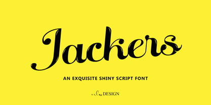 Jackers - An Exquisite Shiny Script Font by erlosDESIGN Jackers is an exquisite shiny script font. Whether you are using it for designs, quotes, titles, brand names, book covers, posters, or just any creation that requires a touch of beauty, this font is a great choice.
 - Mr Stickman by Hanoded,
$15.00 Mr Stickman is a happy clappy kind of font, inspired by an older font of mine called Oranjerie. Oranjerie is an all caps typeface, but Mr Stickman comes with lower case letters - AND - a Stickman Action Figures pack! What more could you possibly want?
 - Another Fool by PizzaDude.dk,
$15.00 Another font, Another Fool! This one made me think of cake - you know, a crisp crust and sprinkles on top. Perhaps the recipe includes blueberry and peanuts? Well, this fonts' recipe includes 6 different versions of each letter as well as multilingual support! Yummy!
 - Hex by Hanoded,
$15.00 Hex is an uneven, spiky font with an evil twist. The glyphs look like they have been scratched onto paper (which is indeed the case), so it will be perfect for your scary halloween postcards or posters. Hex font comes with extensive language support.