10,000 search results
(0.025 seconds)
- Aravis by AravisFonts.com,
$39.89 Amazingly easy on the eye; it draws the reader in with minimal brain bandwidth use. Designed to enable more focus on the content. Good for web pages. Very Dyslexia friendly. Our mission has been to create a font that scientifically designed to be dyslexia friendly while also being attractive and useful. Dyslexia features: Each letter is unique even if reversed or flipped. The spacing is carefully designed using scientific evidence to help all readers from those who read via word shapes to those who read using phonemes and syllables. The visual stress caused by contrast pattern glare is minimised and has fared well when measured by professionals against other common fonts. Usefully mid-sized to make it easy to transfer artwork from common fonts to Aravis. This is very helpful when providing reasonable adjustments for people with Dyslexia. Based on algorithms found in nature. Range of use: Ø 72 Latin based languages Ø Greek and Coptic Ø IPA extensions Ø Good Maths symbols provision with OT support for vulgar fractions Ø Innovative OT support for creating boxes for forms Ø Small Capitals with some accents also supported (Czech) Ø Subscripts and sups: Complete alphabet upper and lower case and numbers Ø Customers can request additional symbols and characters within reason, or add an accent /shape unique to their country if it fits with the overall mission of the font.
 - Sada by Arabetics,
$45.00 Sada is a text font designed with hand held devices and ebooks in mind. Glyphs are designed to be larger than usual and very clear with soft visual characteristics and many traditional Arabic calligraphic transitional features incorporated to improve legibility. The word “sada” means “echo” in Arabic. Even though Sada is a cursive style font it offers clearly distinguished and visually unified letter shapes in every position of a word. Sada supports all Arabetic scripts covered by Unicode 6.1, and the latest Arabic Supplement and Extended-A Unicode blocks, including support for Quranic texts. It comes with three weights, regular, bold, and ultra-light. Each weight has normal and left-slanted “italic” styles. The script design of this font family follows the Arabetics Mutamathil Taqlidi style and utilizes varying x-heights. The Mutamathil Taqlidi type style uses one glyph per every basic Arabic Unicode character or letter, as defined by the Unicode Standards, and one additional final form glyph, for each freely-connecting letter in an Arabic text. Sada includes the required Lam-Alif ligatures in addition to all vowel diacritic ligatures. Sada’s soft-vowel diacritic marks (harakat) are only selectively positioned with most of them appearing on similar lower or upper positions to emphasize they are not part of letters. Kashida is zero width glyph.
 - Akagi by Positype,
$25.00 Akagi started as a rough sketch while on a really long plane ride to Tokyo in 2007. I wanted to develop a sans that was a complete departure from my successful Aaux Pro (now Aaux Next) sans serif family. Whereas Aaux and its siblings are rather unforgiving and stark in their presentation, I wanted this new sans serif to "smile" at you when it's on the page. When the plane landed and I realized I did not sleep through the 15 hour trip, my brain shut off, the laptop closed and I hopped in the car to the hotel—forgetting the "new sans" folder on my desktop. Fast forward a few months and I found myself seeing a lot of crisp, rigid, robot-like sans serif typefaces everywhere... I enjoy these new crop of faces but wanted to see something "friendlier" and remembered my earlier sketch work. The groundwork was there screaming at me to complete and Akagi arose from the ashes. To be truly satisfied with it personally, a great deal of time was spent trying to create a harmony between line and curve in an attempt to show that you can be crisp, clean and legible and still keep some personality. The Light and Fat weights (regular and italic) are my favorites and I hope to see them as the workhorses of the typeface.
 - Gaulois by Canada Type,
$24.95 A couple of years before the second World War, Marcel Jacno, the popular French graphic designer who in the 1930s designed iconic posters for Gaumont and Paramount and famously illustrated the Gaulish helmet that first adorned the Gauloises cigarette packs in 1936, was asked by Deberny & Peignot to design a calligraphic typeface for the advertising market. Jacno's Scribe design, billed by D&P as a "virile ad writing" typeface, was released to some great fanfare in 1937, enjoyed some time of French spotlight, and was ready to make waves in the rest of Europe before the war broke out and snuffed its chances at international recognition. However, samples of it can still be found in some specialty post-war publications as an example of a trend that lasted a couple of decades, when Western European type manufacturers commissioned famous visual artists to design typefaces in order to capitalize on the artists' fame - the trend that brought us standards like Futura and the long list of Lucien Bernhard and Imre Reiner faces. This exclusive digital version of Jacno's design expands on the original concept with a large character set that includes plenty of alternates, a couple of different ways for seamless lowercase connections, three sets of figures, and extended Latin language support, adding up to over 540 characters in a one big, contextually-programmed font.
 - Mistress Benedict Brush by Joanne Marie,
$10.00 Introducing Mistress Benedict Font Duo - a pair of hand brushed fonts attentively designed to work together, helping to produce beautiful typography! This pack of two fonts works so well together and can be used for so many projects, from food packaging to a simple quote that you upload to Instagram. Use them on your t-shirts, mugs, cushions, handmade card designs, anything you like! What do you get? Benedict Font has a neat, handwritten style to it and it's tall ascenders gives that added elegance. With it also being hand brushed Benedict is perfect for all hand lettering typographic designs and works well for short advertising headlines and sub-headers. Benedict has a full set of uppercase and lowercase alternates giving you a different style - it's like two fonts in one! Mistress Benedict Brush includes ligatures, discretionary ligatures and a full set of alternate characters. It also has international character support. Mistress Benedict Caps was hand brushed with the same brush pen and is the perfect companion for Benedict. It's an all caps font where the alternates are actually the lowercase letters. It looks gorgeous on it's own too! Like the brush version, Mistress Benedict also supports international languages. Well, there it is! I really hope that you enjoy using this font duo and please ask if you have any questions. Jo
 - Sisters by Type-Ø-Tones,
$40.00 Sisters is a lively set of stencil display typefaces designed by Type-Ø-Tones’ co-founder Laura Meseguer. The family features four fresh fonts that share foundational principles of construction yet complement each other—as sisters do—by celebrating their differences. Variations in contrast, weight, and design characteristics result in four distinct styles dubbed One through Four. This cool quartet contains no lowercase, asserting the family’s rightful place in the titling typography space. Like many Type-Ø-Tones typefaces, Sisters was conceived as a custom lettering project—in this case, the design was crafted for the identity of an art exhibition. Laura initially drew only the limited character set the show required, but from the outset, she saw great potential for a fully developed type family based on her lettering concept. The first member of Laura’s new family was, naturally, Sisters One. She later added contrast to produce Sisters Two, then equalized the weight of Sisters Two to create Sisters Three. To round out the group, Laura added a deco touch to Sisters Two, resulting in the festive but retro-elegant Sisters Four. Each Sister shares DNA with the other members of the family, just as human siblings do :). Credit for the Sisters name goes to Eider Corral and we couldn’t imagine a more fitting moniker for this little family.
 - Artusi by Zetafonts,
$39.00 Pellegrino Artusi was a celebrated Italian food writer, who is credited with the creation of one of the most influential cookbooks in the history of Italian cuisine. Taking inspiration from his legacy, Francesco Canovaro decided to work on a typographic homage to the delicacy and finesse of Italian traditional cuisine. Aptly named Artusi, the typeface is an enchanting combination of traditional Italian style, contemporary refinement and a playful touch of innovation. It is a transitional serif typeface with both text and display versions, developed on a wide range of seven weights and including a huge range of alternates, OpenType features and ligatures. Each weight of Artusi works like a different course in a balanced meal. Lighter weights are our starters, with their high contrast between thicks and thins, delicate curves, balanced proportions and subtle spiky serifs. The main course are naturally the regular and bold weights, where traditional Italian old style is enriched with a peppery kick of modern details. For dessert, the heavy weights offer luscious curves, opulent calligraphic swashes and eye-catching details, suitable for packaging and logos. When it comes to typography, let Pellegrino Artusi’s legacy inspire you. From packaging to web pages, Artusi typeface will bring a feeling of tradition, craft and quality to any project. Because, as Pellegrino would say, “To make a great impression, you have to choose the finest ingredients”... Buon Appetito!
 - Rex Stephane by Mans Greback,
$79.00 Rex Stephane, designed by Mans Greback, is a striking blackletter font that artfully blends medieval influences with modern geometric shapes. Inspired by the tall stature of Gothic architecture, merged with sharpened edges, this font captures the essence of strict ruling while having an elegance of the Middle Ages. First imagined while exploring an abandoned castle, the typeface is based on ancient manuscripts adorned with calligraphic lettering. These texts became the foundation for Rex Stephane, as Mans Greback aimed to recreate the rich history and grandeur of the medieval era while adding his own contemporary twist. The font is built with advanced OpenType functionality and has a guaranteed top-notch quality, containing stylistic and contextual alternates, ligatures, and more features; all to give you full control and customizability. It has extensive lingual support, covering all Latin-based languages, from Northern Europe to South Africa, from America to South-East Asia. It contains all characters and symbols you'll ever need, including all punctuation and numbers. Mans Greback is a Swedish typeface designer with a passion for creating unique and versatile fonts. With an extensive background in design and typography, Mans has built a reputation for his meticulous attention to detail and prolific craftsmanship. His many fonts are widely used by designers around the world, making his work synonymous with creativity and innovation.
 - Starboy by Shakira Studio,
$19.00 Introducing Starboy - The Hottest Bold Serif Display Font of the Moment! Starboy is here to redefine your design game with a boldness that's right on-trend. This dynamic font duo features both a regular and outline version, making it the ultimate choice for designers who want to stay ahead of the curve in today's design scene. The regular version of Starboy is a powerhouse of bold serifs and stylish sophistication, perfect for creating designs that make a bold statement. The outline version takes this to the next level, adding an extra layer of modernity and versatility to your projects. In a design world that's constantly evolving, Starboy stands out as the go-to font for capturing attention and creating memorable visuals. Whether you're working on cutting-edge branding, striking headlines, or contemporary packaging, Starboy's duo of fonts ensures your work aligns with the latest design trends. Here's what you get: Regular, Outline All Multilingual symbol Opentype features ( ligature, alternate ) Accessible in the Adobe Illustrator, Adobe Photoshop, Adobe InDesign, even work on Microsoft Word. PUA Encoded Characters - Fully accessible without additional design software. Multilingual character supports : (Afrikaans, Albanian, Catalan, Croatian, Czech, Danish, Dutch, English, Estonian, Finnish, French, German, Hungarian, Icelandic, Italian, Lithuanian, Maltese, Norwegian, Polish, Portuguese, Slovenian, Spanish, Swedish, Turkish, Zulu) Follow my shop for upcoming updates, and for more of my work, Thank you!
 - Nova Quinta by Mans Greback,
$69.00 Nova Quinta is a breathtaking, enchanting formal script font that weaves an air of magic and sophistication into your designs. With its delightful swirls and exquisite swashes, this font radiates a lovely charm, perfect for adorning wine labels, farm produce packaging, and luxury branding. Imagine your design coming to life with the genuine elegance of Nova Quinta, transforming your work into an enchanting piece of art. The font's irresistible beauty and decorative allure make it a dreamy choice for projects that require a touch of refinement and grace. The Nova Quinta font family includes four mesmerizing styles to suit various design needs: Regular: A gracefully balanced, enchanting style Bold: A more assertive and captivating presence Italic: A whimsical dance of flourishes and movement Bold Italic: The perfect blend of boldness and flair Unleash your creativity with the advanced OpenType functionality of Nova Quinta. This font family ensures top-notch quality and provides you with full control and customizability. It includes stylistic and contextual alternates, ligatures, and other features to make your designs a vibrant, one-of-a-kind masterpiece. Nova Quinta embraces an extensive lingual support, covering all Latin-based languages, from Northern Europe to South Africa, from America to South-East Asia. It contains all the characters and symbols you'll ever need, including all punctuation and numbers.
 - Geminian by Sudtipos,
$49.00 Geminian is a set of fonts that started as a simple idea based on a theoretical level and developed during a long time, to be able to take shape under a creative impulse inspired by the need to communicate, today more than ever. From an astrological point of view, it celebrates and contributes to this practice, the study of stars position and movement and their influence on people's destiny. As a good Gemini, this set revives the main features of the opposite twins sign. Gemini is associated with thoughts, creativity, and communication. Its ruler Mercury (Hermes for the ancient Greeks), messenger of the Gods, and spokesman of the divine word, gives the natives of this sign intelligence, wit, eloquence and poetry. Geminian aims to be a medium to carry different messages from one end to the other. And this is because when using words, Geminis always surprise. Thanks to this gitf (and language and communication), they are able to bring up the most ingenious ideas, to solve any problem and to contribute new perspectives. These qualities may be the secret of its magnetism. The Geminian set comes in 5 styles including a script with multiple ligatures and alternates, 3 sets of caps and dingbats. In addition the complete font family supports a wide variety of Latin alphabet-based languages.
 - Le Havre Rough by insigne,
$19.00 Le Havre Rough. It’s high-resolution, hand-crafted letterpress to the core. Based on insigne’s popular Le Havre typeface, this new heat-treated, weathered face of all caps joins the realism and appeal of the top-quality Le Havre family. Rough’s eroded, printed look is extremely customizable, offering eleven distressed choices that appear fantastic even at large output sizes. Go ahead. Try it on, say, a billboard. Maybe even Times Square. The font includes hand-printed texture and distinctive shadow choices, too. Options include three inline versions, two shadow layers, and a clean primary version. Combine and match the options easily as you need, layering normal and shadow variations to alter appearance and texture. You can activate Art Deco alternates by using OpenType contextual alternates. Rough has an extra-large character set for many languages. Additionally, the typeface offers 62 extra ornaments like arrows, emblems, numbers & lines. Use its full texture and grit to capture the classic, genuine print feel that you need in your project. A few suggestions for use: - In Photoshop, jigger with various 'anti-aliasing' options for best outcomes. Smooth or strong is generally best. - In Illustrator, the shadow layer occasionally doesn't align when using the regular layer. To fix the alignment, open the type drop-down menu and choose Area Type Options > Em Box Height. Learn more about the using layered type styles on this informative video.
 - Kubrick by Quadrat,
$25.00 Kubrick is an experiment in extremes. The Light font is very tall and slender, the Black font is very massive, and Kubrick's slender counters push some of its glyphs to the edge of recognition. The thin counters and negative spaces also give text set in Kubrick a definite visual sparkle, especially in all-uppercase settings. Because of its extreme letterforms, Kubrick is recommended only for large display use. The default letterspacing is set fairly wide to keep text legible. Kubrick was a double-experiment. One part of it was to see how heavy and massive a typeface I could make while still keeping it legible. The other part was to develop a Multiple Master font. Multiple Master fonts were a format developed by Adobe that allowed the user to change things like the weight and width of a typeface. Monollith started as just such a Multiple Master typeface, but when Adobe discontinued the Multiple Master format, I stopped work on the typeface. Later I decided to continue work on it, but as five separate font weights: Light, Medium, Bold, ExtraBold and Black. Very rectilinear letterforms with extremely narrow counters and negative spaces. The five fonts go from very thin and condensed to very heavy and extended. Use in large display settings where unornamented high visual impact is desired.
 - Biloner by Nathatype,
$29.00 Biloner is a font in simple, clean sans serif base forms. Its letters have no ornaments and serifs making them look modern and simple. The firm, straight letter shapes look strong and evident. This font shows enlarged capital letters to create a brave, prominent look enabling it to be the center design and to make an explicit message. Despite its original sans serif font base form, Biloner adds detailed brush touches to the letters to give extra rough textures on the letter lines. The brush scratches are on the edge or certain parts of the letters adding dimensions and attractive visuals. Fortunately, this font is applicable for any text sizes thanks to its great legibility, and you may also enjoy the available features here.) Features: Ligatures Multilingual Supports PUA Encoded Numerals and Punctuations Biloner’s flexibility enables it to adapt to any design styles, either the modern and contemporary, or brave and creative ones. It surely fits for any design contexts such as titles, posters, book covers, and brandings. Find out more ways to use this font by taking a look at the font preview. Thanks for purchasing our fonts. Hopefully, you have a great time using our font. Feel free to contact us anytime for further information or when you have trouble with the font. Thanks a lot and happy designing.
 - Grandhappy by Journey's End,
$18.00 Have you ever searched for a font that looked like it was really someone's handwriting, only to find that it was too feminine or too hard to read? I used to want a font like that, too, until I discovered that a font like that had been residing in my attic, in letters to me from my late grandfather. Not only was I thrilled to have a font like this at hand, but also one that would be a memory of my grandfather every time I used it. He was a hard-working man, raising a family during the Depression, yet was still fun-loving, kind, and generous. We called him Grandhappy. As a wedding present, I received from him rolling pins and a cutting board made of 8 different kinds of wood that he pieced together. In this font, the bullet is a rolling pin in honor of that! Other than the fact that this is a font from the hand of one greatly loved, my favorite thing is that although a True Type Font, it has some features of an Open Type font. There are many alternative letter choices available through the use of little-used keys on the keyboard and alt codes. This font was chosen to portray Jay Gatsby's handwriting in The Great Gatsby (2013).
 - Lady Slippers by Studioways,
$40.00 This is Lady Slippers, a delicate and beautiful typeface resembling one of Eliza Gwendalyn’s popular modern calligraphic styles! She is the full blown version with many OpenType bells and whistles such as, swashes, ligatures, discretionary ligatures and stylistic alternates. Enabling them makes it possible to create beautiful and seemingly hand-written calligraphy designs. Then there’s Lady Slippers Basic, Lady Slippers Loops, and Lady Slippers Align. These fonts are toned down versions of Lady Slippers. Still beautiful and delicate handwritten script typefaces, they are meant for users who don't require all of OpenType goodies. Each of these fonts support some basic OT features, like fractions, superiors, and ordinals. In an interesting twist, we have redrawn the lowercase in Lady Slippers Align to align on the baseline, giving Lady Slippers a more traditional calligraphic appeal. Finally, Lady Slippers Ornament is offered as a companion for any font in the Lady Slippers family. It contains decorative ornaments, crests and other hand drawn elements, as well as a set of figures, minimal punctuation, and some catchwords useful for invitations and bridal pieces. The package includes a key map so finding the ornaments is made easy. All the glyphs are accessible from any standard keyboard. You can purchase the fonts separately, or one of the discounted bundles we've put together, Lady Slippers 4 Pack (includes Basic, Loops, Align and Ornaments) or the Lady Slippers & Ornaments pack.
 - Amorie by Kimmy Design,
$12.00 Amorie is a tall and skinny hand drawn font. It comes in various weight and styles, and with an array of opentype options. Built to appear completely hand crafted, different designers could produce completely different results, selecting either Modella (classic and chic), Nova (fun and fancy) or SC (Small Caps and all business.) Each style comes in light, medium and bold and has an accompanying italics version. Opentype for this font includes Contextual Alternatives, which produces three versions of each character, making sure no two identical letters appear next to each other thus giving your design a fully authentic look. There are also stylistic alternatives, which offer different style to a select few characters, including capital letters: A, K, R, Q, Y and lowercase letters: a, e, k, t, y. Lastly, is a large set of swashes, 3 for each letter they accompany. For the most part this includes the whole uppercase alphabet as well as lower case letters with an ascender or descender. Amorie includes a large set of graphic extras, including stylish frames, arrows, line breaks, corners, flourishes and more. The complete package gives you one unbeatable font family. If you do not use Opentype but are using a program that includes a full glyph panel, you will be able to access each of the style variations you want.
 - Sworded by Fabulous Rice,
$35.00 Sworded is a font family of 8 fonts that was inspired by such diverse things as architecture, tombstones, video games, watching old movies or reading comic books. The art of creating beautiful letters has slowly declined with the rise of the digital age and its solid-colour, 2D fonts. And most of the time, the care given to typography in cultural products just isn't what it used to be anymore. This was the inspiration for Sworded, a family of 4 layerable fonts that can bring a feeling of depth to its letters, and offers endless possible combinations. Sworded Regular is the basic shape of all the characters. Sworded Deep gives an impression of depth to characters or acts on its own as an illusion. Sworded Bright can be used as the bright side of a bevel. Sworded Dark can be used to flesh out the dark side of a bevel. Sworded Shadowed is a contour font with a shadow effect. Sworded Wire is a wire font without depth indication. Sworded Outline is an outline font. Sworded Hatched is a variation of Sworded Shadowed with lines giving a gradient illusion. But of course, any font can be combined with any other font(s) to obtain various results. There are hundreds possible combinations with these eight fonts. Have fun!
 - Oxford Street by K-Type,
$20.00 Oxford Street is a signage font that began as a redrawing of the capital letters used for street nameplates in the borough of Westminster in Central London. The nameplates were designed in 1967 by the Design Research Unit using custom lettering based on Adrian Frutiger’s Univers typeface, a curious combination of Univers 69 Bold Ultra Condensed, a weight that doesn’t seem to exist but which would flatten the long curves of glyphs such as O, C and D, and Universe 67 Bold Condensed with its more rounded lobes on glyphs like B, P and R. Letters were then remodelled to improve their use on street signs. Thin strokes like the inner diagonals of M and N were thickened to create a more monolinear alphabet; the high interior apexes were lowered and the wide joins thinned. The crossbar of the A was lowered, the K was made double junction, and the tail of the Q was given a baseline curve. K-Type Oxford Street continues the process of impertinent improvement and includes myriad minor adjustments and several more conspicuous amendments. The stroke junctions of M and N are further narrowed and their interior apexes modified. The middle apex of the W is narrowed and the glyph is a little more condensed. The C and S are drawn more open, terminals slightly shortened. The K-Type font adds a new lowercase which is also made more monolinear so better suited to signage, loosely based on Univers but also taking inspiration from the Transport typeface both in a taller x-height and character formation. The lowercase L has a curled foot, the k is double junctioned to match the uppercase, and terminals of a, c, e, g and s are drawn shorter for openness and clarity. A full repertoire of Latin Extended-A characters features low-rise diacritics that keep congestion to a minimum in multiple lines of text. The font tips the hat to signage history by including stylistic alternates for M, W and w that have the pointed middles of the earlier MOT street sign typeface. Incidentally, Alistair Hall (‘London Street Signs’, Batsford, 2020) notes that when the manufacturer of signs was changed in 2007, Helvetica Bold Condensed was substituted in place of the custom design, “an unfortunate case of an off-the-peg suit replacing a tailored one” and a blunder that has happily since been rectified, though offending nameplates can still be spotted by discerning font fans.
 - Martian Grotesk by Martian Fonts,
$35.00 Martian Grotesk is a large typeface family originally designed for the screen which consists of a variable font with 2 axes of variation and 63 styles: Condensed to Ultra Wide, Thin to Ultra Black. Aesthetics The font style is characterized by some brutality and assertiveness. Overhanging terminals, a closed aperture, and an almost complete lack of contrast lead to this effect. Additionally, some elements of the letters are especially enlarged. This font gives any text the impression of being a “signature” style. Nevertheless, we still maintain the golden mean between its rebellious nature and readability. Perfect for web development We created Martian Grotesk for the web and digital project world. When laying out web pages, frontend developers are constantly faced with the fact that uneven metrics do not allow text to be evenly placed on some design element, for example, on a button. Instead, they have to compensate in some way, like making the top padding smaller and the bottom padding larger in CSS. This little deal really hurts. Also, if your project adheres to design system principles, you might be unable to stand a lack of systematic approach when working with fonts. We researched and calculated vertical metrics and set them up in a way that guarantees equal space above the cap height and under the baseline. This enables the text labels to be evenly placed on buttons, inputs, lists, and forms. In addition, we found a proper ratio of the letter heights, so, with commonly used font sizes—10, 15, and 20 pixels—the glyph heights stick to the pixel grid. As a result, the letter shapes become sharper, which reduces the load on the reader's eyes and simply looks much better. The typeface also comes equipped with OpenType and TrueType hinting, and Martian Grotesk appears legible on most platforms, even when being rendered in small sizes. When coupled together, all the above features make Martian Grotesk a reasonable choice for any user interface design. Roadmap Martian Grotesk right now is a work-in-progress product. The font is completely ready for professional use, however, many great features are still ahead! For example, support for Extended Cyrillic characters, and italics. Pricing Purchasing an early version of the font presents the opportunity to get it at a very attractive price! That’s because with every new version, costs will go up to reflect the additional value that comes with every release. But after purchasing Martian Grotesk, all its future updates are included for free!
 - Archive Modern II by Archive Type,
$19.95An antiquated modern display typeface. - Everlasting by Bogstav,
$17.00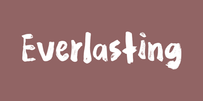 Handmade with an organic feeling.
 - Lemonism by Bogstav,
$17.00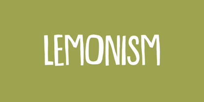 Handmade with an organic feeling.
 - Ahorn by Bogstav,
$17.00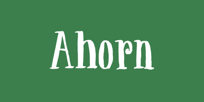 Handmade with an organic feeling.
 - Children Block Letters by m u r,
$15.00An child's 3D block letters. - Falcon Casual by TypeArt Foundry,
$45.00 An even more casual script.
 - Cassjor by Wooden Type Fonts,
$15.00 An avant garde design, geometric.
 - Talkback by Bogstav,
$17.00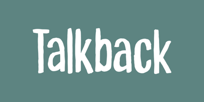 Handmade with an organic feeling.
 - Osculate by Bogstav,
$17.00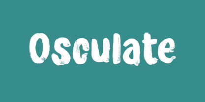 Handmade with an organic feeling.
 - Dolenzo J - Unknown license

- Pharmacy - Unknown license

- Roz by Gaslight,
$25.00 Roz is clean geometric sans round by one side and sharp on the other side. It has three weights and corresponding italics. Roz is ideal for package design, headlines and other typographic mediums.
 - Avoda by Typefactory,
$14.00 Avoda is an elegant and modern sans serif font. No matter the topic, this font will be an incredibly asset to your fonts’ library, as it has the potential to elevate any creation.
 - Stridere by Greater Albion Typefounders,
$16.00 Think of a slender Black Letter screeching to a halt on the page and you have the essential idea of Stridere. Want ornate formality and fast movement all in one? Here it is!
 - Sandalwood JNL by Jeff Levine,
$29.00 An example of an antique sans serif wood type displayed in Rob Roy Kelly’s “American Wood Type” was the working model for Sandalwood JNL, which is available in both regular and oblique versions.
 - Interna by Volcano Type,
$19.00A font that's a sans on the outside and a serif on the inside. Inspired by fonts like Rotis, Clarendon and a little Avant Garde, Interna has a slightly vintage feel to it. - TOMO Ziguret by TOMO Fonts,
$15.00 TOMO Ziguret! A handmade font that would love to play with your designs! Ideal for kids toys or when packaging is involved — We would love to see this one on beautifully crafted book.
 - Market JNL by Jeff Levine,
$29.00Market JNL is based on lettering found on a circa 1940s office supply product. There is a distinct Art Deco feel to this font, and it lends itself perfectly to all retro projects. - P.T. Barnum by Bitstream,
$29.99 One of the original nineteenth century designs, cut at Barnhart Brothers & Spindler in Chicago about 1880, passed on to us through ATF. Unlike most Circus types, the serifs of P.T. Barnum are bracketed.
 - Love Affair by Gleb Guralnyk,
$12.00 Love Affair is an art nouveau vintage style font. It's an old-school typeface, perfect for creating some classic lettering compositions. Love Affair includes lots of ligatures to create more organic text shape.

